` root element.
```javascript
import {Block, BlockAttr, BlockCompositionType, BlockType} from '@stripoinc/ui-editor-extensions';
export class SimpleBlock extends Block {
getBlockCompositionType() {
return BlockCompositionType.BLOCK;
}
getTemplate() {
const {BLOCK_IMAGE, BLOCK_TEXT, BLOCK_BUTTON} = BlockType;
return `
<${BLOCK_IMAGE}
${BlockAttr.BLOCK_IMAGE.src}="https://hpy.stripocdn.email/content/guids/CABINET_e5244175dd1729a1d6ee1f8bd0d5490f/images/50421523966142571.jpg"
${BlockAttr.BLOCK_IMAGE.alt}="Lorem ipsum">
<${BLOCK_TEXT}>
Lorem ipsum dolor sit amet
<${BLOCK_BUTTON} ${BlockAttr.BLOCK_BUTTON.href}="https://stripo.email">
Click me
`
}
// Additional block configuration methods...
}
```
### Creating a Container
You can create container markup using template aliases to group related content elements. The `allowInnerBlocksSelection()` and `allowInnerBlocksDND()` methods provide fine-grained control over user interactions within the container:
* `allowInnerBlocksSelection()`: Controls whether users can select individual blocks within the container
* `allowInnerBlocksDND()`: Controls whether users can drag and drop blocks within the container
```javascript
import {Block, BlockAttr, BlockCompositionType, BlockType} from '@stripoinc/ui-editor-extensions';
export class SimpleBlock extends Block {
getBlockCompositionType() {
return BlockCompositionType.CONTAINER;
}
getTemplate() {
const {CONTAINER, BLOCK_TEXT, BLOCK_BUTTON} = BlockType;
return `
<${CONTAINER}>
<${BLOCK_TEXT}>
Lorem ipsum dolor sit amet
<${BLOCK_BUTTON} ${BlockAttr.BLOCK_BUTTON.href}="https://stripo.email">
Click me
`
}
allowInnerBlocksSelection() {
return false; // Disable selection of blocks inside the container
}
allowInnerBlocksDND() {
return false; // Disable drag and drop of blocks inside the container
}
// Additional block configuration methods...
}
```
### Creating a Structure
Structures allow you to create multi-column layouts using template aliases. When creating structures, ensure that the combined width of all containers within the structure totals 100% for proper layout rendering.
The `allowInnerBlocksSelection()` and `allowInnerBlocksDND()` methods provide the same interaction controls as containers, allowing you to manage user behavior within the structure's containers.
```javascript
import {Block, BlockAttr, BlockCompositionType, BlockType} from '@stripoinc/ui-editor-extensions';
export class SimpleBlock extends Block {
getBlockCompositionType() {
return BlockCompositionType.STRUCTURE;
}
getTemplate() {
const {STRUCTURE, CONTAINER, BLOCK_TEXT, BLOCK_BUTTON} = BlockType;
// Create a two-column structure:
// - First column: 50% width containing a Text Block
// - Second column: 50% width containing a Button Block
return `
<${STRUCTURE}>
<${CONTAINER} ${BlockAttr.CONTAINER.widthPercent}="50">
<${BLOCK_TEXT}>
Lorem ipsum dolor sit amet
<${CONTAINER} ${BlockAttr.CONTAINER.widthPercent}="50">
<${BLOCK_BUTTON} ${BlockAttr.BLOCK_BUTTON.href}="https://stripo.email">
Click me
`
}
allowInnerBlocksSelection() {
return true; // Allow selection of blocks inside the structure
}
allowInnerBlocksDND() {
return false; // Disable drag and drop of blocks inside the structure
}
// Additional block configuration methods...
}
```
#### Adding an Empty Container
Empty containers serve as placeholders that users can populate with content. You can define empty containers using template aliases to create flexible layout structures.
```javascript
import {Block, BlockAttr, BlockCompositionType, BlockType} from '@stripoinc/ui-editor-extensions';
export class SimpleBlock extends Block {
getBlockCompositionType() {
return BlockCompositionType.STRUCTURE;
}
// Create a two-column structure:
// - First column: 50% width containing an Empty Container
// - Second column: 50% width containing a Button Block
getTemplate() {
const {STRUCTURE, CONTAINER, EMPTY_CONTAINER, BLOCK_BUTTON} = BlockType;
return `
<${STRUCTURE}>
<${EMPTY_CONTAINER} ${BlockAttr.EMPTY_CONTAINER.widthPercent}="50">
<${CONTAINER} ${BlockAttr.CONTAINER.widthPercent}="50">
<${BLOCK_BUTTON} ${BlockAttr.BLOCK_BUTTON.href}="https://stripo.email">
Click me
`
}
allowInnerBlocksSelection() {
return true; // Allow selection of blocks inside the structure
}
allowInnerBlocksDND() {
return true; // Allow drag and drop of blocks inside the structure
}
// Additional block configuration methods...
}
```
#### Customizing Quick-Add Icons
You can customize the quick-add icons that appear inside empty containers to provide users with specific block options. This is accomplished by specifying block IDs in the `blocks` attribute of the empty container.
```javascript
import {Block, BlockAttr, BlockCompositionType, BlockType} from '@stripoinc/ui-editor-extensions';
export class SimpleBlock extends Block {
getId() {
return 'simple-block';
}
getBlockCompositionType() {
return BlockCompositionType.STRUCTURE;
}
getTemplate() {
const {STRUCTURE, EMPTY_CONTAINER, BLOCK_IMAGE, BLOCK_TEXT} = BlockType;
// Specify block IDs that will appear as quick-add icons in the empty container
return `
<${STRUCTURE}>
<${EMPTY_CONTAINER}
${BlockAttr.EMPTY_CONTAINER.widthPercent}="100"
${BlockAttr.EMPTY_CONTAINER.blocks}="${BLOCK_IMAGE}, ${BLOCK_TEXT}, simple-block">
`
}
allowInnerBlocksSelection() {
return true; // Allow selection of blocks inside the structure
}
allowInnerBlocksDND() {
return true; // Allow drag and drop of blocks inside the structure
}
// Additional block configuration methods...
}
```
---
---
url: https://plugin.stripo.email/extensions/tutorials/how-to/settings-panel.md
---
# Configure the Settings Panel
## What is a Settings Panel?
The Settings Panel in the Stripo Extensions SDK is a customizable configuration interface that:
* Displays when users select blocks in the editor
* Organizes controls into logical tabs (Settings, Styles, Data, etc.)
* Can be customized per block type - both built-in and custom
* Maintains consistency across the editor while allowing deep customization
* Adapts to different block types automatically
## Examples
### Add New Control
Insert a custom control into a specific position within a tab.
```javascript
import {SettingsPanelRegistry, SettingsPanelTab, SettingsTab, BlockType} from '@stripoinc/ui-editor-extensions';
class ExtendedButtonSettings extends SettingsPanelRegistry {
registerBlockControls(controls) {
// Insert the custom control 'my-analytics-control' into the Styles tab
// of the Button block at position 1 (second position, after the first control)
controls[BlockType.BLOCK_BUTTON]
.find(tab => tab.getTabId() === SettingsTab.STYLES)
.addControl('my-analytics-control', 1);
}
}
```
### Remove Existing Control
Remove a control from a block's settings panel.
```javascript
class SimplifiedTextSettings extends SettingsPanelRegistry {
registerBlockControls(controls) {
// Remove 'Right to Left Text Direction' control from Text block settings
controls[BlockType.BLOCK_TEXT]
.find(tab => tab.getTabId() === SettingsTab.SETTINGS)
.deleteControl(TextControls.DIRECTION);
}
}
```
### Reorder Controls
This example demonstrates:
* Reordering the 'Button Text' and 'Alignment on Desktop' controls
* Moving the 'Padding' control from the 'Settings' tab to the 'Styles' tab
```javascript
class ReorderedButtonSettings extends SettingsPanelRegistry {
registerBlockControls(controls) {
const buttonPanel = controls[BlockType.BLOCK_BUTTON];
const settingsTab = buttonPanel.find(tab => tab.getTabId() === SettingsTab.SETTINGS);
const stylesTab = buttonPanel.find(tab => tab.getTabId() === SettingsTab.STYLES);
// Reorder the 'Alignment on Desktop' control to position 1
settingsTab.deleteControl(ButtonControls.ALIGNMENT);
settingsTab.addControl(ButtonControls.ALIGNMENT, 1);
// Move the 'Padding' control to the 'Styles' tab
settingsTab.deleteControl(ButtonControls.INTERNAL_INDENTS);
stylesTab.addControl(ButtonControls.INTERNAL_INDENTS, 0);
}
}
```
### Multiple Tabs
Organize controls into multiple tabs to improve the user experience:
```javascript
class ProductBlockSettings extends SettingsPanelRegistry {
registerBlockControls(controls) {
controls['product-block'] = [
new SettingsPanelTab(
SettingsTab.SETTINGS,
[
'display-mode-control'
]),
new SettingsPanelTab(
'card',
[
'price-format-control',
'currency-control',
])
.withLabel(this.api.translate('Product Card'))
];
}
}
```
### Custom Tab Labels
The default tabs (`SettingsTab.SETTINGS`, `SettingsTab.STYLES`, and `SettingsTab.DATA`) include built-in localized labels.\
For custom tabs, use the `withLabel()` method to provide a translation key, ensuring proper localization across all supported languages:
```javascript
class CustomRegistry extends SettingsPanelRegistry {
registerBlockControls(controls) {
controls['banner-block'] = [
new SettingsPanelTab(
'branding',
['logo-control', 'color-scheme-control'])
.withLabel(this.api.translate('Brand Settings'))
];
}
}
// In your extension builder
new ExtensionBuilder()
.withLocalization({
'en': {
'Brand Settings': 'Brand Settings'
},
'es': {
'Brand Settings': 'Configuración de Marca'
},
'fr': {
'Brand Settings': 'Paramètres de Marque'
}
})
.withSettingsPanelRegistry(CustomRegistry)
.build();
```
---
---
url: https://plugin.stripo.email/extensions/tutorials/examples/coupon-block.md
---
# Create a Custom Coupon Block
## Overview
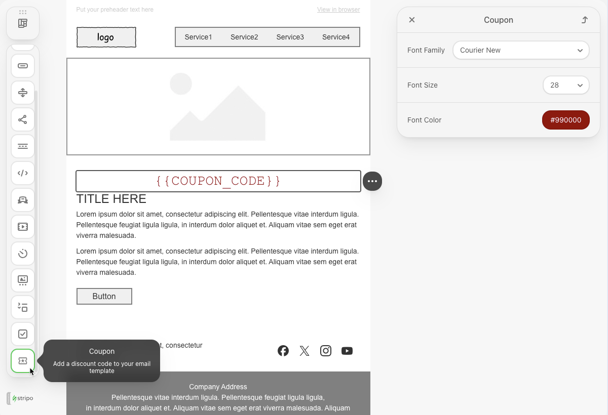
The Coupon Block extension demonstrates how to create a custom content block for the Stripo Email Editor. This tutorial walks you through building a reusable coupon code block with customizable styling options, including font family, size, and color controls.
### What You'll Build
In this tutorial, you'll create a fully functional custom block that:
* Displays a coupon code with a placeholder for dynamic content {{COUPON\_CODE}}
* Provides a custom icon for the blocks panel
* Includes styling controls in the settings panel (font family, size, and color)
* Supports internationalization for multi-language editors
* Integrates seamlessly with the Stripo editor's existing UI
::: image-wrap
:::
### Use Cases
* **E-commerce Promotions**: Add discount codes to promotional email campaigns
* **Loyalty Programs**: Display member-exclusive coupon codes
* **Seasonal Sales**: Highlight special offer codes in marketing emails
* **Personalized Offers**: Use merge tags to show customer-specific discount codes
## Prerequisites
Before starting this tutorial, ensure you have:
* Node.js version 22.x or higher installed
* Basic understanding of JavaScript ES6+ syntax
* Familiarity with the Stripo Extensions SDK
* A text editor or IDE for code development
## Understanding the Components
A complete custom block extension consists of several key components:
### 1. Block Definition
The core `Block` class that defines the block's structure, appearance, and behavior.
### 2. Settings Panel Registry
Configuration that determines which controls appear in the settings panel when the block is selected.
### 3. Custom Controls
Reusable control components that allow users to modify block properties (font, color, size, etc.).
### 4. Icon Registry
Custom SVG icons that appear in the blocks panel for visual identification.
### 5. Internationalization
Translation files that support multiple languages in the editor interface.
## Step 1: Project Setup
Create your project structure and install dependencies according to the [Getting Started](/extensions/getting-started) guide.
Your project directory structure should look like this:
```bash
coupon-block/
├── index.html
├── src/
│ ├── creds.js
│ ├── index.js
│ └── extension.js
├── package.json
└── vite.config.js
```
## Step 2: Create the Coupon Block Class
Create a new file `src/CouponBlock.js` with the following block definition:
```javascript
import {Block, BlockType} from '@stripoinc/ui-editor-extensions';
/**
* Coupon Block Component
* A custom block for displaying coupon codes in email templates
*/
export class CouponBlock extends Block {
/**
* Returns the unique identifier for this block
* This ID is used to register the block and reference it in settings
* @returns {string} Unique block identifier
*/
getId() {
return 'coupon-block';
}
/**
* Returns the icon identifier for the blocks panel
* This icon appears in the blocks library for users to drag and drop
* @returns {string} Icon identifier registered in IconsRegistry
*/
getIcon() {
return 'couponBlockIcon';
}
/**
* Returns the display name shown in the blocks panel
* Uses the translation API for internationalization support
* @returns {string} Translated block name
*/
getName() {
return this.api.translate('Coupon');
}
/**
* Returns the description shown in the blocks panel
* Provides users with information about the block's purpose
* @returns {string} Translated block description
*/
getDescription() {
return this.api.translate('Add a discount code to your email template');
}
/**
* Returns the HTML template structure for this block
* The template defines the initial markup when the block is inserted
* @returns {string} HTML template with merge tag placeholder
*/
getTemplate() {
return `
<${BlockType.BLOCK_TEXT} align="center">
{{COUPON_CODE}}
`
}
}
```
### Key Components Explained
* **getId()**: Returns a unique identifier for the block. This ID is used throughout the extension system to reference the block in settings panels, event handlers, and registries.
* **getIcon()**: Specifies which icon to display in the blocks panel. The icon identifier must match a key registered in the `IconsRegistry`.
* **getName()**: Provides the user-facing name displayed in the blocks panel. Uses `this.api.translate()` for internationalization support.
* **getDescription()**: Offers a brief description of the block's purpose, helping users understand when to use it.
* **getTemplate()**: Specifies the HTML structure inserted when users add the block to their email. In this implementation, `BlockType.BLOCK_TEXT` is placed inside `` and `` elements, rather than as a root node. Because of this, users cannot directly select or edit this text region using `BlockCompositionType.BLOCK`, which also restricts free-form editing of the coupon code area.
::: tip Merge Tags
Merge tags like {{COUPON\_CODE}} can be replaced with actual values when generating the final email.
:::
## Step 3: Register Custom Icons
Create the icon registry to provide custom icons for your blocks.
### Create Icon Registry
Create `src/icons/ExtensionIconsRegistry.js`:
```javascript
import {IconsRegistry} from '@stripoinc/ui-editor-extensions';
import couponBlockIcon from './coupon.svg?raw';
/**
* Extension Icons Registry
* Registers custom SVG icons for use in the extension
*/
export class ExtensionIconsRegistry extends IconsRegistry {
/**
* Registers SVG icons by adding them to the icons map
* @param {Object} iconsMap - Map of icon identifiers to SVG strings
*/
registerIconsSvg(iconsMap) {
iconsMap['couponBlockIcon'] = couponBlockIcon;
}
}
```
### Add SVG Icon
Create `src/icons/coupon.svg`:
```svg
```
::: tip Custom Icons
You can use any SVG icon you prefer. The `?raw` import suffix in Vite tells the bundler to import the SVG file as a string rather than a URL, which is required for the IconsRegistry.
:::
## Step 4: Create Custom Controls
Stripo provides a wide variety of built-in control classes for common styling needs, which you can use directly without implementing them from scratch. In this section, we'll utilize three such built-in controls to easily add styling to our coupon block:
### Font Color Control
Create `src/settings/controls/CouponFontColorControl.js`:
```javascript
import {TextColorBuiltInControl} from '@stripoinc/ui-editor-extensions';
export const COUPON_FONT_COLOR_CONTROL_ID = 'coupon-font-color-control';
/**
* Coupon Font Color Control
* Extends the built-in text color control for changing coupon text color
*/
export class CouponFontColorControl extends TextColorBuiltInControl {
/**
* Returns the unique identifier for this control
* @returns {string} Control identifier
*/
getId() {
return COUPON_FONT_COLOR_CONTROL_ID;
}
}
```
### Font Size Control
Create `src/settings/controls/CouponFontSizeControl.js`:
```javascript
import {TextSizeBuiltInControl} from '@stripoinc/ui-editor-extensions';
export const COUPON_FONT_SIZE_CONTROL_ID = 'coupon-font-size-control';
/**
* Coupon Font Size Control
* Extends the built-in text size control for changing coupon text size
*/
export class CouponFontSizeControl extends TextSizeBuiltInControl {
/**
* Returns the unique identifier for this control
* @returns {string} Control identifier
*/
getId() {
return COUPON_FONT_SIZE_CONTROL_ID;
}
}
```
### Font Family Control
Create `src/settings/controls/CouponFontFamilyControl.js`:
```javascript
import {TextFontFamilyBuiltInControl} from '@stripoinc/ui-editor-extensions';
export const COUPON_FONT_FAMILY_CONTROL_ID = 'coupon-font-family-control';
/**
* Coupon Font Family Control
* Extends the built-in font family control for changing coupon text font
*/
export class CouponFontFamilyControl extends TextFontFamilyBuiltInControl {
/**
* Returns the unique identifier for this control
* @returns {string} Control identifier
*/
getId() {
return COUPON_FONT_FAMILY_CONTROL_ID;
}
}
```
## Step 5: Configure Settings Panel
The settings panel registry determines which controls appear when users select your custom block.
Create `src/settings/ExtensionSettingsPanelRegistry.js`:
```javascript
import {SettingsPanelRegistry, SettingsPanelTab, SettingsTab} from '@stripoinc/ui-editor-extensions';
import {COUPON_FONT_COLOR_CONTROL_ID} from './controls/CouponFontColorControl';
import {COUPON_FONT_SIZE_CONTROL_ID} from './controls/CouponFontSizeControl';
import {COUPON_FONT_FAMILY_CONTROL_ID} from './controls/CouponFontFamilyControl';
/**
* Extension Settings Panel Registry
* Configures which controls appear in the settings panel for each custom block
*/
export class ExtensionSettingsPanelRegistry extends SettingsPanelRegistry {
/**
* Registers controls for custom blocks
* @param {Object} controls - Map of block IDs to control configurations
*/
registerBlockControls(controls) {
// Register controls for the coupon block
controls['coupon-block'] = [
// Create a tab in the Styles section
new SettingsPanelTab(
SettingsTab.STYLES, // Built-in tab identifier
[
// List of control IDs to display in this tab
COUPON_FONT_FAMILY_CONTROL_ID,
COUPON_FONT_SIZE_CONTROL_ID,
COUPON_FONT_COLOR_CONTROL_ID
]
)
]
}
}
```
## Step 6: Add Internationalization
Create translation files to support multiple languages in the editor interface.
Create `src/i18n/en.js`:
```javascript
/**
* English translations for the Coupon Block extension
* Keys are used in this.api.translate() calls throughout the extension
*/
export default {
"Coupon": "Coupon",
"Add a discount code to your email template": "Add a discount code to your email template",
}
```
### Adding More Languages
To support additional languages, create more translation files:
```javascript
// src/i18n/es.js - Spanish translations
export default {
"Coupon": "Cupón",
"Add a discount code to your email template": "Añade un código de descuento a tu plantilla de correo",
}
// src/i18n/fr.js - French translations
export default {
"Coupon": "Coupon",
"Add a discount code to your email template": "Ajoutez un code de réduction à votre modèle d'e-mail",
}
```
## Step 7: Register the Extension
Create `src/extension.js` to assemble all components and register the extension:
```javascript
import { ExtensionBuilder } from '@stripoinc/ui-editor-extensions';
import {ExtensionIconsRegistry} from './icons/ExtensionIconsRegistry';
import {CouponBlock} from './CouponBlock';
import en from './i18n/en';
import es from './i18n/es';
import fr from './i18n/fr';
import {ExtensionSettingsPanelRegistry} from './settings/ExtensionSettingsPanelRegistry';
import {CouponFontColorControl} from './settings/controls/CouponFontColorControl';
import {CouponFontSizeControl} from './settings/controls/CouponFontSizeControl';
import {CouponFontFamilyControl} from './settings/controls/CouponFontFamilyControl';
/**
* Coupon Block Extension
* Combines all extension components into a single extension package
*/
const extension = new ExtensionBuilder()
// Register custom icons
.withIconsRegistry(ExtensionIconsRegistry)
// Register localization files
.withLocalization({
'en': en,
'es': es,
'fr': fr,
})
// Register settings panel configuration
.withSettingsPanelRegistry(ExtensionSettingsPanelRegistry)
// Register custom controls
.addControl(CouponFontColorControl)
.addControl(CouponFontSizeControl)
.addControl(CouponFontFamilyControl)
// Register custom blocks
.addBlock(CouponBlock)
// Build the final extension object
.build();
export default extension;
```
## Step 8: Run the Development Server
Your coupon block extension is now ready for testing.
### Start the Development Server
```bash
npm run dev
```
This command will:
1. Start the Vite development server on `http://localhost:3000`
2. Automatically open your default browser
3. Load the Stripo editor with your coupon block extension
## Complete Example
For a full working example with all source files, check out the complete implementation in our [GitHub repository](https://github.com/stripoinc/stripo-plugin-samples/tree/main/extensions/javascript/coupon-block).
---
---
url: >-
https://plugin.stripo.email/extensions/tutorials/examples/integrations/external-image-library.md
---
# Integrate an External Image Library
## Overview
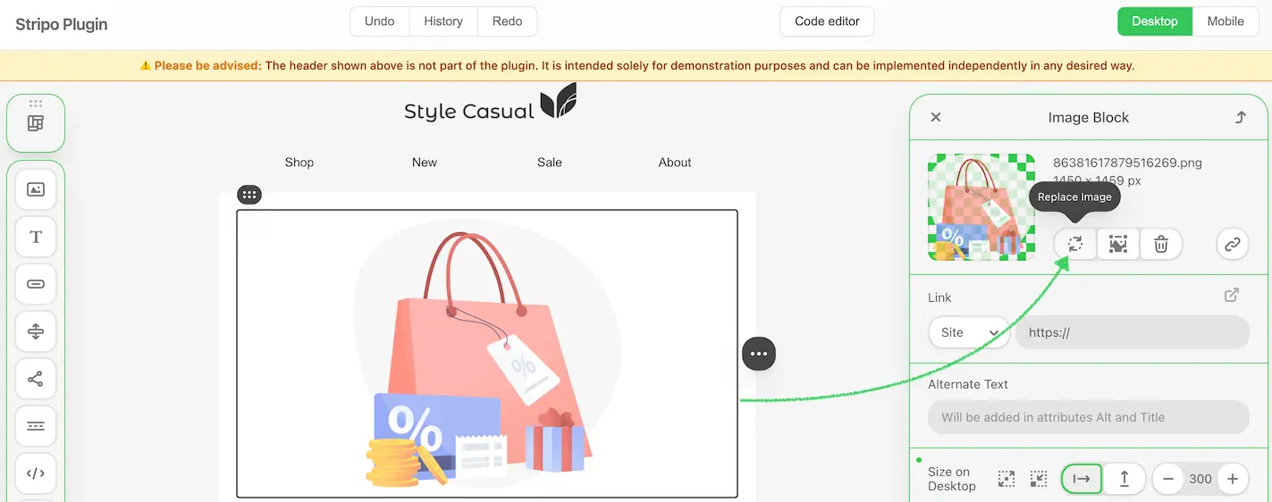
The External Image Library integration allows users to browse and select images from your image hosting service or third-party platforms directly within the Stripo Email Editor. This integration provides a seamless experience for embedding images into email templates while maintaining full control over your image assets.
### What You'll Build
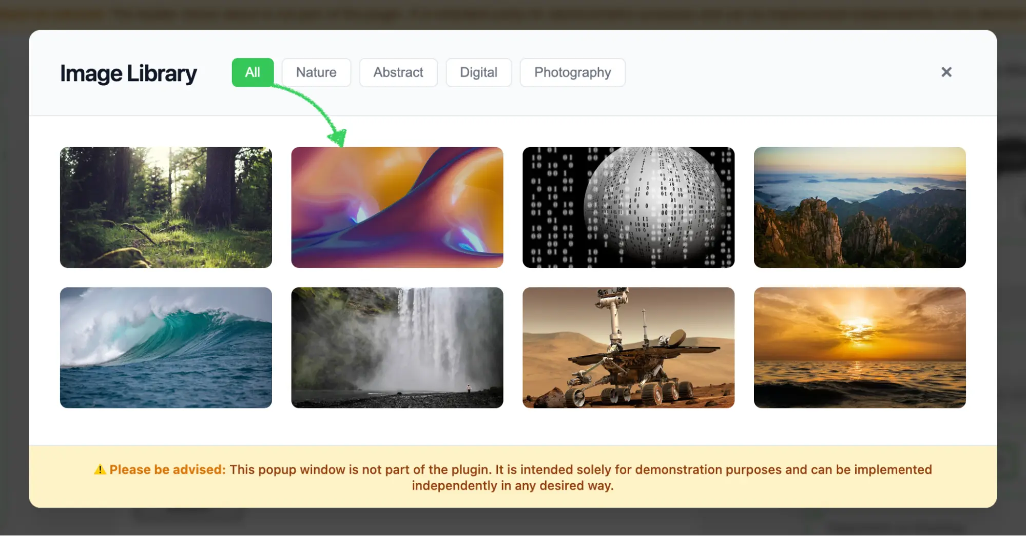
In this tutorial, you'll create a fully functional image library modal that:
* Displays a responsive grid of image thumbnails with hover effects
* Supports category-based filtering (All, Nature, Abstract, Digital and Photography)
* Handles image selection with proper callback integration
* Returns image data in the format expected by the Stripo Editor
::: image-wrap
{width=1423 height=562}
:::
::: image-wrap
{width=1999 height=1045}
:::
### Use Cases
* **Custom Image Platform**: Connect to your proprietary image hosting service
* **Curated Content**: Provide pre-approved images for brand consistency
* **Third-Party Integration**: Connect to platforms such as Unsplash, Pexels, or Shutterstock
* **Dynamic Content**: Fetch images from your API or CMS in real time
* **Brand Asset Management**: Integrate with your Digital Asset Management (DAM) system
## Prerequisites
Before starting this tutorial, ensure you have:
* Node.js version 22.x or higher installed
* A basic understanding of JavaScript ES6+ syntax
* Familiarity with the Stripo Extensions SDK
## Understanding the Interface
The [ExternalImageLibrary](/extensions/reference/integrations/ExternalImageLibrary) class must implement a single method:
```typescript
openImageLibrary(
currentImageUrl: string,
onImageSelectCallback: (image: ExternalGalleryImage) => void,
onCancelCallback: () => void
): void
```
### Parameters
| Parameter | Type | Description |
|-----------|------|-------------|
| `currentImageUrl` | `string` | Currently selected image URL (if any) |
| `onImageSelectCallback` | `Function` | Callback function invoked when a user selects an image |
| `onCancelCallback` | `Function` | Callback function invoked when a user cancels the selection |
### ExternalGalleryImage Object
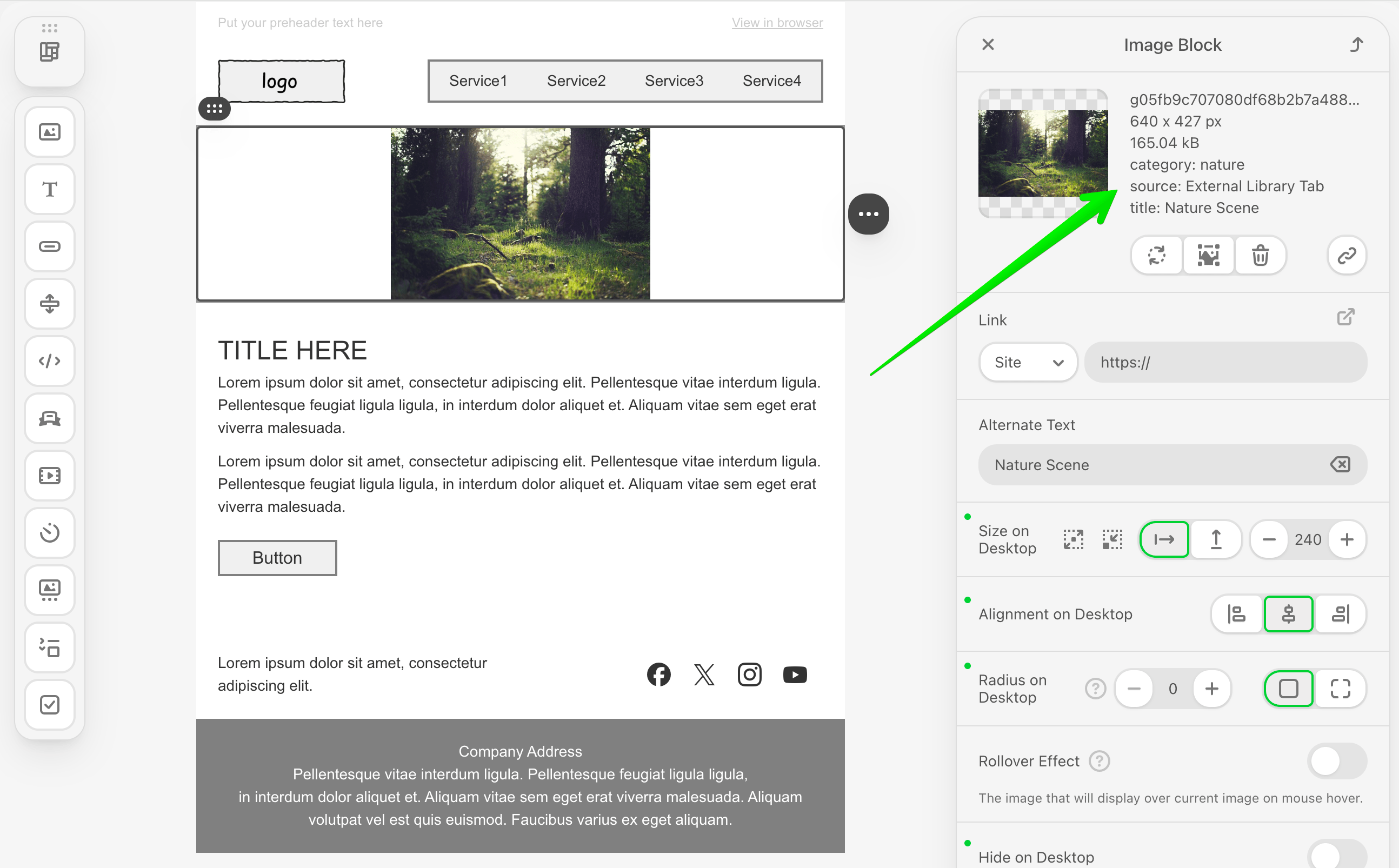
When a user selects an image, your library implementation must return an object with the following structure:
```typescript
{
originalName: string; // Image file name
width: number; // Image width in pixels
height: number; // Image height in pixels
sizeBytes: number; // File size in bytes
url: string; // Image URL
altText: string; // Alt text for accessibility
labels?: Record; // Optional metadata (v3.2.0+)
}
```
:::tip Starting from v3.2.0, you can include optional metadata using the `labels` property to store additional image information such as category, source or custom tags.
:::
::: image-wrap
:::
## Step 1: Project Setup
Create your project structure and install dependencies according to the [Getting Started](/extensions/getting-started) guide.
Your project directory structure should look like this:
```bash
external-image-library/
├── index.html
├── src/
│ ├── creds.js
│ ├── index.js
│ └── extension.js
├── package.json
└── vite.config.js
```
## Step 2: Create the Image Library Class
Create a new file `src/MyExternalImagesLibrary.js` with the following basic class structure:
```javascript
import {ExternalImageLibrary} from '@stripoinc/ui-editor-extensions';
/**
* External Image Library Implementation
* This class implements a modal image gallery with filtering capabilities
* for the Stripo Email Editor extension system.
*/
export default class MyExternalImagesLibrary extends ExternalImageLibrary {
// Instance properties
externalLibrary;
imageSelectCallback = () => {};
cancelCallback = () => {};
activeCategory = 'all';
constructor() {
super();
this.createModal();
this.attachEventListeners();
this.initializeFilters();
}
/**
* Required method called by the Stripo editor
* Opens the image library modal dialog
* @param {string} currentImageUrl - Currently selected image URL (if any)
* @param {Function} onImageSelectCallback - Callback invoked when an image is selected
* @param {Function} onCancelCallback - Callback invoked when the modal is cancelled
*/
openImageLibrary(currentImageUrl, onImageSelectCallback, onCancelCallback) {
// Store callbacks
this.imageSelectCallback = onImageSelectCallback;
this.cancelCallback = onCancelCallback;
// Show modal
this.externalLibrary.style.display = 'flex';
// Reset filters to show all images
this.filterImages('all');
const allButton = this.externalLibrary.querySelector('[data-category="all"]');
if (allButton) {
this.updateActiveButton(allButton);
}
}
}
```
### Key Components Explained
* **Instance Properties**:
* `externalLibrary`: Reference to the modal DOM element
* `imageSelectCallback`: Stores the success callback from the Stripo editor
* `cancelCallback`: Stores the cancel callback from the Stripo editor
* `activeCategory`: Tracks the currently active filter category
* **Constructor**: Initializes the complete modal UI when the class is instantiated
* **openImageLibrary**: Required method that:
* Stores the callbacks for later invocation
* Displays the modal dialog
* Resets filters to display all images
* Updates the active button state
## Step 3: Define Image Data and Styles
Add static properties for image data and UI configuration. Continue editing `src/MyExternalImagesLibrary.js`:
```javascript
export default class MyExternalImagesLibrary extends ExternalImageLibrary {
// ... existing properties ...
// UI Style configurations
static STYLES = {
// Modal overlay styles
overlay: {
backgroundColor: 'rgba(0,0,0,.7)',
position: 'fixed',
top: '0',
right: '0',
bottom: '0',
left: '0',
zIndex: '1050',
display: 'flex',
alignItems: 'center',
justifyContent: 'center',
backdropFilter: 'blur(4px)',
fontFamily: "-apple-system, BlinkMacSystemFont, 'Segoe UI', Roboto, 'Helvetica Neue', Arial, sans-serif"
},
// Modal container styles
modal: {
backgroundColor: '#ffffff',
borderRadius: '12px',
boxShadow: '0 20px 25px -5px rgba(0, 0, 0, 0.1), 0 10px 10px -5px rgba(0, 0, 0, 0.04)',
maxWidth: '1000px',
width: '90%',
display: 'flex',
flexDirection: 'column',
position: 'relative'
},
// Header styles
header: {
padding: '24px 32px',
borderBottom: '1px solid #e5e7eb',
display: 'flex',
alignItems: 'center',
justifyContent: 'space-between',
backgroundColor: '#f9fafb',
borderRadius: '12px 12px 0 0'
},
// Content container styles
content: {
padding: '32px',
height: '340px',
overflowY: 'auto',
overflowX: 'hidden',
boxSizing: 'border-box'
},
// Grid styles
grid: {
display: 'grid',
gridTemplateColumns: 'repeat(auto-fill, minmax(200px, 1fr))',
gap: '20px',
gridAutoRows: '125px'
},
// Button styles
buttonActive: {
padding: '6px 14px',
borderRadius: '6px',
border: 'none',
backgroundColor: '#34c759',
color: 'white',
fontSize: '14px',
fontWeight: '500',
cursor: 'pointer',
transition: 'background-color 0.2s'
},
buttonInactive: {
padding: '6px 14px',
borderRadius: '6px',
border: '1px solid #e5e7eb',
backgroundColor: 'white',
color: '#6b7280',
fontSize: '14px',
fontWeight: '500',
cursor: 'pointer',
transition: 'all 0.2s'
},
// Footer styles
footer: {
padding: '16px 32px',
borderTop: '1px solid #e5e7eb',
backgroundColor: '#fef3c7',
borderRadius: '0 0 12px 12px',
textAlign: 'center'
}
};
// Sample images data
static IMAGES = [
{
category: 'nature',
src: 'https://demo.stripocdn.email/content/guids/CABINET_ec6ac1de70c49219cc55754951562cc72c549fc9e7a7ec9636d3be7a33c392e2/images/g05fb9c707080df68b2b7a48884ecfb678ea72bfba6c4b30a3622d77b4e1fc4d686c2fa0ca69ecb08cb93ebe999a2cffd_640.jpeg',
title: 'Nature Scene'
},
{
category: 'abstract',
src: 'https://demo.stripocdn.email/content/guids/CABINET_ec6ac1de70c49219cc55754951562cc72c549fc9e7a7ec9636d3be7a33c392e2/images/g039e37b4b08aab63892fa5bcb069ef5a4c3903ffdfe6a266b65d59c96669e69786dd8db7d6d686af5a93c55b5f59cc21_640.jpeg',
title: 'Abstract Art'
},
{
category: 'digital',
src: 'https://demo.stripocdn.email/content/guids/CABINET_ec6ac1de70c49219cc55754951562cc72c549fc9e7a7ec9636d3be7a33c392e2/images/g865b29f858626ae67bf436c38ea27d23ce34ce2c083b7829929c1ce0f1c7a6f72f2f7654bfe16d837d53df0713b157da_640.jpeg',
title: 'Digital Design'
},
{
category: 'photography',
src: 'https://demo.stripocdn.email/content/guids/CABINET_ec6ac1de70c49219cc55754951562cc72c549fc9e7a7ec9636d3be7a33c392e2/images/gf0fe89ba1310967859765c4634e5fdb5abc15576715a0e8793c2bccdd12fabb435f1f62ebf39c017d6c520c6a0cd0e83_640.jpeg',
title: 'Mountain Vista'
},
{
category: 'nature',
src: 'https://rf.stripocdn.email/content/guids/CABINET_ec6ac1de70c49219cc55754951562cc72c549fc9e7a7ec9636d3be7a33c392e2/images/ge472fe8d47d49d6b4f022364cf352302eff394855af35507d5b92fe30d08e0c8a992246d3d813ff21769fd771fab7c90_640.jpeg',
title: 'Ocean'
},
{
category: 'nature',
src: 'https://demo.stripocdn.email/content/guids/CABINET_ec6ac1de70c49219cc55754951562cc72c549fc9e7a7ec9636d3be7a33c392e2/images/g82fa2ffeb30d400bfa57c908a9716e883b41baf34f6ca09cb0650124ef4f0d10322137d9cfab9ae35aedb1a3d8adfb4e_640.jpeg',
title: 'Waterfall'
},
{
category: 'digital',
src: 'https://rf.stripocdn.email/content/guids/CABINET_ec6ac1de70c49219cc55754951562cc72c549fc9e7a7ec9636d3be7a33c392e2/images/g37c2a939530fa27db0025bc0031514973909782c635b82080f91f5c7c15d473e0b3b7c6d41ef5a20d6370c6f58ae8ff0_640.jpeg',
title: 'Lunar Rover'
},
{
category: 'photography',
src: 'https://demo.stripocdn.email/content/guids/CABINET_ec6ac1de70c49219cc55754951562cc72c549fc9e7a7ec9636d3be7a33c392e2/images/gfd3e800e20a1305512a60feb3cdf5fbc07ac64b8397398a9c12e3eb73ae28805d1ed5cbc941f302ab7186feedd38e4ff_640.jpeg',
title: 'Ocean Sunset'
}
];
// ... rest of the class ...
}
```
### Image Object Properties
| Property | Type | Description |
|----------|------|-------------|
| `category` | `string` | Filter category (nature, abstract, digital, photography) |
| `src` | `string` | Image URL |
| `title` | `string` | Image display name and alt text |
::: tip Production Implementation
In production environments, replace the static `IMAGES` array with API calls to dynamically fetch images from your backend service or third-party image providers.
:::
## Step 4: Build the Modal UI Structure
Implement the core modal creation methods. These methods generate the modal HTML structure and inject it into the page.
### Create Modal Method
```javascript
/**
* Creates the modal HTML structure and appends it to the document body
*/
createModal() {
const modalHtml = this.generateModalHTML();
const container = document.createElement('div');
container.innerHTML = modalHtml;
document.body.appendChild(container);
// Store reference to the modal element
this.externalLibrary = document.getElementById('externalImagesLibrary');
// Initially hide the modal
this.externalLibrary.style.display = 'none';
}
/**
* Generates the complete modal HTML structure
* @returns {string} Complete HTML string for the modal
*/
generateModalHTML() {
return `
${this.generateHeaderHTML()}
${this.generateContentHTML()}
${this.generateFooterHTML()}
`;
}
```
### Style Conversion Helper
Add the following utility method that converts JavaScript style objects to inline CSS strings:
```javascript
/**
* Converts a style object to an inline style string
* @param {Object} styleObj - Style object with camelCase properties
* @returns {string} Inline CSS style string with kebab-case properties
*/
styleObjToString(styleObj) {
return Object.entries(styleObj)
.map(([key, value]) => {
// Convert camelCase to kebab-case
const kebabKey = key.replace(/([A-Z])/g, '-$1').toLowerCase();
return `${kebabKey}: ${value}`;
})
.join('; ');
}
```
::: warning Important
The `styleObjToString()` method is essential for converting the `STYLES` object into inline CSS strings. This method is required for proper modal rendering.
:::
### Modal Structure Overview
The modal consists of three main sections:
1. **Header**: Title, category filter buttons, and close button
2. **Content**: Scrollable grid of image thumbnails
3. **Footer**: Informational disclaimer
## Step 5: Generate Header with Filters
Create the header section with title, filter buttons, and close button.
### Header HTML Generator
```javascript
/**
* Generates the modal header section HTML
* @returns {string} HTML string for the header section
*/
generateHeaderHTML() {
return `
Image Library
${this.generateFilterButtons()}
${this.generateCloseButton()}
`;
}
```
### Filter Buttons Generator
```javascript
/**
* Generates category filter buttons HTML
* @returns {string} HTML string for all filter buttons
*/
generateFilterButtons() {
const categories = [
{ id: 'all', label: 'All', active: true },
{ id: 'nature', label: 'Nature', active: false },
{ id: 'abstract', label: 'Abstract', active: false },
{ id: 'digital', label: 'Digital', active: false },
{ id: 'photography', label: 'Photography', active: false }
];
return categories.map(cat => `
${cat.label}
`).join('');
}
```
::: tip Category Customization
Categories can be added or modified by updating the `categories` array. Ensure your image data contains matching `category` values for proper filtering.
:::
### Close Button Generator
```javascript
/**
* Generates close button HTML with hover effects
* @returns {string} HTML string for the close button
*/
generateCloseButton() {
return `
×
`;
}
```
## Step 6: Generate Content with Image Grid
Create the content section that displays the image thumbnails in a responsive grid.
### Content Container Generator
```javascript
/**
* Generates the modal content section HTML with image grid
* @returns {string} HTML string for the content section
*/
generateContentHTML() {
return `
${this.generateImageThumbnails()}
`;
}
```
### Image Thumbnails Generator
```javascript
/**
* Generates image thumbnail cards HTML
* @returns {string} HTML string for all image thumbnail cards
*/
generateImageThumbnails() {
return MyExternalImagesLibrary.IMAGES.map(image => `
`).join('');
}
```
### Key Features
1. **Responsive Grid**: Utilizes CSS Grid with `auto-fill` to create a responsive layout that adapts to different screen sizes
2. **Fixed Row Height**: The `gridAutoRows: '125px'` property ensures consistent thumbnail heights across the grid
3. **Hover Effects**: Inline event handlers provide smooth transition animations during user interaction
4. **Data Attributes**: Image metadata (`data-category`) is stored in data attributes for efficient filtering
5. **Overlay Effect**: The title appears on hover with a gradient background overlay for enhanced visual presentation
6. **Object Fit**: The `object-fit: cover` property ensures images fill their containers while maintaining their aspect ratio
## Step 7: Generate Footer with Disclaimer
Add a footer section to display important notices or disclaimers.
```javascript
/**
* Generates the modal footer section HTML with disclaimer notice
* @returns {string} HTML string for the footer section
*/
generateFooterHTML() {
return `
⚠️ Please be advised: This popup window is not part of the plugin. It is intended solely for demonstration purposes and can be implemented independently in any desired way.
`;
}
```
## Step 8: Implement Event Handlers
Add event listeners to handle user interactions with the modal.
### Attach Event Listeners
```javascript
/**
* Attaches event listeners to modal elements after creation
*/
attachEventListeners() {
// Close button click handler
this.externalLibrary.querySelector('.close')
.addEventListener('click', this.cancelAndClose.bind(this));
// Image click handler (using event delegation)
this.externalLibrary.addEventListener('click', this.onImageClick.bind(this));
}
```
### Handle Image Selection
```javascript
/**
* Handles click events on image thumbnail cards
* @param {Event} e - Click event object
*/
onImageClick(e) {
// Check if clicked on thumbnail or any of its children
const thumbnail = e.target.closest('.thumbnail');
if (!thumbnail) return;
// Get the image element within the thumbnail
const img = thumbnail.querySelector('img');
if (!img) return;
// Create callback object with image data
const imageData = {
originalName: img.src.split('/').pop(),
width: 600,
height: 410,
size: 169000,
url: img.getAttribute('src'),
altText: img.getAttribute('alt')
};
// Close modal and execute callback
this.close();
this.imageSelectCallback(imageData);
}
```
::: tip Dynamic Image Metadata
In production environments, you should fetch actual image dimensions and file sizes from your backend or use the Image API to retrieve real metadata. The example above uses placeholder values for demonstration purposes.
:::
### Handle Modal Closure
```javascript
/**
* Closes the modal and invokes the cancel callback
*/
cancelAndClose() {
this.close();
this.cancelCallback();
}
/**
* Closes the modal dialog by hiding it from view
*/
close() {
this.externalLibrary.style.display = 'none';
}
```
### Event Delegation Benefits
Using event delegation by listening to the parent container provides several advantages:
* **Improved Performance**: A single event listener replaces multiple individual listeners for each thumbnail
* **Simplified Maintenance**: Eliminates the need to dynamically attach and detach listeners
* **Future-Proof Implementation**: Automatically handles dynamically added image elements
* **Memory Efficiency**: Reduces the memory footprint when managing numerous elements
## Step 9: Implement Category Filtering
Add filtering functionality to help users find images by category.
### Initialize Filter Buttons
```javascript
/**
* Initializes category filter button functionality
*/
initializeFilters() {
const filterButtons = this.externalLibrary.querySelectorAll('.filter-buttons button');
filterButtons.forEach(button => {
button.addEventListener('click', (e) => {
const category = e.target.getAttribute('data-category');
this.filterImages(category);
this.updateActiveButton(e.target);
});
});
}
```
### Filter Images by Category
```javascript
/**
* Filters displayed images based on the selected category
* @param {string} category - Category identifier to filter by (or 'all' for all images)
*/
filterImages(category) {
this.activeCategory = category;
const thumbnails = this.externalLibrary.querySelectorAll('.thumbnail');
thumbnails.forEach(thumbnail => {
const shouldShow = category === 'all' ||
thumbnail.getAttribute('data-category') === category;
thumbnail.style.display = shouldShow ? 'block' : 'none';
});
}
```
### Update Button Visual States
```javascript
/**
* Updates the visual state of category filter buttons
* @param {HTMLElement} activeButton - The button element that was clicked and should be marked active
*/
updateActiveButton(activeButton) {
const buttons = this.externalLibrary.querySelectorAll('.filter-buttons button');
buttons.forEach(button => {
const isActive = button === activeButton;
const styles = isActive ?
MyExternalImagesLibrary.STYLES.buttonActive :
MyExternalImagesLibrary.STYLES.buttonInactive;
// Apply styles
Object.assign(button.style, styles);
});
}
```
## Step 10: Register the Extension
Create `src/extension.js` to register your image library with the Stripo extension system:
```javascript
import {ExtensionBuilder} from '@stripoinc/ui-editor-extensions';
import MyExternalImagesLibrary from './MyExternalImagesLibrary';
export default new ExtensionBuilder()
.withExternalImageLibrary(MyExternalImagesLibrary)
.build();
```
### Extension Registration Explained
The `ExtensionBuilder` class provides a fluent API for registering integrations:
* **`withExternalImageLibrary()`**: Registers your custom image library implementation
* **`build()`**: Constructs and returns the final extension object for the editor
::: tip Multiple Integrations
Multiple `.with*()` methods can be chained to register different integrations within a single extension:
```javascript
new ExtensionBuilder()
.withExternalImageLibrary(MyExternalImagesLibrary)
.withExternalVideosLibrary(MyExternalVideosLibrary)
.withExternalMergeTagsSelector(MyMergeTagsSelector)
.build();
```
:::
## Step 11: Run the Development Server
Your implementation is now ready for testing.
### Start the Development Server
```bash
npm run dev
```
This command will:
1. Start the Vite development server on `http://localhost:3000`
2. Automatically open your default browser
3. Load the Stripo Editor with your image library extension integrated
## Complete Example
For a full working example, check out the complete implementation in our [GitHub repository](https://github.com/stripoinc/stripo-plugin-samples/tree/main/extensions/javascript/external-image-library).
---
---
url: >-
https://plugin.stripo.email/extensions/tutorials/examples/integrations/external-image-library-tab.md
---
# Integrate a Custom Tab in the Native Image Gallery
## Overview
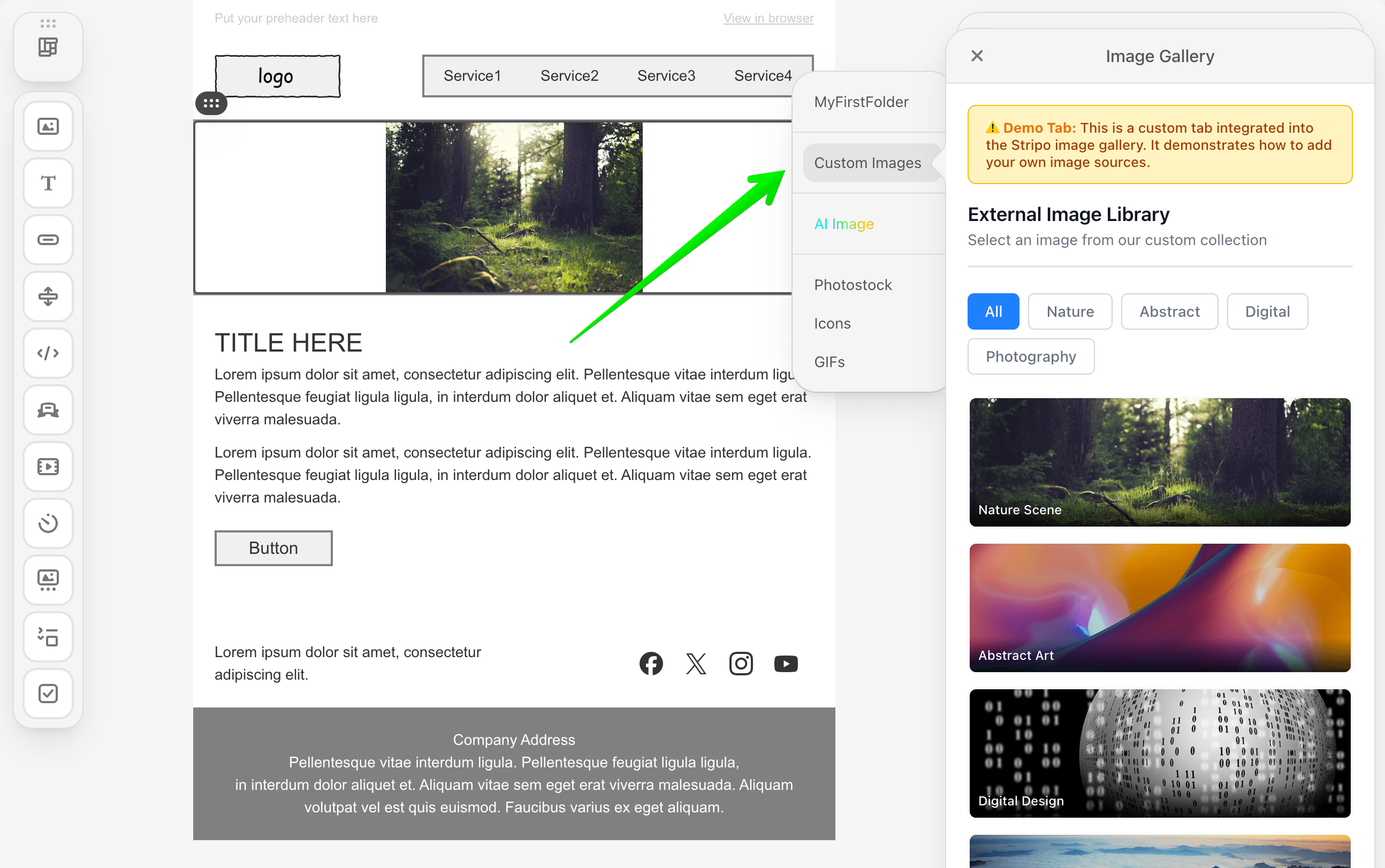
The External Image Library Tab integration allows you to add a custom tab directly within Stripo's native image gallery interface. Unlike creating a standalone modal dialog, this integration embeds your custom image collection as a seamless tab alongside Stripo's built-in image sources.
### What You'll Build
In this tutorial, you'll create a fully functional custom image library tab that:
* Integrates directly into Stripo's native gallery as a custom tab
* Displays a responsive grid of image thumbnails with hover effects
* Supports category-based filtering (All, Nature, Abstract, Digital, and Photography)
* Handles image selection with proper callback integration
* Provides localization support for multiple languages
* Returns enhanced image metadata using the `labels` property
::: tip Available from v3.2.0
The `ExternalImageLibraryTab` interface and enhanced metadata support through the `labels` property are available starting from v3.2.0 of the Stripo Extensions SDK.
:::
::: image-wrap
:::
::: image-wrap

:::
### Use Cases
* **Seamless User Experience**: Integrate your image library without disrupting the native editor workflow
* **Enhanced Metadata**: Store additional image information such as categories or custom tags
## Prerequisites
Before starting this tutorial, ensure you have:
* Node.js version 22.x or higher installed
* A basic understanding of JavaScript ES6+ syntax
* Familiarity with the Stripo Extensions SDK
* Completed the [Getting Started](/extensions/getting-started) guide
## Understanding the Interface
The [ExternalImageLibraryTab](/extensions/reference/integrations/ExternalImageLibrary#externalimagelibrarytab) class must implement two key methods:
### Required Methods
```typescript
/**
* Returns the localized name of the tab
* This name will be displayed as the tab title in the gallery
*/
getName(): string
/**
* Called when the tab is opened
* Renders content into the provided container
*/
openImageLibraryTab(
container: HTMLElement,
onImageSelect: (image: ExternalGalleryImage) => void,
selectedNode?: ImmutableHtmlNode
): void
```
### Method Parameters
| Method | Parameter | Type | Description |
|--------|-----------|------|-------------|
| `openImageLibraryTab` | `container` | `HTMLElement` | DOM container where your tab content should be rendered |
| `openImageLibraryTab` | `onImageSelect` | `Function` | Callback to invoke when a user selects an image |
| `openImageLibraryTab` | `selectedNode` | `ImmutableHtmlNode` | (Optional) Selected node for which the gallery is being opened |
### ExternalGalleryImage Object
When a user selects an image, your implementation must return an object with the following structure:
```typescript
{
originalName: string; // Image file name
width: number; // Image width in pixels
height: number; // Image height in pixels
sizeBytes: number; // File size in bytes
url: string; // Image URL
altText: string; // Alt text for accessibility
labels?: Record; // Optional metadata
}
```
:::tip Enhanced Metadata
The optional `labels` property lets you attach extra metadata to an image—such as its category, source, or custom tags. These details will be shown beneath the default image properties like dimensions and file size in the gallery UI.
:::
## Step 1: Project Setup
Create your project structure and install dependencies according to the [Getting Started](/extensions/getting-started) guide.
Your project directory structure should look like this:
```bash
external-image-library-tab/
├── index.html
├── src/
│ ├── creds.js
│ ├── index.js
│ ├── extension.js
├── package.json
└── vite.config.js
```
### Install Dependencies
Ensure you have the required dependencies in your `package.json`:
```json
{
"name": "external-image-library-tab",
"version": "1.0.0",
"description": "External Image Library Tab Extension for Stripo Editor",
"scripts": {
"dev": "vite",
"build": "vite build"
},
"dependencies": {
"@stripoinc/ui-editor-extensions": "^3.2.0"
},
"devDependencies": {
"vite": "^7.1.9"
}
}
```
Run the installation:
```bash
npm install
```
## Step 2: Create the Tab Implementation Class
Create a new file `src/MyExternalImageLibraryTab.js` that implements the `ExternalImageLibraryTab` interface:
```javascript
import {ExternalImageLibraryTab} from '@stripoinc/ui-editor-extensions';
import {ImageLibraryTabUI} from './ImageLibraryTabUI.js';
/**
* External Image Library Tab Implementation
* This class implements the ExternalImageLibraryTab interface
* and delegates all UI logic to ImageLibraryTabUI
*/
export default class MyExternalImageLibraryTab extends ExternalImageLibraryTab {
constructor() {
super();
// Create UI handler instance
this.ui = new ImageLibraryTabUI();
}
/**
* Required method: Returns the localized name of the tab
* This name will be displayed as the tab title in the gallery
* @returns {string} Localized tab name
*/
getName() {
return this.api.translate('Custom Images');
}
/**
* Required method: Called when the tab is opened
* Delegates rendering to the UI class
* @param {HTMLElement} container - DOM container where content should be rendered
* @param {Function} onImageSelect - Callback to invoke when an image is selected
* @param {ImmutableHtmlNode} selectedNode - (Optional) Selected node for which the gallery is being opened
*/
openImageLibraryTab(container, onImageSelect, selectedNode) {
this.ui.initialize(container, onImageSelect);
}
}
```
### Key Components Explained
* **Constructor**: Initializes the UI handler class that manages all presentation logic
* **getName()**: Returns the tab name. Uses `this.api.translate()` to support localization
* **openImageLibraryTab()**: Entry point called by Stripo when the tab is activated. Delegates rendering to the UI class
:::tip Separation of Concerns
This example follows a clean architecture pattern by separating the interface implementation (Tab class) from the UI logic (UI class). This makes the code more maintainable and testable.
:::
## Step 3: Create the UI Handler Class
Create a new file `src/ImageLibraryTabUI.js` that handles all UI rendering and interactions:
```javascript
/**
* UI Logic and Rendering for Image Library Tab
* This class handles all the presentation logic, DOM manipulation,
* and user interactions for the custom image library tab.
*/
export class ImageLibraryTabUI {
constructor() {
this.container = null;
this.imageSelectCallback = () => {};
this.activeCategory = 'all';
}
/**
* Initializes the UI and renders content in the provided container
* @param {HTMLElement} container - DOM container where content should be rendered
* @param {Function} onImageSelect - Callback to invoke when an image is selected
*/
initialize(container, onImageSelect) {
this.container = container;
this.imageSelectCallback = onImageSelect;
this.renderUI();
this.initializeFilters();
this.filterImages('all');
}
/**
* Renders the complete UI structure inside the container
*/
renderUI() {
const html = this.generateHTML();
this.container.innerHTML = html;
this.attachEventListeners();
}
}
```
### Instance Properties
| Property | Type | Description |
|----------|------|-------------|
| `container` | `HTMLElement` | Reference to the DOM container provided by Stripo |
| `imageSelectCallback` | `Function` | Callback to invoke when an image is selected |
| `activeCategory` | `string` | Currently active filter category |
## Step 4: Define Image Data and Styles
Add static properties for image data and UI configuration to `src/ImageLibraryTabUI.js`:
```javascript
export class ImageLibraryTabUI {
// UI Style configurations
static STYLES = {
// Container styles
container: {
padding: '20px',
boxSizing: 'border-box',
backgroundColor: '#ffffff',
fontFamily: '-apple-system, BlinkMacSystemFont, \'Segoe UI\', Roboto, \'Helvetica Neue\', Arial, sans-serif',
},
// Header styles
header: {
marginBottom: '24px',
paddingBottom: '16px',
borderBottom: '2px solid #e5e7eb',
},
// Filter buttons container
filterContainer: {
display: 'flex',
gap: '8px',
marginBottom: '20px',
flexWrap: 'wrap',
},
// Grid styles
grid: {
display: 'grid',
gridTemplateColumns: 'repeat(auto-fill, minmax(180px, 1fr))',
gap: '16px',
gridAutoRows: '120px',
},
// Button styles
buttonActive: {
padding: '8px 16px',
borderRadius: '6px',
border: 'none',
backgroundColor: '#3b82f6',
color: 'white',
fontSize: '14px',
fontWeight: '500',
cursor: 'pointer',
transition: 'background-color 0.2s',
},
buttonInactive: {
padding: '8px 16px',
borderRadius: '6px',
border: '1px solid #d1d5db',
backgroundColor: 'white',
color: '#6b7280',
fontSize: '14px',
fontWeight: '500',
cursor: 'pointer',
transition: 'all 0.2s',
},
// Notice banner styles
notice: {
padding: '12px 16px',
marginBottom: '20px',
backgroundColor: '#fef3c7',
borderRadius: '8px',
border: '1px solid #fbbf24',
},
};
// Sample images data
static IMAGES = [
{
category: 'nature',
src: 'https://demo.stripocdn.email/content/guids/CABINET_ec6ac1de70c49219cc55754951562cc72c549fc9e7a7ec9636d3be7a33c392e2/images/g05fb9c707080df68b2b7a48884ecfb678ea72bfba6c4b30a3622d77b4e1fc4d686c2fa0ca69ecb08cb93ebe999a2cffd_640.jpeg',
title: 'Nature Scene',
},
{
category: 'abstract',
src: 'https://demo.stripocdn.email/content/guids/CABINET_ec6ac1de70c49219cc55754951562cc72c549fc9e7a7ec9636d3be7a33c392e2/images/g039e37b4b08aab63892fa5bcb069ef5a4c3903ffdfe6a266b65d59c96669e69786dd8db7d6d686af5a93c55b5f59cc21_640.jpeg',
title: 'Abstract Art',
},
{
category: 'digital',
src: 'https://demo.stripocdn.email/content/guids/CABINET_ec6ac1de70c49219cc55754951562cc72c549fc9e7a7ec9636d3be7a33c392e2/images/g865b29f858626ae67bf436c38ea27d23ce34ce2c083b7829929c1ce0f1c7a6f72f2f7654bfe16d837d53df0713b157da_640.jpeg',
title: 'Digital Design',
},
{
category: 'photography',
src: 'https://demo.stripocdn.email/content/guids/CABINET_ec6ac1de70c49219cc55754951562cc72c549fc9e7a7ec9636d3be7a33c392e2/images/gf0fe89ba1310967859765c4634e5fdb5abc15576715a0e8793c2bccdd12fabb435f1f62ebf39c017d6c520c6a0cd0e83_640.jpeg',
title: 'Mountain Vista',
},
{
category: 'nature',
src: 'https://rf.stripocdn.email/content/guids/CABINET_ec6ac1de70c49219cc55754951562cc72c549fc9e7a7ec9636d3be7a33c392e2/images/ge472fe8d47d49d6b4f022364cf352302eff394855af35507d5b92fe30d08e0c8a992246d3d813ff21769fd771fab7c90_640.jpeg',
title: 'Ocean',
},
{
category: 'nature',
src: 'https://demo.stripocdn.email/content/guids/CABINET_ec6ac1de70c49219cc55754951562cc72c549fc9e7a7ec9636d3be7a33c392e2/images/g82fa2ffeb30d400bfa57c908a9716e883b41baf34f6ca09cb0650124ef4f0d10322137d9cfab9ae35aedb1a3d8adfb4e_640.jpeg',
title: 'Waterfall',
},
{
category: 'digital',
src: 'https://rf.stripocdn.email/content/guids/CABINET_ec6ac1de70c49219cc55754951562cc72c549fc9e7a7ec9636d3be7a33c392e2/images/g37c2a939530fa27db0025bc0031514973909782c635b82080f91f5c7c15d473e0b3b7c6d41ef5a20d6370c6f58ae8ff0_640.jpeg',
title: 'Lunar Rover',
},
{
category: 'photography',
src: 'https://demo.stripocdn.email/content/guids/CABINET_ec6ac1de70c49219cc55754951562cc72c549fc9e7a7ec9636d3be7a33c392e2/images/gfd3e800e20a1305512a60feb3cdf5fbc07ac64b8397398a9c12e3eb73ae28805d1ed5cbc941f302ab7186feedd38e4ff_640.jpeg',
title: 'Ocean Sunset',
},
];
// ... rest of the class ...
}
```
### Image Object Properties
| Property | Type | Description |
|----------|------|-------------|
| `category` | `string` | Filter category (nature, abstract, digital, photography) |
| `src` | `string` | Image URL |
| `title` | `string` | Image display name and alt text |
::: tip Production Implementation
In production environments, replace the static `IMAGES` array with API calls to dynamically fetch images from your backend service or third-party image providers. Consider implementing pagination or lazy loading for better performance with large image collections.
:::
## Step 5: Generate the UI Structure
Add methods to generate the complete HTML structure for your tab. Continue editing `src/ImageLibraryTabUI.js`:
```javascript
/**
* Generates the complete HTML structure
* @returns {string} Complete HTML string for the tab content
*/
generateHTML() {
return `
${this.generateNoticeHTML()}
${this.generateHeaderHTML()}
${this.generateFilterButtonsHTML()}
${this.generateImageGridHTML()}
`;
}
/**
* Converts a style object to an inline style string
* @param {Object} styleObj - Style object with camelCase properties
* @returns {string} Inline CSS style string with kebab-case properties
*/
styleObjToString(styleObj) {
return Object.entries(styleObj)
.map(([key, value]) => {
// Convert camelCase to kebab-case
const kebabKey = key.replace(/([A-Z])/g, '-$1').toLowerCase();
return `${kebabKey}: ${value}`;
})
.join('; ');
}
```
### Notice Banner
Add an informational banner to explain the custom tab to users:
```javascript
/**
* Generates notice banner HTML
* @returns {string} HTML string for the notice banner
*/
generateNoticeHTML() {
return `
⚠️ Demo Tab:
This is a custom tab integrated into the Stripo image gallery.
It demonstrates how to add your own image sources.
`;
}
```
### Header Section
Create the header with title and description:
```javascript
/**
* Generates the header section HTML
* @returns {string} HTML string for the header section
*/
generateHeaderHTML() {
return `
External Image Library
Select an image from our custom collection
`;
}
```
## Step 6: Generate Filter Buttons
Create category filter buttons to help users navigate the image collection:
```javascript
/**
* Generates category filter buttons HTML
* @returns {string} HTML string for filter buttons
*/
generateFilterButtonsHTML() {
const categories = [
{id: 'all', label: 'All', active: true},
{id: 'nature', label: 'Nature', active: false},
{id: 'abstract', label: 'Abstract', active: false},
{id: 'digital', label: 'Digital', active: false},
{id: 'photography', label: 'Photography', active: false},
];
const buttons = categories.map(cat => `
${cat.label}
`).join('');
return `
${buttons}
`;
}
```
::: tip Category Customization
Categories can be customized by modifying the `categories` array. Ensure your image data contains matching `category` values for proper filtering functionality.
:::
## Step 7: Generate Image Grid with Thumbnails
Create the image grid that displays all available images:
```javascript
/**
* Generates image grid HTML with thumbnails
* @returns {string} HTML string for the image grid
*/
generateImageGridHTML() {
const thumbnails = ImageLibraryTabUI.IMAGES.map(image => `
${image.title}
`).join('');
return `
${thumbnails}
`;
}
```
## Step 8: Implement Event Handlers
Add event listeners to handle user interactions:
```javascript
/**
* Attaches event listeners to interactive elements
*/
attachEventListeners() {
// Use capture phase to ensure we catch the event before child handlers
this.container.addEventListener('click', this.onImageClick.bind(this));
}
/**
* Handles click events on image thumbnail cards
* @param {Event} e - Click event object
*/
onImageClick(e) {
const thumbnail = e.target.closest('.thumbnail');
if (!thumbnail) {
return;
}
const img = thumbnail.querySelector('img');
if (!img) {
return;
}
const title = img.getAttribute('data-title') || img.getAttribute('alt') || '';
const category = img.getAttribute('data-category') || '';
// Create enhanced metadata using labels
const labels = {
category: category,
source: 'External Library Tab',
title: title,
};
// Create callback object with image data and metadata
const imageData = {
originalName: img.src.split('/').pop() || '',
width: 600,
height: 410,
sizeBytes: 169000,
url: img.getAttribute('src') || '',
altText: title,
labels: labels, // Enhanced metadata (v3.2.0+)
};
// Invoke the callback to insert the image into the editor
this.imageSelectCallback(imageData);
}
```
### Enhanced Metadata with Labels
The `labels` property allows you to attach custom metadata to each image:
| Label Key | Example Value | Purpose |
|-----------|---------------|---------|
| `category` | "nature" | Organize images by type |
| `source` | "External Library Tab" | Track image origin |
| `title` | "Ocean Sunset" | Store descriptive information |
| Custom keys | Any value | Add your own metadata fields |
## Step 9: Implement Category Filtering
Add filtering functionality to help users find images by category:
```javascript
/**
* Initializes category filter button functionality
*/
initializeFilters() {
const filterButtons = this.container.querySelectorAll('.filter-buttons button');
filterButtons.forEach(button => {
button.addEventListener('click', (e) => {
e.stopPropagation(); // Prevent event from bubbling to image click handler
const category = e.target.getAttribute('data-category');
if (category) {
this.filterImages(category);
this.updateActiveButton(e.target);
}
});
});
}
/**
* Filters displayed images based on the selected category
* @param {string} category - Category identifier to filter by (or 'all' for all images)
*/
filterImages(category) {
this.activeCategory = category;
const thumbnails = this.container.querySelectorAll('.thumbnail');
thumbnails.forEach(thumbnail => {
const shouldShow = category === 'all' ||
thumbnail.getAttribute('data-category') === category;
thumbnail.style.display = shouldShow ? 'block' : 'none';
});
}
/**
* Updates the visual state of category filter buttons
* @param {HTMLElement} activeButton - The button element that should be marked active
*/
updateActiveButton(activeButton) {
const buttons = this.container.querySelectorAll('.filter-buttons button');
buttons.forEach(button => {
const isActive = button === activeButton;
const styles = isActive ?
ImageLibraryTabUI.STYLES.buttonActive :
ImageLibraryTabUI.STYLES.buttonInactive;
// Apply styles
Object.assign(button.style, styles);
});
}
```
## Step 10: Register the Extension with Localization
Create `src/extension.js` to register your image library tab with localization support:
```javascript
import {ExtensionBuilder} from '@stripoinc/ui-editor-extensions';
import MyExternalImageLibraryTab from './MyExternalImageLibraryTab.js';
const extension = new ExtensionBuilder()
.withExternalImageLibraryTab(MyExternalImageLibraryTab)
.withLocalization({
'en': {
'Custom Images': 'Custom Images',
},
'uk': {
'Custom Images': 'Власні зображення',
},
})
.build();
export default extension;
```
### Extension Registration Explained
The `ExtensionBuilder` provides a fluent API for registering your custom tab:
* **`withExternalImageLibraryTab()`**: Registers your custom tab implementation
* **`withLocalization()`**: Provides translations for different languages
* **`build()`**: Constructs and returns the final extension object
### Localization Structure
The localization object maps language codes to translation dictionaries:
```javascript
{
'en': { // Language code (English)
'Key': 'Value' // Translation key-value pairs
},
'uk': { // Language code (Ukrainian)
'Key': 'Значення'
}
}
```
::: tip Multiple Integrations
You can chain multiple `.with*()` methods to register different integrations:
```javascript
new ExtensionBuilder()
.withExternalImageLibraryTab(MyImageTab)
.withExternalVideosLibrary(MyVideoLibrary)
.withLocalization({ /* translations */ })
.build();
```
:::
## Step 11: Run the Development Server
Your implementation is now ready for testing!
### Start the Development Server
```bash
npm run dev
```
This command will:
1. Start the Vite development server on `http://localhost:3000`
2. Automatically open your default browser
3. Load the Stripo Editor with your custom image library tab
## Complete Example
For a full working example, check out the complete implementation in our [GitHub repository](https://github.com/stripoinc/stripo-plugin-samples/tree/main/extensions/javascript/external-image-library-tab).
---
---
url: >-
https://plugin.stripo.email/extensions/tutorials/examples/integrations/external-video-library.md
---
# Integrate an External Video Library
## Overview
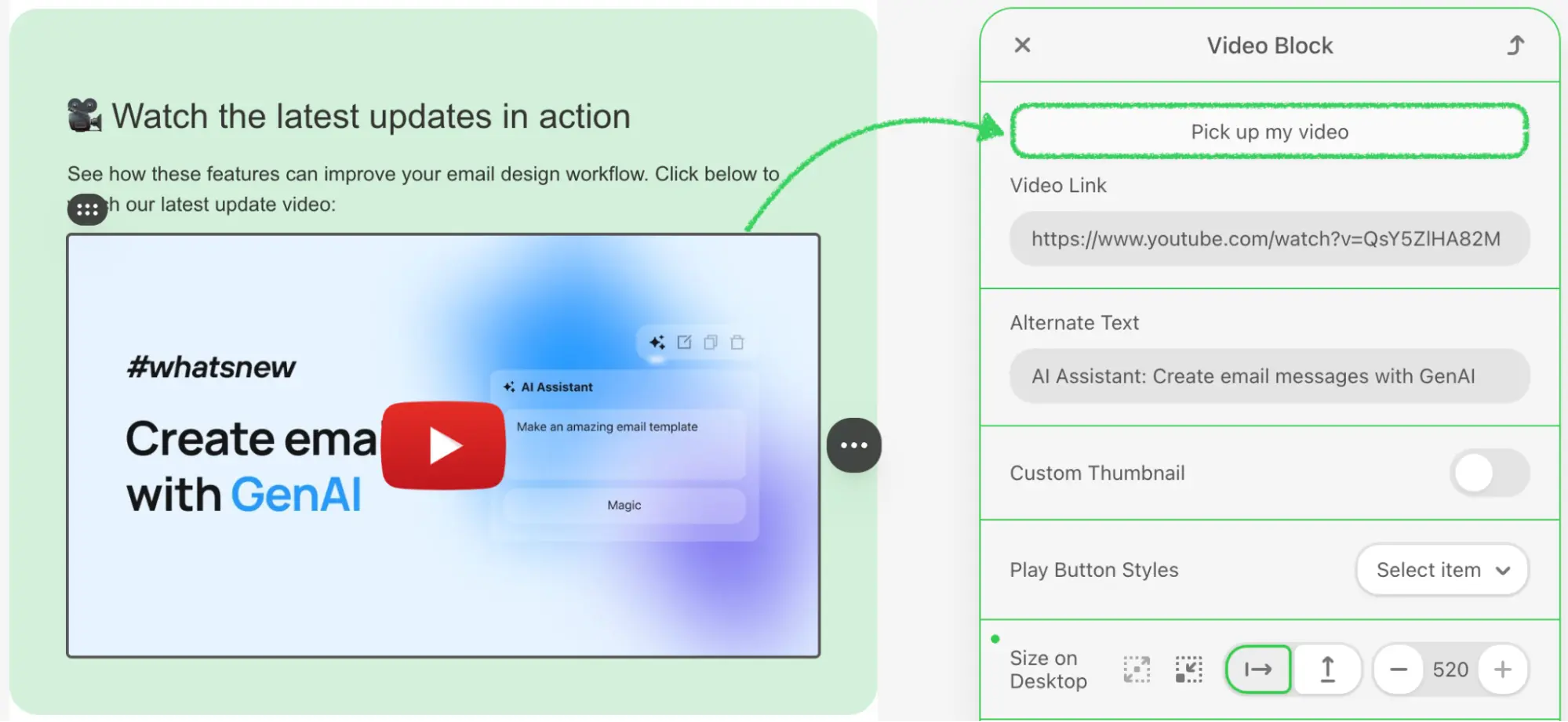
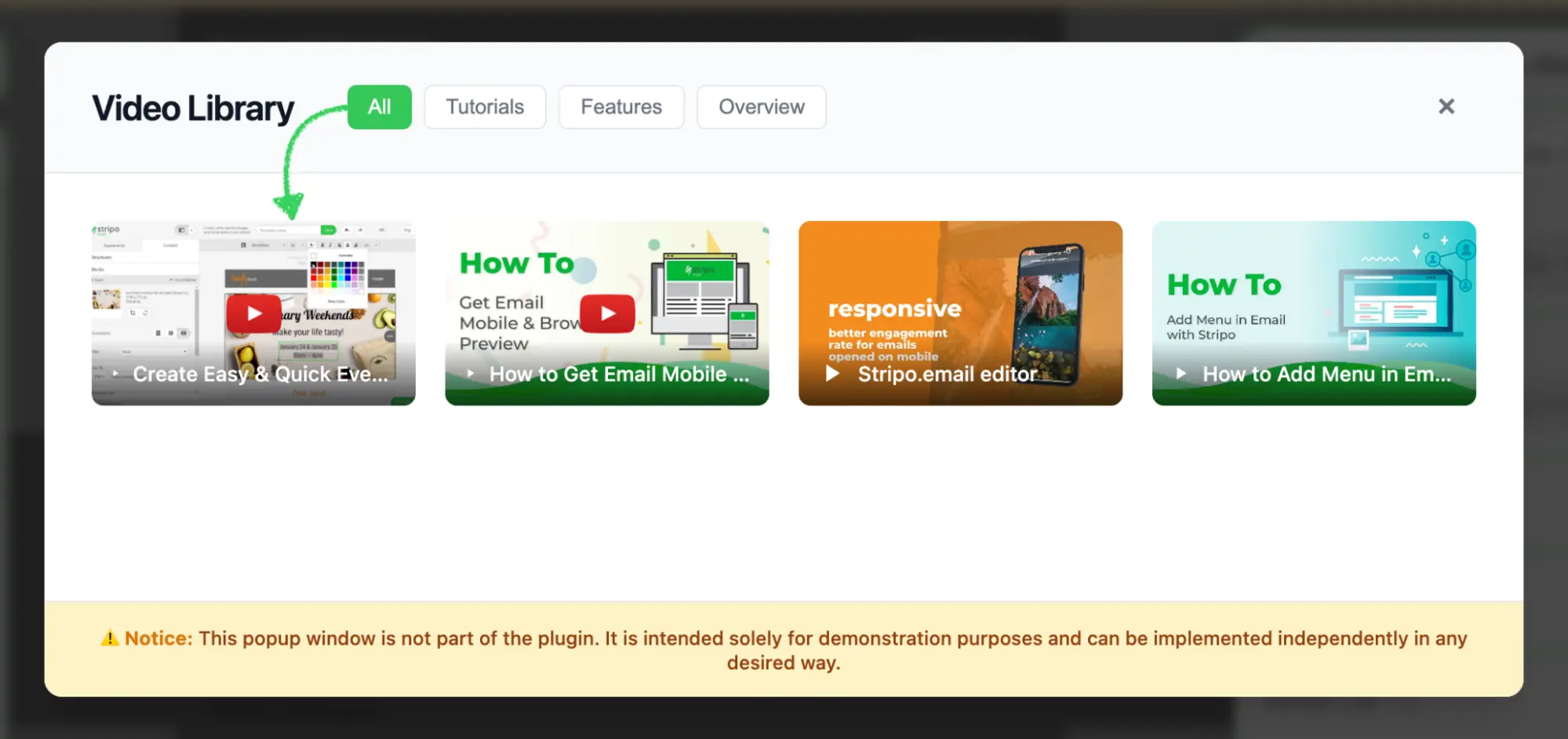
The External Video Library integration enables users to browse and select videos from your video hosting service or third-party platforms such as YouTube, Vimeo, or Wistia directly within the Stripo Email Editor. This integration provides a seamless experience for embedding videos in email templates while automatically generating email-safe video thumbnails with play buttons.
### What You'll Build
In this tutorial, you'll create a fully functional video library modal that:
* Displays a responsive grid of video thumbnails with hover effects
* Supports category-based filtering (All, Tutorials, Features, Overview)
* Handles video selection with proper callback integration
* Returns video data in the format expected by the Stripo editor
::: image-wrap
{width=1999 height=921}
:::
::: image-wrap
{width=1999 height=943}
:::
### Use Cases
* **Custom Video Platform**: Connect your proprietary video hosting service
* **Curated Content**: Provide pre-approved videos for brand consistency
* **Third-Party Integration**: Connect to YouTube, Vimeo, Wistia, or other platforms
* **Dynamic Content**: Fetch videos from your API or CMS in real-time
## Prerequisites
Before starting this tutorial, ensure you have:
* Node.js version 22.x or higher installed
* Basic understanding of JavaScript ES6+ syntax
* Familiarity with the Stripo Extensions SDK
## Understanding the Interface
The [ExternalVideosLibrary](/extensions/reference/integrations/ExternalVideosLibrary) class must implement a single method:
```typescript
openExternalVideosLibraryDialog(
currentVideo: string,
onVideoSelectCallback: (video: ExternalGalleryVideo) => void,
onCancelCallback: () => void
): void
```
### Parameters
| Parameter | Type | Description |
|-------------------------|------------|-------------------------------------------------------------|
| `currentVideo` | `string` | Currently selected video URL |
| `onVideoSelectCallback` | `Function` | Callback function invoked when a user selects a video |
| `onCancelCallback` | `Function` | Callback function invoked when a user cancels the selection |
### ExternalGalleryVideo Object
When a user selects a video, your library implementation must return an object with the following structure:
```typescript
{
originalVideoName: string; // Video title/name
originalImageName: string; // Thumbnail image name
urlImage: string; // Thumbnail image URL
urlVideo: string; // Video URL (YouTube, Vimeo, etc.)
hasCustomButton: boolean; // Use custom play button styling
altText: string; // Alt text for accessibility
}
```
## Step 1: Project Setup
Create your project structure and install dependencies according to the [Getting Started](/extensions/getting-started) guide.
Your project directory structure should look like this:
```bash
external-video-library/
├── index.html
├── src/
│ ├── creds.js
│ ├── index.js
│ └── extension.js
├── package.json
└── vite.config.js
```
## Step 2: Create the Video Library Class
Create a new file `src/MyExternalVideoLibrary.js` with the following basic class structure:
```javascript
import {ExternalVideosLibrary} from '@stripoinc/ui-editor-extensions';
/**
* External Video Library Implementation
* This class implements a modal video gallery with filtering capabilities
* for the Stripo Email Editor extension system.
*/
export class MyExternalVideoLibrary extends ExternalVideosLibrary {
// Instance properties
externalLibrary;
videoSelectCallback = () => {};
cancelCallback = () => {};
activeCategory = 'all';
constructor() {
super();
this.createModal();
this.attachEventListeners();
this.initializeFilters();
}
/**
* Required method called by the Stripo editor
* Opens the video library modal dialog
* @param {ExternalGalleryVideo} currentVideo - Currently selected video (if any)
* @param {Function} onVideoSelectCallback - Callback invoked when a video is selected
* @param {Function} onCancelCallback - Callback invoked when the modal is cancelled
*/
openExternalVideosLibraryDialog(currentVideo, onVideoSelectCallback, onCancelCallback) {
// Store callbacks
this.videoSelectCallback = onVideoSelectCallback;
this.cancelCallback = onCancelCallback;
// Show modal
this.externalLibrary.style.display = 'flex';
// Reset filters to show all videos
this.filterVideos('all');
const allButton = this.externalLibrary.querySelector('[data-category="all"]');
if (allButton) {
this.updateActiveButton(allButton);
}
}
}
```
### Key Components Explained
* **Instance Properties**:
* `externalLibrary`: Reference to the modal DOM element
* `videoSelectCallback`: Stores the success callback from the Stripo editor
* `cancelCallback`: Stores the cancel callback from the Stripo editor
* `activeCategory`: Tracks the currently active filter category
* **Constructor**: Initializes the complete modal UI upon class instantiation
* **openExternalVideosLibraryDialog**: Required method that performs the following:
* Stores the callbacks for later invocation
* Displays the modal dialog
* Resets filters to display all videos
* Updates the active button state
## Step 3: Define Video Data and Styles
Add static properties for video data and UI configuration. Continue editing `src/MyExternalVideoLibrary.js`:
```javascript
export class MyExternalVideoLibrary extends ExternalVideosLibrary {
// ... existing properties ...
// UI Style configurations
static STYLES = {
// Modal overlay styles
overlay: {
backgroundColor: 'rgba(0,0,0,.7)',
position: 'fixed',
top: '0',
right: '0',
bottom: '0',
left: '0',
zIndex: '1050',
display: 'flex',
alignItems: 'center',
justifyContent: 'center',
backdropFilter: 'blur(4px)',
fontFamily: "-apple-system, BlinkMacSystemFont, 'Segoe UI', Roboto, 'Helvetica Neue', Arial, sans-serif"
},
// Modal container styles
modal: {
backgroundColor: '#ffffff',
borderRadius: '12px',
boxShadow: '0 20px 25px -5px rgba(0, 0, 0, 0.1), 0 10px 10px -5px rgba(0, 0, 0, 0.04)',
maxWidth: '1000px',
width: '90%',
display: 'flex',
flexDirection: 'column',
position: 'relative'
},
// Header styles
header: {
padding: '24px 32px',
borderBottom: '1px solid #e5e7eb',
display: 'flex',
alignItems: 'center',
justifyContent: 'space-between',
backgroundColor: '#f9fafb',
borderRadius: '12px 12px 0 0'
},
// Content container styles
content: {
padding: '32px',
height: '289px',
overflowY: 'auto',
overflowX: 'hidden',
boxSizing: 'border-box'
},
// Grid styles
grid: {
display: 'grid',
gridTemplateColumns: 'repeat(auto-fill, minmax(200px, 1fr))',
gap: '20px',
gridAutoRows: '125px'
},
// Button styles
buttonActive: {
padding: '6px 14px',
borderRadius: '6px',
border: 'none',
backgroundColor: '#34c759',
color: 'white',
fontSize: '14px',
fontWeight: '500',
cursor: 'pointer',
transition: 'background-color 0.2s'
},
buttonInactive: {
padding: '6px 14px',
borderRadius: '6px',
border: '1px solid #e5e7eb',
backgroundColor: 'white',
color: '#6b7280',
fontSize: '14px',
fontWeight: '500',
cursor: 'pointer',
transition: 'all 0.2s'
},
// Footer styles
footer: {
padding: '16px 32px',
borderTop: '1px solid #e5e7eb',
backgroundColor: '#fef3c7',
borderRadius: '0 0 12px 12px',
textAlign: 'center'
}
};
// Sample videos data
static VIDEOS = [
{
category: 'tutorial',
src: 'https://psyrh.stripocdn.email/content/guids/videoImgGuid/images/23121555584914821.png',
title: 'Create Easy & Quick Event Reminder Using Template for Food Industry',
altText: 'Create Easy & Quick Event Reminder Using Template for Food Industry',
urlVideo: 'https://www.youtube.com/watch?v=rNmAdmOMp0Y',
hasButton: true
},
{
category: 'features',
src: 'https://psyrh.stripocdn.email/content/guids/videoImgGuid/images/1641555585106902.png',
title: 'How to Get Email Mobile & Browser Preview with Stripo',
altText: 'How to Get Email Mobile & Browser Preview with Stripo',
urlVideo: 'https://www.youtube.com/watch?v=R4NXtC3h598',
hasButton: true
},
{
category: 'overview',
src: 'https://psyrh.stripocdn.email/content/guids/videoImgGuid/images/1881555585513981',
title: 'Stripo.email editor',
altText: 'Stripo.email editor',
urlVideo: 'https://www.youtube.com/watch?v=ryqOEPk51Lg',
hasButton: false
},
{
category: 'tutorial',
src: 'https://psyrh.stripocdn.email/content/guids/videoImgGuid/images/24481555585355917',
title: 'How to Add Menu in Email with Stripo',
altText: 'How to Add Menu in Email with Stripo',
urlVideo: 'https://www.youtube.com/watch?v=XPFWthaa35Q',
hasButton: false
}
];
// ... rest of the class ...
}
```
### Video Object Properties
| Property | Type | Description |
|----------|------|-------------|
| `category` | `string` | Filter category (tutorial, features, overview) |
| `src` | `string` | Thumbnail image URL |
| `title` | `string` | Video display name |
| `altText` | `string` | Alt text for accessibility |
| `urlVideo` | `string` | YouTube, Vimeo, or other video URL |
| `hasButton` | `boolean` | Whether to show custom play button overlay |
::: tip Production Implementation
In production environments, replace the static `VIDEOS` array with API calls to fetch videos dynamically from your backend service.
:::
## Step 4: Build the Modal UI Structure
Implement the core modal creation methods. These methods generate the modal HTML structure and inject it into the page.
### Create Modal Method
```javascript
/**
* Creates the modal HTML structure and appends it to the document body
*/
createModal() {
const modalHtml = this.generateModalHTML();
const container = document.createElement('div');
container.innerHTML = modalHtml;
document.body.appendChild(container);
// Store reference to the modal element
this.externalLibrary = document.getElementById('externalVideoLibrary');
// Initially hide the modal
this.externalLibrary.style.display = 'none';
}
/**
* Generates the complete modal HTML structure
* @returns {string} Complete HTML string for the modal
*/
generateModalHTML() {
return `
${this.generateHeaderHTML()}
${this.generateContentHTML()}
${this.generateFooterHTML()}
`;
}
```
### Style Conversion Helper
Add this utility method that converts JavaScript style objects to inline CSS strings:
```javascript
/**
* Converts a style object to an inline style string
* @param {Object} styleObj - Style object with camelCase properties
* @returns {string} Inline CSS style string with kebab-case properties
*/
styleObjToString(styleObj) {
return Object.entries(styleObj)
.map(([key, value]) => {
// Convert camelCase to kebab-case
const kebabKey = key.replace(/([A-Z])/g, '-$1').toLowerCase();
return `${kebabKey}: ${value}`;
})
.join('; ');
}
```
::: warning Important
The `styleObjToString()` method is essential for converting the `STYLES` object into inline CSS strings. This method is required for proper modal rendering.
:::
### Modal Structure Overview
The modal consists of three main sections:
1. **Header**: Title, category filter buttons, and close button
2. **Content**: Scrollable grid of video thumbnails
3. **Footer**: Informational disclaimer
## Step 5: Generate Header with Filters
Create the header section with title, filter buttons, and close button.
### Header HTML Generator
```javascript
/**
* Generates the modal header section HTML
* @returns {string} HTML string for the header section
*/
generateHeaderHTML() {
return `
Video Library
${this.generateFilterButtons()}
${this.generateCloseButton()}
`;
}
```
### Filter Buttons Generator
```javascript
/**
* Generates category filter buttons HTML
* @returns {string} HTML string for all filter buttons
*/
generateFilterButtons() {
const categories = [
{ id: 'all', label: 'All', active: true },
{ id: 'tutorial', label: 'Tutorials', active: false },
{ id: 'features', label: 'Features', active: false },
{ id: 'overview', label: 'Overview', active: false }
];
return categories.map(cat => `
${cat.label}
`).join('');
}
```
::: tip Category Customization
Categories can be added or modified by updating the `categories` array. Ensure that your video data contains matching `category` values for proper filtering.
:::
### Close Button Generator
```javascript
/**
* Generates close button HTML with hover effects
* @returns {string} HTML string for the close button
*/
generateCloseButton() {
return `
×
`;
}
```
## Step 6: Generate Content with Video Grid
Create the content section that displays the video thumbnails in a responsive grid.
### Content Container Generator
```javascript
/**
* Generates the modal content section HTML with video grid
* @returns {string} HTML string for the content section
*/
generateContentHTML() {
return `
${this.generateVideoThumbnails()}
`;
}
```
### Video Thumbnails Generator
```javascript
/**
* Generates video thumbnail cards HTML
* @returns {string} HTML string for all video thumbnail cards
*/
generateVideoThumbnails() {
return MyExternalVideoLibrary.VIDEOS.map(video => `
`).join('');
}
```
### Key Features
1. **Responsive Grid**: Utilizes CSS Grid with `auto-fill` to create a responsive layout that adapts to different screen sizes
2. **Fixed Row Height**: The `gridAutoRows: '125px'` property ensures consistent thumbnail heights across the grid
3. **Hover Effects**: Inline event handlers provide smooth transition animations on user interaction
4. **Data Attributes**: Video metadata (`data-url-video`, `data-has-button`) is stored in data attributes for efficient retrieval
5. **Play Button Overlay**: SVG play icon with gradient background overlay for enhanced visual presentation
6. **Text Truncation**: Automatic ellipsis handling prevents long video titles from breaking the layout
## Step 7: Generate Footer with Disclaimer
Add a footer section to display important notices or disclaimers.
```javascript
/**
* Generates the modal footer section HTML with disclaimer notice
* @returns {string} HTML string for the footer section
*/
generateFooterHTML() {
return `
⚠️ Notice: This popup window is not part of the plugin. It is intended solely for demonstration purposes and can be implemented independently in any desired way.
`;
}
```
## Step 8: Implement Event Handlers
Add event listeners to handle user interactions with the modal.
### Attach Event Listeners
```javascript
/**
* Attaches event listeners to modal elements after creation
*/
attachEventListeners() {
// Close button click handler
this.externalLibrary.querySelector('.close')
.addEventListener('click', this.cancelAndClose.bind(this));
// Video click handler (using event delegation)
this.externalLibrary.addEventListener('click', this.onVideoClick.bind(this));
}
```
### Handle Video Selection
```javascript
/**
* Handles click events on video thumbnail cards
* @param {Event} e - Click event object
*/
onVideoClick(e) {
// Check if clicked on thumbnail or any of its children
const thumbnail = e.target.closest('.thumbnail');
if (!thumbnail) return;
// Get the image element within the thumbnail
const img = thumbnail.querySelector('img');
if (!img) return;
// Create callback object with video data
const videoData = {
originalVideoName: img.getAttribute('alt'),
originalImageName: img.getAttribute('alt'),
urlImage: img.getAttribute('src'),
urlVideo: img.getAttribute('data-url-video'),
hasCustomButton: img.getAttribute('data-has-button') === 'true',
altText: img.getAttribute('alt')
};
// Close modal and execute callback
this.close();
this.videoSelectCallback(videoData);
}
```
### Handle Modal Closure
```javascript
/**
* Closes the modal and invokes the cancel callback
*/
cancelAndClose() {
this.close();
this.cancelCallback();
}
/**
* Closes the modal dialog by hiding it from view
*/
close() {
this.externalLibrary.style.display = 'none';
}
```
### Event Delegation Benefits
Using event delegation by listening on the parent container provides several advantages:
* **Improved Performance**: A single event listener replaces multiple individual listeners for each thumbnail
* **Simplified Maintenance**: Eliminates the need to attach and detach listeners dynamically
* **Future-Proof Implementation**: Automatically handles dynamically added video elements
* **Memory Efficiency**: Reduces memory footprint when managing numerous elements
## Step 9: Implement Category Filtering
Add filtering functionality to help users find videos by category.
### Initialize Filter Buttons
```javascript
/**
* Initializes category filter button functionality
*/
initializeFilters() {
const filterButtons = this.externalLibrary.querySelectorAll('.filter-buttons button');
filterButtons.forEach(button => {
button.addEventListener('click', (e) => {
const category = e.target.getAttribute('data-category');
this.filterVideos(category);
this.updateActiveButton(e.target);
});
});
}
```
### Filter Videos by Category
```javascript
/**
* Filters displayed videos based on the selected category
* @param {string} category - Category identifier to filter by (or 'all' for all videos)
*/
filterVideos(category) {
this.activeCategory = category;
const thumbnails = this.externalLibrary.querySelectorAll('.thumbnail');
thumbnails.forEach(thumbnail => {
const shouldShow = category === 'all' ||
thumbnail.getAttribute('data-category') === category;
thumbnail.style.display = shouldShow ? 'block' : 'none';
});
}
```
### Update Button Visual States
```javascript
/**
* Updates the visual state of category filter buttons
* @param {HTMLElement} activeButton - The button element that was clicked and should be marked active
*/
updateActiveButton(activeButton) {
const buttons = this.externalLibrary.querySelectorAll('.filter-buttons button');
buttons.forEach(button => {
const isActive = button === activeButton;
const styles = isActive ?
MyExternalVideoLibrary.STYLES.buttonActive :
MyExternalVideoLibrary.STYLES.buttonInactive;
// Apply styles
Object.assign(button.style, styles);
});
}
```
## Step 10: Register the Extension
Create `src/extension.js` to register your video library with the Stripo extension system:
```javascript
import {ExtensionBuilder} from "@stripoinc/ui-editor-extensions";
import {MyExternalVideoLibrary} from "./MyExternalVideoLibrary";
export default new ExtensionBuilder()
.withExternalVideosLibrary(MyExternalVideoLibrary)
.build();
```
### Extension Registration Explained
The `ExtensionBuilder` class provides a fluent API for registering integrations:
* **`withExternalVideosLibrary()`**: Registers your custom video library implementation
* **`build()`**: Constructs the final extension object for the editor
::: tip Multiple Integrations
Multiple `.with*()` methods can be chained to register different integrations within a single extension:
```javascript
new ExtensionBuilder()
.withExternalVideosLibrary(MyExternalVideoLibrary)
.withExternalImageLibrary(MyExternalImageLibrary)
.withExternalMergeTagsSelector(MyMergeTagsSelector)
.build();
```
:::
## Step 11: Run the Development Server
Your implementation is now ready for testing.
### Start the Development Server
```bash
npm run dev
```
This command will:
1. Start the Vite development server on `http://localhost:3000`
2. Automatically open your default browser
3. Load the Stripo editor with your video library extension integrated
## Complete Example
For a full working example, check out the complete implementation in our [GitHub repository](https://github.com/stripoinc/stripo-plugin-samples/tree/main/extensions/javascript/external-video-library).
---
---
url: >-
https://plugin.stripo.email/extensions/tutorials/examples/integrations/external-smart-elements-library.md
---
# Integrate an External Smart Elements Library
## Overview
The External Smart Elements Library integration enables users to browse and select dynamic, data-driven content elements from your product catalog or third-party sources directly within the Stripo Email Editor. Smart elements are pre-configured, reusable components that include dynamic content such as product recommendations, personalized offers, or any complex HTML structures that adapt based on data.
### What You'll Build
In this tutorial, you'll create a fully functional smart elements library modal that:
* Displays a responsive grid of product cards with images, prices, and ratings
* Supports category-based filtering (All, Electronics, Accessories, Fitness, Home)
* Handles element selection with proper callback integration
* Returns smart element data in the format expected by the Stripo editor
::: image-wrap
{width=1999 height=858}
:::
::: image-wrap
{width=1999 height=965}
:::
::: image-wrap
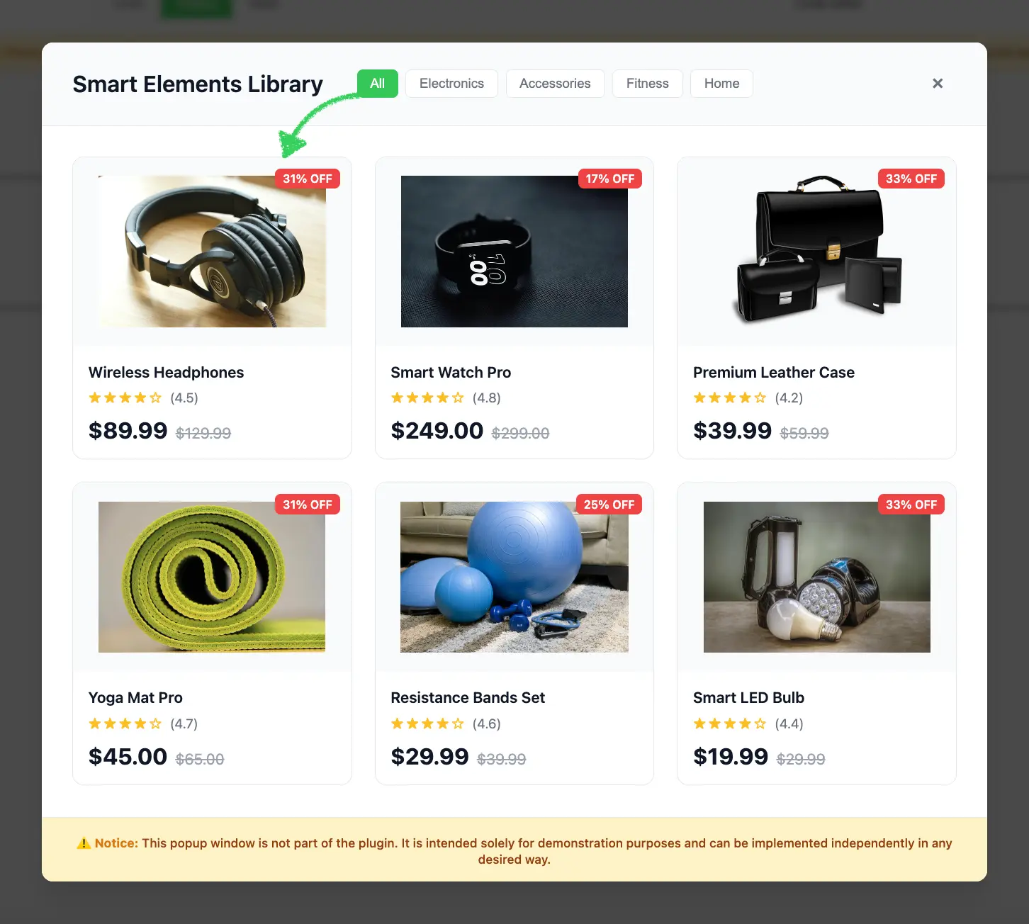{width=1452 height=1304}
:::
::: image-wrap
{width=1999 height=965}
:::
### Use Cases
* **Product Catalogs**: Connect to your e-commerce platform to display products
* **Dynamic Content**: Provide personalized product recommendations
* **Third-Party Integration**: Connect to platforms like Shopify, WooCommerce, or custom APIs
* **Data-Driven Templates**: Create templates that adapt based on user data or behavior3
* **Personalization**: Insert context-aware content blocks with merge tags
## Prerequisites
Before starting this tutorial, ensure you have:
* Node.js version 22.x or higher installed
* Basic understanding of JavaScript ES6+ syntax
* Familiarity with the Stripo Extensions SDK
## Understanding the Interface
The [ExternalSmartElementsLibrary](/extensions/reference/integrations/ExternalSmartElementsLibrary) class must implement a single method:
```typescript
openSmartElementsLibrary(
onDataSelectCallback: (smartElement: ExternalSmartElement) => void,
onCancelCallback: () => void
): void
```
### Parameters
| Parameter | Type | Description |
|-----------|------|-------------|
| `onDataSelectCallback` | `Function` | Callback function invoked when a user selects an element |
| `onCancelCallback` | `Function` | Callback function invoked when a user cancels the selection |
### ExternalSmartElement Object
When a user selects an element, your library implementation must return an object with string key-value pairs:
```typescript
type ExternalSmartElement = Record
```
**Common Properties** (customizable based on your needs):
```typescript
{
p_name: string; // Product name
p_price: string; // Product price (e.g., "$89.99")
p_image: string; // Product image URL
// ... any custom properties
}
```
::: tip Property Names
Property names starting with `p_` are commonly used for product-related smart elements, but you can define any property names that suit your use case. All values must be strings.
:::
## Step 1: Project Setup
Create your project structure and install dependencies according to the [Getting Started](/extensions/getting-started) guide.
Your project directory structure should look like this:
```bash
external-smart-elements/
├── index.html
├── src/
│ ├── creds.js
│ ├── index.js
│ └── extension.js
├── package.json
└── vite.config.js
```
## Step 2: Create the Smart Elements Library Class
Create a new file `src/MyExternalSmartElementsLibrary.js` with the following basic class structure:
```javascript
import {ExternalSmartElementsLibrary} from '@stripoinc/ui-editor-extensions';
/**
* External Smart Elements Library Implementation
* This class implements a modal product gallery with filtering capabilities
* for the Stripo Email Editor extension system.
*/
export class MyExternalSmartElementsLibrary extends ExternalSmartElementsLibrary {
// Instance properties
externalLibrary;
dataSelectCallback = () => {};
cancelCallback = () => {};
activeCategory = 'all';
constructor() {
super();
this.createModal();
this.attachEventListeners();
this.initializeFilters();
}
/**
* Required method called by the Stripo editor
* Opens the smart elements library modal dialog
* @param {Function} onDataSelectCallback - Callback invoked when an element is selected
* @param {Function} onCancelCallback - Callback invoked when the modal is cancelled
*/
openSmartElementsLibrary(onDataSelectCallback, onCancelCallback) {
// Store callbacks
this.dataSelectCallback = onDataSelectCallback;
this.cancelCallback = onCancelCallback;
// Show modal
this.externalLibrary.style.display = 'flex';
// Reset filters to show all products
this.filterProducts('all');
const allButton = this.externalLibrary.querySelector('[data-category="all"]');
if (allButton) {
this.updateActiveButton(allButton);
}
}
}
```
### Key Components Explained
* **Instance Properties**:
* `externalLibrary`: Reference to the modal DOM element
* `dataSelectCallback`: Stores the success callback from the Stripo editor
* `cancelCallback`: Stores the cancel callback from the Stripo editor
* `activeCategory`: Tracks the currently active filter category
* **Constructor**: Initializes the complete modal UI when the class is instantiated
* **openSmartElementsLibrary**: Required method that:
* Stores the callbacks for later invocation
* Displays the modal dialog
* Resets filters to display all products
* Updates the active button state
## Step 3: Define Smart Elements Data and Styles
Add static properties for product data and UI configuration. Continue editing `src/MyExternalSmartElementsLibrary.js`:
```javascript
export class MyExternalSmartElementsLibrary extends ExternalSmartElementsLibrary {
// ... existing properties ...
// UI Style configurations
static STYLES = {
// Modal overlay styles
overlay: {
backgroundColor: 'rgba(0,0,0,.7)',
position: 'fixed',
top: '0',
right: '0',
bottom: '0',
left: '0',
zIndex: '1050',
display: 'flex',
alignItems: 'center',
justifyContent: 'center',
backdropFilter: 'blur(4px)',
fontFamily: "-apple-system, BlinkMacSystemFont, 'Segoe UI', Roboto, 'Helvetica Neue', Arial, sans-serif"
},
// Modal container styles
modal: {
backgroundColor: '#ffffff',
borderRadius: '12px',
boxShadow: '0 20px 25px -5px rgba(0, 0, 0, 0.1), 0 10px 10px -5px rgba(0, 0, 0, 0.04)',
maxWidth: '1000px',
width: '90%',
display: 'flex',
flexDirection: 'column',
position: 'relative'
},
// Header styles
header: {
padding: '24px 32px',
borderBottom: '1px solid #e5e7eb',
display: 'flex',
alignItems: 'center',
justifyContent: 'space-between',
backgroundColor: '#f9fafb',
borderRadius: '12px 12px 0 0'
},
// Content container styles
content: {
padding: '32px',
height: '731px',
overflowY: 'auto',
overflowX: 'hidden',
boxSizing: 'border-box'
},
// Grid styles
grid: {
display: 'grid',
gridTemplateColumns: 'repeat(auto-fill, minmax(240px, 1fr))',
gap: '24px'
},
// Button styles
buttonActive: {
padding: '6px 14px',
borderRadius: '6px',
border: 'none',
backgroundColor: '#34c759',
color: 'white',
fontSize: '14px',
fontWeight: '500',
cursor: 'pointer',
transition: 'background-color 0.2s'
},
buttonInactive: {
padding: '6px 14px',
borderRadius: '6px',
border: '1px solid #e5e7eb',
backgroundColor: 'white',
color: '#6b7280',
fontSize: '14px',
fontWeight: '500',
cursor: 'pointer',
transition: 'all 0.2s'
},
// Footer styles
footer: {
padding: '16px 32px',
borderTop: '1px solid #e5e7eb',
backgroundColor: '#fef3c7',
borderRadius: '0 0 12px 12px',
textAlign: 'center'
}
};
// Sample smart elements data
static SMART_ELEMENTS = [
{
category: 'electronics',
p_name: 'Wireless Headphones',
p_price: '$89.99',
p_original_price: '$129.99',
p_image: 'https://rf.stripocdn.email/content/guids/CABINET_6832604a6dbd8f35c4c45dc999af6fe2144259d656ce5a5ea76e6969ed796bbd/images/gc0859fd762dc386caf67532ca5d9b968b19ba37572e19b72126eb421bee4adfc410dc64eea3dee23cf33c3da5ae06b88_640.jpeg',
p_rating: '4.5',
p_discount: '31% OFF'
},
{
category: 'electronics',
p_name: 'Smart Watch Pro',
p_price: '$249.00',
p_original_price: '$299.00',
p_image: 'https://rf.stripocdn.email/content/guids/CABINET_6832604a6dbd8f35c4c45dc999af6fe2144259d656ce5a5ea76e6969ed796bbd/images/g5b54a78c579f1641216bab7b119c28b0b3dfa50ab44655c45039c8ac164e6d1835ad29ae242af635a8efe74a03f636a0_640.jpeg',
p_rating: '4.8',
p_discount: '17% OFF'
},
{
category: 'accessories',
p_name: 'Premium Leather Case',
p_price: '$39.99',
p_original_price: '$59.99',
p_image: 'https://rf.stripocdn.email/content/guids/CABINET_6832604a6dbd8f35c4c45dc999af6fe2144259d656ce5a5ea76e6969ed796bbd/images/gc7a4da5fc1d4a3c14ca8964200ede6290826a825cea3dc704d47db7c9938b64c099879d2feeebfb24f3ae749d85736f1_640.png',
p_rating: '4.2',
p_discount: '33% OFF'
},
{
category: 'fitness',
p_name: 'Yoga Mat Pro',
p_price: '$45.00',
p_original_price: '$65.00',
p_image: 'https://rf.stripocdn.email/content/guids/CABINET_6832604a6dbd8f35c4c45dc999af6fe2144259d656ce5a5ea76e6969ed796bbd/images/g3d9ab12046aedd0dd772da9bea9768d5fba2840db28046cf73de1f1bded09ad666ef5788d4812a07ad8cfa531487251f_640.jpeg',
p_rating: '4.7',
p_discount: '31% OFF'
},
{
category: 'fitness',
p_name: 'Resistance Bands Set',
p_price: '$29.99',
p_original_price: '$39.99',
p_image: 'https://rf.stripocdn.email/content/guids/CABINET_6832604a6dbd8f35c4c45dc999af6fe2144259d656ce5a5ea76e6969ed796bbd/images/g939d0a14c9627c0476e3b6cdbee39819532d8823d6e23a3c2e6c651e4466402be0ea7a0384f1cd8e15d04fa52b27fa46_640.jpeg',
p_rating: '4.6',
p_discount: '25% OFF'
},
{
category: 'home',
p_name: 'Smart LED Bulb',
p_price: '$19.99',
p_original_price: '$29.99',
p_image: 'https://rf.stripocdn.email/content/guids/CABINET_6832604a6dbd8f35c4c45dc999af6fe2144259d656ce5a5ea76e6969ed796bbd/images/g2b88c1f3019297a862fe221399e7cc8a69a6e0549a7d280cdbbef815ed22d0c5b9beed9e477ca16497218e9670c152e1_640.jpeg',
p_rating: '4.4',
p_discount: '33% OFF'
}
];
// ... rest of the class ...
}
```
### Smart Element Object Properties
| Property | Type | Description |
|----------|------|-------------|
| `category` | `string` | Filter category (electronics, accessories, fitness, home) |
| `p_name` | `string` | Product name |
| `p_price` | `string` | Product price |
| `p_original_price` | `string` | Original price before discount |
| `p_image` | `string` | Product image URL |
| `p_rating` | `string` | Product rating (0-5) |
| `p_discount` | `string` | Discount label (optional) |
::: tip Production Implementation
In production environments, replace the static `SMART_ELEMENTS` array with API calls to dynamically fetch products from your backend service, e-commerce platform, or product recommendation engine.
:::
## Step 4: Build the Modal UI Structure
Implement the core modal creation methods. These methods generate the modal HTML structure and inject it into the page.
### Create Modal Method
```javascript
/**
* Creates the modal HTML structure and appends it to the document body
*/
createModal() {
const modalHtml = this.generateModalHTML();
const container = document.createElement('div');
container.innerHTML = modalHtml;
document.body.appendChild(container);
// Store reference to the modal element
this.externalLibrary = document.getElementById('externalSmartElementsLibrary');
// Initially hide the modal
this.externalLibrary.style.display = 'none';
}
/**
* Generates the complete modal HTML structure
* @returns {string} Complete HTML string for the modal
*/
generateModalHTML() {
return `
${this.generateHeaderHTML()}
${this.generateContentHTML()}
${this.generateFooterHTML()}
`;
}
```
### Style Conversion Helper
Add the following utility method that converts JavaScript style objects to inline CSS strings:
```javascript
/**
* Converts a style object to an inline style string
* @param {Object} styleObj - Style object with camelCase properties
* @returns {string} Inline CSS style string with kebab-case properties
*/
styleObjToString(styleObj) {
return Object.entries(styleObj)
.map(([key, value]) => {
// Convert camelCase to kebab-case
const kebabKey = key.replace(/([A-Z])/g, '-$1').toLowerCase();
return `${kebabKey}: ${value}`;
})
.join('; ');
}
```
::: warning Important
The `styleObjToString()` method is essential for converting the `STYLES` object into inline CSS strings. This method is required for proper modal rendering.
:::
### Modal Structure Overview
The modal consists of three main sections:
1. **Header**: Title, category filter buttons, and close button
2. **Content**: Scrollable grid of product cards
3. **Footer**: Informational disclaimer
## Step 5: Generate Header with Filters
Create the header section with title, filter buttons, and close button.
### Header HTML Generator
```javascript
/**
* Generates the modal header section HTML
* @returns {string} HTML string for the header section
*/
generateHeaderHTML() {
return `
Smart Elements Library
${this.generateFilterButtons()}
${this.generateCloseButton()}
`;
}
```
### Filter Buttons Generator
```javascript
/**
* Generates category filter buttons HTML
* @returns {string} HTML string for all filter buttons
*/
generateFilterButtons() {
const categories = [
{ id: 'all', label: 'All', active: true },
{ id: 'electronics', label: 'Electronics', active: false },
{ id: 'accessories', label: 'Accessories', active: false },
{ id: 'fitness', label: 'Fitness', active: false },
{ id: 'home', label: 'Home', active: false }
];
return categories.map(cat => `
${cat.label}
`).join('');
}
```
::: tip Category Customization
Categories can be added or modified by updating the `categories` array. Ensure your smart elements data contains matching `category` values for proper filtering.
:::
### Close Button Generator
```javascript
/**
* Generates close button HTML with hover effects
* @returns {string} HTML string for the close button
*/
generateCloseButton() {
return `
×
`;
}
```
## Step 6: Generate Content with Product Grid
Create the content section that displays the product cards in a responsive grid.
### Content Container Generator
```javascript
/**
* Generates the modal content section HTML with product grid
* @returns {string} HTML string for the content section
*/
generateContentHTML() {
return `
${this.generateProductCards()}
`;
}
```
### Product Cards Generator
```javascript
/**
* Generates product card HTML
* @returns {string} HTML string for all product cards
*/
generateProductCards() {
return MyExternalSmartElementsLibrary.SMART_ELEMENTS.map(element => `
${element.p_discount ? `
${element.p_discount}
` : ''}
${element.p_name}
${this.generateStarRating(parseFloat(element.p_rating))}
(${element.p_rating})
${element.p_price}
${element.p_original_price}
`).join('');
}
```
### Star Rating Generator
```javascript
/**
* Generates star rating HTML
* @param {number} rating - Rating value (0-5)
* @returns {string} HTML string for star rating
*/
generateStarRating(rating) {
const fullStars = Math.floor(rating);
const hasHalfStar = rating % 1 !== 0;
const emptyStars = 5 - Math.ceil(rating);
let stars = '';
// Full stars
for (let i = 0; i < fullStars; i++) {
stars += '★ ';
}
// Half star
if (hasHalfStar) {
stars += '☆ ';
}
// Empty stars
for (let i = 0; i < emptyStars; i++) {
stars += '★ ';
}
return `${stars}
`;
}
```
### Key Features
1. **Responsive Grid**: Utilizes CSS Grid with `auto-fill` to create a responsive layout that adapts to different screen sizes
2. **Product Cards**: Each card displays product image, name, rating, price, and discount badge
3. **Hover Effects**: Inline event handlers provide smooth transition animations during user interaction
4. **Data Attributes**: Product metadata is stored in data attributes for efficient retrieval
5. **Discount Badges**: Conditionally rendered discount labels positioned absolutely
6. **Star Ratings**: Dynamic star rating visualization based on numeric rating value
## Step 7: Generate Footer with Disclaimer
Add a footer section to display important notices or disclaimers.
```javascript
/**
* Generates the modal footer section HTML with disclaimer notice
* @returns {string} HTML string for the footer section
*/
generateFooterHTML() {
return `
⚠️ Notice: This popup window is not part of the plugin. It is intended solely for demonstration purposes and can be implemented independently in any desired way.
`;
}
```
## Step 8: Implement Event Handlers
Add event listeners to handle user interactions with the modal.
### Attach Event Listeners
```javascript
/**
* Attaches event listeners to modal elements after creation
*/
attachEventListeners() {
// Close button click handler
this.externalLibrary.querySelector('.close')
.addEventListener('click', this.cancelAndClose.bind(this));
// Product card click handler (using event delegation)
this.externalLibrary.addEventListener('click', this.onProductClick.bind(this));
}
```
### Handle Product Selection
```javascript
/**
* Handles click events on product cards
* @param {Event} e - Click event object
*/
onProductClick(e) {
// Check if clicked on product card or any of its children
const productCard = e.target.closest('.product-card');
if (!productCard) return;
// Create callback object with product data
// Note: All values must be strings as per ExternalSmartElement type
const smartElementData = {
category: productCard.getAttribute('data-category'),
p_name: productCard.getAttribute('data-name'),
p_price: productCard.getAttribute('data-price'),
p_image: productCard.getAttribute('data-image'),
p_original_price: productCard.getAttribute('data-original-price'),
p_rating: productCard.getAttribute('data-rating'),
p_discount: productCard.getAttribute('data-discount') || ''
};
// Close modal and execute callback
this.close();
this.dataSelectCallback(smartElementData);
}
```
::: tip Data Format
The `ExternalSmartElement` type requires all values to be strings. When storing numeric data like ratings in data attributes, ensure they remain as strings. The consumer of the data can parse them as needed.
:::
### Handle Modal Closure
```javascript
/**
* Closes the modal and invokes the cancel callback
*/
cancelAndClose() {
this.close();
this.cancelCallback();
}
/**
* Closes the modal dialog by hiding it from view
*/
close() {
this.externalLibrary.style.display = 'none';
}
```
### Event Delegation Benefits
Using event delegation by listening to the parent container provides several advantages:
* **Improved Performance**: A single event listener replaces multiple individual listeners for each card
* **Simplified Maintenance**: Eliminates the need to dynamically attach and detach listeners
* **Future-Proof Implementation**: Automatically handles dynamically added product elements
* **Memory Efficiency**: Reduces the memory footprint when managing numerous elements
## Step 9: Implement Category Filtering
Add filtering functionality to help users find products by category.
### Initialize Filter Buttons
```javascript
/**
* Initializes category filter button functionality
*/
initializeFilters() {
const filterButtons = this.externalLibrary.querySelectorAll('.filter-buttons button');
filterButtons.forEach(button => {
button.addEventListener('click', (e) => {
const category = e.target.getAttribute('data-category');
this.filterProducts(category);
this.updateActiveButton(e.target);
});
});
}
```
### Filter Products by Category
```javascript
/**
* Filters displayed products based on the selected category
* @param {string} category - Category identifier to filter by (or 'all' for all products)
*/
filterProducts(category) {
this.activeCategory = category;
const productCards = this.externalLibrary.querySelectorAll('.product-card');
productCards.forEach(card => {
const shouldShow = category === 'all' ||
card.getAttribute('data-category') === category;
card.style.display = shouldShow ? 'flex' : 'none';
});
}
```
### Update Button Visual States
```javascript
/**
* Updates the visual state of category filter buttons
* @param {HTMLElement} activeButton - The button element that was clicked and should be marked active
*/
updateActiveButton(activeButton) {
const buttons = this.externalLibrary.querySelectorAll('.filter-buttons button');
buttons.forEach(button => {
const isActive = button === activeButton;
const styles = isActive ?
MyExternalSmartElementsLibrary.STYLES.buttonActive :
MyExternalSmartElementsLibrary.STYLES.buttonInactive;
// Apply styles
Object.assign(button.style, styles);
});
}
```
## Step 10: Register the Extension
Create `src/extension.js` to register your smart elements library with the Stripo extension system:
```javascript
import {ExtensionBuilder} from '@stripoinc/ui-editor-extensions';
import {MyExternalSmartElementsLibrary} from './MyExternalSmartElementsLibrary';
export default new ExtensionBuilder()
.withExternalSmartElementsLibrary(MyExternalSmartElementsLibrary)
.build();
```
### Extension Registration Explained
The `ExtensionBuilder` class provides a fluent API for registering integrations:
* **`withExternalSmartElementsLibrary()`**: Registers your custom smart elements library implementation
* **`build()`**: Constructs and returns the final extension object for the editor
::: tip Multiple Integrations
Multiple `.with*()` methods can be chained to register different integrations within a single extension:
```javascript
new ExtensionBuilder()
.withExternalSmartElementsLibrary(MyExternalSmartElementsLibrary)
.withExternalImageLibrary(MyExternalImageLibrary)
.withExternalVideosLibrary(MyExternalVideosLibrary)
.build();
```
:::
## Step 11: Run the Development Server
Your implementation is now ready for testing.
### Start the Development Server
```bash
npm run dev
```
This command will:
1. Start the Vite development server on `http://localhost:3000`
2. Automatically open your default browser
3. Load the Stripo Editor with your smart elements library extension integrated
## Complete Example
For a full working example, check out the complete implementation in our [GitHub repository](https://github.com/stripoinc/stripo-plugin-samples/tree/main/extensions/javascript/external-smart-elements).
---
---
url: >-
https://plugin.stripo.email/extensions/tutorials/examples/integrations/external-merge-tags-selector.md
---
# Integrate an External Merge Tags Selector
## Overview
The External Merge Tags Selector integration enables users to browse and select dynamic merge tags from your customer data platform, CRM, or custom data sources directly within the Stripo Email Editor. Merge tags are placeholders that get replaced with actual customer data when emails are sent, enabling personalized email content at scale.
### What You'll Build
In this tutorial, you'll create a fully functional merge tags selector modal that:
* Displays a responsive grid of merge tag cards with labels, values, descriptions, and previews
* Supports category-based filtering (All, Personal, Contact, Company, Date/Time, Custom)
* Handles merge tag selection with proper callback integration
* Shows real-time preview values for each merge tag
* Detects and displays module context with a visual badge indicator
* Returns merge tag data in the format expected by the Stripo editor
::: image-wrap
{width=1999 height=971}
:::
::: image-wrap
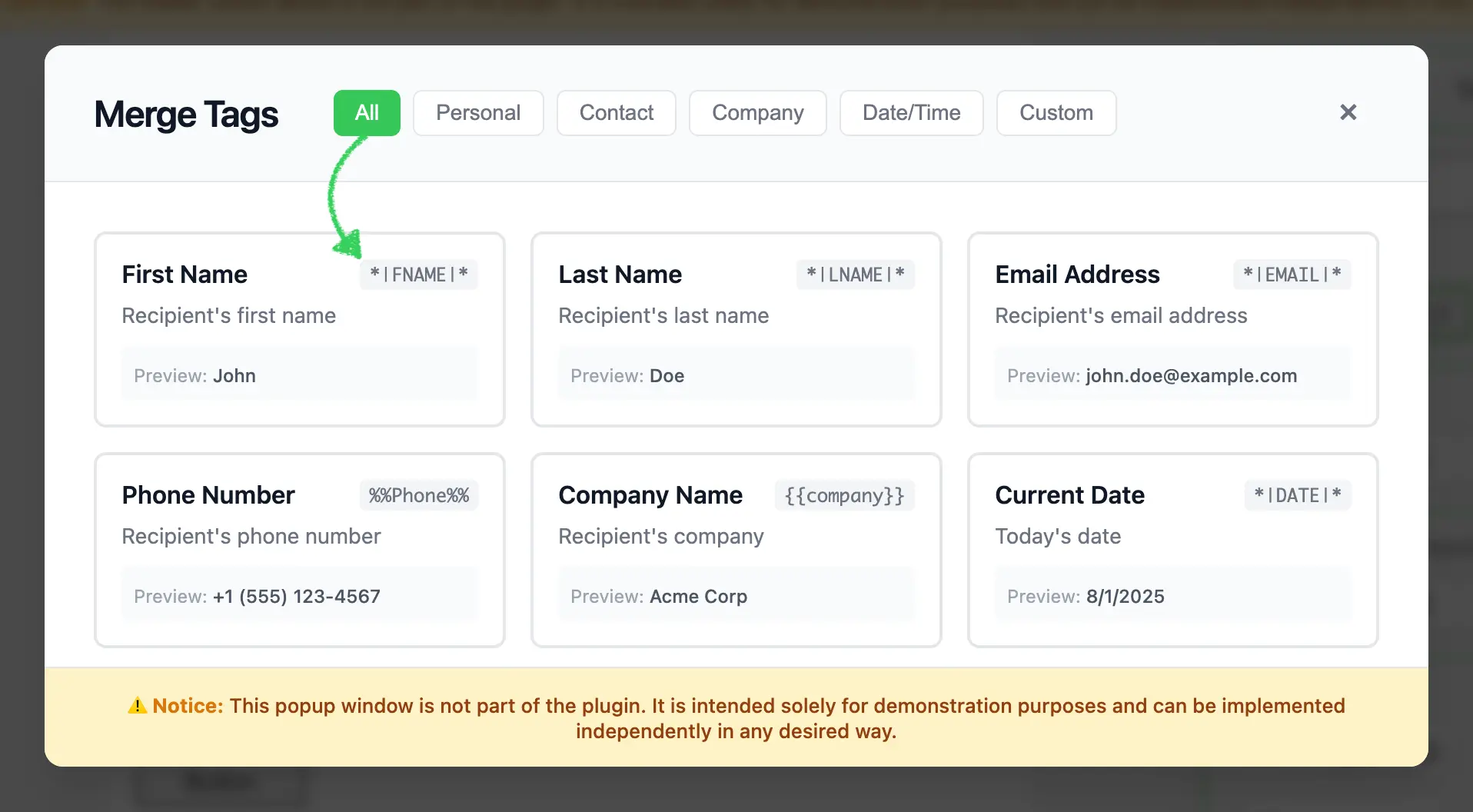{width=1916 height=1056}
:::
::: image-wrap
{width=1070 height=1032}
:::
### Use Cases
* **CRM Integration**: Connect to Salesforce, HubSpot, or other CRM systems to access contact fields
* **Customer Data Platforms**: Integrate with Segment, mParticle, or custom CDP solutions
* **E-commerce Platforms**: Access customer purchase history, cart data, and product recommendations
* **Marketing Automation**: Connect to Mailchimp, SendGrid, or custom email service providers
* **Custom Data Sources**: Fetch merge tags from your API or internal systems
* **Multi-System Integration**: Combine merge tags from multiple data sources in a single interface
## Prerequisites
Before starting this tutorial, ensure you have:
* Node.js version 22.x or higher installed
* Basic understanding of JavaScript ES6+ syntax
* Familiarity with the Stripo Extensions SDK
* Understanding of how merge tags work in email marketing
## Understanding the Interface
The External Merge Tags integration requires two key components:
### 1. Custom UI Element
Create a custom UI element that extends `UIElement` to replace the default merge tags selector:
```typescript
class MergeTagsUiElement extends UIElement {
getId(): string; // Unique element ID
getTemplate(): string; // HTML template for the button
onRender(container: HTMLElement): void; // Setup event listeners
onDestroy(): void; // Cleanup
onAttributeUpdated(name: string, value: any): void; // Handle attribute changes
}
```
### 2. UI Element Tag Registry
Register your custom UI element to replace the default merge tags selector:
```typescript
class ExtensionTagRegistry extends UIElementTagRegistry {
registerUiElements(uiElementsTagsMap: Record): void;
}
```
### Merge Tag Object Structure
When a user selects a merge tag, your implementation must return an object with the following structure:
```typescript
{
value: string; // The merge tag value (e.g., "*|FNAME|*")
label: string; // Human-readable label (e.g., "First Name")
}
```
::: tip Merge Tag Formats
Merge tags can follow different formats depending on your email service provider:
* Mailchimp: `*|FIELD|*`
* Campaign Monitor: `%%field%%`
* Custom: Any format your system supports
:::
## Step 1: Project Setup
Create your project structure and install dependencies according to the [Getting Started](/extensions/getting-started) guide.
Your project directory structure should look like this:
```bash
external-merge-tags/
├── index.html
├── src/
│ ├── creds.js
│ ├── index.js
│ ├── extension.js
├── package.json
└── vite.config.js
```
## Step 2: Create the Merge Tags Library Class
Create a new file `src/MyExternalMergeTagsLibrary.js` with the following basic class structure:
```javascript
/**
* External Merge Tags Library Implementation
* This class implements a modal merge tags selector with filtering capabilities
* for the Stripo Email Editor extension system.
*/
export class MyExternalMergeTagsLibrary {
// Instance properties
externalLibrary;
selectedMergetag = null;
dataSelectCallback = () => {};
activeCategory = 'all';
isModule = false;
constructor() {
this.createModal();
this.attachEventListeners();
this.initializeFilters();
this.addStyles();
}
/**
* Opens the merge tags library modal
* @param {string} mergeTag - Currently selected merge tag value (if any)
* @param {boolean} isModule - Whether the merge tag is being used in a module context
* @param {Function} onDataSelectCallback - Callback invoked when a tag is selected
*/
openMergeTagsLibrary(mergeTag, isModule, onDataSelectCallback) {
// Store callback and selected tag
this.selectedMergetag = mergeTag;
this.isModule = isModule;
this.dataSelectCallback = onDataSelectCallback;
// Update module badge visibility
const moduleBadge = this.externalLibrary.querySelector('.module-badge');
if (moduleBadge) {
moduleBadge.style.display = this.isModule ? 'inline-block' : 'none';
}
// Update selected state
this.updateSelectedTag();
// Show modal
this.externalLibrary.style.display = 'flex';
// Reset filters to show all tags
this.filterTags('all');
const allButton = this.externalLibrary.querySelector('[data-category="all"]');
if (allButton) {
this.updateActiveButton(allButton);
}
}
}
```
### Key Components Explained
* **Instance Properties**:
* `externalLibrary`: Reference to the modal DOM element
* `selectedMergetag`: Currently selected merge tag value
* `dataSelectCallback`: Callback function from the Stripo editor
* `activeCategory`: Currently active filter category
* `isModule`: Boolean flag indicating if the merge tag is used in a module context
* **Constructor**: Initializes the modal UI, event listeners, filters, and custom styles
* **openMergeTagsLibrary**: Required method that:
* Stores the selected merge tag, module context, and callback
* Shows/hides the "Module" badge based on context
* Updates visual selection state
* Displays the modal
* Resets filters to show all tags
## Step 3: Define Merge Tags Data and Styles
Add static properties for merge tags data and UI configuration. Continue editing `src/MyExternalMergeTagsLibrary.js`:
```javascript
export class MyExternalMergeTagsLibrary {
// ... existing properties ...
// UI Style configurations
static STYLES = {
// Modal overlay styles
overlay: {
backgroundColor: 'rgba(0,0,0,.7)',
position: 'fixed',
top: '0',
right: '0',
bottom: '0',
left: '0',
zIndex: '1050',
display: 'flex',
alignItems: 'center',
justifyContent: 'center',
backdropFilter: 'blur(4px)',
fontFamily: "-apple-system, BlinkMacSystemFont, 'Segoe UI', Roboto, 'Helvetica Neue', Arial, sans-serif"
},
// Modal container styles
modal: {
backgroundColor: '#ffffff',
borderRadius: '12px',
boxShadow: '0 20px 25px -5px rgba(0, 0, 0, 0.1), 0 10px 10px -5px rgba(0, 0, 0, 0.04)',
maxWidth: '900px',
width: '90%',
display: 'flex',
flexDirection: 'column',
position: 'relative'
},
// Header styles
header: {
padding: '24px 32px',
borderBottom: '1px solid #e5e7eb',
display: 'flex',
alignItems: 'center',
justifyContent: 'space-between',
backgroundColor: '#f9fafb',
borderRadius: '12px 12px 0 0'
},
// Content container styles
content: {
padding: '32px',
height: '315px',
overflowY: 'auto',
overflowX: 'hidden',
boxSizing: 'border-box'
},
// Grid styles
grid: {
display: 'grid',
gridTemplateColumns: 'repeat(auto-fill, minmax(220px, 1fr))',
gap: '16px'
},
// Button styles
buttonActive: {
padding: '6px 14px',
borderRadius: '6px',
border: 'none',
backgroundColor: '#34c759',
color: 'white',
fontSize: '14px',
fontWeight: '500',
cursor: 'pointer',
transition: 'background-color 0.2s'
},
buttonInactive: {
padding: '6px 14px',
borderRadius: '6px',
border: '1px solid #e5e7eb',
backgroundColor: 'white',
color: '#6b7280',
fontSize: '14px',
fontWeight: '500',
cursor: 'pointer',
transition: 'all 0.2s'
},
// Footer styles
footer: {
padding: '16px 32px',
borderTop: '1px solid #e5e7eb',
backgroundColor: '#fef3c7',
borderRadius: '0 0 12px 12px',
textAlign: 'center'
}
};
// Sample merge tags data
static MERGE_TAGS = [
{
category: 'personal',
value: '*|FNAME|*',
label: 'First Name',
preview: 'John',
description: 'Recipient\'s first name'
},
{
category: 'personal',
value: '*|LNAME|*',
label: 'Last Name',
preview: 'Doe',
description: 'Recipient\'s last name'
},
{
category: 'personal',
value: '*|EMAIL|*',
label: 'Email Address',
preview: 'john.doe@example.com',
description: 'Recipient\'s email address'
},
{
category: 'contact',
value: '%%Phone%%',
label: 'Phone Number',
preview: '+1 (555) 123-4567',
description: 'Recipient\'s phone number'
},
{
category: 'company',
value: '{{company}}',
label: 'Company Name',
preview: 'Acme Corp',
description: 'Recipient\'s company'
},
{
category: 'date',
value: '*|DATE|*',
label: 'Current Date',
preview: new Date().toLocaleDateString(),
description: 'Today\'s date'
},
{
category: 'custom',
value: '*|CUSTOM_FIELD|*',
label: 'Custom Field',
preview: 'Custom Value',
description: 'Custom merge field'
}
];
// ... rest of the class ...
}
```
### Merge Tag Object Properties
| Property | Type | Description |
|----------|------|-------------|
| `category` | `string` | Filter category (personal, contact, company, date, custom) |
| `value` | `string` | The actual merge tag value used in templates |
| `label` | `string` | Human-readable display name |
| `preview` | `string` | Sample value shown to users |
| `description` | `string` | Helpful description of the merge tag's purpose |
::: tip Production Implementation
In production environments, replace the static `MERGE_TAGS` array with API calls to dynamically fetch merge tags from your CRM, CDP, or custom data sources.
:::
## Step 4: Build the Modal UI Structure
Implement the core modal creation methods. These methods generate the modal HTML structure and inject it into the page.
### Create Modal Method
```javascript
/**
* Creates the modal HTML structure and appends it to the document body
*/
createModal() {
const modalHtml = this.generateModalHTML();
const container = document.createElement('div');
container.innerHTML = modalHtml;
document.body.appendChild(container);
// Store reference to the modal element
this.externalLibrary = document.getElementById('externalMergeTags');
// Initially hide the modal
this.externalLibrary.style.display = 'none';
}
/**
* Generates the complete modal HTML structure
* @returns {string} Complete HTML string for the modal
*/
generateModalHTML() {
return `
`;
}
```
### Style Conversion Helper
Add the following utility method that converts JavaScript style objects to inline CSS strings:
```javascript
/**
* Converts a style object to an inline style string
* @param {Object} styleObj - Style object with camelCase properties
* @returns {string} Inline CSS style string with kebab-case properties
*/
styleObjToString(styleObj) {
return Object.entries(styleObj)
.map(([key, value]) => {
// Convert camelCase to kebab-case
const kebabKey = key.replace(/([A-Z])/g, '-$1').toLowerCase();
return `${kebabKey}: ${value}`;
})
.join('; ');
}
```
### Add Custom Styles for Selection State
```javascript
/**
* Adds custom styles for the selected merge tag state
*/
addStyles() {
const style = document.createElement('style');
style.innerHTML = `
#externalMergeTags .tag-card.selected {
border-color: #3b82f6;
box-shadow: 0 0 0 3px rgba(59, 130, 246, 0.1);
}
`;
document.head.appendChild(style);
}
```
::: warning Important
The `styleObjToString()` method is essential for converting the `STYLES` object into inline CSS strings. The `addStyles()` method adds CSS for visual selection feedback.
:::
### Modal Structure Overview
The modal consists of three main sections:
1. **Header**: Title, category filter buttons, and close button
2. **Content**: Scrollable grid of merge tag cards with labels, values, descriptions, and previews
3. **Footer**: Informational disclaimer
## Step 5: Generate Header with Filters
Create the header section with title, filter buttons, and close button.
### Header HTML Generator
```javascript
/**
* Generates the modal header section HTML
* @returns {string} HTML string for the header section
*/
generateHeaderHTML() {
return `
Merge Tags
Module
${this.generateFilterButtons()}
${this.generateCloseButton()}
`;
}
```
::: tip Module Badge Feature
The header includes a "Module" badge that displays when the merge tag selector is opened from within a module context. This badge is hidden by default and only becomes visible when `isModule` is true, helping users understand whether they're working with merge tags in a regular template or within a reusable module component.
:::
### Filter Buttons Generator
```javascript
/**
* Generates category filter buttons HTML
* @returns {string} HTML string for all filter buttons
*/
generateFilterButtons() {
const categories = [
{ id: 'all', label: 'All', active: true },
{ id: 'personal', label: 'Personal', active: false },
{ id: 'contact', label: 'Contact', active: false },
{ id: 'company', label: 'Company', active: false },
{ id: 'date', label: 'Date/Time', active: false },
{ id: 'custom', label: 'Custom', active: false }
];
return categories.map(cat => `
${cat.label}
`).join('');
}
```
::: tip Category Customization
Categories can be added or modified by updating the `categories` array. Ensure your merge tags data contains matching `category` values for proper filtering. Common categories include personal info, contact details, company data, transactional data, and custom fields.
:::
### Close Button Generator
```javascript
/**
* Generates close button HTML with hover effects
* @returns {string} HTML string for the close button
*/
generateCloseButton() {
return `
×
`;
}
```
## Step 6: Generate Content with Merge Tags Grid
Create the content section that displays merge tag cards in a responsive grid.
### Content Container Generator
```javascript
/**
* Generates the modal content section HTML with merge tags grid
* @returns {string} HTML string for the content section
*/
generateContentHTML() {
return `
${this.generateMergeTagCards()}
`;
}
```
### Merge Tag Cards Generator
```javascript
/**
* Generates merge tag card HTML
* @returns {string} HTML string for all merge tag cards
*/
generateMergeTagCards() {
return MyExternalMergeTagsLibrary.MERGE_TAGS.map(tag => `
${tag.label}
${tag.value}
${tag.description}
Preview:
${tag.preview}
`).join('');
}
```
### Key Features
1. **Responsive Grid**: Utilizes CSS Grid with `auto-fill` to create a responsive layout that adapts to different screen sizes
2. **Merge Tag Cards**: Each card displays the merge tag label, value (in monospace), description, and sample preview
3. **Hover Effects**: Inline event handlers provide smooth transition animations with conditional logic to preserve selected state
4. **Data Attributes**: Merge tag metadata is stored in data attributes for efficient retrieval on selection
5. **Visual Feedback**: Selected cards have distinct styling to indicate current selection
6. **Preview Display**: Shows sample data to help users understand what the merge tag will display
::: tip Design Considerations
The monospace font for merge tag values helps users distinguish the actual merge tag syntax from the display labels. The preview section provides crucial context about what data the merge tag represents.
:::
## Step 7: Generate Footer with Disclaimer
Add a footer section to display important notices or disclaimers.
```javascript
/**
* Generates the modal footer section HTML with disclaimer notice
* @returns {string} HTML string for the footer section
*/
generateFooterHTML() {
return `
⚠️ Notice: This popup window is not part of the plugin. It is intended solely for demonstration purposes and can be implemented independently in any desired way.
`;
}
```
## Step 8: Implement Event Handlers
Add event listeners to handle user interactions with the modal.
### Attach Event Listeners
```javascript
/**
* Attaches event listeners to modal elements after creation
*/
attachEventListeners() {
// Close button click handler
this.externalLibrary.querySelector('.close')
.addEventListener('click', this.cancelAndClose.bind(this));
// Tag card click handler (using event delegation)
this.externalLibrary.addEventListener('click', this.onTagClick.bind(this));
}
```
### Handle Merge Tag Selection
```javascript
/**
* Handles click events on merge tag cards
* @param {Event} e - Click event object
*/
onTagClick(e) {
// Check if clicked on tag card or any of its children
const tagCard = e.target.closest('.tag-card');
if (!tagCard) return;
// Create callback object with tag data
const tagData = {
value: tagCard.getAttribute('data-value'),
label: tagCard.getAttribute('data-label')
};
// Close modal and execute callback
this.close();
this.dataSelectCallback(tagData);
}
```
::: tip Data Format
The callback receives an object with `value` and `label` properties. The `value` is the actual merge tag syntax that will be inserted into the template, while the `label` provides the human-readable name for display purposes.
:::
### Handle Selected State Updates
```javascript
/**
* Updates the selected state of merge tag cards
*/
updateSelectedTag() {
// Remove selected class from all cards
const selectedElement = this.externalLibrary.querySelector('.tag-card.selected');
if (selectedElement) {
selectedElement.classList.remove('selected');
// Reset styles
selectedElement.style.borderColor = '#e5e7eb';
selectedElement.style.transform = 'translateY(0)';
selectedElement.style.boxShadow = 'none';
}
// Add selected class to current tag
if (this.selectedMergetag) {
const currentTag = this.externalLibrary.querySelector(`[data-value="${this.selectedMergetag}"]`);
if (currentTag) {
currentTag.classList.add('selected');
}
}
}
```
### Handle Modal Closure
```javascript
/**
* Closes the modal and executes cancel callback
*/
cancelAndClose() {
this.close();
}
/**
* Closes the modal by hiding it from view
*/
close() {
this.externalLibrary.style.display = 'none';
}
```
### Event Delegation Benefits
Using event delegation by listening to the parent container provides several advantages:
* **Improved Performance**: A single event listener replaces multiple individual listeners for each card
* **Simplified Maintenance**: Eliminates the need to dynamically attach and detach listeners
* **Future-Proof Implementation**: Automatically handles dynamically added merge tag elements
* **Memory Efficiency**: Reduces the memory footprint when managing numerous elements
## Step 9: Implement Category Filtering
Add filtering functionality to help users find merge tags by category.
### Initialize Filter Buttons
```javascript
/**
* Initializes category filter button functionality
*/
initializeFilters() {
const filterButtons = this.externalLibrary.querySelectorAll('.filter-buttons button');
filterButtons.forEach(button => {
button.addEventListener('click', (e) => {
const category = e.target.getAttribute('data-category');
this.filterTags(category);
this.updateActiveButton(e.target);
});
});
}
```
### Filter Merge Tags by Category
```javascript
/**
* Filters displayed merge tags based on the selected category
* @param {string} category - Category identifier to filter by (or 'all' for all tags)
*/
filterTags(category) {
this.activeCategory = category;
const tagCards = this.externalLibrary.querySelectorAll('.tag-card');
tagCards.forEach(card => {
const shouldShow = category === 'all' ||
card.getAttribute('data-category') === category;
card.style.display = shouldShow ? 'flex' : 'none';
});
}
```
### Update Button Visual States
```javascript
/**
* Updates the visual state of category filter buttons
* @param {HTMLElement} activeButton - The button element that was clicked and should be marked active
*/
updateActiveButton(activeButton) {
const buttons = this.externalLibrary.querySelectorAll('.filter-buttons button');
buttons.forEach(button => {
const isActive = button === activeButton;
const styles = isActive ?
MyExternalMergeTagsLibrary.STYLES.buttonActive :
MyExternalMergeTagsLibrary.STYLES.buttonInactive;
// Apply styles
Object.assign(button.style, styles);
});
}
```
## Step 10: Create the Merge Tags UI Element
Create `src/MergeTagsUiElement.js` to define the custom UI element that will replace the default merge tags selector:
```javascript
import {UIElement, UIElementType} from '@stripoinc/ui-editor-extensions';
import {MyExternalMergeTagsLibrary} from './MyExternalMergeTagsLibrary';
export const EXTERNAL_MERGE_TAGS_UI_ELEMENT_ID = 'external-merge-tags-ui-element';
export class MergeTagsUiElement extends UIElement {
isModuleNode = false;
/**
* Returns the unique identifier for this UI element
*/
getId() {
return EXTERNAL_MERGE_TAGS_UI_ELEMENT_ID;
}
/**
* Returns the HTML template for the merge tags button
*/
getTemplate() {
return `
<${UIElementType.BUTTON} id="mergeTagsButton" class="btn btn-primary">Open merge tags
`;
}
/**
* Called when the element is rendered in the editor
* @param {HTMLElement} container - The container element
*/
onRender(container) {
this.listener = this._onClick.bind(this);
this.mergeTagsButton = container.querySelector('#mergeTagsButton');
this.mergeTagsButton.addEventListener('click', this.listener);
}
/**
* Called when the element is destroyed
*/
onDestroy() {
this.mergeTagsButton.removeEventListener('click', this.listener);
}
/**
* Handles button click events
*/
_onClick(event) {
this.openMergeTagLibrary();
}
/**
* Opens the external merge tags library modal
*/
openMergeTagLibrary() {
if (!this.mergeTagsLibrary) {
this.mergeTagsLibrary = new MyExternalMergeTagsLibrary();
}
this.mergeTagsLibrary.openMergeTagsLibrary(this.selectedMergeTag?.value, this.isModuleNode, (data) => {
this.api.triggerValueChange(data);
});
}
/**
* Called when an attribute is updated
* @param {string} name - Attribute name
* @param {any} value - New attribute value
*/
onAttributeUpdated(name, value) {
if (name === 'blockNode') {
this.isModuleNode = !!value.getClosestModuleId();
}
if (name === 'mergeTag') {
this.selectedMergeTag = value;
// If a merge tag is selected, open the library immediately
this.selectedMergeTag && this.openMergeTagLibrary();
}
}
}
```
### UI Element Lifecycle Methods
| Method | Purpose |
|--------|---------|
| `getId()` | Returns unique identifier for the UI element |
| `getTemplate()` | Returns HTML template for the button |
| `onRender(container)` | Sets up event listeners when rendered |
| `onDestroy()` | Cleans up event listeners when destroyed |
| `onAttributeUpdated(name, value)` | Handles attribute changes from the editor |
### Module Context Detection
The UI element tracks whether the merge tag is being used within a module context through the `blockNode` attribute:
* **`isModuleNode` property**: Boolean flag that indicates if the current node is within a module
* **`blockNode` attribute**: When updated, the code checks if the node has a closest module ID using `value.getClosestModuleId()`
* **Module Badge**: The modal displays a "Module" badge when `isModuleNode` is true, helping users understand the context
::: tip API Integration
The `this.api.triggerValueChange(data)` method notifies the Stripo editor of the selected merge tag. The editor will then insert or update the merge tag in the template based on the current context. The `isModuleNode` flag is passed to the library to enable context-aware UI features like the module badge.
:::
## Step 11: Create the UI Element Tag Registry
Create `src/ExtensionTagRegistry.js` to register your custom UI element to replace the default merge tags selector:
```javascript
import {UIElementTagRegistry, UIElementType} from '@stripoinc/ui-editor-extensions';
import {EXTERNAL_MERGE_TAGS_UI_ELEMENT_ID} from './MergeTagsUiElement';
export class ExtensionTagRegistry extends UIElementTagRegistry {
/**
* Registers custom UI elements to replace default editor elements
* @param {Object} uiElementsTagsMap - Map of UI element types to custom element IDs
*/
registerUiElements(uiElementsTagsMap) {
uiElementsTagsMap[UIElementType.MERGETAGS] = EXTERNAL_MERGE_TAGS_UI_ELEMENT_ID;
}
}
```
### How Tag Registry Works
The `UIElementTagRegistry` allows you to map standard Stripo UI element types to your custom implementations:
1. **UIElementType.MERGETAGS**: The standard merge tags selector type
2. **EXTERNAL\_MERGE\_TAGS\_UI\_ELEMENT\_ID**: Your custom element's unique ID
3. When the editor needs a merge tags selector, it will use your custom implementation instead
::: warning Important
The tag registry is what enables your custom UI element to replace the default merge tags selector throughout the editor. Without this registration, your custom element would exist but not be automatically used by the editor.
:::
## Step 12: Register the Extension
Create `src/extension.js` to register your merge tags integration with the Stripo extension system:
```javascript
import { ExtensionBuilder } from '@stripoinc/ui-editor-extensions';
import {MergeTagsUiElement} from './MergeTagsUiElement';
import {ExtensionTagRegistry} from './ExtensionTagRegistry';
const extension = new ExtensionBuilder()
.addUiElement(MergeTagsUiElement)
.withUiElementTagRegistry(ExtensionTagRegistry)
.build();
export default extension;
```
### Extension Registration Explained
The `ExtensionBuilder` class provides a fluent API for registering integrations:
1. **`.addUiElement(MergeTagsUiElement)`**: Registers your custom UI element with the extension system
2. **`.withUiElementTagRegistry(ExtensionTagRegistry)`**: Registers your tag registry to replace default UI elements
3. **`.build()`**: Constructs and returns the final extension object for the editor
### Registration Order
The order of operations is important:
1. First, register the UI element using `addUiElement()`
2. Then, register the tag registry using `withUiElementTagRegistry()`
3. The tag registry maps the `UIElementType.MERGETAGS` to your custom element's ID
4. When the editor needs a merge tags selector, it will use your custom element
::: tip Multiple Integrations
Multiple integration methods can be chained to register different types of extensions within a single extension object:
```javascript
new ExtensionBuilder()
.addUiElement(MergeTagsUiElement)
.withUiElementTagRegistry(ExtensionTagRegistry)
.withExternalImageLibrary(MyExternalImageLibrary)
.withExternalVideosLibrary(MyExternalVideosLibrary)
.build();
```
:::
## Step 13: Configure the Editor Integration
Update your `src/index.js` to properly integrate the extension with the Stripo editor:
```javascript
import extension from './extension.js';
import {PLUGIN_ID, SECRET_KEY, EDITOR_URL, EMAIL_ID, USER_ID} from './creds';
// Initialize the editor with your extension
function _runEditor(template, extension) {
window.UIEditor.initEditor(
document.querySelector('#stripoEditorContainer'),
{
html: template.html,
css: template.css,
metadata: {
emailId: EMAIL_ID
},
locale: 'en',
onTokenRefreshRequest: function (callback) {
_request('POST', 'https://plugins.stripo.email/api/v1/auth',
JSON.stringify({
pluginId: PLUGIN_ID,
secretKey: SECRET_KEY,
userId: USER_ID,
role: 'user'
}),
function(data) {
callback(JSON.parse(data).token);
}
);
},
// ... other configuration ...
ignoreClickOutsideSelectors: ['#externalMergeTags'],
extensions: [
extension
]
}
);
}
```
### Critical Configuration Options
| Option | Purpose |
|--------|---------|
| `ignoreClickOutsideSelectors` | Prevents editor from closing your modal when clicking inside it |
| `extensions` | Array of extension objects to register with the editor |
::: warning Important
The `ignoreClickOutsideSelectors: ['#externalMergeTags']` configuration is critical. Without it, clicking inside your modal may trigger the editor's click-outside handlers and cause unexpected behavior. Make sure the selector matches your modal's ID.
:::
## Step 14: Run the Development Server
Your implementation is now ready for testing.
### Start the Development Server
```bash
npm run dev
```
This command will:
1. Start the Vite development server on `http://localhost:3000`
2. Automatically open your default browser
3. Load the Stripo Editor with your merge tags extension integrated
## Complete Example
For a full working example, check out the complete implementation in our [GitHub repository](https://github.com/stripoinc/stripo-plugin-samples/tree/main/extensions/javascript/external-merge-tags).
---
---
url: >-
https://plugin.stripo.email/extensions/tutorials/examples/integrations/external-ai-assistant.md
---
# Integrate an External AI Assistant
## Overview
The External AI Assistant integration enables users to enhance and transform text content using AI-powered suggestions directly within the Stripo Email Editor. This integration provides a seamless experience for improving email copy with various text transformations including tone adjustment, length modification, and professional formatting.
### What You'll Build
In this tutorial, you'll create a fully functional AI assistant modal that:
* Displays the original text content for reference
* Provides quick action buttons for common text transformations
* Includes an editable text area for manual adjustments
* Supports multiple transformation types (professional, casual, expand, shorten, generate)
* Handles text selection with proper callback integration
* Returns transformed text in the format expected by the Stripo editor
::: image-wrap
{width=1626 height=756}
:::
::: image-wrap
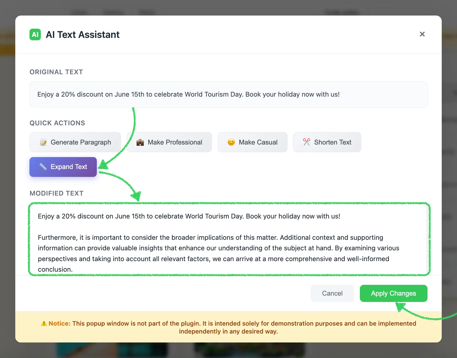{width=1736 height=1360}
:::
::: image-wrap
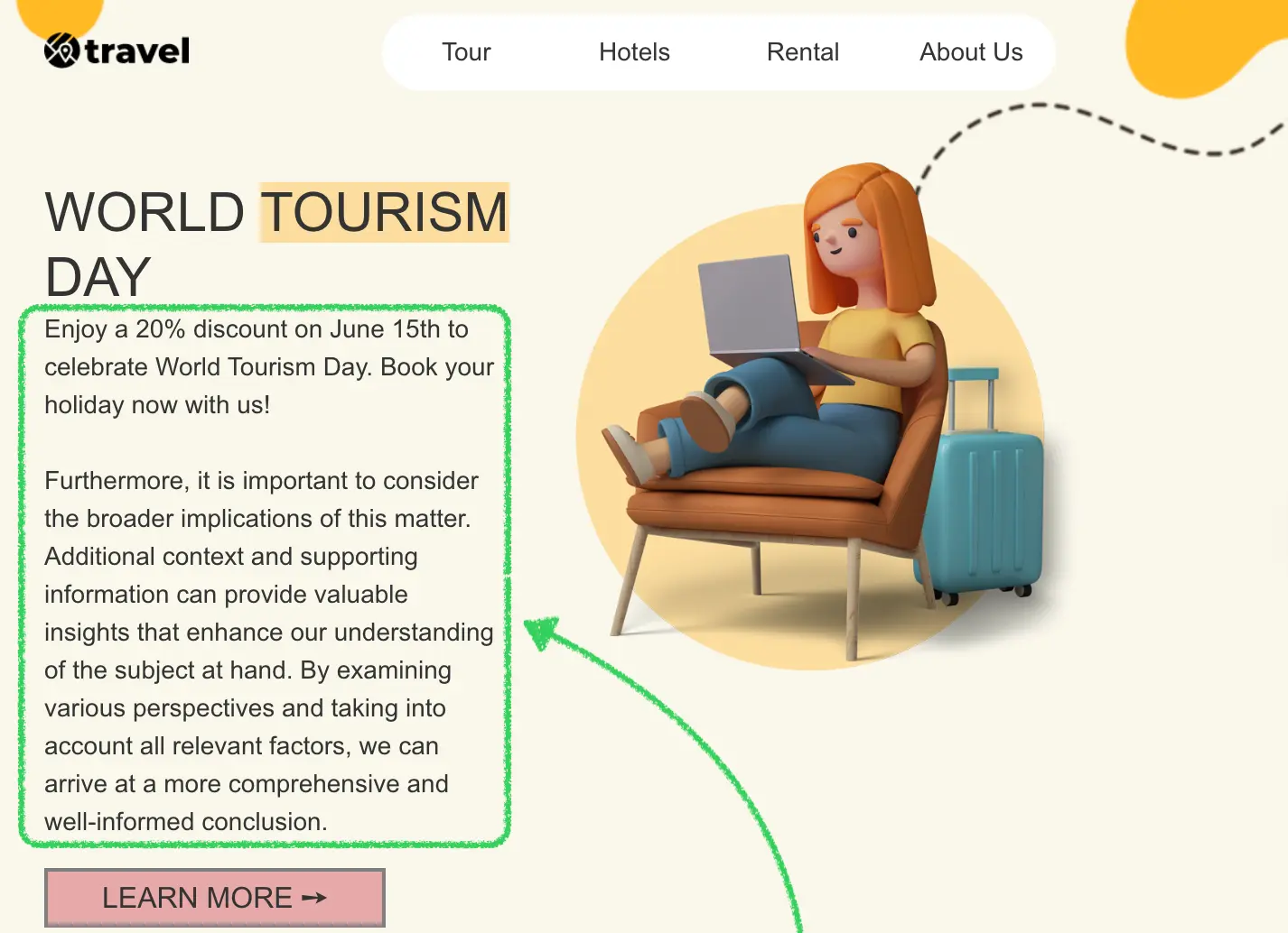{width=1426 height=1034}
:::
### Use Cases
* **Content Enhancement**: Improve email copy with AI-powered suggestions
* **Tone Adjustment**: Transform text between professional and casual tones
* **Length Optimization**: Expand or shorten content to fit design requirements
* **Content Generation**: Generate new paragraphs when starting from scratch
* **Multi-language Support**: Connect to translation APIs for internationalization
* **Brand Voice**: Ensure consistent brand voice across email campaigns
* **A/B Testing**: Generate variations of content for testing
## Prerequisites
Before starting this tutorial, ensure you have:
* Node.js version 22.x or higher installed
* Basic understanding of JavaScript ES6+ syntax
* Familiarity with the Stripo Extensions SDK
## Understanding the Interface
The [ExternalAiAssistant](/extensions/reference/integrations/ExternalAiAssistant) class must implement a single method:
```typescript
openAiAssistant({
value: string,
onDataSelectCallback: (transformedText: string) => void,
onCancelCallback: () => void
}): void
```
### Parameters
| Parameter | Type | Description |
|-----------|------|-------------|
| `value` | `string` | The original text content to enhance or transform |
| `onDataSelectCallback` | `Function` | Callback function invoked when user applies transformed text |
| `onCancelCallback` | `Function` | Callback function invoked when user cancels the operation |
### Return Value
When a user applies transformed text, your assistant implementation must invoke the callback with a string containing the enhanced text:
```javascript
onDataSelectCallback(textarea.value);
```
## Step 1: Project Setup
Create your project structure and install dependencies according to the [Getting Started](/extensions/getting-started) guide.
Your project directory structure should look like this:
```bash
external-ai-assistant/
├── index.html
├── src/
│ ├── creds.js
│ ├── index.js
│ ├── extension.js
├── package.json
└── vite.config.js
```
## Step 2: Create the AI Assistant Class
Create a new file `src/MyExternalAiAssistant.js` with the following basic class structure:
```javascript
import {ExternalAiAssistant} from '@stripoinc/ui-editor-extensions';
/**
* External AI Assistant Implementation
* This class implements a modal AI text assistant with various text transformation capabilities
* for the Stripo Email Editor extension system.
*/
export class MyExternalAiAssistant extends ExternalAiAssistant {
// Instance properties
externalAiAssistant;
dataSelectCallback = () => {};
cancelCallback = () => {};
originalText = '';
constructor() {
super();
this.createModal();
this.attachEventListeners();
}
/**
* Required method called by the Stripo editor
* Opens the AI assistant modal dialog
* @param {Object} params - Parameters object
* @param {string} params.value - The text to work with
* @param {Function} params.onDataSelectCallback - Callback when text is selected
* @param {Function} params.onCancelCallback - Callback when modal is cancelled
*/
openAiAssistant({value, onDataSelectCallback, onCancelCallback}) {
// Store callbacks
this.dataSelectCallback = onDataSelectCallback;
this.cancelCallback = onCancelCallback;
this.originalText = value || '';
// Display original text
const originalTextDiv = this.externalAiAssistant.querySelector('#originalText');
originalTextDiv.textContent = this.originalText || 'No text provided';
// Set the textarea value
this.externalAiAssistant.querySelector('#text').value = this.originalText;
// Show modal
this.externalAiAssistant.style.display = 'flex';
}
}
```
### Key Components Explained
* **Instance Properties**:
* `externalAiAssistant`: Reference to the modal DOM element
* `dataSelectCallback`: Stores the success callback from the Stripo editor
* `cancelCallback`: Stores the cancel callback from the Stripo editor
* `originalText`: Stores the original text for reference and transformations
* **Constructor**: Initializes the complete modal UI when the class is instantiated
* **openAiAssistant**: Required method that:
* Stores the callbacks for later invocation
* Displays the original text in a read-only section
* Pre-fills the editable textarea with the original text
* Shows the modal dialog
## Step 3: Define Text Transformations and Styles
Add static properties for transformation logic and UI configuration. Continue editing `src/MyExternalAiAssistant.js`:
```javascript
export class MyExternalAiAssistant extends ExternalAiAssistant {
// ... existing properties ...
// UI Style configurations
static STYLES = {
// Modal overlay styles
overlay: {
backgroundColor: 'rgba(0, 0, 0, 0.6)',
backdropFilter: 'blur(4px)',
position: 'fixed',
top: '0',
right: '0',
bottom: '0',
left: '0',
zIndex: '1050',
fontFamily: "-apple-system, BlinkMacSystemFont, 'Segoe UI', Roboto, 'Helvetica Neue', Arial, sans-serif",
display: 'flex',
alignItems: 'center',
justifyContent: 'center',
padding: '20px'
},
// Modal container styles
modal: {
background: '#ffffff',
borderRadius: '12px',
boxShadow: '0 20px 60px rgba(0, 0, 0, 0.15)',
maxWidth: '900px',
width: '100%',
maxHeight: '90vh',
display: 'flex',
flexDirection: 'column'
},
// Header styles
header: {
padding: '24px 30px',
borderBottom: '1px solid #e5e7eb',
display: 'flex',
alignItems: 'center',
justifyContent: 'space-between'
},
// Body styles
body: {
padding: '30px',
overflowY: 'auto',
flex: '1'
},
// Footer styles
footer: {
padding: '20px 30px',
borderTop: '1px solid #e5e7eb',
display: 'flex',
justifyContent: 'flex-end',
gap: '12px'
},
// Button styles
suggestionButton: {
background: 'linear-gradient(135deg, #f5f7fa 0%, #e9ecef 100%)',
border: '1px solid #dee2e6',
borderRadius: '8px',
padding: '10px 20px',
fontSize: '14px',
fontWeight: '500',
color: '#495057',
cursor: 'pointer',
transition: 'all 0.3s ease',
display: 'flex',
alignItems: 'center',
gap: '8px'
},
primaryButton: {
backgroundColor: '#34c759',
color: 'white',
padding: '10px 24px',
borderRadius: '8px',
fontSize: '14px',
fontWeight: '500',
border: 'none',
cursor: 'pointer',
transition: 'all 0.3s ease'
},
cancelButton: {
backgroundColor: '#f3f4f6',
color: '#6b7280',
padding: '10px 24px',
borderRadius: '8px',
fontSize: '14px',
fontWeight: '500',
border: 'none',
cursor: 'pointer',
transition: 'all 0.3s ease'
},
// Disclaimer footer styles
disclaimerFooter: {
padding: '16px 30px',
borderTop: '1px solid #e5e7eb',
backgroundColor: '#fef3c7',
borderRadius: '0 0 12px 12px',
textAlign: 'center'
}
};
// Text transformation templates
static TEXT_TRANSFORMATIONS = {
paragraph: {
icon: '📝',
label: 'Generate Paragraph',
transform: () => "Lorem ipsum dolor sit amet, consectetur adipiscing elit. Sed do eiusmod tempor incididunt ut labore et dolore magna aliqua. Ut enim ad minim veniam, quis nostrud exercitation ullamco laboris nisi ut aliquip ex ea commodo consequat. Duis aute irure dolor in reprehenderit in voluptate velit esse cillum dolore eu fugiat nulla pariatur. Excepteur sint occaecat cupidatat non proident, sunt in culpa qui officia deserunt mollit anim id est laborum."
},
professional: {
icon: '💼',
label: 'Make Professional',
transform: (text) => text ?
`Dear valued recipient,\n\nI hope this message finds you well. ${text}\n\nPlease do not hesitate to contact me if you require any further information or clarification.\n\nBest regards` :
"Dear valued recipient,\n\nI hope this message finds you well. I am writing to bring to your attention a matter of significant importance that requires your immediate consideration.\n\nPlease do not hesitate to contact me if you require any further information or clarification.\n\nBest regards"
},
casual: {
icon: '😊',
label: 'Make Casual',
transform: (text) => text ?
`Hey there! 👋\n\n${text}\n\nLet me know if you need anything else!\n\nCheers!` :
"Hey there! 👋\n\nJust wanted to drop you a quick message. Hope everything's going great on your end!\n\nLet me know if you need anything else!\n\nCheers!"
},
shorten: {
icon: '✂️',
label: 'Shorten Text',
transform: (text) => text && text.length > 50 ?
text.substring(0, Math.min(text.length / 2, 100)) + "..." :
"Brief and concise message."
},
expand: {
icon: '📏',
label: 'Expand Text',
transform: (text) => text ?
`${text}\n\nFurthermore, it is important to consider the broader implications of this matter. Additional context and supporting information can provide valuable insights that enhance our understanding of the subject at hand. By examining various perspectives and taking into account all relevant factors, we can arrive at a more comprehensive and well-informed conclusion.` :
"This is an expanded version of the text with additional details, context, and supporting information. It provides a more comprehensive view of the subject matter, exploring various aspects and implications that might not have been immediately apparent in the original version."
}
};
// ... rest of the class ...
}
```
### Transformation Object Properties
Each transformation in `TEXT_TRANSFORMATIONS` contains:
| Property | Type | Description |
|----------|------|-------------|
| `icon` | `string` | Emoji icon displayed on the button |
| `label` | `string` | Button label text |
| `transform` | `Function` | Transformation function that takes original text and returns transformed text |
::: tip Production Implementation
In production environments, replace the static transformation functions with actual API calls to AI services like OpenAI, Anthropic Claude, or your custom AI backend.
:::
## Step 4: Build the Modal UI Structure
Implement the core modal creation methods. These methods generate the modal HTML structure and inject it into the page.
### Create Modal Method
```javascript
/**
* Creates the modal HTML structure and appends it to the document body
*/
createModal() {
const modalHtml = this.generateModalHTML();
const container = document.createElement('div');
container.innerHTML = modalHtml;
document.body.appendChild(container);
// Store reference to the modal element
this.externalAiAssistant = document.getElementById('externalAiAssistant');
// Initially hide the modal
this.externalAiAssistant.style.display = 'none';
}
/**
* Generates the complete modal HTML structure
* @returns {string} Complete HTML string for the modal
*/
generateModalHTML() {
return `
${this.generateHeaderHTML()}
${this.generateBodyHTML()}
${this.generateFooterHTML()}
${this.generateDisclaimerFooterHTML()}
`;
}
```
### Style Conversion Helper
Add the following utility method that converts JavaScript style objects to inline CSS strings:
```javascript
/**
* Converts a style object to an inline style string
* @param {Object} styleObj - Style object with camelCase properties
* @returns {string} Inline CSS style string with kebab-case properties
*/
styleObjToString(styleObj) {
return Object.entries(styleObj)
.map(([key, value]) => {
// Convert camelCase to kebab-case
const kebabKey = key.replace(/([A-Z])/g, '-$1').toLowerCase();
return `${kebabKey}: ${value}`;
})
.join('; ');
}
```
::: warning Important
The `styleObjToString()` method is essential for converting the `STYLES` object into inline CSS strings. This method is required for proper modal rendering.
:::
### Modal Structure Overview
The modal consists of four main sections:
1. **Header**: Title with AI icon and close button
2. **Body**: Original text display, action buttons, and text editor
3. **Footer**: Cancel and Apply buttons
4. **Disclaimer Footer**: Informational notice
## Step 5: Generate Header with Branding
Create the header section with AI branding and close button.
### Header HTML Generator
```javascript
/**
* Generates the modal header section HTML
* @returns {string} HTML string for the header section
*/
generateHeaderHTML() {
return `
AI
AI Text Assistant
${this.generateCloseButton()}
`;
}
```
### Close Button Generator
```javascript
/**
* Generates close button HTML with hover effects
* @returns {string} HTML string for the close button
*/
generateCloseButton() {
return `
×
`;
}
```
## Step 6: Generate Body with Three Sections
Create the body section containing original text, action buttons, and text editor.
### Body Container Generator
```javascript
/**
* Generates the modal body section HTML
* @returns {string} HTML string for the body section
*/
generateBodyHTML() {
return `
${this.generateOriginalTextSection()}
${this.generateActionsSection()}
${this.generateTextEditorSection()}
`;
}
```
### Original Text Section
```javascript
/**
* Generates the original text section HTML
* @returns {string} HTML string for original text section
*/
generateOriginalTextSection() {
return `
`;
}
```
### Actions Section with Quick Actions
```javascript
/**
* Generates the actions section HTML
* @returns {string} HTML string for actions section
*/
generateActionsSection() {
return `
Quick Actions
${this.generateActionButtons()}
`;
}
/**
* Generates action button HTML
* @returns {string} HTML string for action buttons
*/
generateActionButtons() {
return Object.entries(MyExternalAiAssistant.TEXT_TRANSFORMATIONS).map(([action, config]) => `
${config.icon}
${config.label}
`).join('');
}
```
### Text Editor Section
```javascript
/**
* Generates the text editor section HTML
* @returns {string} HTML string for text editor section
*/
generateTextEditorSection() {
return `
`;
}
```
### Key Features
1. **Three-Section Layout**: Clear separation of original text, actions, and editable output
2. **Scrollable Original Text**: Maximum height with overflow for long content
3. **Flexible Action Grid**: Wraps buttons on smaller screens
4. **Hover Effects**: Gradient transformation on button hover with smooth animations
5. **Editable Textarea**: Users can manually edit generated text before applying
6. **Focus States**: Visual feedback when textarea is focused
## Step 7: Generate Footer with Action Buttons
Add footer section with cancel and apply buttons.
```javascript
/**
* Generates the modal footer section HTML
* @returns {string} HTML string for the footer section
*/
generateFooterHTML() {
return `
Cancel
Apply Changes
`;
}
/**
* Generates the disclaimer footer section HTML
* @returns {string} HTML string for the disclaimer footer
*/
generateDisclaimerFooterHTML() {
return `
⚠️ Notice: This popup window is not part of the plugin. It is intended solely for demonstration purposes and can be implemented independently in any desired way.
`;
}
```
## Step 8: Implement Event Handlers
Add event listeners to handle user interactions with the modal.
### Attach Event Listeners
```javascript
/**
* Attaches event listeners to modal elements after creation
*/
attachEventListeners() {
// Close button click handler
this.externalAiAssistant.querySelector('.close')
.addEventListener('click', this.cancelAndClose.bind(this));
// Cancel button click handler
this.externalAiAssistant.querySelector('.cancelButton')
.addEventListener('click', this.cancelAndClose.bind(this));
// OK button click handler
this.externalAiAssistant.querySelector('.okButton')
.addEventListener('click', this.onOkClick.bind(this));
// Suggestion button click handlers
const suggestionButtons = this.externalAiAssistant.querySelectorAll('.suggestion-btn');
suggestionButtons.forEach(btn => {
btn.addEventListener('click', (e) => this.handleSuggestion(e.currentTarget.dataset.action));
});
}
```
### Handle Text Transformations
```javascript
/**
* Handles suggestion button clicks
* @param {string} action - The action to perform
*/
handleSuggestion(action) {
const transformation = MyExternalAiAssistant.TEXT_TRANSFORMATIONS[action];
if (!transformation) return;
const textarea = this.externalAiAssistant.querySelector('#text');
textarea.value = transformation.transform(this.originalText);
}
```
::: tip Real AI Integration
In production, the `handleSuggestion` method should make actual API calls to AI services.
:::
### Handle Apply and Cancel Actions
```javascript
/**
* Handles OK button click
*/
onOkClick() {
const text = this.externalAiAssistant.querySelector('#text').value.replaceAll('\n', '
Display Conditions
`;
}
/**
* Generates the modal content section HTML
* @returns {string} HTML string for the content section
*/
generateContentHTML() {
const CSS = MyExternalDisplayConditions.CSS_CLASSES;
return `
Condition Rules
Add Condition
Show this content if
${this.getDropdownMarkup(CSS.DROPDOWN_CONCATENATION)}
conditions are met
`;
}
/**
* Generates the modal footer section HTML with disclaimer notice
* @returns {string} HTML string for the footer section
*/
generateFooterHTML() {
return `
⚠️ Notice: This popup window is not part of the plugin. It is intended solely for demonstration purposes and can be implemented independently in any desired way.
`;
}
/**
* Attaches event listeners to modal elements after creation
*/
attachModalEventListeners() {
this.conditionsPopupElement.querySelector('#closePopupButton')
.addEventListener('click', this.closePopup.bind(this));
this.conditionsPopupElement.querySelector('#closeConditionsPopup')
.addEventListener('click', this.cancelConditions.bind(this));
this.conditionsPopupElement.querySelector('#applyConditionsAction')
.addEventListener('click', this.applyConditions.bind(this));
this.conditionsPopupElement.querySelector('#addNewCondition')
.addEventListener('click', this.addConditionRow.bind(this));
this.conditionsPopupElement.querySelector('#removeConditionsPopup')
.addEventListener('click', this.removeConditions.bind(this));
// Set up concatenation dropdown
const CSS = MyExternalDisplayConditions.CSS_CLASSES;
this.setDropdownOptions(
this.conditionsPopupElement,
CSS.DROPDOWN_CONCATENATION,
MyExternalDisplayConditions.AVAILABLE_CONDITION_CONCATENATIONS
);
this.setDropdownValue(
this.conditionsPopupElement,
CSS.DROPDOWN_CONCATENATION,
MyExternalDisplayConditions.AVAILABLE_CONDITION_CONCATENATIONS[0].value
);
}
```
### Modal Structure Overview
The modal consists of three main sections:
1. **Header**: Title and close button
2. **Content**:
* Conditions table (dynamically populated)
* Add Condition button
* Concatenation selector (all/any)
* Action buttons (Remove All, Cancel, Apply)
3. **Footer**: Informational disclaimer
## Step 6: Implement Condition Row Management
Add methods for creating and managing individual condition rows:
```javascript
/**
* Creates HTML for a condition row
* @param {string} deleteActionClass - Unique class for the delete button
* @returns {string} HTML string for the condition row
*/
createConditionRowHTML(deleteActionClass) {
const CSS = MyExternalDisplayConditions.CSS_CLASSES;
return `
${this.getDropdownMarkup(CSS.DROPDOWN_NAME)}
${this.getDropdownMarkup(CSS.DROPDOWN_OPERATION)}
`;
}
/**
* Sets up event listeners for a condition row
* @param {HTMLElement} row - The row element
* @param {string} deleteActionClass - Class for the delete button
*/
setupConditionRowListeners(row, deleteActionClass) {
const CSS = MyExternalDisplayConditions.CSS_CLASSES;
const inputElement = row.querySelector(`.${CSS.CONDITION_VALUE}`);
// Add focus/hover styles to input
inputElement.addEventListener('focus', function() {
this.style.borderColor = '#3b82f6';
this.style.boxShadow = '0 0 0 3px rgba(59, 130, 246, 0.1)';
});
inputElement.addEventListener('blur', function() {
this.style.borderColor = '#e5e7eb';
this.style.boxShadow = 'none';
});
// Clear validation error when user starts typing
inputElement.addEventListener('input', () => {
this.hideValidationError();
});
// Add delete button listener
const deleteButton = row.querySelector('.' + deleteActionClass);
if (deleteButton) {
deleteButton.addEventListener('click', this.deleteConditionRow);
// Add hover effects
deleteButton.addEventListener('mouseenter', function() {
this.style.backgroundColor = '#fee2e2';
});
deleteButton.addEventListener('mouseleave', function() {
this.style.backgroundColor = 'transparent';
});
}
}
/**
* Adds a new condition row to the table
* @param {Event} e - The event object (can be null)
* @param {Object} conditionValue - The condition values to populate
*/
addConditionRow(e, conditionValue) {
const CSS = MyExternalDisplayConditions.CSS_CLASSES;
if (!conditionValue) {
conditionValue = MyExternalDisplayConditions.DEFAULT_CONDITION;
}
const deleteActionClass = CSS.DELETE_ACTION_PREFIX + Math.random().toString().replace('.', 'd');
const tr = document.createElement('tr');
tr.classList.add(CSS.CONDITION_ROW);
tr.innerHTML = this.createConditionRowHTML(deleteActionClass);
this.conditionsPopupElement.querySelector(`.${CSS.CONDITIONS_TABLE}`).appendChild(tr);
// Set dropdown options and values
this.setDropdownOptions(tr, CSS.DROPDOWN_NAME, MyExternalDisplayConditions.AVAILABLE_CONDITION_NAMES);
this.setDropdownValue(tr, CSS.DROPDOWN_NAME, conditionValue.name);
this.setDropdownOptions(tr, CSS.DROPDOWN_OPERATION, MyExternalDisplayConditions.AVAILABLE_CONDITION_OPERATIONS);
this.setDropdownValue(tr, CSS.DROPDOWN_OPERATION, conditionValue.operation);
// Set input value
const inputElement = tr.querySelector(`.${CSS.CONDITION_VALUE}`);
inputElement.value = conditionValue.value;
// Setup event listeners
this.setupConditionRowListeners(tr, deleteActionClass);
this.updateDeleteActionVisibility();
}
/**
* Deletes a condition row
* @param {Event} e - The click event
*/
deleteConditionRow = (e) => {
const CSS = MyExternalDisplayConditions.CSS_CLASSES;
const row = e.target.closest(`.${CSS.CONDITION_ROW}`);
if (row) {
row.remove();
this.updateDeleteActionVisibility();
}
}
/**
* Updates visibility of delete buttons based on row count
*/
updateDeleteActionVisibility() {
const CSS = MyExternalDisplayConditions.CSS_CLASSES;
const rows = this.conditionsPopupElement.querySelectorAll(`.${CSS.CONDITIONS_TABLE} .${CSS.CONDITION_ROW}`);
if (rows.length > 0) {
const firstDeleteButton = rows[0].querySelector('button[class*="condition-delete-action"]');
if (firstDeleteButton) {
// Hide delete button for first row if it's the only row
firstDeleteButton.style.display = rows.length > 1 ? 'flex' : 'none';
}
}
}
```
### Row Management Features
1. **Dynamic Row Creation**: Each condition row contains three dropdowns (field, operation) and one text input (value)
2. **Unique Delete Buttons**: Each row gets a uniquely identified delete button
3. **Visual Feedback**: Hover effects and focus states provide clear user feedback
4. **Smart Delete Visibility**: The first row's delete button is hidden when it's the only row
5. **Validation Integration**: Input changes clear any displayed validation errors
## Step 7: Implement Validation
Add validation methods to ensure user input is complete:
```javascript
/**
* Shows a validation error message
* @param {string} message - The error message to display
*/
showValidationError(message) {
// Remove any existing error message
this.hideValidationError();
// Create error element
const errorDiv = document.createElement('div');
errorDiv.className = 'validation-error';
errorDiv.style.cssText = `
background-color: #fef2f2;
border: 1px solid #fecaca;
color: #dc2626;
padding: 12px 16px;
border-radius: 6px;
margin-bottom: 16px;
font-size: 14px;
display: flex;
align-items: center;
gap: 8px;
`;
errorDiv.innerHTML = `
${message}
`;
// Insert at the beginning of the content area
const contentDiv = this.conditionsPopupElement.querySelector('[style*="padding: 32px"]');
if (contentDiv) {
contentDiv.insertBefore(errorDiv, contentDiv.firstChild);
}
}
/**
* Hides the validation error message
*/
hideValidationError() {
const existingError = this.conditionsPopupElement.querySelector('.validation-error');
if (existingError) {
existingError.remove();
}
}
```
## Step 8: Implement Condition Application Logic
Add the logic to collect, validate, and format conditions:
```javascript
/**
* Applies the conditions and closes the modal
*/
applyConditions() {
const CSS = MyExternalDisplayConditions.CSS_CLASSES;
const MSG = MyExternalDisplayConditions.MESSAGES;
const conditions = [];
const rows = this.conditionsPopupElement.querySelectorAll(`.${CSS.CONDITIONS_TABLE} .${CSS.CONDITION_ROW}`);
// Collect conditions with non-empty values
for (let i = 0; i < rows.length; i++) {
const row = rows[i];
const value = row.querySelector(`.${CSS.CONDITION_VALUE}`).value;
if (value.length) {
conditions.push({
name: this.getDropdownValue(row, CSS.DROPDOWN_NAME),
operation: this.getDropdownValue(row, CSS.DROPDOWN_OPERATION),
value
});
}
}
// Validation: at least one condition must have a value
if (conditions.length === 0) {
this.showValidationError(MSG.VALIDATION_ERROR);
return;
}
// Build the final condition script
const concatenation = this.getDropdownValue(this.conditionsPopupElement, CSS.DROPDOWN_CONCATENATION);
const finalCondition = conditions.map(condition => {
return condition.operation + '(\'' + condition.value + '\', ' + condition.name + ')';
}).join(' ' + concatenation + ' ');
// Call the success callback
this.selectConditionsCallback({
name: MSG.CONDITION_NAME,
description: MSG.CONDITION_DESCRIPTION,
beforeScript: '%IF ' + finalCondition + '%',
afterScript: '%/IF%'
});
this.closePopup();
}
/**
* Removes all conditions
*/
removeConditions() {
this.selectConditionsCallback(null);
this.closePopup();
}
/**
* Cancels the modal without applying changes
*/
cancelConditions() {
this.onCancelCallback();
this.closePopup();
}
/**
* Closes the modal
*/
closePopup() {
this.conditionsPopupElement.style.visibility = 'hidden';
this.hideValidationError();
}
```
### Condition Script Format
The `applyConditions` method generates a script in this format:
**Single condition:**
```
%IF equals('test@gmail.com', $EMAIL)%
```
**Multiple conditions with AND:**
```
%IF equals('test@gmail.com', $EMAIL) && in_array('premium', $PHONE)%
```
**Multiple conditions with OR:**
```
%IF equals('test@gmail.com', $EMAIL) || equals('test@yahoo.com', $EMAIL)%
```
## Step 9: Implement Condition Parsing
Add methods to parse existing conditions when editing:
```javascript
/**
* Activates the conditions popup
* @param {DisplayCondition} appliedCondition - Currently applied condition
*/
activateConditionsPopup(appliedCondition) {
if (!this.conditionsPopupElement) {
this.createConditionsPopup();
}
this.initConditions(appliedCondition);
this.conditionsPopupElement.style.visibility = 'visible';
}
/**
* Initializes conditions from applied condition data
* @param {DisplayCondition} appliedCondition - The applied condition object
*/
initConditions(appliedCondition) {
const CSS = MyExternalDisplayConditions.CSS_CLASSES;
// Clear existing conditions
const table = this.conditionsPopupElement.querySelector(`.${CSS.CONDITIONS_TABLE}`);
if (table) {
table.innerHTML = '';
}
// Parse and add conditions
const initialConditions = this.parseAppliedCondition(appliedCondition.beforeScript);
initialConditions.conditions.forEach(condition => {
this.addConditionRow(null, condition);
});
// Set concatenation value
this.setDropdownValue(this.conditionsPopupElement, CSS.DROPDOWN_CONCATENATION, initialConditions.concatenation);
}
/**
* Parses an applied condition string into its components
* @param {string} appliedCondition - The condition string
* @returns {Object} Parsed condition object with conditions array and concatenation
*/
parseAppliedCondition(appliedCondition) {
// Remove wrapper tags
const str = appliedCondition
.trim()
.replace('%IF ', '')
.replace('%/IF%', '');
// Find concatenation operator
const concatenation = this.findConditionOptionValue(
str,
MyExternalDisplayConditions.AVAILABLE_CONDITION_CONCATENATIONS
);
// Split by concatenation and parse individual conditions
const conditions = str
.split(concatenation)
.map((conditionStr) => {
// Extract value between quotes
const valueMatch = conditionStr.match(/'([^']+)'/);
const value = valueMatch ? valueMatch[1] : '';
return {
name: this.findConditionOptionValue(
conditionStr,
MyExternalDisplayConditions.AVAILABLE_CONDITION_NAMES
),
operation: this.findConditionOptionValue(
conditionStr,
MyExternalDisplayConditions.AVAILABLE_CONDITION_OPERATIONS
),
value
};
});
return {
conditions,
concatenation
};
}
/**
* Finds the value of an option that exists in the given string
* @param {string} str - The string to search in
* @param {Array} options - Array of option objects with value property
* @returns {string} The found option value or first option's value as default
*/
findConditionOptionValue(str, options) {
const foundOption = options.find(option => str.includes(option.value));
return foundOption ? foundOption.value : options[0].value;
}
```
### Parsing Logic
The parsing logic handles:
1. **Script Cleanup**: Removes `%IF` and `%/IF%` wrapper tags
2. **Concatenation Detection**: Identifies `&&` (AND) or `||` (OR) operators
3. **Condition Splitting**: Splits multiple conditions based on the concatenation operator
4. **Value Extraction**: Uses regex to extract values between single quotes
5. **Field Detection**: Matches field names (`$EMAIL`, `$PHONE`) from the condition string
6. **Operation Detection**: Identifies the operation (`equals`, `in_array`) used
## Step 10: Register the Extension
Create `src/extension.js` to register your display conditions library with the Stripo extension system:
```javascript
import {ExtensionBuilder} from '@stripoinc/ui-editor-extensions';
import {MyExternalDisplayConditions} from './MyExternalDisplayConditions';
const extension = new ExtensionBuilder()
.withExternalDisplayCondition(MyExternalDisplayConditions)
.build();
export default extension;
```
### Extension Registration Explained
The `ExtensionBuilder` class provides a fluent API for registering integrations:
* **`withExternalDisplayCondition()`**: Registers your custom display conditions implementation
* **`build()`**: Constructs and returns the final extension object for the editor
::: tip Multiple Integrations
Multiple `.with*()` methods can be chained to register different integrations within a single extension:
```javascript
new ExtensionBuilder()
.withExternalDisplayCondition(MyExternalDisplayConditions)
.withExternalImageLibrary(MyExternalImageLibrary)
.withExternalVideosLibrary(MyExternalVideosLibrary)
.build();
```
:::
## Step 11: Enable Conditions in Editor Configuration
Update your `src/index.js` to enable display conditions:
```javascript
import extension from './extension.js';
import {PLUGIN_ID, SECRET_KEY, EDITOR_URL, EMAIL_ID, USER_ID} from './creds';
function _runEditor(template, extension) {
window.UIEditor.initEditor(
document.querySelector('#stripoEditorContainer'),
{
html: template.html,
css: template.css,
metadata: {
emailId: EMAIL_ID
},
locale: 'en',
conditionsEnabled: true, // IMPORTANT: Enable display conditions
extensions: [
extension
],
// ... other configuration
}
);
}
```
::: warning Important Configuration
You **must** set `conditionsEnabled: true` in the editor configuration for display conditions to work. Without this flag, the display conditions UI will not appear in the editor.
:::
## Step 12: Run the Development Server
Your implementation is now ready for testing.
### Start the Development Server
```bash
npm run dev
```
This command will:
1. Start the Vite development server on `http://localhost:3000`
2. Automatically open your default browser
3. Load the Stripo Editor with your display conditions extension integrated
## Complete Example
For a full working example, check out the complete implementation in our [GitHub repository](https://github.com/stripoinc/stripo-plugin-samples/tree/main/extensions/javascript/external-display-conditions).
---
---
url: >-
https://plugin.stripo.email/extensions/tutorials/examples/integrations/external-custom-font.md
---
# Integrate an External Custom Font
## Overview
The External Custom Font integration allows users to add and manage custom web fonts directly within the Stripo Email Editor. This integration provides a seamless experience for incorporating brand-specific typography, web fonts from CDNs, or self-hosted font files into email templates while maintaining full control over your font library.
### What You'll Build
In this tutorial, you'll create a fully functional custom font selector that:
* Extends the default font family dropdown with an "Add Custom Font" option
* Opens a modal dialog to collect font information (name, CSS font-family, URL)
* Validates all required font properties before submission
* Integrates seamlessly with the editor's font management system
* Provides visual feedback with modern, user-friendly interface
::: image-wrap
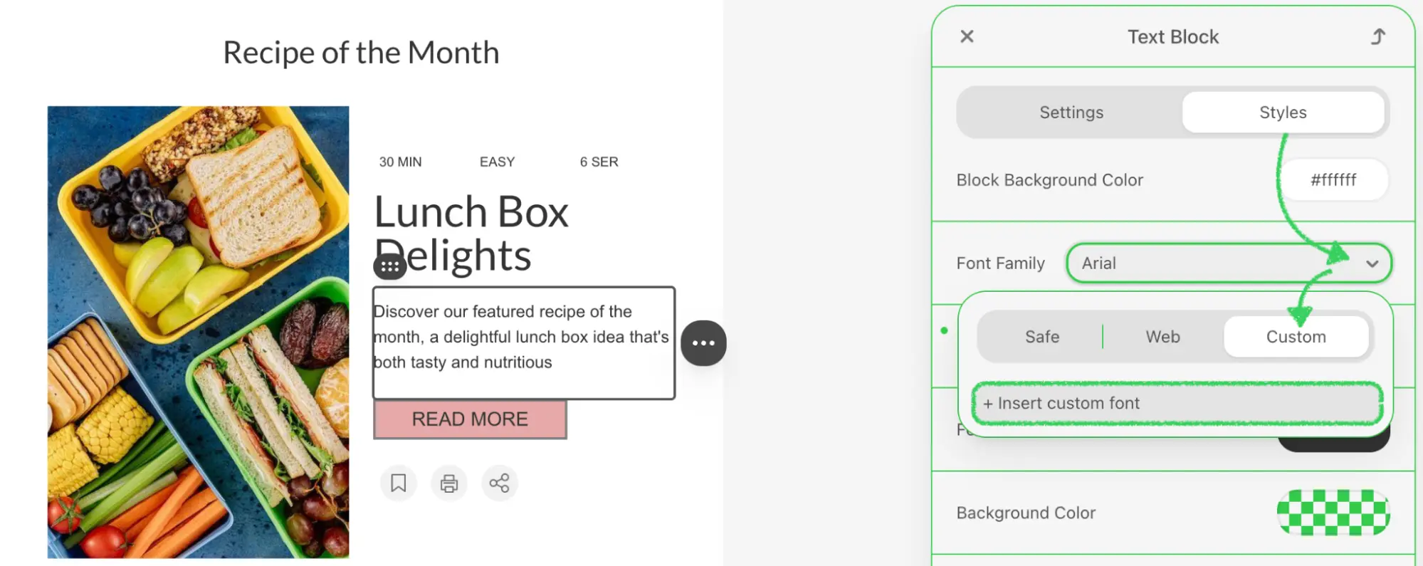{width=1999 height=795}
:::
::: image-wrap
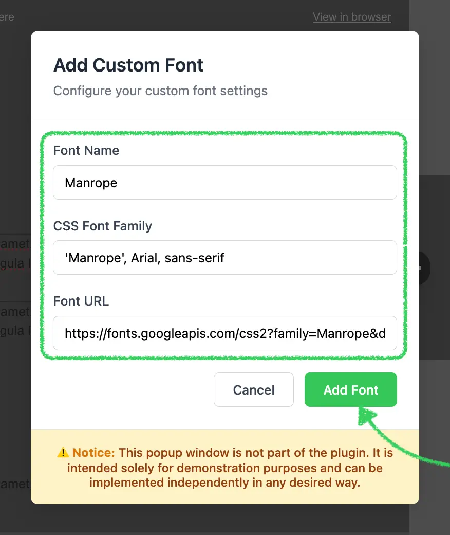{width=580}
:::
::: image-wrap
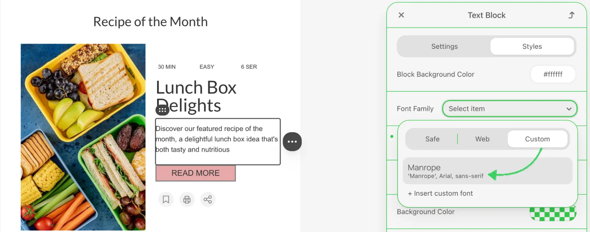{width=1999 height=788}
:::
### Use Cases
* **Brand Typography**: Incorporate your organization's proprietary fonts into email templates
* **Google Fonts Integration**: Add fonts from Google Fonts or other web font CDNs
* **Self-Hosted Fonts**: Connect to fonts hosted on your own servers or CDN
* **Font Marketplace Integration**: Link to third-party font providers like Adobe Fonts or Typekit
* **Multi-Brand Support**: Enable different font sets for different brands or clients
## Prerequisites
Before starting this tutorial, ensure you have:
* Node.js version 22.x or higher installed
* Basic understanding of JavaScript ES6+ syntax
* Familiarity with the Stripo Extensions SDK
* Understanding of CSS `@font-face` and web fonts
## Understanding the Interface
The External Custom Font integration requires two key components:
### 1. Custom UI Element
Create a custom UI element that extends `UIElement` to wrap the default font selector and add custom functionality:
```typescript
class CustomFontFamilySelectUIElement extends UIElement {
getId(): string; // Unique element ID
getTemplate(): string; // HTML template wrapping original selector
onRender(container: HTMLElement): void; // Setup event listeners
onDestroy(): void; // Cleanup event listeners
onAttributeUpdated(name: string, value: any): void; // Handle attribute changes
getValue(): string; // Get current font value
setValue(value: string): void; // Set font value programmatically
}
```
### 2. UI Element Tag Registry
Register your custom UI element to replace the default font family selector:
```typescript
class ExtensionTagRegistry extends UIElementTagRegistry {
registerUiElements(uiElementsTagsMap: Record): void;
}
```
### Custom Font Object Structure
When adding a custom font, your implementation must provide an object with the following structure:
```typescript
{
name: string; // Display name (e.g., "Montserrat Bold")
fontFamily: string; // CSS font-family value (e.g., "'Montserrat', sans-serif")
url: string; // Font resource URL (e.g., "https://fonts.googleapis.com/...")
}
```
::: tip Font URL Formats
Font URLs can point to various resources:
* **Google Fonts**: `https://fonts.googleapis.com/css2?family=Roboto:wght@400;700`
* **Self-hosted**: `https://cdn.yoursite.com/fonts/custom-font.woff2`
* **Adobe Fonts**: `https://use.typekit.net/abc1234.css`
* Any valid web font resource that uses `@font-face` CSS rules
:::
## Step 1: Project Setup
Create your project structure and install dependencies according to the [Getting Started](/extensions/getting-started) guide.
Your project directory structure should look like this:
```bash
external-custom-font/
├── index.html
├── src/
│ ├── creds.js
│ ├── index.js
│ ├── extension.js
├── package.json
└── vite.config.js
```
## Step 2: Create the Custom Font Selector UI Element
Create a new file `src/CustomFontFamilySelectUIElement.js` with the following implementation:
```javascript
import {ADD_CUSTOM_FONT_OPTION, UEAttr, UIElement} from '@stripoinc/ui-editor-extensions';
export const CUSTOM_FONT_FAMILY_SELECT_UI_ELEMENT_ID = 'custom-font-family-select';
export const ORIGINAL_FONT_FAMILY_SELECT_ID = 'original-font-family-select';
export class CustomFontFamilySelectUIElement extends UIElement {
getId() {
return CUSTOM_FONT_FAMILY_SELECT_UI_ELEMENT_ID;
}
getTemplate() {
return `<${ORIGINAL_FONT_FAMILY_SELECT_ID}
id="originalSelect"
style="width: 100%;"
${UEAttr.FONT_FAMILY_SELECT.addCustomFontOption}="+ Insert custom font">
`;
}
onRender(container) {
this.listener = this._onChange.bind(this);
this.originalSelect = container.querySelector('#originalSelect');
this.originalSelect.addEventListener('change', this.listener);
}
onDestroy() {
this.originalSelect.removeEventListener('change', this.listener);
}
onAttributeUpdated(name, value) {
this.originalSelect.setUIEAttribute(name, value);
super.onAttributeUpdated(name, value);
}
getValue() {
return this.originalSelect.value;
}
setValue(value) {
this.originalSelect.value = value;
}
_onChange(event) {
if (event.target.value !== ADD_CUSTOM_FONT_OPTION) {
this.api.triggerValueChange(event.target.value);
} else if (!this.dialog) {
this._showDialog();
}
}
}
```
### Key Components Explained
* **Template Structure**:
* Wraps the original font selector using `ORIGINAL_FONT_FAMILY_SELECT_ID`
* Adds custom option via `UEAttr.FONT_FAMILY_SELECT.addCustomFontOption` attribute
* The custom option text is "+ Insert custom font"
* **Event Handling**:
* `onRender()`: Attaches change listener to the select element
* `_onChange()`: Distinguishes between regular font selection and custom font trigger
* When `ADD_CUSTOM_FONT_OPTION` is selected, opens the custom font dialog
* **Value Management**:
* `getValue()` and `setValue()`: Proxy methods that delegate to the original select
* `onAttributeUpdated()`: Forwards attribute changes to the wrapped element
::: warning Important Constants
The SDK provides `ADD_CUSTOM_FONT_OPTION` constant to identify the special custom font option. Never hardcode this value, always import it from the SDK.
:::
## Step 3: Create the Custom Font Dialog
Add the dialog creation and management methods to `CustomFontFamilySelectUIElement.js`:
### Dialog Display Method
```javascript
_showDialog() {
this.dialog = document.createElement('div');
this.dialog.innerHTML = this._getDialogTemplate();
this.api.ignoreClickOutside(true);
document.body.appendChild(this.dialog);
// Add event listeners
this.dialog.querySelector('#confirm').addEventListener('click', () => this._submitDialog());
this.dialog.querySelector('#cancel').addEventListener('click', () => this._closeDialog());
// Add input event listeners to hide error message when user starts typing
const inputs = this.dialog.querySelectorAll('input');
inputs.forEach(input => {
input.addEventListener('input', () => {
const errorMsg = this.dialog.querySelector('#error-message');
if (errorMsg) {
errorMsg.style.display = 'none';
}
});
});
}
```
### Dialog Template Method
```javascript
_getDialogTemplate() {
return `
Add Custom Font
Configure your custom font settings
⚠️ Notice: This popup window is not part of the plugin. It is intended solely for demonstration purposes and can be implemented independently in any desired way.
`;
}
```
### Dialog Features Explained
1. **Modal Overlay**: Fixed position overlay with semi-transparent background and blur effect
2. **Form Fields**:
* **Font Name**: Display name shown in the font selector dropdown
* **CSS Font Family**: The actual CSS `font-family` value (e.g., "'Roboto', sans-serif")
* **Font URL**: Link to the font resource or stylesheet
3. **Input Enhancement**: Focus states with blue border and shadow for better UX
4. **Error Display**: Hidden error message that shows when validation fails
5. **Animations**: Smooth fade-in animation using CSS keyframes
6. **Responsive Design**: Uses `max-width: 90vw` to ensure dialog fits on small screens
::: tip Click Outside Prevention
The `this.api.ignoreClickOutside(true)` call prevents the editor from closing the dialog when clicking inside it. Remember to call `ignoreClickOutside(false)` when closing the dialog.
:::
## Step 4: Implement Dialog Submission and Validation
Add the submission and validation logic to handle font addition:
### Submit Dialog Method
```javascript
_submitDialog() {
const nameInput = this.dialog.querySelector('#name');
const fontFamilyInput = this.dialog.querySelector('#fontFamily');
const urlInput = this.dialog.querySelector('#url');
// Reset any previous error states
[nameInput, fontFamilyInput, urlInput].forEach(input => {
input.style.borderColor = '#d1d5db';
});
// Validate inputs
let hasError = false;
if (!nameInput.value.trim()) {
nameInput.style.borderColor = '#ef4444';
hasError = true;
}
if (!fontFamilyInput.value.trim()) {
fontFamilyInput.style.borderColor = '#ef4444';
hasError = true;
}
if (!urlInput.value.trim()) {
urlInput.style.borderColor = '#ef4444';
hasError = true;
}
if (hasError) {
// Show error message
const errorMsg = this.dialog.querySelector('#error-message');
if (errorMsg) {
errorMsg.style.display = 'block';
}
return;
}
const newFont = {
name: nameInput.value.trim(),
fontFamily: fontFamilyInput.value.trim(),
url: urlInput.value.trim(),
}
this.api.addCustomFont(newFont);
this._closeDialog();
}
```
### Close Dialog Method
```javascript
_closeDialog() {
if (this.dialog) {
this.dialog.remove();
this.dialog = undefined;
this.api.ignoreClickOutside(false);
this.originalSelect.value = '';
}
}
```
### Validation Logic Explained
1. **Input Retrieval**: Gets references to all three input fields
2. **State Reset**: Clears any previous error border colors
3. **Validation**:
* Checks each field is not empty using `trim()`
* Highlights invalid fields with red border (`#ef4444`)
* Sets `hasError` flag when validation fails
4. **Error Display**: Shows error message if any field is invalid
5. **Font Registration**: If validation passes, calls `this.api.addCustomFont()` with font object
6. **Cleanup**: Closes dialog and resets the select value
::: tip Font Family Format
The `fontFamily` field should follow CSS `font-family` syntax:
* Single font: `'Roboto'`
* With fallback: `'Roboto', sans-serif`
* Multiple words: `'Open Sans', Arial, sans-serif`
Always include quotes around font names with spaces.
:::
## Step 5: Create the UI Element Tag Registry
Create `src/ExtensionTagRegistry.js` to register your custom font selector as a replacement for the default:
```javascript
import {UIElementTagRegistry, UIElementType} from '@stripoinc/ui-editor-extensions';
import {CUSTOM_FONT_FAMILY_SELECT_UI_ELEMENT_ID, ORIGINAL_FONT_FAMILY_SELECT_ID} from './CustomFontFamilySelectUIElement';
export class ExtensionTagRegistry extends UIElementTagRegistry {
registerUiElements(uiElementsTagsMap) {
uiElementsTagsMap[ORIGINAL_FONT_FAMILY_SELECT_ID] = uiElementsTagsMap[UIElementType.FONT_FAMILY_SELECT];
uiElementsTagsMap[UIElementType.FONT_FAMILY_SELECT] = CUSTOM_FONT_FAMILY_SELECT_UI_ELEMENT_ID;
}
}
```
### Tag Registry Logic Explained
The registry performs two critical mappings:
1. **Preserve Original Selector**:
```javascript
uiElementsTagsMap[ORIGINAL_FONT_FAMILY_SELECT_ID] =
uiElementsTagsMap[UIElementType.FONT_FAMILY_SELECT];
```
* Saves the original font selector implementation
* Makes it available under `ORIGINAL_FONT_FAMILY_SELECT_ID`
* Allows your custom element to wrap and reuse the original
2. **Replace Default Selector**:
```javascript
uiElementsTagsMap[UIElementType.FONT_FAMILY_SELECT] =
CUSTOM_FONT_FAMILY_SELECT_UI_ELEMENT_ID;
```
* Maps the standard font selector type to your custom implementation
* Ensures all font selector instances use your enhanced version
* Seamlessly integrates with the editor without modifying existing code
::: warning Order Matters
The order of these two statements is critical. First save the original selector reference, then replace it with your custom implementation. Reversing the order will break the functionality.
:::
## Step 6: Register the Extension
Create `src/extension.js` to register your custom font integration with the Stripo extension system:
```javascript
import {ExtensionBuilder} from '@stripoinc/ui-editor-extensions';
import {CustomFontFamilySelectUIElement} from './CustomFontFamilySelectUIElement';
import {ExtensionTagRegistry} from './ExtensionTagRegistry';
const extension = new ExtensionBuilder()
.addUiElement(CustomFontFamilySelectUIElement)
.withUiElementTagRegistry(ExtensionTagRegistry)
.build();
export default extension;
```
### Extension Registration Explained
The `ExtensionBuilder` provides a fluent API for composing extensions:
1. **`.addUiElement(CustomFontFamilySelectUIElement)`**:
* Registers your custom UI element class with the extension system
* Makes the element available for use in the editor
* The editor will instantiate this class when needed
2. **`.withUiElementTagRegistry(ExtensionTagRegistry)`**:
* Registers your tag registry to control UI element mapping
* Tells the editor to replace the default font selector with your custom one
* Enables the wrapper pattern by preserving access to the original selector
3. **`.build()`**:
* Constructs and returns the final extension configuration object
* This object is passed to the editor during initialization
::: tip Multiple Integrations
You can chain multiple integration methods within a single extension:
```javascript
new ExtensionBuilder()
.addUiElement(CustomFontFamilySelectUIElement)
.withUiElementTagRegistry(ExtensionTagRegistry)
.withExternalImageLibrary(MyExternalImageLibrary)
.withExternalVideosLibrary(MyExternalVideosLibrary)
.build();
```
This allows combining custom fonts with other external integrations.
:::
## Step 7: Run the Development Server
Your implementation is now ready for testing.
### Start the Development Server
```bash
npm run dev
```
This command will:
1. Start the Vite development server on `http://localhost:3000`
2. Automatically open your default browser
3. Load the Stripo Editor with your custom font integration
## Complete Example
For a full working example, check out the complete implementation in our [GitHub repository](https://github.com/stripoinc/stripo-plugin-samples/tree/main/extensions/javascript/external-custom-font).
---
---
url: https://plugin.stripo.email/extensions/reference.md
---
# Stripo Extensions SDK API Reference
Comprehensive API documentation for the Stripo Email Editor Extensions SDK.
## Core Interfaces
### API Interfaces
| API | Description |
|---------------------------------------------------------|------------------------------------------------------------|
| [BaseApi](./reference/api/BaseApi.md) | Core API functionality for all extension components |
| [BaseModifierApi](./reference/api/BaseModifierApi.md) | Document modification capabilities |
| [BlockApi](./reference/api/BlockApi.md) | API interface for Block implementations |
| [BlockRendererApi](./reference/api/BlockRendererApi.md) | API interface for BlockRenderer implementations |
| [BlocksPanelApi](./reference/api/BlocksPanelApi.md) | API interface for custom blocks panel implementations |
| [ContextActionApi](./reference/api/ContextActionApi.md) | API interface for context action implementations |
| [ControlApi](./reference/api/ControlApi.md) | API interface for control implementations |
| [GeneralPanelTabApi](./reference/api/GeneralPanelTabApi.md) | API interface for general panel tab implementations |
| [ModulesPanelTabApi](./reference/api/ModulesPanelTabApi.md) | API interface for modules panel tab implementations |
| [SettingsPanelApi](./reference/api/SettingsPanelApi.md) | API interface for settings panel tab implementations |
| [UIElementApi](./reference/api/UIElementApi.md) | API interface for UI element implementations |
### Block Components
| API | Description |
|---------------------------------------------------------|------------------------------------------------------------|
| [Block](./reference/blocks/Block.md) | Base abstract class for creating custom blocks |
| [BlockRenderer](./reference/blocks/BlockRenderer.md) | Base class for custom block rendering |
| [BlocksPanel](./reference/blocks/BlocksPanel.md) | Base class for creating custom blocks panels |
| [ContextAction](./reference/blocks/ContextAction.md) | Abstract base class for context menu actions |
### Control Components
| API | Description |
|---------------------------------------------------------|------------------------------------------------------------|
| [Control](./reference/controls/Control.md) | Abstract base class for creating custom controls |
| [GeneralPanelTab](./reference/controls/GeneralPanelTab.md) | Base class for creating general panel tabs |
| [ModulesPanelTab](./reference/controls/ModulesPanelTab.md) | Base class for creating modules panel tabs |
### Core Components
| API | Description |
|---------------------------------------------------------|------------------------------------------------------------|
| [Extension](./reference/core/Extension.md) | Base class for creating Stripo extensions |
| [ExtensionBuilder](./reference/core/ExtensionBuilder.md) | Builder class for constructing extension configurations |
### Template Modification
| API | Description |
|--------------------------------------------------------------------------|--------------------------------------------------------------|
| [TemplateModifier](./reference/modification/TemplateModifier.md) | Base interface for managing template modifications |
| [HtmlNodeModifier](./reference/modification/HtmlNodeModifier.md) | Interface for modifying HTML nodes in email templates |
| [CssNodeModifier](./reference/modification/CssNodeModifier.md) | Interface for modifying CSS rules and properties |
| [MultiRowStructureModifier](./reference/modification/MultiRowStructureModifier.md) | Interface for creating and modifying email structure layouts |
| [ModificationDescription](./reference/modification/ModificationDescription.md) | Class for providing context about template modifications |
### Node Interfaces
#### Base Node Interfaces
| API | Description |
|-------------------------------------------------------------------|----------------------------------------------------------|
| [BaseImmutableNode](./reference/nodes/BaseImmutableNode.md) | Common interface for all immutable nodes |
| [BaseImmutableHtmlNode](./reference/nodes/BaseImmutableHtmlNode.md) | HTML-specific base with type casting method |
| [BaseImmutableCssNode](./reference/nodes/BaseImmutableCssNode.md) | CSS-specific base with type casting and comment checking |
#### HTML Node Interfaces
| API | Description |
|-------------------------------------------------------------------|----------------------------------------------------------|
| [ImmutableHtmlNode](./reference/nodes/ImmutableHtmlNode.md) | Base interface for immutable HTML nodes |
| [ImmutableHtmlElementNode](./reference/nodes/ImmutableHtmlElementNode.md) | HTML elements with attributes, styles, and methods |
| [ImmutableHtmlTextNode](./reference/nodes/ImmutableHtmlTextNode.md) | Text content nodes |
#### CSS Node Interfaces
| API | Description |
|-------------------------------------------------------------------|----------------------------------------------------------|
| [ImmutableCssNode](./reference/nodes/ImmutableCssNode.md) | Base interface for immutable CSS nodes |
| [ImmutableCssRuleNode](./reference/nodes/ImmutableCssRuleNode.md) | CSS rules with selectors |
| [ImmutableCssAttributeNode](./reference/nodes/ImmutableCssAttributeNode.md) | CSS properties/attributes |
| [ImmutableCssCommentNode](./reference/nodes/ImmutableCssCommentNode.md) | CSS comments |
| [ImmutableCssDocumentNode](./reference/nodes/ImmutableCssDocumentNode.md) | Document and media query containers |
### Types and Interfaces
| API | Description |
|-----|-------------|
| [AIPopoverOptions](./reference/types/AIPopoverOptions.md) | Configuration for AI-assisted popovers |
| [BlockHint](./reference/types/BlockHint.md) | Configuration for block hints and tooltips |
| [BlockItem](./reference/types/BlockItem.md) | Configuration for block items in panels |
| [CustomFontFamily](./reference/types/CustomFontFamily.md) | Configuration for custom font families |
| [DisplayCondition](./reference/types/DisplayCondition.md) | Configuration for conditional element visibility |
| [EditorPermissions](./reference/types/EditorPermissions.md) | Interface describing the current user's editor permissions |
| [EmojiPopoverOptions](./reference/types/EmojiPopoverOptions.md) | Configuration for emoji picker popovers |
| [HideElementState](./reference/types/HideElementState.md) | Type for device-specific hidden element state |
| [StructureLayout](./reference/types/StructureLayout.md) | Type for defining container layouts in structures |
### Constants and Enums
| API | Description |
|-----|------------------------------------------------------------|
| [AiAssistantValueType](./reference/constants/AiAssistantValueType.md) | Enum for AI assistant value types |
| [BlockAttr](./reference/constants/BlockAttr.md) | Enum for block attribute constants |
| [BlockCompositionType](./reference/constants/BlockCompositionType.md) | Enum defining block composition types |
| [BlockType](./reference/constants/BlockType.md) | Enum for block type definitions |
| [ContextActionType](./reference/constants/ContextActionType.md) | Enum for context action type definitions |
| [EditorState](./reference/constants/EditorState.md) | Interface for the active editor state object |
| [EditorStatePropertyType](./reference/constants/EditorStatePropertyType.md) | Enum for observable editor state properties |
| [OrderableItemIconPosition](./reference/constants/OrderableItemIconPosition.md) | Enum for orderable UI element drag handle icon positioning |
| [PanelPosition](./reference/constants/PanelPosition.md) | Enum for defining panel positioning options |
| [PreviewDeviceMode](./reference/constants/PreviewDeviceMode.md) | Enum for preview device mode settings |
| [SettingsTab](./reference/constants/SettingsTab.md) | Enum for settings tab definitions |
| [ThemeMode](./reference/constants/ThemeMode) | Enum for email template theme mode values |
| [UEAttr](./reference/constants/UEAttr.md) | Enum for UI element attribute constants |
| [UIElementType](./reference/constants/UIElementType.md) | Enum for UI element type definitions |
### Integrations
| API | Description |
|-----|----------------------------------------------------------------------|
| [ExternalAiAssistant](./reference/integrations/ExternalAiAssistant.md) | Interface for integrating external AI assistants |
| [ExternalDisplayConditionsLibrary](./reference/integrations/ExternalDisplayConditionsLibrary.md) | Interface for integrating external display condition systems |
| [ExternalImageLibrary](./reference/integrations/ExternalImageLibrary.md) | Interface for integrating external image libraries |
| [ExternalImageLibraryTab](./reference/integrations/ExternalImageLibraryTab.md) | Interface for creating a custom tab within image libraries (v3.2.0+) |
| [ExternalSmartElementsLibrary](./reference/integrations/ExternalSmartElementsLibrary.md) | Interface for integrating external smart elements libraries |
| [ExternalVideosLibrary](./reference/integrations/ExternalVideosLibrary.md) | Interface for integrating external video libraries |
### Settings Panel
| API | Description |
|-----|-------------|
| [SettingsPanelRegistry](./reference/settings-panel/SettingsPanelRegistry.md) | Registry for managing settings panel tabs |
| [SettingsPanelTab](./reference/settings-panel/SettingsPanelTab.md) | Base class for creating custom settings panel tabs |
### Icons Management
| API | Description |
|-----|-------------|
| [IconsRegistry](./reference/icons/IconsRegistry.md) | Registry for managing custom SVG icons in extensions |
### UI Elements
| API | Description |
|-----|-------------|
| [UIElement](./reference/ui-elements/UIElement.md) | Base class for creating custom UI elements |
| [UIElementTagRegistry](./reference/ui-elements/UIElementTagRegistry.md) | Registry for managing custom UI element tags |
---
---
url: https://plugin.stripo.email/extensions/reference/api/BaseApi.md
---
# BaseApi
Core interface providing fundamental API functionality for all extension components in the Stripo Email Editor Extensions SDK.
```typescript
interface BaseApi
```
## Description
The `BaseApi` interface defines the fundamental API methods available to all extension components, including blocks, controls, renderers, and context actions. It provides access to editor configuration, internationalization, state management, and UI features such as popovers.
## Import
```typescript
import { BaseApi } from '@stripoinc/ui-editor-extensions';
```
## Properties
None (all functionality is provided through methods)
## Methods
### getDocumentRootHtmlNode()
Retrieves the root immutable HTML node of the document template.
```typescript
getDocumentRootHtmlNode(): ImmutableHtmlNode
```
#### Returns
[`ImmutableHtmlNode`](../nodes/ImmutableHtmlNode.md) - The root HTML node of the email document
#### Usage Notes
* Provides read-only access to the entire document structure
* Use for querying elements across the document
* Combine with selectors to find specific nodes
* Immutable nodes ensure document consistency
#### Example
```typescript
const rootNode = this.api.getDocumentRootHtmlNode();
const allImages = rootNode.querySelectorAll('img');
const stripeCount = rootNode.querySelectorAll('.esd-stripe').length;
```
***
### getDocumentRootCssNode()
Retrieves the root immutable CSS node of the document's stylesheet.
```typescript
getDocumentRootCssNode(): ImmutableCssNode
```
#### Returns
[`ImmutableCssNode`](../nodes/ImmutableCssNode.md) - The root CSS node containing all styles
#### Usage Notes
* Provides access to document-level CSS rules
* Allows querying for specific CSS rules or media queries
* Enables reading CSS properties and values
* Essential for style-related controls
#### Example
```typescript
const desktopH1CssNode = this.api.getDocumentRootCssNode().querySelector('h1');
const mobileH1CssNode = this.api.getDocumentRootCssNode().querySelector('@{media only screen and (max-width: 600px)} h1');
```
### getEditorConfig()
Retrieves the current configuration settings of the editor instance.
```typescript
getEditorConfig(): Record
```
#### Returns
`Record` - A record object containing editor configuration key-value pairs
#### Usage Notes
* Contains editor features, metadata, and settings
* Configuration is set during editor initialization
* May include custom metadata for your application
* Read-only—configuration cannot be modified through this method
#### Example
```typescript
const config = this.api.getEditorConfig();
// Access standard configuration
const locale = config.locale;
const name = config.name;
const emailId = config.metadata.emailId;
// Access custom data
const enabled = config.customBlock?.enabled;
```
***
### getUserPermissions()
:::::tip Version Availability
This method is available starting from v3.10.0
:::::
Retrieves the current user's permissions in the editor.
```typescript
getUserPermissions(): EditorPermissions
```
#### Returns
[`EditorPermissions`](../types/EditorPermissions.md) - Object describing the user's access to editor features
#### Usage Notes
* Permissions are provided by your backend through the User Permissions API
* Use to adapt extension UI to the current user's access level
* Combine with `onUserPermissionsUpdated()` to react to permission changes
* See [Permissions and Access Management](/editor-configuration/permissions-and-access-management) for configuration details
#### Example
```typescript
const permissions = this.api.getUserPermissions();
// Hide editing controls for read-only users
if (!permissions.content?.write) {
this.disableEditingControls();
}
// Check module management access
if (permissions.modules?.write) {
this.showModuleActions();
}
```
***
### translate()
Translates a given key into the currently configured language, optionally interpolating parameters.
```typescript
translate(key: string, params?: Record): string
```
#### Parameters
| Parameter | Type | Description |
|-----------|------|-------------|
| key | `string` | The localization key to translate |
| params | `Record` | Optional parameters for interpolation into the translated string |
#### Returns
`string` - The translated string
#### Usage Notes
* Respects the current editor language setting
* Supports parameter interpolation using placeholders
* Returns the key itself if translation is not found
* Essential for creating multilingual extensions
#### Example
```typescript
// Simple translation
const title = this.api.translate('block.product.title');
// Translation with parameters
const message = this.api.translate('block.product.count', {
count: 5,
total: 10
});
// If translation is "Showing {count} of {total} products"
// Result: "Showing 5 of 10 products"
// Using in block names
public getName(): string {
return this.api.translate('blocks.myBlock.name');
}
```
### addCustomFont()
Adds a new font family to the editor configuration.
```typescript
addCustomFont(font: CustomFontFamily): void
```
#### Parameters
| Parameter | Type | Description |
|-----------|------|-------------|
| font | [`CustomFontFamily`](../types/CustomFontFamily.md) | Font family configuration object |
#### Usage Notes
* Makes font available in all font selection dropdowns
* Font CSS is automatically loaded if URL is provided
* Useful for brand-specific or custom fonts
* Fonts are available for the entire editor session
#### Example
```typescript
// Add a custom brand font
this.api.addCustomFont({
name: 'Brand Font',
fontFamily: 'BrandFont, Arial, sans-serif',
url: 'https://fonts.example.com/brand-font.css'
});
```
***
### ignoreClickOutside()
Controls whether clicking outside the current element triggers deselection.
```typescript
ignoreClickOutside(ignore: boolean): void
```
#### Parameters
| Parameter | Type | Description |
|-----------|------|-------------|
| ignore | `boolean` | If true, disables deselection on outside clicks; if false, enables it |
#### Usage Notes
* Useful when showing custom UI that users need to interact with
* Prevents loss of context when using external controls
* Remember to reset (set to false) when interaction is complete
* Only affects the current selection context
#### Example
```typescript
public onSelect(node: ImmutableHtmlNode): void {
// Prevent deselection while configuration dialog is open
this.api.ignoreClickOutside(true);
this.showConfigurationDialog({
onClose: () => {
// Re-enable normal deselection behavior
this.api.ignoreClickOutside(false);
}
});
}
// Another example with external panel
private openExternalPanel(): void {
this.api.ignoreClickOutside(true);
const panel = document.getElementById('external-panel');
panel.style.display = 'block';
panel.addEventListener('close', () => {
this.api.ignoreClickOutside(false);
}, { once: true });
}
```
***
### getEditorState()
Returns information about the active state of the editor.
```typescript
getEditorState(): EditorState
```
#### Returns
[`EditorState`](../constants/EditorState) - Object containing:
| Property | Type | Description |
|----------|-------------------------------------------------------|--------------------------------|
| previewDeviceMode | [`PreviewDeviceMode`](../constants/PreviewDeviceMode) | Current preview mode |
| panelPosition | [`PanelPosition`](../constants/PanelPosition) | Position of the settings panel |
| themeMode | [`ThemeMode`](../constants/ThemeMode) | Current email template theme |
#### Usage Notes
* Use to adapt behavior based on preview mode
* State reflects current user interface configuration
* Useful for responsive behavior in extensions
* Use `themeMode` to keep extension UI styling aligned with the email template theme
#### Example
```typescript
const state = this.api.getEditorState();
// Adapt to preview mode
if (state.previewDeviceMode === PreviewDeviceMode.MOBILE) {
// Simplified behavior for mobile preview
this.useMobileSettings();
} else {
// Full desktop functionality
this.useDesktopSettings();
}
// Check panel position
if (state.panelPosition === PanelPosition.BLOCKS_SETTINGS) {
// Adjust UI accordingly
}
// Match extension UI to the email template theme
if (state.themeMode === ThemeMode.DARK) {
this.useDarkThemeStyles();
}
```
***
### onUserPermissionsUpdated()
:::::tip Version Availability
This method is available starting from v3.10.0
:::::
Subscribes to user permission changes in the editor.
```typescript
onUserPermissionsUpdated(
callback: (newPermissions: EditorPermissions, oldPermissions?: EditorPermissions) => void
): void
```
#### Parameters
| Parameter | Type | Description |
|-----------|------|-------------|
| callback | `Function` | Function called when permissions are updated, receiving new permissions and optionally old permissions |
#### Usage Notes
* Callback is triggered whenever the user's permissions are updated
* `oldPermissions` may be `undefined` on the initial update
* Useful for keeping extension UI in sync with access changes without reloading the editor
* No automatic cleanup - subscriptions persist for component lifetime
#### Example
```typescript
public onDocumentInit(): void {
this.api.onUserPermissionsUpdated((newPermissions, oldPermissions) => {
console.log('Permissions updated', newPermissions, oldPermissions);
// Toggle editing UI based on the new access level
this.setEditingEnabled(!!newPermissions.content?.write);
});
}
```
***
### onEditorStatePropUpdated()
Subscribes to changes in specific editor state properties.
```typescript
onEditorStatePropUpdated(
prop: EditorStatePropertyType,
callback: (newValue: unknown, oldValue: unknown) => void
): void
```
#### Parameters
| Parameter | Type | Description |
|-----------|------|-------------|
| prop | [`EditorStatePropertyType`](../constants/EditorStatePropertyType.md) | The property to monitor for changes |
| callback | `Function` | Function called when the property value changes |
#### EditorStatePropertyType
See [`EditorStatePropertyType`](../constants/EditorStatePropertyType.md) for available property types.
#### Usage Notes
* Callback is triggered whenever the specified property changes
* Useful for reactive UI updates
* Multiple subscriptions to the same property are supported
* No automatic cleanup - subscriptions persist for component lifetime
#### Example
```typescript
public onDocumentInit(): void {
// Monitor preview mode changes
this.api.onEditorStatePropUpdated(
EditorStatePropertyType.previewDeviceMode,
(newMode, oldMode) => {
console.log(`Preview changed from ${oldMode} to ${newMode}`);
this.updateBlockDisplay(newMode);
}
);
// Monitor email template theme changes
this.api.onEditorStatePropUpdated(
EditorStatePropertyType.themeMode,
(newTheme, oldTheme) => {
console.log(`Theme changed from ${oldTheme} to ${newTheme}`);
this.updateThemeStyles(newTheme);
}
);
}
private updateBlockDisplay(mode: PreviewDeviceMode): void {
if (mode === PreviewDeviceMode.MOBILE) {
// Update for mobile preview
}
}
```
***
### openAIPopover()
Opens an AI assistant popover anchored to a target element.
```typescript
openAIPopover(options: AIPopoverOptions): void
```
#### Parameters
| Parameter | Type | Description |
|-----------|------|-------------|
| options | [`AIPopoverOptions`](../types/AIPopoverOptions.md) | Configuration for the AI popover |
#### Usage Notes
* Requires AI features to be enabled in editor configuration
* Provides context-aware content generation
* Popover placement auto-adjusts to stay visible
* User must have appropriate permissions for AI features
#### Example
```typescript
import {ExtensionPopoverType, PopoverSide, UIElement} from '@stripoinc/ui-editor-extensions';
export class AIPopoverUIElement extends UIElement {
getId() {
return 'ai-popover-element';
}
getTemplate() {
return `
Improve with AI
`
}
onRender(container) {
this.aiButton = container.querySelector('.ai-button');
this.aiButton.addEventListener('click', this.showAiPopover.bind(this));
}
showAiPopover() {
this.api.openAIPopover({
targetElement: this.aiButton,
value: 'Hello world',
preferredSides: [PopoverSide.LEFT],
type: ExtensionPopoverType.AI_TEXT,
onResult: (result) => {console.log(result)}
})
}
onDestroy() {
this.aiButton.removeEventListener('click', this.showAiPopover.bind(this));
}
}
```
***
### openEmojiPopover()
Opens an emoji picker popover anchored to a target element.
```typescript
openEmojiPopover(options: EmojiPopoverOptions): void
```
#### Parameters
| Parameter | Type | Description |
|-----------|------|-------------|
| options | [`EmojiPopoverOptions`](../types/EmojiPopoverOptions.md) | Configuration for the emoji picker |
#### Usage Notes
* Shows native emoji picker interface
* Supports search and categories
* Auto-positions to stay within viewport
* Returns the selected emoji character
#### Example
```typescript
import {ExtensionPopoverType, PopoverSide, UIElement} from '@stripoinc/ui-editor-extensions';
export class EmojiPopoverUIElement extends UIElement {
getId() {
return 'emoji-popover-element';
}
getTemplate() {
return `
Pick Emoji
`
}
onRender(container) {
this.emojiButton = container.querySelector('.emoji-button');
this.emojiButton.addEventListener('click', this.showEmojiPopover.bind(this));
}
showEmojiPopover() {
this.api.openEmojiPopover({
targetElement: this.emojiButton,
preferredSides: [PopoverSide.LEFT],
onResult: (result) => {console.log(result)}
})
}
onDestroy() {
this.emojiButton.removeEventListener('click', this.showEmojiPopover.bind(this));
}
}
```
***
### sendEvent()
:::::tip Version Availability
This method is available starting from v3.8.0
:::::
Sends a fire-and-forget event with arbitrary contextual data to the editor integration layer. Calling `sendEvent()` triggers the editor initialization callback `onEvent(type, params)`, so your host application can react to extension-originated events. See [Initialization Settings](https://plugin.stripo.email/editor-configuration/initialization-settings) for details.
```typescript
sendEvent(type: string, params: Record): void
```
#### Parameters
| Parameter | Type | Description |
|-----------|------|-------------|
| type | `string` | Event identifier |
| params | `Record` | Additional event payload |
#### Usage Notes
* Useful for custom analytics
* Does not return a value and does not wait for a response
* Triggers the editor-level `onEvent(type, params)` callback configured during initialization
#### Example
```typescript
this.api.sendEvent('extensions.product-card.selected', {
blockId: this.getId(),
panel: 'settings',
locale: this.api.getEditorConfig().locale
});
```
## Implementation Context
The `BaseApi` is available in various extension components through their respective API properties:
* **Block**: Access via `this.api` in block methods
* **Control**: Access via `this.api` in control methods
* **BlockRenderer**: Access via `this.api` in renderer methods
* **ContextAction**: Access via `this.api` in action methods
## Best Practices
1. **Always use translations** for user-facing text to support internationalization
2. **Check configuration** before using optional features
3. **Reset interaction states** (like `ignoreClickOutside`) when done
4. **Subscribe to state changes** early in component lifecycle
5. **Validate configuration values** before using them
---
---
url: https://plugin.stripo.email/extensions/reference/api/BaseModifierApi.md
---
# BaseModifierApi
Interface providing document modification capabilities for extension components within the Stripo Email Editor Extensions SDK.
```typescript
interface BaseModifierApi
```
## Description
The `BaseModifierApi` interface provides access to the template modification system, allowing extension components to make changes to email templates in a controlled, synchronized manner. It ensures all modifications are properly tracked, support undo/redo operations, and maintain consistency in collaborative editing sessions.
## Import
```typescript
import { BaseModifierApi } from '@stripoinc/ui-editor-extensions';
```
## Properties
None (all functionality is provided through methods)
## Methods
### getDocumentModifier()
Retrieves a modifier instance for performing operations on the document's template.
```typescript
getDocumentModifier(): TemplateModifier
```
#### Returns
[TemplateModifier](../modification/TemplateModifier.md) - A TemplateModifier instance capable of modifying HTML and CSS nodes
#### Usage Notes
* Modifications are batched until `apply()` is called
* Supports method chaining for multiple modifications
* Maintains proper synchronization in collaborative environments
#### Example
```typescript
// Get a modifier instance
const modifier = this.api.getDocumentModifier();
// Chain multiple modifications
modifier
.modifyHtml(htmlNode)
.setAttribute('data-id', '123')
.setStyle('color', 'blue')
.modifyCss(cssNode)
.setProperty('font-size', '16px')
.setProperty('margin', '10px')
.apply(new ModificationDescription('Updated block styling and content'));
```
---
---
url: https://plugin.stripo.email/extensions/reference/api/BlockApi.md
---
# BlockApi
Interface providing API access for Block implementations in the Stripo Email Editor Extensions SDK.
```typescript
interface BlockApi extends BaseApi, BaseModifierApi
```
## Description
The `BlockApi` interface provides comprehensive access to editor functionalities for block implementations. It combines base API features (translation, configuration, state management) with document modification capabilities, enabling blocks to interact with and modify email templates while maintaining synchronization with the editor's collaborative features.
## Import
```typescript
import { BlockApi } from '@stripoinc/ui-editor-extensions';
```
## Inheritance Hierarchy
```
BaseApi
↓
BlockApi ← BaseModifierApi
```
## Properties
None (all functionality provided through methods)
## Methods
### setViewOnly()
Sets the view-only state for the current block context.
```typescript
setViewOnly(viewOnly: boolean): void
```
#### Parameters
| Parameter | Type | Description |
|-----------|------|-------------|
| viewOnly | `boolean` | If true, interactions might be restricted |
#### Usage Notes
* Controls whether the block can be dragged and dropped within the template
* Useful for singleton blocks or conditional editing
#### Example
```typescript
public onDocumentInit(): void {
// Ensure only one instance can be edited
const instances = this.api.getDocumentRoot()
.querySelectorAll(`.${this.getUniqueBlockClassname()}`);
if (instances.length > 1) {
this.api.setViewOnly(true);
}
}
```
***
### getHiddenElementState()
Gets the current device-specific hidden state for the provided node.
```typescript
getHiddenElementState(target: ImmutableHtmlNode): HideElementState
```
#### Parameters
| Parameter | Type | Description |
|-----------|------|-------------|
| target | [ImmutableHtmlNode](../nodes/ImmutableHtmlNode) | The node to inspect |
#### Returns
[HideElementState](../types/HideElementState) - `'desktop'`, `'mobile'`, or `undefined`
#### Usage Notes
* The editor resolves the canonical node that owns the visibility configuration
* Use this method when custom controls need to stay synchronized with the built-in hide-element state
* `undefined` means the target is not hidden for a specific device mode
#### Example
```typescript
public onTemplateNodeUpdated(node: ImmutableHtmlNode): void {
const hiddenState = this.api.getHiddenElementState(node);
if (hiddenState === 'mobile') {
this.api.sendEvent('extensions.block.hidden-on-mobile', {
blockId: this.getId(),
});
}
}
```
## Inherited Methods from BaseApi
[BaseApi](./BaseApi.md) - Base API interface
## Inherited Methods from BaseModifierApi
[BaseModifierApi](./BaseModifierApi.md) - Document modification API
---
---
url: https://plugin.stripo.email/extensions/reference/api/BlockRendererApi.md
---
# BlockRendererApi
Interface providing API access for BlockRenderer implementations in the Stripo Email Editor Extensions SDK.
```typescript
interface BlockRendererApi extends BaseApi
```
## Description
The `BlockRendererApi` interface provides access to editor functionalities for custom block renderer implementations. It inherits all base API functionality, giving renderers access to translation, configuration, and editor state features while rendering custom block content.
## Import
```typescript
import { BlockRendererApi } from '@stripoinc/ui-editor-extensions';
```
## Inheritance Hierarchy
```
BaseApi
↓
BlockRendererApi
```
## Properties
None (all functionality provided through inherited methods)
## Methods
The `BlockRendererApi` interface currently does not define any additional methods beyond those inherited from `BaseApi`.
## Inherited Methods from BaseApi
[BaseApi](./BaseApi.md) - Base API interface
---
---
url: https://plugin.stripo.email/extensions/reference/api/BlocksPanelApi.md
---
# BlocksPanelApi
API interface for interacting with and customizing the editor's blocks panel.
```typescript
interface BlocksPanelApi extends BaseApi
```
## Description
The `BlocksPanelApi` interface provides API functionality for customizing blocks panel. It extends the `BaseApi` interface, giving blocks panel implementations access to core editor features like configuration, translations, and state management.
## Import
```typescript
import { BlocksPanelApi } from '@stripoinc/ui-editor-extensions';
```
## Inheritance Hierarchy
```
BaseApi
↓
BlocksPanelApi
```
## Properties
None (inherits all properties from BaseApi)
## Methods
The `BlocksPanelApi` interface currently does not define any additional methods beyond those inherited from `BaseApi`.
## Inherited Methods from BaseApi
[BaseApi](./BaseApi.md) - Base API interface
---
---
url: https://plugin.stripo.email/extensions/reference/api/ContextActionApi.md
---
# ContextActionApi
API interface for context action implementations in the Stripo Email Editor Extensions SDK.
```typescript
interface ContextActionApi extends BaseApi, BaseModifierApi
```
## Description
The `ContextActionApi` interface provides API functionality for context actions - custom actions that appear in contextual menus when users interact with email elements. It combines the base API functionality with document modification capabilities, allowing context actions to both read editor state and modify the email template.
## Import
```typescript
import { ContextActionApi } from '@stripoinc/ui-editor-extensions';
```
## Inheritance
* Extends: [BaseApi](./BaseApi.md), [BaseModifierApi](./BaseModifierApi.md)
## Properties
None (inherits all properties from parent interfaces)
## Methods
The `ContextActionApi` interface currently does not define any additional methods beyond those inherited from `BaseApi` and `BaseModifierApi`.
## Inherited Methods from BaseApi
[BaseApi](./BaseApi.md) - Base API interface
## Inherited Methods from BaseModifierApi
[BaseModifierApi](./BaseModifierApi.md) - Document modification API
---
---
url: https://plugin.stripo.email/extensions/reference/api/ControlApi.md
---
# ControlApi
API interface for control implementations in the Stripo Email Editor Extensions SDK.
```typescript
interface ControlApi extends BaseApi, BaseModifierApi
```
## Description
The `ControlApi` interface provides comprehensive API functionality for custom controls in the settings panel. It extends both `BaseApi` and `BaseModifierApi`, offering methods to manage UI elements, access document nodes, handle value changes, and modify the email template. Controls use this API to create rich, interactive settings interfaces for email elements.
## Import
```typescript
import { ControlApi } from '@stripoinc/ui-editor-extensions';
```
## Inheritance
* Extends: [BaseApi](./BaseApi.md), [BaseModifierApi](./BaseModifierApi.md)
## Properties
None (all functionality provided through methods)
## Methods
### setVisibility()
Sets the visibility of a specific UI element within the control's scope.
```typescript
setVisibility(uiElementName: string, isVisible: boolean): void
```
#### Parameters
| Parameter | Type | Description |
|-----------|------|-------------|
| uiElementName | `string` | The ID of the UI element to show/hide |
| isVisible | `boolean` | True to show the element, false to hide it |
#### Usage Notes
* Controls dynamic UI element visibility
* Useful for conditional settings
* Affects only elements within this control
* Changes are immediate
#### Example
```typescript
// Show/hide advanced options based on toggle
public onValueChanged(elementName: string, value: any): void {
if (elementName === 'showAdvanced') {
this.api.setVisibility('advancedSettingsSelectPicker', value);
}
}
```
***
### setUIEAttribute()
Sets a specific attribute on a target UI element within the control's scope.
```typescript
setUIEAttribute(uiElementName: string, attribute: string, value: unknown): void
```
#### Parameters
| Parameter | Type | Description |
|-----------|------|-------------|
| uiElementName | `string` | The ID of the target UI element |
| attribute | `string` | The name of the attribute to set (use UEAttr constants) |
| value | `unknown` | The value to set for the attribute |
#### Usage Notes
* Use with `UEAttr` constants for attribute names
* Dynamically modify UI element properties
* Common attributes: disabled, placeholder, min, max
* Changes apply immediately to the UI
#### Example
```typescript
import { UEAttr } from '@stripoinc/ui-editor-extensions';
// Disable input based on condition
this.api.setUIEAttribute('fontSize', UEAttr.TEXT.disabled, isLocked);
// Update placeholder text
this.api.setUIEAttribute('customText', UEAttr.TEXT.placeholder,
this.api.translate('placeholders.enterText'));
// Set min/max values
this.api.setUIEAttribute('width', UEAttr.COUNTER.minValue, 100);
this.api.setUIEAttribute('width', UEAttr.COUNTER.maxValue, 600);
```
***
### updateValues()
Updates the values of multiple UI elements within the control's scope at once.
```typescript
updateValues(valuesMap: Record): void
```
#### Parameters
| Parameter | Type | Description |
|-----------|------|-------------|
| valuesMap | `Record` | Object where keys are UI element IDs and values are their new values |
#### Usage Notes
* Efficient bulk updates
* Use for setting initial values
#### Example
```typescript
// Set multiple values at once
this.api.updateValues({
'enableFeatureSwitcher': true,
'itemCountCounter': 5,
'styleSelect': 'modern'
});
```
***
### updateUIElementValue()
:::tip Version Availability
This method is available starting from v3.5.0
:::
Updates the value of a single UI element within the control's scope using path notation.
```typescript
updateUIElementValue(path: string, value: unknown): void
```
#### Parameters
| Parameter | Type | Description |
|-----------|------|-------------|
| path | `string` | The path of the target UI element. Can include indices for repeatable elements. |
| value | `unknown` | The new value to set for the UI element. |
#### Usage Notes
* Supports granular updates
* Crucial for updating items within [REPEATABLE](../constants/UIElementType.md#repeatable) elements
* Path notation: `elementName` for top-level, `elementName[index].fieldName` for nested/repeatable elements
#### Example
```typescript
// Update the value of the input with the name 'text'
this.api.updateUIElementValue('text', 'updated value');
// Update the value of the input with name 'text' in the first item
// of the REPEATABLE element with name 'items'
this.api.updateUIElementValue('items[0].text', 'updated value');
```
***
### getValues()
Returns the current values of all UI elements managed by this control.
```typescript
getValues(): Record
```
#### Returns
`Record` - Object with UI element IDs as keys and their current values
#### Usage Notes
* Get all values for saving/validation
* Useful for creating presets
* Includes only elements within this control
* Values reflect current UI state
#### Example
```typescript
// Save current settings as preset
public saveAsPreset(name: string): void {
const currentValues = this.api.getValues();
const preset = {
name: name,
values: currentValues,
timestamp: Date.now()
};
this.savePreset(preset);
}
// Validate all values
public validateSettings(): boolean {
const values = this.api.getValues();
return values.itemCountCounter >= 1 &&
values.itemCountCounter <= 10;
}
```
***
### onValueChanged()
Registers a callback function to be invoked when the value of a specific UI element changes.
```typescript
onValueChanged(
uiElementName: string,
callback: (newValue: unknown, oldValue: unknown, index?: number) => void
): void
```
#### Parameters
| Parameter | Type | Description |
|-----------|------|-------------|
| uiElementName | `string` | The ID of the UI element to listen to |
| callback | `Function` | Function called when value changes, receiving new and old values, and an optional index if the element is part of a repeatable list |
#### Usage Notes
* `index` parameter (v3.5.0+) is provided when the changed element is part of a [REPEATABLE](../constants/UIElementType.md#repeatable) UI element.
#### Example
```typescript
public onRender(): void {
// Basic usage
this.api.onValueChanged('contentText', (newValue, oldValue) => {
console.log(`Value changed from ${oldValue} to ${newValue}`);
});
// v3.5.0+: Usage with repeatable elements
this.api.onValueChanged('items.title', (newValue, oldValue, index) => {
console.log(`Item at index ${index} changed from ${oldValue} to ${newValue}`);
});
}
```
***
### setSettingsPanelTabTitleHtml()
::::tip Version Availability
This method is available starting from v3.6.0
::::
Updates a settings panel tab title using raw HTML.
```typescript
setSettingsPanelTabTitleHtml(tabId: string, html: string): void
```
#### Parameters
| Parameter | Type | Description |
|-----------|------|-------------|
| tabId | `string` | The ID of the settings panel tab to update |
| html | `string` | HTML string to render as the tab title |
#### Example
```typescript
this.api.setSettingsPanelTabTitleHtml(
'appearance',
'): void
```
#### Parameters
| Name | Type | Description |
|------|------|-------------|
| valuesMap | `Record` | UI element IDs mapped to their new values |
***
### getValues()
Returns the current values of all UI elements managed by this tab.
```typescript
getValues(): Record
```
#### Returns
`Record` - Current values keyed by UI element ID
***
### onValueChanged()
Registers a callback function to be invoked when the value of a specific UI element changes.
```typescript
onValueChanged(
uiElementName: string,
callback: (newValue: unknown, oldValue: unknown) => void
): void
```
#### Parameters
| Name | Type | Description |
|------|------|-------------|
| uiElementName | `string` | ID of the UI element to listen to |
| callback | `(newValue: unknown, oldValue: unknown) => void` | Callback for value changes |
---
---
url: https://plugin.stripo.email/extensions/reference/api/SettingsPanelApi.md
---
# SettingsPanelApi
API interface for settings panel tab implementations in the Stripo Email Editor Extensions SDK.
```typescript
interface SettingsPanelApi extends BaseApi
```
## Description
The `SettingsPanelApi` interface provides API functionality for custom settings panel tabs. It extends the `BaseApi` interface, giving settings panel implementations access to core editor features like configuration, translations, and state management.
## Import
```typescript
import { SettingsPanelApi } from '@stripoinc/ui-editor-extensions';
```
## Inheritance
* Extends: [BaseApi](./BaseApi.md)
## Properties
None (inherits all properties from BaseApi)
## Methods
The `SettingsPanelApi` interface currently does not define any additional methods beyond those inherited from `BaseApi`.
## Inherited Methods from BaseApi
[BaseApi](./BaseApi.md) - Base API interface
---
---
url: https://plugin.stripo.email/extensions/reference/api/UIElementApi.md
---
# UIElementApi
API interface for UI element implementations in the Stripo Email Editor Extensions SDK.
```typescript
interface UIElementApi extends BaseApi
```
## Description
The `UIElementApi` interface provides API functionality for custom UI elements used within controls. It extends the `BaseApi` interface and adds methods for handling value changes. UI elements are the building blocks of control interfaces - inputs, toggles, selects, and other interactive components.
## Import
```typescript
import { UIElementApi } from '@stripoinc/ui-editor-extensions';
```
## Inheritance
* Extends: [BaseApi](./BaseApi.md)
## Properties
None (all functionality provided through methods)
## Methods
### triggerValueChange()
Function to be called by the UIElement implementation when its value changes. This signals the change to the managing control.
```typescript
triggerValueChange(value: unknown): void
```
#### Parameters
| Parameter | Type | Description |
|-----------|------|-------------|
| value | `unknown` | The new value of the UI element |
#### Usage Notes
* Call this whenever the element's value changes
* The control receives this through its value change handlers
* Triggers validation and dependent updates
* Essential for two-way data binding
#### Example
```typescript
import {UIElement} from '@stripoinc/ui-editor-extensions';
export class CustomSlider extends UIElement {
getId() {
return 'custom-slider';
}
getTemplate() {
return `
50
`;
}
onRender(container) {
this.slider = container.querySelector('.slider');
this.display = container.querySelector('.value-display');
this.slider.addEventListener('input', (event) => {
const value = parseInt(event.target.value);
this.display.textContent = value;
// Notify the editor of the value change
this.api.triggerValueChange(value);
});
}
getValue() {
return parseInt(this.slider.value);
}
setValue(value) {
this.slider.value = value;
this.display.textContent = value;
}
}
```
***
## Inherited Methods from BaseApi
[BaseApi](./BaseApi.md) - Base API interface
---
---
url: https://plugin.stripo.email/extensions/reference/blocks/Block.md
---
# Block
Core class for creating custom blocks in the Stripo Email Editor Extensions SDK.
```typescript
class Block
```
## Description
The `Block` class is the foundation for all custom blocks in the Stripo Email Editor. It provides the essential structure and lifecycle hooks for creating reusable email content components that integrate seamlessly with the editor's drag-and-drop interface, collaboration features, and template management system.
Blocks represent discrete pieces of email content, ranging from simple elements like buttons and images to complex structures containing other blocks. Each block type appears in the editor's blocks panel and can be dragged into email templates.
## Import
```typescript
import { Block } from '@stripoinc/ui-editor-extensions';
```
## Properties
### api
Provides access to editor functionalities specific to this block instance.
```typescript
public api!: BlockApi
```
#### Type
[BlockApi](../api/BlockApi.md)
#### Usage Notes
* Automatically injected by the editor when the block is instantiated
* Available in all lifecycle methods
* Provides access to template modification, translation, and editor state
## Methods
### getId()
Retrieves the unique identifier for this block type.
```typescript
public getId(): string
```
#### Returns
`string` - A unique identifier for the block type
#### Usage Notes
* Must be unique across all registered blocks
* Used for block registration and CSS class generation
#### Example
```typescript
public getId(): string {
return 'my-custom-block';
}
```
***
### getTemplate()
Retrieves the HTML template string that defines the initial structure of this block.
```typescript
public getTemplate(): string
```
#### Returns
`string` - HTML template for the block
#### Usage Notes
* Defines the initial HTML structure when the block is dragged into the editor
* Can use [template aliases](../../tutorials/how-to/template-aliases.md) for common patterns
#### Example
```typescript
public getTemplate(): string {
return `
Welcome!
Your content here
`;
}
```
***
### getTemplateStyles()
::::tip Version Availability
This method is available starting from v3.7.0
::::
Retrieves a CSS template string that defines styles associated with this block.
```typescript
public getTemplateStyles(): string
```
#### Returns
`string` - CSS styles for the block. Defaults to an empty string.
#### Usage Notes
* Styles are injected when the block is used and removed when the last instance is deleted
* Use for block-scoped styles that should travel with the block
#### Example
```typescript
public getTemplateStyles(): string {
return `
.${this.getUniqueBlockClassname()} .cta {
background: #0b5fff;
color: #fff;
}
`;
}
```
***
### getIcon()
Retrieves the URL or icon content representing this block in the editor's block panel.
```typescript
public getIcon(): string
```
#### Returns
`string` - Icon source (URL or data URI)
#### Usage Notes
* Displayed in the blocks panel
* Recommended size: 24x24px for optimal display
* Supports SVG, PNG, JPG formats
#### Example
```typescript
import blockIcon from './assets/icon.svg';
public getIcon(): string {
return blockIcon;
}
```
***
### getName()
Retrieves the display name of the block shown to users in the block panel.
```typescript
public getName(): string
```
#### Returns
`string` - Localized block name
#### Usage Notes
* Displayed in the blocks panel and tooltips
* Should be concise and descriptive
* Use `this.api.translate()` for localization support
#### Example
```typescript
public getName(): string {
return this.api.translate('block.customBlock.name');
}
```
***
### getDescription()
Retrieves a short description of the block shown to users, often as a tooltip in the block panel.
```typescript
public getDescription(): string
```
#### Returns
`string` - Localized description
#### Usage Notes
* Displayed as tooltip in blocks panel
* Should briefly explain the block's purpose
* Use `this.api.translate()` for localization
#### Example
```typescript
public getDescription(): string {
return this.api.translate('block.customBlock.description');
}
```
***
### getSettingsPanelTitleHtml()
:::tip Version Availability
This method is available starting from v3.5.0
:::
Retrieves the title of the block in the settings panel.
```typescript
public getSettingsPanelTitleHtml(): string
```
#### Returns
`string` - Localized block name in settings panel, can contain HTML markup.
#### Usage Notes
* Displayed as title in the settings panel when the block is selected
* Can contain HTML markup for rich formatting
* If not implemented, `getName()` will be used as the default title in the settings panel
#### Example
```typescript
public getSettingsPanelTitleHtml(): string {
return `${this.getName()} (v1.0) `;
}
```
### isEnabled()
Determines if the block should be available for use in the editor.
```typescript
public isEnabled(): boolean
```
#### Returns
`boolean` - True if the block is enabled, false otherwise. Defaults to `true`.
#### Usage Notes
* Override to provide conditional availability
* Can depend on editor configuration or user permissions
* Disabled blocks don't appear in the blocks panel
#### Example
```typescript
public isEnabled(): boolean {
const config = this.api.getEditorConfig();
return config.features?.customBlocks === true;
}
```
***
### canBeSavedAsModule()
Determines if the block can be saved as a reusable module by the user.
```typescript
public canBeSavedAsModule(): boolean
```
#### Returns
`boolean` - True if the block can be saved as a module. Defaults to `false`.
#### Usage Notes
* Only applicable for STRUCTURE and CONTAINER composition types
* Enables "Save as Module" option in context menu
* Modules can be reused across different templates
#### Example
```typescript
public canBeSavedAsModule(): boolean {
return this.getBlockCompositionType() === BlockCompositionType.STRUCTURE;
}
```
***
### getContextActionsIds()
Specifies the context actions available for this block.
```typescript
public getContextActionsIds(): string[] | undefined
```
#### Returns
`string[] | undefined` - Array of context action IDs, or undefined to use defaults
#### Usage Notes
* Controls which actions appear in the block's context menu
* Use `ContextActionType` enum for standard actions
* Can include custom action IDs registered via `ExtensionBuilder`
* Return `undefined` to use default actions
#### Example
```typescript
import { ContextActionType } from '@stripoinc/ui-editor-extensions';
public getContextActionsIds(): string[] {
return [
ContextActionType.COPY,
ContextActionType.MOVE,
'my-custom-action'
];
}
```
***
### getCustomRenderer()
Provides a custom renderer class for this block, allowing for specialized rendering logic.
```typescript
public getCustomRenderer(): ConstructorOfType | undefined
```
#### Returns
`ConstructorOfType | undefined` - Constructor for a custom renderer class
#### Usage Notes
* Enables different display in editor vs. actual HTML
* Useful for showing merge tags as preview values
* Return `undefined` to use default rendering
* Custom renderers disable inner block selection for STRUCTURE/CONTAINER types
#### Example
```typescript
public getCustomRenderer(): ConstructorOfType {
return MyCustomRenderer;
}
```
***
### getUniqueBlockClassname()
Gets a unique CSS class name specifically for this block type.
```typescript
public getUniqueBlockClassname(): string
```
#### Returns
`string` - Unique CSS class name. Defaults to `esd-{blockId}`.
#### Usage Notes
* Used for CSS targeting and block identification
* Applied to the block's root element
* Override only if custom class naming is required
#### Example
```typescript
public getUniqueBlockClassname(): string {
return `custom-block-${this.getId()}`;
}
```
***
### getBlockCompositionType()
Determines if block is atomic or composite.
```typescript
public getBlockCompositionType(): BlockCompositionType
```
#### Returns
[BlockCompositionType](../constants/BlockCompositionType.md) - The composition type. Defaults to `BlockCompositionType.BLOCK`.
#### Usage Notes
* `BLOCK` - Atomic block
* `CONTAINER` - Can contain other atomic blocks
* `STRUCTURE` - Can contain containers with blocks
* `STRIPE` - Stripe-level block container (top-level section)
#### Example
```typescript
public getBlockCompositionType(): BlockCompositionType {
return BlockCompositionType.STRUCTURE;
}
```
***
### shouldDisplayQuickAddIcon()
Determines if block should be included in empty container quick insert actions list.
```typescript
public shouldDisplayQuickAddIcon(): boolean
```
#### Returns
`boolean` - True to show quick-add icon. Defaults to `false`.
#### Usage Notes
* Adds block icon to quick-add menu in empty containers
* Provides faster access to frequently used blocks
#### Example
```typescript
public shouldDisplayQuickAddIcon(): boolean {
return true;
}
```
***
### shouldDisplayInBlocksPanel()
::::tip Version Availability
This method is available starting from v3.7.0
::::
Determines if the block should appear in the blocks panel.
```typescript
public shouldDisplayInBlocksPanel(): boolean
```
#### Returns
`boolean` - True to show in the blocks panel. Defaults to `true`.
#### Usage Notes
* Useful when you want the block to be available for drag-and-drop not from the blocks panel, but for example from the ModulesSettingsTab using UIElementType.DRAGGABLE\_BLOCK
#### Example
```typescript
public shouldDisplayInBlocksPanel(): boolean {
return false;
}
```
***
### allowInnerBlocksSelection()
Determines if nested blocks selection is allowed in extensions of type STRUCTURE or CONTAINER.
```typescript
public allowInnerBlocksSelection(): boolean
```
#### Returns
`boolean` - True to allow selection. Defaults to `true`.
#### Usage Notes
* Only applicable for STRUCTURE and CONTAINER types
* When false, prevents users from selecting inner blocks
* Useful for blocks that should be edited as a whole unit
***
### allowInnerBlocksDND()
Determines if nested blocks drag and drop is allowed in extensions of type STRUCTURE or CONTAINER.
```typescript
public allowInnerBlocksDND(): boolean
```
#### Returns
`boolean` - True to allow drag and drop. Defaults to `true`.
#### Usage Notes
* Only applicable for STRUCTURE and CONTAINER types
* When false, prevents dragging blocks into or within the container
* Useful for fixed-layout blocks
***
### allowInteractWithAMPWhenSelected()
:::::tip Version Availability
This method is available starting from v3.8.0
:::::
Determines if AMP content inside the selected block remains interactive.
```typescript
public allowInteractWithAMPWhenSelected(): boolean
```
#### Returns
`boolean` - True to allow AMP interaction while selected. Defaults to `true`.
#### Usage Notes
* Useful for blocks containing AMP-specific interactive elements
* Override to disable interaction when your block should behave as a locked editing surface
#### Example
```typescript
public allowInteractWithAMPWhenSelected(): boolean {
return false;
}
```
## Lifecycle Hooks
### onDocumentInit()
Called when the editor document is initialized.
```typescript
public onDocumentInit(): void
```
#### Usage Notes
* Executes once when document loads
* Useful for initial setup or validation
* Can modify existing block instances in the template
* Has access to the complete document via `this.api`
#### Example
```typescript
public onDocumentInit(): void {
// Ensure only one instance exists
const blocks = this.api.getDocumentRoot()
.querySelectorAll(`.${this.getUniqueBlockClassname()}`);
if (blocks.length > 1) {
// Remove extra instances
const modifier = this.api.getDocumentModifier();
for (let i = 1; i < blocks.length; i++) {
modifier.modifyHtml(blocks[i]).remove();
}
modifier.apply(new ModificationDescription('Removed duplicate blocks'));
}
}
```
***
### onSelect()
Called when an instance of this block is selected in the editor.
```typescript
public onSelect(node: ImmutableHtmlNode): void
```
#### Parameters
| Parameter | Type | Description |
|-----------|------|-------------|
| node | [ImmutableHtmlNode](../nodes/ImmutableHtmlNode.md) | The selected block instance |
#### Usage Notes
* Triggered each time user selects the block
* Can be used to update UI or gather analytics
* Has access to the specific block instance via `node`
#### Example
```typescript
public onSelect(node: ImmutableHtmlNode): void {
console.log('Block selected:', node.getAttribute('id'));
// Perform other actions
}
```
***
### onCopy()
Called when an instance of this block is copied.
```typescript
public onCopy(modifier: HtmlNodeModifier): void
```
#### Parameters
| Parameter | Type | Description |
|-----------|------|-------------|
| modifier | [HtmlNodeModifier](../modification/HtmlNodeModifier.md) | The HTML node modifier for the copied block instance |
#### Usage Notes
* Executes on block duplication
* Useful for resetting unique identifiers or state
* Use the `modifier` to make changes to the copied block
* The modifier is already focused on the newly copied block node
#### Example
```typescript
public onCopy(modifier: HtmlNodeModifier): void {
// Reset unique ID on copied block
modifier.setAttribute('data-id', generateUniqueId());
}
```
***
### onDelete()
Called when an instance of this block is deleted.
```typescript
public onDelete(node: ImmutableHtmlNode): void
```
#### Parameters
| Parameter | Type | Description |
|-----------|------|-------------|
| node | [ImmutableHtmlNode](../nodes/ImmutableHtmlNode.md) | The block instance being deleted |
#### Usage Notes
* Executes before block removal
* Useful for cleanup operations
* Can modify other parts of the document
#### Example
```typescript
public onDelete(node: ImmutableHtmlNode): void {
// Clean up associated CSS rules
const blockId = node.getAttribute('data-id');
const cssRule = this.api.getDocumentRootCssNode()
.querySelector(`#${blockId}`);
if (cssRule) {
this.api.getDocumentModifier()
.modifyCss(cssRule).removeRule()
.apply(new ModificationDescription('Removed block styles'));
}
}
```
***
### onCreated()
Called after a new instance of this block is created and added to the document.
```typescript
public onCreated(node: ImmutableHtmlNode): void
```
#### Parameters
| Parameter | Type | Description |
|-----------|------|-------------|
| node | [ImmutableHtmlNode](../nodes/ImmutableHtmlNode.md) | The newly created block instance |
#### Usage Notes
* Triggered after drag-and-drop or programmatic insertion
* Useful for initialization or default configuration
#### Example
```typescript
public onCreated(node: ImmutableHtmlNode): void {
// Set default configuration
const modifier = this.api.getDocumentModifier();
modifier.modifyHtml(node)
.setAttribute('data-created', new Date().toISOString())
.setNodeConfig({ initialized: true })
.apply(new ModificationDescription('Initialized new block'));
}
```
***
### onDocumentChanged()
Called when any part of the document template has changed.
```typescript
public onDocumentChanged(node: ImmutableHtmlNode): void
```
#### Parameters
| Parameter | Type | Description |
|-----------|------|-------------|
| node | [ImmutableHtmlNode](../nodes/ImmutableHtmlNode.md) | The current block instance |
#### Usage Notes
* Triggered frequently during editing
* Use cautiously for performance-sensitive operations
* Consider debouncing or throttling if needed
* Useful for maintaining document-wide consistency
* The `node` parameter provides access to the root template node
#### Example
```typescript
private changeTimeout: number;
public onDocumentChanged(node: ImmutableHtmlNode): void {
// Debounce updates
clearTimeout(this.changeTimeout);
this.changeTimeout = setTimeout(() => {
// Access current node configuration
const config = node.getNodeConfig();
this.updateTemplateState(config);
}, 500);
}
```
---
---
url: https://plugin.stripo.email/extensions/reference/blocks/BlockRenderer.md
---
# BlockRenderer
Base class for creating custom block renderers in the Stripo Email Editor Extensions SDK.
```typescript
class BlockRenderer
```
## Description
The `BlockRenderer` class enables custom visual representation of blocks in the editor that differs from their actual HTML content. This is particularly useful for displaying merge tags as preview values, showing placeholder content for empty blocks, or creating interactive editing experiences.
When a block uses a custom renderer, the editor displays the renderer's output instead of the actual HTML content, while the underlying template remains unchanged.
## Import
```typescript
import { BlockRenderer } from '@stripoinc/ui-editor-extensions';
```
## Properties
### api
Provides access to editor functionalities for the renderer.
```typescript
api!: BlockRendererApi
```
#### Type
[BlockRendererApi](../api/BlockRendererApi.md)
#### Usage Notes
* Automatically injected by the editor
* Provides access to translation and configuration
* Available when rendering methods are called
## Methods
### getPreviewInnerHtml()
Returns custom content to be displayed inside the block's root TD element.
```typescript
public getPreviewInnerHtml(node: ImmutableHtmlNode): string
```
#### Parameters
| Parameter | Type | Description |
|-----------|------|-------------|
| node | [ImmutableHtmlNode](../nodes/ImmutableHtmlNode) | The current block node to render |
#### Returns
`string` - HTML string to display in the editor
#### Usage Notes
* Called whenever the block needs to be rendered in the editor
* The returned HTML is displayed instead of the actual node content
* Should return valid HTML that fits within a TD element
* Can access node attributes and configuration via the `node` parameter
#### Example
```typescript
public getPreviewInnerHtml(node: ImmutableHtmlNode): string {
const config = node.getNodeConfig();
if (!config.initialized) {
return 'Click to configure this block
';
}
// Replace merge tags with preview values
const content = node.getInnerHTML();
return content.replace(/\{\{name\}\}/g, 'John Doe')
.replace(/\{\{email\}\}/g, 'john@example.com');
}
```
---
---
url: https://plugin.stripo.email/extensions/reference/blocks/BlocksPanel.md
---
# BlocksPanel
Base class for customizing blocks panel in the Stripo Email Editor Extensions SDK.
```typescript
class BlocksPanel
```
## Description
The `BlocksPanel` class enables you to customize the appearance and behavior of the blocks panel in the Stripo editor. By overriding its methods, you can define how each block is displayed, modify block hints, headers, and control the overall look and feel of the panel to better fit your extension's requirements.
## Import
```typescript
import { BlocksPanel } from '@stripoinc/ui-editor-extensions';
```
## Properties
### api
```typescript
api: BlocksPanelApi
```
#### Type
[BlocksPanelApi](../api/BlocksPanelApi.md)
The API instance providing access to editor configuration, translations, and other core functionality.
## Methods
### getBlockItemHtml()
Generates HTML representation for a block item. Override to customize block appearance.
```typescript
getBlockItemHtml(block: BlockItem): string | undefined
```
#### Parameters
| Parameter | Type | Description |
|-----------|--------------------------------------------|-------------|
| block | [BlockItem](../types/BlockItem) | The block item to generate HTML for |
#### Returns
`string | undefined` - Custom HTML string or `undefined` to use default representation
#### Usage Notes
* Return custom HTML to override default block appearance
* Return `undefined` to use the editor's default block rendering
* Consider accessibility when creating custom HTML
#### Example
```typescript
public getBlockItemHtml(block: BlockItem): string | undefined {
return `
${block.title}
`;
}
```
***
### isBlockHintVisible()
Determines whether a hint (tooltip) should be displayed for the block.
```typescript
isBlockHintVisible(block: BlockItem): boolean
```
#### Parameters
| Parameter | Type | Description |
|-----------|------|-------------|
| block | [BlockItem](../types/BlockItem) | The block item to check hint visibility for |
#### Returns
`boolean` - `true` if hint should be visible, `false` otherwise
#### Example
```typescript
public isBlockHintVisible(block: BlockItem): boolean {
// Hide hints for image block
if (block.name === BlockType.BLOCK_IMAGE) {
return false;
}
// Show hints for other blocks
return true;
}
```
***
### getBlockHint()
Defines the hint content for a block item.
```typescript
getBlockHint(block: BlockItem): BlockHint | undefined
```
#### Parameters
| Parameter | Type | Description |
|-----------|------|-------------|
| block | [BlockItem](../types/BlockItem) | The block item to get hint for |
#### Returns
`BlockHint | undefined` - Custom hint or `undefined` for default
#### Example
```typescript
public getBlockHint(block: BlockItem): BlockHint | undefined {
if (block.name === BlockType.BLOCK_TEXT) {
return {
title: this.api.translate('blocks.text.hint.title'),
description: this.api.translate('blocks.text.hint.description')
};
}
// Default hint for standard blocks
return {
title: block.title,
description: block.description
};
}
```
***
### getBlocksPanelHeaderHtml()
Generates HTML for the blocks panel header.
```typescript
getBlocksPanelHeaderHtml(): string | undefined
```
#### Returns
`string | undefined` - Custom header HTML or `undefined` for no header
#### Example
```typescript
public getBlocksPanelHeaderHtml(): string | undefined {
const config = this.api.getEditorConfig();
const brandName = config.brand?.name || 'Blocks';
return `
${brandName} Library
`;
}
```
***
### isPanelPlacementChangeEnabled()
::::tip Version Availability
This method is available starting from v3.6.0
::::
Determines whether a draggable handle should be displayed in the modules panel.
```typescript
isPanelPlacementChangeEnabled(): boolean
```
#### Returns
`boolean` - `true` to enable panel placement changes, `false` to hide the drag handle
#### Example
```typescript
public isPanelPlacementChangeEnabled(): boolean {
return false;
}
```
***
### getModulesPanelCollapsedHtml()
Generates HTML for the modules panel in collapsed state.
```typescript
getModulesPanelCollapsedHtml(): string | undefined
```
#### Returns
`string | undefined` - Custom collapsed panel HTML or `undefined` for default
#### Example
```typescript
public getModulesPanelCollapsedHtml(): string | undefined {
return `
📦
${this.api.translate('modules.title')}
`;
}
```
***
### isModulesPanelCollapsedHintVisible()
Determines whether a hint (tooltip) should be displayed for the collapsed modules panel.
```typescript
isModulesPanelCollapsedHintVisible(): boolean
```
#### Returns
`boolean` - `true` to show hint, `false` to hide
#### Example
```typescript
public isModulesPanelCollapsedHintVisible(): boolean {
// Hide hints for the collapsed modules panel
const config = this.api.getEditorConfig();
if (config.hideModulesHints) {
return false;
}
return true;
}
```
***
### getHintDelay()
Gets custom delay for showing hints.
```typescript
getHintDelay(): number | undefined
```
#### Returns
`number | undefined` - Delay in milliseconds or `undefined` for default (1000ms)
#### Example
```typescript
public getHintDelay(): number | undefined {
// Show hints faster for new users
const config = this.api.getEditorConfig();
if (config.user?.isNew) {
return 200; // 200ms for new users
}
return 1000; // 1 second for experienced users
}
```
***
### getModulesPanelHint()
Gets hint text for modules panel.
```typescript
getModulesPanelHint(): BlockHint | undefined
```
#### Returns
`BlockHint | undefined` - Custom hint or `undefined` for default
#### Example
```typescript
public getModulesPanelHint(): BlockHint {
return {
title: this.api.translate('Modules and structures'),
description: this.api.translate('Click to open the modules and structures panel.'),
};
}
```
***
### getModulesTabIconName()
Gets the icon name for the modules tab. Override to customize tab icons.
```typescript
getModulesTabIconName(modulesTab: {key: string; label: Record}): string | undefined
```
#### Parameters
| Parameter | Type | Description |
|-----------|------|-------------|
| modulesTab | `{key: string; label: Record}` | The modules tab configuration containing key and localized labels |
#### Returns
`string | undefined` - Icon name for the tab or `undefined` to use default icon or text
#### Usage Notes
* Return a custom icon name to override the default tab appearance
* Return `undefined` to use the default icon or text label
* Icon names should correspond to available icons in the editor's icon set
#### Example
```typescript
public getModulesTabIconName(modulesTab: {key: string; label: Record}): string | undefined {
// Custom icons for different module tabs
switch (modulesTab.key) {
case 'general':
return 'general-modules';
case 'email':
return 'email-modules';
default:
return undefined;
}
}
```
---
---
url: https://plugin.stripo.email/extensions/reference/blocks/ContextAction.md
---
# ContextAction
Core class for creating context actions in the Stripo Email Editor Extensions SDK.
```typescript
class ContextAction
```
## Description
The `ContextAction` class provides the foundation for creating custom context menu actions that appear when users interact with email elements.
## Import
```typescript
import { ContextAction } from '@stripoinc/ui-editor-extensions';
```
## Properties
### api
```typescript
api: ContextActionApi
```
The API instance providing access to editor functionality, document modification capabilities, and core features. Automatically injected by the framework.
## Methods
### getId()
Retrieves a unique identifier for the context action.
```typescript
getId(): string
```
#### Returns
`string` - Unique identifier for the action
#### Usage Notes
* Must be unique across all context actions
#### Example
```typescript
public getId(): string {
return 'improve-action';
}
```
***
### getIcon()
Retrieves the URL or icon content representing this action.
```typescript
getIcon(): string
```
#### Returns
`string` - Icon source (URL or data URI)
#### Usage Notes
* Recommended size: 24x24px for optimal display
* Supports SVG, PNG, JPG formats
#### Example
```typescript
import actionIcon from './assets/icon.svg';
public getIcon(): string {
return actionIcon;
}
```
***
### getLabel()
Retrieves the display label for the action.
```typescript
getLabel(): string
```
#### Returns
`string` - Display label for the menu item
#### Usage Notes
* Should be localized using the translation API
* Keep labels concise and action-oriented
* Use sentence case (e.g., "Duplicate block", not "DUPLICATE BLOCK")
#### Example
```typescript
public getLabel(): string {
return this.api.translate('actions.duplicate.label');
// Returns: "Duplicate block" (in current language)
}
```
***
### onClick()
Handles the action execution when clicked.
```typescript
onClick(node: ImmutableHtmlNode): void
```
#### Parameters
| Parameter | Type | Description |
|-----------|------|-------------|
| node | [ImmutableHtmlNode](../nodes/ImmutableHtmlNode) | The HTML node the action was triggered on |
#### Usage Notes
* This is where the main action logic goes
* Use the API to modify the document
* Handle errors gracefully
#### Example
```typescript
public onClick(node: ImmutableHtmlNode): void {
// Perform the action
this.api.getDocumentModifier()
.modifyHtml(node)
.setAttribute('data-tracking-id', Math.random())
.apply(new ModificationDescription('Added tracking parameter to block'));
}
```
---
---
url: https://plugin.stripo.email/extensions/reference/controls/Control.md
---
# Control
Core class for creating custom controls in the Stripo Email Editor Extensions SDK.
```typescript
class Control
```
## Description
The `Control` class provides the foundation for creating custom settings panel controls that allow users to modify email elements. Controls appear in the settings panel when an element is selected and provide an interface for editing properties such as colors, sizes, fonts, and other attributes. By extending this class, you can create rich, interactive controls with custom UI elements and behavior.
## Import
```typescript
import { Control } from '@stripoinc/ui-editor-extensions';
```
## Constructor
The constructor is typically called by the extension framework when instantiating your control.
## Properties
### api
```typescript
api: ControlApi
```
Provides access to editor functionalities specific to this control instance, including document access, UI element management, and template modification capabilities. Automatically injected by the framework.
## Methods
### getId()
Retrieves the unique identifier for this control type.
```typescript
getId(): string
```
#### Returns
`string` - Unique identifier for the control
#### Usage Notes
* Must be unique across all controls
* Used for registration and internal referencing
#### Example
```typescript
public getId(): string {
return 'custom-gradient-control';
}
```
***
### getTemplate()
Retrieves the HTML template string that defines the control's UI structure.
```typescript
getTemplate(): string
```
#### Returns
`string` - HTML template containing UI elements
#### Usage Notes
* Use custom UI element tags (e.g., `<${UIElementType.LABEL}>`, `<${UIElementType.SWITCHER}>`)
* Can include custom HTML for layout and styling
* Template is parsed and rendered by the editor
#### Example
```typescript
public getTemplate(): string {
return `
<${UIElementType.LABEL} ${UEAttr.LABEL.text}="Settings:">
<${UIElementType.SWITCHER} ${UEAttr.SWITCHER.name}="enableFeature">
`;
}
```
***
### onTemplateNodeUpdated()
Called whenever the underlying template node associated with this control is updated.
```typescript
onTemplateNodeUpdated(node: ImmutableHtmlNode): void
```
#### Parameters
| Parameter | Type | Description |
|-----------|------|-------------|
| node | [ImmutableHtmlNode](../nodes/ImmutableHtmlNode) | The updated HTML node representing the control's context |
#### Usage Notes
* Called on every modification to the selected element
* Use to sync control values with the actual element state
* Update UI elements to reflect current node properties
* Avoid heavy computations - called frequently
#### Example
```typescript
public onTemplateNodeUpdated(node: ImmutableHtmlNode): void {
// Extract values from the template
const currentCount = parseInt(node.getAttribute('data-count') || '3');
const style = node.getAttribute('data-style') || 'classic';
// // Update UI to reflect template state
this.api.updateValues({
'itemCount': currentCount,
'styleSelect': style
});
}
```
### isVisible()
Determines if the control should be visible in the control panel.
```typescript
public isVisible(node: ImmutableHtmlNode): boolean
```
#### Parameters
| Parameter | Type | Description |
|-----------|------|-------------|
| node | [ImmutableHtmlNode](../nodes/ImmutableHtmlNode) | The selected node |
#### Returns
`boolean` - `true` to show control, `false` to hide
#### Default Implementation
Returns `true` (always visible)
#### Usage Notes
* Override to conditionally show/hide control
* Called on every node selection and modification
* Use for context-sensitive controls
#### Example
```typescript
public isVisible(node: ImmutableHtmlNode): boolean {
// Hide for locked elements
if (node.hasClass('data-locked')) {
return false;
}
return true;
}
```
***
### onRender()
Hook called when the control is initially rendered.
```typescript
onRender(): void
```
#### Usage Notes
* Called once after the control's template is rendered
* Use for initial setup and event listener attachment
#### Example
```typescript
public onRender(): void {
// Set up value change handlers
this.api.onValueChanged('backgroundColorPicker', (newColor, oldColor) => {
this.applyBackgroundColor(newColor);
});
//...
}
```
***
### onDestroy()
Optional cleanup hook called when the control is being destroyed.
```typescript
onDestroy(): void
```
#### Usage Notes
* Called when control is removed from the panel
* Use to clean up resources
* Prevent memory leaks by proper cleanup
* Clear any timers or intervals
#### Example
```typescript
public onDestroy(): void {
// Clear any timers
if (this.updateTimer) {
clearTimeout(this.updateTimer);
}
}
```
---
---
url: https://plugin.stripo.email/extensions/reference/controls/GeneralPanelTab.md
---
# GeneralPanelTab
:::tip Version Availability
This class is available starting from v3.5.0
:::
Core class for creating custom tabs in the "General" panel of the Stripo Email Editor.
```typescript
class GeneralPanelTab
```
## Description
The `GeneralPanelTab` class allows developers to extend the editor's "General" panel (typically found in the left sidebar) with custom tabs. Unlike standard [Controls](./Control.md) which are context-sensitive to the selected block, General Panel Tabs provide global functionality or settings that are accessible regardless of which block is currently selected.
## Import
```typescript
import { GeneralPanelTab } from '@stripoinc/ui-editor-extensions';
```
## Properties
### api
Provides access to editor functionalities specific to this tab instance.
```typescript
public api!: GeneralPanelTabApi
```
#### Type
[GeneralPanelTabApi](../api/GeneralPanelTabApi.md)
## Methods
### getId()
Retrieves the unique identifier for this tab.
```typescript
public getId(): string
```
#### Returns
`string` - Unique identifier for the tab
#### Usage Notes
* Must be unique across all registered tabs
***
### getIcon()
Retrieves the icon representing this tab in the general panel header.
```typescript
public getIcon(): string
```
#### Returns
`string` - Icon key from the [IconsRegistry](../icons/IconsRegistry.md)
***
### getName()
Retrieves the display name of the tab shown to the user in the header hint.
```typescript
public getName(): string
```
#### Returns
`string` - Localized tab name
#### Usage Notes
* Displayed as a tooltip or label for the tab icon
* Use `this.api.translate()` for localization
***
### getTabIndex()
Retrieves the position/order of the tab in the General panel.
```typescript
public getTabIndex(): number
```
#### Returns
`number` - The index position (0-based)
***
### getTemplate()
Retrieves the HTML template string that defines the initial structure of the tab's content.
```typescript
public getTemplate(): string
```
#### Returns
`string` - HTML template
#### Usage Notes
* Defines the UI structure rendered when the tab is opened
* Can use standard HTML and [UI Elements](../../reference/constants/UIElementType.md)
***
### isEnabled()
Determines if the tab should be available for use in the editor.
```typescript
public isEnabled(): boolean
```
#### Returns
`boolean` - True if enabled. Defaults to `true`.
## Lifecycle Hooks
### onRender()
Optional hook called when the general panel tab is initially rendered.
```typescript
public onRender(): void
```
#### Usage Notes
* Use for setup tasks like attaching event listeners to template elements
* Initialize UI state
***
### onDocumentChanged()
Lifecycle hook called when any part of the document template has changed.
```typescript
public onDocumentChanged(): void
```
#### Usage Notes
* Triggered frequently during editing
* Use for global tab state synchronization with the document
***
### onDestroy()
Optional cleanup hook called when the general panel tab is being destroyed.
```typescript
public onDestroy(): void
```
#### Usage Notes
* Clean up event listeners, timers, or other resources
---
---
url: https://plugin.stripo.email/extensions/reference/controls/ModulesPanelTab.md
---
# ModulesPanelTab
::::tip Version Availability
This class is available starting from v3.7.0
::::
Core class for creating custom tabs in the "Modules" panel of the Stripo Email Editor.
```typescript
class ModulesPanelTab
```
## Description
The `ModulesPanelTab` class allows developers to extend the editor's "Modules" panel with custom tabs. These tabs are useful for module libraries, reusable content collections, or any custom module browsing experience.
## Import
```typescript
import { ModulesPanelTab } from '@stripoinc/ui-editor-extensions';
```
## Properties
### api
Provides access to editor functionalities specific to this tab instance.
```typescript
public api!: ModulesPanelTabApi
```
#### Type
[ModulesPanelTabApi](../api/ModulesPanelTabApi.md)
## Methods
### getId()
Retrieves the unique identifier for this tab.
```typescript
public getId(): string
```
#### Returns
`string` - Unique identifier for the tab
#### Usage Notes
* Must be unique across all registered modules panel tabs
***
### getIcon()
Retrieves the icon representing this tab in the modules panel header.
```typescript
public getIcon(): string
```
#### Returns
`string` - Icon key from the [IconsRegistry](../icons/IconsRegistry.md)
***
### getName()
Retrieves the display name of the tab shown to the user in the header hint.
```typescript
public getName(): string
```
#### Returns
`string` - Localized tab name
#### Usage Notes
* Displayed as a tooltip or label for the tab icon
* Use `this.api.translate()` for localization
***
### getTabIndex()
Retrieves the position/order of the tab in the Modules panel.
```typescript
public getTabIndex(): number
```
#### Returns
`number` - The index position (0-based)
***
### getTemplate()
Retrieves the HTML template string that defines the initial structure of the tab's content.
```typescript
public getTemplate(): string
```
#### Returns
`string` - HTML template
#### Usage Notes
* Defines the UI structure rendered when the tab is opened
* Can use standard HTML and [UI Elements](../../reference/constants/UIElementType.md)
***
### isEnabled()
Determines if the tab should be available for use in the editor.
```typescript
public isEnabled(): boolean
```
#### Returns
`boolean` - True if enabled. Defaults to `true`.
## Lifecycle Hooks
### onRender()
Optional hook called when the modules panel tab is initially rendered.
```typescript
public onRender(): void
```
#### Usage Notes
* Use for setup tasks like attaching event listeners to template elements
* Initialize UI state
***
### onDocumentChanged()
Lifecycle hook called when any part of the document template has changed.
```typescript
public onDocumentChanged(): void
```
#### Usage Notes
* Triggered frequently during editing
* Use for tab state synchronization with the document
---
---
url: https://plugin.stripo.email/extensions/reference/core/Extension.md
---
# Extension
Main container class that bundles all extension components for the Stripo Email Editor.
```typescript
class Extension
```
## Description
The `Extension` class is the central container that holds all the components of your Stripo extension. It packages together blocks, controls, UI elements, external integrations, localization, and styles into a single deployable unit that can be loaded into the Stripo Email Editor.
Extensions are typically created using the [ExtensionBuilder](./ExtensionBuilder.md) class which provides a fluent API for configuration. Once built, the extension is registered with the editor to make its functionality available to users.
## Import
```typescript
import { Extension } from '@stripoinc/ui-editor-extensions';
```
## Constructor
The `Extension` class constructor accepts an options object with all extension components. However it's recommended to use [ExtensionBuilder](./ExtensionBuilder.md) for creating extensions.
```typescript
constructor(options: ExtensionOptions)
```
### ExtensionOptions
```typescript
interface ExtensionOptions {
i18n: Record> | undefined;
styles: string | undefined;
previewStyles?: string;
uiElements: ConstructorOfType[];
generalPanelTabs: ConstructorOfType[];
modulesPanelTabs: ConstructorOfType[];
controls: ConstructorOfType[];
contextActions: ConstructorOfType[];
blocks: ConstructorOfType[];
uiElementTagRegistry: ConstructorOfType | undefined;
settingsPanelRegistry: ConstructorOfType | undefined;
externalSmartElementsLibrary?: ConstructorOfType;
externalImageLibrary?: ConstructorOfType;
externalAiAssistant?: ConstructorOfType;
externalDisplayConditionsLibrary?: ConstructorOfType;
externalVideoLibrary?: ConstructorOfType;
blocksPanel?: ConstructorOfType;
iconsRegistry?: ConstructorOfType;
externalImageLibraryTab?: ConstructorOfType;
}
```
## Methods
### getI18n()
Returns the internationalization configuration for the extension.
```typescript
public getI18n(): Record> | undefined
```
#### Returns
`Record> | undefined` - Localization strings organized by language code
***
### getStyles()
Returns the CSS styles that will be injected into the editor.
```typescript
public getStyles(): string | undefined
```
#### Returns
`string | undefined` - CSS styles as a string
***
### getPreviewStyles()
Returns the CSS styles specific to the email preview mode.
```typescript
public getPreviewStyles(): string | undefined
```
#### Returns
`string | undefined` - Preview-specific CSS styles
***
### getUiElements()
Returns all custom UI elements registered with the extension.
```typescript
public getUiElements(): ConstructorOfType[]
```
#### Returns
`ConstructorOfType[]` - Array of UI element constructors
***
### getUiElementTagRegistry()
Returns the registry for custom UI element tags.
```typescript
public getUiElementTagRegistry(): ConstructorOfType | undefined
```
#### Returns
`ConstructorOfType | undefined` - UI element tag registry constructor
***
### getControls()
Returns all controls (custom and built-in) registered with the extension.
```typescript
public getControls(): ConstructorOfType[]
```
#### Returns
`ConstructorOfType[]` - Array of control constructors
***
### getSettingsPanelRegistry()
Returns the registry for custom settings panels.
```typescript
public getSettingsPanelRegistry(): ConstructorOfType | undefined
```
#### Returns
`ConstructorOfType | undefined` - Settings panel registry constructor
***
### getContextActions()
Returns all context actions registered with the extension.
```typescript
public getContextActions(): ConstructorOfType[]
```
#### Returns
`ConstructorOfType[]` - Array of context action constructors
***
### getBlocks()
Returns all custom blocks registered with the extension.
```typescript
public getBlocks(): ConstructorOfType[]
```
#### Returns
`ConstructorOfType[]` - Array of block constructors
***
### getGeneralPanelTabs()
:::tip Version Availability
This method is available starting from v3.5.0
:::
Returns all custom general panel tabs registered with the extension.
```typescript
public getGeneralPanelTabs(): ConstructorOfType[]
```
#### Returns
`ConstructorOfType[]` - Array of general panel tab constructors
***
### getModulesPanelTabs()
::::tip Version Availability
This method is available starting from v3.7.0
::::
Returns all custom modules panel tabs registered with the extension.
```typescript
public getModulesPanelTabs(): ConstructorOfType[]
```
#### Returns
`ConstructorOfType[]` - Array of modules panel tab constructors
***
### getExternalSmartElementsLibrary()
Returns the external smart elements library integration if configured.
```typescript
public getExternalSmartElementsLibrary(): ConstructorOfType | undefined
```
#### Returns
`ConstructorOfType | undefined` - Smart elements library constructor
***
### getExternalImageLibrary()
Returns the external image library integration if configured.
```typescript
public getExternalImageLibrary(): ConstructorOfType | undefined
```
#### Returns
`ConstructorOfType | undefined` - Image library constructor
***
### getExternalImageLibraryTab()
:::tip Version Availability
This method is available starting from v3.2.0
:::
Returns the external image library tab if configured.
```typescript
public getExternalImageLibraryTab(): ConstructorOfType | undefined
```
#### Returns
`ConstructorOfType | undefined` - Image library tab constructor
***
### getExternalAiAssistant()
Returns the external AI assistant integration if configured.
```typescript
public getExternalAiAssistant(): ConstructorOfType | undefined
```
#### Returns
`ConstructorOfType | undefined` - AI assistant constructor
***
### getExternalDisplayConditionsLibrary()
Returns the external display conditions library if configured.
```typescript
public getExternalDisplayConditionsLibrary(): ConstructorOfType | undefined
```
#### Returns
`ConstructorOfType | undefined` - Display conditions library constructor
***
### getExternalVideoLibrary()
Returns the external video library integration if configured.
```typescript
public getExternalVideoLibrary(): ConstructorOfType | undefined
```
#### Returns
`ConstructorOfType | undefined` - Video library constructor
***
### getBlocksPanel()
Returns the custom blocks panel configuration if provided.
```typescript
public getBlocksPanel(): ConstructorOfType | undefined
```
#### Returns
`ConstructorOfType | undefined` - Blocks panel constructor
***
### getIconsRegistry()
Returns the custom icons registry if configured.
```typescript
public getIconsRegistry(): ConstructorOfType | undefined
```
#### Returns
`ConstructorOfType | undefined` - Icons registry constructor
#### Usage Notes
* Allows registration of custom SVG icons for use in controls and UI elements
* Icons can be referenced by key throughout the extension
* Useful for maintaining consistent iconography across custom components
## Usage Example
While you can instantiate `Extension` directly, it's recommended to use `ExtensionBuilder`:
```typescript
import { ExtensionBuilder } from '@stripoinc/ui-editor-extensions';
import { MyCustomBlock } from './blocks/MyCustomBlock';
import { MyCustomControl } from './controls/MyCustomControl';
const extension = new ExtensionBuilder()
.addBlock(MyCustomBlock)
.addControl(MyCustomControl)
.withLocalization({
'en': {
'my.block.title': 'My Custom Block'
}
})
.addStyles(`
.my-custom-control {
padding: 20px;
background: #f0f0f0;
}
`)
.build();
```
---
---
url: https://plugin.stripo.email/extensions/reference/core/ExtensionBuilder.md
---
# ExtensionBuilder
Builder class for creating extensions using a fluent API pattern.
```typescript
class ExtensionBuilder
```
## Description
`ExtensionBuilder` provides a convenient fluent interface for constructing [Extension](./Extension.md) instances. It allows you to progressively configure all aspects of your extension - from blocks and controls to external integrations and styling - using method chaining. This approach makes extension configuration more readable and maintainable compared to direct constructor calls.
The builder pattern ensures that all components are properly collected and configured before creating the final Extension instance.
## Import
```typescript
import { ExtensionBuilder } from '@stripoinc/ui-editor-extensions';
```
## Methods
### withLocalization()
Sets the internationalization configuration for the extension.
```typescript
public withLocalization(i18n: Record>): this
```
#### Parameters
| Name | Type | Description |
|------|------|-------------|
| i18n | `Record>` | Localization strings organized by language code |
#### Returns
`this` - The builder instance for method chaining
#### Example
```typescript
builder.withLocalization({
'en': {
'button.label': 'Click Me',
'block.title': 'Custom Block'
},
'es': {
'button.label': 'Haz Clic',
'block.title': 'Bloque Personalizado'
}
})
```
***
### addStyles()
Adds CSS styles for editor UI to the extension. Can be called multiple times to add styles incrementally.
```typescript
public addStyles(styles: string): this
```
#### Parameters
| Name | Type | Description |
|------|------|-------------|
| styles | `string` | CSS styles to inject into the editor |
#### Returns
`this` - The builder instance for method chaining
#### Usage Notes
* Can be called multiple times to add styles incrementally
* All styles are concatenated when the extension is built
#### Example
```typescript
builder
.addStyles('.my-block { padding: 20px; }')
.addStyles('.my-control { border: 1px solid #ccc; }')
```
***
### withPreviewStyles()
Sets CSS styles specific to the email template preview.
```typescript
public withPreviewStyles(styles: string): this
```
#### Parameters
| Name | Type | Description |
|------|------|-------------|
| styles | `string` | CSS styles for preview mode only |
#### Returns
`this` - The builder instance for method chaining
#### Usage Notes
* These styles are only applied in preview template frame
* Useful for setting styles of selected block (borders, context actions, etc.)
* Does not affect the editor interface
***
### addBlock()
Registers a custom block with the extension.
```typescript
public addBlock(block: ConstructorOfType): this
```
#### Parameters
| Name | Type | Description |
|------|----------------------------------------------------------------------------|-------------|
| block | [ConstructorOfType\](../blocks/Block.md) | Block class constructor |
#### Returns
`this` - The builder instance for method chaining
#### Example
```typescript
import { MyHeroBlock } from './blocks/MyHeroBlock';
import { MyTestimonialBlock } from './blocks/MyTestimonialBlock';
builder
.addBlock(MyHeroBlock)
.addBlock(MyTestimonialBlock)
```
***
### addControl()
Registers a custom control or built-in control extension.
```typescript
public addControl(control: ConstructorOfType): this
```
#### Parameters
| Name | Type | Description |
|------|-------------------------------------------------------------------------|-------------|
| control | [ConstructorOfType\](../controls/Control.md) | Control class constructor |
#### Returns
`this` - The builder instance for method chaining
***
### addContextAction()
Registers a custom context action for blocks.
```typescript
public addContextAction(contextAction: ConstructorOfType): this
```
#### Parameters
| Name | Type | Description |
|------|----------------------------------------------------------------------------------------------|-------------|
| contextAction | [ConstructorOfType\](../blocks/ContextAction.md) | Context action class constructor |
#### Returns
`this` - The builder instance for method chaining
***
### addUiElement()
Registers a custom UI element.
```typescript
public addUiElement(uiElement: ConstructorOfType): this
```
#### Parameters
| Name | Type | Description |
|------|---------------------------------------------------------------------------------------------|-------------|
| uiElement | [ConstructorOfType\](../ui-elements/UIElement.md) | UI element class constructor |
#### Returns
`this` - The builder instance for method chaining
***
### withUiElementTagRegistry()
Sets the UI element tag registry for custom element tags.
```typescript
public withUiElementTagRegistry(
uiElementTagRegistry: ConstructorOfType
): this
```
#### Parameters
| Name | Type | Description |
|------|------|-------------|
| uiElementTagRegistry | [ConstructorOfType\](../ui-elements/UIElementTagRegistry.md) | Tag registry class constructor |
#### Returns
`this` - The builder instance for method chaining
***
### withSettingsPanelRegistry()
Sets the settings panel registry for custom settings panels.
```typescript
public withSettingsPanelRegistry(
settingsPanelRegistry: ConstructorOfType
): this
```
#### Parameters
| Name | Type | Description |
|------|-----------------------------------------------------------------------------------------------------------------------------------|-------------|
| settingsPanelRegistry | [ConstructorOfType\](../settings-panel/SettingsPanelRegistry.md) | Registry class constructor |
#### Returns
`this` - The builder instance for method chaining
***
### withBlocksPanel()
Sets a custom blocks panel configuration.
```typescript
public withBlocksPanel(blocksPanel: ConstructorOfType): this
```
#### Parameters
| Name | Type | Description |
|------|---------------------------------------------------------------------------------------------|-------------|
| blocksPanel | [ConstructorOfType\](../blocks/BlocksPanel.md) | Blocks panel class constructor |
#### Returns
`this` - The builder instance for method chaining
***
### withExternalImageLibrary()
Integrates an external image library.
```typescript
public withExternalImageLibrary(
externalImageLibrary: ConstructorOfType
): this
```
#### Parameters
| Name | Type | Description |
|------|------------------------------------------------------------------------------------------------------------------------------|-------------|
| externalImageLibrary | [ConstructorOfType\](../integrations/ExternalImageLibrary.md) | Image library class constructor |
#### Returns
`this` - The builder instance for method chaining
***
### withExternalImageLibraryTab()
:::tip Version Availability
This method is available starting from v3.2.0
:::
Registers a custom tab within the external image library interface.
```typescript
public withExternalImageLibraryTab(
externalImageLibraryTab: ConstructorOfType
): this
```
#### Parameters
| Name | Type | Description |
|------|------|-------------|
| externalImageLibraryTab | [ConstructorOfType\](../integrations/ExternalImageLibraryTab.md) | Image library tab class constructor |
#### Returns
`this` - The builder instance for method chaining
***
### withExternalVideosLibrary()
Integrates an external video library.
```typescript
public withExternalVideosLibrary(
externalVideoLibrary: ConstructorOfType
): this
```
#### Parameters
| Name | Type | Description |
|------|------|-------------|
| externalVideoLibrary | [ConstructorOfType\](../integrations/ExternalVideosLibrary.md) | Video library class constructor |
#### Returns
`this` - The builder instance for method chaining
***
### withExternalSmartElementsLibrary()
Integrates an external smart elements library.
```typescript
public withExternalSmartElementsLibrary(
externalSmartElementsLibrary: ConstructorOfType
): this
```
#### Parameters
| Name | Type | Description |
|------|------|-------------|
| externalSmartElementsLibrary | [ConstructorOfType\](../integrations/ExternalSmartElementsLibrary.md) | Smart elements library constructor |
#### Returns
`this` - The builder instance for method chaining
***
### withExternalAiAssistant()
Integrates an external AI assistant.
```typescript
public withExternalAiAssistant(
externalAiAssistant: ConstructorOfType
): this
```
#### Parameters
| Name | Type | Description |
|------|------|-------------|
| externalAiAssistant | [ConstructorOfType\](../integrations/ExternalAiAssistant.md) | AI assistant class constructor |
#### Returns
`this` - The builder instance for method chaining
***
### withExternalDisplayCondition()
Integrates an external display conditions library.
```typescript
public withExternalDisplayCondition(
externalDisplayCondition: ConstructorOfType
): this
```
#### Parameters
| Name | Type | Description |
|------|------|-------------|
| externalDisplayCondition | [ConstructorOfType\](../integrations/ExternalDisplayConditionsLibrary.md) | Display conditions library constructor |
#### Returns
`this` - The builder instance for method chaining
***
### withIconsRegistry()
Sets a custom icons registry for registering SVG icons.
```typescript
public withIconsRegistry(iconsRegistry: ConstructorOfType): this
```
#### Parameters
| Name | Type | Description |
|------|------|-------------|
| iconsRegistry | [ConstructorOfType\](../icons/IconsRegistry.md) | Icons registry class constructor |
#### Returns
`this` - The builder instance for method chaining
#### Usage Notes
* Allows registration of custom SVG icons for use in controls and UI elements
* Icons can be referenced by key throughout the extension
* Useful for maintaining consistent iconography across custom components
#### Example
```typescript
import { MyIconsRegistry } from './icons/MyIconsRegistry';
builder.withIconsRegistry(MyIconsRegistry)
```
***
### addGeneralPanelTab()
:::tip Version Availability
This method is available starting from v3.5.0
:::
Registers a custom tab within the "General" panel of the editor.
```typescript
public addGeneralPanelTab(tab: ConstructorOfType): this
```
#### Parameters
| Name | Type | Description |
|------|------|-------------|
| tab | [ConstructorOfType\](../controls/GeneralPanelTab.md) | General panel tab class constructor |
#### Returns
`this` - The builder instance for method chaining
#### Example
```typescript
import { MyGlobalSettingsTab } from './tabs/MyGlobalSettingsTab';
builder.addGeneralPanelTab(MyGlobalSettingsTab)
```
***
### addModulesPanelTab()
::::tip Version Availability
This method is available starting from v3.7.0
::::
Registers a custom tab within the "Modules" panel of the editor.
```typescript
public addModulesPanelTab(tab: ConstructorOfType): this
```
#### Parameters
| Name | Type | Description |
|------|------|-------------|
| tab | [ConstructorOfType\](../controls/ModulesPanelTab.md) | Modules panel tab class constructor |
#### Returns
`this` - The builder instance for method chaining
#### Example
```typescript
import { MyModulesTab } from './tabs/MyModulesTab';
builder.addModulesPanelTab(MyModulesTab)
```
***
### build()
Creates the final Extension instance with all configured components.
```typescript
public build(): Extension
```
#### Returns
`Extension` - The configured extension instance ready for registration
---
---
url: https://plugin.stripo.email/extensions/reference/icons/IconsRegistry.md
---
# IconsRegistry
Core class for registering custom SVG icons in the Stripo Editor extension.
```typescript
class IconsRegistry
```
## Description
`IconsRegistry` provides a mechanism to register custom SVG icons that can be used throughout your extension in controls, UI elements, and other components. By extending this class and implementing the `registerIconsSvg()` method, you can define a collection of SVG icons that will be available to your extension components.
This is particularly useful when you need custom iconography that matches your brand or provides specific functionality not available in the default icon set.
## Import
```typescript
import { IconsRegistry } from '@stripoinc/ui-editor-extensions';
```
## Methods
### registerIconsSvg()
Registers a map of SVG icons that will be available throughout the extension.
```typescript
public registerIconsSvg(iconsMap: Record): void
```
#### Parameters
| Name | Type | Description |
|------|------|-------------|
| iconsMap | `Record` | Map of icon keys to SVG string content |
#### Returns
`void`
#### Implementation Requirements
* Must be implemented in your custom registry class
* Each icon should be provided as a complete SVG string
* Icon keys should be descriptive and unique
* SVG content should be valid and properly formatted
## Usage
### Basic Implementation
```typescript
import { IconsRegistry } from '@stripoinc/ui-editor-extensions';
export class MyIconsRegistry extends IconsRegistry {
public registerIconsSvg(iconsMap: Record): void {
iconsMap['my-custom-icon'] = `
`;
iconsMap['my-star-icon'] = `
`;
}
}
```
### Registering with Extension
```typescript
import { ExtensionBuilder } from '@stripoinc/ui-editor-extensions';
import { MyIconsRegistry } from './icons/MyIconsRegistry';
const extension = new ExtensionBuilder()
.withIconsRegistry(MyIconsRegistry)
.build();
```
### Using Registered Icons
Once registered, icons can be referenced by their keys in controls and UI elements:
```typescript
// In a custom control
export class MyCustomControl extends Control {
public getIcon(): string {
return 'my-custom-icon'; // References the registered icon key
}
}
```
## Best Practices
### Icon Design
* **Consistent sizing**: Use consistent viewBox dimensions across all icons (e.g., 24x24)
* **Simple paths**: Keep SVG paths simple for better performance
* **No inline styles**: Avoid inline fill/stroke colors to allow dynamic theming
* **Optimize SVGs**: Minify SVG content to reduce payload size
### Naming Conventions
```typescript
// Good: Descriptive, kebab-case names
iconsMap['user-settings'] = '...';
iconsMap['export-pdf'] = '...';
iconsMap['color-picker'] = '...';
// Avoid: Generic or unclear names
iconsMap['icon1'] = '...';
iconsMap['custom'] = '...';
```
### Performance Considerations
```typescript
export class MyIconsRegistry extends IconsRegistry {
public registerIconsSvg(iconsMap: Record): void {
// Register only icons you actually use
// Don't import entire icon libraries unnecessarily
iconsMap['needed-icon-1'] = ICON_SVG_1;
iconsMap['needed-icon-2'] = ICON_SVG_2;
}
}
```
---
---
url: >-
https://plugin.stripo.email/extensions/reference/constants/AiAssistantValueType.md
---
# AiAssistantValueType
Enum defining the types of content that can be processed by AI assistants.
```typescript
enum AiAssistantValueType
```
## Description
`AiAssistantValueType` identifies different types of email content that AI assistants can generate, modify, or optimize. This enum is used when integrating external AI services to specify what type of content is being processed, allowing the AI to apply appropriate generation strategies and constraints.
## Import
```typescript
import { AiAssistantValueType } from '@stripoinc/ui-editor-extensions';
```
## Enum Values
### SUBJECT
Email subject line content.
```typescript
SUBJECT = 'subject'
```
***
### HIDDEN\_PREHEADER
Hidden preheader text that appears in email previews.
```typescript
HIDDEN_PREHEADER = 'hiddenPreheader'
```
**Purpose**: AI generation of preview text shown in inbox listings.
***
### TEXT\_BLOCK
Body text content within email blocks.
```typescript
TEXT_BLOCK = 'textBlock'
```
**Purpose**: AI generation and enhancement of email body content.
---
---
url: https://plugin.stripo.email/extensions/reference/constants/BlockAttr.md
---
# BlockAttr
Configuration object defining supported attributes for different block types.
```typescript
const BlockAttr: {
EMPTY_CONTAINER: EmptyContainerAttributes;
CONTAINER: ContainerAttributes;
BLOCK_IMAGE: ImageAttributes;
BLOCK_BUTTON: ButtonAttributes;
}
```
## Description
`BlockAttr` provides a structured definition of attributes supported by various block types in the Stripo Email Editor. These attributes define the configurable properties that can be set on blocks, enabling dynamic behavior and customization. Each block type has its own set of relevant attributes that correspond to its functionality.
## Import
```typescript
import { BlockAttr } from '@stripoinc/ui-editor-extensions';
```
## Block Attribute Definitions
### CONTAINER
Attributes for container blocks.
```typescript
CONTAINER: {
widthPercent: 'width-percent'
}
```
#### Attributes
| Attribute | Type | Description |
|-----------|------|-------------|
| widthPercent | `string` | Container width as percentage of structure width |
#### Usage Example
```typescript
getTemplate() {
const {STRUCTURE, CONTAINER, BLOCK_TEXT, BLOCK_BUTTON} = BlockType;
// Create a two-column structure:
// - First column: 50% width containing a Text Block
// - Second column: 50% width containing a Button Block
return `
<${STRUCTURE}>
<${CONTAINER} ${BlockAttr.CONTAINER.widthPercent}="50">
<${BLOCK_TEXT}>
Lorem ipsum dolor sit amet
<${CONTAINER} ${BlockAttr.CONTAINER.widthPercent}="50">
<${BLOCK_BUTTON} ${BlockAttr.BLOCK_BUTTON.href}="https://stripo.email">
Click me
`
}
```
***
### EMPTY\_CONTAINER
Attributes for empty container blocks.
```typescript
EMPTY_CONTAINER: {
widthPercent: 'width-percent',
blocks: 'blocks'
}
```
#### Attributes
| Attribute | Type | Description |
|-----------|------|------------------------------------------------------------------|
| widthPercent | `string` | Container width as percentage of structure width |
| blocks | `string` | List of blocks ids available for insertion through quick actions |
#### Usage Example
```typescript
getTemplate() {
const {STRUCTURE, EMPTY_CONTAINER, BLOCK_IMAGE, BLOCK_TEXT} = BlockType;
// Specify block IDs that will appear as quick-add icons in the empty container
return `
<${STRUCTURE}>
<${EMPTY_CONTAINER}
${BlockAttr.EMPTY_CONTAINER.widthPercent}="100"
${BlockAttr.EMPTY_CONTAINER.blocks}="${BLOCK_IMAGE}, ${BLOCK_TEXT}, simple-block">
`
}
```
***
### BLOCK\_IMAGE
Attributes for image blocks.
```typescript
BLOCK_IMAGE: {
src: 'src',
alt: 'alt',
href: 'href'
}
```
#### Attributes
| Attribute | Type | Description |
|-----------|------|-------------|
| src | `string` | Image URL |
| alt | `string` | Alternative text for accessibility |
| href | `string` | URL the image links to when clicked |
#### Usage Example
```typescript
getTemplate() {
const {STRUCTURE, CONTAINER, BLOCK_IMAGE} = BlockType;
return `
<${STRUCTURE}>
<${CONTAINER} ${BlockAttr.CONTAINER.widthPercent}="100">
<${BLOCK_IMAGE}
${BlockAttr.BLOCK_IMAGE.src}="https://hpy.stripocdn.email/content/guids/CABINET_e5244175dd1729a1d6ee1f8bd0d5490f/images/50421523966142571.jpg"
${BlockAttr.BLOCK_IMAGE.alt}="Lorem ipsum"
${BlockAttr.BLOCK_IMAGE.href}="https://stripo.email">
`
}
```
***
### BLOCK\_BUTTON
Attributes for button blocks.
```typescript
BLOCK_BUTTON: {
href: 'href'
}
```
#### Attributes
| Attribute | Type | Description |
|-----------|------|-------------|
| href | `string` | URL the button links to when clicked |
#### Usage Example
```typescript
getTemplate() {
const {STRUCTURE, CONTAINER, BLOCK_BUTTON} = BlockType;
return `
<${STRUCTURE}>
<${CONTAINER} ${BlockAttr.CONTAINER.widthPercent}="100">
<${BLOCK_BUTTON} ${BlockAttr.BLOCK_BUTTON.href}="https://stripo.email">
Click me
`
}
```
---
---
url: >-
https://plugin.stripo.email/extensions/reference/constants/BlockCompositionType.md
description: >-
The four allowed composition values a block can declare — BLOCK, CONTAINER,
STRUCTURE and STRIPE — and where each one may be placed in an email template.
---
# BlockCompositionType
Enumeration defining the composition types for blocks in the Stripo Email Editor Extensions SDK.
```typescript
enum BlockCompositionType {
BLOCK = 'BLOCK',
CONTAINER = 'CONTAINER',
STRUCTURE = 'STRUCTURE',
STRIPE = 'STRIPE'
}
```
## Description
The `BlockCompositionType` enum categorizes blocks based on their structural role and nesting capabilities within email templates. It determines how blocks interact with each other, what they can contain, and where they can be placed in the template hierarchy.
## Import
```typescript
import { BlockCompositionType } from '@stripoinc/ui-editor-extensions';
```
## Enum Values
### BLOCK
Represents an atomic block that contains content.
```typescript
BlockCompositionType.BLOCK = 'BLOCK'
```
#### Characteristics
* **Content-focused** - Contains actual email content (text, images, buttons, etc.)
* **Can be inserted into** - Containers
* **Examples** - Text blocks, image blocks, button blocks, video blocks, social icons
#### Usage Example
```typescript
import {Block, BlockCompositionType} from '@stripoinc/ui-editor-extensions';
export class ButtonBlock extends Block {
public getBlockCompositionType(): BlockCompositionType {
return BlockCompositionType.BLOCK;
}
public getTemplate(): string {
return `
Click Me
`;
}
// Additional block configuration methods...
}
```
***
### CONTAINER
Represents a container that can hold atomic blocks.
```typescript
BlockCompositionType.CONTAINER = 'CONTAINER'
```
#### Characteristics
* **Holds atomic blocks** - Can contain BLOCK type components
* **Layout management** - Manages arrangement of child blocks
* **Can be inserted into** - Structures
* **Can be saved as module** - If enabled via `canBeSavedAsModule()`
* **Examples** - Product cards, feature boxes, content sections
#### Usage Example
```typescript
import {Block, BlockAttr, BlockCompositionType, BlockType} from '@stripoinc/ui-editor-extensions';
export class SimpleBlock extends Block {
getBlockCompositionType() {
return BlockCompositionType.CONTAINER;
}
getTemplate() {
const {CONTAINER, BLOCK_TEXT, BLOCK_BUTTON} = BlockType;
return `
<${CONTAINER}>
<${BLOCK_TEXT}>
Lorem ipsum dolor sit amet
<${BLOCK_BUTTON} ${BlockAttr.BLOCK_BUTTON.href}="https://stripo.email">
Click me
`
}
// Additional block configuration methods...
}
```
***
### STRUCTURE
Represents a structure that can hold containers with blocks inside them.
```typescript
BlockCompositionType.STRUCTURE = 'STRUCTURE'
```
#### Characteristics
* **Top-level organization** - Holds containers which hold blocks
* **Multi-column layouts** - Manages complex structural arrangements
* **Can be inserted into** - Stripes (email sections)
* **Can be saved as module** - If enabled via `canBeSavedAsModule()`
* **Examples** - Multi-column layouts, product grids, newsletter sections
#### Usage Example
```typescript
import {Block, BlockAttr, BlockCompositionType, BlockType} from '@stripoinc/ui-editor-extensions';
export class StructureBlock extends Block {
getBlockCompositionType() {
return BlockCompositionType.STRUCTURE;
}
getTemplate() {
const {STRUCTURE, CONTAINER, BLOCK_TEXT, BLOCK_BUTTON} = BlockType;
// Create a two-column structure:
// - First column: 50% width containing a Text Block
// - Second column: 50% width containing a Button Block
return `
<${STRUCTURE}>
<${CONTAINER} ${BlockAttr.CONTAINER.widthPercent}="50">
<${BLOCK_TEXT}>
Lorem ipsum dolor sit amet
<${CONTAINER} ${BlockAttr.CONTAINER.widthPercent}="50">
<${BLOCK_BUTTON} ${BlockAttr.BLOCK_BUTTON.href}="https://stripo.email">
Click me
`
}
allowInnerBlocksSelection() {
return true; // Allow selection of blocks inside the structure
}
allowInnerBlocksDND() {
return false; // Disable drag and drop of blocks inside the structure
}
// Additional block configuration methods...
}
```
***
### STRIPE
Represents a stripe-level block container (top-level email section).
```typescript
BlockCompositionType.STRIPE = 'STRIPE'
```
#### Characteristics
* **Top-level sections** - Contains structures or containers
* **Template layout** - Represents email stripes/sections
* **Examples** - Header stripe, footer stripe, content stripe
#### Usage Example
```typescript
import {Block, BlockAttr, BlockCompositionType, BlockType} from '@stripoinc/ui-editor-extensions';
export class StripeBlock extends Block {
getBlockCompositionType() {
return BlockCompositionType.STRIPE;
}
getTemplate() {
const {STRIPE, STRUCTURE, CONTAINER, BLOCK_TEXT} = BlockType;
return `
<${STRIPE}>
<${STRUCTURE}>
<${CONTAINER}>
<${BLOCK_TEXT}>
Stripe content
`
}
}
```
***
## Template Hierarchy
The composition types follow a strict hierarchy in email templates:
```
Document
└── Stripe (BlockCompositionType.STRIPE)
└── Structure (BlockCompositionType.STRUCTURE)
└── Container (BlockCompositionType.CONTAINER)
└── Block (BlockCompositionType.BLOCK)
```
---
---
url: https://plugin.stripo.email/extensions/reference/constants/BlockType.md
---
# BlockType
Comprehensive enum of all supported block types in the Stripo Email Editor.
```typescript
enum BlockType
```
## Description
`BlockType` enumerates all available block types in the Stripo Email Editor, including default content blocks, container blocks, and custom block types.
This enum is crucial for determining and handling the type of each block when configuring or managing controls for existing blocks in the editor.
## Import
```typescript
import { BlockType } from '@stripoinc/ui-editor-extensions';
```
## Default Content Blocks
### BLOCK\_IMAGE
Image content block.
```typescript
BLOCK_IMAGE = 'BLOCK_IMAGE'
```
**Features**: Image upload, alt text, links, responsive sizing
***
### BLOCK\_TEXT
Text content block.
```typescript
BLOCK_TEXT = 'BLOCK_TEXT'
```
**Features**: Rich text editing, formatting, links, merge tags
***
### BLOCK\_BUTTON
Call-to-action button block.
```typescript
BLOCK_BUTTON = 'BLOCK_BUTTON'
```
**Features**: Customizable styling, links, hover effects
***
### BLOCK\_SPACER
Vertical spacing block.
```typescript
BLOCK_SPACER = 'BLOCK_SPACER'
```
**Features**: Adjustable height, responsive spacing
***
### BLOCK\_VIDEO
Video content block.
```typescript
BLOCK_VIDEO = 'BLOCK_VIDEO'
```
**Features**: Video embedding, thumbnails, play buttons
***
### BLOCK\_SOCIAL
Social media links block.
```typescript
BLOCK_SOCIAL = 'BLOCK_SOCIAL'
```
**Features**: Social icons, customizable networks, styling
***
### BLOCK\_BANNER
Banner section block.
```typescript
BLOCK_BANNER = 'BLOCK_BANNER'
```
**Features**: Background images, overlays, text content
***
### BLOCK\_TIMER
Countdown timer block.
```typescript
BLOCK_TIMER = 'BLOCK_TIMER'
```
**Features**: Dynamic countdown, customizable end time
***
### BLOCK\_MENU
Navigation menu block.
```typescript
BLOCK_MENU = 'BLOCK_MENU'
```
**Features**: responsive menu
***
### BLOCK\_MENU\_ITEM
Individual menu item within menu block.
```typescript
BLOCK_MENU_ITEM = 'BLOCK_MENU_ITEM'
```
**Features**: Link, text, styling options
***
### BLOCK\_HTML
Custom HTML block.
```typescript
BLOCK_HTML = 'BLOCK_HTML'
```
**Features**: Raw HTML input, code editor
## AMP Blocks
### BLOCK\_AMP\_CAROUSEL
AMP carousel component.
```typescript
BLOCK_AMP_CAROUSEL = 'BLOCK_AMP_CAROUSEL'
```
**Features**: AMP-compatible image carousel
***
### BLOCK\_AMP\_ACCORDION
AMP accordion component.
```typescript
BLOCK_AMP_ACCORDION = 'BLOCK_AMP_ACCORDION'
```
**Features**: Collapsible content sections for AMP emails
***
### BLOCK\_AMP\_FORM
AMP form component.
```typescript
BLOCK_AMP_FORM = 'BLOCK_AMP_FORM'
```
**Features**: Interactive forms in AMP emails
## Container Blocks
### CONTAINER
Basic container for holding other blocks.
```typescript
CONTAINER = 'CONTAINER'
```
**Purpose**: Column within structures, holds content blocks
***
### STRUCTURE
Row structure containing containers.
```typescript
STRUCTURE = 'STRUCTURE'
```
**Purpose**: Creates multi-column layouts
***
### STRIPE
Top-level section container.
```typescript
STRIPE = 'STRIPE'
```
**Purpose**: Full-width sections of the email
***
### EMPTY\_CONTAINER
Placeholder container with no content.
```typescript
EMPTY_CONTAINER = 'EMPTY_CONTAINER'
```
**Purpose**: Drop zone for adding blocks
---
---
url: >-
https://plugin.stripo.email/extensions/reference/constants/ContextActionType.md
---
# ContextActionType
Enum defining available context actions for blocks in the editor.
```typescript
enum ContextActionType
```
## Description
`ContextActionType` enumerates all the context actions that can be performed on blocks within the Stripo Email Editor. These actions appear in context menus when users right-click on blocks or access block options. Extensions can implement custom handlers for these actions or add them to their custom blocks.
## Import
```typescript
import { ContextActionType } from '@stripoinc/ui-editor-extensions';
```
## Enum Values
### SAVE\_AS\_MODULE
Saves the current block as a reusable module.
```typescript
SAVE_AS_MODULE = 'saveAsModule'
```
**Usage**: Allows users to save frequently used blocks as modules for reuse across different emails.
***
### IMPROVE\_WITH\_AI
Enhances the block content using AI assistance.
```typescript
IMPROVE_WITH_AI = 'improveWithAI'
```
**Usage**: Triggers AI-powered improvements for text, layout, or styling.
***
### MOVE
Moves the block to a different position in the email.
```typescript
MOVE = 'move'
```
**Usage**: Enables drag-and-drop or cut-and-paste functionality for blocks.
***
### COPY
Creates a copy of the block.
```typescript
COPY = 'copy'
```
**Usage**: Duplicates the block for use elsewhere in the email.
***
### REMOVE
Deletes the block from the email.
```typescript
REMOVE = 'remove'
```
**Usage**: Permanently removes the block from the template.
***
### CLEAR\_CONTAINER
Removes all content from a container block.
```typescript
CLEAR_CONTAINER = 'clearContainer'
```
**Usage**: Empties a container while preserving its structure and settings.
***
### EXTERNAL\_DISPLAY\_CONDITION
Sets display conditions using an external library.
```typescript
EXTERNAL_DISPLAY_CONDITION = 'externalDisplayCondition'
```
**Usage**: Integrates with external services to set conditional display rules.
---
---
url: https://plugin.stripo.email/extensions/reference/constants/EditorState.md
---
# EditorState
:::::tip Version Availability
This interface is available starting from v3.8.0
:::::
Typed object returned by `BaseApi.getEditorState()`.
```typescript
interface EditorState {
previewDeviceMode: PreviewDeviceMode;
panelPosition: PanelPosition;
themeMode: ThemeMode;
}
```
## Description
The `EditorState` interface groups the observable editor UI state into a single typed object. It lets extensions inspect the current preview mode, panel layout, and active editor theme.
## Import
```typescript
import { EditorState } from '@stripoinc/ui-editor-extensions';
```
## Properties
| Property | Type | Description |
|----------|------|-----------------------------------|
| `previewDeviceMode` | [`PreviewDeviceMode`](./PreviewDeviceMode) | Current device preview mode |
| `panelPosition` | [`PanelPosition`](./PanelPosition) | Current panel arrangement |
| `themeMode` | [`ThemeMode`](./ThemeMode) | Current email template theme mode |
## Example
```typescript
const state = this.api.getEditorState();
if (state.previewDeviceMode === PreviewDeviceMode.MOBILE) {
this.useMobileLayout();
}
if (state.themeMode === ThemeMode.DARK) {
this.useDarkThemeStyles();
}
```
---
---
url: >-
https://plugin.stripo.email/extensions/reference/constants/EditorStatePropertyType.md
---
# EditorStatePropertyType
Enum defining observable properties of the editor's active state in the Stripo Email Editor Extensions SDK.
```typescript
enum EditorStatePropertyType {
previewDeviceMode = 'previewDeviceMode',
panelPosition = 'panelPosition',
themeMode = 'themeMode'
}
```
## Description
The `EditorStatePropertyType` enum identifies specific editor state properties that extensions can monitor for changes. It enables reactive behavior in extensions by allowing them to subscribe to state changes and update their functionality accordingly.
## Import
```typescript
import { EditorStatePropertyType } from '@stripoinc/ui-editor-extensions';
```
## Enum Values
### previewDeviceMode
Property containing information about the active preview mode.
```typescript
EditorStatePropertyType.previewDeviceMode = 'previewDeviceMode'
```
#### Description
Represents the current device preview mode in the editor (desktop or mobile).
#### Value Type When Subscribed
`'DESKTOP' | 'MOBILE'`
#### Usage Notes
* Monitors changes between desktop and mobile preview modes
* Useful for adapting block behavior based on preview context
* Commonly used to show different content or layouts per device
* Value changes when user switches preview mode in the editor
#### Example
```typescript
this.api.onEditorStatePropUpdated(
EditorStatePropertyType.previewDeviceMode,
(newMode, oldMode) => {
console.log(`Preview changed from ${oldMode} to ${newMode}`);
}
);
```
### panelPosition
Property containing information about the current panel layout configuration.
```typescript
EditorStatePropertyType.panelPosition = 'panelPosition'
```
#### Description
Represents the current arrangement of the blocks panel and settings panel in the editor interface.
#### Value Type When Subscribed
`'BLOCKS_SETTINGS' | 'SETTINGS_BLOCKS'`
#### Usage Notes
* Monitors changes in panel layout configuration
* Useful for adapting extension UI based on panel positioning
* `BLOCKS_SETTINGS`: Blocks panel on left, settings panel on right (default)
* `SETTINGS_BLOCKS`: Settings panel on left, blocks panel on right
* Value changes when panel layout is reconfigured in the editor
#### Example
```typescript
this.api.onEditorStatePropUpdated(
EditorStatePropertyType.panelPosition,
(newPosition, oldPosition) => {
console.log(`Panel layout changed from ${oldPosition} to ${newPosition}`);
}
);
```
### themeMode
Property containing information about the email template theme.
```typescript
EditorStatePropertyType.themeMode = 'themeMode'
```
#### Description
Represents the current email template UI theme.
#### Value Type When Subscribed
`'LIGHT' | 'DARK'`
#### Usage Notes
* Monitors changes between light and dark email template themes
* Useful for adapting extension UI styles to match the email template theme
* Value changes when the email template theme changes
#### Example
```typescript
this.api.onEditorStatePropUpdated(
EditorStatePropertyType.themeMode,
(newTheme, oldTheme) => {
console.log(`Theme changed from ${oldTheme} to ${newTheme}`);
}
);
```
---
---
url: >-
https://plugin.stripo.email/extensions/reference/constants/OrderableItemIconPosition.md
---
# OrderableItemIconPosition
Enum defining the position of the drag handle icon in orderable UI elements.
```typescript
enum OrderableItemIconPosition
```
## Description
`OrderableItemIconPosition` specifies where the drag handle icon should be positioned within orderable list items. This affects both the visual appearance and user interaction patterns when reordering items.
## Import
```typescript
import { OrderableItemIconPosition } from '@stripoinc/ui-editor-extensions';
```
## Values
### TOP
Position the drag handle icon at the top of the item.
```typescript
TOP = 'TOP'
```
***
### LEFT
Position the drag handle icon on the left side of the item.
```typescript
LEFT = 'LEFT'
```
## Usage Examples
### Using TOP Position (Default)
```javascript
import { UIElementType, UEAttr } from '@stripoinc/ui-editor-extensions';
class MyControl extends Control {
getTemplate() {
return `
<${UIElementType.ORDERABLE} name="myList">
<${UIElementType.ORDERABLE_ITEM}>
<${UIElementType.LABEL} ${UEAttr.LABEL.text}="Item 1">
`;
}
}
```
### Using LEFT Position
```javascript
import { UIElementType, UEAttr } from '@stripoinc/ui-editor-extensions';
class MyControl extends Control {
getTemplate() {
return `
<${UIElementType.ORDERABLE} name="myList" position="LEFT">
<${UIElementType.ORDERABLE_ITEM}>
<${UIElementType.LABEL} ${UEAttr.LABEL.text}="Item 1">
`;
}
}
```
---
---
url: https://plugin.stripo.email/extensions/reference/constants/PanelPosition.md
---
# PanelPosition
Enum defining the layout position of panels in the Stripo Email Editor.
```typescript
enum PanelPosition
```
## Description
The `PanelPosition` enum specifies how the blocks panel and settings panel are arranged in the editor interface. This determines the overall layout of the editing workspace, affecting where users find the blocks library and element settings.
## Import
```typescript
import { PanelPosition } from '@stripoinc/ui-editor-extensions';
```
## Enum Values
| Value | Description |
|-------|-------------|
| `BLOCKS_SETTINGS` | Blocks panel on the left, settings panel on the right |
| `SETTINGS_BLOCKS` | Settings panel on the left, blocks panel on the right |
## Detailed Value Descriptions
### BLOCKS\_SETTINGS
```typescript
PanelPosition.BLOCKS_SETTINGS = 'BLOCKS_SETTINGS'
```
The default and most common layout:
* **Left side**: Blocks panel (drag-and-drop elements)
* **Center**: Email template canvas
* **Right side**: Settings panel (element properties)
This layout follows the natural left-to-right workflow: select a block → drop it in the template → configure its settings.
### SETTINGS\_BLOCKS
```typescript
PanelPosition.SETTINGS_BLOCKS = 'SETTINGS_BLOCKS'
```
Alternative reversed layout:
* **Left side**: Settings panel (element properties)
* **Center**: Email template canvas
* **Right side**: Blocks panel (drag-and-drop elements)
This layout may be preferred for right-to-left languages or specific workflow preferences.
---
---
url: >-
https://plugin.stripo.email/extensions/reference/constants/PreviewDeviceMode.md
---
# PreviewDeviceMode
Enumeration defining the available device preview modes in the Stripo Email Editor.
```typescript
enum PreviewDeviceMode {
DESKTOP = 'DESKTOP',
MOBILE = 'MOBILE'
}
```
## Description
The `PreviewDeviceMode` enum represents the two primary device viewing modes available in the Stripo editor. It allows extensions to identify and respond to the current preview context, enabling responsive behavior and device-specific optimizations in email templates.
## Import
```typescript
import { PreviewDeviceMode } from '@stripoinc/ui-editor-extensions';
```
## Enum Values
| Value | Description |
|-------|-------------|
| `DESKTOP` | Desktop view mode (typically 600px+ width) |
| `MOBILE` | Mobile view mode (typically 320px-480px width) |
## Detailed Value Descriptions
### DESKTOP
```typescript
PreviewDeviceMode.DESKTOP = 'DESKTOP'
```
Represents the desktop preview mode:
* Full-width email template view
* Default editing mode for most users
* Shows how emails appear on desktop email clients
* Typically renders at 600px or wider
#### Use Cases
* Default layout and styling
* Multi-column structures
* Larger images and typography
* Desktop-optimized interactive elements
### MOBILE
```typescript
PreviewDeviceMode.MOBILE = 'MOBILE'
```
Represents the mobile preview mode:
* Narrow viewport email template view
* Shows responsive behavior and mobile optimizations
* Simulates mobile email client rendering
* Typically renders at 320px to 480px width
#### Use Cases
* Single-column layouts
* Touch-optimized button sizes
* Simplified navigation menus
* Mobile-specific content hiding/showing
---
---
url: https://plugin.stripo.email/extensions/reference/constants/SettingsTab.md
---
# SettingsTab
Enum defining standard settings panel tab identifiers.
```typescript
enum SettingsTab
```
## Description
`SettingsTab` provides standardized identifiers for the main tabs in block settings panels. These predefined tab types help maintain consistency across the editor interface and ensure that similar settings are grouped logically. While you can create custom tab identifiers, using these standard ones when appropriate improves user experience through familiar organization.
## Import
```typescript
import { SettingsTab } from '@stripoinc/ui-editor-extensions';
```
## Enum Values
### SETTINGS
General configuration and layout settings.
```typescript
SETTINGS = 'settings'
```
**Purpose**: Primary settings that control block behavior and layout.
***
### STYLES
Visual appearance and styling options.
```typescript
STYLES = 'styles'
```
**Purpose**: Controls that affect the visual presentation.
***
### DATA
Data binding and dynamic content settings.
```typescript
DATA = 'data'
```
**Purpose**: Configuration for dynamic content and data sources.
---
---
url: https://plugin.stripo.email/extensions/reference/constants/ThemeMode.md
---
# ThemeMode
:::::tip Version Availability
This enum is available starting from v3.9.0
:::::
Enum defining the email template theme mode exposed through editor state.
```typescript
enum ThemeMode {
LIGHT = 'LIGHT',
DARK = 'DARK'
}
```
## Description
`ThemeMode` identifies whether the email template is currently rendered in light or dark mode. Use it with [`BaseApi.getEditorState()`](../api/BaseApi#geteditorstate) or [`BaseApi.onEditorStatePropUpdated()`](../api/BaseApi#oneditorstatepropupdated) when extension UI should adapt to the editor theme.
## Import
```typescript
import { ThemeMode } from '@stripoinc/ui-editor-extensions';
```
## Enum Values
| Value | Description |
|-------|-------------|
| `LIGHT` | The email template is using the light theme |
| `DARK` | The email template is using the dark theme |
## Example
```typescript
const {themeMode} = this.api.getEditorState();
if (themeMode === ThemeMode.DARK) {
this.api.sendEvent('extensions.theme.dark-mode-active', {});
}
// Use this global API to change the email template theme
// StripoEditorApi.templateThemeModeApi.setTemplateThemeMode('DARK');
```
---
---
url: https://plugin.stripo.email/extensions/reference/constants/UEAttr.md
---
# UEAttr
Configuration object defining supported attributes for UI elements.
```typescript
const UEAttr: {
DEFAULT: UIElementAttributes;
BUTTON: ButtonAttributes;
CHECKBOX: CheckBoxAttributes;
CHECK_BUTTONS: CheckButtonsAttributes;
COLOR: UIElementAttributes;
COUNTER: CounterAttributes;
DATEPICKER: DatePickerAttributes;
LABEL: LabelAttributes;
MESSAGE: MessageAttributes;
RADIO_BUTTONS: RadioButtonsAttributes;
SELECTPICKER: SelectAttributes;
FONT_FAMILY_SELECT: FontFamilySelectAttributes;
SWITCHER: UIElementAttributes;
TEXT: TextAttributes;
TEXTAREA: TextAreaAttributes;
ICON: IconAttributes;
CHECK_ITEM: CheckItemAttributes;
SELECT_ITEM: SelectItemAttributes;
RADIO_ITEM: RadioItemAttributes;
NESTED_CONTROL: NestedControlAttributes;
EXPANDABLE: ExpandableAttributes;
ORDERABLE: OrderableAttributes;
ORDERABLE_ITEM: OrderableItemAttributes;
ORDERABLE_ICON: OrderableIconAttributes;
REPEATABLE: UIElementAttributes;
DRAGGABLE_BLOCK: UIElementAttributes;
AMP_FORM_SERVICE_PICKER: UIElementAttributes;
MULTIPLE_SELECT: TextAttributes;
}
```
## Description
`UEAttr` provides comprehensive attribute definitions for all UI elements in the Stripo Email Editor. Each UI element type has specific attributes that control its appearance, behavior, and data handling. These attributes can be set in templates or modified dynamically through the UIElement API.
## Import
```typescript
import { UEAttr } from '@stripoinc/ui-editor-extensions';
```
## Common Attributes
### DEFAULT
Base attributes shared by all UI elements.
```typescript
DEFAULT: {
name: 'name',
disabled: 'disabled'
}
```
| Attribute | Type | Description |
|-----------|------|-------------|
| name | `string` | Element identifier |
| disabled | `boolean` | Disable interaction |
## Input Element Attributes
### BUTTON
Button element attributes.
```typescript
BUTTON: {
name: 'name',
disabled: 'disabled',
caption: 'caption',
icon: 'icon'
}
```
| Attribute | Type | Description |
|-----------|------|-------------|
| caption | `string` | Button text |
| icon | `string` | Icon identifier |
***
### CHECKBOX
Checkbox element attributes.
```typescript
CHECKBOX: {
name: 'name',
disabled: 'disabled',
caption: 'caption'
}
```
| Attribute | Type | Description |
|-----------|------|-------------|
| caption | `string` | Checkbox label |
***
### CHECK\_BUTTONS
Check button group attributes.
```typescript
CHECK_BUTTONS: {
name: 'name',
disabled: 'disabled',
buttons: 'buttons'
}
```
| Attribute | Type | Description |
|-----------|------|-------------|
| buttons | `string` | Button configuration |
***
### COUNTER
Numeric counter attributes.
```typescript
COUNTER: {
name: 'name',
disabled: 'disabled',
minValue: 'min-value',
maxValue: 'max-value',
step: 'step'
}
```
| Attribute | Type | Description |
|-----------|------|-------------|
| minValue | `number` | Minimum value |
| maxValue | `number` | Maximum value |
| step | `number` | Increment step |
***
### DATEPICKER
Date picker attributes.
```typescript
DATEPICKER: {
name: 'name',
disabled: 'disabled',
placeholder: 'placeholder',
minDate: 'min-date'
}
```
| Attribute | Type | Description |
|-----------|------|-------------|
| placeholder | `string` | Placeholder text |
| minDate | `string` | Minimum selectable date |
## Text Input Attributes
### TEXT
Text input attributes.
```typescript
TEXT: {
name: 'name',
disabled: 'disabled',
placeholder: 'placeholder'
}
```
| Attribute | Type | Description |
|-----------|------|-------------|
| placeholder | `string` | Placeholder text |
***
### TEXTAREA
Textarea attributes.
```typescript
TEXTAREA: {
name: 'name',
disabled: 'disabled',
placeholder: 'placeholder',
resizable: 'resizable'
}
```
| Attribute | Type | Description |
|-----------|------|-------------|
| placeholder | `string` | Placeholder text |
| resizable | `boolean` | Allow resizing |
## Selection Attributes
### SELECTPICKER
Select dropdown attributes.
```typescript
SELECTPICKER: {
name: 'name',
disabled: 'disabled',
searchable: 'searchable',
multiSelect: 'multi-select',
placeholder: 'placeholder',
items: 'items'
}
```
| Attribute | Type | Description |
|-----------|------|-------------|
| searchable | `boolean` | Enable search |
| multiSelect | `boolean` | Allow multiple selection |
| placeholder | `string` | Placeholder text |
| items | `string` | Option items |
***
### FONT\_FAMILY\_SELECT
Font family selector attributes.
```typescript
FONT_FAMILY_SELECT: {
// All SELECTPICKER attributes plus:
addCustomFontOption: 'add-custom-font-option'
}
```
| Attribute | Type | Description |
|-----------|------|-------------|
| addCustomFontOption | `boolean` | Show "Add custom font" option |
***
### RADIO\_BUTTONS
Radio button group attributes.
```typescript
RADIO_BUTTONS: {
name: 'name',
disabled: 'disabled',
buttons: 'buttons'
}
```
| Attribute | Type | Description |
|-----------|------|-------------|
| buttons | `string` | Radio button configuration |
## Display Element Attributes
### LABEL
Label element attributes.
```typescript
LABEL: {
name: 'name',
disabled: 'disabled',
text: 'text',
hint: 'hint'
}
```
| Attribute | Type | Description |
|-----------|------|-------------|
| text | `string` | Label text |
| hint | `string` | Tooltip text |
***
### MESSAGE
Message element attributes.
```typescript
MESSAGE: {
name: 'name',
disabled: 'disabled',
type: 'type',
icon: 'icon'
}
```
| Attribute | Type | Description |
|-----------|------|-------------|
| type | `string` | Message type (info/warning/error) |
| icon | `string` | Icon identifier (available from v3.10.0) |
***
### ICON
Icon element attributes.
```typescript
ICON: {
name: 'name',
disabled: 'disabled',
img: 'img',
src: 'src',
title: 'title',
width: 'width',
height: 'height',
imageClass: 'image-class',
hint: 'hint',
isActive: 'is-active',
visibility: 'visibility',
transform: 'transform'
}
```
| Attribute | Type | Description |
|-----------|------|-------------|
| img | `string` | Image element |
| src | `string` | Image source URL |
| title | `string` | Icon title |
| width | `number` | Icon width |
| height | `number` | Icon height |
| imageClass | `string` | CSS class for image |
| hint | `string` | Tooltip text |
| isActive | `boolean` | Active state |
| visibility | `string` | Visibility state |
| transform | `string` | CSS transform |
## Component Item Attributes
### CHECK\_ITEM
Checkbox item attributes.
```typescript
CHECK_ITEM: {
name: 'name',
disabled: 'disabled',
text: 'text',
hint: 'hint',
icon: 'icon',
value: 'value'
}
```
| Attribute | Type | Description |
|-----------|------|-------------|
| text | `string` | Item text |
| hint | `string` | Tooltip |
| icon | `string` | Item icon |
| value | `string` | Item value |
***
### RADIO\_ITEM
Radio item attributes.
```typescript
RADIO_ITEM: {
name: 'name',
disabled: 'disabled',
text: 'text',
hint: 'hint',
icon: 'icon',
value: 'value'
}
```
***
### SELECT\_ITEM
Select option attributes.
```typescript
SELECT_ITEM: {
name: 'name',
disabled: 'disabled',
text: 'text',
value: 'value'
}
```
| Attribute | Type | Description |
|-----------|------|-------------|
| text | `string` | Display text |
| value | `string` | Option value |
***
### NESTED\_CONTROL
Nested control container attributes.
```typescript
NESTED_CONTROL: {
name: 'name',
disabled: 'disabled',
controlId: 'control-id'
}
```
| Attribute | Type | Description |
|-----------|------|-------------|
| controlId | `string` | ID of nested control |
***
## Container Element Attributes
### EXPANDABLE
Expandable container attributes.
```typescript
EXPANDABLE: {
name: 'name',
expanded: 'expanded'
}
```
| Attribute | Type | Description |
|-----------|------|-------------|
| expanded | `boolean` | Initial expanded state |
***
### ORDERABLE
Orderable list container attributes.
```typescript
ORDERABLE: {
name: 'name',
icon: 'icon',
position: 'position'
}
```
| Attribute | Type | Description |
|-----------|------|-------------|
| icon | `string` | Icon name for drag handle |
| position | `'TOP' \| 'LEFT'` | Position of drag handle icon |
***
### ORDERABLE\_ITEM
Orderable list item attributes.
```typescript
ORDERABLE_ITEM: {
name: 'name'
}
```
| Attribute | Type | Description |
|-----------|------|-------------|
| name | `string` | Unique identifier for the item (optional, auto-generated if not provided) |
***
### ORDERABLE\_ICON
Orderable item drag handle icon attributes.
```typescript
ORDERABLE_ICON: {
name: 'name',
icon: 'icon'
}
```
| Attribute | Type | Description |
|-----------|------|-------------|
| icon | `string` | Icon name to override parent's drag handle |
***
### REPEATABLE
::::tip Version Availability
This element is available starting from v3.5.0
::::
Repeatable list container attributes.
```typescript
REPEATABLE: {
name: 'name',
disabled: 'disabled'
}
```
| Attribute | Type | Description |
|-----------|------|-------------|
| name | `string` | Element identifier |
| disabled | `boolean` | Disable interaction |
***
### DRAGGABLE\_BLOCK
::::tip Version Availability
This element is available starting from v3.7.0
::::
Draggable block element attributes.
```typescript
DRAGGABLE_BLOCK: {
name: 'name',
disabled: 'disabled',
blockId: 'block-id'
}
```
| Attribute | Type | Description |
|-----------|------|-------------|
| blockId | `string` | Block ID to bind to the draggable element |
| name | `string` | Element identifier |
| disabled | `boolean` | Disable interaction |
***
### AMP\_FORM\_SERVICE\_PICKER
:::::tip Version Availability
This element is available starting from v3.8.0
:::::
AMP form service picker attributes.
For more details about configuring AMP services, see [Initialization Settings: AMP Form Services](https://plugin.stripo.email/editor-configuration/initialization-settings#amp-form-services).
```typescript
AMP_FORM_SERVICE_PICKER: {
name: 'name',
disabled: 'disabled'
}
```
| Attribute | Type | Description |
|-----------|------|-------------|
| name | `string` | Element identifier |
| disabled | `boolean` | Disable interaction |
***
### MULTIPLE\_SELECT
:::::tip Version Availability
This element is available starting from v3.8.0
:::::
Multiple select element attributes. This UI element allows users to manage an array of tags in a single input.
```typescript
MULTIPLE_SELECT: {
name: 'name',
disabled: 'disabled',
placeholder: 'placeholder'
}
```
| Attribute | Type | Description |
|-----------|------|-------------|
| name | `string` | Element identifier |
| disabled | `boolean` | Disable interaction |
| placeholder | `string` | Placeholder text shown when nothing is selected |
---
---
url: https://plugin.stripo.email/extensions/reference/constants/UIElementType.md
---
# UIElementType
Enum defining all available UI element types in the editor.
```typescript
enum UIElementType
```
## Description
`UIElementType` enumerates all the standard UI elements available in the Stripo Email Editor. These elements are the building blocks for creating controls and user interfaces within extensions. Each element type has specific attributes and behaviors that make them suitable for different interaction patterns.
## Import
```typescript
import { UIElementType } from '@stripoinc/ui-editor-extensions';
```
## Input Elements
### BUTTON
Clickable button element.
```typescript
BUTTON = 'UE-BUTTON'
```
**Attributes**: caption, icon, disabled, name
**Use Cases**: Actions, triggers, confirmations
***
### CHECKBOX
Single checkbox input.
```typescript
CHECKBOX = 'UE-CHECKBOX'
```
**Attributes**: caption, disabled, name
**Use Cases**: Boolean options, feature toggles
***
### CHECK\_BUTTONS
Group of checkbox buttons.
```typescript
CHECK_BUTTONS = 'UE-CHECK-BUTTONS'
```
**Attributes**: buttons, disabled, name
**Use Cases**: Multiple selection from options
***
### RADIO\_BUTTONS
Group of radio buttons.
```typescript
RADIO_BUTTONS = 'UE-RADIO-BUTTONS'
```
**Attributes**: buttons, disabled, name
**Use Cases**: Single selection from options
***
### SWITCHER
Toggle switch element.
```typescript
SWITCHER = 'UE-SWITCHER'
```
**Attributes**: disabled, name
**Use Cases**: On/off states, feature enablement
## Text Input Elements
### TEXT
Single-line text input.
```typescript
TEXT = 'UE-TEXT'
```
**Attributes**: placeholder, disabled, name
**Use Cases**: Short text, names, titles
***
### TEXTAREA
Multi-line text input.
```typescript
TEXTAREA = 'UE-TEXTAREA'
```
**Attributes**: placeholder, resizable, disabled, name
**Use Cases**: Long text, descriptions, content
## Selection Elements
### SELECTPICKER
Dropdown select element.
```typescript
SELECTPICKER = 'UE-SELECT'
```
**Attributes**: searchable, multiSelect, placeholder, items, disabled, name
**Use Cases**: Choosing from many options
***
### FONT\_FAMILY\_SELECT
Specialized font family selector.
```typescript
FONT_FAMILY_SELECT = 'UE-FONT-FAMILY-SELECT'
```
**Attributes**: All select attributes plus addCustomFontOption
**Use Cases**: Font selection with custom font support
***
### AMP\_FORM\_SERVICE\_PICKER
:::::tip Version Availability
This element is available starting from v3.8.0
:::::
AMP form service picker element.
For more details about configuring AMP services, see [Initialization Settings: AMP Form Services](https://plugin.stripo.email/editor-configuration/initialization-settings#amp-form-services).
```typescript
AMP_FORM_SERVICE_PICKER = 'UE-AMP-FORM-SERVICE-PICKER'
```
**Attributes**: name, disabled
**Use Cases**: AMP form service selection
***
### MULTIPLE\_SELECT
:::::tip Version Availability
This element is available starting from v3.8.0
:::::
Multiple select input element. This UI element allows users to manage an array of tags in a single input.
```typescript
MULTIPLE_SELECT = 'UE-MULTIPLE_SELECT'
```
**Attributes**: placeholder, disabled, name
**Use Cases**: Selecting multiple values with a dedicated UI element
## Specialized Input Elements
### COLOR
Color picker element.
```typescript
COLOR = 'UE-COLOR'
```
**Attributes**: disabled, name
**Use Cases**: Color selection
***
### COUNTER
Numeric counter input.
```typescript
COUNTER = 'UE-COUNTER'
```
**Attributes**: minValue, maxValue, step, disabled, name
**Use Cases**: Numeric values, quantities
***
### DATEPICKER
Date selection element.
```typescript
DATEPICKER = 'UE-DATEPICKER'
```
**Attributes**: placeholder, minDate, disabled, name
**Use Cases**: Date selection, scheduling
***
### MERGETAGS
Merge tag selector.
```typescript
MERGETAGS = 'UE-MERGETAGS'
```
**Attributes**: disabled, name
**Use Cases**: Dynamic content insertion
## Display Elements
### LABEL
Text label element.
```typescript
LABEL = 'UE-LABEL'
```
**Attributes**: text, hint, name
**Use Cases**: Field labels, descriptions
***
### MESSAGE
Message display element.
```typescript
MESSAGE = 'UE-MESSAGE'
```
**Attributes**: type, icon, disabled, name
**Use Cases**: Info, warning, error messages
***
### ICON
Icon display element.
```typescript
ICON = 'UE-ICON'
```
**Attributes**: img, src, title, width, height, hint, disabled, visibility
**Use Cases**: Visual indicators, buttons with icons
## Component Elements
### CHECK\_ITEM
Individual checkbox item.
```typescript
CHECK_ITEM = 'UE-CHECK-ITEM'
```
**Attributes**: text, hint, icon, value, disabled, name
**Use Cases**: Item in checkbox group
***
### RADIO\_ITEM
Individual radio button item.
```typescript
RADIO_ITEM = 'UE-RADIO-ITEM'
```
**Attributes**: text, hint, icon, value, disabled, name
**Use Cases**: Item in radio group
***
### SELECT\_ITEM
Individual select option.
```typescript
SELECT_ITEM = 'UE-SELECT-ITEM'
```
**Attributes**: text, value, disabled, name
**Use Cases**: Option in select dropdown
## Container Elements
### EXPANDABLE
Expandable/collapsible container.
```typescript
EXPANDABLE = 'UE-EXPANDABLE'
```
**Attributes**: expanded, name
**Use Cases**: Collapsible sections, grouped controls
***
### EXPANDABLE\_HEADER
Header section of an expandable container.
```typescript
EXPANDABLE_HEADER = 'UE-EXPANDABLE_HEADER'
```
**Attributes**: N/A
**Use Cases**: Title/header area for expandable sections
***
### EXPANDABLE\_CONTENT
Content section of an expandable container.
```typescript
EXPANDABLE_CONTENT = 'UE-EXPANDABLE_CONTENT'
```
**Attributes**: N/A
**Use Cases**: Collapsible content area
***
### ORDERABLE
Reorderable list container.
```typescript
ORDERABLE = 'UE-ORDERABLE'
```
**Attributes**: icon, position, name
**Use Cases**: Drag-and-drop reordering of items
***
### ORDERABLE\_ITEM
Individual item within an orderable list.
```typescript
ORDERABLE_ITEM = 'UE-ORDERABLE-ITEM'
```
**Attributes**: name
**Use Cases**: Items that can be reordered within an orderable container
***
### ORDERABLE\_ICON
Custom drag handle icon for an orderable item.
```typescript
ORDERABLE_ICON = 'UE-ORDERABLE-ICON'
```
**Attributes**: icon, name
**Use Cases**: Override default drag handle for specific items
***
### NESTED\_CONTROL
Container for nested control elements.
```typescript
NESTED_CONTROL = 'UE-NESTED-CONTROL'
```
**Attributes**: controlId
**Use Cases**: Embedding controls within other controls
***
### REPEATABLE
:::tip Version Availability
This element is available starting from v3.5.0
:::
Container for repeatable list of items.
```typescript
REPEATABLE = 'UE-REPEATABLE'
```
**Attributes**: name
**Use Cases**: Dynamic lists of items (e.g., gallery items, menu links, social icons)
***
### DRAGGABLE\_BLOCK
::::tip Version Availability
This element is available starting from v3.7.0
::::
Draggable block reference element.
```typescript
DRAGGABLE_BLOCK = 'UE-DRAGGABLE-BLOCK'
```
**Attributes**: block-id, name, disabled
**Use Cases**: Drag-and-drop block selectors, module pickers
***
### SCROLLABLE
:::::tip Version Availability
This element is available starting from v3.8.0
:::::
Scrollable container element.
```typescript
SCROLLABLE = 'UE-SCROLLABLE-CONTAINER'
```
**Attributes**: No dedicated `UEAttr` mapping is currently documented
**Use Cases**: Scrollable side panels, constrained lists, overflow-heavy layouts
---
---
url: >-
https://plugin.stripo.email/extensions/reference/integrations/ExternalAiAssistant.md
---
# ExternalAiAssistant
Core class for integrating external AI assistants with the Stripo Email Editor.
```typescript
class ExternalAiAssistant
```
## Description
`ExternalAiAssistant` enables integration of third-party AI services (like OpenAI, Claude, or custom AI solutions) into the Stripo Email Editor. This interface allows users to leverage AI for generating and improving email content including subject lines, preheaders, and body text. The AI assistant can provide contextual suggestions based on the type of content being edited.
## Import
```typescript
import { ExternalAiAssistant } from '@stripoinc/ui-editor-extensions';
```
## Methods
### openAiAssistant()
Opens the AI assistant interface for content generation or improvement.
```typescript
openAiAssistant(params: {
value: string;
onDataSelectCallback: ExternalAiAssistantCallback;
onCancelCallback: ExternalAiAssistantCancelCallback;
type: AiAssistantValueType;
}): void
```
#### Parameters
| Name | Type | Description |
|------|------|-------------|
| value | `string` | Current content to be improved or context for generation |
| onDataSelectCallback | `ExternalAiAssistantCallback` | Called when AI generates content |
| onCancelCallback | `ExternalAiAssistantCancelCallback` | Called when user cancels |
| type | `AiAssistantValueType` | Type of content (SUBJECT, HIDDEN\_PREHEADER, TEXT\_BLOCK) |
## Callback Types
### ExternalAiAssistantCallback
Called when AI assistant generates content.
```typescript
type ExternalAiAssistantCallback = (html: string) => void
```
**Parameters**:
* `html` - Generated HTML content from the AI
***
### ExternalAiAssistantCancelCallback
Called when the user cancels the AI assistant.
```typescript
type ExternalAiAssistantCancelCallback = () => void
```
---
---
url: >-
https://plugin.stripo.email/extensions/reference/integrations/ExternalDisplayConditionsLibrary.md
---
# ExternalDisplayConditionsLibrary
Core class for integrating external display condition systems with the Stripo Email Editor.
```typescript
class ExternalDisplayConditionsLibrary
```
## Description
`ExternalDisplayConditionsLibrary` enables integration of third-party conditional display systems that control when and to whom email content is shown. This interface allows users to set sophisticated display rules based on recipient attributes, behaviors, segments, or any custom logic. Display conditions enable personalized email experiences by showing or hiding content blocks dynamically based on defined criteria.
## Import
```typescript
import { ExternalDisplayConditionsLibrary } from '@stripoinc/ui-editor-extensions';
```
## Properties
### api
```typescript
api: ExternalDisplayConditionsApi
```
#### Type
[ExternalDisplayConditionsApi](../api/ExternalDisplayConditionsApi.md)
The API instance providing access to editor configuration, translations, and other core functionality for display conditions integrations.
## Methods
### getCategoryName()
Returns the name of the display condition category.
```typescript
getCategoryName(): string
```
#### Returns
`string` - The name of the category
***
### openExternalDisplayConditionsDialog()
Opens the display conditions configuration dialog.
```typescript
openExternalDisplayConditionsDialog(
currentCondition: DisplayCondition,
successCallback: ExternalDisplayConditionSelectedCB,
cancelCallback: () => void
): void
```
#### Parameters
| Name | Type | Description |
|------|------|-------------|
| currentCondition | `DisplayCondition` | Current display condition to edit |
| successCallback | `ExternalDisplayConditionSelectedCB` | Called with updated condition |
| cancelCallback | `() => void` | Called when dialog is cancelled |
***
### getIsContextActionEnabled()
Determines if the context action for this library is enabled.
```typescript
getIsContextActionEnabled(): boolean
```
#### Returns
`boolean` - True if the context action should be shown
***
### getContextActionIndex()
Gets the display position for the context action.
```typescript
getContextActionIndex(): number
```
#### Returns
`number` - Index position for the context action in the menu
## Type Definitions
### DisplayCondition
Represents a display condition configuration.
```typescript
interface DisplayCondition {
id: number; // ID of the condition
name: string; // name of the condition
description: string; // description of the condition
beforeScript: string; // script to run before the condition
afterScript: string; // script to run after the condition
extraData?: string; // extra custom data, can be set by user
conditionsCount?: number; // number of individual conditions represented
}
```
### ExternalDisplayConditionSelectedCB
Callback for when a condition is selected.
```typescript
type ExternalDisplayConditionSelectedCB = (condition: DisplayCondition) => void
```
---
---
url: >-
https://plugin.stripo.email/extensions/reference/integrations/ExternalImageLibrary.md
---
# ExternalImageLibrary
Core class for integrating external image libraries with the Stripo Email Editor.
```typescript
class ExternalImageLibrary
```
## Description
`ExternalImageLibrary` enables integration of third-party image storage and management services (like Cloudinary, Unsplash, or custom DAM systems) into the Stripo Email Editor. This interface allows users to browse, search, and select images from external sources directly within the editor, streamlining the workflow for adding images to email templates.
## Import
```typescript
import { ExternalImageLibrary } from '@stripoinc/ui-editor-extensions';
```
## Methods
### openImageLibrary()
Opens the external image library interface for image selection.
```typescript
openImageLibrary(
currentImageUrl: string,
onImageSelectCallback: ExternalGalleryImageSelectCallback,
onCancelCallback: ExternalGalleryImageCancelCallback
): void
```
#### Parameters
| Name | Type | Description |
|------|------|-------------|
| currentImageUrl | `string` | URL of the currently selected image (if any) |
| onImageSelectCallback | `ExternalGalleryImageSelectCallback` | Called when user selects an image |
| onCancelCallback | `ExternalGalleryImageCancelCallback` | Called when user cancels |
## Type Definitions
### Callback Types
```typescript
type ExternalGalleryImageSelectCallback = (image: ExternalGalleryImage) => void;
type ExternalGalleryImageCancelCallback = () => void;
```
### ExternalGalleryImage
Represents an image from the external gallery.
```typescript
interface ExternalGalleryImage {
originalName: string; // Original filename (e.g., 'product-photo.png')
width: number; // Width in pixels
height: number; // Height in pixels
sizeBytes: number; // File size in bytes
url: string; // Full URL to the image
altText: string; // Alt text for accessibility
labels?: Record; // Optional metadata (v3.2.0+)
}
```
---
---
url: >-
https://plugin.stripo.email/extensions/reference/integrations/ExternalImageLibraryTab.md
---
# ExternalImageLibraryTab
:::tip Version Availability
This class is available starting from v3.2.0
:::
Create custom tab within the external image library interface to organize images from different sources.
```typescript
class ExternalImageLibraryTab
```
## Description
The `ExternalImageLibraryTab` class allows you to add a custom tab to the image library interface.
## Import
```typescript
import { ExternalImageLibraryTab } from '@stripoinc/ui-editor-extensions';
```
## Methods
### getName()
Returns the translated name/label for the tab.
```typescript
public getName(): string
```
#### Returns
`string` - The tab label to display in the image library interface
***
### openImageLibraryTab()
Opens the custom tab and provides a container for rendering your image library UI.
```typescript
public openImageLibraryTab(
container: HTMLElement,
onImageSelectCallback: ExternalGalleryImageSelectCallback,
selectedNode?: ImmutableHtmlNode
): void
```
#### Parameters
| Name | Type | Description |
|------|------|-------------|
| container | `HTMLElement` | DOM element where your custom UI should be rendered |
| onImageSelectCallback | `ExternalGalleryImageSelectCallback` | Callback to invoke when a user selects an image |
| selectedNode | `ImmutableHtmlNode` | (Optional) Selected node for which the gallery is being opened. Available from v3.4.0 |
---
---
url: >-
https://plugin.stripo.email/extensions/reference/integrations/ExternalSmartElementsLibrary.md
---
# ExternalSmartElementsLibrary
Core class for integrating external smart elements libraries with the Stripo Email Editor.
```typescript
class ExternalSmartElementsLibrary
```
## Description
`ExternalSmartElementsLibrary` enables integration of dynamic content libraries that provide smart, data-driven elements for email templates. Smart elements are pre-configured, reusable components that can include dynamic content, personalization, product recommendations, or any complex HTML structures that adapt based on data. This interface allows users to browse and insert these intelligent components directly into their emails.
## Import
```typescript
import { ExternalSmartElementsLibrary } from '@stripoinc/ui-editor-extensions';
```
## Methods
### openSmartElementsLibrary()
Opens the smart elements library interface for element selection.
```typescript
openSmartElementsLibrary(
onDataSelectCallback: ExternalSmartElementSelectCallback,
onCancelCallback: ExternalSmartElementCancelCallback
): void
```
#### Parameters
| Name | Type | Description |
|------|------|-------------|
| onDataSelectCallback | `ExternalSmartElementSelectCallback` | Called when user selects a smart element |
| onCancelCallback | `ExternalSmartElementCancelCallback` | Called when user cancels |
## Type Definitions
### ExternalSmartElement
Represents a smart element as a key-value map of properties.
```typescript
type ExternalSmartElement = Record
```
**Common Properties**:
* `p_name` - Product name
* `p_image` - Product image link
* `p_price` - Product price
* Custom properties based on element type
### Callback Types
```typescript
type ExternalSmartElementSelectCallback = (smartElement: ExternalSmartElement) => void;
type ExternalSmartElementCancelCallback = () => void;
```
---
---
url: >-
https://plugin.stripo.email/extensions/reference/integrations/ExternalVideosLibrary.md
---
# ExternalVideosLibrary
Core class for integrating external video libraries with the Stripo Email Editor.
```typescript
class ExternalVideosLibrary
```
## Description
`ExternalVideosLibrary` enables integration of third-party video hosting and management services (like YouTube, Vimeo, Wistia, or custom video platforms) into the Stripo Email Editor. This interface allows users to browse, search, and select videos from external sources, automatically generating video thumbnails with play buttons for email-safe video representation.
## Import
```typescript
import { ExternalVideosLibrary } from '@stripoinc/ui-editor-extensions';
```
## Methods
### openExternalVideosLibraryDialog()
Opens the external video library interface for video selection.
```typescript
openExternalVideosLibraryDialog(
currentValue: string,
successCallback: ExternalVideosLibrarySelectedCallback,
cancelCallback: ExternalVideosLibraryCancelCallback
): void
```
#### Parameters
| Name | Type | Description |
|-----------------|-----------------------------------------|----------------------------------|
| currentValue | `string` | Currently selected video URL |
| successCallback | `ExternalVideosLibrarySelectedCallback` | Called when user selects a video |
| cancelCallback | `ExternalVideosLibraryCancelCallback` | Called when user cancels |
## Type Definitions
### ExternalGalleryVideo
Represents a video from the external gallery.
```typescript
type ExternalGalleryVideo = {
originalVideoName: string; // Video name/title
originalImageName: string; // Thumbnail image name
urlImage: string; // Thumbnail image URL
urlVideo: string; // Video URL or embed link
hasCustomButton: boolean; // Whether to use custom play button
altText: string; // Alt text for video thumbnail
}
```
### Callback Types
```typescript
type ExternalVideosLibrarySelectedCallback = (value: ExternalGalleryVideo) => void;
type ExternalVideosLibraryCancelCallback = () => void;
```
---
---
url: >-
https://plugin.stripo.email/extensions/reference/modification/TemplateModifier.md
---
# TemplateModifier
Interface for managing template modifications in the Stripo Email Editor Extensions SDK.
```typescript
interface TemplateModifier
```
## Description
The `TemplateModifier` interface provides a unified API for modifying both HTML and CSS nodes in email templates. It follows a fluent interface pattern, allowing method chaining for multiple modifications before applying them as a single transaction.
## Import
```typescript
import { TemplateModifier } from '@stripoinc/ui-editor-extensions';
```
## Properties
None
## Methods
### modifyHtml()
Sets the HTML node for modification and returns an HtmlNodeModifier instance.
```typescript
modifyHtml(node: ImmutableHtmlNode): HtmlNodeModifier
```
#### Parameters
| Parameter | Type | Description |
|-----------|-----------------------------------------------------------------------|-------------|
| node | [ImmutableHtmlNode](/extensions/reference/nodes/ImmutableHtmlNode) | The HTML node to modify |
#### Returns
[HtmlNodeModifier](./HtmlNodeModifier) - Interface for chaining HTML modifications
#### Usage Notes
* Call this method to begin modifying an HTML element
* Multiple HTML nodes can be modified in a single transaction
* Changes are not applied until `apply()` is called
#### Example
```typescript
const modifier = this.api.getDocumentModifier();
modifier.modifyHtml(buttonNode)
.setStyle('background', 'blue')
.apply(description);
```
***
### modifyCss()
Sets the CSS node for modification and returns a CssNodeModifier instance.
```typescript
modifyCss(node: ImmutableCssNode): CssNodeModifier
```
#### Parameters
| Parameter | Type | Description |
|-----------|---------------------------------------------------------------------|------------------------|
| node | [ImmutableCssNode](/extensions/reference/nodes/ImmutableCssNode) | The CSS node to modify |
#### Returns
[CssNodeModifier](./CssNodeModifier) - Interface for chaining CSS modifications
#### Usage Notes
* Use this method to modify CSS rules and properties
* Can be combined with HTML modifications in the same transaction
* Supports media queries and nested rules
#### Example
```typescript
modifier.modifyCss(cssNode)
.setProperty('color', 'red')
.setProperty('font-size', '16px')
.apply(description);
```
***
### apply()
Applies all accumulated modifications as a single transaction.
```typescript
apply(description: ModificationDescription): void
```
#### Parameters
| Parameter | Type | Description |
|-----------|------|-------------|
| description | [ModificationDescription](./ModificationDescription) | Description object providing context about the modifications |
#### Returns
`void`
#### Usage Notes
* This method executes all queued modifications
* Modifications are applied atomically
* The description is used for version history and undo/redo
#### Example
```typescript
modifier
.modifyHtml(htmlNode)
.setInnerHtml('New content')
.modifyCss(cssNode)
.setProperty('margin', '10px')
.apply(new ModificationDescription('Updated content and styling'));
```
---
---
url: >-
https://plugin.stripo.email/extensions/reference/modification/HtmlNodeModifier.md
---
# HtmlNodeModifier
Interface for modifying HTML nodes within email templates.
```typescript
interface HtmlNodeModifier extends TemplateModifier
```
## Description
`HtmlNodeModifier` provides methods for manipulating HTML elements, including content modification, attribute management, styling, and advanced features such as display conditions and structure management.
## Import
```typescript
import { HtmlNodeModifier } from '@stripoinc/ui-editor-extensions';
```
## Inheritance
Extends: [`TemplateModifier`](./TemplateModifier)
## Methods
### Content Modification Methods
#### setInnerHtml()
Replaces the inner HTML content of the current node.
```typescript
setInnerHtml(html: string): HtmlNodeModifier
```
| Parameter | Type | Description |
|-----------|------|-------------|
| `html` | `string` | The HTML string to set as inner content |
**Returns:** `HtmlNodeModifier` for method chaining
**Example:**
```typescript
modifier.modifyHtml(element)
.setInnerHtml('New content
');
```
***
#### setText()
Updates the text content of an HTML text node.
```typescript
setText(newValue: string): HtmlNodeModifier
```
| Parameter | Type | Description |
|-----------|------|-------------|
| `newValue` | `string` | The new text value |
**Returns:** `HtmlNodeModifier` for method chaining
**Example:**
```typescript
modifier.modifyHtml(textNode)
.setText('Updated text content');
```
***
#### append()
Appends HTML content as the last child of the current node.
```typescript
append(html: string): HtmlNodeModifier
```
| Parameter | Type | Description |
|-----------|------|-------------|
| `html` | `string` | The HTML string to append |
**Returns:** `HtmlNodeModifier` for method chaining
**Example:**
```typescript
modifier.modifyHtml(container)
.append('Additional content
');
```
***
#### prepend()
Prepends HTML content as the first child of the current node.
```typescript
prepend(html: string): HtmlNodeModifier
```
| Parameter | Type | Description |
|-----------|------|-------------|
| `html` | `string` | The HTML string to prepend |
**Returns:** `HtmlNodeModifier` for method chaining
**Example:**
```typescript
modifier.modifyHtml(container)
.prepend('');
```
***
#### replaceWith()
Replaces the current node with new HTML content.
```typescript
replaceWith(html: string): HtmlNodeModifier
```
| Parameter | Type | Description |
|-----------|------|-------------|
| `html` | `string` | The HTML string to replace the node with |
**Returns:** `HtmlNodeModifier` for method chaining
**Example:**
```typescript
modifier.modifyHtml(oldElement)
.replaceWith('New element
');
```
***
### Attribute Methods
#### setAttribute()
Sets or updates an attribute on the current HTML node.
```typescript
setAttribute(name: string, value: string): HtmlNodeModifier
```
| Parameter | Type | Description |
|-----------|------|-------------|
| `name` | `string` | The attribute name |
| `value` | `string` | The attribute value |
**Returns:** `HtmlNodeModifier` for method chaining
**Example:**
```typescript
modifier.modifyHtml(link)
.setAttribute('href', 'https://example.com')
.setAttribute('target', '_blank');
```
***
#### removeAttribute()
Removes an attribute from the current HTML node.
```typescript
removeAttribute(name: string): HtmlNodeModifier
```
| Parameter | Type | Description |
|-----------|------|-------------|
| `name` | `string` | The attribute name to remove |
**Returns:** `HtmlNodeModifier` for method chaining
**Example:**
```typescript
modifier.modifyHtml(element)
.removeAttribute('data-old-value');
```
***
#### setValue()
Sets the value attribute for form elements.
```typescript
setValue(value: string): HtmlNodeModifier
```
| Parameter | Type | Description |
|-----------|------|-------------|
| `value` | `string` | The value to set |
**Returns:** `HtmlNodeModifier` for method chaining
**Example:**
```typescript
modifier.modifyHtml(inputElement)
.setValue('default text');
```
***
### Class Methods
#### setClass()
Adds a CSS class to the current node.
```typescript
setClass(name: string): HtmlNodeModifier
```
| Parameter | Type | Description |
|-----------|------|-------------|
| `name` | `string` | The CSS class name to add |
**Returns:** `HtmlNodeModifier` for method chaining
**Example:**
```typescript
modifier.modifyHtml(element)
.setClass('highlighted')
.setClass('active');
```
***
#### removeClass()
Removes a CSS class from the current node.
```typescript
removeClass(name: string): HtmlNodeModifier
```
| Parameter | Type | Description |
|-----------|------|-------------|
| `name` | `string` | The CSS class name to remove |
**Returns:** `HtmlNodeModifier` for method chaining
**Example:**
```typescript
modifier.modifyHtml(element)
.removeClass('disabled');
```
***
#### setHiddenElementState()
Sets the device-specific hidden state for the current HTML node.
```typescript
setHiddenElementState(state: HideElementState): HtmlNodeModifier
```
| Parameter | Type | Description |
|-----------|------|-------------|
| `state` | [`HideElementState`](/extensions/reference/types/HideElementState) | The hidden state to apply |
**Returns:** `HtmlNodeModifier` for method chaining
**Usage Notes:**
* The editor resolves the canonical target node for the current HTML node (BLOCK, CONTAINER, STRUCTURE, STRIPE)
* Use `'desktop'` to hide the target on desktop
* Use `'mobile'` to hide the target on mobile
* Use `undefined` to clear the device-specific hidden state
**Example:**
```typescript
modifier.modifyHtml(element)
.setHiddenElementState('mobile');
```
***
### Style Methods
#### setStyle()
Sets a CSS style property on the current node.
```typescript
setStyle(property: string, value: string): HtmlNodeModifier
```
| Parameter | Type | Description |
|-----------|------|-------------|
| `property` | `string` | The CSS property name |
| `value` | `string` | The CSS property value |
**Returns:** `HtmlNodeModifier` for method chaining
**Example:**
```typescript
modifier.modifyHtml(element)
.setStyle('background-color', '#f0f0f0')
.setStyle('padding', '10px');
```
***
#### removeStyle()
Removes a CSS style property from the current node.
```typescript
removeStyle(property: string): HtmlNodeModifier
```
| Parameter | Type | Description |
|-----------|------|-------------|
| `property` | `string` | The CSS property name to remove |
**Returns:** `HtmlNodeModifier` for method chaining
**Example:**
```typescript
modifier.modifyHtml(element)
.removeStyle('margin');
```
***
### Advanced Methods
#### delete()
Removes the current node from the DOM tree.
```typescript
delete(): HtmlNodeModifier
```
**Returns:** `HtmlNodeModifier` for method chaining
**Example:**
```typescript
modifier.modifyHtml(elementToRemove)
.delete();
```
***
#### setDisplayCondition()
Sets a display condition for conditional visibility.
```typescript
setDisplayCondition(condition: DisplayCondition): HtmlNodeModifier
```
| Parameter | Type | Description |
|-----------|-----------------------------------------------------------------------|-------------|
| `condition` | [`DisplayCondition`](/extensions/reference/types/DisplayCondition) | The display condition configuration |
**Returns:** `HtmlNodeModifier` for method chaining
**Usage Notes:**
* Display conditions control element visibility based on runtime evaluation
* Useful for personalization, A/B testing, and dynamic content
* Conditions are evaluated when the email is rendered
**Example:**
```typescript
modifier.modifyHtml(element)
.setDisplayCondition({
id: 1,
name: 'Female',
description: 'Only female customers will see this part of the email.',
beforeScript: '{% if contact.gender == \"Female\" %}',
afterScript: '{% endif %}'
});
```
***
#### setNodeConfig()
Attaches custom configuration data to the node.
```typescript
setNodeConfig(config: Record): HtmlNodeModifier
```
| Parameter | Type | Description |
|-----------|------|-------------|
| `config` | `Record` | Configuration object to attach |
**Returns:** `HtmlNodeModifier` for method chaining
**Usage Notes:**
* Store extension-specific data without using HTML attributes
* Configuration is preserved during template operations
* Synchronized across all users in collaborative editing
**Example:**
```typescript
modifier.modifyHtml(widgetNode)
.setNodeConfig({
widgetType: 'countdown',
endDate: '2024-12-31T23:59:59Z',
format: 'DD:HH:MM:SS',
onExpiry: 'hide'
});
```
***
#### multiRowStructureModifier()
Returns a modifier for creating and modifying email structures.
```typescript
multiRowStructureModifier(): MultiRowStructureModifier
```
**Returns:** [`MultiRowStructureModifier`](./MultiRowStructureModifier) - Interface for structure modifications
**Example:**
```typescript
modifier.modifyHtml(structureNode)
.multiRowStructureModifier()
.updateLayout(['33%', '34%', '33%']);
```
---
---
url: >-
https://plugin.stripo.email/extensions/reference/modification/CssNodeModifier.md
---
# CssNodeModifier
Interface for modifying CSS nodes in email templates.
```typescript
interface CssNodeModifier extends TemplateModifier
```
## Description
`CssNodeModifier` provides methods for manipulating CSS rules, properties, and media queries in email templates. It enables adding, modifying, and removing CSS rules while maintaining email client compatibility.
## Import
```typescript
import { CssNodeModifier } from '@stripoinc/ui-editor-extensions';
```
## Inheritance
Extends: [`TemplateModifier`](./TemplateModifier)
## Methods
### Rule Management Methods
#### insertRuleBefore()
Inserts a CSS rule before a specified node.
```typescript
insertRuleBefore(css: string, beforeNode: ImmutableCssNode): CssNodeModifier
```
| Parameter | Type | Description |
|-----------|-----------------------------------------------------------------------|-------------|
| `css` | `string` | The CSS rule string to insert |
| `beforeNode` | [`ImmutableCssNode`](/extensions/reference/nodes/ImmutableCssNode) | The node to insert before |
**Returns:** `CssNodeModifier` for method chaining
**Throws:** Error if the node is not a rule or media type
**Example:**
```typescript
modifier.modifyCss(documentNode)
.insertRuleBefore('.new-class { color: red; }', existingRule);
```
***
#### insertRuleAfter()
Inserts a CSS rule after a specified node.
```typescript
insertRuleAfter(css: string, afterNode: ImmutableCssNode): CssNodeModifier
```
| Parameter | Type | Description |
|-----------|------|-------------|
| `css` | `string` | The CSS rule string to insert |
| `afterNode` | [`ImmutableCssNode`](/extensions/reference/nodes/ImmutableCssNode) | The node to insert after |
**Returns:** `CssNodeModifier` for method chaining
**Throws:** Error if the node is not a rule or media type
**Example:**
```typescript
modifier.modifyCss(documentNode)
.insertRuleAfter('@media (max-width: 600px) { .mobile { display: block; } }', mediaQuery);
```
***
#### appendRule()
Appends a CSS rule as the last child of the current node.
```typescript
appendRule(css: string): CssNodeModifier
```
| Parameter | Type | Description |
|-----------|------|-------------|
| `css` | `string` | The CSS rule string to append |
**Returns:** `CssNodeModifier` for method chaining
**Throws:** Error if the node is not a rule or media type
**Example:**
```typescript
modifier.modifyCss(styleNode)
.appendRule('.footer { background: #f0f0f0; padding: 20px; }');
```
***
#### prependRule()
Prepends a CSS rule as the first child of the current node.
```typescript
prependRule(css: string): CssNodeModifier
```
| Parameter | Type | Description |
|-----------|------|-------------|
| `css` | `string` | The CSS rule string to prepend |
**Returns:** `CssNodeModifier` for method chaining
**Throws:** Error if the node is not a rule or media type
**Example:**
```typescript
modifier.modifyCss(styleNode)
.prependRule('* { box-sizing: border-box; }');
```
***
#### removeRule()
Removes the current CSS rule or media node.
```typescript
removeRule(): CssNodeModifier
```
**Returns:** `CssNodeModifier` for method chaining
**Throws:** Error if the node is not a rule or media type
**Example:**
```typescript
modifier.modifyCss(outdatedRule)
.removeRule();
```
***
### Property Methods
#### setProperty()
Sets or updates a CSS property in the current rule.
```typescript
setProperty(name: string, value: string): CssNodeModifier
```
| Parameter | Type | Description |
|-----------|------|-------------|
| `name` | `string` | The CSS property name |
| `value` | `string` | The CSS property value |
**Returns:** `CssNodeModifier` for method chaining
**Throws:** Error if multiple properties with the same name are found
**Example:**
```typescript
modifier.modifyCss(ruleNode)
.setProperty('color', '#333333')
.setProperty('font-size', '16px')
.setProperty('line-height', '1.5');
```
***
#### removeProperty()
Removes a CSS property from the current rule.
```typescript
removeProperty(name: string): CssNodeModifier
```
| Parameter | Type | Description |
|-----------|------|-------------|
| `name` | `string` | The CSS property name to remove |
**Returns:** `CssNodeModifier` for method chaining
**Throws:** Error if multiple properties with the same name are found
**Example:**
```typescript
modifier.modifyCss(ruleNode)
.removeProperty('text-decoration')
.removeProperty('text-transform');
```
---
---
url: >-
https://plugin.stripo.email/extensions/reference/modification/MultiRowStructureModifier.md
---
# MultiRowStructureModifier
Interface for creating and modifying email structure layouts.
```typescript
interface MultiRowStructureModifier
```
## Description
`MultiRowStructureModifier` provides high-level methods to manage email structure containers, handling the intricate details of email-compatible HTML generation.
## Import
```typescript
import { MultiRowStructureModifier } from '@stripoinc/ui-editor-extensions';
```
## Access
Access the `MultiRowStructureModifier` through the `HtmlNodeModifier`:
```typescript
const structureModifier = modifier
.modifyHtml(structureNode)
.multiRowStructureModifier();
```
## Methods
### updateLayoutWithContent()
Creates a new structure with specified containers and content.
```typescript
updateLayoutWithContent(
layout: StructureLayout[],
containerContent: string[]
): HtmlNodeModifier
```
#### Parameters
| Parameter | Type | Description |
|--------------------|-----------------------------------------------------------------------|-----------------------------------------------------------------|
| `layout` | [`StructureLayout[]`](/extensions/reference/types/StructureLayout.md) | Array of container configurations defining the structure layout |
| `containerContent` | `string[]` | Array of HTML content strings for containers content |
#### Returns
[`HtmlNodeModifier`](./HtmlNodeModifier.md) for method chaining
#### Description
This method completely replaces the existing structure with a new layout defined by the container configuration and content distribution. It handles:
* Responsive design implementation
* MSO/Outlook compatibility
* Automatic image resizing
* Proper DOM positioning
* Content distribution to content containers only
#### Usage Notes
* Content is only placed in content containers
* Empty and spacer containers do not receive content
* Number of content strings can be less than content containers (remaining will be empty)
* Excess content is wrapped to the next line as a new structure
#### Example
```typescript
// Create a three-column layout with mixed container types
structureModifier.updateLayoutWithContent(
[
{width: '15%', contentType: 'SPACER'}, // Left margin
'35%', // Content column 1
{width: '15%', contentType: 'EMPTY'}, // Placeholder for d&d content
'35%' // Content column 2
],
[
`<${BlockType.BLOCK_TEXT}>
Content 1
`,
`<${BlockType.BLOCK_TEXT}>
Content 2
`
]
);
```
***
### updateLayout()
Modifies the container layout while preserving existing content.
```typescript
updateLayout(layout: StructureLayout[]): HtmlNodeModifier
```
#### Parameters
| Parameter | Type | Description |
|-----------|------|-------------|
| `layout` | [`StructureLayout[]`](/extensions/reference/types/StructureLayout.md) | New container layout configuration |
#### Returns
[`HtmlNodeModifier`](./HtmlNodeModifier.md) for method chaining
#### Description
This method changes the container arrangement of the current structure without losing existing content. Content is redistributed among the new container layout with intelligent handling of mismatches.
#### Content Redistribution Rules
1. **More containers than content**: Empty containers are added
2. **Fewer containers than content**: Excess content is wrapped to the next line as a new structure
3. **Same number**: Content is mapped one-to-one
4. **Empty/Spacer containers**: Do not receive redistributed content
#### Example
```typescript
// Convert two-column to three-column layout
structureModifier.updateLayout(['33%', '34%', '33%']);
// Add margins with spacers
structureModifier.updateLayout([
{width: '30%', contentType: 'SPACER'},
'40%',
{width: '30%', contentType: 'SPACER'}
]);
```
---
---
url: >-
https://plugin.stripo.email/extensions/reference/modification/ModificationDescription.md
---
# ModificationDescription
Class for providing context about template modifications.
```typescript
class ModificationDescription
```
## Description
`ModificationDescription` provides metadata about modifications for version history, undo/redo functionality, and internationalization support. Every modification applied through the Template Modifier API requires a description to document the change and provide context for collaboration and history tracking.
## Import
```typescript
import { ModificationDescription } from '@stripoinc/ui-editor-extensions';
```
## Constructor
```typescript
constructor(key: string)
```
### Parameters
| Parameter | Type | Description |
|-----------|------|-------------|
| `key` | `string` | Description text or internationalization key |
### Example
```typescript
// Simple text description
const description = new ModificationDescription('Changed button color');
// Internationalization key
const i18nDescription = new ModificationDescription('actions.button_color_changed');
```
## Methods
### withParams()
Adds parameters for template string interpolation.
```typescript
withParams(params: Record): ModificationDescription
```
#### Parameters
| Parameter | Type | Description |
|-----------|------|-------------|
| `params` | `Record` | Key-value pairs for template interpolation |
#### Returns
`ModificationDescription` - Returns this instance for method chaining
#### Description
This method allows you to provide dynamic values that will be interpolated into the description text. Parameters are replaced in the description string using `{paramName}` syntax.
#### Example
```typescript
const description = new ModificationDescription('Changed color from {oldColor} to {newColor}')
.withParams({
oldColor: '#000000',
newColor: '#FF0000'
});
// Results in: "Changed color from #000000 to #FF0000"
```
***
### getValue()
Returns the description data structure.
```typescript
getValue(): {key: string; params: Record}
```
#### Returns
An object containing:
* `key`: The description text or i18n key
* `params`: The parameters object (may be undefined if not set)
#### Example
```typescript
const description = new ModificationDescription('Button updated')
.withParams({ type: 'primary' });
console.log(description.getValue());
// Output: { key: 'Button updated', params: { type: 'primary' } }
```
---
---
url: https://plugin.stripo.email/extensions/reference/nodes/BaseImmutableNode.md
---
# BaseImmutableNode
Foundational interface for all immutable nodes in the Stripo Email Editor Extensions SDK.
```typescript
interface BaseImmutableNode
```
## Description
`BaseImmutableNode` is the foundational interface that provides common querying and traversal methods for both HTML and CSS nodes. It enables navigation through the document tree, searching for elements, and accessing node relationships.
## Import
```typescript
import { BaseImmutableNode } from '@stripoinc/ui-editor-extensions';
```
## Type Parameters
| Parameter | Constraint | Description |
|-----------|------------|-------------|
| `T` | `ImmutableHtmlNode \| ImmutableCssNode` | The specific node type (HTML or CSS) |
## Methods
### Query Methods
#### querySelector()
Finds a single matching child element within the node's subtree.
```typescript
querySelector(selector: string): T | undefined
```
| Parameter | Type | Description |
|-----------|------|-------------|
| `selector` | `string` | CSS selector for HTML nodes, special syntax for CSS nodes |
**Returns:** `T | undefined` - First matching node, or `undefined` if no match
**HTML Selector Syntax:**
* Standard CSS selectors: `.class`, `#id`, `tag`, `[attribute]`
**CSS Node Selector Syntax:**
* `@{max-width:100px}` - Media query, exact match
* `@*{max-width}` - Media query, partial match
* `#test.class-2` - Selector, exact match
* `*#test` - Selector, partial match
* `{display}` - Attribute, exact match
* `&{comment text}` - Comment, exact match
* `&*{comment}` - Comment, partial match
**Example:**
```typescript
// HTML node
const button = htmlNode.querySelector('.btn-primary');
// CSS node
const mediaQuery = cssNode.querySelector('@{media only screen and (max-width: 600px)}');
```
***
#### querySelectorAll()
Returns all matching elements within the current node's subtree.
```typescript
querySelectorAll(selector: string): T[]
```
| Parameter | Type | Description |
|-----------|------|-------------|
| `selector` | `string` | CSS selector for HTML nodes, special syntax for CSS nodes |
**Returns:** `T[]` - Array of matching nodes, empty array if no matches
**Example:**
```typescript
// Find all buttons
const buttons = htmlNode.querySelectorAll('button');
// Find all CSS rules with display property
const displayRules = cssNode.querySelectorAll('{display}');
```
***
#### closest()
Finds the closest ancestor matching the selector.
```typescript
closest(selector: string): T | undefined
```
| Parameter | Type | Description |
|-----------|------|-------------|
| `selector` | `string` | Selector to match parent nodes |
**Returns:** `T | undefined` - Closest matching parent, or `undefined` if not found
**Example:**
```typescript
// Find closest container
const container = element.closest('.container');
// Find parent media query
const mediaParent = cssRule.closest('@*{max-width}');
```
***
### Navigation Methods
#### parent()
Retrieves the parent node.
```typescript
parent(): T | undefined
```
**Returns:** `T | undefined` - Parent node, or `undefined` if no parent
**Example:**
```typescript
const parentElement = node.parent();
if (parentElement) {
console.log('Parent found');
}
```
***
#### children()
Retrieves direct child element nodes (excludes text nodes).
```typescript
children(): T[]
```
**Returns:** `T[]` - Array of child element nodes
**Example:**
```typescript
const childElements = container.children();
console.log(`Container has ${childElements.length} child elements`);
```
***
#### childNodes()
Retrieves all child nodes including text nodes.
```typescript
childNodes(): T[]
```
**Returns:** `T[]` - Array of all child nodes
**Example:**
```typescript
const allChildren = element.childNodes();
// Includes both element and text nodes
```
***
#### siblings()
Retrieves sibling nodes of the current node.
```typescript
siblings(): T[]
```
**Returns:** `T[]` - Array of sibling nodes (excludes current node)
**Example:**
```typescript
const siblings = node.siblings();
siblings.forEach(sibling => {
// Process each sibling
});
```
***
#### nextSibling()
Retrieves the next sibling node.
```typescript
nextSibling(): T | undefined
```
**Returns:** `T | undefined` - Next sibling, or `undefined` if none
**Example:**
```typescript
let current = firstNode;
while (current) {
// Process node
current = current.nextSibling();
}
```
***
#### nextElementSibling()
Retrieves the next sibling that is an element node.
```typescript
nextElementSibling(): T | undefined
```
**Returns:** `T | undefined` - Next element sibling, or `undefined` if none
**Example:**
```typescript
const nextElement = node.nextElementSibling();
// Skips text nodes
```
***
#### previousSibling()
Retrieves the previous sibling node.
```typescript
previousSibling(): T | undefined
```
**Returns:** `T | undefined` - Previous sibling, or `undefined` if none
***
#### previousElementSibling()
Retrieves the previous sibling that is an element node.
```typescript
previousElementSibling(): T | undefined
```
**Returns:** `T | undefined` - Previous element sibling, or `undefined` if none
***
### Node Information Methods
#### getType()
Retrieves the type of the node.
```typescript
getType(): string | undefined
```
**Returns:** `string | undefined` - Node type
**HTML Node Types:**
* `'element'` - HTML element
* `'text'` - Text node
* `'comment'` - Comment node
* `'document'` - Document node
* `'doctype'` - DOCTYPE declaration
* `'documentFragment'` - Document fragment
**CSS Node Types:**
* `'attr'` - CSS attribute/property
* `'comment'` - CSS comment
* `'rule'` - CSS rule
* `'media'` - Media query
* `'document'` - CSS document
**Example:**
```typescript
if (node.getType() === 'element') {
// Handle element node
}
```
***
#### getNodeConfig()
Retrieves the configuration object of the node.
```typescript
getNodeConfig(): Record
```
**Returns:** `Record` - Node configuration object
**Example:**
```typescript
const config = node.getNodeConfig();
if (config.customProperty) {
// Use custom configuration
}
```
***
#### getClosestModuleId()
Retrieves the ID of the closest module associated with the current node.
```typescript
getClosestModuleId(): number | undefined
```
**Returns:** `number | undefined` - Module ID, or `undefined` if not within a module
**Example:**
```typescript
const moduleId = node.getClosestModuleId();
if (moduleId) {
console.log(`Node is within module ${moduleId}`);
}
```
***
#### getClosestModuleElement()
Retrieves the closest module element associated with the current node.
```typescript
getClosestModuleElement(): T | undefined
```
**Returns:** `T | undefined` - The immutable node representing the module element, or `undefined` if not within a module
**Example:**
```typescript
const moduleElement = node.getClosestModuleElement();
if (moduleElement) {
console.log('Module element:', moduleElement);
}
```
***
#### getModuleElementsById()
Returns module elements by module ID.
```typescript
getModuleElementsById(id: number): T[]
```
**Returns:** `T[]` - Array of module elements matching the ID
**Example:**
```typescript
const modules = node.getModuleElementsById(123);
```
***
#### getModuleElements()
Returns all module elements within the document.
```typescript
getModuleElements(): T[]
```
**Returns:** `T[]` - Array of all module elements
**Example:**
```typescript
const allModules = node.getModuleElements();
```
## Best Practices
1. **Check for undefined**: Many methods return `undefined` when no match is found
2. **Use appropriate selectors**: HTML and CSS nodes have different selector syntaxes
3. **Type checking**: Use `getType()` to determine node type before operations
4. **Efficient traversal**: Use specific methods like `children()` vs `childNodes()` based on needs
5. **Cache results**: Store frequently accessed nodes to avoid repeated queries
---
---
url: >-
https://plugin.stripo.email/extensions/reference/nodes/BaseImmutableHtmlNode.md
---
# BaseImmutableHtmlNode
Base interface for HTML-specific node operations.
```typescript
interface BaseImmutableHtmlNode extends BaseImmutableNode
```
## Description
`BaseImmutableHtmlNode` extends the base immutable node interface with HTML-specific type casting methods. It provides the foundation for all HTML nodes (both element and text nodes) and enables safe type conversion between different HTML node types.
## Import
```typescript
import { BaseImmutableHtmlNode } from '@stripoinc/ui-editor-extensions';
```
## Inheritance
Extends: [`BaseImmutableNode`](./BaseImmutableNode.md)
## Methods
### asText()
Casts the current node to an `ImmutableHtmlTextNode`.
```typescript
asText(): ImmutableHtmlTextNode
```
**Returns:** [`ImmutableHtmlTextNode`](./ImmutableHtmlTextNode.md) - The current node as a text node
**Description:** This method performs a type cast to interpret the current node as a text node. Use this when you know the node is a text node and need to access text-specific methods.
**Example:**
```typescript
const node: BaseImmutableHtmlNode = getNode();
if (node.getType() === 'text') {
const textNode = node.asText();
const content = textNode.getTextContent();
}
```
***
### asElement()
Casts the current node to an `ImmutableHtmlElementNode`.
```typescript
asElement(): ImmutableHtmlElementNode
```
**Returns:** [`ImmutableHtmlElementNode`](./ImmutableHtmlElementNode.md) - The current node as an element node
**Description:** This method performs a type cast to interpret the current node as an element node. Use this when you know the node is an element and need to access element-specific methods.
**Example:**
```typescript
const node: BaseImmutableHtmlNode = getNode();
if (node.getType() === 'element') {
const element = node.asElement();
const tagName = element.getTagName();
const classes = element.getClassList();
}
```
## Type Casting Pattern
### Safe Type Casting
Always check the node type before casting:
```typescript
function processHtmlNode(node: BaseImmutableHtmlNode) {
const nodeType = node.getType();
switch(nodeType) {
case 'element':
const element = node.asElement();
// Access element-specific methods
console.log(`Tag: ${element.getTagName()}`);
break;
case 'text':
const textNode = node.asText();
// Access text-specific methods
console.log(`Text: ${textNode.getTextContent()}`);
break;
default:
console.log(`Unknown node type: ${nodeType}`);
}
}
```
---
---
url: https://plugin.stripo.email/extensions/reference/nodes/BaseImmutableCssNode.md
---
# BaseImmutableCssNode
Base interface for CSS-specific node operations.
```typescript
interface BaseImmutableCssNode extends BaseImmutableNode
```
## Description
`BaseImmutableCssNode` extends the base immutable node interface with CSS-specific type casting methods and properties. It provides the foundation for all CSS nodes (rules, attributes, comments, and documents) and enables safe type conversion between different CSS node types.
## Import
```typescript
import { BaseImmutableCssNode } from '@stripoinc/ui-editor-extensions';
```
## Inheritance
Extends: [`BaseImmutableNode`](./BaseImmutableNode.md)
## Methods
### isCommented()
Checks if the CSS node is commented out.
```typescript
isCommented(): boolean
```
**Returns:** `boolean` - True if the node is commented, false otherwise
**Throws:** `Error` if the node cannot be found
**Description:** Determines if the current CSS node has been commented out. This is useful for identifying disabled styles or temporarily excluded rules.
**Example:**
```typescript
if (cssNode.isCommented()) {
console.log('This CSS node is commented out');
}
```
***
### asDocument()
Casts the current node to an `ImmutableCssDocumentNode`.
```typescript
asDocument(): ImmutableCssDocumentNode
```
**Returns:** [`ImmutableCssDocumentNode`](./ImmutableCssDocumentNode.md) - The current node as a document node
**Description:** Type casts the node as a CSS document node. Use this for root stylesheets or media query blocks.
**Example:**
```typescript
if (node.getType() === 'document' || node.getType() === 'media') {
const doc = node.asDocument();
// Process document or media query
}
```
***
### asRule()
Casts the current node to an `ImmutableCssRuleNode`.
```typescript
asRule(): ImmutableCssRuleNode
```
**Returns:** [`ImmutableCssRuleNode`](./ImmutableCssRuleNode.md) - The current node as a rule node
**Description:** Type casts the node as a CSS rule node. Use this when working with CSS rules that have selectors.
**Example:**
```typescript
if (node.getType() === 'rule') {
const rule = node.asRule();
const selector = rule.getSelector();
}
```
***
### asAttribute()
Casts the current node to an `ImmutableCssAttributeNode`.
```typescript
asAttribute(): ImmutableCssAttributeNode
```
**Returns:** [`ImmutableCssAttributeNode`](./ImmutableCssAttributeNode.md) - The current node as an attribute node
**Description:** Type casts the node as a CSS attribute (property) node. Use this for accessing CSS property names and values.
**Example:**
```typescript
if (node.getType() === 'attr') {
const attr = node.asAttribute();
const name = attr.getAttributeName();
const value = attr.getAttributeValue();
}
```
***
### asComment()
Casts the current node to an `ImmutableCssCommentNode`.
```typescript
asComment(): ImmutableCssCommentNode
```
**Returns:** [`ImmutableCssCommentNode`](./ImmutableCssCommentNode.md) - The current node as a comment node
**Description:** Type casts the node as a CSS comment node. Use this for accessing comment text content.
**Example:**
```typescript
if (node.getType() === 'comment') {
const comment = node.asComment();
const text = comment.getTextContent();
}
```
## Type Casting Pattern
### Safe Type Casting
Always check the node type before casting:
```typescript
function processCssNode(node: BaseImmutableCssNode) {
const nodeType = node.getType();
switch(nodeType) {
case 'rule':
const rule = node.asRule();
console.log(`Rule: ${rule.getSelector()}`);
break;
case 'attr':
const attr = node.asAttribute();
console.log(`Property: ${attr.getAttributeName()}: ${attr.getAttributeValue()}`);
break;
case 'comment':
const comment = node.asComment();
console.log(`Comment: ${comment.getTextContent()}`);
break;
case 'document':
case 'media':
const doc = node.asDocument();
console.log('Document or media query node');
break;
default:
console.log(`Unknown CSS node type: ${nodeType}`);
}
}
```
---
---
url: https://plugin.stripo.email/extensions/reference/nodes/ImmutableHtmlNode.md
---
# ImmutableHtmlNode
Union type representing immutable HTML nodes in email templates.
```typescript
type ImmutableHtmlNode = ImmutableHtmlElementNode | ImmutableHtmlTextNode;
```
## Description
`ImmutableHtmlNode` is a union type that represents any HTML node in the template structure. It can be either an element node (tags like ``, `
`, etc.) or a text node (text content within elements). This type is used throughout the API for HTML manipulation and querying.
## Import
```typescript
import { ImmutableHtmlNode } from '@stripoinc/ui-editor-extensions';
```
## Type Members
| Type | Description |
|------|-------------|
| [`ImmutableHtmlElementNode`](./ImmutableHtmlElementNode.md) | Represents HTML element nodes with tags, attributes, and styles |
| [`ImmutableHtmlTextNode`](./ImmutableHtmlTextNode.md) | Represents text content within HTML elements |
## Base Inheritance
All HTML nodes extend from:
* [`BaseImmutableNode`](./BaseImmutableNode.md) - Common node operations
* [`BaseImmutableHtmlNode`](./BaseImmutableHtmlNode.md) - HTML-specific base operations
## Type Guards and Casting
### Determining Node Type
```typescript
function processNode(node: ImmutableHtmlNode) {
const type = node.getType();
if (type === 'element') {
// Node is ImmutableHtmlElementNode
const element = node.asElement();
const tagName = element.getTagName();
console.log(`Element: ${tagName}`);
} else if (type === 'text') {
// Node is ImmutableHtmlTextNode
const textNode = node.asText();
const content = textNode.getTextContent();
console.log(`Text: ${content}`);
}
}
```
### Type Casting Methods
```typescript
// Cast to element node
const element: ImmutableHtmlElementNode = node.asElement();
// Cast to text node
const textNode: ImmutableHtmlTextNode = node.asText();
```
---
---
url: >-
https://plugin.stripo.email/extensions/reference/nodes/ImmutableHtmlElementNode.md
---
# ImmutableHtmlElementNode
Interface representing immutable HTML element nodes in email templates.
```typescript
interface ImmutableHtmlElementNode extends ImmutableHtmlTextNode
```
## Description
`ImmutableHtmlElementNode` represents HTML elements (tags) in the template structure. It provides methods to access element properties, attributes, styles, classes, and content. This interface is essential for inspecting and analyzing HTML elements before making modifications.
## Import
```typescript
import { ImmutableHtmlElementNode } from '@stripoinc/ui-editor-extensions';
```
## Inheritance
Extends: [`ImmutableHtmlTextNode`](./ImmutableHtmlTextNode.md)
## Methods
### Attribute Methods
#### getAttribute()
Retrieves the value of a specified attribute.
```typescript
getAttribute(name: string): string | null
```
| Parameter | Type | Description |
|-----------|------|-------------|
| `name` | `string` | The attribute name (case-sensitive) |
**Returns:** `string | null` - Attribute value or null if not found
**Example:**
```typescript
const href = element.getAttribute('href');
const target = element.getAttribute('target');
const dataId = element.getAttribute('data-id');
```
***
### Class Methods
#### hasClass()
Checks if the element has a specific CSS class.
```typescript
hasClass(className: string): boolean
```
| Parameter | Type | Description |
|-----------|------|-------------|
| `className` | `string` | The CSS class name to check |
**Returns:** `boolean` - True if class exists, false otherwise
**Example:**
```typescript
if (element.hasClass('active')) {
console.log('Element is active');
}
```
***
#### getClassList()
Retrieves all CSS classes applied to the element.
```typescript
getClassList(): string[]
```
**Returns:** `string[]` - Array of class names
**Example:**
```typescript
const classes = element.getClassList();
// ['btn', 'btn-primary', 'large']
```
***
### Style Methods
#### getStyle()
Retrieves the value of a specific inline style property.
```typescript
getStyle(name: string): string | undefined
```
| Parameter | Type | Description |
|-----------|------|-------------|
| `name` | `string` | The style property name (case-sensitive) |
**Returns:** `string | undefined` - Style value or undefined if not set
**Example:**
```typescript
const color = element.getStyle('color');
const backgroundColor = element.getStyle('background-color');
```
***
#### getComputedStyle()
Retrieves the computed style value of a CSS property.
```typescript
getComputedStyle(name: string): string | undefined
```
| Parameter | Type | Description |
|-----------|------|-------------|
| `name` | `string` | The CSS property name (case-sensitive) |
**Returns:** `string | undefined` - Computed style value or undefined
**Note:** Computed styles include inherited and stylesheet-defined styles.
**Example:**
```typescript
const computedColor = element.getComputedStyle('color');
const computedFontSize = element.getComputedStyle('font-size');
```
***
### Element Information Methods
#### getTagName()
Retrieves the tag name of the element.
```typescript
getTagName(): string
```
**Returns:** `string` - Lowercase tag name
**Example:**
```typescript
const tagName = element.getTagName();
// 'div', 'p', 'table', etc.
```
***
#### getValue()
Retrieves the value attribute of the element.
```typescript
getValue(): string | undefined
```
**Returns:** `string | undefined` - Value attribute content, or `undefined` if the node or the value attribute is not found
**Example:**
```typescript
const inputValue = inputElement.getValue();
```
***
### Content Methods
#### getInnerHTML()
Retrieves the inner HTML content.
```typescript
getInnerHTML(): string
```
**Returns:** `string` - Inner HTML as string
**Example:**
```typescript
const innerHTML = element.getInnerHTML();
// 'Hello World
'
```
***
#### getOuterHTML()
Retrieves the outer HTML including the element itself.
```typescript
getOuterHTML(): string
```
**Returns:** `string` - Outer HTML as string
**Example:**
```typescript
const outerHTML = element.getOuterHTML();
// ''
```
***
#### getInnerText()
Retrieves the text content of the element and its descendants.
```typescript
getInnerText(): string
```
**Returns:** `string` - Concatenated text content
**Example:**
```typescript
const text = element.getInnerText();
// All text content without HTML tags
```
***
### Layout Methods
#### getBoundingClientRect()
Retrieves the bounding rectangle of the element.
```typescript
getBoundingClientRect(): DOMRect | undefined
```
**Returns:** `DOMRect | undefined` - Element's bounding rectangle, or `undefined` if the node or its DOM element is not found
**DOMRect Properties:**
* `x`, `y`: Top-left coordinates
* `width`, `height`: Dimensions
* `top`, `right`, `bottom`, `left`: Edge positions
**Example:**
```typescript
const rect = element.getBoundingClientRect();
console.log(`Width: ${rect.width}, Height: ${rect.height}`);
```
***
### Advanced Methods
#### getDisplayCondition()
Retrieves the display condition configuration.
```typescript
getDisplayCondition(): DisplayCondition
```
**Returns:** [`DisplayCondition`](../types/DisplayCondition.md) - Display condition object
**Example:**
```typescript
const condition = element.getDisplayCondition();
if (condition) {
console.log(`Condition: ${condition.name}`);
}
```
---
---
url: >-
https://plugin.stripo.email/extensions/reference/nodes/ImmutableHtmlTextNode.md
---
# ImmutableHtmlTextNode
Interface for immutable HTML text nodes in email templates.
```typescript
interface ImmutableHtmlTextNode extends BaseImmutableHtmlNode
```
## Description
`ImmutableHtmlTextNode` represents text content within HTML elements. It provides methods to access and work with text nodes, which are the actual textual content displayed in email templates. Text nodes contain no markup, only plain text.
## Import
```typescript
import { ImmutableHtmlTextNode } from '@stripoinc/ui-editor-extensions';
```
## Inheritance
Extends: [`BaseImmutableHtmlNode`](./BaseImmutableHtmlNode.md)
## Methods
### getTextContent()
Retrieves the text content of the node.
```typescript
getTextContent(): string | undefined
```
**Returns:** `string | undefined` - The text content, or `undefined` if the node has no content
**Example:**
```typescript
const text = textNode.getTextContent();
console.log(`Text: "${text}"`);
```
---
---
url: https://plugin.stripo.email/extensions/reference/nodes/ImmutableCssNode.md
---
# ImmutableCssNode
Union type representing immutable CSS nodes in email templates.
```typescript
type ImmutableCssNode = ImmutableCssCommentNode
| ImmutableCssAttributeNode
| ImmutableCssRuleNode
| ImmutableCssDocumentNode;
```
## Description
`ImmutableCssNode` is a union type that represents any CSS node in the stylesheet structure. It can be a comment, attribute (property), rule, or document node. This type is used throughout the API for CSS manipulation and querying.
## Import
```typescript
import { ImmutableCssNode } from '@stripoinc/ui-editor-extensions';
```
## Type Members
| Type | Description |
|------|-------------|
| [`ImmutableCssCommentNode`](./ImmutableCssCommentNode.md) | CSS comment nodes |
| [`ImmutableCssAttributeNode`](./ImmutableCssAttributeNode.md) | CSS properties within rules |
| [`ImmutableCssRuleNode`](./ImmutableCssRuleNode.md) | CSS rules with selectors |
| [`ImmutableCssDocumentNode`](./ImmutableCssDocumentNode.md) | CSS document root or @media blocks |
## Base Inheritance
All CSS nodes extend from:
* [`BaseImmutableNode`](./BaseImmutableNode.md) - Common node operations
* [`BaseImmutableCssNode`](./BaseImmutableCssNode.md) - CSS-specific base operations
## Type Guards and Casting
### Determining Node Type
```typescript
function processCssNode(node: ImmutableCssNode) {
const type = node.getType();
switch(type) {
case 'rule':
const rule = node.asRule();
console.log(`Rule: ${rule.getSelector()}`);
break;
case 'attr':
const attr = node.asAttribute();
console.log(`Property: ${attr.getAttributeName()}: ${attr.getAttributeValue()}`);
break;
case 'comment':
const comment = node.asComment();
console.log(`Comment: ${comment.getTextContent()}`);
break;
case 'document':
case 'media':
const doc = node.asDocument();
console.log('Document or media query node');
break;
}
}
```
---
---
url: https://plugin.stripo.email/extensions/reference/nodes/ImmutableCssRuleNode.md
---
# ImmutableCssRuleNode
Interface for immutable CSS rule nodes in stylesheets.
```typescript
interface ImmutableCssRuleNode extends BaseImmutableCssNode
```
## Description
`ImmutableCssRuleNode` represents CSS rules with selectors in the stylesheet. It provides methods to access rule properties, selectors, and child nodes (properties and comments). This interface is essential for inspecting and analyzing CSS rules before modification.
## Import
```typescript
import { ImmutableCssRuleNode } from '@stripoinc/ui-editor-extensions';
```
## Inheritance
Extends: [`BaseImmutableCssNode`](./BaseImmutableCssNode.md)
## Methods
### getSelector()
Retrieves the selector string of the CSS rule.
```typescript
getSelector(): string
```
**Returns:** `string` - The CSS selector
**Throws:** `Error` if the node cannot be found
**Example:**
```typescript
const selector = rule.getSelector();
// ".button", "#header", "table.email-container", etc.
```
---
---
url: >-
https://plugin.stripo.email/extensions/reference/nodes/ImmutableCssAttributeNode.md
---
# ImmutableCssAttributeNode
Interface for immutable CSS attribute (property) nodes.
```typescript
interface ImmutableCssAttributeNode extends BaseImmutableCssNode
```
## Description
`ImmutableCssAttributeNode` represents CSS properties within rules. Each attribute node contains a property name and value pair (e.g., `color: blue`). This interface provides methods to access both the property name and its value.
## Import
```typescript
import { ImmutableCssAttributeNode } from '@stripoinc/ui-editor-extensions';
```
## Inheritance
Extends: [`BaseImmutableCssNode`](./BaseImmutableCssNode.md)
## Methods
### getAttributeName()
Retrieves the name of the CSS property.
```typescript
getAttributeName(): string
```
**Returns:** `string` - The CSS property name
**Throws:** `Error` if the node cannot be found
**Example:**
```typescript
const propertyName = attribute.getAttributeName();
// "color", "font-size", "background-color", etc.
```
***
### getAttributeValue()
Retrieves the value of the CSS property.
```typescript
getAttributeValue(): string
```
**Returns:** `string` - The CSS property value
**Throws:** `Error` if the node cannot be found
**Example:**
```typescript
const propertyValue = attribute.getAttributeValue();
// "blue", "16px", "#ffffff", "1.5em", etc.
```
---
---
url: >-
https://plugin.stripo.email/extensions/reference/nodes/ImmutableCssCommentNode.md
---
# ImmutableCssCommentNode
Interface for immutable CSS comment nodes.
```typescript
interface ImmutableCssCommentNode extends BaseImmutableCssNode
```
## Description
`ImmutableCssCommentNode` represents CSS comments in stylesheets. Comments can contain documentation, TODOs, temporary code, or metadata. This interface provides methods to access the comment text content.
## Import
```typescript
import { ImmutableCssCommentNode } from '@stripoinc/ui-editor-extensions';
```
## Inheritance
Extends: [`BaseImmutableCssNode`](./BaseImmutableCssNode.md)
## Methods
### getTextContent()
Retrieves the text content of the CSS comment.
```typescript
getTextContent(): string | undefined
```
**Returns:** `string | undefined` - The comment text (without /\* \*/ delimiters), or `undefined` if the node has no content
**Example:**
```typescript
const commentText = comment.getTextContent();
// "TODO: Update these styles", "Legacy code - do not remove", etc.
```
---
---
url: >-
https://plugin.stripo.email/extensions/reference/nodes/ImmutableCssDocumentNode.md
---
# ImmutableCssDocumentNode
Interface for immutable CSS document and media query nodes.
```typescript
interface ImmutableCssDocumentNode extends BaseImmutableCssNode
```
## Description
`ImmutableCssDocumentNode` represents CSS document nodes, which include the root stylesheet node and media query blocks. These nodes serve as containers for CSS rules and other nested structures. The interface extends the base CSS node without adding additional methods, as document nodes primarily act as structural containers.
## Import
```typescript
import { ImmutableCssDocumentNode } from '@stripoinc/ui-editor-extensions';
```
## Inheritance
Extends: [`BaseImmutableCssNode`](./BaseImmutableCssNode.md)
## Node Types
Document nodes can represent:
1. **Root Document**: The top-level stylesheet container
2. **Media Queries**: `@media` rule containers
3. **Other At-Rules**: `@supports`, `@document` containers (limited email support)
---
---
url: >-
https://plugin.stripo.email/extensions/reference/settings-panel/SettingsPanelRegistry.md
---
# SettingsPanelRegistry
Registry for customizing block settings panels with controls and tabs.
```typescript
class SettingsPanelRegistry
```
## Description
`SettingsPanelRegistry` allows you to customize the settings panels that appear when users select blocks in the email editor. You can organize controls into tabs, add custom controls to existing blocks, or completely restructure the settings interface for specific block types. This is essential for providing intuitive configuration options for your custom blocks and enhancing the editing experience for built-in blocks.
The registry works with [SettingsPanelTab](./SettingsPanelTab.md) instances to define the structure and content of settings panels.
## Import
```typescript
import { SettingsPanelRegistry } from '@stripoinc/ui-editor-extensions';
```
## Properties
### api
Provides access to settings panel-specific editor functionalities.
```typescript
public api!: SettingsPanelApi
```
#### Type
[SettingsPanelApi](../api/SettingsPanelApi.md)
#### Usage Notes
* Automatically injected by the editor
* Provides methods for panel manipulation
* Available after registry initialization
## Abstract Methods
### registerBlockControls()
Registers custom control configurations for specific block types.
```typescript
public registerBlockControls(
blockControlsMap: Record
): void
```
#### Parameters
| Name | Type | Description |
|------|------|-------------|
| blockControlsMap | `Record` | Map of block IDs to their settings panel tabs |
#### Usage Notes
* Block IDs should match those from `Block.getId()` or built-in block types
* Each block can have multiple tabs
* Tabs are displayed in the order they appear in the array
---
---
url: >-
https://plugin.stripo.email/extensions/reference/settings-panel/SettingsPanelTab.md
---
# SettingsPanelTab
Configuration class for organizing controls within settings panel tabs.
```typescript
class SettingsPanelTab
```
## Description
`SettingsPanelTab` represents a single tab within a block's settings panel. It defines which controls appear in the tab, their order, and the tab's label. Tabs help organize related controls together, making the settings interface more intuitive and manageable for users.
This class provides a fluent API for configuring tabs, allowing you to dynamically add, remove, and reorder controls as needed.
## Import
```typescript
import { SettingsPanelTab } from '@stripoinc/ui-editor-extensions';
```
## Constructor
```typescript
constructor(tabId: string, controlsIds: string[])
```
### Parameters
| Name | Type | Description |
|------|------|-------------|
| tabId | `string` | Identifier for the tab (e.g., 'settings', 'styles', 'data') |
| controlsIds | `string[]` | Array of control IDs to display in this tab |
### Example
```typescript
const settingsTab = new SettingsPanelTab(SettingsTab.SETTINGS, [
GeneralControls.TEXT_COLOR,
'my-padding-control'
]);
```
## Methods
### getTabId()
Returns the identifier of this tab.
```typescript
public getTabId(): string
```
#### Returns
`string` - The tab identifier
***
### getLabel()
Returns the display label for this tab.
```typescript
public getLabel(): string | undefined
```
#### Returns
`string | undefined` - The tab label, or undefined if not set
***
### getControlsIds()
Returns the array of control IDs in this tab.
```typescript
public getControlsIds(): string[]
```
#### Returns
`string[]` - Array of control identifiers
***
### getControls()
:::::tip Version Availability
This method is available starting from v3.8.0
:::::
Returns the normalized control configuration objects in this tab.
```typescript
public getControls(): SettingsPanelTabControl[]
```
#### Returns
[`SettingsPanelTabControl[]`](#settingspaneltabcontrolconfig) - Array of control configuration objects
***
### withLabel()
Sets a custom display label for the tab.
```typescript
public withLabel(label: string): SettingsPanelTab
```
#### Parameters
| Name | Type | Description |
|------|------|-------------|
| label | `string` | The label to display on the tab |
#### Returns
`SettingsPanelTab` - The tab instance for method chaining
#### Example
```typescript
const tab = new SettingsPanelTab('settings', ['color', 'size'])
.withLabel('Appearance');
```
***
### addControl()
Adds a control to the tab at the specified position.
```typescript
public addControl(
control: string | SettingsPanelTabControlConfig,
position: number
): SettingsPanelTab
```
#### Parameters
| Name | Type | Description |
|------|------|-------------|
| control | `string \| SettingsPanelTabControlConfig` | Control ID or control configuration object |
| position | `number` | Position index |
#### Returns
`SettingsPanelTab` - The tab instance for method chaining
#### Position Behavior
* `position < 0`: Adds control at the beginning
* `position > array.length`: Adds control at the end
* `0 <= position <= array.length`: Inserts at specified index
#### Example
```typescript
const tab = new SettingsPanelTab('settings', ['color'])
.addControl('size', 0) // Add at beginning: ['size', 'color']
.addControl(
{
id: 'padding',
class: 'custom-grid-cell',
withFullHeight: true
},
1
);
```
***
### deleteControl()
Removes a control from the tab.
```typescript
public deleteControl(controlId: string): void
```
#### Parameters
| Name | Type | Description |
|------|------|-------------|
| controlId | `string` | The ID of the control to remove |
#### Usage Notes
* Does nothing if the control ID is not found
* Maintains the order of remaining controls
#### Example
```typescript
const tab = new SettingsPanelTab('settings', ['color', 'size', 'padding']);
tab.deleteControl('size'); // Result: ['color', 'padding']
```
## SettingsPanelTabControlConfig
:::::tip Version Availability
This interface is available starting from v3.8.0
:::::
```typescript
interface SettingsPanelTabControlConfig {
id: string;
class?: string;
withFullHeight?: boolean;
}
```
### Properties
| Property | Type | Description |
|----------|------|-------------|
| `id` | `string` | Control identifier |
| `class` | `string` | Optional CSS class applied by the editor layout |
| `withFullHeight` | `boolean` | Expands the control to full available tab height when supported |
---
---
url: https://plugin.stripo.email/extensions/reference/types/AIPopoverOptions.md
---
# AIPopoverOptions
Interface defining configuration options for AI-assisted popovers in the Stripo Email Editor Extensions SDK.
```typescript
interface AIPopoverOptions
```
## Description
The `AIPopoverOptions` interface configures AI-powered content generation popovers that can be anchored to specific elements in the editor. These popovers provide context-aware AI assistance for generating email content, subject lines, preheaders, and other text elements.
## Import
```typescript
import { AIPopoverOptions } from '@stripoinc/ui-editor-extensions';
```
## Properties
### targetElement
HTML element that the popover anchors to.
```typescript
targetElement: HTMLElement
```
#### Type
`HTMLElement`
#### Usage Notes
* Required for computing popover placement
* Should be a visible element in the DOM
* Typically the element being edited or a related button
* Popover positioning is calculated relative to this element
#### Example
```typescript
{
targetElement: container.querySelector('#ai-button')
}
```
***
### preferredSides
Ordered array of preferred placement sides for the popover.
```typescript
preferredSides: PopoverSide[]
```
#### Type
`PopoverSide[]` - Array of placement preferences
#### PopoverSide Enum
```typescript
enum PopoverSide {
TOP = 'top',
RIGHT = 'right',
BOTTOM = 'bottom',
LEFT = 'left'
}
```
#### Usage Notes
* Defines fallback positioning when space is constrained
* First available position in the array is used
* If no preferred sides fit, the popover auto-positions
* Order matters - earlier positions have higher priority
#### Example
```typescript
{
preferredSides: [PopoverSide.BOTTOM, PopoverSide.TOP, PopoverSide.RIGHT]
}
```
***
### type
Specifies the AI intent or content type to generate.
```typescript
type: ExtensionPopoverType
```
#### Type
`ExtensionPopoverType`
#### ExtensionPopoverType Enum
```typescript
enum ExtensionPopoverType {
AI_HIDDEN_PREHEADER = 'aiHiddenPreheader',
AI_SUBJECT = 'aiSubject',
AI_TEXT = 'aiText'
}
```
#### Usage Notes
* Determines the AI model's behavior and prompting
* `AI_TEXT` - General text content generation
* `AI_SUBJECT` - Email subject line generation
* `AI_HIDDEN_PREHEADER` - Preheader text generation
* Each type optimizes for different content characteristics
#### Example
```typescript
{
type: ExtensionPopoverType.AI_TEXT
}
```
***
### value
Initial text context that seeds the AI generation.
```typescript
value: string
```
#### Type
`string`
#### Usage Notes
* Provides context for more relevant AI suggestions
* Can be existing content to improve or refine
* Empty string for completely new content generation
* AI uses this as a starting point or reference
#### Example
```typescript
{
value: 'Welcome to our newsletter'
}
```
***
### onResult
Callback function invoked when AI generation completes.
```typescript
onResult: (response: string) => void
```
#### Type
`(response: string) => void`
#### Parameters
| Parameter | Type | Description |
|-----------|------|-------------|
| response | `string` | The AI-generated text content |
#### Usage Notes
* Not called if user cancels the popover
* Use this to update your block's content
* Should handle the response asynchronously
#### Example
```typescript
{
onResult: (generatedText: string) => {
console.log('AI generated:', generatedText);
// Update block content with generated text
}
}
```
---
---
url: https://plugin.stripo.email/extensions/reference/types/BlockHint.md
---
# BlockHint
Interface defining the structure of tooltip content displayed when hovering over block items in the Stripo Email Editor.
```typescript
interface BlockHint {
title: string;
description: string;
}
```
## Description
The `BlockHint` interface represents the tooltip or hint information displayed when users hover over block items in the blocks panel. It provides contextual information to help users understand what a block does before dragging it into their email template.
## Import
```typescript
import { BlockHint } from '@stripoinc/ui-editor-extensions';
```
## Properties
### title
The main heading text displayed in the hint tooltip.
```typescript
title: string
```
#### Type
`string`
***
### description
Detailed explanation of the block's functionality and usage.
```typescript
description: string
```
#### Type
`string`
---
---
url: https://plugin.stripo.email/extensions/reference/types/BlockItem.md
---
# BlockItem
Interface defining the structure of a draggable block element in the Stripo Email Editor blocks panel.
```typescript
interface BlockItem {
name: string;
title: string;
iconSrc: string;
description: string;
disabled?: boolean;
}
```
## Description
The `BlockItem` interface represents a single draggable block element that appears in the Stripo Email Editor blocks panel. Each block item contains metadata about the block, including its visual representation, textual information, and interaction state.
## Import
```typescript
import { BlockItem } from '@stripoinc/ui-editor-extensions';
```
## Properties
### name
Unique internal identifier for the block type.
```typescript
name: string
```
#### Type
`string`
***
### title
User-friendly display title shown in the blocks panel.
```typescript
title: string
```
#### Type
`string`
***
### iconSrc
URL to the block's icon image or image content.
```typescript
iconSrc: string
```
#### Type
`string`
### description
Detailed description of the block's purpose and functionality.
```typescript
description: string
```
#### Type
`string`
***
### disabled
Controls whether the block can be dragged and used.
```typescript
disabled: boolean
```
#### Type
`boolean`
---
---
url: https://plugin.stripo.email/extensions/reference/types/CustomFontFamily.md
---
# CustomFontFamily
Interface defining custom font family configuration for the Stripo Email Editor Extensions SDK.
```typescript
interface CustomFontFamily
```
## Description
The `CustomFontFamily` interface specifies the structure for adding custom fonts to the Stripo Email Editor. It allows extensions to register brand-specific or custom fonts that become available throughout the editor, including in font selection dropdowns and for use in email templates.
## Import
```typescript
import { CustomFontFamily } from '@stripoinc/ui-editor-extensions';
```
## Properties
### name
Display name of the font family shown in the editor's font selector.
```typescript
name: string
```
#### Type
`string`
#### Usage Notes
* This is the human-readable name displayed to users
* Should be descriptive and recognizable
* Appears in all font family selection dropdowns
* Can include spaces and special characters
#### Example
```typescript
{
name: 'Proxima Nova'
}
```
***
### fontFamily
CSS font-family declaration used in the document's HTML/CSS.
```typescript
fontFamily: string
```
#### Type
`string`
#### Usage Notes
* Must be a valid CSS font-family value
* Can include fallback fonts
* This value is directly inserted into CSS rules
* Should follow standard CSS font-family syntax
#### Example
```typescript
{
fontFamily: '"Proxima Nova", "Helvetica Neue", Helvetica, Arial, sans-serif'
}
```
***
### url
URL pointing to the font file or CSS file containing @font-face declarations.
```typescript
url: string
```
#### Type
`string`
#### Usage Notes
* Can be an absolute URL to external font services
* Can be a relative URL to self-hosted fonts
* Typically points to a CSS file with @font-face rules
* The CSS is automatically loaded when the font is registered
* Supports Google Fonts, Adobe Fonts, or custom font hosting
#### Example
```typescript
{
url: 'https://fonts.googleapis.com/css2?family=Proxima+Nova:wght@400;700'
}
```
---
---
url: https://plugin.stripo.email/extensions/reference/types/DisplayCondition.md
---
# DisplayCondition
Configuration interface for conditional element visibility.
```typescript
interface DisplayCondition
```
## Description
`DisplayCondition` defines the configuration for controlling when an HTML element should be displayed based on dynamic conditions. This is used for personalization, A/B testing, and responsive content delivery in email templates.
## Import
```typescript
import { DisplayCondition } from '@stripoinc/ui-editor-extensions';
```
## Properties
| Property | Type | Required | Description |
|----------|------|----------|-------------|
| `id` | `number` | Yes | Unique identifier for the condition |
| `name` | `string` | Yes | Human-readable name for the condition |
| `description` | `string` | Yes | Detailed description of what the condition does |
| `beforeScript` | `string` | Yes | JavaScript code executed before condition evaluation |
| `afterScript` | `string` | Yes | JavaScript code executed after condition evaluation |
| `extraData` | `string` | No | Optional additional data in string format |
| `conditionsCount` | `number` | No | Optional number of individual conditions represented by this display condition |
---
---
url: https://plugin.stripo.email/extensions/reference/types/EmojiPopoverOptions.md
---
# EmojiPopoverOptions
Interface defining configuration options for emoji picker popovers in the Stripo Email Editor Extensions SDK.
```typescript
interface EmojiPopoverOptions
```
## Description
The `EmojiPopoverOptions` interface configures emoji picker popovers that can be anchored to specific elements in the editor. It provides a user-friendly way to insert emojis into email content, supporting search functionality and emoji categories.
## Import
```typescript
import { EmojiPopoverOptions } from '@stripoinc/ui-editor-extensions';
```
## Properties
### targetElement
HTML element that the popover anchors to.
```typescript
targetElement: HTMLElement
```
#### Type
`HTMLElement`
#### Usage Notes
* Required for computing popover placement
* Should be a visible element in the DOM
* Typically a button or the text input where emoji will be inserted
* Popover positioning is calculated relative to this element
#### Example
```typescript
{
targetElement: container.querySelector('.emoji-button')
}
```
***
### preferredSides
Ordered array of preferred placement sides for the popover.
```typescript
preferredSides: PopoverSide[]
```
#### Type
`PopoverSide[]` - Array of placement preferences
#### PopoverSide Enum
```typescript
enum PopoverSide {
TOP = 'top',
RIGHT = 'right',
BOTTOM = 'bottom',
LEFT = 'left'
}
```
#### Usage Notes
* Defines fallback positioning when space is constrained
* First available position in the array is used
* If no preferred sides fit, the popover auto-positions
* Order matters - earlier positions have higher priority
#### Example
```typescript
{
preferredSides: [PopoverSide.BOTTOM, PopoverSide.TOP]
}
```
***
### onResult
Callback function invoked when an emoji is selected.
```typescript
onResult: (response: string) => void
```
#### Type
`(response: string) => void`
#### Parameters
| Parameter | Type | Description |
|-----------|------|-------------|
| response | `string` | The selected emoji character |
#### Usage Notes
* Called when user selects an emoji from the picker
* Not called if user closes the popover without selection
* The response is the actual emoji character (e.g., "😀")
* Use this to insert the emoji into your content
#### Example
```typescript
{
onResult: (emoji: string) => {
console.log('Selected emoji:', emoji);
// Insert emoji into content
}
}
```
---
---
url: https://plugin.stripo.email/extensions/reference/types/HideElementState.md
---
# HideElementState
Type alias for the editor's device-specific hidden-element state.
```typescript
type HideElementState = 'desktop' | 'mobile' | undefined
```
## Description
`HideElementState` represents whether the editor hides a node on a specific device mode. It is used by [BlockApi](../api/BlockApi) to read the current state and by [HtmlNodeModifier](../modification/HtmlNodeModifier) to update it through template modifications.
## Import
```typescript
import type { HideElementState } from '@stripoinc/ui-editor-extensions';
```
## Values
| Value | Description |
|-------|-------------|
| `'desktop'` | The target node is hidden on desktop |
| `'mobile'` | The target node is hidden on mobile |
| `undefined` | No device-specific hidden state is applied |
## Example
```typescript
const state: HideElementState = this.api.getHiddenElementState(node);
this.api.getDocumentModifier()
.modifyHtml(node)
.setHiddenElementState(state === 'mobile' ? undefined : 'mobile')
.apply(new ModificationDescription('Toggle mobile visibility'));
```
---
---
url: https://plugin.stripo.email/extensions/reference/types/StructureLayout.md
---
# StructureLayout
Type definition for container layouts in email structures.
```typescript
type StructureLayout = CreateStructureEmptyContainer | CreateStructureContentContainer;
```
## Description
`StructureLayout` is a union type that represents different types of containers that can be used in email structure layouts. It allows for flexible container definitions including content containers, empty placeholders, and spacers.
## Import
```typescript
import { StructureLayout } from '@stripoinc/ui-editor-extensions';
```
## Type Definition
### CreateStructureContentContainer
A string value representing the width percentage of a content container:
```typescript
type CreateStructureContentContainer = string;
```
**Examples:** `'50%'`, `'33%'`, `'100%'`
### CreateStructureEmptyContainer
An object configuration for non-content containers:
```typescript
interface CreateStructureEmptyContainer {
width: string;
contentType: 'EMPTY' | 'SPACER';
}
```
## Container Types
### 1. Content Container
**Type:** `string`
Content containers hold actual email content such as text, images, buttons, and other elements.
```typescript
const contentContainer: StructureLayout = '50%';
```
**Characteristics:**
* Defined as a simple string with percentage width
* Receives HTML content during layout operations
* Can be modified and updated with new content
* Typically used for main content areas
### 2. Empty Container
**Type:** `{ width: string, contentType: 'EMPTY' }`
Empty containers are placeholders that reserve space but don't initially contain content.
```typescript
const emptyContainer: StructureLayout = {
width: '25%',
contentType: 'EMPTY'
};
```
**Characteristics:**
* Can be converted to content containers later
* Useful for flexible layouts
* Does not receive content during `updateLayoutWithContent()`
### 3. Spacer Container
**Type:** `{ width: string, contentType: 'SPACER' }`
Spacer containers create spacing and margins in layouts.
```typescript
const spacerContainer: StructureLayout = {
width: '10%',
contentType: 'SPACER'
};
```
**Characteristics:**
* Never receives content
* Used for margins and gutters
* Helps with responsive spacing
* Maintains layout alignment
---
---
url: https://plugin.stripo.email/extensions/reference/ui-elements/UIElement.md
---
# UIElement
Core class for creating custom UI elements in the Stripo Email Editor.
```typescript
class UIElement
```
## Description
`UIElement` is the foundation for building custom user interface components that can be embedded within the Stripo Email Editor's controls and panels. These elements provide interactive functionality beyond standard HTML elements, such as custom inputs, color pickers, dropdowns, or any specialized UI component your extension requires.
UI elements are rendered dynamically when needed and can maintain state, respond to attribute changes, and integrate seamlessly with the editor's control system. They're particularly useful when building complex controls that require custom interaction patterns not available in standard HTML form elements.
## Import
```typescript
import { UIElement } from '@stripoinc/ui-editor-extensions';
```
## Properties
### api
Provides access to editor functionalities specific to this UI element instance.
```typescript
public api!: UIElementApi
```
#### Type
[UIElementApi](../api/UIElementApi.md)
#### Usage Notes
* Automatically injected by the editor when the element is instantiated
* Provides methods for dispatching events and accessing editor state
* Available after the element is registered
## Methods
### getId()
Returns the unique identifier for this UI element type.
```typescript
getId(): string
```
#### Returns
`string` - A unique identifier for the UI element
#### Usage Notes
* Must be unique across all registered UI elements
* Used for registration and referencing within controls
#### Example
```typescript
public getId(): string {
return 'brand-color-picker';
}
```
***
### getTemplate()
Returns the HTML template string that defines the structure of this UI element.
```typescript
getTemplate(): string
```
#### Returns
`string` - HTML template for the element
#### Usage Notes
* Defines the initial HTML structure
* Can use custom attributes that will be managed by the element
* Should be a valid HTML fragment
#### Example
```typescript
public getTemplate(): string {
return `
`;
}
```
***
### onRender()
Called when the UI element should render its content into the provided container.
```typescript
abstract onRender(container: HTMLElement): void
```
#### Parameters
| Name | Type | Description |
|------|------|-------------|
| container | `HTMLElement` | The DOM element where the UI element should be rendered |
#### Usage Notes
* This is where you set up event listeners and initialize the element
* The container already contains the HTML from `getTemplate()`
* Store references to DOM elements for later use
#### Example
```typescript
public onRender(container: HTMLElement): void {
const button = container.querySelector('.picker-button');
const preview = container.querySelector('.color-preview');
button?.addEventListener('click', () => {
this.openColorPicker();
});
// Initialize with current value
if (this.currentColor) {
preview.style.backgroundColor = this.currentColor;
}
}
```
### onDestroy()
Cleanup hook called when the UI element is being destroyed.
```typescript
onDestroy(): void
```
#### Usage Notes
* Remove event listeners added in `onRender()`
* Clear timers or intervals
* Clean up any external resources
* Prevent memory leaks
#### Example
```typescript
public onDestroy(): void {
// Remove event listeners
if (this.clickHandler) {
this.button?.removeEventListener('click', this.clickHandler);
}
// Clear any timers
if (this.updateTimer) {
clearInterval(this.updateTimer);
}
}
```
***
### getValue()
Returns the current value of the UI element.
```typescript
getValue(): any
```
#### Returns
`any` - The current value of the element
#### Usage Notes
* Implement if your element manages state or value
* Called by the editor to retrieve the element's current value
* Return type depends on your element's purpose
#### Example
```typescript
public getValue(): string {
return this.selectedColor || '#000000';
}
```
***
### setValue()
Sets the value of the UI element.
```typescript
setValue(value: any): void
```
#### Parameters
| Name | Type | Description |
|------|------|-------------|
| value | `any` | The new value to set |
#### Usage Notes
* Implement if your element needs to be updated externally
* Update the UI to reflect the new value
* Validate the value if necessary
#### Example
```typescript
public setValue(value: string): void {
if (this.isValidColor(value)) {
this.selectedColor = value;
this.updatePreview(value);
}
}
```
***
### onAttributeUpdated()
Called when one of the element's supported attributes gets updated externally.
```typescript
onAttributeUpdated(name: string, value: unknown): void
```
#### Parameters
| Name | Type | Description |
|------|------|-------------|
| name | `string` | The name of the attribute that was updated |
| value | `unknown` | The new value of the attribute |
#### Usage Notes
* React to attribute changes like visibility or disabled state
* Supported attributes are defined in [UEAttr](../constants/UEAttr.md)
* Update the UI accordingly
#### Example
```typescript
export class CustomSlider extends UIElement {
getId() {
return 'custom-slider';
}
onAttributeUpdated(name, value) {
if (name === 'disabled' && value === true) {
console.log('Slider is disabled');
}
super.onAttributeUpdated(_name, _value);
}
//Additional configuration
}
class CustomControl extends UIElement {
getTemplate() {
return `
`;
}
onRender(container) {
this.api.setUIEAttribute('custom-slider-name',
'disabled',
true);
}
//Additional configuration
}
```
---
---
url: >-
https://plugin.stripo.email/extensions/reference/ui-elements/UIElementTagRegistry.md
---
# UIElementTagRegistry
Registry for mapping custom UI element tags to their implementations.
```typescript
class UIElementTagRegistry
```
## Description
`UIElementTagRegistry` provides a mechanism to register custom HTML tags that will be replaced with your UI elements when controls are rendered. This allows you to use simple, declarative tags in your control templates that automatically get replaced with complex UI elements at runtime.
For example, you can define a tag like `` in your control templates, and the registry will ensure it gets replaced with your custom color picker UI element when the control is rendered.
## Import
```typescript
import { UIElementTagRegistry } from '@stripoinc/ui-editor-extensions';
```
## Methods
### registerUiElements()
Registers mappings between custom HTML tags and UI element IDs.
```typescript
public registerUiElements(uiElementsTagsMap: Record): void
```
#### Parameters
| Name | Type | Description |
|------|------|-------------|
| uiElementsTagsMap | `Record` | Map of tag names to UI element IDs |
#### Usage Notes
* Tag names should be valid HTML custom element names (lowercase with hyphens)
* UI element IDs must match those returned by `UIElement.getId()`
* The map is provided by the editor based on available UI elements
* Register only the tags you want to use in your templates
---
---
url: https://plugin.stripo.email/extensions/changelog.md
---
# Stripo Extensions SDK Change Log
## v3.10.0
### Overview
Version 3.10.0 is a minor release of the Stripo Extensions SDK that introduces programmatic access to user permissions, configurable custom font connection methods, new rich text and popup panel UI elements, and explicitly nullable node query return types.
**Release Date:** 27 July 2026\
**Release Type:** Minor Release\
**Version:** 3.10.0\
**Previous Version:** 3.9.0
:::::tip Editor Compatibility
The npm package version 3.10.0 is fully compatible with the Stripo Editor starting from version **2.71.0 and higher**.
:::::
***
### What's New
#### New: User Permissions API
[BaseApi](./reference/api/BaseApi) now exposes the editor's user permissions through `getUserPermissions()` and the `onUserPermissionsUpdated()` subscription. Use the new [EditorPermissions](./reference/types/EditorPermissions) type to adapt extension UI to the current user's access level. See [Permissions and Access Management](/editor-configuration/permissions-and-access-management) for how permissions are configured on your backend.
```typescript
const permissions = this.api.getUserPermissions();
if (!permissions.content?.write) {
this.disableEditingControls();
}
this.api.onUserPermissionsUpdated((newPermissions, oldPermissions) => {
this.refreshControlsState(newPermissions);
});
```
#### Changed: Nullable Node Query Return Types
Several node query methods now explicitly return `undefined` instead of throwing an error when the underlying node or value is missing:
* `ImmutableHtmlTextNode.getTextContent(): string | undefined`
* `ImmutableHtmlElementNode.getValue(): string | undefined`
* `ImmutableHtmlElementNode.getBoundingClientRect(): DOMRect | undefined`
* `ImmutableHtmlElementNode.getDisplayCondition(): DisplayCondition | undefined`
* `ImmutableCssCommentNode.getTextContent(): string | undefined`
***
### Migration Guide
#### From v3.9.0 to v3.10.0
No breaking changes are required for existing extensions at runtime.
**Nullable Return Types**: If your extension is compiled with strict TypeScript settings, add `undefined` handling for the results of `getTextContent()`, `getValue()`, `getBoundingClientRect()`, and `getDisplayCondition()`.
***
## v3.9.0
### Overview
Version 3.9.0 is a minor release of the Stripo Extensions SDK that introduces programmatic access to the editor’s hidden-element state and template theme mode state, along with condition counts for display conditions.
**Release Date:** 29 April 2026\
**Release Type:** Minor Release\
**Version:** 3.9.0\
**Previous Version:** 3.8.0
:::::tip Editor Compatibility
The npm package version 3.9.0 is fully compatible with the Stripo Editor starting from version **2.63.0 and higher**.
:::::
***
### What's New
#### New: Hidden Element State API
[BlockApi](./reference/api/BlockApi) now includes `getHiddenElementState(target)` for reading the editor's canonical hide-on-device state for a node.
```typescript
public onTemplateNodeUpdated(node: ImmutableHtmlNode): void {
const hiddenState = this.api.getHiddenElementState(node);
if (hiddenState === 'mobile') {
this.api.sendEvent('extensions.block.hidden-on-mobile', {
blockId: this.getId(),
});
}
}
```
#### New: `setHiddenElementState()` for HTML Node Modifications
[HtmlNodeModifier](./reference/modification/HtmlNodeModifier) now supports `setHiddenElementState(state)`. Use this to mark the canonical target node (BLOCK, CONTAINER, STRUCTURE, STRIPE) as hidden on desktop or mobile, or pass `undefined` to clear the hidden state.
```typescript
this.api.getDocumentModifier()
.modifyHtml(this.currentNode)
.setHiddenElementState('mobile')
.apply(new ModificationDescription('Hide block on mobile'));
```
#### New: Exported `HideElementState` Type
The SDK now exports [HideElementState](./reference/types/HideElementState), a union type for hidden-element state values:
```typescript
type HideElementState = 'desktop' | 'mobile' | undefined;
```
#### New: Template Theme Mode State
The SDK now exposes the template's active theme through [ThemeMode](./reference/constants/ThemeMode). Use [BaseApi](./reference/api/BaseApi) to read `getEditorState().themeMode`, or subscribe to `EditorStatePropertyType.themeMode` with `onEditorStatePropUpdated()` to react to `ThemeMode.LIGHT` and `ThemeMode.DARK`.
#### Enhanced: Display Condition Metadata
[DisplayCondition](./reference/types/DisplayCondition) now includes optional `conditionsCount` metadata. External display condition integrations can use this value to preserve or display how many individual conditions are represented by a saved condition object.
***
### Migration Guide
#### From v3.8.0 to v3.9.0
No breaking changes are required for existing extensions. Use `getHiddenElementState()` and `setHiddenElementState()` only when you need to synchronize custom controls with the editor's device-specific visibility state.
For theme-aware extension UI, read `themeMode` from `getEditorState()` or subscribe to `EditorStatePropertyType.themeMode`.
***
## v3.8.0
### Overview
Version 3.8.0 is a minor release of the Stripo Extensions SDK that adds editor event dispatching and theme-aware editor state, introduces richer settings panel tab configuration, expands block support for AMP interaction, and adds new UI building blocks for image alignment and AMP-related controls.
**Release Date:** 8 April 2026\
**Release Type:** Minor Release\
**Version:** 3.8.0\
**Previous Version:** 3.7.0
:::::tip Editor Compatibility
The npm package version 3.8.0 is fully compatible with the Stripo Editor starting from version **2.61.0 and higher**.
:::::
***
### What's New
#### New: BaseApi `sendEvent()` for Editor Integrations
All components inheriting from [BaseApi](./reference/api/BaseApi) can now emit fire-and-forget editor events using `sendEvent(type, params)`. Calling `sendEvent()` triggers the editor initialization callback `onEvent(type, params)`, so your host application can react to extension-originated events. See [Initialization Settings](https://plugin.stripo.email/editor-configuration/initialization-settings) for details.
```typescript
this.api.sendEvent('extensions.coupon.opened', {
blockId: this.getId(),
source: 'settings-panel',
});
```
#### Enhanced: SettingsPanelTab Control Configuration
[SettingsPanelTab](./reference/settings-panel/SettingsPanelTab) now supports richer control metadata via `getControls()` and config-based `addControl()` calls. This lets you attach layout-related options such as custom CSS classes and `withFullHeight`.
```typescript
const tab = new SettingsPanelTab('settings', ['title-control'])
.addControl(
{
id: 'advanced-control',
class: 'custom-grid-cell',
withFullHeight: true,
},
1,
);
```
#### New: AMP-Aware Block Interaction Hook
The [Block](./reference/blocks/Block) class adds `allowInteractWithAMPWhenSelected()` so a block can explicitly control whether AMP content remains interactive while the block is selected.
#### New: Additional UI Elements and Attributes
[UIElementType](./reference/constants/UIElementType) now includes:
* `AMP_FORM_SERVICE_PICKER`
* `MULTIPLE_SELECT`
* `SCROLLABLE`
[UEAttr](./reference/constants/UEAttr) also adds attribute mappings for `AMP_FORM_SERVICE_PICKER` and `MULTIPLE_SELECT`, including `placeholder` support for multiple select elements.
#### New: Image Alignment Built-In Control
`ImageAlignmentBuiltInControl` is now exported for image block integrations that need to reuse the built-in alignment control flow.
***
### Migration Guide
#### From v3.7.0 to v3.8.0
**Settings Panel Tabs**: If you need layout metadata for tab controls, switch from string-only `addControl()` calls to the new object form with `id`, `class`, and `withFullHeight`.
***
## v3.7.0
### Overview
Version 3.7.0 is a minor release of the Stripo Extensions SDK that adds Modules Panel Tabs, introduces draggable block UI elements, expands block composition and block panel hooks, and refines lifecycle cleanup support.
**Release Date:** 9 February 2026\
**Release Type:** Minor Release\
**Version:** 3.7.0\
**Previous Version:** 3.6.0
::::tip Editor Compatibility
The npm package version 3.7.0 is fully compatible with the Stripo Editor starting from version **2.56.0 and higher**.
::::
***
### What's New
#### New: Modules Panel Tabs
A new [ModulesPanelTab](./reference/controls/ModulesPanelTab.md) class and [ModulesPanelTabApi](./reference/api/ModulesPanelTabApi.md) allow you to add custom tabs to the Modules panel, with full access to UI element APIs and lifecycle hooks.
```typescript
import { ExtensionBuilder, ModulesPanelTab } from '@stripoinc/ui-editor-extensions';
class MyModulesTab extends ModulesPanelTab {
getId(): string { return 'my-modules-tab'; }
getIcon(): string { return 'my-icon'; }
getName(): string { return 'My Modules'; }
getTabIndex(): number { return 2; }
getTemplate(): string { return 'My modules tab
'; }
}
const extension = new ExtensionBuilder()
.addModulesPanelTab(MyModulesTab)
.build();
```
#### New: Block Hooks for Panel Visibility and Template Styles
The `Block` class now supports:
* `shouldDisplayInBlocksPanel()` to hide a block from the blocks panel while keeping it available elsewhere.
* `getTemplateStyles()` to provide block-specific CSS that is injected when the block is used.
#### New: Draggable Block UI Elements
[UIElementType.DRAGGABLE\_BLOCK](./components/ui-element#draggable-block-ui-element) has been added with `block-id` support in `UIElementsAttributes`, enabling UI elements that bind to a specific block ID for drag-and-drop scenarios.
#### New: Stripe Block Composition Type
`BlockCompositionType.STRIPE` has been added to support stripe-level composition patterns.
#### Enhanced: Lifecycle Cleanup Hook
`BaseValidatedClass` introduces a `destroy()` method so extensions can clean up resources when the editor is reinitialized or the extension is uninstalled.
***
### Breaking Changes
#### 1. Text Link Color Built-In Control Removed
The `TextLinkColorBuiltInControl` and `BuiltInControlTypes.TextControls.LINKS_COLOR` have been removed, along with the `text-link-color` control implementation.
***
### Migration Guide
#### From v3.6.0 to v3.7.0
**Use Text Color Built-In Control**: Replace `TextLinkColorBuiltInControl` with `TextColorBuiltInControl` and update references from `BuiltInControlTypes.TextControls.LINKS_COLOR` to `BuiltInControlTypes.TextControls.TEXT_COLOR`.
***
## v3.6.0
### Overview
Version 3.6.0 is a minor release of the Stripo Extensions SDK that expands editor APIs for display conditions and tab titles, adds module lookup helpers, and refines node query return types.
**Release Date:** 15 January 2026\
**Release Type:** Minor Release\
**Version:** 3.6.0\
**Previous Version:** 3.5.0
::::tip Editor Compatibility
The npm package version 3.6.0 is fully compatible with the Stripo Editor starting from version **2.53.0 and higher**.
::::
***
### What's New
#### New: External Display Conditions API Access
The `ExternalDisplayConditionsLibrary` now exposes an `api` property of type `ExternalDisplayConditionsApi` for editor integrations.
#### New: Settings Panel Tab Title HTML
The `ControlApi` now includes `setSettingsPanelTabTitleHtml()` to update a settings panel tab title with custom HTML.
```typescript
this.api.setSettingsPanelTabTitleHtml('my-tab', 'My custom tool content
'; }
}
// Register in ExtensionBuilder
const extension = new ExtensionBuilder()
.addGeneralPanelTab(MyGlobalTab)
.build();
```
#### New: Repeatable UI Elements
Introduced `UIElementType.REPEATABLE` for creating lists of items within controls. This allows for dynamic lists of sub-elements that can be managed within a single control.
#### New: Block Settings Panel Title with HTML Support
The `Block` class now includes a `getSettingsPanelTitleHtml()` method that allows you to customize the settings panel title with HTML content.
```typescript
import { Block } from '@stripoinc/ui-editor-extensions';
class MyBlock extends Block {
// ... other methods
getSettingsPanelTitleHtml(): string {
return '
`;
}
}
```
**Use Cases:**
* Filter or customize image suggestions based on the selected node type
* Apply node-specific image constraints (size, format, etc.)
* Provide contextual image recommendations based on node attributes
**Backward Compatibility:**
* The `selectedNode` parameter is optional, so existing implementations continue to work without modifications
* You can gradually adopt this feature when needed
***
### Migration Guide
#### From v3.3.0 to v3.4.0
**No Breaking Changes** - Version 3.4.0 is fully backward compatible with v3.3.0. All existing code will continue to work without modifications.
**Optional Enhancement** - If you want to take advantage of node context in your custom image library tabs, you can add the optional `selectedNode` parameter to your `openImageLibraryTab()` method implementation.
***
## v3.3.0
### Overview
Version 3.3.0 is a minor release of the Stripo Extensions SDK that introduces enhanced node query methods. This release maintains full backward compatibility with v3.2.0.
**Release Date:** 28 November 2025\
**Release Type:** Minor Release\
**Version:** 3.3.0\
**Previous Version:** 3.2.0
:::tip Editor Compatibility
The npm package version 3.3.0 is fully compatible with the Stripo Editor starting from version **2.46.0 and higher**.
:::
***
### What's New
#### New: Module Element Query Method
The `BaseImmutableNode` interface now includes a method `getClosetModuleElement()` to retrieve the closest module element directly.
```typescript
import { ImmutableHtmlNode } from '@stripoinc/ui-editor-extensions';
// In your block or control
const moduleId = node.getClosestModuleId();
console.log('Closest module ID:', moduleId);
// NEW in v3.3.0 - Get the module element itself
const moduleElement = node.getClosetModuleElement();
if (moduleElement) {
console.log('Module element found:', moduleElement.getTagName());
// Perform operations on the module element
}
```
**Use Cases:**
* Direct access to module element for modification
* Inspecting module structure and attributes
**Difference from `getClosestModuleId()`:**
* `getClosestModuleId()`: Returns the numeric ID of the closest module
* `getClosetModuleElement()`: Returns the actual ImmutableNode element of the module, or `undefined` if not found
***
### Migration Guide
#### From v3.2.0 to v3.3.0
**No Breaking Changes** - Version 3.3.0 is fully backward compatible with v3.2.0. All existing code will continue to work without modifications.
***
## v3.2.0
### Overview
Version 3.2.0 is a minor release of the Stripo Extensions SDK that introduces support for a custom image library tab and enhanced image metadata capabilities. This release maintains full backward compatibility with v3.1.0.
**Release Date:** 09 November 2025\
**Release Type:** Minor Release\
**Version:** 3.2.0\
**Previous Version:** 3.1.0
:::tip Editor Compatibility
The npm package version 3.2.0 is fully compatible with the Stripo Editor starting from version **2.43.0 and higher**.
:::
***
### What's New
#### New: ExternalImageLibraryTab Class
A new class has been introduced to enable developers to create a custom tab within the build-in Stripo image library. This allows you to organize images from different sources into a separate tab for better user experience.
::: image-wrap

:::
```typescript
import { ExternalImageLibraryTab, ExternalGalleryImageSelectCallback } from '@stripoinc/ui-editor-extensions';
class MyCustomImageTab extends ExternalImageLibraryTab {
/**
* Returns the translated name/label for the tab
*/
getName(): string {
return 'My Images';
}
/**
* Opens the custom tab and renders your image library UI
* @param container - DOM element where you should render your UI
* @param onImageSelectCallback - Callback to invoke when user selects an image
*/
openImageLibraryTab(
container: HTMLElement,
onImageSelectCallback: ExternalGalleryImageSelectCallback
): void {
// Render your custom image library UI in the container
container.innerHTML = `
`;
// When user selects an image, call the callback
// onImageSelectCallback(imageData);
}
}
// Register in ExtensionBuilder
const extension = new ExtensionBuilder()
.withExternalImageLibraryTab(MyCustomImageTab)
.build();
```
**Full Example Implementation:** [How to Integrate an External Image Library Tab](./tutorials/examples/integrations/external-image-library-tab.md)
***
#### Enhanced: ExternalGalleryImage Interface
The `ExternalGalleryImage` interface now supports optional metadata labels for additional image information:
::: image-wrap

:::
```typescript
import { ExternalGalleryImage } from '@stripoinc/ui-editor-extensions';
// Old (v3.1.0)
const image: ExternalGalleryImage = {
originalName: 'product.png',
width: 800,
height: 600,
sizeBytes: 102400,
url: 'https://example.com/product.png',
altText: 'Product image'
};
// New (v3.2.0) - with optional labels
const image: ExternalGalleryImage = {
originalName: 'product.png',
width: 800,
height: 600,
sizeBytes: 102400,
url: 'https://example.com/product.png',
altText: 'Product image',
labels: { // NEW: Optional metadata
category: 'Products',
photographer: 'John Doe',
license: 'Commercial',
tags: 'red, clothing, winter'
}
};
```
***
### Migration Guide
#### From v3.1.0 to v3.2.0
**No Breaking Changes** - Version 3.2.0 is fully backward compatible with v3.1.0. All existing code will continue to work without modifications.
## v3.1.0
### Overview
Version 3.1.0 is a minor release of the Stripo Extensions SDK that introduces new UI elements for creating orderable/sortable lists, enhanced control lifecycle hooks, and additional node query capabilities. This release maintains full backward compatibility with v3.0.0.
**Release Date:** 03 November 2025\
**Release Type:** Minor Release\
**Version:** 3.1.0\
**Previous Version:** 3.0.0
:::tip Editor Compatibility
The npm package version 3.1.0 is fully compatible with the Stripo Editor starting from version **2.42.0 and higher**.
:::
***
### What's New
#### New: Orderable UI Element
A new UI element has been introduced to create orderable/sortable lists within your custom controls. These elements enable users to reorder items through drag-and-drop or positioning controls.
```typescript
import { UIElementType } from '@stripoinc/ui-editor-extensions';
// Available orderable element types
UIElementType.ORDERABLE // 'UE-ORDERABLE' - Container for orderable items
UIElementType.ORDERABLE_ITEM // 'UE-ORDERABLE-ITEM' - Individual orderable item
UIElementType.ORDERABLE_ICON // 'UE-ORDERABLE-ICON' - Icon for ordering controls
```
***
#### New: Control `onDocumentChanged()` Lifecycle Hook
Controls now have access to a new lifecycle hook that is called whenever any part of the document template changes.
```typescript
import { Control, ImmutableHtmlNode } from '@stripoinc/ui-editor-extensions';
class MyControl extends Control {
getId(): string { return 'my-control'; }
getTemplate(): string { return '...
'; }
/**
* NEW in v3.1.0
* Called when any part of the document template has changed
* @param node - The immutable HTML node representing current node instance
*/
onDocumentChanged(node: ImmutableHtmlNode): void {
// React to document-wide changes
// This can be frequent; use cautiously for performance-sensitive operations
const customValue = node.getAttribute('data-custom');
if (customValue) {
// Update control state based on document changes
}
}
}
```
**Important Notes:**
* This hook can be called frequently during editing
* Use cautiously for performance-sensitive operations
* Receives the current node instance as a parameter
* Useful for controls that need to react to global template changes
**Difference from `onTemplateNodeUpdated()`:**
* `onTemplateNodeUpdated()`: Called when the node associated with this control's context is updated
* `onDocumentChanged()`: Called when any part of the document template changes
***
#### New: Node Module Identification
The `BaseImmutableNode` interface now includes a method to retrieve the closest module ID associated with a node.
```typescript
import { ImmutableHtmlNode } from '@stripoinc/ui-editor-extensions';
// In your block or control
const moduleId = node.getClosestModuleId();
console.log('Closest module ID:', moduleId);
```
**Use Cases:**
* Identifying which module a node belongs to
* Module-specific operations and logic
**Example Implementation:**
The [External Merge Tags Selector](/extensions/tutorials/examples/integrations/external-merge-tags-selector) tutorial demonstrates practical usage of `getClosestModuleId()` for detecting module context and displaying contextual UI indicators.
***
### Migration Guide
#### From v3.0.0 to v3.1.0
**No Breaking Changes** - Version 3.1.0 is fully backward compatible with v3.0.0. All existing code will continue to work without modifications.
## v3.0.0
### Overview
Version 3.0.0 is a major release of the Stripo Extensions SDK that introduces significant architectural improvements, enhanced TypeScript support, and new features for extending the Stripo email editor. This release includes breaking changes that require migration from v2.x.
**Release Date:** 20 October 2025\
**Release Type:** Major Release\
**Version:** 3.0.0\
**Previous Version:** 2.0.2
:::tip Editor Compatibility
The npm package version 3.0.0 is fully compatible with the Stripo Editor starting from version **2.40.0 and higher**.
:::
***
### What's New
#### Enhanced Package Distribution
The SDK now supports multiple module formats for better compatibility across different JavaScript environments:
* **ESM (ECMAScript Modules)**: Modern ES module format
* **CJS (CommonJS)**: Node.js compatible format
* **Browser Bundle**: Optimized browser-ready bundle
```json
{
"exports": {
".": {
"types": "./dist/types/index.d.ts",
"import": "./dist/esm/index.js",
"require": "./dist/cjs/index.cjs",
"default": "./dist/esm/index.js"
},
"./browser": {
"browser": "./dist/browser/index.js",
"default": "./dist/browser/index.js"
}
}
}
```
**Migration:** No code changes required. The package will automatically use the appropriate format for your environment.
***
#### New: Icons Registry
A new `IconsRegistry` class enables [registration](/extensions/features/icons-management) of custom SVG icons for use throughout your extensions.
```typescript
import { IconsRegistry } from '@stripoinc/ui-editor-extensions';
class MyIconsRegistry extends IconsRegistry {
registerIconsSvg(iconsMap: Record): void {
iconsMap['custom-icon'] = '... ';
iconsMap['another-icon'] = '... ';
}
}
// Register in ExtensionBuilder
const extension = new ExtensionBuilder()
.setIconsRegistry(MyIconsRegistry)
.build();
```
**Benefits:**
* Centralized icon management
* SVG support for crisp, scalable icons
* Easy to share icons across multiple components
***
#### New: Control Visibility Management
Controls can now be dynamically shown or hidden based on the selected node's state.
```typescript
import { Control } from '@stripoinc/ui-editor-extensions';
class MyControl extends Control {
// New method - implement to control visibility
isVisible(node: ImmutableHtmlNode): boolean {
// Show control only for specific block types
return node.hasClass('my-custom-block');
}
getId(): string { return 'my-control'; }
getTemplate(): string { return '...
'; }
}
```
**Use Cases:**
* Show controls only for specific block types
* Hide controls based on user permissions
* Conditional UI based on template state
***
#### New: Additional Built-in Controls Available
Pre-built visibility controls are now available for major block types:
* `StructureVisibilityBuiltInControl`
* `ContainerVisibilityBuiltInControl`
* `ImageVisibilityBuiltInControl`
* `ButtonVisibilityBuiltInControl`
* `TextVisibilityBuiltInControl`
New typography and styling controls for button blocks:
* `ButtonFontFamilyBuiltInControl` - Font family selection for buttons
* `ButtonTextSizeBuiltInControl` - Button text size control
* `ButtonTextStyleAndFontColorBuiltInControl` - Combined text style and color control
New background and border controls:
* `ContainerBackgroundImageBuiltInControl` - Set background images on containers
* `ContainerBorderBuiltInControl` - Container border styling
* `StructureBackgroundImageBuiltInControl` - Structure background images
***
#### New BlocksPanel Customization
[Customize](/extensions/reference/blocks/BlocksPanel#getmodulestabiconname) the modules tab icon in the blocks panel:
```typescript
import { BlocksPanel } from '@stripoinc/ui-editor-extensions';
class MyBlocksPanel extends BlocksPanel {
getModulesTabIconName(modulesTab: {
key: string;
label: Record
}): string | undefined {
return 'custom-modules-icon'; // Use registered icon
}
}
```
***
### Breaking Changes
#### 1. Class Architecture: Abstract Classes Replaced with Validated Classes
**BREAKING CHANGE:** All extension base classes have been refactored from TypeScript abstract classes to regular classes with runtime validation.
##### Affected Classes
* `Block`
* `Control`
* `UIElement`
* `ContextAction`
##### Old Implementation (v2.x)
```typescript
import { Block } from '@stripoinc/ui-editor-extensions';
export class MyBlock extends Block {
// TypeScript enforced abstract method implementation
abstract getId(): string;
abstract getTemplate(): string;
abstract getIcon(): string;
abstract getName(): string;
abstract getDescription(): string;
}
```
##### New Implementation (v3.0)
```typescript
import { Block } from '@stripoinc/ui-editor-extensions';
export class MyBlock extends Block {
constructor() {
super(); // Now calls BaseValidatedClass constructor
}
// Methods now throw errors if not implemented
getId(): string { return 'my-block'; }
getTemplate(): string { return '...
'; }
getIcon(): string { return 'icon.svg'; }
getName(): string { return 'My Block'; }
getDescription(): string { return 'Description'; }
}
```
**Why This Change?**
* Improved runtime validation with clearer error messages
* Better developer experience with validation logging
**Migration Steps:**
1. If your class defines a `constructor()`, ensure you call `super()` inside it
2. Ensure all required methods are implemented (validation will catch missing methods at runtime)
3. Test your extension - you'll see helpful error messages if methods are missing
***
#### 2. Block Lifecycle Hooks: Signature Changes
**BREAKING CHANGE:** Several `Block` lifecycle hooks have changed their signatures.
##### `onDocumentInit()` - Return Type Removed
**Old (v2.x):**
```typescript
onDocumentInit(): HtmlNodeModifier | undefined {
const modifier = this.api.getDocumentModifier();
// Make modifications
return modifier;
}
```
**New (v3.0):**
```typescript
onDocumentInit(): void {
const modifier = this.api.getDocumentModifier();
// Make modifications and apply them
modifier.apply(new ModificationDescription(`Some modifications applied`))
// No return value needed
}
```
**Migration:** Remove the return statement and apply migrations with the appropriate description manually.
***
##### `onSelect()` - Return Type Removed
**Old (v2.x):**
```typescript
onSelect(node: ImmutableHtmlNode): HtmlNodeModifier | undefined {
const modifier = this.api.getDocumentModifier();
// Make modifications
return modifier;
}
```
**New (v3.0):**
```typescript
onSelect(node: ImmutableHtmlNode): void {
const modifier = this.api.getDocumentModifier();
// Make modifications and apply them
modifier.apply(new ModificationDescription(`Some modifications applied`))
// No return value needed
}
```
**Migration:** Remove the return statement and apply migrations with the appropriate description manually.
***
##### `onCopy()` - Parameters and Return Type Changed
**Old (v2.x):**
```typescript
onCopy(
targetNode: ImmutableHtmlNode,
sourceNode: ImmutableHtmlNode
): HtmlNodeModifier | undefined {
const modifier = this.api.getDocumentModifier();
// Modify the copied node
return modifier;
}
```
**New (v3.0):**
```typescript
onCopy(modifier: HtmlNodeModifier): void {
// Use the provided modifier directly
// Modifier is already set up for the copy operation
modifier.setAttribute('data-copied', 'true');
// No return value
}
```
**Migration:**
1. Change method signature to accept `modifier: HtmlNodeModifier`
2. Use the provided modifier parameter directly
3. Remove return statement
4. Your modifications will now be applied directly within the copy operation.
***
##### `onDelete()` - Return Type Removed
**Old (v2.x):**
```typescript
onDelete(node: ImmutableHtmlNode): HtmlNodeModifier | undefined {
const modifier = this.api.getDocumentModifier();
// Make modifications
return modifier;
}
```
**New (v3.0):**
```typescript
onDelete(node: ImmutableHtmlNode): void {
const modifier = this.api.getDocumentModifier();
// Make modifications and apply them
modifier.apply(new ModificationDescription(`Some modifications applied`))
// No return value needed
}
```
**Migration:** Remove the return statement and apply migrations with the appropriate description manually.
***
##### `onDocumentChanged()` - Now Receives Node Parameter
**Old (v2.x):**
```typescript
onDocumentChanged(): void {
// React to any document changes
// No context about which node changed
}
```
**New (v3.0):**
```typescript
onDocumentChanged(node: ImmutableHtmlNode): void {
// React to document changes for this specific node
// The node parameter indicates which extension instance triggered the event
// For example, if you have multiple instances of a custom block (such as Coupon block), this hook will be called separately for each node, allowing you to distinguish between them (e.g., Coupon block 1 and Coupon block 2)
if (node.getAttribute('data-custom') === 'value') {
// Handle specific node changes
}
}
```
**Migration:** Add the `node: ImmutableHtmlNode` parameter to your method signature.
***
#### 3. Control Class: `onTemplateNodeUpdated()` Now Optional
**BREAKING CHANGE:** The `onTemplateNodeUpdated()` method is now optional with a default no-op implementation.
**Old (v2.x):**
```typescript
import { Control } from '@stripoinc/ui-editor-extensions';
class MyControl extends Control {
abstract onTemplateNodeUpdated(node: ImmutableHtmlNode): void;
// HAD to implement this method
onTemplateNodeUpdated(node: ImmutableHtmlNode): void {
// Update UI based on node changes
}
}
```
**New (v3.0):**
```typescript
import { Control } from '@stripoinc/ui-editor-extensions';
class MyControl extends Control {
// Now optional - only implement if needed
onTemplateNodeUpdated(node: ImmutableHtmlNode): void {
// Update UI based on node changes
}
// Or omit entirely if you don't need it
}
```
**Migration:** No changes required if you're already implementing this method. If you had empty implementations, you can remove them.
***
#### 4. ContextAction: Method Renamed
**BREAKING CHANGE:** The `getIconClass()` method has been renamed to `getIcon()`.
**Old (v2.x):**
```typescript
import { ContextAction } from '@stripoinc/ui-editor-extensions';
class MyAction extends ContextAction {
getIconClass(): string {
return 'custom-icon';
}
}
```
**New (v3.0):**
```typescript
import { ContextAction } from '@stripoinc/ui-editor-extensions';
class MyAction extends ContextAction {
getIcon(): string {
return 'custom-icon'; // Icon name from IconsRegistry
}
}
```
**Migration:**
1. Rename `getIconClass()` to `getIcon()`
***
#### 5. Built-in Control Renames
**BREAKING CHANGE:** Several built-in controls have been renamed for clarity and consistency.
#### Font Family Controls
**Old (v2.x):**
```typescript
import {
FontFamilyBuiltInControl, // Text font control
LinkColorBuiltInControl, // Text Link color
ButtonFontColorBuiltInControl, // Button font color
BackgroundImageBuiltInControl // Generic background
} from '@stripoinc/ui-editor-extensions';
```
**New (v3.0):**
```typescript
import {
TextFontFamilyBuiltInControl, // Renamed from FontFamilyBuiltInControl
TextLinkColorBuiltInControl, // Renamed from LinkColorBuiltInControl
ButtonFontFamilyBuiltInControl, // New - button specific
// BackgroundImageBuiltInControl - REMOVED, use specific controls below
ContainerBackgroundImageBuiltInControl, // Container specific
StructureBackgroundImageBuiltInControl // Structure specific
} from '@stripoinc/ui-editor-extensions';
```
**Migration Table:**
| Old Name (v2.x) | New Name (v3.0) | Notes |
|----------------|----------------|-------|
| `FontFamilyBuiltInControl` | `TextFontFamilyBuiltInControl` | Renamed for clarity |
| `LinkColorBuiltInControl` | `TextLinkColorBuiltInControl` | Renamed for clarity |
| `ButtonFontColorBuiltInControl` | `ButtonTextStyleAndFontColorBuiltInControl` | Enhanced functionality |
| `BackgroundImageBuiltInControl` | Use `ContainerBackgroundImageBuiltInControl` or `StructureBackgroundImageBuiltInControl` | Removed - use specific controls |
***
### Extension Class Changes
#### New: `iconsRegistry` Support
The `Extension` class now supports icon registry configuration.
**Old (v2.x):**
```typescript
const extension = new ExtensionBuilder()
.setI18n(translations)
.setStyles(styles)
.addBlock(MyBlock)
.build();
```
**New (v3.0):**
```typescript
const extension = new ExtensionBuilder()
.setI18n(translations)
.setStyles(styles)
.setIconsRegistry(MyIconsRegistry) // NEW
.addBlock(MyBlock)
.build();
```
The `Extension` class now has:
* `getIconsRegistry(): ConstructorOfType | undefined` - NEW method
**Migration:** No changes required unless you want to use the new IconsRegistry feature.
---
---
url: https://plugin.stripo.email/hosting-stripo-editor-files-on-your-own-cdn.md
---
# Hosting Stripo Editor Files on Your Own CDN
Stripo's static files are hosted on Stripo servers and can be accessed via the following URL:\
`https://plugins.stripo.email/resources/uieditor/latest/UIEditor.js`
To enhance the loading speed of the source files, you have the option to set up your own Content Delivery Network (CDN) and host the editor's static files there.
The static files required for the UI Editor can be found in [Stripo's GitHub repository](https://github.com/stripoinc/stripo-plugin-releases). In the repository, navigate to the `main` branch and locate the `static` folder. This folder contains the latest release of static files.
You may copy these files and save them on your server. It is required to maintain the same structure (on the same level as they are in the repository), meaning the encapsulation of the files should remain unchanged.
Once the files are on your server, you need to change the URL to the `UIEditor.js` script from ours to your server. For example:
```html
```
Please note that while you can cache all these files on your server, the `UIEditor.js` script should not be cached to ensure you are always using the latest version.
---
---
url: https://plugin.stripo.email/extensions/reference/types/EditorPermissions.md
---
# EditorPermissions
Interface describing the current user's permissions in the Stripo Email Editor.
```typescript
interface EditorPermissions
```
## Description
`EditorPermissions` represents the set of feature permissions granted to the current editor user. Each permission group is an [`EditorPermissionAccess`](#editorpermissionaccess) object with optional `read` and `write` flags. Permissions are provided by your backend through the User Permissions API and can be read in extensions via [BaseApi](../api/BaseApi.md) using `getUserPermissions()` or observed with `onUserPermissionsUpdated()`.
See [Permissions and Access Management](/editor-configuration/permissions-and-access-management) for how permissions are configured on your backend.
## Import
```typescript
import type { EditorPermissions } from '@stripoinc/ui-editor-extensions';
```
## Properties
All properties are optional. A missing permission group means no restriction information is available for it.
| Property | Type | Description |
|----------|------|-------------|
| appearance | `EditorPermissionAccess` | Access to appearance settings (fonts, colors, styles) |
| codeEditor | `EditorPermissionAccess` | Access to the HTML code editor |
| content | `EditorContentPermissionAccess` | Access to template content, with optional text-only editing |
| modules | `EditorPermissionAccess` | Access to browsing and managing custom/saved modules |
| entityImages | `EditorPermissionAccess` | Access to the image gallery scoped to the current entity |
| projectImages | `EditorPermissionAccess` | Access to the image gallery scoped to the project |
| versionHistory | `EditorPermissionAccess` | Access to viewing and restoring template version history |
| manageOwnComments | `EditorPermissionAccess` | Access to viewing and managing the user's own comments |
| manageAllComments | `EditorPermissionAccess` | Access to viewing and managing comments of all users |
| replyAllComments | `EditorPermissionAccess` | Access to replying to comments of all users |
| accessibilityTesting | `EditorPermissionAccess` | Access to the Accessibility Testing Mode |
| elementsLock | `EditorPermissionAccess` | Access to locking and unlocking template elements |
## Related Types
### EditorPermissionAccess
Base access descriptor for a permission group.
```typescript
interface EditorPermissionAccess {
read?: boolean;
write?: boolean;
}
```
| Property | Type | Description |
|----------|------|-------------|
| read | `boolean` | Allows viewing the feature |
| write | `boolean` | Allows modifying data through the feature |
### EditorContentPermissionAccess
Access descriptor for the `content` permission group with an additional text-only flag.
```typescript
interface EditorContentPermissionAccess extends EditorPermissionAccess {
textOnly?: boolean;
}
```
| Property | Type | Description |
|----------|------|-------------|
| textOnly | `boolean` | Allows editing only text values without changing layout or design |
## Example
```typescript
const permissions = this.api.getUserPermissions();
// Adapt extension UI to the user's access level
if (!permissions.content?.write) {
this.disableEditingControls();
}
if (permissions.content?.textOnly) {
this.enableTextOnlyMode();
}
// React to permission changes
this.api.onUserPermissionsUpdated((newPermissions) => {
this.setEditingEnabled(!!newPermissions.content?.write);
});
```