Appearance
Advanced Controls In paid subscriptions only
In this section, we have gathered advanced controls available in paid subscriptions that enhance the email template creation experience. These controls provide powerful customization options, allowing users to tailor their emails with precision and flexibility. Below is the list of these controls with detailed explanations for each.
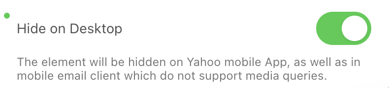
Element Hiding
The Element Hiding control allows users to hide specific elements on mobile or desktop devices. This control can be added to every basic block (e.g., “Image,” “Text,” “Button”), containers, structures, and stripes.
Use Case
When a user wants certain elements to be visible only on mobile or desktop, they can activate this control. For example, promotional banners might be hidden on mobile for a cleaner look.
How to Support
To enable this feature, ensure it's activated in the plugin configuration settings.
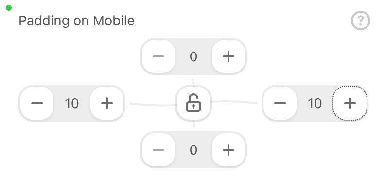
Mobile Padding
The Mobile Padding control enables users to set individual padding for structures, stripes, and basic blocks (e.g., “Image,” “Text,” “Button”) specifically for mobile devices. It appears in the Padding section when configuring these elements.
Use Case
This control is useful when users need to adjust padding for better mobile display. For instance, increasing padding around a button to make it more touch-friendly on smaller screens.
How to Support
Activate this control in the plugin configuration settings. Users can then enter specific padding values for mobile devices.
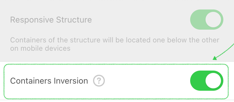
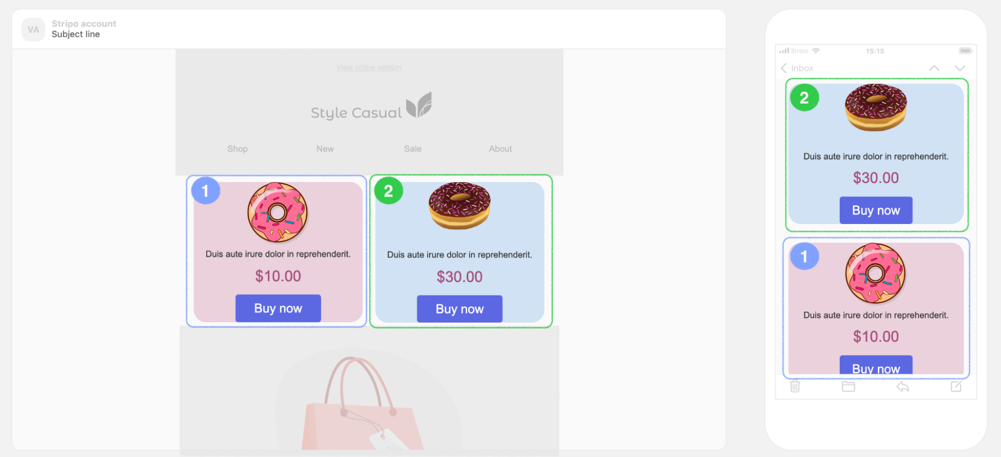
Containers Inversion on Mobile
The Containers Inversion on Mobile control allows users to specify the order in which containers appear on mobile devices. It is available for structures with exactly two containers and will only be active if the “Responsive structure” control is enabled.
Use Case
This control is useful for adjusting the visual hierarchy on mobile. For example, reversing the order of content blocks to prioritize certain information on smaller screens.
How to Support
Enable this feature in the plugin configuration settings and ensure the “Responsive structure” control is active.
Basic Block Alignment on Mobile
The Basic Block Alignment on Mobile control allows users to set different alignments for basic blocks (e.g., “Image,” “Text,” “Button”) on mobile devices. If the user switches to the mobile version of the email template while working in the editor, this control will appear on the settings panel of the selected element.
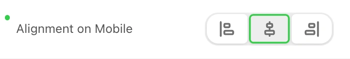
Use Case
This control is ideal for ensuring that elements are properly aligned on mobile devices, enhancing the readability and overall appearance of the email on smaller screens.
How to Support
Activate this feature in the plugin configuration settings. Users can toggle the mobile version to set different alignments for mobile.
Border of Content Part of the Stripe
The Content Border control allows users to set borders for the content area of a selected stripe. Users can configure the border type (straight, dashed, dotted), its color, and width for all sides or specific sides (e.g., only on the left or top).
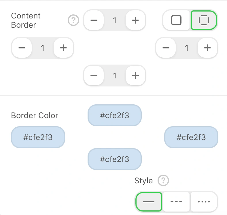
Use Case
This control is useful for enhancing the visual separation of content within a stripe, providing a more polished and defined look.
How to Support
Activate this feature in the plugin configuration settings. Users can then customize the border settings as needed.
Container Background Color
The Container Background Color control allows users to set the background color for a selected container. This control will be added to the set of container’s controls and will be visible in the settings panel when configuring the container.
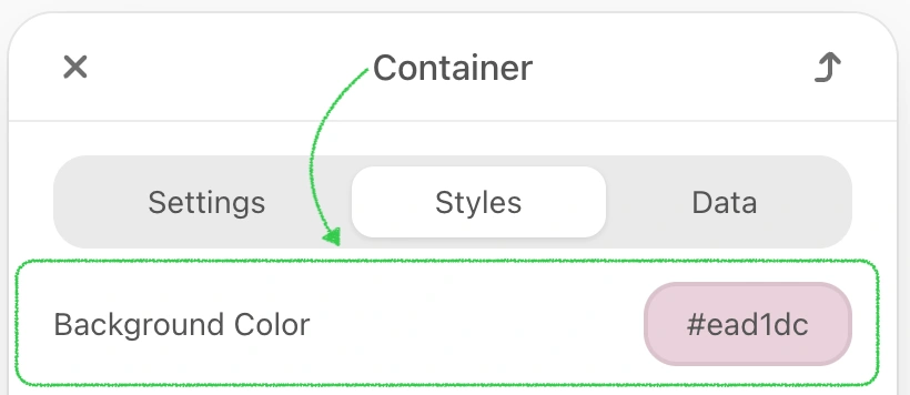
Use Case
This control is beneficial for highlighting specific containers or matching the container background with the overall design theme of the email.
How to Support
Activate this feature in the plugin configuration settings. Users can then select and apply their desired background color.
Structure Background Image
The Structure Background Image control allows users to set any image as the background for a selected structure. Users can configure the alignment and choose to repeat the image if desired. This control will be added to the set of structure’s controls and will be visible in the settings panel when configuring the structure.
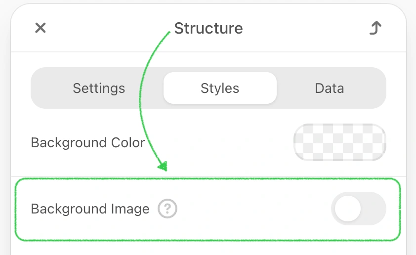
Use Case
This control is useful for adding visual interest and branding to specific sections of the email by using custom background images.
How to Support
Activate this feature in the plugin configuration settings. Users can then upload and adjust their background images.
Container Background Image
The Container Background Image control allows users to set any image as the background for a selected container. Users can configure the alignment and choose to repeat the image if desired. This control will be added to the set of container’s controls and will be visible in the settings panel when configuring the container.
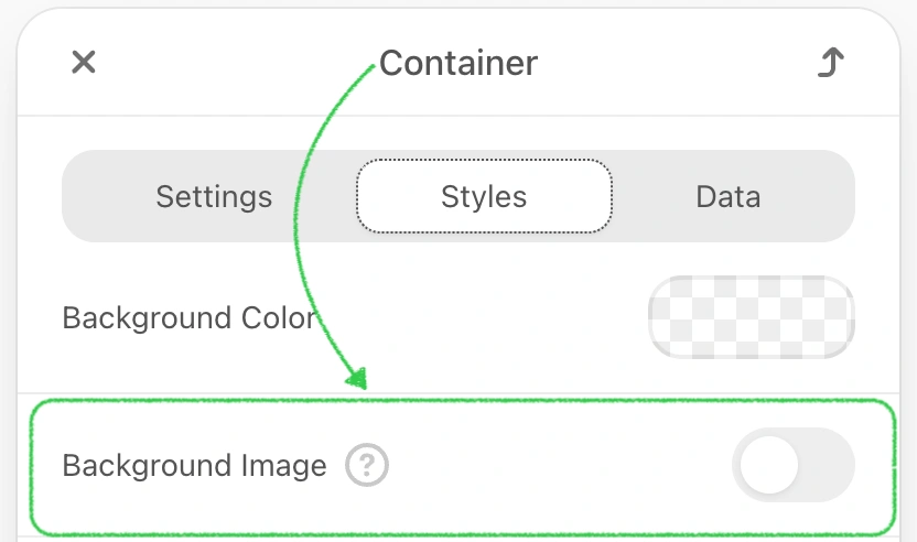
Use Case
This control is useful for adding visual interest and branding to specific containers within the email by using custom background images.
How to Support
Activate this feature in the plugin configuration settings. Users can then upload and adjust their background images.
Management of Container Numbers and Sizes in the Structure
The Management of Container Numbers and Sizes in the Structure control allows users to add or remove containers within a selected structure, with a limit of up to 11 containers per structure. It also enables adjusting the width of each container and the indents between them. This control will be added to the set of structure’s controls and will be visible in the settings Panel when configuring the structure.
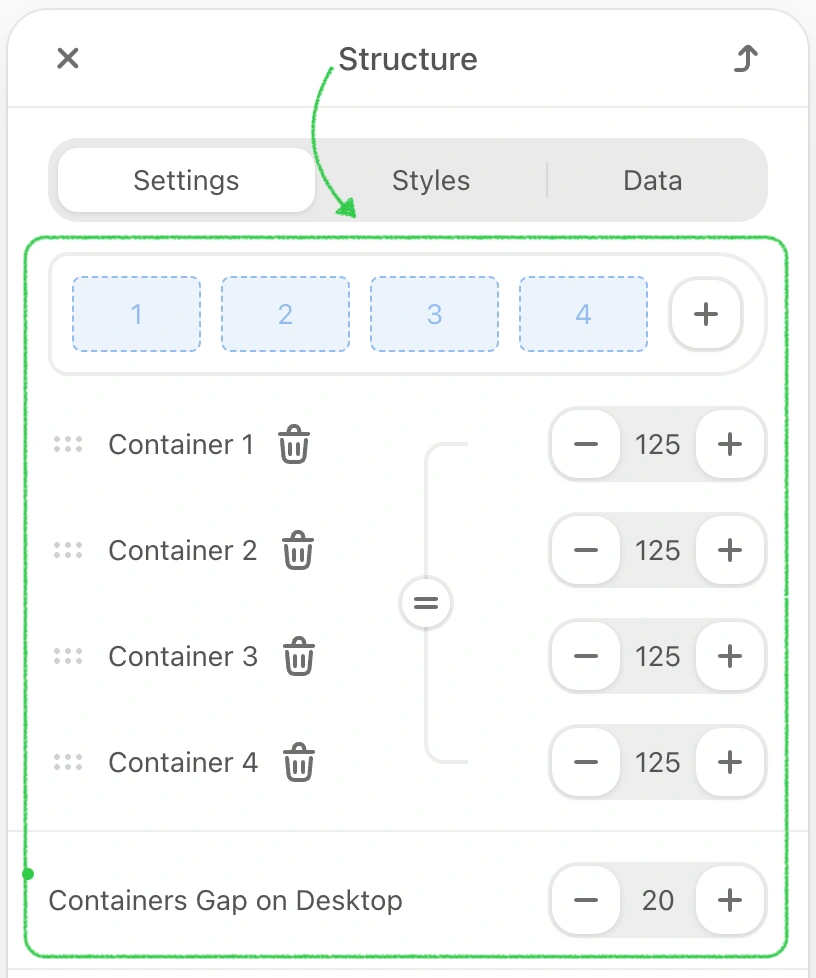
Use Case
This control is useful for customizing the layout of email sections by dynamically managing the number and size of containers within a structure.
How to Support
Activate this feature in the plugin configuration settings. Users can then add, remove, and adjust container sizes as needed.
Image Path Configuration
The Image Path Configuration control adds an extra "Link" control to the Image block (and other blocks like Menu, Banner). It allows users to specify or replace the image URL without modifying the HTML code, which is useful for hosting images externally.
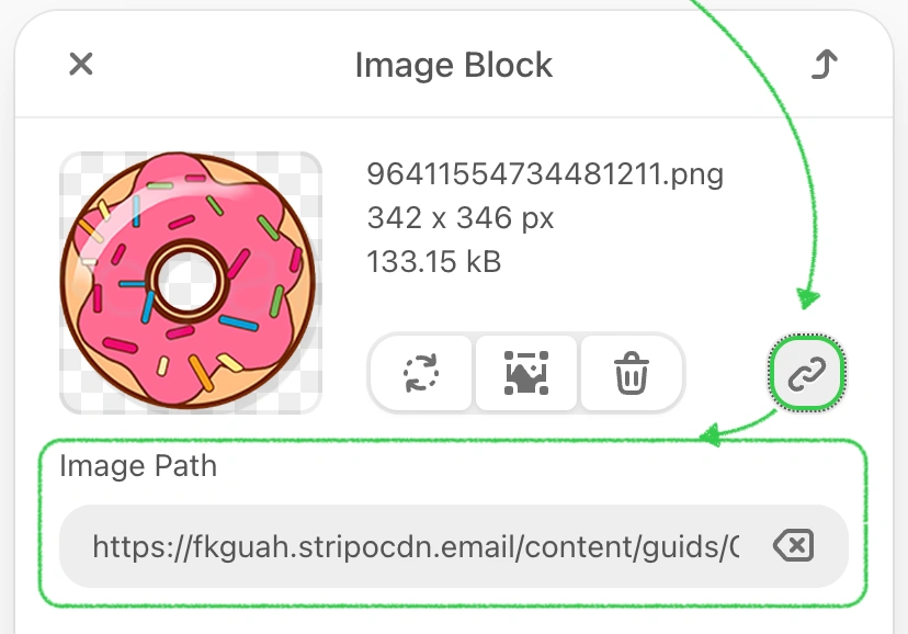
Use Case
This feature is beneficial for users who prefer to host images on their own storage or an external site rather than the default storage.
How to Support
Activate this feature in the plugin configuration settings.
Smart-elements Properties
The Smart-elements Properties control allows users to activate smart properties for containers, structures, and stripes. When this control is activated, a new "Data" tab appears above the set of controls for the selected element, enabling users to configure smart properties.
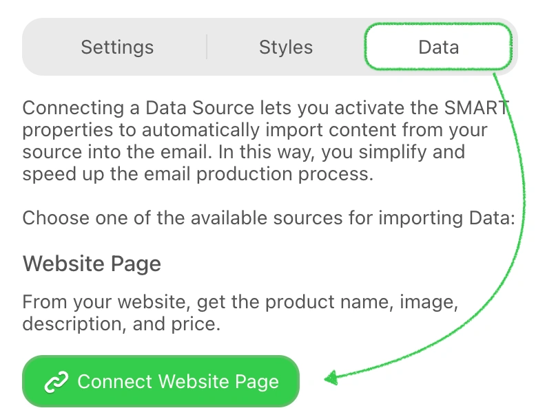
Use Case
This feature is useful for automating the creation of similar elements and reducing the time required for template design.
How to Support
Activate this feature in the plugin configuration settings. For detailed information, refer to the Smart Elements Blog Post.
AMPHTML MIME Type Support
The AMPHTML MIME Type Support control allows users to include AMP components in email templates, enabling dynamic and interactive content within emails. This feature adds a new control to the settings panel for blocks or containers, allowing users to specify whether an element should be included in the traditional HTML version, the AMP HTML version, or both.
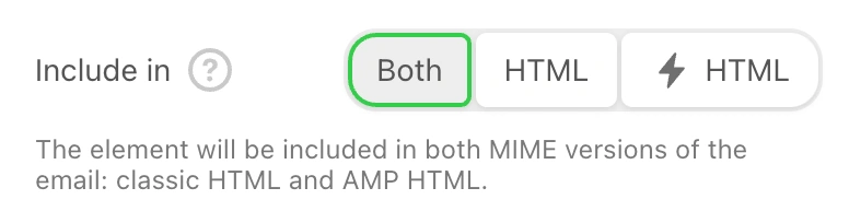
Use Case
This control is useful for creating engaging and interactive email experiences, leveraging AMP technology supported by Gmail and other clients.
How to Support
Activate this feature in the plugin configuration settings. For detailed information, refer to How to Build AMP Emails with Stripo.
Additional Note
Please be advised that if the email template has at least one element included in the AMP version (or contains custom AMP components) when you call the compileEmail JS function or the Compiling Email Templates method from your server, you will receive both the HTML version and the AMP HTML version in the response. For more details, refer to the Plugin Invocations section.
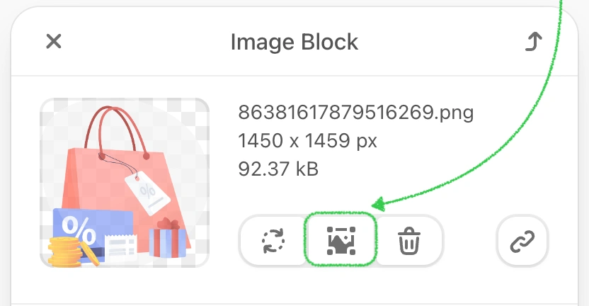
Image Editor
The Image Editor control allows users to apply various effects to images, change their sizes, shapes, and more. When activated, a new control is added to the settings panel for any selected image in the email template.
Use Case
This control is useful for editing images directly within the email editor, enabling quick adjustments and enhancements without the need for external tools.
How to Support
Enable this feature in the plugin configuration settings. Users can then access the image editor by selecting any image within their email template.
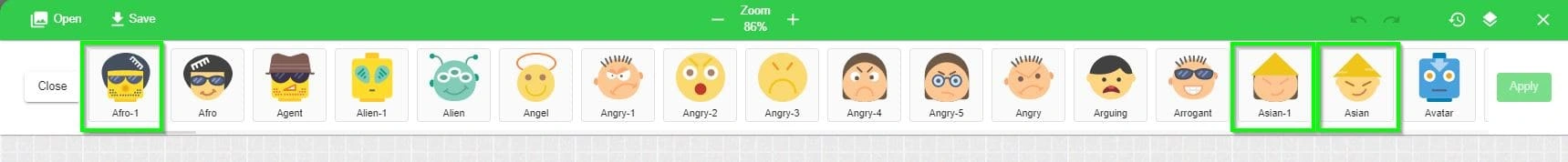
Hide Stickers in Image Editor
If you want to hide certain elements from the “Sticker” menu for your customers, add these parameters to your initialization script:
js
"imageEditor": {
    "stickers": {
        "emotIcons": {
            "exclude": [
                "asian",
                "asian-1",
                "afro"
            ]
        }
    }
}
Icons will not be visible to the end user:
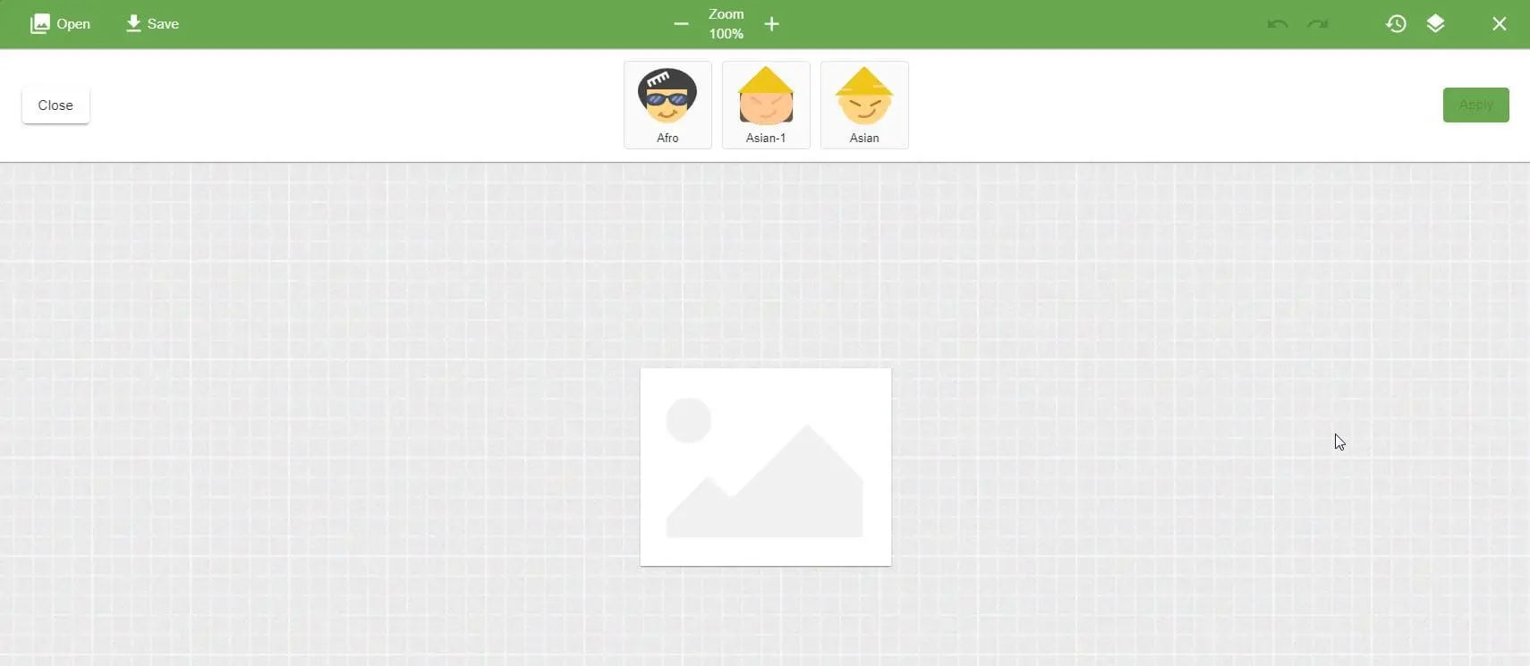
If you want to display only specific stickers, use these parameters:
js
"imageEditor": {
    "stickers": {
        "emotIcons": {
            "include": [
                "asian",
                "asian-1",
                "afro"
            ]
        }
    }
}
Your customer will see only those icons:
Prohibit Image Modification
In certain scenarios, you might want to restrict users from modifying images that come from specific domains. This can be useful for maintaining brand consistency or ensuring that certain images remain unchanged. You can achieve this by configuring the plugin to restrict image editing based on image path domains.
To prohibit image modification for images from specific domains, add the following configuration to your plugin initialization script:
js
{
    "imageEditor": {
        "restrictedUrlRegexList": [
            "domain1",
            "domain2",
            "domainN"
        ]
    }
}
Where:
domain1,domain2,domainNare the domain names for images.
You can specify one or multiple domain names, separated by commas.
As a result, when your customer clicks on an image from these domains, the icon for editing it will not appear:
Rollover Effect
The Rollover Effect, also known as mouseover, replaces an image with another when the mouse cursor hovers over it. This effect works on desktop devices only, and can be applied to any image except banners.
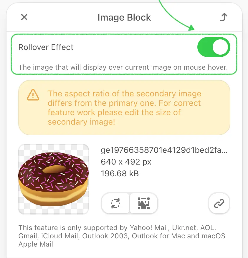
Use Case
This control is useful for creating interactive and engaging visuals within emails, enhancing user experience with dynamic image changes.
How to Support
Activate this feature in the plugin configuration settings. Users can then toggle the “Rollover effect” button in the settings panel, upload images, and configure necessary properties.