Appearance
Initialization Settings
The new Stripo editor accepts a series of configuration parameters upon initialization, allowing you to customize the editor to meet your specific needs.
A minimal configuration looks like this:
js
const stripoConfig = {
  metadata: {
    emailId: '...'
  },
  html: '...',
  css: '...',
  onTokenRefreshRequest: function(callback) {
    /*
      This function is called whenever the authentication token needs to be refreshed.
      You should send a request to your backend to obtain a new token.

      Example:
      Send a request to your backend (e.g., https://your_domain/stripo/token) to retrieve the new token.
    */
    const token = ... // Replace with the logic to obtain the token
    callback(token);  // Pass the retrieved token to the callback function
  }
}
You can configure various parameters to customize its behavior and functionality. Below is a list of possible parameters
Supported Parameters
| Parameter | Description | |||||||||||||||||||||||||||
|---|---|---|---|---|---|---|---|---|---|---|---|---|---|---|---|---|---|---|---|---|---|---|---|---|---|---|---|---|
Required parameter | Additional data to be passed during the initialization. This can include user-specific or email-specific metadata. A detailed description can be found in the metadata section | |||||||||||||||||||||||||||
Required parameter | Called by the editor to obtain an authentication token. Parameters:
| |||||||||||||||||||||||||||
Required parameter Only for emails opened for the first time in the plugin or when using the forceRecreate: true parameter | The HTML content of the email template to be loaded into the editor. | |||||||||||||||||||||||||||
| The CSS styles associated with the email template. | |||||||||||||||||||||||||||
| Defines what the editor opens for editing: | |||||||||||||||||||||||||||
| Module Editing Mode only. The ID of an existing module to open for editing. When provided, any passed | |||||||||||||||||||||||||||
| Module Editing Mode only. Required when creating a new module (i.e. when | |||||||||||||||||||||||||||
| Module Editing Mode only, optional. The storage key of the module folder the new module is saved to (the same Storage Key ID configured for module folders in your Plugin settings). If omitted, the first folder the user can write to is used. See Module Editing Mode. | |||||||||||||||||||||||||||
| Module Editing Mode only, applies when creating a new module (ignored if | |||||||||||||||||||||||||||
| Module Editing Mode only, applies when creating a new module (ignored if | |||||||||||||||||||||||||||
| Module Editing Mode only, applies when creating a new module (ignored if | |||||||||||||||||||||||||||
| Module Editing Mode only, applies when creating a new module (ignored if | |||||||||||||||||||||||||||
| The name of the email template. The email name is used to set the default value of the utm_campaign parameter. This helps in tracking the campaign associated with the email by automatically populating the utm_campaign field with the email's name. | |||||||||||||||||||||||||||
| UTM parameters for tracking purposes, such as source, medium, campaign, content, and term. A detailed description can be found in the UTM Parameters. | |||||||||||||||||||||||||||
| The locale setting for the editor, determining the language and regional settings. Supported locales: | |||||||||||||||||||||||||||
| A boolean parameter that forces the replacement of an existing email in Stripo’s database with new HTML and CSS during editor initialization. This parameter works only if no one is currently working on the email. | |||||||||||||||||||||||||||
| An array of element selectors on the page specifies which elements should ignore clicks and not reset the selected block. This means that when these elements are clicked, they won't cause any changes to the currently selected block, maintaining the user's focus and selection. Sample: [".ignore-click", "#skip-element"] | |||||||||||||||||||||||||||
| Panel positioning on the screen:
"BLOCKS_SETTINGS" | |||||||||||||||||||||||||||
| Set of methods for displaying notifications. A detailed description can be found in the notifications section. | |||||||||||||||||||||||||||
| Set of tags and attributes allowed to be pasted into a text block. This is useful for limiting unsupported markup when copying code from external sources. A detailed description can be found in the textEditorAllowedPasteContent section. | |||||||||||||||||||||||||||
| The
Sample: js Behavior:
| |||||||||||||||||||||||||||
| When `preserveAltOnImageReplace` is set to `true`, the original ALT text of an image remains in place when the image itself is swapped for a new one. This is useful for maintaining accessibility standards without requiring manual re-entry of ALT descriptions. When Sample: js Use Cases:
| |||||||||||||||||||||||||||
| The default search string for images from the "Stock" tab in the gallery (if enabled) refers to the pre-configured keyword or phrase used to automatically search for and display a set of default images when the Stock Images tab is opened. This helps to provide users with an immediate selection of relevant images without requiring them to enter a search term manually. Default value depends on current season: “spring” / “summer” / “autumn” / “winter” Sample: "summer" | |||||||||||||||||||||||||||
| The initial settings for displaying the code editor are specified in detail in the codeEditor section. These settings define how the code editor will appear and function when first opened, including aspects such as layout, themes, and default configurations. For a comprehensive explanation of these settings, refer to the codeEditor section. | |||||||||||||||||||||||||||
| The CSS selector for the element to which a click handler for opening/closing the code editor will be automatically added. Sample: ".code-editor-button" | |||||||||||||||||||||||||||
| The list of merge tags to be added to the text block editing panel is specified in the mergeTags section. These merge tags allow users to dynamically insert personalized content into emails, such as recipient names or other variables. For a comprehensive description and how to use these merge tags, refer to the mergeTags section. | |||||||||||||||||||||||||||
| The list of social networks to be added to the social networks block is specified in the socialNetworks section. This list defines which social media platforms will be available for inclusion in the block, allowing users to link to their social media profiles or share content. For a detailed description and configuration options, refer to the socialNetworks section. | |||||||||||||||||||||||||||
| The list of links to be added to the link selection component is specified in the specialLinks section. This list provides predefined links that users can easily add to their content. For a detailed description and usage instructions, refer to the specialLinks section. | |||||||||||||||||||||||||||
| An array of share-item keys that should be hidden from the Share tab in the link-type selector. Accepts a subset of the supported keys: | |||||||||||||||||||||||||||
| A boolean flag that hides the entire Share tab from the link-type selector in the Link control. When set to | |||||||||||||||||||||||||||
| Optional display settings that define how the template is rendered inside the editor (HTML/AMP mode, merge tags, visibility of conditions, etc). Learn more. | |||||||||||||||||||||||||||
| Defines the visual theme used to render the opened template inside the editor (LIGHT or DARK). This setting affects only the editor UI and does not change the email content. Learn more. | |||||||||||||||||||||||||||
| The list of fonts to be included in the Font Family control for the basic blocks is specified in the Font Management section. This list defines the available font options that users can choose from when editing text. This customization allows you to control which fonts are available to users, ensuring consistency with your design guidelines and brand standards. | |||||||||||||||||||||||||||
| This feature enables the Conditions tab in the editor, allowing users to set display conditions for their email content. This provides users with the ability to define when and how certain content should be displayed based on specified conditions. For a detailed description and configuration options, refer to the "Display Conditions" section. | |||||||||||||||||||||||||||
| The CSS selector for the element to which a click handler for undoing the last action will be automatically added. Sample: ".undo-button" | |||||||||||||||||||||||||||
| The CSS selector for the element to which a click handler for redoing the last undone action will be automatically added. Sample: ".redo-button" | |||||||||||||||||||||||||||
| The CSS selector for the element to which a click handler for switching to mobile view will be automatically added. Sample: ".mobile-view-button" | |||||||||||||||||||||||||||
| The CSS selector for the element to which a click handler for switching to desktop view will be automatically added. Sample: ".desktop-view-button" | |||||||||||||||||||||||||||
| The CSS selector for the element to which a click handler for opening/closing the version history will be automatically added. Sample: ".version-history-button" | |||||||||||||||||||||||||||
| This feature allows for overriding any translation in the editor, providing customized localization. Usage: Set the localePatch parameter during the initialization of the Stripo editor to define custom translations. Provide keys and new values for the language you need.Updated Format (Recommended): js Deprecated Format (Deprecated): js ⚠️ Note: The previous format is now deprecated but remains functional for backward compatibility. It is recommended to use the new format to ensure future compatibility. For a list of all editor phrases, refer to the editor phrases JSON file. | |||||||||||||||||||||||||||
| This feature allows you to define predefined values for menu items, including the number and titles of the items. Usage: Set the defaultMenuItems parameter during the initialization of the Stripo editor to specify default menu items with their names and links. These predefined values will appear once the Menu block is dropped into the email.Sample: js | |||||||||||||||||||||||||||
| The syncModulesEnabled parameter controls the synchronization of modules.Usage: Include the syncModulesEnabled parameter with true value during the initialization of the plugin to enable module synchronization. This ensures that any changes made to modules are automatically synchronized across different instances.Sample: js | |||||||||||||||||||||||||||
| This feature provides the opportunity to disable the responsive view for your email template. Usage: Set the disableAdaptDesign parameter to true during the initialization of the Stripo editor to disable the responsive view for the email template. When enabled, the “Responsive design” control within the General Styles tab of the editor will be deactivated by default.Sample: js | |||||||||||||||||||||||||||
| This parameter allows you to control whether cursors of other users are displayed during real-time co-editing. By default, when multiple users edit the same email simultaneously, the editor shows colored cursors indicating the positions of other participants. While this can be helpful, in some use cases it may create visual noise and distract users. Usage: Set the disableRemoteCursors parameter to true during the initialization of the Stripo editor to hide cursors of other users in co-editing mode.When enabled, only the current user’s cursor will be visible in the editor. Other users can still edit the email simultaneously — this setting affects only the visual representation, not the collaboration functionality itself. Sample: js false or not specified, the editor uses the default behavior and displays cursors of other users during co-editing sessions. | |||||||||||||||||||||||||||
| This parameter controls the ability to move blocks inside the structure. When set to true, users can drag and drop blocks within the structure, allowing them to rearrange content more easily.Usage: Set the moveBlockAvailability parameter to true during the initialization of the Stripo editor to enable the drag-and-drop functionality for blocks. This allows users to move blocks within the structure using a mouse, making it easy to rearrange content by simply dragging and dropping blocks to the desired location.Sample: js true value will enable the functionality to move blocks within the editor. Enabling block movement enhances the user experience by providing a flexible and intuitive way to organize content within the editor. | |||||||||||||||||||||||||||
| Set to true to enable the native spellchecker for the users in the editor. In this case, text with typos will be underlined and, by right-clicking, will appear in the context menu of suggestions for correction. Works in beta mode. | |||||||||||||||||||||||||||
| Enables text emojis in text blocks (e.g., 🙂 🚀 ❤️). Set to false to disable. Default: true. | |||||||||||||||||||||||||||
| This parameter enables the inclusion of a Content Security Policy (CSP) meta tag in the edited document, helping to protect against certain types of attacks, such as Cross-Site Scripting (XSS). When set to true, the editor will automatically add a CSP tag that restricts the sources from which content can be loaded, enhancing the security of the emails being edited. Usage: Set the enableXSSSecurity parameter to true during the initialization of the Stripo editor to apply the Content Security Policy. This helps prevent unauthorized scripts and other potentially malicious content from being executed within the email.Sample: js | |||||||||||||||||||||||||||
| This feature specifies a list of domains that are allowed to be sources for script tags within the editor. Usage: Set the allowedScriptSourceDomains parameter during the initialization of the Stripo editor to define which domains are permitted for script tags.The value must be provided as a single string, where domains are separated by spaces. This allows you to control which external scripts can be executed inside the editor environment. Sample: js
| |||||||||||||||||||||||||||
| This feature enables the "Outlook Support" control for the "Button" block by default. Usage: Set the supportOutlookButtonsByDefault parameter to true during the initialization of the Stripo editor to ensure that buttons are automatically optimized for Outlook. This is particularly useful for ensuring that buttons render correctly in Outlook email clients.Sample: js | |||||||||||||||||||||||||||
| This feature controls automatic font size optimization for button elements in Outlook. Usage: Sample: js How It Works:
This logic ensures that button text renders correctly in Outlook without overflow or unwanted wrapping. If this automatic optimization doesn't match your design preferences or causes unexpected font sizing, you can disable it by setting the parameter to false to use standard, unmodified font sizes. Details: | |||||||||||||||||||||||||||
Deprecated | The shouldBeSavedToLibrary parameter controls the 'save as module' functionality for individual containers, structures, or stripes within the editor. This can be set to a boolean value or a function to determine the availability of the feature based on specific conditions.Usage: To completely disable the 'save as module' functionality for all containers, structures, or stripes, set shouldBeSavedToLibrary to a function that always returns falsejs Sample: Provide a function that returns a boolean value to conditionally enable or disable the 'save as module' functionality based on the content of the module. js true to enable the 'save as module' functionality or false to disable it.This allows for greater flexibility in controlling when and how modules can be saved to the library, ensuring that only appropriate content is preserved as reusable modules. | |||||||||||||||||||||||||||
| The validateModuleSave parameter allows you to define a callback function that validates whether a module can be saved or updated in the editor.This function is called whenever a user clicks the Save or Update button in the module editor. It receives full information about the module — such as its id, name, html, type, and isSynced — and must return a response that determines whether saving is allowed.Usage: To connect a validation function, add the validateModuleSave parameter during plugin initialization: js The function receives a single argument data, which is an object of type ModuleSaveValidationData containing all available module details:
| |||||||||||||||||||||||||||
| The validateModuleDelete parameter allows you to define a callback function that validates whether a module can be deleted from the library.This function is called whenever a user confirms the deletion of a module in the confirmation pop-up. It receives full information about the module — such as its id, name, html, type, and isSynced — and must return a response that determines whether the module can be deleted.Usage: To connect a validation function, add the validateModuleDelete parameter during plugin initialization: js The function receives a single argument data, which is an object of type ModuleDeleteValidationData containing all available module details:
The function must return an object with the following properties:
| |||||||||||||||||||||||||||
| This parameter lets you decide, at run‑time, whether the Image path field for a particular picture should be hidden (and therefore left unchanged) in the Image Gallery. It is useful when your application wants to keep certain images hosted at a fixed external URL and does not want end‑users to move or re‑upload them to Plugin storage. shouldHideImagePath accepts a function that receives the image URL (string) and returns a boolean:
Add the parameter to your initEditor options and supply your own predicate function. js js | |||||||||||||||||||||||||||
| The disableImageUnadapt parameter defines whether users are allowed to turn off the “Responsive image” option when editing an image, video, or banner block.By default, this parameter is set to false, meaning users can manually enable or disable the responsive behavior. When disableImageUnadapt is set to true, the responsive mode will be automatically enabled and locked if the image’s total width (including margins, paddings, and borders) is more than 320 px. In this case, the Responsive image toggle remains active but disabled, and hovering over it will display a tooltip message: “This setting is automatically enabled due to the image width and cannot be disabled for proper mobile display.” Usage: Include the disableImageUnadapt parameter during plugin initialization if you want to enforce automatic responsive behavior for large images.Sample: js | |||||||||||||||||||||||||||
| The youtubeApiKey parameter connects with YouTube to fetch video links and generate screenshots for the “Video” block. This key is necessary for accessing YouTube's API and ensuring proper functionality of video-related features within the plugin.Usage: Include the youtubeApiKey parameter during the initialization of the plugin. This parameter should contain your YouTube API key, which you can obtain by following the instructions in the “How to Get a YouTube API Key” article.Sample: js | |||||||||||||||||||||||||||
| This parameter enables the Keep Module Styles control in the module saving panel of the editor. When enabled, the control allows users to preserve the visual appearance of a module by inlining global appearance styles from the email message into the module’s HTML when the module is saved. This helps ensure that the module keeps its original design when reused in other email messages. Usage: Implement the keepModuleStylesEnabled parameter in your initialization script to enable the Keep Module Styles option in the module saving panel.When this parameter is set to true, users will see the toggle when saving a module and can choose whether the module styles should be preserved. Sample: js In this configuration, the Keep Module Styles control becomes available in the module saving panel, allowing users to inline appearance styles into the module HTML when saving the module. | |||||||||||||||||||||||||||
| The modulesDisabled parameter is used to control whether users can manage the modules within the settings panel. When set to true, users will not have the ability to see and manage modules, including the ability to save new ones.Usage: Include the modulesDisabled parameter during the initialization of the plugin. This parameter should be set to true to disable module management for users. Sample: js If this parameter is not specified, users will have the default ability to manage modules. Note that this parameter will be ignored if you deactivate Modules within the plugin configuration page. Disabling module management can be useful for maintaining control over the modules and ensuring a consistent user experience. | |||||||||||||||||||||||||||
| The By default, this field is hidden because it is primarily intended for advanced scenarios such as internal workflows, integrations, or companion applications that require access to the module identifier. When enabled, the module uid becomes visible in the module management interface, allowing users to view and reference it when saving, editing, or browsing modules in the library. Usage: Sample: js If this parameter is not specified or set to When
| |||||||||||||||||||||||||||
Deprecated | This feature allows the block to be automatically selected after being dragged and dropped from the settings panel. Usage: Set the selectBlockAfterDropFromSettingsPanel parameter to true during the initialization of the Stripo editor to enable this functionality. This improves the workflow by immediately selecting the newly added block for further customization.Sample: js | |||||||||||||||||||||||||||
| This feature allows any element dropped into the editor — whether it is a block, extension, stripe, structure, or module — to be automatically selected right after being placed in the editor. js With this parameter enabled, as soon as the user drags and drops any element into the email layout, that element becomes instantly selected in the editor for immediate customization. This improves workflow consistency by eliminating the need to manually click the dropped element before editing it — useful for all element types, including blocks, structures, stripes, modules, and extensions. | |||||||||||||||||||||||||||
| This parameter specifies an array of category IDs that should be excluded from the modules list within the editor. By providing a list of IDs, you can control which categories of modules are hidden from users, ensuring that only relevant modules are available for selection. Usage: Implement the modulesExcludedCategories parameter in your initialization script to exclude specific categories of modules from the editor's module library. This can be useful for tailoring the editor interface to specific use cases or for simplifying the module selection process by hiding unnecessary categories.Sample: js | |||||||||||||||||||||||||||
| This parameter enables or disables the message settings within the editor. When set to true, users will have access to additional message-related settings, such as title, preheader, UTM parameters, and more. This can be particularly useful if you want to manage these settings directly within the editor. However, if your application already provides these controls in its UI, it may be beneficial to hide them in the editor by setting this parameter to false.Usage: Implement the messageSettingsEnabled parameter in your initialization script to toggle the availability of message settings in the editor. This provides flexibility in managing how message-related configurations are handled, either within the editor or through the application's own UI.Sample: js true, the message settings panel will be enabled, allowing users to configure options like title, preheader, and UTM parameters. If set to false, these settings will be hidden, which is useful if they are already controlled by the application's UI. | |||||||||||||||||||||||||||
| Defines the date and time display format for the Timer block in the editor. Supported Date Formats
💡 Month and weekday names are displayed according to the editor’s selected locale. Usage: js Example: js This configuration will render a date such as 12/31/2025 in the Timer block. Notes
| |||||||||||||||||||||||||||
| The displayTitle parameter controls the visibility of the Subject / Title field in the Message Settings tab. By default, the field is shown.When set to false, the control is hidden in the UI.Usage: Include the displayTitle parameter during initialization to hide the Title control if you manage the subject line in your own interface.Sample: js | |||||||||||||||||||||||||||
| The displayHiddenPreheader parameter controls the visibility of the Hidden Preheader field in the Message Settings tab. It is visible by default.When set to false, the control is hidden in the UI.Usage: Include the displayHiddenPreheader parameter during initialization to remove the Preheader control from the editor UI.Sample: js | |||||||||||||||||||||||||||
| The displayUTM parameter controls the visibility of the UTM Parameters control in the Message Settings tab. It is visible by default.When set to false, the control is hidden in the UI.Usage: Include the displayUTM parameter during initialization if you manage link tracking outside of the plugin.Sample: js | |||||||||||||||||||||||||||
| The displayGmailAnnotations parameter controls the visibility of the Email annotations for Gmail control in the Message Settings tab. It is visible by default.When set to false, this control is hidden and cannot be edited through the UI.Usage: Include the displayGmailAnnotations parameter during initialization if Gmail Annotations are managed externally or not needed.Sample: js | |||||||||||||||||||||||||||
| This parameter allows you to add custom attributes to the iframe container that displays the preview of the opened email. This can be useful for applying specific configurations or styling that is required for your use cases.Usage: Implement the previewIframeAttributes parameter in your initialization script to define custom attributes for the iframe used in the email preview. You can specify any number of attributes, each represented as key-value pairs.Sample: js iframe will include a foo attribute with the value "bar" and an attribute withoutValue without any assigned value. | |||||||||||||||||||||||||||
| This parameter lets you inject a block of custom CSS into the editor’s “view mode” as soon as the Plugin is initialised It is useful for brand‑specific tweaks or quick visual debugging without modifying the underlying HTML. customViewStyles accepts a string that contains one or more CSS rules. The rules are added to the editor inside a dedicated <style></style> tag and apply immediately to the canvasRuntime control – After the editor is loaded, you can enable or disable the injected styles on demand as described in the Actions API: js Usage: js Sample: js | |||||||||||||||||||||||||||
| This parameter allows you to define an array of brand colors that will appear in the color picker component of the editor. These colors help represent the brand's identity and provide users with a consistent palette to choose from when customizing their emails. This feature is particularly useful for maintaining brand consistency across marketing materials. Usage: Set the brandColorPalette parameter during the initialization of the editor to specify a list of named or unnamed brand colors. Each color should be represented by an object containing a required value (hex code or valid CSS color) and an optional name.Sample: js | |||||||||||||||||||||||||||
| This parameter lets you control which basic blocks are visible in the editor at run‑time. Passing a baseBlocks object during plugin initialization overrides the block visibility that may already be stored in the server‑side Plugin Configuration.The parameter is honoured only on Business and Enterprise plans; on other plans it is ignored. Usage: Add the baseBlocks object to the initialization options.Each key toggles a core Stripo block. Set the value to true to show the block, or false to hide it.Sample: js true, regardless of what is set in the back‑end configuration.If a key is omitted, the corresponding block follows the value defined in the Plugin Configuration panel. | |||||||||||||||||||||||||||
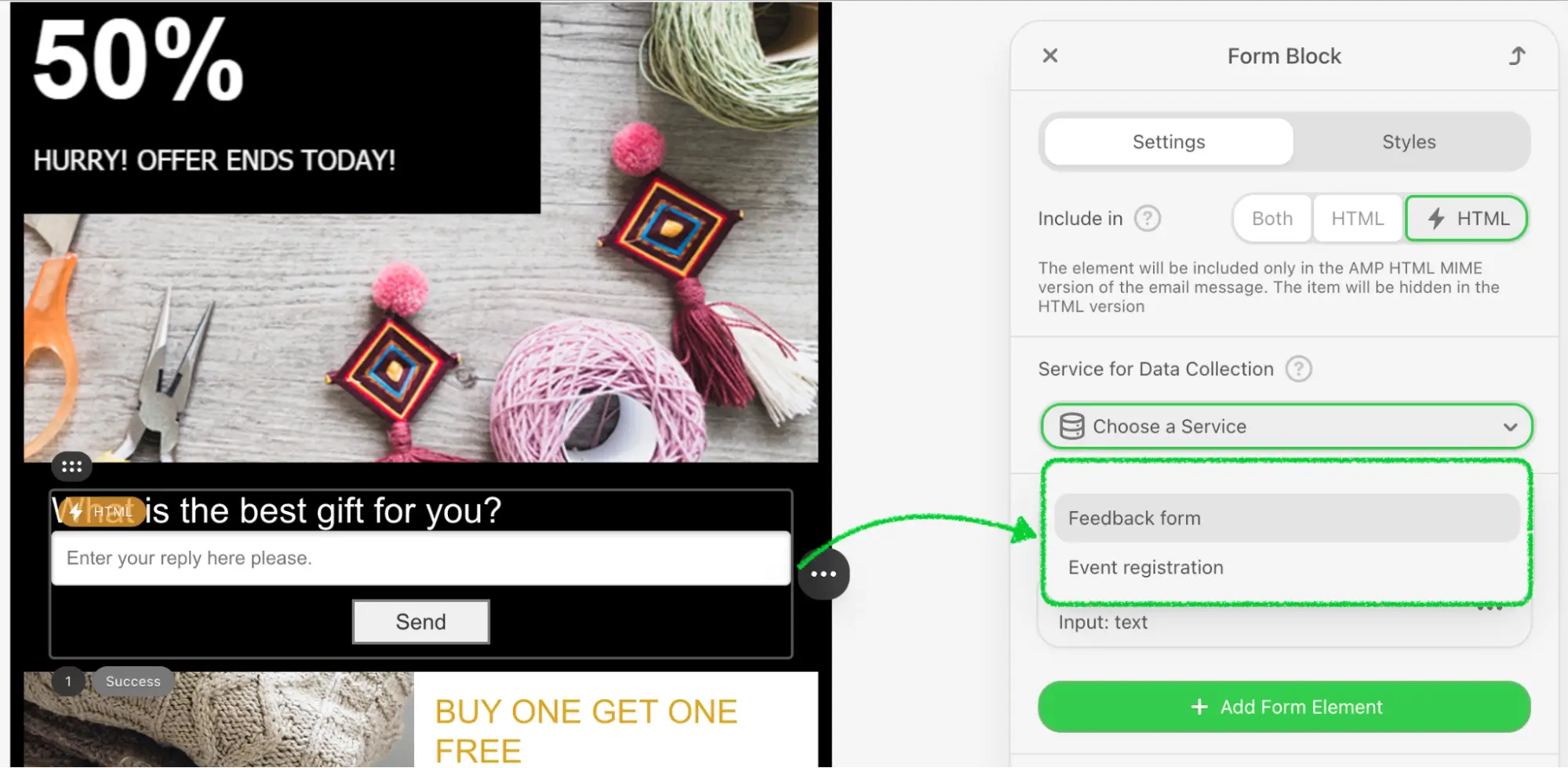
| Defines a list of predefined backend endpoints available for AMP Form blocks in the editor. Each entry includes a | |||||||||||||||||||||||||||
| Controls whether users can manually add their own external AMP Form endpoints. When set to | |||||||||||||||||||||||||||
| This callback allows your application to stay in sync with the current display condition states configured in the editor. The editor will invoke this callback in the following cases:
js
| |||||||||||||||||||||||||||
| This optional callback is triggered when the user clicks the "Restore" button in the banner displayed above the editor settings panel (see more about View Options). It should reset the editor view back to the default display mode by removing previously stored options. Sample: js | |||||||||||||||||||||||||||
| The onSettingsPanelBlockSorting function is used to order blocks in the settings panel. This function allows you to customize the sorting of blocks to match your specific requirements for block display order.Usage: Define the onSettingsPanelBlockSorting function during the initialization of the plugin. This function should take an array of block names as an argument and return the sorted array.Sample: js This callback ensures that your blocks in the settings panel are sorted according to your custom logic, improving the overall organization and user experience of the settings panel. | |||||||||||||||||||||||||||
| This parameter allows you to define a function that will be triggered whenever the email preheader is changed within the editor. The function you provide can include custom logic that responds to these changes, enabling you to perform additional actions or updates based on the new preheader value. Usage: Set the onPreheaderChanged parameter to a function during the initialization of the Stripo editor. This function will be called whenever the preheader of the email is modified by the user, allowing you to implement custom behaviors in response to this event.Sample: js | |||||||||||||||||||||||||||
| The onRtlSet function allows you to determine whether a customer has activated the RTL (Right-to-Left) function. This function can be used to execute custom code or logic based on the RTL setting.Usage: Define the onRtlSet function during the initialization of the plugin. This function will be called with a boolean value indicating whether RTL has been set.Sample: js | |||||||||||||||||||||||||||
| The onTemplateLoaded function is called by the editor after the email has been rendered and the editor is ready to work. This function helps to notify your application that the email template is fully rendered and ready for interaction. Usage: Define the onTemplateLoaded function during the initialization of the Stripo editor. This function can be used to execute any custom code or logic you need once the email is fully loaded and ready for editing.Sample: js | |||||||||||||||||||||||||||
| This parameter allows you to define a function that will be triggered whenever the email title is changed within the editor. The function you provide can include custom logic that responds to these changes, enabling you to perform additional actions or updates based on the new title value. Usage: Set the onTitleChanged parameter to a function during the initialization of the Stripo editor. This function will be called whenever the title of the email is modified by the user, allowing you to implement custom behaviors in response to this event.Sample: js Passing a function to this parameter ensures that your custom logic is executed each time the email title is updated, providing real-time feedback and handling within the editor. | |||||||||||||||||||||||||||
| The onCodeEditorVisibilityChanged function is called by the editor when the code editor is opened or closed. This function helps to notify your application about changes in the visibility of the code editor, allowing you to handle these changes appropriately.Parameters:
Usage: Define the onCodeEditorVisibilityChanged function during the initialization of the Stripo editor. This function can be used to execute any custom code or logic you need when the code editor's visibility changes.Sample: js | |||||||||||||||||||||||||||
| When provided, the Parameters:
Usage: Sample: js This callback ensures that your application can provide users with a seamless font connection experience directly from the font selector. If this parameter is not provided, the "Connect another font" option does not appear in the dropdown (unless activated via the | |||||||||||||||||||||||||||
| The onSettingsPanelPositionChanged function is called when changing the settings panel position. This function helps to notify your application about changes in the position of the settings panel, allowing you to adjust your UI or perform other necessary actions.Parameters:
Usage: Define the onSettingsPanelPositionChanged function during the initialization of the Stripo editor. This function can be used to execute any custom code or logic you need when the settings panel position changes.Sample: js | |||||||||||||||||||||||||||
| The onVersionHistoryVisibilityChanged function is called by the editor when the version history is opened or closed. This function helps to notify your application about changes in the visibility of the version history feature.Parameters:
Usage: Define the onVersionHistoryVisibilityChanged function during the initialization of the Stripo editor. This function can be used to execute any custom code or logic you need when the visibility of the version history changes.Sample: js | |||||||||||||||||||||||||||
| The onVersionHistoryReadAccessChanged function is called by the editor when changing the read access to the version history. This function helps to notify your application about changes in permissions related to the version history feature.Parameters:
Usage: Define the onVersionHistoryReadAccessChanged function during the initialization of the Stripo editor. This function can be used to execute any custom code or logic you need when the read access to the version history changes.Sample: js | |||||||||||||||||||||||||||
| The onSaveStarted function is called when the save procedure starts. This function helps to notify your application that the saving process has begun.Usage: Define the onSaveStarted function during the initialization of the Stripo editor. This function can be used to execute any custom code or logic you need when the save process initiates, such as showing a loading indicator or logging the event.Sample: js | |||||||||||||||||||||||||||
| The onSaveCompleted function is called when the save procedure is completed. This function helps to notify your application that the saving process has finished, and it provides information about any errors that may have occurred.Parameters:
Usage: Define the onSaveCompleted function during the initialization of the Stripo editor. This function can be used to execute any custom code or logic you need once the save process is complete, such as hiding a loading indicator, showing a success message, or handling errors.Sample: js | |||||||||||||||||||||||||||
| The onEditorVisualModeChanged function is called when changing the visual mode of the editor. This function helps to notify your application whenever the visual mode of the editor changes, allowing you to perform any necessary updates based on the current state.Parameters:
Usage: Define the onEditorVisualModeChanged function during the initialization of the Stripo editor. This function can be used to execute any custom code or logic you need when the visual mode changes, such as adjusting the UI or logging the event.Sample: js | |||||||||||||||||||||||||||
| The onUsersInfoRequest function is called by the editor when it needs to update user details for comments stored in the email. This happens automatically when a template with existing comments is opened, ensuring that author names and avatars remain accurate even if users have since changed their profile information.This callback allows your backend to return up-to-date user information for a given list of user IDs, so the Plugin can refresh comment metadata dynamically. Parameters:
Usage: Define the onUsersInfoRequest function during the initialization of the Stripo editor. When the editor detects comments containing user references, it will call this function to obtain the latest user data from your systemSample: js | |||||||||||||||||||||||||||
| The onUsersInfoSearchRequest function enables the @mention feature inside the comment editor. When a user types the “@” symbol and starts entering a name, the Plugin calls this function to search for matching users who can be mentioned in the discussion.If the function is not defined, the tagging feature is disabled — typing “@” will not trigger any search or suggestions. Parameters:
Usage: Define the onUsersInfoSearchRequest function during initialization. The Plugin will automatically trigger it every time the user starts typing a mention to show relevant suggestions.Sample: js | |||||||||||||||||||||||||||
| The onUserListChange function is called when any user connects or disconnects from the editing session. This function helps to notify your application about changes in the user list, allowing you to manage user presence and interactions in real-time.Parameters:
Usage: Define the onUserListChange function during the initialization of the Stripo editor. This function can be used to execute any custom code or logic you need when the user list changes, such as updating the UI to reflect the current users in the session.Sample: js | |||||||||||||||||||||||||||
| The onEvent function is called after a corresponding event occurs in the editor. This function helps to notify your application about various events, allowing you to handle them accordingly.Parameters:
Usage: Define the onEvent function during the initialization of the Stripo editor. This function can be used to execute any custom code or logic you need when specific events occur in the editor. For a detailed description, refer to the onEvent section.Sample: js | |||||||||||||||||||||||||||
| This parameter is a callback function that is triggered when there are unsaved changes in the email. It allows you to perform specific actions whenever the data within the editor changes but hasn't yet been saved. This parameter is particularly relevant when autosaving is deactivated, as it provides a way to monitor changes that require manual saving. Usage: Implement the onDataChanged parameter in your initialization script to monitor changes to the email data. This can be useful for enabling save buttons, alerting users to unsaved changes, or triggering manual save functionalities when autosaving is turned off.Sample: js | |||||||||||||||||||||||||||
| The onElementCopy function is called during block duplication. This function allows you to modify the copied block before it is inserted into the template, enabling you to perform custom transformations such as removing ID attributes, adding markers, or updating references to maintain data consistency.Parameters:
Usage: Define the onElementCopy function during the initialization of the Stripo editor. This function can be used to execute any custom code or logic you need when a block is duplicated. The modifier object provides access to the copied element and methods to modify it. Note that you do not need to call the apply() method at the end of your modifications, as it will be called automatically within the copy action.Sample: js | |||||||||||||||||||||||||||
| The Parameters:
Note: You do not need to call Difference from
Sample: js | |||||||||||||||||||||||||||
| The onModuleAdd function is called whenever a module is inserted into the email template via drag-and-drop or when an existing module is duplicated using the "Copy" context action. This function allows you to modify the module before it is inserted into the template, enabling you to perform custom transformations such as generating unique identifiers, updating references, or adding custom attributes to maintain data consistency.Parameters:
Usage: Define the onModuleAdd function during the initialization of the Stripo editor. This function can be used to execute any custom code or logic you need when a module is added or copied. The modifier object provides access to the module's root node and methods to modify it. Note that you do not need to call the apply() method at the end of your modifications, as it will be called automatically, and your changes will be merged with the main insertion/copy patch.Sample: js | |||||||||||||||||||||||||||
| The Without This means the user must press Undo twice to fully revert the operation. Parameters:
Usage: Backward compatibility: Sample: js | |||||||||||||||||||||||||||
| The onBeforeModuleSave function is called before a module is saved or updated in the Modules Library. This function allows you to modify the module content directly in the editor just before it is persisted, ensuring that the final saved version always reflects the latest state of the template. This callback is useful when you need to apply transformations to the module HTML, inject additional attributes, normalize content, or synchronize it with external systems before saving. Parameters:
Usage: This function is triggered when a user clicks:
After the callback resolves:
Sample: js | |||||||||||||||||||||||||||
| The Function Signature js Parameters:
Use Cases: The callback allows you to execute custom logic to enrich image elements with additional metadata before they are permanently added to the template. Sample: js | |||||||||||||||||||||||||||
| The Parameters:
Usage: Sample: js This callback ensures that your application stays synchronized with user interactions in the image gallery, enabling you to persist user preferences, update UI controls, or log analytics data whenever the gallery view mode is changed. |
Metadata Information
The metadata parameter is mandatory because it is used to identify the email. Additionally, you can specify the username and avatar, which will be used in the version history and during simultaneous editing. You can pass any information needed by the editor, and all these data will be sent to your server in the information provided to the permission checker API.
This is also the right place to define the values for any variables needed during initialization. For example, if a customer configures the folder path for images or modules and needs to operate with specific variables, the editor needs to know the values for those variables. This can be accomplished by including them in the metadata parameter.
| Parameter | Description | Required |
|---|---|---|
emailId | Email identifier | Yes |
username | Username. Used for version history and simultaneous editing | No |
email | User email | No |
avatarUrl | URL to the user's avatar image. Used for visualization during simultaneous editing. | No |
customVar1 | Custom variable 1 | No |
customVar2 | Custom variable 2 | No |
Example:
js
{
...,
"metadata": {
"emailId": "123",
"username": "John Smith",
"email": "john.smith@stripo.email",
"avatarUrl": "https://yourdomail.com/avatars/avatar_1.png",
"customVar1": "12345",
"customVar2": "12345"
},
...
}Use Cases
Version History and Simultaneous Editing:
- The
usernameandavatarUrlhelp in identifying users in the version history and during simultaneous editing.
- The
Folder Paths:
- If the customer configures a folder path for storing images or modules, the
customvariables can be included in the metadata. This allows the editor to know where to save or retrieve these resources.
- If the customer configures a folder path for storing images or modules, the
Custom Variables:
- Any other custom variables required by the editor can be included in the
metadataparameter. For instance, if certain configuration settings or values need to be dynamically provided during initialization, they can be passed here.
- Any other custom variables required by the editor can be included in the
By defining these values during initialization, the editor is equipped with all necessary information to function correctly and efficiently, tailored to the customer's specific setup and requirements.
Please be advised, all the data from this parameter will be included into the UIData parameter within the Email Resources Permissions API.
Notification Settings
The notifications parameter is used to display different types of messages on the application's UI.
For example,
| Parameter | Description |
|---|---|
info | Used to display informational messages. Parameters:
|
error | |
success | |
warn | |
loader | |
hide | Used to close a message |
Message parameters:
| Parameter | Description |
|---|---|
closeable | True if the message can be closed |
autoClose | True if the message can be automatically closed after a certain period |
customClasses | CSS classes to be added to the message's markup |
action | Adds an action button to the message. Parameters:
|
Example:
js
{
...,
"notifications": {
"info": function(message, id, params) { /* Show info message */ },
"error": function(message, id, params) { /* Show error message */ },
"success": function(message, id, params) { /* Show success message */ },
"warn": function(message, id, params) { /* Show warn message */ },
"loader": function(message, id, params) { /* Show loader message */ },
"hide": function(id) { /* Hide message by id */ },
},
...
}Pasting Content Restrictions
The textEditorAllowedPasteContent parameter allows you to restrict the tags and attributes that can be pasted from the clipboard into a text block. This is particularly useful in scenarios where maintaining a consistent and secure format for the text blocks is critical.
Use Case:
Imagine you are developing an email template editor for a marketing platform. To ensure that the pasted content adheres to your formatting standards and to prevent any potential security risks from unwanted HTML tags or attributes, you can use the textEditorAllowedPasteContent option. By defining which HTML tags and attributes are allowed, you can ensure that only specific elements and attributes are included when users paste content into the text editor. Any tags and attributes not specified in the allowed list will be ignored, and the text will be inserted as plain text.
For example, you may want to allow basic formatting tags like <p>, <a>, <strong>, and <em> but restrict other tags that could disrupt the email's design or introduce security vulnerabilities. Additionally, you can specify which attributes are allowed for certain tags, such as allowing only href and title attributes for <a> tags, and src and alt attributes for <img> tags. Other tags and attributes will be stripped out, ensuring that only clean and secure content is inserted.
| Parameter | Description |
|---|---|
tags | An array of tags that are allowed to be pasted |
attributes | An array of attributes that are allowed to be pasted |
js
{
...,
"textEditorAllowedPasteContent": {
"tags": ['b', 'strong', 'i', 'a'],
"attributes": ['href', 'target']
},
...
}In this example, only the specified tags and attributes will be permitted when pasting the coppied content into the text block. This ensures that the content remains consistent with the desired format and helps prevent any unintended HTML or security issues.
Code Editor Settings
This parameter is used to configure the default display state of the code editor.
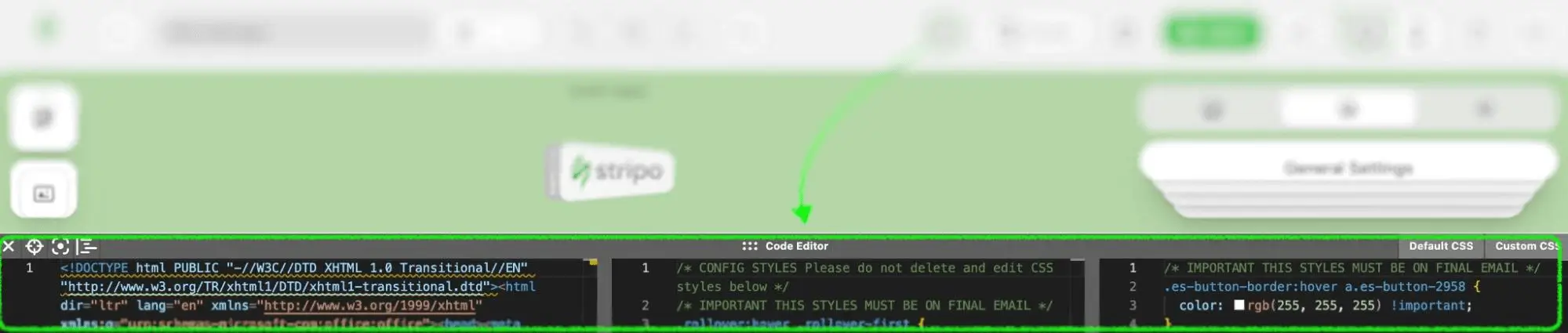
| Parameter | Description |
|---|---|
isOpen | True — if the code editor is open by default |
isDefaultCSSOpen | True — if the default CSS section is open by default |
isCustomCSSOpen | True — if the custom CSS section is open by default |
containerHeight | Default height of the code editor in pixels |
defaultCSSPanelWidth | Width of the default CSS section by default in pixels |
customCSSPanelWidth | Width of the custom CSS section by default in pixels |
Example:
js
{
...,
"codeEditor": {
"isOpen": false,
"isDefaultCSSOpen":true,
"isCustomCSSOpen": false,
"containerHeight": 80,
"defaultCSSPanelWidth": 100,
"customCSSPanelWidth": 100
},
...
}In this example, the code editor is initially closed (isOpen: false), the default CSS section is open (isDefaultCSSOpen: true), and the custom CSS section is closed (isCustomCSSOpen: false). The default height of the code editor container is set to 80 pixels, and both the default and custom CSS panel widths are set to 100 pixels.
Merge Tags Setup
The mergeTags parameter is used to specify merge tags displayed in the settings of a text block. Merge tags are placeholders that dynamically insert personalized content, such as a recipient's name or other specific information, into the text. This is particularly useful in email marketing, where personalization can significantly improve engagement and response rates.
Use Case:
Imagine you are developing an email marketing platform that allows users to create and send personalized emails to their subscribers. To enhance the effectiveness of these emails, you want to allow users to insert personalized content easily. The mergeTags parameter lets you define which merge tags are available for users to insert into their email text blocks. For example, you might want to include merge tags for the recipient's first name, last name, and specific campaign details.
By defining these merge tags, users can quickly add personalized elements to their emails without manually inputting each recipient's information. When the email is sent, the merge tags are replaced with the actual data for each recipient, creating a more personalized and engaging message.
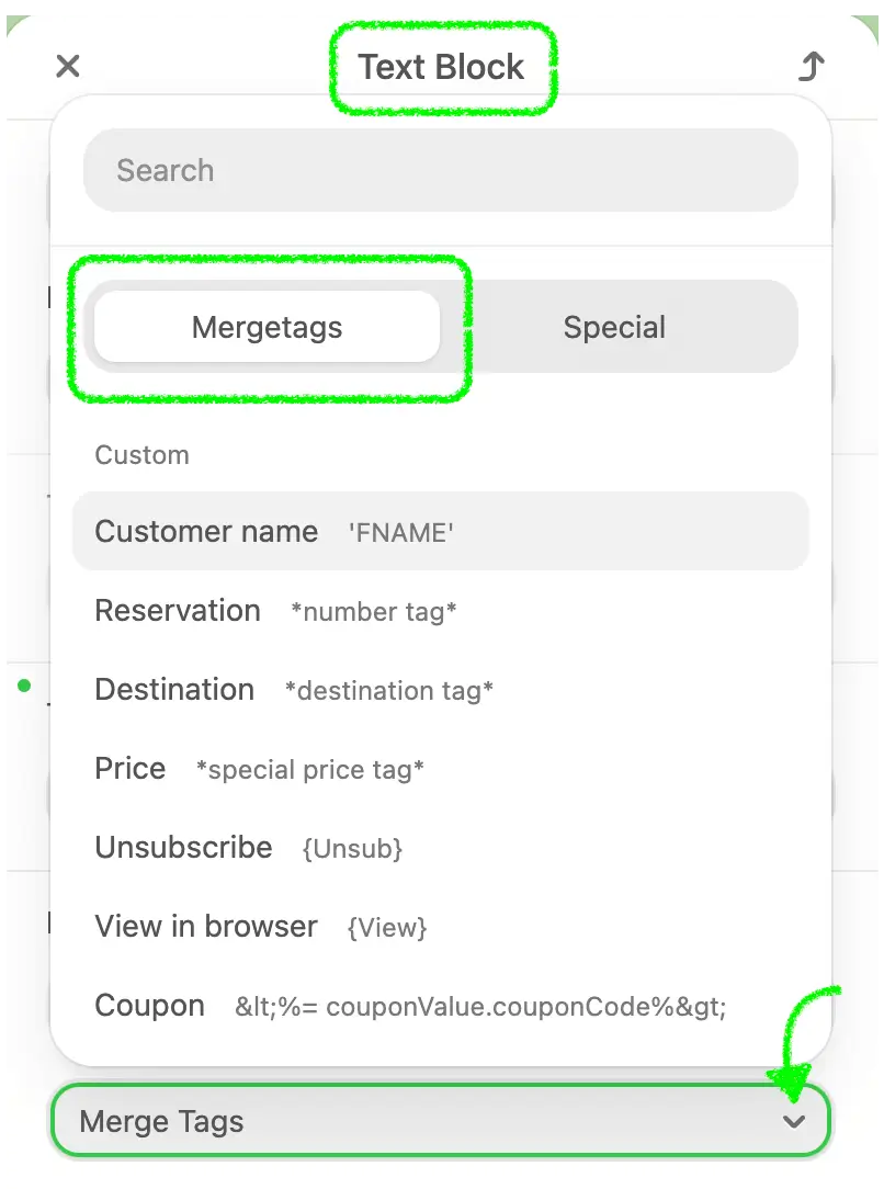
| Parameter | Description |
|---|---|
category | Name of the merge tag group |
entries | An array of merge tags, where:
|
Example:
js
{
...,
"mergeTags": [
{
"category": "Yespo",
"entries": [
{
"label": "First Name",
"value": "%FIRSTNAME|%",
"previewValue": "John",
"hint": "Recipient's first name",
"hidden": false
},
{
"label": "Last Name",
"value": "%LASTNAME|%",
"previewValue": "Doe",
"hint": "Recipient's last name",
"hidden": false
}
]
}
],
...
}Using these merge tags, users can effortlessly create personalized and targeted email content, improving the overall effectiveness of their email marketing campaigns.
Custom Appearance of Merge Tags
You can independently choose how exactly your personalization tags should be displayed. This can be configured during initialization with the following parameters:
customAppearanceMergetags: Enables custom appearance for merge tags.customAppearanceMergetagsInLinks: Enables custom appearance for merge tags within links.customAppearanceMergetagsBorderColor: Specifies the border color for merge tags.customAppearanceMergetagsBackgroundColor: Specifies the background color for merge tags.
Example:
js
{
...
"customAppearanceMergetags": true,
"customAppearanceMergetagsInLinks": true,
"customAppearanceMergetagsBorderColor": "blue",
"customAppearanceMergetagsBackgroundColor": "green"
}This configuration customizes the appearance of merge tags, making them visually distinct with a blue border and green background.
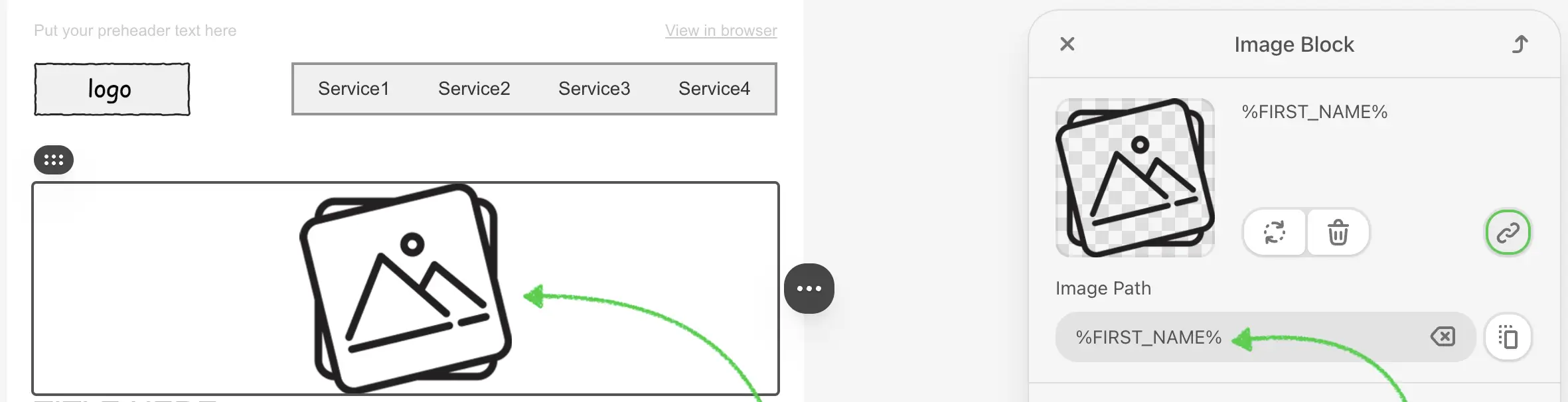
Custom Thumbnails for Images with Merge Tags
When customers use personalization tags (Merge tags) for different images, the editor can't recognize them and as a result, replaces the image with a "broken" icon:
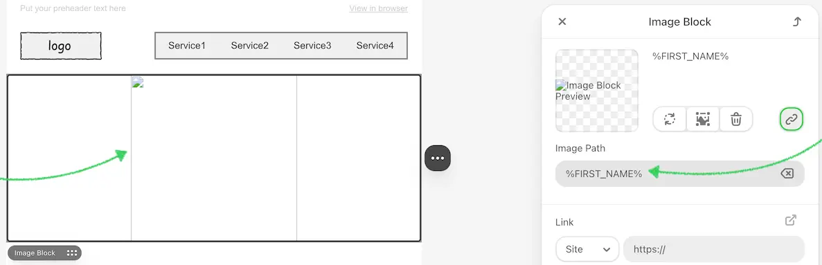
Some users find this confusing. If you want to replace the "broken" icon with your own image, use the configuration below:
js
{
"defaultImgForMergeTagSrc": "URL"
}where:
URL- is the link to your image.
You should apply this configuration during initialization, and it will work as shown in the screenshot below:
Social Networks Configuration
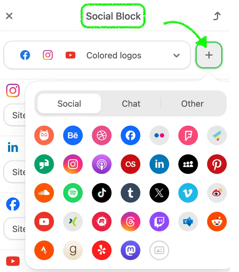
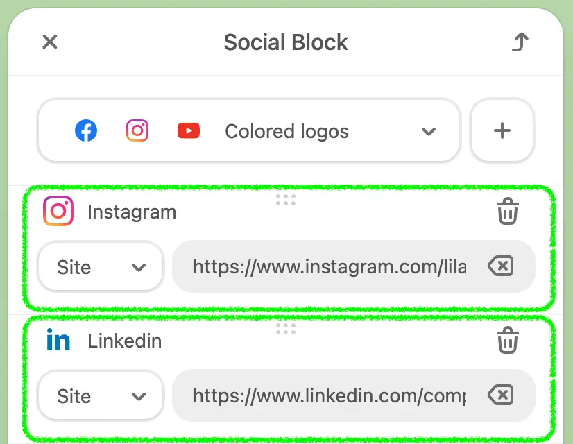
The socialNetworks parameter is used to specify the list of social networks that will be added to the social networks block. This feature is especially useful for individuals or businesses who want to include links to their social media profiles directly within their email templates, allowing recipients to easily connect with them across various platforms.
Use Case:
Imagine you are creating an email template for a marketing campaign. Including links to your social media profiles in the email can increase engagement and drive traffic to your social media pages. By specifying the socialNetworks parameter, you can define which social media icons and links should be displayed in the email's social networks block. If this parameter is specified with social networks, these icons will be added by default once the social network block is dropped into the email template. This ensures that your audience can easily find and follow your social media accounts, helping to build your online presence and foster community engagement.
| Parameter | Description |
|---|---|
name | Name of the social network |
href | URL of the social network profile |
Example:
js
{
...,
"socialNetworks": [
{
"name": "facebook",
"href": "https://facebook.com"
}
],
...
}Supported Social Network Names or Icons:
| Category | Names |
|---|---|
socials | facebook, twitter, instagram, linkedin, pinterest, snapchat, youtube, tiktok, vimeo, reddit, tumblr, weibo, threads, discord, mastodon, custom |
chat | whatsapp, messenger, telegram, skype, hangouts, viber, wechat, slack, teams, zoom |
others | askfm, workplace, blogger, behance, email, dribbble, website, flickr, foursquare, gmail, glassdoor, iTunesPodcasts, tripAdvisor, lastfm, rss |
| appstore, myspace, line, windowsstore, soundcloud, medium, spotify, dropbox, googledrive, github, pdf, doc, xls, ppt, onedrive, meetup | |
| patreon, kofi, buyMeACoffee, yammer, huaweiAppGallery, googleBusiness, strava, google, goodreads, yelp |
Using the socialNetworks parameter ensures that the social media links are consistently formatted and easily accessible, enhancing the overall effectiveness of the email marketing campaign by encouraging social media interaction and engagement.
You can independently choose which style should be applied to the social icons when your customer drops them into an email message. All you need to do is initialize the Plugin with the configuration below:
js
"socialIconsDefaultView": "squareColoredBordered"Available Values:
logoBlack, logoGray, logoWhite, circleColored, roundedColoredBordered, circleColoredBordered, roundedColored, squareColored, squareColoredBordered, circleBlack, circleBlackBordered, roundedBlack, roundedBlackBordered, squareBlack, squareBlackBordered, circleGray, circleGrayBordered, roundedGray, roundedGrayBordered, squareGray, squareGrayBordered, circleWhite, circleWhiteBordered, roundedWhite, roundedWhiteBordered, squareWhite, squareWhiteBordered, logoColoredThe final result depends on your chosen value. In this example, the configuration is set to logoColored.
By customizing the socialIconsDefaultView parameter, you can ensure that the social icons in your email messages match your preferred style and branding.
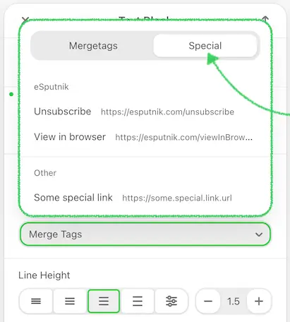
Special Links Configuration
The specialLinks parameter is used to specify a list of links that will be added to the link selection component. This feature is particularly useful for adding commonly used links, such as unsubscribe, support, or social media profile links, directly into email templates. It ensures consistency, saves time, and makes the email creation process more efficient.
Use Case:
Imagine you are managing an email marketing platform where users frequently need to include specific links in their email templates, such as unsubscribe links or customer support links. Manually entering these URLs each time can be tedious and prone to errors. The specialLinks parameter allows you to define these essential links once, and then make them easily accessible for users to insert into their emails.
For example, you might want to include links for unsubscribing from the newsletter, contacting support, or viewing email in browser. By using the specialLinks parameter, you can group these links under specific categories, making it easy for users to find and insert them into their emails
| Parameter | Description |
|---|---|
category | Name of the group of links |
entries | An array of links, where:
|
Example:
js
{
...,
"specialLinks": [
{
"category": "Yespo",
"entries": [
{
"label": "Unsubscribe",
"value": "https://my.yespo.io/unsubscribe",
"hidden": false
}
]
}
],
...
}This approach not only ensures that the links are correctly formatted and consistently used but also significantly speeds up the email creation process. It reduces the likelihood of errors and enhances the overall user experience by providing quick access to frequently used links.
Using the specialLinks parameter, you can help users maintain a high standard of professionalism and compliance in their email campaigns while also making the editing process more efficient and user-friendly.
Share Link Configuration
The hideShareTab and hiddenShareItems parameters give integrators fine-grained control over the Share tab that appears inside the link-type selector of the Link control (used in button blocks, image blocks, text links, and the hyperlink modal).
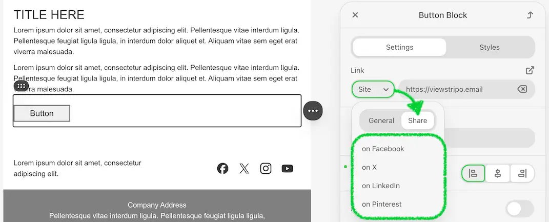
By default, the Share tab is visible and contains four items: Facebook, X, LinkedIn, and Pinterest. These parameters let you hide the entire tab or suppress individual items — for example, when your platform has its own sharing logic or when certain networks are not relevant to your users.
Use cases
Consider an ESP that has built its own social-sharing workflow outside the editor. Showing the editor's built-in Share tab would confuse users with redundant options. By setting hideShareTab: true, the integrator removes the tab entirely, keeping the link selector clean and focused on the options that matter.
Alternatively, if an integrator wants to keep the Share tab but their platform does not support Pinterest or X, they can pass hiddenShareItems: ['pinterest', 'x'] to suppress only those items while leaving Facebook and LinkedIn visible.
Auto-hide tabs row rule:
If the combination of your configuration (for example, `Personalization` disabled at the feature level **and** `hideShareTab: true`) results in only **one** tab remaining in the link-type selector, the tabs row is hidden entirely. The user sees the contents of the single remaining tab directly, without a tab strip above it.
| Parameter | Description |
|---|---|
hideShareTab | boolean. When true, the entire Share tab is removed from the link-type selector. Its content and related translations are absent from the DOM. Defaults to false. |
hiddenShareItems | string[]. An array of share-item keys to hide within the Share tab. Supported keys: 'facebook', 'x', 'linkedin', 'pinterest'. Items not listed remain visible. Defaults to [] (all items shown). |
Example — hide the entire Share tab:
js
{
...,
"hideShareTab": true,
...
}Example — hide specific share items:
js
{
...,
"hiddenShareItems": ["pinterest", "x"],
...
}Note: These parameters apply uniformly across all places where the Link control with the protocol selector is used: button block, image block, text link, and the hyperlink modal.
Custom Appearance of Special Links
Please refer to the section Custom Appearance of Merge Tags.
View Options
The View Options feature allows your end users to control how the email template is rendered inside the editor. This helps them focus on the version of the message that is most relevant to them — whether it's HTML or AMP, mobile or desktop, personalized or raw content.
View Options do not affect the final exported code. They change only what is displayed in the editor for the current user.
Use Cases: Here are typical scenarios where viewOptions bring value to your end users:
- QA testing. A QA engineer wants to verify how the AMP version of the email renders without interference from HTML blocks.
- Content personalization. A marketer previews merge tags as final values to validate personalization logic.
- Condition debugging. A support specialist investigates visibility logic by toggling hidden blocks or specific display conditions.
- Simplified writing. A copywriter works in a distraction-free environment by hiding irrelevant structures or fallback content.
Each user sees only their own specified View Options — they are not shared across collaborators.
UI Behavior and Editor Feedback
When you implement View Options in your interface (e.g., via a dropdown or toggles, see the sample below), users will interact with them to switch between different preview modes.
By default, the template is rendered based on the viewOptions object passed during editor initialization. These values define the initial display context for the editor session.
If the user modifies any of the View Options through your custom UI, the editor will detect this and render content accordingly. In such cases, a persistent notification appears above the Settings panel. This warning explains that some elements might currently be hidden and includes a Restore button to revert back to the default view.
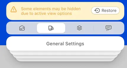
Example scenario:
- You pass
showHiddenElements: trueandmimeType: 'both'during initialization. - The end user switches to
mimeType: 'html'and disables hidden elements. - The editor displays a banner: "Some elements may be hidden due to active view options" with a Restore CTA.
This helps users understand that hidden content is not deleted but simply filtered out.
How to use
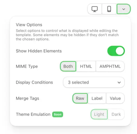
Add the viewOptions parameter to your plugin initialization script to control how the editor displays the template content.
Below is an example of how to pass this parameter:
js
viewOptions: {
showHiddenElements: true, // show/hide hidden elements in the template
mimeType: 'both', // 'both' | 'html' | 'ampHtml'
mergeTags: raw, // 'raw' | 'label' | 'value'
showPinsInEditor: false,
displayConditions: [ // show/hide elements with display conditions
{
id: 'audience-new',
name: 'New Customers',
visibility: true
}
]
}Parameter Reference
| Parameter | Description |
|---|---|
showHiddenElements | Controls whether hidden elements (those explicitly marked as hidden in their settings) are visible in the editor. Default: true. |
mimeType | Determines which version of the template to render: 'html', 'ampHtml', or 'both' (the default). |
mergeTags | Defines how merge tags appear in the editor. Can be:
'raw' is recommended unless customAppearanceMergetags is enabled — in that case, 'label' is preferable. |
displayConditions | An optional list of display condition states to enforce. Each item must include id and name. Visibility states whether the specific element with the condition must be shown or hidden. Use onUpdateDisplayConditionsForViewOptions callback to receive updates on applied conditions from the editor. |
showPinsInEditor | This boolean parameter controls whether comment pins should be visible on the editor canvas.
|
Controlling View Options via API
If your interface includes custom controls (e.g., toggles, dropdowns) that allow users to change the way the email is displayed, you should use the setViewOptions method to update the editor view dynamically. See reference in JavaScript API. This method applies new values for MIME type, merge tag rendering, or visibility filters in real time, without reinitializing the editor — it updates the display instantly.
When calling this method, the editor updates its display immediately and triggers internal logic (like banners, conditional rendering, etc.). You can pass the full object or partial updates depending on your logic.
Separately, the editor may update the internal list of display conditions, for example, when the user creates and applies a new condition or deletes an existing one in the settings panel for this specific email template opened in the editor. The plugin will invoke your onUpdateDisplayConditionsForViewOptions callback in two cases:
- On initialization — to provide the full list of nodes that use display conditions, along with their visibility states;
On condition update — whenever a new display condition is created, removed, or applied to a node within the editor. In such cases, the editor will invoke your callback onUpdateDisplayConditionsForViewOptions, passing the updated list of active condition IDs with their names and visibility states.
This allows you to:
- stay in sync with the condition logic configured inside the editor,
- persist view settings externally if needed,
- update your own UI state accordingly.
Example of how the editor will call your callback:
js
onUpdateDisplayConditionsForViewOptions: function(displayConditions) {
  // displayConditions is an array of:
  // { id: 'audience-new', name: 'New Customers', visibility: true }
  // Optionally update your View Options UI or save state externally
}And finally, when the user clicks the "Restore" button in the View Options banner, the onViewOptionsReset callback will be triggered by the plugin. In this case, your application should remove any viewOptions stored on your end for this user and reset the interface accordingly.
Example:
js
onViewOptionsReset: function(entity, entityId) {
  // Optionally reset your interface to the default state
}Behavior Notes
- View Options affect only the editor view — not the exported result.
- In Commenting Mode, all View Options reset to default. Previous settings are restored upon exit.
- In Code View, all content is always shown regardless of filters.
- If filters hide part of the content, the editor displays a persistent message with a reset button.
Template Theme Mode
The Template Theme Mode option allows you to define how the opened email template is visually rendered inside the editor — in Light or Dark mode.
This setting affects only the editor UI rendering and does not modify the email HTML, styles, or exported content. It is designed to improve editing comfort and visual consistency with your application.
We understand that different email clients (such as Gmail, Outlook, Apple Mail, etc.) apply their own algorithms to determine how an email is rendered in dark mode. Because of this, it is not possible to fully replicate or guarantee identical rendering across all inboxes. The purpose of this feature is not pixel-perfect emulation, but rather a fast visual check based on a controlled dark-mode simulation inside the editor.
You can rely on the following principles:
- If the template looks correct in the editor’s Dark mode, it is very likely to render correctly in real email clients.
- If a visual issue is noticeable in the editor, there is a high probability that the same issue will appear in at least some email clients.
This makes Template Theme Mode a practical tool for early risk detection, rather than a strict preview of a specific mailbox.
Use cases
Template Theme Mode is useful when you need to evaluate how the email content itself behaves when rendered in a dark-mode environment.
Typical scenarios include:
Checking how background colors, images, and text contrast behave when the template is displayed in dark mode.
Identifying elements that rely on transparent or inherited backgrounds and may become unreadable.
Detecting potential issues with icons, buttons, or images that were designed primarily for light backgrounds.
Performing a quick visual risk check before exporting or sending an email campaign.
Validating design decisions early, without testing the email in multiple real inboxes.
This feature helps you catch dark-mode-related risks in the email layout, while the template is being edited — not after it is sent.
How to use
To define the initial theme for the opened template, pass the templateThemeMode parameter during editor initialization.
js
templateThemeMode: 'DARK'If the parameter is not provided, the editor opens in Light mode by default.
Parameter reference
| Parameter | Type | Default | Description |
|---|---|---|---|
templateThemeMode | 'LIGHT' | 'DARK' | 'LIGHT' | Defines how the template is rendered inside the editor UI. This setting affects only the editor view and does not modify the email HTML or exported output. |
Controlling the theme via API
You can also change or read the template theme at runtime using the Template Theme Mode API.
See the Template Theme Mode API section for details on:
- switching the theme dynamically;
- retrieving the current theme value.
Font Management In paid subscriptions only
The Font Management option enables users to customize the fonts available in the Stripo editor, providing flexibility in design and brand consistency.
Use Cases
Font management helps implement a variety of scenarios, such as:
- Customizable Font Lists: Users can customize the list of fonts loaded in the editor. For example, an interface in your app can be created to configure the editor with specific fonts.
- Brand Consistency for Agencies: Digital marketing agencies can customize the list of fonts in the editor according to a client's brand requirements.
- Expanded Font Options: To expand the list of available fonts in the editor, add your web fonts from popular services like Google Fonts.
- Reduced Font Options: By limiting the number of fonts, default fonts are removed, making it easier for users to adhere to brand guidelines.
How to Activate
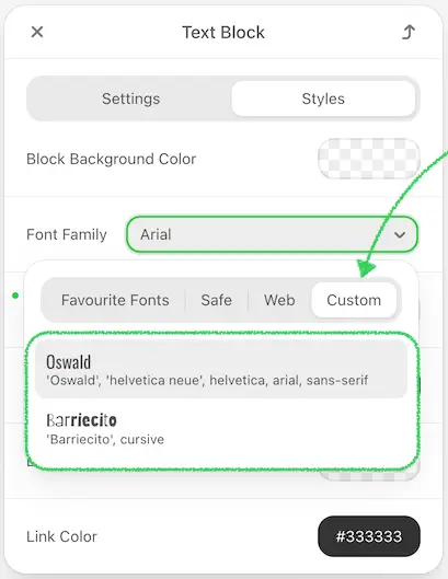
To activate option, include the editorFonts parameter in the plugin initialization script. This parameter allows specifying custom fonts, displaying default fonts, and organizing favorite fonts.
js
"editorFonts": {
  "showDefaultStandardFonts": true,
  "showDefaultNotStandardFonts": true,
  "favouriteFonts": {
    "label": "Favourite Fonts",
    "values": [
      {
        "name": "Barriecito",
        "fontFamily": "'Barriecito', cursive",
        "url": "https://fonts.googleapis.com/css?family=Barriecito&display=swap"
      }
    ]
  },
  "customFonts": [
    {
      "name": "Oswald",
      "fontFamily": "'Oswald', 'helvetica neue', helvetica, arial, sans-serif",
      "url": "https://fonts.googleapis.com/css?family=Oswald"
    },
    {
      "name": "Barriecito",
      "fontFamily": "'Barriecito', cursive",
      "url": "https://fonts.googleapis.com/css?family=Barriecito&display=swap"
    }
  ]
}
Find the parameter descriptions below:
| Parameter | Type | Description |
|---|---|---|
showDefaultStandardFonts | Boolean | Determines whether default standard fonts are displayed. Default is true. |
showDefaultNotStandardFonts | Boolean | Determines whether default non-standard fonts are displayed. Default is true. |
customFonts | Array | List of custom fonts to include, each with name, fontFamily, and url properties. This allows adding web fonts from popular services like Google Fonts.Requirements are as follows:
|
favouriteFonts | Object | Defines a section for favorite fonts at the top of the list. This object contains a label for the section name and values, an array of favorite fonts each with name, fontFamily, and url properties. |
Please be advised that Stripo accepts only the CSS font embedding method, and the CSS file must be hosted in HTTPS protocol. You can use services like Google fonts that provide host font stacks and a well-formatted CSS file. If you want to change the default set of fonts, you need to disable them and use custom fonts to indicate a new set, including the URL parameter for web fonts. In this case, you don’t have to pass the URL parameter to the fonts from the “Standard fonts” list.
User-Added Fonts in Editor
You can let users connect custom fonts directly from the font selector — without leaving the editor. When configured, a "Connect another font" option appears in the font family dropdown. Clicking it opens a UI where the user provides font details; the font is then added to the Custom category for the current session and immediately applied to the selected element.
There are two ways to enable this:
Option 1 — onConnectCustomFont callback (recommended)
Works in any integration mode. Pass the callback at initialization — the editor calls it with an onSave function when the user clicks the option. Open any UI you choose, collect the font data, and call onSave:
js
onConnectCustomFont: function(onSave) {
  openYourFontModal(function(result) {
    onSave({
      name:         result.displayName,   // shown in the font selector
      value:        result.fontFamily,    // CSS font-family, e.g. "'Roboto', sans-serif"
      link:         result.cssUrl,        // optional: URL to the font stylesheet
      importMethod: result.embedMethod    // optional: 'link' | 'import' | 'fontFace' | 'local'
    });
  });
}
The importMethod controls how the font is injected into the email <head>:
| Value | Injected into `<head>` |
|---|---|
| link | <link rel="stylesheet" href="..."> |
| import | <style>@import url('...');</style> |
| fontFace | <style>@font-face { … }</style> |
| local | nothing — font is assumed to be locally available |
Option 2 — Extensions SDK (fallback)
If you are building a plugin-mode integration and prefer not to use the callback, use the external-custom-font extension instead. It activates the same "Connect another font" entry point via the Extensions SDK. Note: if onConnectCustomFont is also provided, the callback takes priority and the extension is not invoked. No changes to existing extension integrations are required.
This functionality is available in Plugin version 2.21.0 or higher and requires the Business or Enterprise plan.
Display Conditions
Display conditions allow you to change the content of emails displayed to recipients, depending on whether the specified condition on your end is met or not.
Users can set conditions manually in the editor (Local) or select them from a list of predefined conditions set earlier (Predefined).
Use Cases:
- Personalized Content: Show different content blocks to different segments of your audience. For example, display a special offer only to female customers or show different products based on user preferences.
- Conditional Display: Include or exclude certain content based on specific conditions, such as geographic location, membership status, or user activity.
- Dynamic Marketing Campaigns: Enhance engagement and relevance by tailoring email content to different user segments.
Important Considerations:
Editor and Application Responsibilities: While the editor is responsible for placing the conditional statements into the correct places within the HTML of the email, it is the responsibility of the application (where the plugin is embedded) to correctly handle these statements when it’s time to send the email, according to their business needs.
No Language Limitations: The editor does not have any limitations regarding the language of these statements, so they can be written in any scripting language supported by your application.
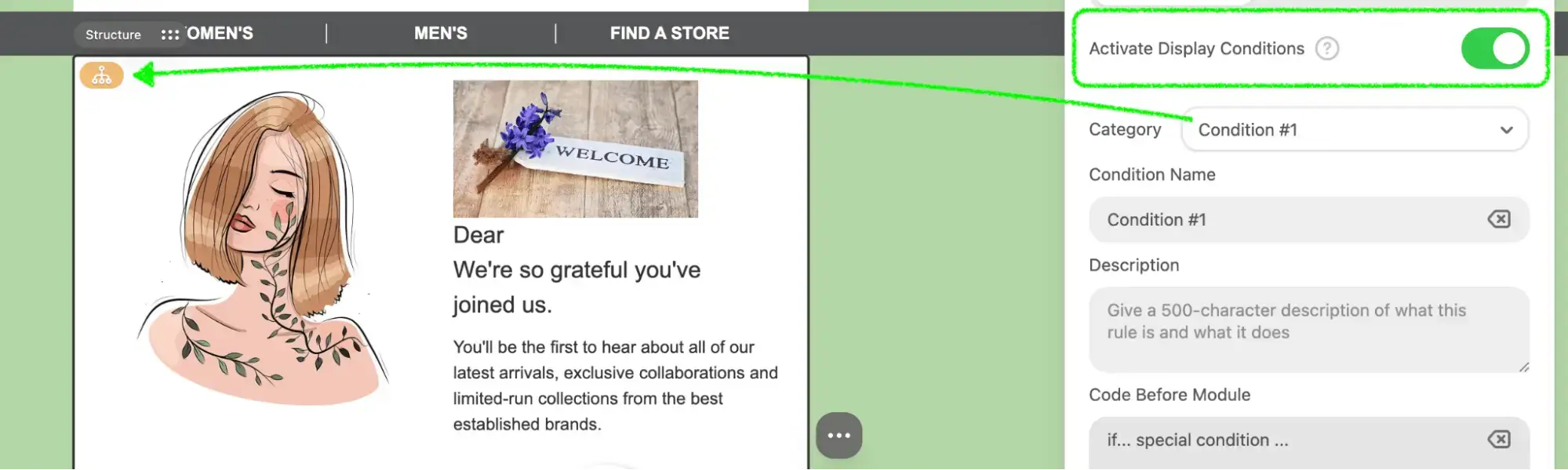
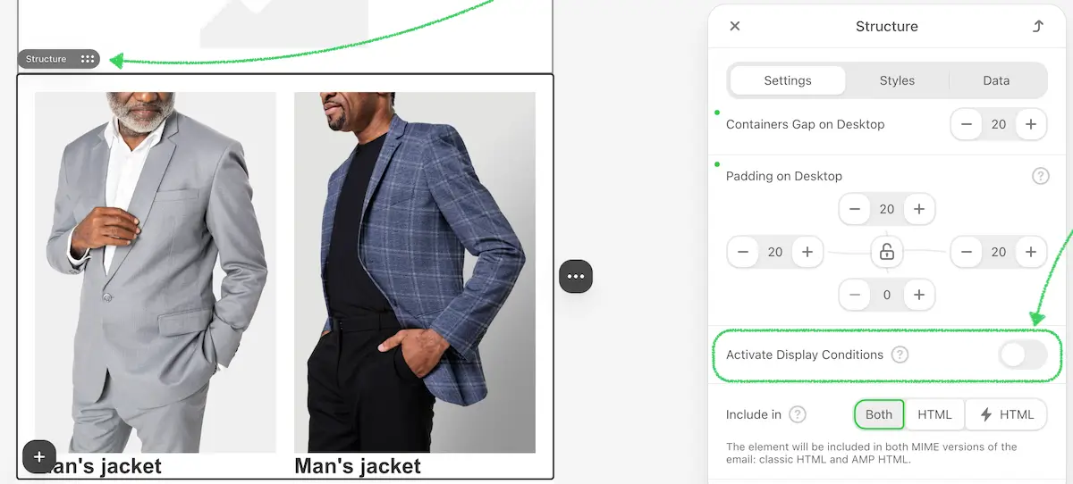
Now let’s go through the initial process of activating and customizing the Display Conditions for the editor users.
Activating Display Conditions
To activate Display Conditions during Plugin initialization, include the following parameter:
js
{
  ...
  "conditionsEnabled": true, // activation of the Display Conditions control in the Editor
  ...
}
This activates the Conditions tab in the editor:
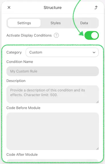
Allowing Local Display Conditions Creation
To allow users to create local Display Conditions directly in the editor, you need to enable the custom conditions setting during the Plugin initialization. This provides users with the flexibility to define conditions based on their specific needs without relying solely on predefined conditions.
Add the following setting to your Plugin initialization configuration:
js
{
  ...
  "conditionsEnabled": true,
  "customConditionsEnabled": true, // enables creating Local Display Conditions inside the Editor
  ...
}
Once activated, users will see an option to create custom conditions in the editor:
Setting Up Predefined Conditions
If you already have a predefined list of display conditions and want to show them in the editor so that users can simply choose from the available options — you can pass these conditions during the plugin initialization, as shown in the example below.
Example configuration for predefined conditions with categories:
js
{
  ...
  "conditionCategories": [
    {
      "category": "Gender",
      "conditions": [
        {
          "id": 1,
          "name": "Female",
          "description": "Only female customers will see this part of the email.",
          "beforeScript": "{% if contact.gender == \"Female\" %}",
          "afterScript": "{% endif %}"
        },
        {
          "id": 2,
          "name": "Male",
          "description": "Only male customers will see this part of the email.",
          "beforeScript": "{% if contact.gender == \"Male\" %}",
          "afterScript": "{% endif %}"
        }
      ]
    }
  ],
  ...
}
Parameter Description:
| Parameter | Description |
|---|---|
category | Name of the category |
conditions | An array of condition details |
Conditions Details:
| Parameter | Description |
|---|---|
id | Unique identifier of the condition |
name | Name of the condition |
description | Description of the condition |
beforeScript | Content to be inserted into the email before the block with the condition |
afterScript | Content to be inserted into the email after the block with the condition |
Here is how the predefined conditions will appear in the editor for users to choose from:
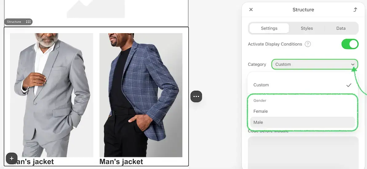
Predefined External
If you don't want to (or cannot) pass a predefined array of display conditions and prefer to let users create them manually, there's an alternative approach using external conditions. This method allows you to define an extension that opens a custom modal window when the display condition feature is activated in the editor.
Within your modal, you can present the conditions in any format — even provide a full builder interface to generate them on the fly. Once the user completes their input, the resulting condition code is passed back via a callback and automatically inserted into the email.
Documentation:
https://plugin.stripo.email/extensions/tutorials/examples/integrations/external-display-conditionsCode example (JavaScript):
https://github.com/stripoinc/stripo-plugin-samples/tree/main/extensions/javascript/external-display-conditionsCode example (TypeScript):
https://github.com/stripoinc/stripo-plugin-samples/tree/main/extensions/typescript/external-display-conditions
Link Selector Customization
The Link Selector Customization feature allows you to set up the view of available link protocols independently. If certain protocols are not needed, you can hide them from customers.
Usage
To customize the link selector, use the following parameters during the initialization of the plugin:
js
{
  "hideLinks": ['mail', 'tel', 'https://some.special.link.url'],
  "hideLinksCategories": ['Yespo']
}
Where:
mail,telare General protocols.https://some.special.link.urlrepresents special links that you have defined in the editor.Yespois a category of special links where it is placed.
After enabling these parameters, the specified protocols will be hidden.
By customizing the link selector, you can streamline the user interface and ensure that only the necessary link protocols are available to your customers, improving their experience and reducing potential confusion
Event Handling
The onEvent parameter is used to define event handlers for various actions within the editor. These events help track user interactions and trigger specific functions in response to those interactions. Below is a list of available events and their descriptions, along with the parameters passed for each event.
Available Events:
| Parameter | Description | Event parameters |
|---|---|---|
editor_view_mode_changed | Triggered when switching between mobile and desktop views. | js |
modules_panel_opened | Triggered when opening a tab from the modules panel. | js |
module_dropped | Triggered when adding a module to the email from pre-made or saved ones. | js |
module_saved | Triggered when saving a module. | js |
module_updated | Triggered when a saved module is updated in the Module Library. | js |
module_deleted | Triggered when a module is deleted from the Module Library of saved modules. Use this event to handle permanent removals from saved collections. | js |
module_removed | Triggered when a user removes a module that was dropped into the email template currently open in the editor. This event is useful for handling temporary removals within the template layout. | js |
module_copied | Triggered when a user duplicates a module that has already been dropped into the email template by clicking the Duplicate icon in the editor. This event helps you track module reuse actions and understand from which type of module the duplication originated. Possible values for copied_from: stripe, structure, container. | js |
modules_already_deleted | Triggered once when an email template is opened in the editor and contains modules that have already been deleted from the Modules Library. During initialization, the editor scans the email template content, detects such modules, and reports their IDs so the plugin’s application can be aware that these elements are no longer valid modules. | js |
module_detached | Triggered when a synchronized module in the email is disconnected from the Modules Library. After this action, the element in the email stops being treated as a module and becomes regular content. | js |
module_sync_property_updated | Triggered when the synchronization state of a synchronized module changes — for example, from ON → OFF or OFF → ON. This event allows you to track when synchronization is enabled or disabled for a specific module inside the email. | js |
module_restored | Triggered when a user restores a synchronized module in the email while it is in the OFF state. As a result, the module content in the email is replaced with the current version stored in the Modules Library. | js |
structure_dropped | Triggered when a user drops a structure (a full content block) into the template. | js |
structure_deleted | Triggered when a user deletes a structure from the template. | js |
structure_copied | Triggered when a user copies a structure within the editor. | js |
block_added | Triggered when adding a block (Text, Button, Image) through actions in an empty container. | js |
block_dropped | Triggered when adding blocks to the email from the blocks panel. | js |
block_copied | Triggered when copying a block. | js |
block_deleted | Triggered when deleting a block. | js |
block_moved | Triggered when moving a block. | js |
email_restored | Triggered after a successful email template restore from Version History. | js |
Example Usage:
js
{
    "onEvent": function handleEvent(type, params) {
        switch (type) {
            case "editor_view_mode_changed":
                // Handle view mode change
                break;
            case "modules_panel_opened":
                // Handle modules panel opening
                break;
            case "module_dropped":
                // Handle module dropped
                break;
            case "module_saved":
                // Handle module saved
                break;
            case "module_updated":
                // Handle module updated
                break;
            case "module_deleted":
                // Handle module deleted
                break;
            case "module_removed":
                // Handle module removed
                break;
            case "module_copied":
                // Handle module copied from another module
                break;
            case "modules_already_deleted":
                // Handle detection of modules that were already deleted from the Modules Library
                break;
            case "module_detached":
                // Handle detaching a synchronized module from the Modules Library
                break;
            case "module_sync_property_updated":
                // Handle change of the module synchronization state
                break;
            case "module_restored":
                // Handle restoring module content from the Modules Library
                break;
            case "structure_dropped":
                // Handle structure dropped
                break;
            case "structure_deleted":
                // Handle structure deleted
                break;
            case "structure_copied":
                // Handle structure copied
                break;
            case "block_added":
                // Handle block added
                break;
            case "block_dropped":
                // Handle block dropped
                break;
            case "block_copied":
                // Handle block copied
                break;
            case "block_deleted":
                // Handle block deleted
                break;
            case "block_moved":
                // Handle block moved
                break;
            case "email_restored":
                // Handle email restored from version history
                break;
            default:
                console.warn("Unhandled event type:", type);
        }
    },
    ...
}
By configuring the onEvent parameter, you can effectively monitor and respond to user interactions within the editor, providing valuable insights and enhancing the overall user experience.
UTM Parameters
The utm parameter is used to configure the initial settings for UTM tags in your email templates. These tags are essential for tracking the performance of your email campaigns in analytics platforms.
Use Case:
Imagine you are setting up an email marketing campaign and you need to track its performance in Google Analytics. By using UTM tags, you can identify which email brought traffic to your website and how effective it was in terms of conversions. The utm parameter allows you to predefine these tags, ensuring that all links in your email carry the necessary tracking information.
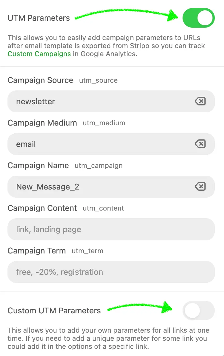
Here's a detailed description of each parameter and its usage.
Parameter Description:
| Parameter | Description |
|---|---|
utmSource | Source of the traffic (e.g., 'Yespo') |
utmMedium | Medium of the campaign (e.g., 'email') |
utmCampaign | Name of the campaign (e.g., 'Spring_Sale') |
utmContent | Content of the campaign (e.g., 'Banner') |
utmTerm | Term used for paid search campaigns (e.g., 'Discount') |
customUtms | Additional custom UTM tags. Parameters:
|
Example Usage:
js
{
  ...,
  "utm": {
    "utmSource": "Yespo",
    "utmMedium": "email",
    "utmCampaign": "Spring_Sale",
    "utmContent": "Banner",
    "utmTerm": "Discount",
    "customUtms": [
      {
        "name": "utmCustom1",
        "value": "someValue"
      }
    ]
  },
  ...
}
Detailed Explanation:
- utmSource: This parameter identifies the source of the traffic. For example, if your emails are sent through the Yespo platform, you might set
utmSourceto "Yespo". - utmMedium: This parameter specifies the medium of the campaign. In the case of email campaigns, you would typically set this to "email".
- utmCampaign: This parameter names the campaign. For example, if you are running a Spring Sale, you could set
utmCampaignto "Spring_Sale". - utmContent: This parameter differentiates content within the same ad or campaign. For instance, if you have multiple banners, you could label them individually using
utmContent. - utmTerm: This parameter is used for paid search campaigns to capture the keyword term. Even if you are not running paid search campaigns, you can use this field to track specific promotions or discounts, like "Discount".
- customUtms: This array allows you to add additional custom UTM tags that may be specific to your needs. Each custom UTM includes a
nameand avalue.
How to Utilize:
- Predefine UTM Tags: Set the initial values for UTM tags in your email templates using the
utmparameter. This ensures consistency across all your email campaigns. - Add Custom Tags: Use the
customUtmsarray to include any additional tracking parameters that are unique to your campaign requirements. - Track Campaign Performance: By embedding these UTM tags in your email links, you can track the effectiveness of your campaigns in your analytics platform, such as Google Analytics. This helps you understand which emails drive the most traffic and conversions, allowing you to optimize future campaigns.
By setting up these UTM tags initially, you ensure that all the necessary tracking information is included in your email links, facilitating comprehensive campaign performance analysis.
AMP Form Services
The ampFormServices parameter is used to predefine backend endpoints available for AMP Form blocks in the editor.
This feature simplifies the setup of AMP forms by allowing users to select a ready-to-use endpoint from a dropdown list instead of manually typing a URL.
It helps maintain consistency, prevents configuration errors, and ensures that form data is sent only to authorized endpoints.
Use Case
Imagine your users frequently include AMP forms in their emails — for example, to collect feedback, register event participants, or confirm attendance.
Instead of manually inserting different submission URLs, you can provide them with a list of predefined endpoints.
When they drop an AMP Form block into the template, the settings panel displays those endpoints as selectable options.
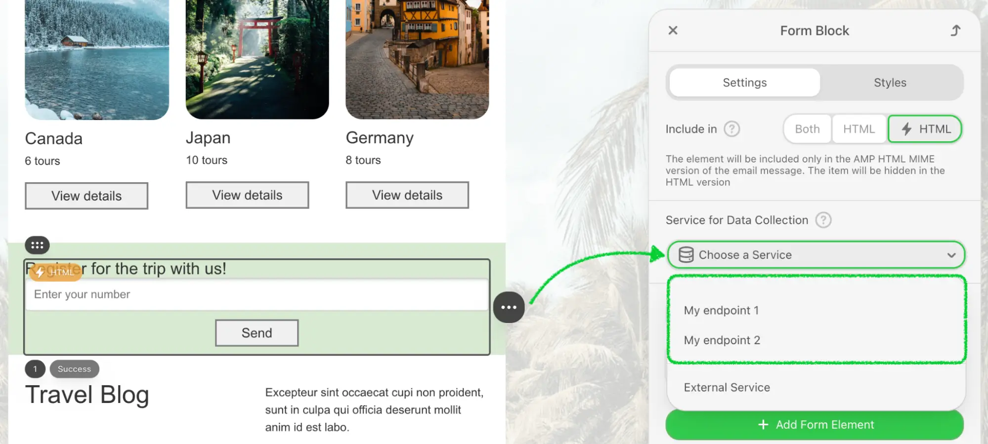
Selecting a service automatically assigns its URL to the form’s action-xhr attribute, ensuring correct data routing.
Parameter Description
| Parameter | Description |
|---|---|
ampFormServices | Defines the list of predefined backend endpoints available for selection in AMP Form block settings. Each service includes a label (visible name) and a value (submission URL). |
showExternalAmpFormServices | Controls whether users can add custom external services manually. If set to false, only predefined endpoints from ampFormServices will be available. Default: true. |
Example Usage
js
{
  ...,
  "ampFormServices": [
    {
      "label": "Feedback form",
      "value": "https://example.com/api/amp/feedback"
    },
    {
      "label": "Event registration",
      "value": "https://example.com/api/amp/register"
    }
  ],
  "showExternalAmpFormServices": false
}
In this example:
- Two form services (“Feedback form” and “Event registration”) are predefined.
- The user will see these two options in the dropdown list when configuring the AMP Form block.
- The “Add external service” option will be hidden, ensuring that only approved endpoints are used.