Appearance
Stripo Extensions SDK Change Log
v3.9.0
Overview
Version 3.9.0 is a minor release of the Stripo Extensions SDK that introduces programmatic access to the editor’s hidden-element state and template theme mode state, along with condition counts for display conditions.
Release Date: 29 April 2026
Release Type: Minor Release
Version: 3.9.0
Previous Version: 3.8.0
Editor Compatibility
The npm package version 3.9.0 is fully compatible with the Stripo Editor starting from version 2.63.0 and higher.
What's New
New: Hidden Element State API
BlockApi now includes getHiddenElementState(target) for reading the editor's canonical hide-on-device state for a node.
typescript
public onTemplateNodeUpdated(node: ImmutableHtmlNode): void {
  const hiddenState = this.api.getHiddenElementState(node);

  if (hiddenState === 'mobile') {
    this.api.sendEvent('extensions.block.hidden-on-mobile', {
      blockId: this.getId(),
    });
  }
}
New: setHiddenElementState() for HTML Node Modifications
HtmlNodeModifier now supports setHiddenElementState(state). Use this to mark the canonical target node (BLOCK, CONTAINER, STRUCTURE, STRIPE) as hidden on desktop or mobile, or pass undefined to clear the hidden state.
typescript
this.api.getDocumentModifier()
  .modifyHtml(this.currentNode)
  .setHiddenElementState('mobile')
  .apply(new ModificationDescription('Hide block on mobile'));
New: Exported HideElementState Type
The SDK now exports HideElementState, a union type for hidden-element state values:
typescript
type HideElementState = 'desktop' | 'mobile' | undefined;New: Template Theme Mode State
The SDK now exposes the template's active theme through ThemeMode. Use BaseApi to read getEditorState().themeMode, or subscribe to EditorStatePropertyType.themeMode with onEditorStatePropUpdated() to react to ThemeMode.LIGHT and ThemeMode.DARK.
Enhanced: Display Condition Metadata
DisplayCondition now includes optional conditionsCount metadata. External display condition integrations can use this value to preserve or display how many individual conditions are represented by a saved condition object.
Migration Guide
From v3.8.0 to v3.9.0
No breaking changes are required for existing extensions. Use getHiddenElementState() and setHiddenElementState() only when you need to synchronize custom controls with the editor's device-specific visibility state.
For theme-aware extension UI, read themeMode from getEditorState() or subscribe to EditorStatePropertyType.themeMode.
v3.8.0
Overview
Version 3.8.0 is a minor release of the Stripo Extensions SDK that adds editor event dispatching and theme-aware editor state, introduces richer settings panel tab configuration, expands block support for AMP interaction, and adds new UI building blocks for image alignment and AMP-related controls.
Release Date: 8 April 2026
Release Type: Minor Release
Version: 3.8.0
Previous Version: 3.7.0
Editor Compatibility
The npm package version 3.8.0 is fully compatible with the Stripo Editor starting from version 2.61.0 and higher.
What's New
New: BaseApi sendEvent() for Editor Integrations
All components inheriting from BaseApi can now emit fire-and-forget editor events using sendEvent(type, params). Calling sendEvent() triggers the editor initialization callback onEvent(type, params), so your host application can react to extension-originated events. See Initialization Settings for details.
typescript
this.api.sendEvent('extensions.coupon.opened', {
  blockId: this.getId(),
  source: 'settings-panel',
});
Enhanced: SettingsPanelTab Control Configuration
SettingsPanelTab now supports richer control metadata via getControls() and config-based addControl() calls. This lets you attach layout-related options such as custom CSS classes and withFullHeight.
typescript
const tab = new SettingsPanelTab('settings', ['title-control'])
  .addControl(
    {
      id: 'advanced-control',
      class: 'custom-grid-cell',
      withFullHeight: true,
    },
    1,
  );
New: AMP-Aware Block Interaction Hook
The Block class adds allowInteractWithAMPWhenSelected() so a block can explicitly control whether AMP content remains interactive while the block is selected.
New: Additional UI Elements and Attributes
UIElementType now includes:
AMP_FORM_SERVICE_PICKERMULTIPLE_SELECTSCROLLABLE
UEAttr also adds attribute mappings for AMP_FORM_SERVICE_PICKER and MULTIPLE_SELECT, including placeholder support for multiple select elements.
New: Image Alignment Built-In Control
ImageAlignmentBuiltInControl is now exported for image block integrations that need to reuse the built-in alignment control flow.
Migration Guide
From v3.7.0 to v3.8.0
Settings Panel Tabs: If you need layout metadata for tab controls, switch from string-only addControl() calls to the new object form with id, class, and withFullHeight.
v3.7.0
Overview
Version 3.7.0 is a minor release of the Stripo Extensions SDK that adds Modules Panel Tabs, introduces draggable block UI elements, expands block composition and block panel hooks, and refines lifecycle cleanup support.
Release Date: 9 February 2026
Release Type: Minor Release
Version: 3.7.0
Previous Version: 3.6.0
Editor Compatibility
The npm package version 3.7.0 is fully compatible with the Stripo Editor starting from version 2.56.0 and higher.
What's New
New: Modules Panel Tabs
A new ModulesPanelTab class and ModulesPanelTabApi allow you to add custom tabs to the Modules panel, with full access to UI element APIs and lifecycle hooks.
typescript
import { ExtensionBuilder, ModulesPanelTab } from '@stripoinc/ui-editor-extensions';

class MyModulesTab extends ModulesPanelTab {
  getId(): string { return 'my-modules-tab'; }
  getIcon(): string { return 'my-icon'; }
  getName(): string { return 'My Modules'; }
  getTabIndex(): number { return 2; }
  getTemplate(): string { return '<div>My modules tab</div>'; }
}

const extension = new ExtensionBuilder()
  .addModulesPanelTab(MyModulesTab)
  .build();
New: Block Hooks for Panel Visibility and Template Styles
The Block class now supports:
shouldDisplayInBlocksPanel()to hide a block from the blocks panel while keeping it available elsewhere.getTemplateStyles()to provide block-specific CSS that is injected when the block is used.
New: Draggable Block UI Elements
UIElementType.DRAGGABLE_BLOCK has been added with block-id support in UIElementsAttributes, enabling UI elements that bind to a specific block ID for drag-and-drop scenarios.
New: Stripe Block Composition Type
BlockCompositionType.STRIPE has been added to support stripe-level composition patterns.
Enhanced: Lifecycle Cleanup Hook
BaseValidatedClass introduces a destroy() method so extensions can clean up resources when the editor is reinitialized or the extension is uninstalled.
Breaking Changes
1. Text Link Color Built-In Control Removed
The TextLinkColorBuiltInControl and BuiltInControlTypes.TextControls.LINKS_COLOR have been removed, along with the text-link-color control implementation.
Migration Guide
From v3.6.0 to v3.7.0
Use Text Color Built-In Control: Replace TextLinkColorBuiltInControl with TextColorBuiltInControl and update references from BuiltInControlTypes.TextControls.LINKS_COLOR to BuiltInControlTypes.TextControls.TEXT_COLOR.
v3.6.0
Overview
Version 3.6.0 is a minor release of the Stripo Extensions SDK that expands editor APIs for display conditions and tab titles, adds module lookup helpers, and refines node query return types.
Release Date: 15 January 2026
Release Type: Minor Release
Version: 3.6.0
Previous Version: 3.5.0
Editor Compatibility
The npm package version 3.6.0 is fully compatible with the Stripo Editor starting from version 2.53.0 and higher.
What's New
New: External Display Conditions API Access
The ExternalDisplayConditionsLibrary now exposes an api property of type ExternalDisplayConditionsApi for editor integrations.
New: Settings Panel Tab Title HTML
The ControlApi now includes setSettingsPanelTabTitleHtml() to update a settings panel tab title with custom HTML.
typescript
this.api.setSettingsPanelTabTitleHtml('my-tab', '<span class="my-icon"></span> My Tab');New: Blocks Panel Placement Toggle
The BlocksPanel class adds isPanelPlacementChangeEnabled() to control whether the modules panel shows the drag handle for reordering.
typescript
class MyBlocksPanel extends BlocksPanel {
  isPanelPlacementChangeEnabled(): boolean {
    return false;
  }
}
New: Module Lookup Helpers
ImmutableHtmlNode now supports module discovery helpers for finding module elements in the document tree:
typescript
const modules = node.getModuleElements();
const moduleById = node.getModuleElementsById(123);
Breaking Changes
1. Typo Fix: getClosetModuleElement() Renamed
The method getClosetModuleElement() has been renamed to getClosestModuleElement().
Migration Guide
From v3.5.0 to v3.6.0
Rename Method: Replace getClosetModuleElement() with getClosestModuleElement().
v3.5.0
Overview
Version 3.5.0 is a minor release of the Stripo Extensions SDK that introduces the General Panel Tab for custom editor extensions, support for repeatable UI elements, and architectural improvements.
Release Date: 19 December 2025
Release Type: Minor Release
Version: 3.5.0
Previous Version: 3.4.0
Editor Compatibility
The npm package version 3.5.0 is fully compatible with the Stripo Editor starting from version 2.49.1 and higher.
What's New
New: General Panel Tab
A new GeneralPanelTab class has been introduced to allow developers to add custom tabs to the "General" panel of the editor. This is ideal for global extension settings or tools that are not specific to a single block.
typescript
import { GeneralPanelTab, ExtensionBuilder } from '@stripoinc/ui-editor-extensions';

class MyGlobalTab extends GeneralPanelTab {
  getId(): string { return 'my-global-tab'; }
  getIcon(): string { return 'my-icon'; }
  getName(): string { return 'My Tool'; }
  getTabIndex(): number { return 1; }
  getTemplate(): string { return '<div>My custom tool content</div>'; }
}

// Register in ExtensionBuilder
const extension = new ExtensionBuilder()
  .addGeneralPanelTab(MyGlobalTab)
  .build();
New: Repeatable UI Elements
Introduced UIElementType.REPEATABLE for creating lists of items within controls. This allows for dynamic lists of sub-elements that can be managed within a single control.
New: Block Settings Panel Title with HTML Support
The Block class now includes a getSettingsPanelTitleHtml() method that allows you to customize the settings panel title with HTML content.
typescript
import { Block } from '@stripoinc/ui-editor-extensions';

class MyBlock extends Block {
  // ... other methods

  getSettingsPanelTitleHtml(): string {
    return '<span class="my-icon"></span> My Custom Block';
  }
}
Enhanced: Control API with Repeatable Support
The ControlApi has been enhanced with updateUIElementValue() to support granular updates, including items within repeatable elements using path notation.
typescript
// Update a specific field in a repeatable list
this.api.updateUIElementValue('items[0].title', 'New Title');
The onValueChanged callback now also receives an optional index parameter when the change occurs within a repeatable element.
typescript
this.api.onValueChanged('items.title', (newValue, oldValue, index) => {
  console.log(`Item at index ${index} changed from ${oldValue} to ${newValue}`);
});
Breaking Changes
1. ContextActionType: Removed Items
The following constants have been removed from ContextActionType:
UPDATE_MODULEREMOVE_CONTAINER
Migration Guide
From v3.4.0 to v3.5.0
Context Actions: If you were using ContextActionType.UPDATE_MODULE or ContextActionType.REMOVE_CONTAINER, please update your implementation as these are no longer supported.
v3.4.0
Overview
Version 3.4.0 is a minor release of the Stripo Extensions SDK that enhances the External Image Library Tab with contextual node information. This release maintains full backward compatibility with v3.3.0.
Release Date: 12 December 2025
Release Type: Minor Release
Version: 3.4.0
Previous Version: 3.3.0
Editor Compatibility
The npm package version 3.4.0 is fully compatible with the Stripo Editor starting from version 2.48.0 and higher.
What's New
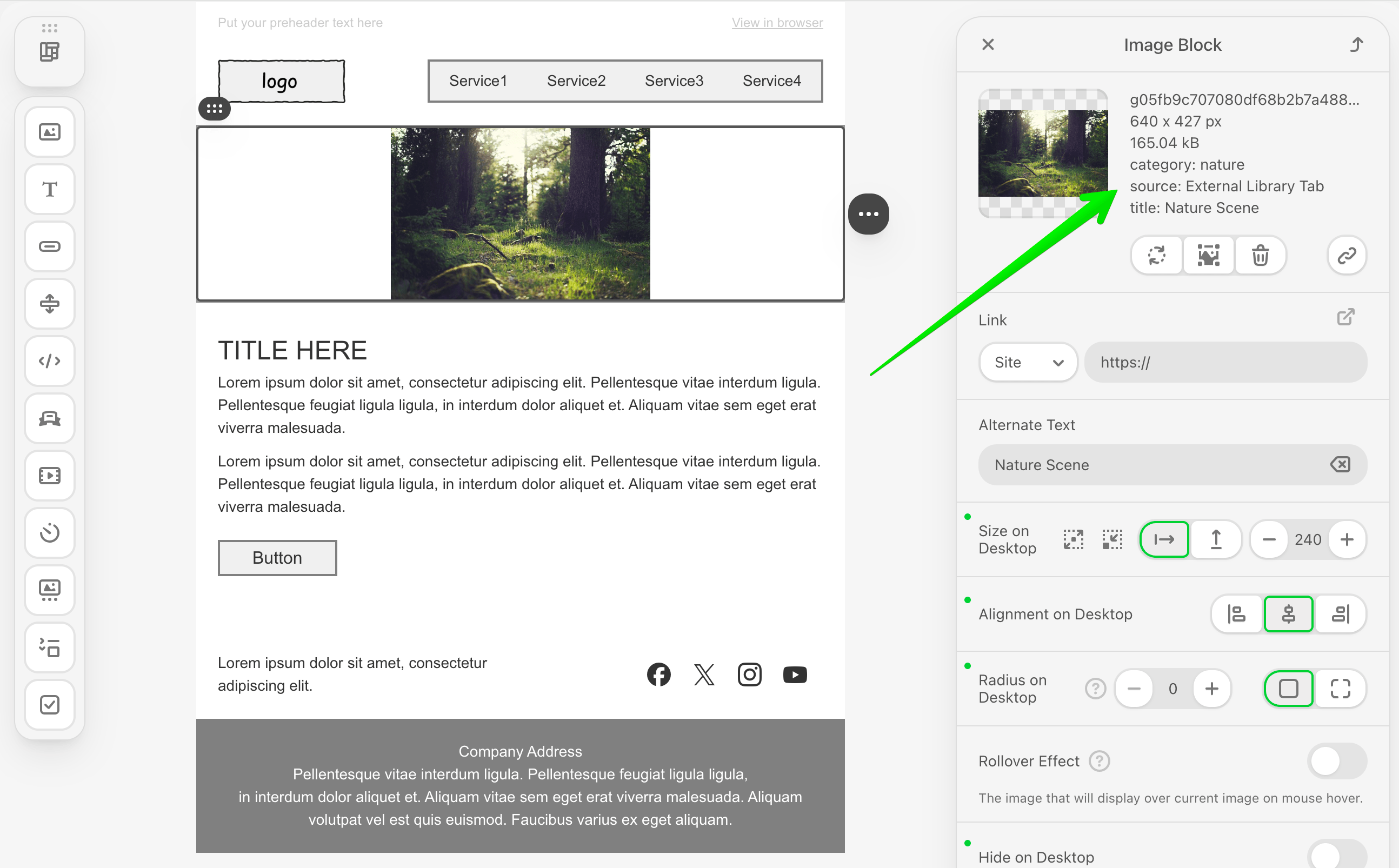
Enhanced: ExternalImageLibraryTab with Node Context
The ExternalImageLibraryTab class has been enhanced to provide contextual information about the selected node when opening the image library. The openImageLibraryTab() method now receives an optional selectedNode parameter.
typescript
import { ExternalImageLibraryTab, ExternalGalleryImageSelectCallback, ImmutableHtmlNode } from '@stripoinc/ui-editor-extensions';

class MyCustomImageTab extends ExternalImageLibraryTab {
  getName(): string {
    return 'My Images';
  }

  // Old (v3.3.0)
  // openImageLibraryTab(
  //   container: HTMLElement,
  //   onImageSelectCallback: ExternalGalleryImageSelectCallback
  // ): void { ... }

  // New (v3.4.0) - with optional selectedNode parameter
  openImageLibraryTab(
    container: HTMLElement,
    onImageSelectCallback: ExternalGalleryImageSelectCallback,
    selectedNode?: ImmutableHtmlNode  // NEW: Optional node context
  ): void {
    // Access information about the selected node
    if (selectedNode) {
      const nodeId = selectedNode.getAttribute('id');
      console.log('Image library opened for node:', nodeId);

      // Use node context to customize image library behavior
    }

    // Render your custom image library UI in the container
    container.innerHTML = `
      <div class="my-image-gallery">
        <!-- Your custom image gallery UI -->
      </div>
    `;
  }
}
Use Cases:
- Filter or customize image suggestions based on the selected node type
- Apply node-specific image constraints (size, format, etc.)
- Provide contextual image recommendations based on node attributes
Backward Compatibility:
- The
selectedNodeparameter is optional, so existing implementations continue to work without modifications - You can gradually adopt this feature when needed
Migration Guide
From v3.3.0 to v3.4.0
No Breaking Changes - Version 3.4.0 is fully backward compatible with v3.3.0. All existing code will continue to work without modifications.
Optional Enhancement - If you want to take advantage of node context in your custom image library tabs, you can add the optional selectedNode parameter to your openImageLibraryTab() method implementation.
v3.3.0
Overview
Version 3.3.0 is a minor release of the Stripo Extensions SDK that introduces enhanced node query methods. This release maintains full backward compatibility with v3.2.0.
Release Date: 28 November 2025
Release Type: Minor Release
Version: 3.3.0
Previous Version: 3.2.0
Editor Compatibility
The npm package version 3.3.0 is fully compatible with the Stripo Editor starting from version 2.46.0 and higher.
What's New
New: Module Element Query Method
The BaseImmutableNode interface now includes a method getClosetModuleElement() to retrieve the closest module element directly.
typescript
import { ImmutableHtmlNode } from '@stripoinc/ui-editor-extensions';

// In your block or control
const moduleId = node.getClosestModuleId();
console.log('Closest module ID:', moduleId);

// NEW in v3.3.0 - Get the module element itself
const moduleElement = node.getClosetModuleElement();
if (moduleElement) {
  console.log('Module element found:', moduleElement.getTagName());
  // Perform operations on the module element
}
Use Cases:
- Direct access to module element for modification
- Inspecting module structure and attributes
Difference from getClosestModuleId():
getClosestModuleId(): Returns the numeric ID of the closest modulegetClosetModuleElement(): Returns the actual ImmutableNode element of the module, orundefinedif not found
Migration Guide
From v3.2.0 to v3.3.0
No Breaking Changes - Version 3.3.0 is fully backward compatible with v3.2.0. All existing code will continue to work without modifications.
v3.2.0
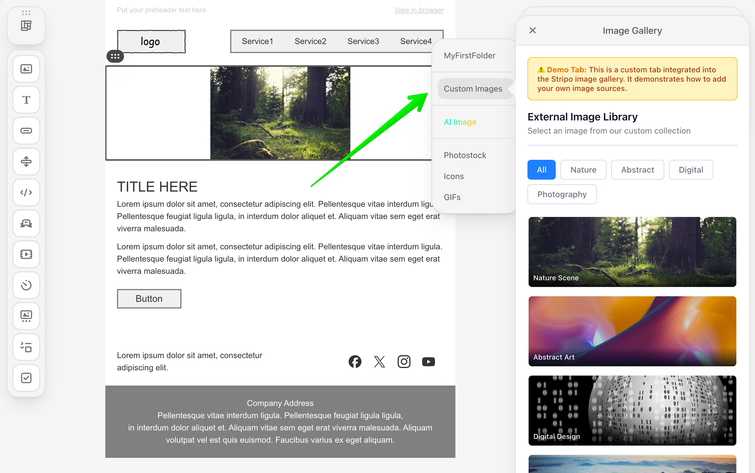
Overview
Version 3.2.0 is a minor release of the Stripo Extensions SDK that introduces support for a custom image library tab and enhanced image metadata capabilities. This release maintains full backward compatibility with v3.1.0.
Release Date: 09 November 2025
Release Type: Minor Release
Version: 3.2.0
Previous Version: 3.1.0
Editor Compatibility
The npm package version 3.2.0 is fully compatible with the Stripo Editor starting from version 2.43.0 and higher.
What's New
New: ExternalImageLibraryTab Class
A new class has been introduced to enable developers to create a custom tab within the build-in Stripo image library. This allows you to organize images from different sources into a separate tab for better user experience.
typescript
import { ExternalImageLibraryTab, ExternalGalleryImageSelectCallback } from '@stripoinc/ui-editor-extensions';

class MyCustomImageTab extends ExternalImageLibraryTab {
  /**
   * Returns the translated name/label for the tab
   */
  getName(): string {
    return 'My Images';
  }

  /**
   * Opens the custom tab and renders your image library UI
   * @param container - DOM element where you should render your UI
   * @param onImageSelectCallback - Callback to invoke when user selects an image
   */
  openImageLibraryTab(
    container: HTMLElement,
    onImageSelectCallback: ExternalGalleryImageSelectCallback
  ): void {
    // Render your custom image library UI in the container
    container.innerHTML = `
      <div class="my-image-gallery">
        <!-- Your custom image gallery UI -->
      </div>
    `;

    // When user selects an image, call the callback
    // onImageSelectCallback(imageData);
  }
}

// Register in ExtensionBuilder
const extension = new ExtensionBuilder()
  .withExternalImageLibraryTab(MyCustomImageTab)
  .build();
Full Example Implementation: How to Integrate an External Image Library Tab
Enhanced: ExternalGalleryImage Interface
The ExternalGalleryImage interface now supports optional metadata labels for additional image information:
typescript
import { ExternalGalleryImage } from '@stripoinc/ui-editor-extensions';

// Old (v3.1.0)
const image: ExternalGalleryImage = {
  originalName: 'product.png',
  width: 800,
  height: 600,
  sizeBytes: 102400,
  url: 'https://example.com/product.png',
  altText: 'Product image'
};

// New (v3.2.0) - with optional labels
const image: ExternalGalleryImage = {
  originalName: 'product.png',
  width: 800,
  height: 600,
  sizeBytes: 102400,
  url: 'https://example.com/product.png',
  altText: 'Product image',
  labels: {                            // NEW: Optional metadata
    category: 'Products',
    photographer: 'John Doe',
    license: 'Commercial',
    tags: 'red, clothing, winter'
  }
};
Migration Guide
From v3.1.0 to v3.2.0
No Breaking Changes - Version 3.2.0 is fully backward compatible with v3.1.0. All existing code will continue to work without modifications.
v3.1.0
Overview
Version 3.1.0 is a minor release of the Stripo Extensions SDK that introduces new UI elements for creating orderable/sortable lists, enhanced control lifecycle hooks, and additional node query capabilities. This release maintains full backward compatibility with v3.0.0.
Release Date: 03 November 2025
Release Type: Minor Release
Version: 3.1.0
Previous Version: 3.0.0
Editor Compatibility
The npm package version 3.1.0 is fully compatible with the Stripo Editor starting from version 2.42.0 and higher.
What's New
New: Orderable UI Element
A new UI element has been introduced to create orderable/sortable lists within your custom controls. These elements enable users to reorder items through drag-and-drop or positioning controls.
typescript
import { UIElementType } from '@stripoinc/ui-editor-extensions';

// Available orderable element types
UIElementType.ORDERABLE         // 'UE-ORDERABLE' - Container for orderable items
UIElementType.ORDERABLE_ITEM    // 'UE-ORDERABLE-ITEM' - Individual orderable item
UIElementType.ORDERABLE_ICON    // 'UE-ORDERABLE-ICON' - Icon for ordering controls
New: Control onDocumentChanged() Lifecycle Hook
Controls now have access to a new lifecycle hook that is called whenever any part of the document template changes.
typescript
import { Control, ImmutableHtmlNode } from '@stripoinc/ui-editor-extensions';

class MyControl extends Control {
  getId(): string { return 'my-control'; }
  getTemplate(): string { return '<div>...</div>'; }

  /**
   * NEW in v3.1.0
   * Called when any part of the document template has changed
   * @param node - The immutable HTML node representing current node instance
   */
  onDocumentChanged(node: ImmutableHtmlNode): void {
    // React to document-wide changes
    // This can be frequent; use cautiously for performance-sensitive operations
    const customValue = node.getAttribute('data-custom');
    if (customValue) {
      // Update control state based on document changes
    }
  }
}
Important Notes:
- This hook can be called frequently during editing
- Use cautiously for performance-sensitive operations
- Receives the current node instance as a parameter
- Useful for controls that need to react to global template changes
Difference from onTemplateNodeUpdated():
onTemplateNodeUpdated(): Called when the node associated with this control's context is updatedonDocumentChanged(): Called when any part of the document template changes
New: Node Module Identification
The BaseImmutableNode interface now includes a method to retrieve the closest module ID associated with a node.
typescript
import { ImmutableHtmlNode } from '@stripoinc/ui-editor-extensions';

// In your block or control
const moduleId = node.getClosestModuleId();
console.log('Closest module ID:', moduleId);
Use Cases:
- Identifying which module a node belongs to
- Module-specific operations and logic
Example Implementation:
The External Merge Tags Selector tutorial demonstrates practical usage of getClosestModuleId() for detecting module context and displaying contextual UI indicators.
Migration Guide
From v3.0.0 to v3.1.0
No Breaking Changes - Version 3.1.0 is fully backward compatible with v3.0.0. All existing code will continue to work without modifications.
v3.0.0
Overview
Version 3.0.0 is a major release of the Stripo Extensions SDK that introduces significant architectural improvements, enhanced TypeScript support, and new features for extending the Stripo email editor. This release includes breaking changes that require migration from v2.x.
Release Date: 20 October 2025
Release Type: Major Release
Version: 3.0.0
Previous Version: 2.0.2
Editor Compatibility
The npm package version 3.0.0 is fully compatible with the Stripo Editor starting from version 2.40.0 and higher.
What's New
Enhanced Package Distribution
The SDK now supports multiple module formats for better compatibility across different JavaScript environments:
- ESM (ECMAScript Modules): Modern ES module format
- CJS (CommonJS): Node.js compatible format
- Browser Bundle: Optimized browser-ready bundle
json
{
  "exports": {
    ".": {
      "types": "./dist/types/index.d.ts",
      "import": "./dist/esm/index.js",
      "require": "./dist/cjs/index.cjs",
      "default": "./dist/esm/index.js"
    },
    "./browser": {
      "browser": "./dist/browser/index.js",
      "default": "./dist/browser/index.js"
    }
  }
}
Migration: No code changes required. The package will automatically use the appropriate format for your environment.
New: Icons Registry
A new IconsRegistry class enables registration of custom SVG icons for use throughout your extensions.
typescript
import { IconsRegistry } from '@stripoinc/ui-editor-extensions';

class MyIconsRegistry extends IconsRegistry {
  registerIconsSvg(iconsMap: Record<string, string>): void {
    iconsMap['custom-icon'] = '<svg>...</svg>';
    iconsMap['another-icon'] = '<svg>...</svg>';
  }
}

// Register in ExtensionBuilder
const extension = new ExtensionBuilder()
  .setIconsRegistry(MyIconsRegistry)
  .build();
Benefits:
- Centralized icon management
- SVG support for crisp, scalable icons
- Easy to share icons across multiple components
New: Control Visibility Management
Controls can now be dynamically shown or hidden based on the selected node's state.
typescript
import { Control } from '@stripoinc/ui-editor-extensions';

class MyControl extends Control {
  // New method - implement to control visibility
  isVisible(node: ImmutableHtmlNode): boolean {
    // Show control only for specific block types
    return node.hasClass('my-custom-block');
  }

  getId(): string { return 'my-control'; }
  getTemplate(): string { return '<div>...</div>'; }
}
Use Cases:
- Show controls only for specific block types
- Hide controls based on user permissions
- Conditional UI based on template state
New: Additional Built-in Controls Available
Pre-built visibility controls are now available for major block types:
StructureVisibilityBuiltInControlContainerVisibilityBuiltInControlImageVisibilityBuiltInControlButtonVisibilityBuiltInControlTextVisibilityBuiltInControl
New typography and styling controls for button blocks:
ButtonFontFamilyBuiltInControl- Font family selection for buttonsButtonTextSizeBuiltInControl- Button text size controlButtonTextStyleAndFontColorBuiltInControl- Combined text style and color control
New background and border controls:
ContainerBackgroundImageBuiltInControl- Set background images on containersContainerBorderBuiltInControl- Container border stylingStructureBackgroundImageBuiltInControl- Structure background images
New BlocksPanel Customization
Customize the modules tab icon in the blocks panel:
typescript
import { BlocksPanel } from '@stripoinc/ui-editor-extensions';

class MyBlocksPanel extends BlocksPanel {
  getModulesTabIconName(modulesTab: {
    key: string;
    label: Record<string, string>
  }): string | undefined {
    return 'custom-modules-icon'; // Use registered icon
  }
}
Breaking Changes
1. Class Architecture: Abstract Classes Replaced with Validated Classes
BREAKING CHANGE: All extension base classes have been refactored from TypeScript abstract classes to regular classes with runtime validation.
Affected Classes
BlockControlUIElementContextAction
Old Implementation (v2.x)
typescript
import { Block } from '@stripoinc/ui-editor-extensions';

export class MyBlock extends Block {
  // TypeScript enforced abstract method implementation
  abstract getId(): string;
  abstract getTemplate(): string;
  abstract getIcon(): string;
  abstract getName(): string;
  abstract getDescription(): string;
}
New Implementation (v3.0)
typescript
import { Block } from '@stripoinc/ui-editor-extensions';

export class MyBlock extends Block {
  constructor() {
    super(); // Now calls BaseValidatedClass constructor
  }

  // Methods now throw errors if not implemented
  getId(): string { return 'my-block'; }
  getTemplate(): string { return '<div>...</div>'; }
  getIcon(): string { return 'icon.svg'; }
  getName(): string { return 'My Block'; }
  getDescription(): string { return 'Description'; }
}
Why This Change?
- Improved runtime validation with clearer error messages
- Better developer experience with validation logging
Migration Steps:
- If your class defines a
constructor(), ensure you callsuper()inside it - Ensure all required methods are implemented (validation will catch missing methods at runtime)
- Test your extension - you'll see helpful error messages if methods are missing
2. Block Lifecycle Hooks: Signature Changes
BREAKING CHANGE: Several Block lifecycle hooks have changed their signatures.
onDocumentInit() - Return Type Removed
Old (v2.x):
typescript
onDocumentInit(): HtmlNodeModifier | undefined {
  const modifier = this.api.getDocumentModifier();
  // Make modifications
  return modifier;
}
New (v3.0):
typescript
onDocumentInit(): void {
  const modifier = this.api.getDocumentModifier();
  // Make modifications and apply them
  modifier.apply(new ModificationDescription(`Some modifications applied`))
  // No return value needed
}
Migration: Remove the return statement and apply migrations with the appropriate description manually.
onSelect() - Return Type Removed
Old (v2.x):
typescript
onSelect(node: ImmutableHtmlNode): HtmlNodeModifier | undefined {
  const modifier = this.api.getDocumentModifier();
  // Make modifications
  return modifier;
}
New (v3.0):
typescript
onSelect(node: ImmutableHtmlNode): void {
  const modifier = this.api.getDocumentModifier();
  // Make modifications and apply them
  modifier.apply(new ModificationDescription(`Some modifications applied`))
  // No return value needed
}
Migration: Remove the return statement and apply migrations with the appropriate description manually.
onCopy() - Parameters and Return Type Changed
Old (v2.x):
typescript
onCopy(
  targetNode: ImmutableHtmlNode,
  sourceNode: ImmutableHtmlNode
): HtmlNodeModifier | undefined {
  const modifier = this.api.getDocumentModifier();
  // Modify the copied node
  return modifier;
}
New (v3.0):
typescript
onCopy(modifier: HtmlNodeModifier): void {
  // Use the provided modifier directly
  // Modifier is already set up for the copy operation
  modifier.setAttribute('data-copied', 'true');
  // No return value
}
Migration:
- Change method signature to accept
modifier: HtmlNodeModifier - Use the provided modifier parameter directly
- Remove return statement
- Your modifications will now be applied directly within the copy operation.
onDelete() - Return Type Removed
Old (v2.x):
typescript
onDelete(node: ImmutableHtmlNode): HtmlNodeModifier | undefined {
  const modifier = this.api.getDocumentModifier();
  // Make modifications
  return modifier;
}
New (v3.0):
typescript
onDelete(node: ImmutableHtmlNode): void {
  const modifier = this.api.getDocumentModifier();
  // Make modifications and apply them
  modifier.apply(new ModificationDescription(`Some modifications applied`))
  // No return value needed
}
Migration: Remove the return statement and apply migrations with the appropriate description manually.
onDocumentChanged() - Now Receives Node Parameter
Old (v2.x):
typescript
onDocumentChanged(): void {
  // React to any document changes
  // No context about which node changed
}
New (v3.0):
typescript
onDocumentChanged(node: ImmutableHtmlNode): void {
  // React to document changes for this specific node
  // The node parameter indicates which extension instance triggered the event
  // For example, if you have multiple instances of a custom block (such as Coupon block), this hook will be called separately for each node, allowing you to distinguish between them (e.g., Coupon block 1 and Coupon block 2)
  if (node.getAttribute('data-custom') === 'value') {
    // Handle specific node changes
  }
}
Migration: Add the node: ImmutableHtmlNode parameter to your method signature.
3. Control Class: onTemplateNodeUpdated() Now Optional
BREAKING CHANGE: The onTemplateNodeUpdated() method is now optional with a default no-op implementation.
Old (v2.x):
typescript
import { Control } from '@stripoinc/ui-editor-extensions';

class MyControl extends Control {
  abstract onTemplateNodeUpdated(node: ImmutableHtmlNode): void;

  // HAD to implement this method
  onTemplateNodeUpdated(node: ImmutableHtmlNode): void {
    // Update UI based on node changes
  }
}
New (v3.0):
typescript
import { Control } from '@stripoinc/ui-editor-extensions';

class MyControl extends Control {
  // Now optional - only implement if needed
  onTemplateNodeUpdated(node: ImmutableHtmlNode): void {
    // Update UI based on node changes
  }

  // Or omit entirely if you don't need it
}
Migration: No changes required if you're already implementing this method. If you had empty implementations, you can remove them.
4. ContextAction: Method Renamed
BREAKING CHANGE: The getIconClass() method has been renamed to getIcon().
Old (v2.x):
typescript
import { ContextAction } from '@stripoinc/ui-editor-extensions';

class MyAction extends ContextAction {
  getIconClass(): string {
    return 'custom-icon';
  }
}
New (v3.0):
typescript
import { ContextAction } from '@stripoinc/ui-editor-extensions';

class MyAction extends ContextAction {
  getIcon(): string {
    return 'custom-icon'; // Icon name from IconsRegistry
  }
}
Migration:
- Rename
getIconClass()togetIcon()
5. Built-in Control Renames
BREAKING CHANGE: Several built-in controls have been renamed for clarity and consistency.
Font Family Controls
Old (v2.x):
typescript
import {
  FontFamilyBuiltInControl,       // Text font control
  LinkColorBuiltInControl,        // Text Link color
  ButtonFontColorBuiltInControl,  // Button font color
  BackgroundImageBuiltInControl   // Generic background
} from '@stripoinc/ui-editor-extensions';
New (v3.0):
typescript
import {
  TextFontFamilyBuiltInControl,   // Renamed from FontFamilyBuiltInControl
  TextLinkColorBuiltInControl,    // Renamed from LinkColorBuiltInControl
  ButtonFontFamilyBuiltInControl, // New - button specific
  // BackgroundImageBuiltInControl - REMOVED, use specific controls below
  ContainerBackgroundImageBuiltInControl,  // Container specific
  StructureBackgroundImageBuiltInControl   // Structure specific
} from '@stripoinc/ui-editor-extensions';
Migration Table:
| Old Name (v2.x) | New Name (v3.0) | Notes |
|---|---|---|
FontFamilyBuiltInControl | TextFontFamilyBuiltInControl | Renamed for clarity |
LinkColorBuiltInControl | TextLinkColorBuiltInControl | Renamed for clarity |
ButtonFontColorBuiltInControl | ButtonTextStyleAndFontColorBuiltInControl | Enhanced functionality |
BackgroundImageBuiltInControl | Use ContainerBackgroundImageBuiltInControl or StructureBackgroundImageBuiltInControl | Removed - use specific controls |
Extension Class Changes
New: iconsRegistry Support
The Extension class now supports icon registry configuration.
Old (v2.x):
typescript
const extension = new ExtensionBuilder()
  .setI18n(translations)
  .setStyles(styles)
  .addBlock(MyBlock)
  .build();
New (v3.0):
typescript
const extension = new ExtensionBuilder()
  .setI18n(translations)
  .setStyles(styles)
  .setIconsRegistry(MyIconsRegistry)  // NEW
  .addBlock(MyBlock)
  .build();
The Extension class now has:
getIconsRegistry(): ConstructorOfType<IconsRegistry> | undefined- NEW method
Migration: No changes required unless you want to use the new IconsRegistry feature.