Appearance
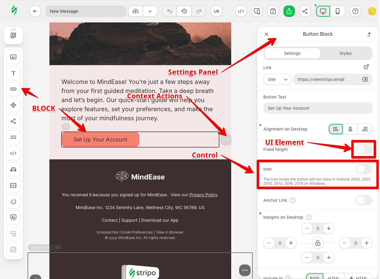
UI Element
Overview
UI Elements are the foundational building blocks for creating custom user interface components in the Stripo Email Editor. They enable you to extend the editor's interface with custom inputs, pickers, dropdowns, and specialized interactive components that go beyond standard HTML form elements. UI Elements can be embedded within controls and settings panels to provide rich, interactive functionality tailored to your specific needs.
Purpose and Core Concepts
What is a UI Element?
A UI Element in the Stripo Extensions SDK is a reusable UI component that:
- Defines custom interactive interface elements (color pickers, dropdowns, custom inputs, etc.)
- Can be embedded within controls
- Maintains state and responds to external attribute changes
- Integrates seamlessly with the editor's control system
- Provides lifecycle hooks for initialization and cleanup
- Communicates value changes to parent controls
Built-in vs Custom UI Elements
The SDK provides a rich set of built-in UI elements for common use cases, but you can also create custom UI elements when you need specialized functionality:
Built-in UI Elements - Ready to use without additional configuration:
- Buttons, checkboxes, radio buttons
- Text inputs, textareas, date pickers
- Color pickers, font family selectors
- Dropdown selects, switchers, counters
- Labels, messages, icons
- And more (see the Built-in UI Elements table)
Custom UI Elements - When built-in elements don't meet your needs:
- Brand-specific color palette pickers
- Advanced file uploaders with preview
- Custom merge tag selectors
- Specialized input validators
- Integration with external services
- Complex multi-field components
Creating Custom UI Elements
To create a custom UI element, follow these steps:
- Create a class that extends the
UIElementclass - Register your UI element with the
ExtensionBuilder
UI element configuration requires:
- Unique element identifier (
getId())- This identifier is used as a tag name in control templates
- It must be unique across all UI elements in the extension
- HTML template structure (
getTemplate()) - Render logic (
onRender())- Register all event listeners and other UI element-specific logic here
- Cleanup logic (
onDestroy())- Remove all event listeners and other UI element-specific logic here
- Getter and setter methods to maintain UI element state from parent control
- (Optional) Attribute update handler (
onAttributeUpdated())- This method is called when an attribute of the UI element is updated from the parent control
Once registered, you can use your custom UI element in control templates by referencing its ID:
javascript
import {UIElement, ExtensionBuilder} from '@stripoinc/ui-editor-extensions';

class BrandColorPickerUIElement extends UIElement {
    getId() {
        return 'brand-color-picker';
    }

    getTemplate() {
        return `
            <div class="brand-color-picker-palette" style="display: flex; gap: 16px;">
                <button
                    data-value="#ff6f61"
                    style="width: 30px; height: 30px; border-radius: 50%; border: none; background-color: #ff6f61; cursor: pointer;"
                    title="Coral"></button>
                <button
                    data-value="#43e97b"
                    style="width: 30px; height: 30px; border-radius: 50%; border: none; background-color: #43e97b; cursor: pointer;"
                    title="Mint"></button>
                <button
                    data-value="#5f72bd"
                    style="width: 30px; height: 30px; border-radius: 50%; border: none; background-color: #5f72bd; cursor: pointer;"
                    title="Violet"></button>
            </div>
        `;
    }

    onRender(container) {
        this.palette = container.querySelector('.brand-color-picker-palette');
        this.palette.addEventListener('click', this.paletteClickHandler.bind(this));
    }

    onDestroy() {
        this.palette.removeEventListener('click', this.paletteClickHandler.bind(this));
    }

    paletteClickHandler(e) {
        const selectedColor = e.target.getAttribute('data-value');

        // Trigger value change to parent control.
        // The 'setValue' method will be called automatically.
        this.api.triggerValueChange(selectedColor);
    }

    getValue() {
        return this.palette.querySelector('button.selected')?.getAttribute('data-value');
    }

    setValue(_value) {
        this.palette.querySelector('button.selected')?.classList.remove('selected');
        this.palette.querySelector(`button[data-value="${_value}"]`)?.classList.add('selected');
    }

    onAttributeUpdated(_name, _value) {
        // Handle attribute updates from parent control
        console.log(`Attribute updated: ${_name} = `, _value);
    }
}

class BrandControl extends Control {
    getId() {
        return 'brand-control';
    }

    getTemplate() {
        return `<brand-color-picker name="brandColorPicker"></brand-color-picker>`;
    }

    onRender() {
        this.api.onValueChanged('brandColorPicker', (newValue, oldValue) => {
            // Handle value changes from 'brandColorPicker' UI element
            console.log('brandColorPicker value changed:', newValue);
        });
    }

    onTemplateNodeUpdated(node) {
        // Update UI to reflect template state
        this.api.updateValues({
            'brandColorPicker': '#43e97b' // Get actual value from node
        });

        // Optionally, set UI element state with attribute values
        this.api.setUIEAttribute('brandColorPicker', 'preferred-color', '#53f97a');
    }
}

export default new ExtensionBuilder()
    .addUiElement(BrandColorPickerUIElement)
    .addControl(BrandControl)
    .build();
Built-in UI Elements
Supported Built-in UI Elements
The following image and table list all built-in UI elements available in the Stripo Extensions SDK:
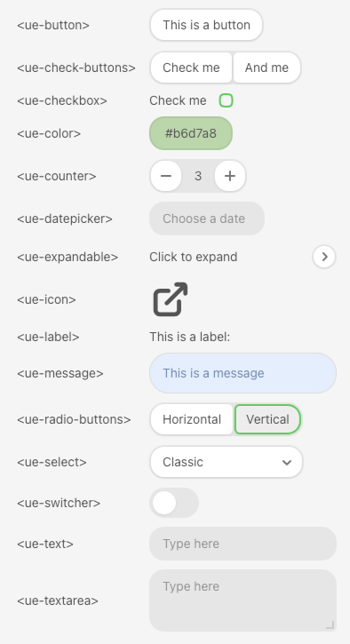
| Tag Name | Alias | Description | Common Attributes |
|---|---|---|---|
<ue-button> | UIElementType.BUTTON | Button element for triggering actions | name, disabled, caption, icon |
<ue-check-buttons> | UIElementType.CHECK_BUTTONS | Group of checkboxes as buttons | name, disabled, buttons |
<ue-checkbox> | UIElementType.CHECKBOX | Checkbox input for boolean values | name, disabled, caption |
<ue-color> | UIElementType.COLOR | Color picker for selecting colors | name, disabled |
<ue-counter> | UIElementType.COUNTER | Numeric input with increment/decrement buttons | name, disabled, min-value, max-value, step |
<ue-datepicker> | UIElementType.DATEPICKER | Date picker for selecting dates | name, disabled, placeholder, min-date |
<ue-amp-form-service-picker> | UIElementType.AMP_FORM_SERVICE_PICKER | AMP form service picker | name, disabled |
<ue-expandable> | UIElementType.EXPANDABLE | Expandable/collapsible container | name, expanded |
<ue-icon> | UIElementType.ICON | Icon display element | name, img, src, title, width, height, image-class, hint, is-active, visibility, transform |
<ue-label> | UIElementType.LABEL | Text label with optional hint | name, text, hint |
<ue-message> | UIElementType.MESSAGE | Message box for displaying information | name, type |
<ue-multiple_select> | UIElementType.MULTIPLE_SELECT | Multiple select input | name, disabled, placeholder |
<ue-nested-control> | UIElementType.NESTED_CONTROL | Container for nesting other controls | name, disabled, control-id |
<ue-orderable> | UIElementType.ORDERABLE | Reorderable list container | name, icon, position |
<ue-radio-buttons> | UIElementType.RADIO_BUTTONS | Radio button group | name, disabled, buttons |
<ue-repeatable> | UIElementType.REPEATABLE | Repeatable list container for dynamic items | name |
<ue-draggable-block> | UIElementType.DRAGGABLE_BLOCK | Draggable block selector element | name, disabled, block-id |
<ue-scrollable-container> | UIElementType.SCROLLABLE | Scrollable container wrapper | |
<ue-select> | UIElementType.SELECTPICKER | Dropdown select picker | name, disabled, searchable, multi-select, placeholder, items |
<ue-switcher> | UIElementType.SWITCHER | Toggle switcher for boolean values | name, disabled |
<ue-text> | UIElementType.TEXT | Single-line text input | name, disabled, placeholder |
<ue-textarea> | UIElementType.TEXTAREA | Multi-line text input | name, disabled, resizable, placeholder |
Using Built-in UI Elements
All built-in UI elements can be used directly in your control templates without additional registration by referencing their tag names or aliases:
Simple Usage
javascript
class ComprehensiveControl extends Control {
    getId() {
        return 'comprehensive-control';
    }

    getTemplate() {
        return `
            <div class="container two-columns">
                <${UIElementType.LABEL} ${UEAttr.LABEL.text}="<ue-button>"></${UIElementType.LABEL}>
                <${UIElementType.COLOR} ${UEAttr.COLOR.name}="colorPicker"></${UIElementType.COLOR}>
            </div>`;
    }

    onRender() {
        // Listen for 'colorPicker' UI element value changes
        this.api.onValueChanged('colorPicker', (newValue, oldValue) => {
            this.api.getDocumentModifier()
                .modifyHtml(this.node.querySelector(`.custom-message-area`))
                .setStyle('background-color', newValue)
                .apply(new ModificationDescription(`Updated background color to ${newValue}`));
        })
    }

    onTemplateNodeUpdated(node) {
        this.node = node;

        // Set the value for 'colorPicker' UI element
        const element = node.querySelector('.custom-message-area');
        this.api.updateValues({
            'colorPicker': node.querySelector(`.custom-message-area`).getStyle('background-color')
        });
    }
}
Complex Usage
Expandable UI Element
Expandable UI Elements allow you to group multiple UI elements inside a collapsible section, making complex forms more organized and user-friendly. An expandable UI element is composed of three main parts:
<ue-expandable>— The main wrapper for the entire collapsible section<ue-expandable-header>— The header area, typically containing the title, placed next to the expand/collapse toggle<ue-expandable-content>— The container for the content that is shown or hidden when expanded or collapsed
javascript
class ExpandableControl extends Control {
    getTemplate() {
        return `
            <div class="container">
                <${UIElementType.EXPANDABLE}>
                    <${UIElementType.EXPANDABLE_HEADER}>
                        <${UIElementType.LABEL} ${UEAttr.LABEL.text}="Click to expand"></${UIElementType.LABEL}>
                    </${UIElementType.EXPANDABLE_HEADER}>
                    <${UIElementType.EXPANDABLE_CONTENT}>
                        <${UIElementType.LABEL} ${UEAttr.LABEL.text}="First content row"></${UIElementType.LABEL}>
                        <${UIElementType.LABEL} ${UEAttr.LABEL.text}="Another row"></${UIElementType.LABEL}>
                    </${UIElementType.EXPANDABLE_CONTENT}>
                </${UIElementType.EXPANDABLE}>
            </div>`;
    }

    // Additional configuration should be here
}
Orderable UI Element
The Orderable UI Element allows users to reorder items within a list by dragging and dropping them. This component is useful when you need to provide a visual interface for changing the sequence of elements, such as reordering menu items, social links, or content blocks.
An orderable component is composed of three main parts:
<ue-orderable>— The main wrapper that manages the reorderable list<ue-orderable-item>— Individual items that can be reordered<ue-orderable-icon>— (Optional) Custom drag handle icon for individual items
Attributes
<ue-orderable> attributes:
name— (Required) Unique identifier for the orderable elementicon— (Optional) Icon name for the drag handle (default: system icon)position— (Optional) Position of the drag handle icon. Values:TOP,LEFT(default:TOP)
<ue-orderable-item> attributes:
name— (Optional) Unique identifier for the item. If not provided, items will be automatically named asitem1,item2, etc.
<ue-orderable-icon> attributes:
icon— (Required) Icon name to override the parent's drag handle icon for this specific item
Value Format
The orderable element returns an array of item names representing their current order:
typescript
// Example value when items are reordered
['item2', 'item1', 'item3']
Usage Examples
Example 1: Default Icon with Top Positioning
Use the default drag handle icon positioned at the top of each item. Items without an explicit name attribute will be automatically named as item1, item2, etc.
javascript
class OrderableControl extends Control {
    getTemplate() {
        return `
            <div class="container">
                <${UIElementType.ORDERABLE} name="orderableUIElement">
                    <${UIElementType.ORDERABLE_ITEM}>
                        <${UIElementType.LABEL} ${UEAttr.LABEL.text}="Item 1"></${UIElementType.LABEL}>
                    </${UIElementType.ORDERABLE_ITEM}>
                    <${UIElementType.ORDERABLE_ITEM}>
                        <${UIElementType.LABEL} ${UEAttr.LABEL.text}="Item 2"></${UIElementType.LABEL}>
                    </${UIElementType.ORDERABLE_ITEM}>
                </${UIElementType.ORDERABLE}>
            </div>`;
    }

    onRender() {
        this.api.onValueChanged('orderableUIElement', (newValue, oldValue) => {
            // oldValue -> ['item1', 'item2']
            // newValue -> ['item2', 'item1']
            console.log('Items reordered:', newValue);
        });
    }

    // Additional configuration should be here
}
Example 2: Custom Icon with Named Items
Use a custom icon (dots-3) for the drag handle while explicitly naming each item for better tracking:
javascript
class OrderableControl extends Control {
    getTemplate() {
        return `
            <div class="container">
                <${UIElementType.ORDERABLE} name="orderableUIElement" icon="dots-3">
                    <${UIElementType.ORDERABLE_ITEM} name="orderableItem1">
                        <${UIElementType.LABEL} ${UEAttr.LABEL.text}="Item 1"></${UIElementType.LABEL}>
                    </${UIElementType.ORDERABLE_ITEM}>
                    <${UIElementType.ORDERABLE_ITEM} name="orderableItem2">
                        <${UIElementType.LABEL} ${UEAttr.LABEL.text}="Item 2"></${UIElementType.LABEL}>
                    </${UIElementType.ORDERABLE_ITEM}>
                </${UIElementType.ORDERABLE}>
            </div>`;
    }

    onRender() {
        this.api.onValueChanged('orderableUIElement', (newValue, oldValue) => {
            // oldValue -> ['orderableItem1', 'orderableItem2']
            // newValue -> ['orderableItem2', 'orderableItem1']
            console.log('Items reordered:', newValue);
        });
    }

    // Additional configuration should be here
}
Example 3: Left-Positioned Icon with Per-Item Customization
Position the drag handle on the left side and override the icon for specific items:
javascript
class OrderableControl extends Control {
    getTemplate() {
        return `
            <div class="container">
                <${UIElementType.ORDERABLE} name="orderableUIElement" icon="dots-3" position="LEFT">
                    <${UIElementType.ORDERABLE_ITEM} name="orderableItem1">
                        <${UIElementType.LABEL} ${UEAttr.LABEL.text}="Item 1"></${UIElementType.LABEL}>
                    </${UIElementType.ORDERABLE_ITEM}>
                    <${UIElementType.ORDERABLE_ITEM} name="orderableItem2">
                        <${UIElementType.ORDERABLE_ICON} icon="dots-6"></${UIElementType.ORDERABLE_ICON}>
                        <${UIElementType.LABEL} ${UEAttr.LABEL.text}="Item 2"></${UIElementType.LABEL}>
                    </${UIElementType.ORDERABLE_ITEM}>
                </${UIElementType.ORDERABLE}>
            </div>`;
    }

    onRender() {
        this.api.onValueChanged('orderableUIElement', (newValue, oldValue) => {
            // oldValue -> ['orderableItem1', 'orderableItem2']
            // newValue -> ['orderableItem2', 'orderableItem1']
            console.log('Items reordered:', newValue);
        });
    }

    // Additional configuration should be here
}
Key Concepts
- Automatic Naming: If items don't have a
nameattribute, they're automatically assigned names likeitem1,item2, etc. - Icon Positioning: The
positionattribute controls where the drag handle appears (TOPorLEFT) - Per-Item Icons: Use
<ue-orderable-icon>within an item to override the parent's drag handle icon - Value Tracking: The component's value is always an array of item names in their current order
- Nested Content: Items can contain any combination of UI elements, not just labels
Nested UI Element
The Nested UI Element allows you to embed one control inside another control's template. This enables powerful composition patterns such as grouping multiple controls within an Expandable section or creating dynamic lists of controls with the Orderable component.
Attributes:
control-id— (Required) The unique identifier of the control to be nested
Key Use Cases:
- Grouping multiple controls in expandable sections
- Creating reorderable lists of controls
- Building complex, hierarchical control layouts
Usage Example: Nested Control in Expandable Section
javascript
class ExpandableNestedControl extends Control {
    getId() {
        return 'expandable-nested-control';
    }

    getTemplate() {
        return `
            <div class="container">
                <${UIElementType.EXPANDABLE}>
                    <${UIElementType.EXPANDABLE_HEADER}>
                        <${UIElementType.LABEL} ${UEAttr.LABEL.text}="Advanced Settings"></${UIElementType.LABEL}>
                    </${UIElementType.EXPANDABLE_HEADER}>
                    <${UIElementType.EXPANDABLE_CONTENT}>

                        <${UIElementType.NESTED_CONTROL}
                            ${UEAttr.NESTED_CONTROL.controlId}="my-custom-control-1-id">
                        </${UIElementType.NESTED_CONTROL}>

                        <${UIElementType.NESTED_CONTROL}
                            ${UEAttr.NESTED_CONTROL.controlId}="my-custom-control-2-id">
                        </${UIElementType.NESTED_CONTROL}>

                    </${UIElementType.EXPANDABLE_CONTENT}>
                </${UIElementType.EXPANDABLE}>
            </div>`;
    }

    // Additional configuration should be here
}
Usage Example: Orderable List of Controls
javascript
class OrderableNestedControlList extends Control {
    getId() {
        return 'orderable-nested-list';
    }

    getTemplate() {
        return `
            <div class="container">
                <${UIElementType.ORDERABLE} name="controlsList">
                    <${UIElementType.ORDERABLE_ITEM} name="item1">
                        <${UIElementType.NESTED_CONTROL}
                            ${UEAttr.NESTED_CONTROL.controlId}="my-custom-control-1-id">
                        </${UIElementType.NESTED_CONTROL}>
                    </${UIElementType.ORDERABLE_ITEM}>

                    <${UIElementType.ORDERABLE_ITEM} name="item2">
                        <${UIElementType.NESTED_CONTROL}
                            ${UEAttr.NESTED_CONTROL.controlId}="my-custom-control-2-id">
                        </${UIElementType.NESTED_CONTROL}>
                    </${UIElementType.ORDERABLE_ITEM}>
                </${UIElementType.ORDERABLE}>
            </div>`;
    }

    onRender() {
        this.api.onValueChanged('controlsList', (newValue, oldValue) => {
            // Handle reordering of nested controls
            console.log('Controls reordered:', newValue);
        });
    }

    // Additional configuration should be here
}
Repeatable UI Element
Version Availability
This element is available starting from v3.5.0
The Repeatable UI Element allows you to dynamically repeat a section of UI elements N times, creating dynamic forms and lists. This is particularly useful for building interfaces where users need to manage multiple similar items, such as filter groups, gallery items or any collection of structured data.
Attributes:
name— (Required) Unique identifier for the repeatable element
Key Features:
- Dynamic creation/removal of repeated sections
- Each repeated item maintains its own state
- Flexible value addressing for individual items or all items
Value Format
The repeatable element returns an array of objects, where each object contains the values of all UI elements within that repeated section:
typescript
// Example value structure
[
    { text: 'one', text2: 'first' },
    { text: 'two', text2: 'second' },
    { text: 'three', text2: 'third' }
]
API Methods
The Repeatable UI Element supports several addressing patterns for interacting with values:
1. Listen to all items changes:
javascript
this.api.onValueChanged('items', (newValue, oldValue) => {
    // newValue = [
    //    { text: 'one', text2: 'first' },
    //    { text: 'two', text2: 'second' }
    // ]
});
2. Listen to a specific field across all items:
javascript
this.api.onValueChanged('items.text2', (newValue, oldValue) => {
    // newValue = {
    //   idx: 2, // index of the changed item (0-based)
    //   value: 'updated value'
    // }
});
3. Listen to a specific field in a specific item:
javascript
this.api.onValueChanged('items[1].text2', (newValue, oldValue) => {
    // newValue = 'updated value'
});
4. Update all items at once:
javascript
this.api.updateValues({
    items: [
        { text: 'one', text2: 'first' },
        { text: 'two', text2: 'second' }
    ]
});
5. Update a specific field in a specific item:
javascript
this.api.updateUIElementValue('items[0].text', 'updated value');6. Set attributes on specific items:
javascript
// Disable a specific field in a specific item
this.api.setUIEAttribute('items[0].text2', 'disabled', true);

// Disable a field across all repeated items
this.api.setUIEAttribute('items.text2', 'disabled', true);
Usage Examples
Example 1: Simple Repeatable List
javascript
class SimpleRepeatableControl extends Control {
    getId() {
        return 'simple-repeatable-control';
    }

    getTemplate() {
        return `
            <div class="container">
                <${UIElementType.REPEATABLE} name="items">
                    <${UIElementType.TEXT} ${UEAttr.TEXT.name}="text"></${UIElementType.TEXT}>
                    <${UIElementType.TEXT} ${UEAttr.TEXT.name}="text2"></${UIElementType.TEXT}>
                </${UIElementType.REPEATABLE}>
            </div>`;
    }

    onRender() {
        // Initialize with data
        this.api.updateValues({
            items: [
                { text: 'First', text2: 'Item 1' },
                { text: 'Second', text2: 'Item 2' }
            ]
        });

        // Listen for changes
        this.api.onValueChanged('items', (newValue, oldValue) => {
            console.log('Items updated:', newValue);
        });
    }
}
Example 2: Dynamic Filter Builder
A comprehensive example showing a filter builder with multiple filter groups:
javascript
import { Control, UEAttr, UIElementType } from '@stripoinc/ui-editor-extensions';

class FilterBuilderControl extends Control {
    FILTER_GROUPS_DATA = [
        {
            name: 'Filter Group 1',
            filters: [
                { type: 'standard', attribute: 'item_id', operator: 'is_exactly', value: '' },
                { type: 'standard', attribute: 'item_id', operator: 'contains', value: 'blue', connectionType: 'and' }
            ]
        },
        {
            name: 'Filter Group 2',
            filters: [
                { type: 'standard', attribute: 'item_id', operator: 'is_exactly', value: '' }
            ]
        }
    ];

    activeFilterGroup = 0;

    getId() {
        return 'filter-builder-control';
    }

  getTemplate() {
    return `
      <div class="container">
        <div>
            <${UIElementType.RADIO_BUTTONS} ${UEAttr.RADIO_BUTTONS.name}="filterTabs"></${UIElementType.RADIO_BUTTONS}>
            <${UIElementType.BUTTON} name="addFilterGroupButton">Add Filter Group</${UIElementType.BUTTON}>
        </div>

        <${UIElementType.REPEATABLE} name="items">
          <div name="shouldConcatenationBeVisible">
            <${UIElementType.RADIO_BUTTONS} ${UEAttr.RADIO_BUTTONS.name}="filterConcatenation">
                <${UIElementType.RADIO_ITEM} ${UEAttr.RADIO_ITEM.text}="and" ${UEAttr.RADIO_ITEM.value}="and"></${UIElementType.RADIO_ITEM}>
                <${UIElementType.RADIO_ITEM} ${UEAttr.RADIO_ITEM.text}="or" ${UEAttr.RADIO_ITEM.value}="or"></${UIElementType.RADIO_ITEM}>
            </${UIElementType.RADIO_BUTTONS}>
          </div>

          <div class="container two-columns">
            <${UIElementType.LABEL} name="filterNameLabel"></${UIElementType.LABEL}>
            <${UIElementType.BUTTON} name="filterDeleteButton">Delete</${UIElementType.BUTTON}>
          </div>

          <div class="container two-columns">
            <${UIElementType.LABEL} ${UEAttr.LABEL.text}="Filter Type"></${UIElementType.LABEL}>
            <${UIElementType.SELECTPICKER} ${UEAttr.SELECTPICKER.name}="typeSelect">
                <${UIElementType.SELECT_ITEM} ${UEAttr.SELECT_ITEM.value}="standard" ${UEAttr.SELECT_ITEM.text}="Standard"></${UIElementType.SELECT_ITEM}>
                <${UIElementType.SELECT_ITEM} ${UEAttr.SELECT_ITEM.value}="classic" ${UEAttr.SELECT_ITEM.text}="Classic"></${UIElementType.SELECT_ITEM}>
            </${UIElementType.SELECTPICKER}>

            <${UIElementType.LABEL} ${UEAttr.LABEL.text}="Attribute"></${UIElementType.LABEL}>
            <${UIElementType.SELECTPICKER} ${UEAttr.SELECTPICKER.name}="attributeSelect">
                <${UIElementType.SELECT_ITEM} ${UEAttr.SELECT_ITEM.value}="item_id" ${UEAttr.SELECT_ITEM.text}="Item Id"></${UIElementType.SELECT_ITEM}>
            </${UIElementType.SELECTPICKER}>

            <${UIElementType.LABEL} ${UEAttr.LABEL.text}="Operator"></${UIElementType.LABEL}>
            <${UIElementType.SELECTPICKER} ${UEAttr.SELECTPICKER.name}="operatorSelect">
                <${UIElementType.SELECT_ITEM} ${UEAttr.SELECT_ITEM.value}="is_exactly" ${UEAttr.SELECT_ITEM.text}="Is Exactly"></${UIElementType.SELECT_ITEM}>
                <${UIElementType.SELECT_ITEM} ${UEAttr.SELECT_ITEM.value}="contains" ${UEAttr.SELECT_ITEM.text}="Contains"></${UIElementType.SELECT_ITEM}>
            </${UIElementType.SELECTPICKER}>

            <${UIElementType.LABEL} ${UEAttr.LABEL.text}="Value"></${UIElementType.LABEL}>
            <${UIElementType.TEXT} ${UEAttr.TEXT.name}="filterInputValue"></${UIElementType.TEXT}>
          </div>
        </${UIElementType.REPEATABLE}>
      </div>`;
    }

    #updateFilterTabs() {
        this.api.setUIEAttribute(
            'filterTabs',
            UEAttr.RADIO_BUTTONS.buttons,
            this.FILTER_GROUPS_DATA.map((group, idx) => ({
                [UEAttr.RADIO_ITEM.text]: group.name,
                [UEAttr.RADIO_ITEM.value]: idx
            }))
        );
    }

    onRender() {
        // Setup filter group tabs
        this.api.setVisibility('items[0].shouldConcatenationBeVisible', false);
        this.#updateFilterTabs();
        this.api.updateValues({ filterTabs: this.activeFilterGroup });

        // Handle adding new filter group
        this.api.onValueChanged('addFilterGroupButton', () => {
            this.FILTER_GROUPS_DATA.push({
                name: `Filter Group ${this.FILTER_GROUPS_DATA.length + 1}`,
                filters: [{ type: 'standard', attribute: 'item_id', operator: 'is_exactly', value: '' }]
            });
            this.#updateFilterTabs();
        });

        // Handle filter deletion
        this.api.onValueChanged('items.filterDeleteButton', (newValue) => {
            this.FILTER_GROUPS_DATA[this.activeFilterGroup].filters.splice(newValue.idx, 1);
            this.#loadActiveFilterGroup();
        });

        // Handle tab switching
        this.api.onValueChanged('filterTabs', (newValue) => {
            this.activeFilterGroup = newValue;
            this.#loadActiveFilterGroup();
        });

        // Load initial data
        this.#loadActiveFilterGroup();

        // Listen to all filter changes
        this.api.onValueChanged('items', (newValue) => {
            // newValue contains array of all filter values
            console.log('Filters updated:', newValue);
        });
    }

    #loadActiveFilterGroup() {
        this.api.updateValues({
            items: this.FILTER_GROUPS_DATA[this.activeFilterGroup].filters.map((filter, idx) => ({
                filterNameLabel: `Filter ${idx + 1}`,
                typeSelect: filter.type,
                attributeSelect: filter.attribute,
                operatorSelect: filter.operator,
                filterInputValue: filter.value,
                filterConcatenation: filter.connectionType
            }))
        });
    }

    onTemplateNodeUpdated(node) {
        this.node = node;
    }
}
Key Concepts
- Dynamic Items: The number of repeated items is determined by the array length passed to
updateValues - Indexed Access: Use bracket notation like
items[0].textto access specific items - Field Access: Use dot notation like
items.textto listen to a field across all items - Conditional Rendering: Use
setVisibilityAPI method to show/hide items - Full Control API Support: All standard Control API methods work with repeatable elements
- Nested UI Elements: Items can contain any combination of UI elements including other complex elements
Draggable Block UI Element
Version Availability
This element is available starting from v3.7.0
The Draggable Block UI Element lets you expose a draggable block card inside a control template. Use it to create module libraries or curated block lists in custom panels.
Attributes:
name— (Required) Unique identifier for the draggable elementblock-id— (Required) Block ID to bind to the draggable elementdisabled— (Optional) Disable drag-and-drop
Usage Example:
javascript
class DraggableBlockControl extends Control {
    getTemplate() {
        return `
            <div class="container">
                <${UIElementType.DRAGGABLE_BLOCK}
                    ${UEAttr.DRAGGABLE_BLOCK.name}="promoBlock"
                    ${UEAttr.DRAGGABLE_BLOCK.blockId}="promo-block">
                </${UIElementType.DRAGGABLE_BLOCK}>
            </div>`;
    }
}
AMP Form Service Picker UI Element
Version Availability
This element is available starting from v3.8.0
The AMP Form Service Picker UI Element exposes a built-in picker for AMP form service configuration flows. For more details about configuring AMP services, see Initialization Settings: AMP Form Services.
Attributes:
name- (Required) Unique identifier for the UI elementdisabled- (Optional) Disable interaction
Usage Example:
javascript
class AmpFormControl extends Control {
    getTemplate() {
        return `
            <${UIElementType.AMP_FORM_SERVICE_PICKER}
                ${UEAttr.AMP_FORM_SERVICE_PICKER.name}="servicePicker">
            </${UIElementType.AMP_FORM_SERVICE_PICKER}>
        `;
    }
}
Multiple Select UI Element
Version Availability
This element is available starting from v3.8.0
The Multiple Select UI Element provides a built-in control for choosing several values from the same field.
Attributes:
name- (Required) Unique identifier for the UI elementplaceholder- (Optional) Placeholder textdisabled- (Optional) Disable interaction
Usage Example:
javascript
class TagsControl extends Control {
    getTemplate() {
        return `
            <${UIElementType.MULTIPLE_SELECT}
                ${UEAttr.MULTIPLE_SELECT.name}="selectedTags"
                ${UEAttr.MULTIPLE_SELECT.placeholder}="Choose tags">
            </${UIElementType.MULTIPLE_SELECT}>
        `;
    }
}
Scrollable UI Element
Version Availability
This element is available starting from v3.8.0
The Scrollable UI Element provides a scrollable wrapper for overflow-heavy layouts inside custom controls and tabs.
Overriding Built-in UI Elements
The UIElementTagRegistry allows you to replace built-in UI elements with custom implementations throughout your extension. This is particularly useful when you want to:
- Apply consistent branding to all UI elements
- Add custom functionality to standard elements
- Integrate with external services
- Enforce specific validation or formatting rules
Creating a Tag Registry
To override built-in UI elements:
- Create a class that extends
UIElementTagRegistry - Implement the
registerUiElements()method - Map tags to your custom UI element IDs
- Register the registry with
ExtensionBuilder
javascript
import {UIElementTagRegistry, UIElementType, ExtensionBuilder} from '@stripoinc/ui-editor-extensions';

class CustomTagRegistry extends UIElementTagRegistry {
    registerUiElements(uiElementsTagsMap) {
        // Override the built-in color picker with custom implementation
        uiElementsTagsMap[UIElementType.COLOR] = 'brand-color-picker';
    }
}

export default new ExtensionBuilder()
    .addUiElement(BrandColorPickerUIElement)
    .withUiElementTagRegistry(CustomTagRegistry)
    .build();
UI Element API
The UI Element API, accessible through this.api, provides method to notify the parent control when the UI element's value changes, ensuring proper synchronization and state management.
For complete API reference, see UIElementApi.