Appearance
Integrate an External Custom Font
Overview
The External Custom Font integration allows users to add and manage custom web fonts directly within the Stripo Email Editor. This integration provides a seamless experience for incorporating brand-specific typography, web fonts from CDNs, or self-hosted font files into email templates while maintaining full control over your font library.
What You'll Build
In this tutorial, you'll create a fully functional custom font selector that:
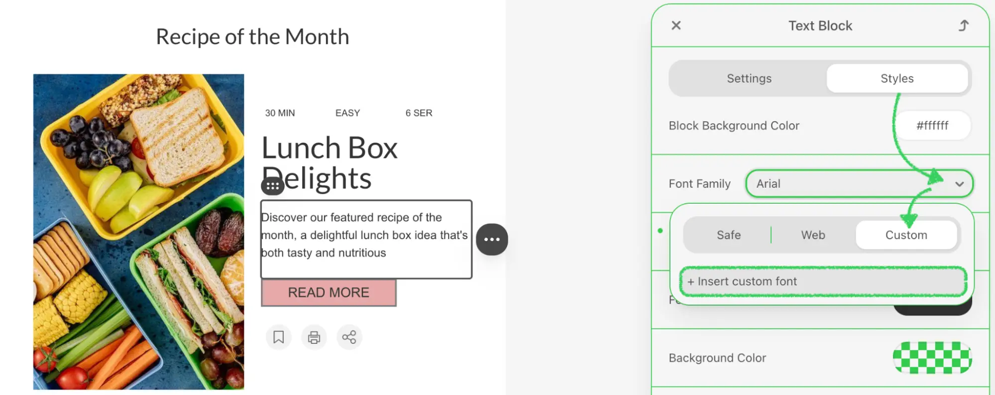
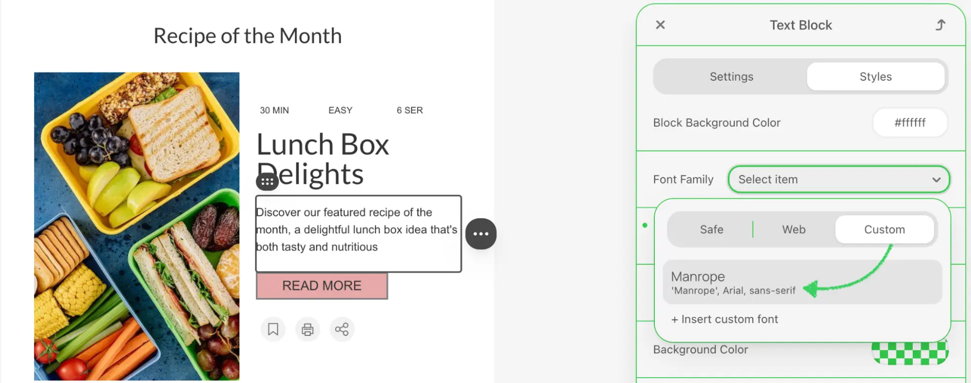
- Extends the default font family dropdown with an "Add Custom Font" option
- Opens a modal dialog to collect font information (name, CSS font-family, URL)
- Validates all required font properties before submission
- Integrates seamlessly with the editor's font management system
- Provides visual feedback with modern, user-friendly interface
Use Cases
- Brand Typography: Incorporate your organization's proprietary fonts into email templates
- Google Fonts Integration: Add fonts from Google Fonts or other web font CDNs
- Self-Hosted Fonts: Connect to fonts hosted on your own servers or CDN
- Font Marketplace Integration: Link to third-party font providers like Adobe Fonts or Typekit
- Multi-Brand Support: Enable different font sets for different brands or clients
Prerequisites
Before starting this tutorial, ensure you have:
- Node.js version 22.x or higher installed
- Basic understanding of JavaScript ES6+ syntax
- Familiarity with the Stripo Extensions SDK
- Understanding of CSS
@font-faceand web fonts
Understanding the Interface
The External Custom Font integration requires two key components:
1. Custom UI Element
Create a custom UI element that extends UIElement to wrap the default font selector and add custom functionality:
typescript
class CustomFontFamilySelectUIElement extends UIElement {
  getId(): string;                          // Unique element ID
  getTemplate(): string;                    // HTML template wrapping original selector
  onRender(container: HTMLElement): void;   // Setup event listeners
  onDestroy(): void;                        // Cleanup event listeners
  onAttributeUpdated(name: string, value: any): void;  // Handle attribute changes
  getValue(): string;                       // Get current font value
  setValue(value: string): void;            // Set font value programmatically
}
2. UI Element Tag Registry
Register your custom UI element to replace the default font family selector:
typescript
class ExtensionTagRegistry extends UIElementTagRegistry {
  registerUiElements(uiElementsTagsMap: Record<string, string>): void;
}
Custom Font Object Structure
When adding a custom font, your implementation must provide an object with the following structure:
typescript
{
  name: string;        // Display name (e.g., "Montserrat Bold")
  fontFamily: string;  // CSS font-family value (e.g., "'Montserrat', sans-serif")
  url: string;         // Font resource URL (e.g., "https://fonts.googleapis.com/...")
}
Font URL Formats
Font URLs can point to various resources:
- Google Fonts:
https://fonts.googleapis.com/css2?family=Roboto:wght@400;700 - Self-hosted:
https://cdn.yoursite.com/fonts/custom-font.woff2 - Adobe Fonts:
https://use.typekit.net/abc1234.css - Any valid web font resource that uses
@font-faceCSS rules
Step 1: Project Setup
Create your project structure and install dependencies according to the Getting Started guide.
Your project directory structure should look like this:
bash
external-custom-font/
├── index.html
├── src/
│   ├── creds.js
│   ├── index.js
│   ├── extension.js
├── package.json
└── vite.config.js
Step 2: Create the Custom Font Selector UI Element
Create a new file src/CustomFontFamilySelectUIElement.js with the following implementation:
javascript
import {ADD_CUSTOM_FONT_OPTION, UEAttr, UIElement} from '@stripoinc/ui-editor-extensions';

export const CUSTOM_FONT_FAMILY_SELECT_UI_ELEMENT_ID = 'custom-font-family-select';
export const ORIGINAL_FONT_FAMILY_SELECT_ID = 'original-font-family-select';

export class CustomFontFamilySelectUIElement extends UIElement {
    getId() {
        return CUSTOM_FONT_FAMILY_SELECT_UI_ELEMENT_ID;
    }

    getTemplate() {
        return `<${ORIGINAL_FONT_FAMILY_SELECT_ID}
            id="originalSelect"
            style="width: 100%;"
            ${UEAttr.FONT_FAMILY_SELECT.addCustomFontOption}="+ Insert custom font">
        </${ORIGINAL_FONT_FAMILY_SELECT_ID}>`;
    }

    onRender(container) {
        this.listener = this._onChange.bind(this);
        this.originalSelect = container.querySelector('#originalSelect');
        this.originalSelect.addEventListener('change', this.listener);
    }

    onDestroy() {
        this.originalSelect.removeEventListener('change', this.listener);
    }

    onAttributeUpdated(name, value) {
        this.originalSelect.setUIEAttribute(name, value);
        super.onAttributeUpdated(name, value);
    }

    getValue() {
        return this.originalSelect.value;
    }

    setValue(value) {
        this.originalSelect.value = value;
    }

    _onChange(event) {
        if (event.target.value !== ADD_CUSTOM_FONT_OPTION) {
            this.api.triggerValueChange(event.target.value);
        } else if (!this.dialog) {
            this._showDialog();
        }
    }
}
Key Components Explained
Template Structure:
- Wraps the original font selector using
ORIGINAL_FONT_FAMILY_SELECT_ID - Adds custom option via
UEAttr.FONT_FAMILY_SELECT.addCustomFontOptionattribute - The custom option text is "+ Insert custom font"
- Wraps the original font selector using
Event Handling:
onRender(): Attaches change listener to the select element_onChange(): Distinguishes between regular font selection and custom font trigger- When
ADD_CUSTOM_FONT_OPTIONis selected, opens the custom font dialog
Value Management:
getValue()andsetValue(): Proxy methods that delegate to the original selectonAttributeUpdated(): Forwards attribute changes to the wrapped element
Important Constants
The SDK provides ADD_CUSTOM_FONT_OPTION constant to identify the special custom font option. Never hardcode this value, always import it from the SDK.
Step 3: Create the Custom Font Dialog
Add the dialog creation and management methods to CustomFontFamilySelectUIElement.js:
Dialog Display Method
javascript
_showDialog() {
    this.dialog = document.createElement('div');
    this.dialog.innerHTML = this._getDialogTemplate();
    this.api.ignoreClickOutside(true);
    document.body.appendChild(this.dialog);

    // Add event listeners
    this.dialog.querySelector('#confirm').addEventListener('click', () => this._submitDialog());
    this.dialog.querySelector('#cancel').addEventListener('click', () => this._closeDialog());

    // Add input event listeners to hide error message when user starts typing
    const inputs = this.dialog.querySelectorAll('input');
    inputs.forEach(input => {
        input.addEventListener('input', () => {
            const errorMsg = this.dialog.querySelector('#error-message');
            if (errorMsg) {
                errorMsg.style.display = 'none';
            }
        });
    });
}
Dialog Template Method
javascript
_getDialogTemplate() {
    return `<div style="
        position: fixed;
        top: 0;
        left: 0;
        right: 0;
        bottom: 0;
        background: rgba(0, 0, 0, 0.5);
        display: flex;
        align-items: center;
        justify-content: center;
        z-index: 9999;">
        <div style="
            background: #ffffff;
            border-radius: 8px;
            box-shadow: 0 4px 24px rgba(0, 0, 0, 0.15);
            width: 420px;
            max-width: 90vw;
            animation: fadeIn 0.2s ease-out;">
            <div style="
                padding: 24px;
                border-bottom: 1px solid #e5e7eb;">
                <h2 style="
                    margin: 0;
                    font-size: 20px;
                    font-weight: 600;
                    color: #1f2937;
                    font-family: -apple-system, BlinkMacSystemFont, 'Segoe UI', Roboto, 'Helvetica Neue', Arial, sans-serif;">
                    Add Custom Font
                </h2>
                <p style="
                    margin: 8px 0 0 0;
                    font-size: 14px;
                    color: #6b7280;
                    font-family: -apple-system, BlinkMacSystemFont, 'Segoe UI', Roboto, 'Helvetica Neue', Arial, sans-serif;">
                    Configure your custom font settings
                </p>
            </div>
            <div style="padding: 24px;">
                <div style="margin-bottom: 20px;">
                    <label style="
                        display: block;
                        margin-bottom: 8px;
                        font-size: 14px;
                        font-weight: 500;
                        color: #374151;
                        font-family: -apple-system, BlinkMacSystemFont, 'Segoe UI', Roboto, 'Helvetica Neue', Arial, sans-serif;">
                        Font Name
                    </label>
                    <input id="name"
                        placeholder="e.g., My Custom Font"
                        style="
                            width: 100%;
                            padding: 10px 12px;
                            border: 1px solid #d1d5db;
                            border-radius: 6px;
                            font-size: 14px;
                            font-family: -apple-system, BlinkMacSystemFont, 'Segoe UI', Roboto, 'Helvetica Neue', Arial, sans-serif;
                            transition: all 0.2s;
                            box-sizing: border-box;
                            outline: none;"
                        onfocus="this.style.borderColor='#3b82f6'; this.style.boxShadow='0 0 0 3px rgba(59, 130, 246, 0.1)'"
                        onblur="this.style.borderColor='#d1d5db'; this.style.boxShadow='none'">
                </div>
                <div style="margin-bottom: 20px;">
                    <label style="
                        display: block;
                        margin-bottom: 8px;
                        font-size: 14px;
                        font-weight: 500;
                        color: #374151;
                        font-family: -apple-system, BlinkMacSystemFont, 'Segoe UI', Roboto, 'Helvetica Neue', Arial, sans-serif;">
                        CSS Font Family
                    </label>
                    <input id="fontFamily"
                        placeholder="e.g., 'My Font', sans-serif"
                        style="
                            width: 100%;
                            padding: 10px 12px;
                            border: 1px solid #d1d5db;
                            border-radius: 6px;
                            font-size: 14px;
                            font-family: -apple-system, BlinkMacSystemFont, 'Segoe UI', Roboto, 'Helvetica Neue', Arial, sans-serif;
                            transition: all 0.2s;
                            box-sizing: border-box;
                            outline: none;"
                        onfocus="this.style.borderColor='#3b82f6'; this.style.boxShadow='0 0 0 3px rgba(59, 130, 246, 0.1)'"
                        onblur="this.style.borderColor='#d1d5db'; this.style.boxShadow='none'">
                </div>
                <div style="margin-bottom: 24px;">
                    <label style="
                        display: block;
                        margin-bottom: 8px;
                        font-size: 14px;
                        font-weight: 500;
                        color: #374151;
                        font-family: -apple-system, BlinkMacSystemFont, 'Segoe UI', Roboto, 'Helvetica Neue', Arial, sans-serif;">
                        Font URL
                    </label>
                    <input id="url"
                        placeholder="e.g., https://fonts.googleapis.com/..."
                        style="
                            width: 100%;
                            padding: 10px 12px;
                            border: 1px solid #d1d5db;
                            border-radius: 6px;
                            font-size: 14px;
                            font-family: -apple-system, BlinkMacSystemFont, 'Segoe UI', Roboto, 'Helvetica Neue', Arial, sans-serif;
                            transition: all 0.2s;
                            box-sizing: border-box;
                            outline: none;"
                        onfocus="this.style.borderColor='#3b82f6'; this.style.boxShadow='0 0 0 3px rgba(59, 130, 246, 0.1)'"
                        onblur="this.style.borderColor='#d1d5db'; this.style.boxShadow='none'">
                </div>
                <div id="error-message" style="
                    display: none;
                    padding: 12px;
                    background: #fee2e2;
                    border: 1px solid #fecaca;
                    border-radius: 6px;
                    color: #991b1b;
                    font-size: 14px;
                    font-family: -apple-system, BlinkMacSystemFont, 'Segoe UI', Roboto, 'Helvetica Neue', Arial, sans-serif;
                    margin-bottom: 20px;">
                    All fields are required. Please fill in all the information.
                </div>
                <div style="
                    display: flex;
                    gap: 12px;
                    justify-content: flex-end;">
                    <button
                        id="cancel"
                        style="
                            padding: 10px 20px;
                            border: 1px solid #d1d5db;
                            border-radius: 6px;
                            background: #ffffff;
                            color: #374151;
                            font-size: 14px;
                            font-weight: 500;
                            font-family: -apple-system, BlinkMacSystemFont, 'Segoe UI', Roboto, 'Helvetica Neue', Arial, sans-serif;
                            cursor: pointer;
                            transition: all 0.2s;">
                        Cancel
                    </button>
                    <button id="confirm"
                        style="
                            padding: 10px 20px;
                            border: none;
                            border-radius: 6px;
                            background: #34c759;
                            color: #ffffff;
                            font-size: 14px;
                            font-weight: 500;
                            font-family: -apple-system, BlinkMacSystemFont, 'Segoe UI', Roboto, 'Helvetica Neue', Arial, sans-serif;
                            cursor: pointer;
                            transition: all 0.2s;">
                        Add Font
                    </button>
                </div>
            </div>
            <div style="
                padding: 16px 24px;
                border-top: 1px solid #e5e7eb;
                background-color: #fef3c7;
                border-radius: 0 0 8px 8px;
                text-align: center;">
                <p style="
                    margin: 0;
                    font-size: 13px;
                    color: #92400e;
                    font-weight: 500;
                    font-family: -apple-system, BlinkMacSystemFont, 'Segoe UI', Roboto, 'Helvetica Neue', Arial, sans-serif;">
                    <span style="font-weight: 700; color: #d97706;">⚠️ Notice:</span> This popup window is not part of the plugin. It is intended solely for demonstration purposes and can be implemented independently in any desired way.
                </p>
            </div>
        </div>
    </div>
    <style>
        @keyframes fadeIn {
            from {
                opacity: 0;
                transform: scale(0.95);
            }
            to {
                opacity: 1;
                transform: scale(1);
            }
        }
    </style>`;
}
Dialog Features Explained
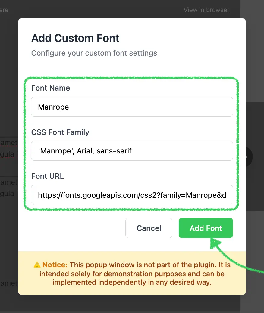
- Modal Overlay: Fixed position overlay with semi-transparent background and blur effect
- Form Fields:
- Font Name: Display name shown in the font selector dropdown
- CSS Font Family: The actual CSS
font-familyvalue (e.g., "'Roboto', sans-serif") - Font URL: Link to the font resource or stylesheet
- Input Enhancement: Focus states with blue border and shadow for better UX
- Error Display: Hidden error message that shows when validation fails
- Animations: Smooth fade-in animation using CSS keyframes
- Responsive Design: Uses
max-width: 90vwto ensure dialog fits on small screens
Click Outside Prevention
The this.api.ignoreClickOutside(true) call prevents the editor from closing the dialog when clicking inside it. Remember to call ignoreClickOutside(false) when closing the dialog.
Step 4: Implement Dialog Submission and Validation
Add the submission and validation logic to handle font addition:
Submit Dialog Method
javascript
_submitDialog() {
    const nameInput = this.dialog.querySelector('#name');
    const fontFamilyInput = this.dialog.querySelector('#fontFamily');
    const urlInput = this.dialog.querySelector('#url');

    // Reset any previous error states
    [nameInput, fontFamilyInput, urlInput].forEach(input => {
        input.style.borderColor = '#d1d5db';
    });

    // Validate inputs
    let hasError = false;
    if (!nameInput.value.trim()) {
        nameInput.style.borderColor = '#ef4444';
        hasError = true;
    }
    if (!fontFamilyInput.value.trim()) {
        fontFamilyInput.style.borderColor = '#ef4444';
        hasError = true;
    }
    if (!urlInput.value.trim()) {
        urlInput.style.borderColor = '#ef4444';
        hasError = true;
    }

    if (hasError) {
        // Show error message
        const errorMsg = this.dialog.querySelector('#error-message');
        if (errorMsg) {
            errorMsg.style.display = 'block';
        }
        return;
    }

    const newFont = {
        name: nameInput.value.trim(),
        fontFamily: fontFamilyInput.value.trim(),
        url: urlInput.value.trim(),
    }
    this.api.addCustomFont(newFont);
    this._closeDialog();
}
Close Dialog Method
javascript
_closeDialog() {
    if (this.dialog) {
        this.dialog.remove();
        this.dialog = undefined;
        this.api.ignoreClickOutside(false);
        this.originalSelect.value = '';
    }
}
Validation Logic Explained
- Input Retrieval: Gets references to all three input fields
- State Reset: Clears any previous error border colors
- Validation:
- Checks each field is not empty using
trim() - Highlights invalid fields with red border (
#ef4444) - Sets
hasErrorflag when validation fails
- Checks each field is not empty using
- Error Display: Shows error message if any field is invalid
- Font Registration: If validation passes, calls
this.api.addCustomFont()with font object - Cleanup: Closes dialog and resets the select value
Font Family Format
The fontFamily field should follow CSS font-family syntax:
- Single font:
'Roboto' - With fallback:
'Roboto', sans-serif - Multiple words:
'Open Sans', Arial, sans-serif
Always include quotes around font names with spaces.
Step 5: Create the UI Element Tag Registry
Create src/ExtensionTagRegistry.js to register your custom font selector as a replacement for the default:
javascript
import {UIElementTagRegistry, UIElementType} from '@stripoinc/ui-editor-extensions';
import {CUSTOM_FONT_FAMILY_SELECT_UI_ELEMENT_ID, ORIGINAL_FONT_FAMILY_SELECT_ID} from './CustomFontFamilySelectUIElement';

export class ExtensionTagRegistry extends UIElementTagRegistry {
    registerUiElements(uiElementsTagsMap) {
        uiElementsTagsMap[ORIGINAL_FONT_FAMILY_SELECT_ID] = uiElementsTagsMap[UIElementType.FONT_FAMILY_SELECT];
        uiElementsTagsMap[UIElementType.FONT_FAMILY_SELECT] = CUSTOM_FONT_FAMILY_SELECT_UI_ELEMENT_ID;
    }
}
Tag Registry Logic Explained
The registry performs two critical mappings:
Preserve Original Selector:
javascriptuiElementsTagsMap[ORIGINAL_FONT_FAMILY_SELECT_ID] = uiElementsTagsMap[UIElementType.FONT_FAMILY_SELECT];- Saves the original font selector implementation
- Makes it available under
ORIGINAL_FONT_FAMILY_SELECT_ID - Allows your custom element to wrap and reuse the original
Replace Default Selector:
javascriptuiElementsTagsMap[UIElementType.FONT_FAMILY_SELECT] = CUSTOM_FONT_FAMILY_SELECT_UI_ELEMENT_ID;- Maps the standard font selector type to your custom implementation
- Ensures all font selector instances use your enhanced version
- Seamlessly integrates with the editor without modifying existing code
Order Matters
The order of these two statements is critical. First save the original selector reference, then replace it with your custom implementation. Reversing the order will break the functionality.
Step 6: Register the Extension
Create src/extension.js to register your custom font integration with the Stripo extension system:
javascript
import {ExtensionBuilder} from '@stripoinc/ui-editor-extensions';
import {CustomFontFamilySelectUIElement} from './CustomFontFamilySelectUIElement';
import {ExtensionTagRegistry} from './ExtensionTagRegistry';

const extension = new ExtensionBuilder()
    .addUiElement(CustomFontFamilySelectUIElement)
    .withUiElementTagRegistry(ExtensionTagRegistry)
    .build();

export default extension;
Extension Registration Explained
The ExtensionBuilder provides a fluent API for composing extensions:
.addUiElement(CustomFontFamilySelectUIElement):- Registers your custom UI element class with the extension system
- Makes the element available for use in the editor
- The editor will instantiate this class when needed
.withUiElementTagRegistry(ExtensionTagRegistry):- Registers your tag registry to control UI element mapping
- Tells the editor to replace the default font selector with your custom one
- Enables the wrapper pattern by preserving access to the original selector
.build():- Constructs and returns the final extension configuration object
- This object is passed to the editor during initialization
Multiple Integrations
You can chain multiple integration methods within a single extension:
javascript
new ExtensionBuilder()
    .addUiElement(CustomFontFamilySelectUIElement)
    .withUiElementTagRegistry(ExtensionTagRegistry)
    .withExternalImageLibrary(MyExternalImageLibrary)
    .withExternalVideosLibrary(MyExternalVideosLibrary)
    .build();
This allows combining custom fonts with other external integrations.
Step 7: Run the Development Server
Your implementation is now ready for testing.
Start the Development Server
bash
npm run devThis command will:
- Start the Vite development server on
http://localhost:3000 - Automatically open your default browser
- Load the Stripo Editor with your custom font integration
Complete Example
For a full working example, check out the complete implementation in our GitHub repository.