Appearance
Integrate an External Merge Tags Selector
Overview
The External Merge Tags Selector integration enables users to browse and select dynamic merge tags from your customer data platform, CRM, or custom data sources directly within the Stripo Email Editor. Merge tags are placeholders that get replaced with actual customer data when emails are sent, enabling personalized email content at scale.
What You'll Build
In this tutorial, you'll create a fully functional merge tags selector modal that:
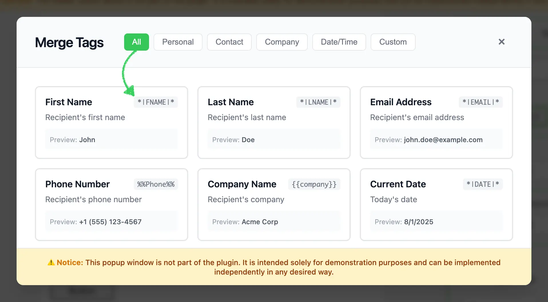
- Displays a responsive grid of merge tag cards with labels, values, descriptions, and previews
- Supports category-based filtering (All, Personal, Contact, Company, Date/Time, Custom)
- Handles merge tag selection with proper callback integration
- Shows real-time preview values for each merge tag
- Detects and displays module context with a visual badge indicator
- Returns merge tag data in the format expected by the Stripo editor

Use Cases
- CRM Integration: Connect to Salesforce, HubSpot, or other CRM systems to access contact fields
- Customer Data Platforms: Integrate with Segment, mParticle, or custom CDP solutions
- E-commerce Platforms: Access customer purchase history, cart data, and product recommendations
- Marketing Automation: Connect to Mailchimp, SendGrid, or custom email service providers
- Custom Data Sources: Fetch merge tags from your API or internal systems
- Multi-System Integration: Combine merge tags from multiple data sources in a single interface
Prerequisites
Before starting this tutorial, ensure you have:
- Node.js version 22.x or higher installed
- Basic understanding of JavaScript ES6+ syntax
- Familiarity with the Stripo Extensions SDK
- Understanding of how merge tags work in email marketing
Understanding the Interface
The External Merge Tags integration requires two key components:
1. Custom UI Element
Create a custom UI element that extends UIElement to replace the default merge tags selector:
typescript
class MergeTagsUiElement extends UIElement {
  getId(): string;                          // Unique element ID
  getTemplate(): string;                    // HTML template for the button
  onRender(container: HTMLElement): void;   // Setup event listeners
  onDestroy(): void;                        // Cleanup
  onAttributeUpdated(name: string, value: any): void;  // Handle attribute changes
}
2. UI Element Tag Registry
Register your custom UI element to replace the default merge tags selector:
typescript
class ExtensionTagRegistry extends UIElementTagRegistry {
  registerUiElements(uiElementsTagsMap: Record<string, string>): void;
}
Merge Tag Object Structure
When a user selects a merge tag, your implementation must return an object with the following structure:
typescript
{
  value: string;  // The merge tag value (e.g., "*|FNAME|*")
  label: string;  // Human-readable label (e.g., "First Name")
}
Merge Tag Formats
Merge tags can follow different formats depending on your email service provider:
- Mailchimp:
*|FIELD|* - Campaign Monitor:
%%field%% - Custom: Any format your system supports
Step 1: Project Setup
Create your project structure and install dependencies according to the Getting Started guide.
Your project directory structure should look like this:
bash
external-merge-tags/
├── index.html
├── src/
│   ├── creds.js
│   ├── index.js
│   ├── extension.js
├── package.json
└── vite.config.js
Step 2: Create the Merge Tags Library Class
Create a new file src/MyExternalMergeTagsLibrary.js with the following basic class structure:
javascript
/**
 * External Merge Tags Library Implementation
 * This class implements a modal merge tags selector with filtering capabilities
 * for the Stripo Email Editor extension system.
 */
export class MyExternalMergeTagsLibrary {
    // Instance properties
    externalLibrary;
    selectedMergetag = null;
    dataSelectCallback = () => {};
    activeCategory = 'all';
    isModule = false;

    constructor() {
        this.createModal();
        this.attachEventListeners();
        this.initializeFilters();
        this.addStyles();
    }

    /**
     * Opens the merge tags library modal
     * @param {string} mergeTag - Currently selected merge tag value (if any)
     * @param {boolean} isModule - Whether the merge tag is being used in a module context
     * @param {Function} onDataSelectCallback - Callback invoked when a tag is selected
     */
    openMergeTagsLibrary(mergeTag, isModule, onDataSelectCallback) {
        // Store callback and selected tag
        this.selectedMergetag = mergeTag;
        this.isModule = isModule;
        this.dataSelectCallback = onDataSelectCallback;

        // Update module badge visibility
        const moduleBadge = this.externalLibrary.querySelector('.module-badge');
        if (moduleBadge) {
            moduleBadge.style.display = this.isModule ? 'inline-block' : 'none';
        }

        // Update selected state
        this.updateSelectedTag();

        // Show modal
        this.externalLibrary.style.display = 'flex';

        // Reset filters to show all tags
        this.filterTags('all');
        const allButton = this.externalLibrary.querySelector('[data-category="all"]');
        if (allButton) {
            this.updateActiveButton(allButton);
        }
    }
}
Key Components Explained
Instance Properties:
externalLibrary: Reference to the modal DOM elementselectedMergetag: Currently selected merge tag valuedataSelectCallback: Callback function from the Stripo editoractiveCategory: Currently active filter categoryisModule: Boolean flag indicating if the merge tag is used in a module context
Constructor: Initializes the modal UI, event listeners, filters, and custom styles
openMergeTagsLibrary: Required method that:
- Stores the selected merge tag, module context, and callback
- Shows/hides the "Module" badge based on context
- Updates visual selection state
- Displays the modal
- Resets filters to show all tags
Step 3: Define Merge Tags Data and Styles
Add static properties for merge tags data and UI configuration. Continue editing src/MyExternalMergeTagsLibrary.js:
javascript
export class MyExternalMergeTagsLibrary {
    // ... existing properties ...

    // UI Style configurations
    static STYLES = {
        // Modal overlay styles
        overlay: {
            backgroundColor: 'rgba(0,0,0,.7)',
            position: 'fixed',
            top: '0',
            right: '0',
            bottom: '0',
            left: '0',
            zIndex: '1050',
            display: 'flex',
            alignItems: 'center',
            justifyContent: 'center',
            backdropFilter: 'blur(4px)',
            fontFamily: "-apple-system, BlinkMacSystemFont, 'Segoe UI', Roboto, 'Helvetica Neue', Arial, sans-serif"
        },

        // Modal container styles
        modal: {
            backgroundColor: '#ffffff',
            borderRadius: '12px',
            boxShadow: '0 20px 25px -5px rgba(0, 0, 0, 0.1), 0 10px 10px -5px rgba(0, 0, 0, 0.04)',
            maxWidth: '900px',
            width: '90%',
            display: 'flex',
            flexDirection: 'column',
            position: 'relative'
        },

        // Header styles
        header: {
            padding: '24px 32px',
            borderBottom: '1px solid #e5e7eb',
            display: 'flex',
            alignItems: 'center',
            justifyContent: 'space-between',
            backgroundColor: '#f9fafb',
            borderRadius: '12px 12px 0 0'
        },

        // Content container styles
        content: {
            padding: '32px',
            height: '315px',
            overflowY: 'auto',
            overflowX: 'hidden',
            boxSizing: 'border-box'
        },

        // Grid styles
        grid: {
            display: 'grid',
            gridTemplateColumns: 'repeat(auto-fill, minmax(220px, 1fr))',
            gap: '16px'
        },

        // Button styles
        buttonActive: {
            padding: '6px 14px',
            borderRadius: '6px',
            border: 'none',
            backgroundColor: '#34c759',
            color: 'white',
            fontSize: '14px',
            fontWeight: '500',
            cursor: 'pointer',
            transition: 'background-color 0.2s'
        },

        buttonInactive: {
            padding: '6px 14px',
            borderRadius: '6px',
            border: '1px solid #e5e7eb',
            backgroundColor: 'white',
            color: '#6b7280',
            fontSize: '14px',
            fontWeight: '500',
            cursor: 'pointer',
            transition: 'all 0.2s'
        },

        // Footer styles
        footer: {
            padding: '16px 32px',
            borderTop: '1px solid #e5e7eb',
            backgroundColor: '#fef3c7',
            borderRadius: '0 0 12px 12px',
            textAlign: 'center'
        }
    };

    // Sample merge tags data
    static MERGE_TAGS = [
        {
            category: 'personal',
            value: '*|FNAME|*',
            label: 'First Name',
            preview: 'John',
            description: 'Recipient\'s first name'
        },
        {
            category: 'personal',
            value: '*|LNAME|*',
            label: 'Last Name',
            preview: 'Doe',
            description: 'Recipient\'s last name'
        },
        {
            category: 'personal',
            value: '*|EMAIL|*',
            label: 'Email Address',
            preview: 'john.doe@example.com',
            description: 'Recipient\'s email address'
        },
        {
            category: 'contact',
            value: '%%Phone%%',
            label: 'Phone Number',
            preview: '+1 (555) 123-4567',
            description: 'Recipient\'s phone number'
        },
        {
            category: 'company',
            value: '{{company}}',
            label: 'Company Name',
            preview: 'Acme Corp',
            description: 'Recipient\'s company'
        },
        {
            category: 'date',
            value: '*|DATE|*',
            label: 'Current Date',
            preview: new Date().toLocaleDateString(),
            description: 'Today\'s date'
        },
        {
            category: 'custom',
            value: '*|CUSTOM_FIELD|*',
            label: 'Custom Field',
            preview: 'Custom Value',
            description: 'Custom merge field'
        }
    ];

    // ... rest of the class ...
}
Merge Tag Object Properties
| Property | Type | Description |
|---|---|---|
category | string | Filter category (personal, contact, company, date, custom) |
value | string | The actual merge tag value used in templates |
label | string | Human-readable display name |
preview | string | Sample value shown to users |
description | string | Helpful description of the merge tag's purpose |
Production Implementation
In production environments, replace the static MERGE_TAGS array with API calls to dynamically fetch merge tags from your CRM, CDP, or custom data sources.
Step 4: Build the Modal UI Structure
Implement the core modal creation methods. These methods generate the modal HTML structure and inject it into the page.
Create Modal Method
javascript
/**
 * Creates the modal HTML structure and appends it to the document body
 */
createModal() {
    const modalHtml = this.generateModalHTML();
    const container = document.createElement('div');
    container.innerHTML = modalHtml;
    document.body.appendChild(container);

    // Store reference to the modal element
    this.externalLibrary = document.getElementById('externalMergeTags');
    // Initially hide the modal
    this.externalLibrary.style.display = 'none';
}

/**
 * Generates the complete modal HTML structure
 * @returns {string} Complete HTML string for the modal
 */
generateModalHTML() {
    return `
        <div id="externalMergeTags" style="${this.styleObjToString(MyExternalMergeTagsLibrary.STYLES.overlay)}">
            <div style="${this.styleObjToString(MyExternalMergeTagsLibrary.STYLES.modal)}">
                ${this.generateHeaderHTML()}
                ${this.generateContentHTML()}
                ${this.generateFooterHTML()}
            </div>
        </div>
    `;
}
Style Conversion Helper
Add the following utility method that converts JavaScript style objects to inline CSS strings:
javascript
/**
 * Converts a style object to an inline style string
 * @param {Object} styleObj - Style object with camelCase properties
 * @returns {string} Inline CSS style string with kebab-case properties
 */
styleObjToString(styleObj) {
    return Object.entries(styleObj)
        .map(([key, value]) => {
            // Convert camelCase to kebab-case
            const kebabKey = key.replace(/([A-Z])/g, '-$1').toLowerCase();
            return `${kebabKey}: ${value}`;
        })
        .join('; ');
}
Add Custom Styles for Selection State
javascript
/**
 * Adds custom styles for the selected merge tag state
 */
addStyles() {
    const style = document.createElement('style');
    style.innerHTML = `
        #externalMergeTags .tag-card.selected {
            border-color: #3b82f6;
            box-shadow: 0 0 0 3px rgba(59, 130, 246, 0.1);
        }
    `;
    document.head.appendChild(style);
}
Important
The styleObjToString() method is essential for converting the STYLES object into inline CSS strings. The addStyles() method adds CSS for visual selection feedback.
Modal Structure Overview
The modal consists of three main sections:
- Header: Title, category filter buttons, and close button
- Content: Scrollable grid of merge tag cards with labels, values, descriptions, and previews
- Footer: Informational disclaimer
Step 5: Generate Header with Filters
Create the header section with title, filter buttons, and close button.
Header HTML Generator
javascript
/**
 * Generates the modal header section HTML
 * @returns {string} HTML string for the header section
 */
generateHeaderHTML() {
    return `
        <div style="${this.styleObjToString(MyExternalMergeTagsLibrary.STYLES.header)}">
            <div style="display: flex; align-items: center; gap: 12px;">
                <h2 style="margin: 0; font-size: 24px; font-weight: 600; color: #111827; letter-spacing: -0.025em;">
                    Merge Tags
                </h2>
                <span class="module-badge" style="display: none; background-color: #3b82f6; color: white; padding: 4px 12px; border-radius: 6px; font-size: 14px; font-weight: 600; letter-spacing: 0.025em;">
                    Module
                </span>
                <div class="filter-buttons" style="display: flex; gap: 8px; margin-left: 24px;">
                    ${this.generateFilterButtons()}
                </div>
            </div>
            ${this.generateCloseButton()}
        </div>
    `;
}
Module Badge Feature
The header includes a "Module" badge that displays when the merge tag selector is opened from within a module context. This badge is hidden by default and only becomes visible when isModule is true, helping users understand whether they're working with merge tags in a regular template or within a reusable module component.
Filter Buttons Generator
javascript
/**
 * Generates category filter buttons HTML
 * @returns {string} HTML string for all filter buttons
 */
generateFilterButtons() {
    const categories = [
        { id: 'all', label: 'All', active: true },
        { id: 'personal', label: 'Personal', active: false },
        { id: 'contact', label: 'Contact', active: false },
        { id: 'company', label: 'Company', active: false },
        { id: 'date', label: 'Date/Time', active: false },
        { id: 'custom', label: 'Custom', active: false }
    ];

    return categories.map(cat => `
        <button
            data-category="${cat.id}"
            style="${this.styleObjToString(cat.active ? MyExternalMergeTagsLibrary.STYLES.buttonActive : MyExternalMergeTagsLibrary.STYLES.buttonInactive)}">
            ${cat.label}
        </button>
    `).join('');
}
Category Customization
Categories can be added or modified by updating the categories array. Ensure your merge tags data contains matching category values for proper filtering. Common categories include personal info, contact details, company data, transactional data, and custom fields.
Close Button Generator
javascript
/**
 * Generates close button HTML with hover effects
 * @returns {string} HTML string for the close button
 */
generateCloseButton() {
    return `
        <button class="close" type="button"
            style="cursor: pointer; background: transparent; border: none; font-size: 24px;
                   color: #6b7280; width: 40px; height: 40px; display: flex; align-items: center;
                   justify-content: center; border-radius: 8px; transition: all 0.2s;"
            onmouseover="this.style.backgroundColor='#f3f4f6'; this.style.color='#111827';"
            onmouseout="this.style.backgroundColor='transparent'; this.style.color='#6b7280';">
            <span style="line-height: 1;">×</span>
        </button>
    `;
}
Step 6: Generate Content with Merge Tags Grid
Create the content section that displays merge tag cards in a responsive grid.
Content Container Generator
javascript
/**
 * Generates the modal content section HTML with merge tags grid
 * @returns {string} HTML string for the content section
 */
generateContentHTML() {
    return `
        <div style="${this.styleObjToString(MyExternalMergeTagsLibrary.STYLES.content)}">
            <div class="tags-grid" style="${this.styleObjToString(MyExternalMergeTagsLibrary.STYLES.grid)}">
                ${this.generateMergeTagCards()}
            </div>
        </div>
    `;
}
Merge Tag Cards Generator
javascript
/**
 * Generates merge tag card HTML
 * @returns {string} HTML string for all merge tag cards
 */
generateMergeTagCards() {
    return MyExternalMergeTagsLibrary.MERGE_TAGS.map(tag => `
        <div class="tag-card"
             data-category="${tag.category}"
             data-value="${tag.value}"
             data-label="${tag.label}"
             style="cursor: pointer; border: 2px solid #e5e7eb; border-radius: 8px;
                    padding: 16px; background-color: #ffffff; transition: all 0.2s;
                    display: flex; flex-direction: column; gap: 8px;"
             onmouseover="if(!this.classList.contains('selected')) {
                           this.style.borderColor='#d1d5db';
                           this.style.transform='translateY(-2px)';
                           this.style.boxShadow='0 4px 6px -1px rgba(0, 0, 0, 0.1), 0 2px 4px -1px rgba(0, 0, 0, 0.06)';
                         }"
             onmouseout="if(!this.classList.contains('selected')) {
                          this.style.borderColor='#e5e7eb';
                          this.style.transform='translateY(0)';
                          this.style.boxShadow='none';
                        }">
            <div style="display: flex; justify-content: space-between; align-items: flex-start;">
                <h3 style="margin: 0; font-size: 16px; font-weight: 600; color: #111827;">
                    ${tag.label}
                </h3>
                <span style="font-family: 'Monaco', 'Consolas', monospace; font-size: 12px;
                             background-color: #f3f4f6; padding: 2px 6px; border-radius: 4px;
                             color: #6b7280;">
                    ${tag.value}
                </span>
            </div>
            <p style="margin: 0; font-size: 14px; color: #6b7280;">
                ${tag.description}
            </p>
            <div style="background-color: #f9fafb; padding: 8px; border-radius: 4px;
                        margin-top: 4px;">
                <span style="font-size: 12px; color: #9ca3af;">Preview: </span>
                <span style="font-size: 12px; color: #4b5563; font-weight: 500;">
                    ${tag.preview}
                </span>
            </div>
        </div>
    `).join('');
}
Key Features
- Responsive Grid: Utilizes CSS Grid with
auto-fillto create a responsive layout that adapts to different screen sizes - Merge Tag Cards: Each card displays the merge tag label, value (in monospace), description, and sample preview
- Hover Effects: Inline event handlers provide smooth transition animations with conditional logic to preserve selected state
- Data Attributes: Merge tag metadata is stored in data attributes for efficient retrieval on selection
- Visual Feedback: Selected cards have distinct styling to indicate current selection
- Preview Display: Shows sample data to help users understand what the merge tag will display
Design Considerations
The monospace font for merge tag values helps users distinguish the actual merge tag syntax from the display labels. The preview section provides crucial context about what data the merge tag represents.
Step 7: Generate Footer with Disclaimer
Add a footer section to display important notices or disclaimers.
javascript
/**
 * Generates the modal footer section HTML with disclaimer notice
 * @returns {string} HTML string for the footer section
 */
generateFooterHTML() {
    return `
        <div style="${this.styleObjToString(MyExternalMergeTagsLibrary.STYLES.footer)}">
            <p style="margin: 0; font-size: 13px; color: #92400e; font-weight: 500;">
                <span style="font-weight: 700; color: #d97706;">⚠️ Notice:</span> This popup window is not part of the plugin. It is intended solely for demonstration purposes and can be implemented independently in any desired way.
            </p>
        </div>
    `;
}
Step 8: Implement Event Handlers
Add event listeners to handle user interactions with the modal.
Attach Event Listeners
javascript
/**
 * Attaches event listeners to modal elements after creation
 */
attachEventListeners() {
    // Close button click handler
    this.externalLibrary.querySelector('.close')
        .addEventListener('click', this.cancelAndClose.bind(this));

    // Tag card click handler (using event delegation)
    this.externalLibrary.addEventListener('click', this.onTagClick.bind(this));
}
Handle Merge Tag Selection
javascript
/**
 * Handles click events on merge tag cards
 * @param {Event} e - Click event object
 */
onTagClick(e) {
    // Check if clicked on tag card or any of its children
    const tagCard = e.target.closest('.tag-card');
    if (!tagCard) return;

    // Create callback object with tag data
    const tagData = {
        value: tagCard.getAttribute('data-value'),
        label: tagCard.getAttribute('data-label')
    };

    // Close modal and execute callback
    this.close();
    this.dataSelectCallback(tagData);
}
Data Format
The callback receives an object with value and label properties. The value is the actual merge tag syntax that will be inserted into the template, while the label provides the human-readable name for display purposes.
Handle Selected State Updates
javascript
/**
 * Updates the selected state of merge tag cards
 */
updateSelectedTag() {
    // Remove selected class from all cards
    const selectedElement = this.externalLibrary.querySelector('.tag-card.selected');
    if (selectedElement) {
        selectedElement.classList.remove('selected');
        // Reset styles
        selectedElement.style.borderColor = '#e5e7eb';
        selectedElement.style.transform = 'translateY(0)';
        selectedElement.style.boxShadow = 'none';
    }

    // Add selected class to current tag
    if (this.selectedMergetag) {
        const currentTag = this.externalLibrary.querySelector(`[data-value="${this.selectedMergetag}"]`);
        if (currentTag) {
            currentTag.classList.add('selected');
        }
    }
}
Handle Modal Closure
javascript
/**
 * Closes the modal and executes cancel callback
 */
cancelAndClose() {
    this.close();
}

/**
 * Closes the modal by hiding it from view
 */
close() {
    this.externalLibrary.style.display = 'none';
}
Event Delegation Benefits
Using event delegation by listening to the parent container provides several advantages:
- Improved Performance: A single event listener replaces multiple individual listeners for each card
- Simplified Maintenance: Eliminates the need to dynamically attach and detach listeners
- Future-Proof Implementation: Automatically handles dynamically added merge tag elements
- Memory Efficiency: Reduces the memory footprint when managing numerous elements
Step 9: Implement Category Filtering
Add filtering functionality to help users find merge tags by category.
Initialize Filter Buttons
javascript
/**
 * Initializes category filter button functionality
 */
initializeFilters() {
    const filterButtons = this.externalLibrary.querySelectorAll('.filter-buttons button');

    filterButtons.forEach(button => {
        button.addEventListener('click', (e) => {
            const category = e.target.getAttribute('data-category');
            this.filterTags(category);
            this.updateActiveButton(e.target);
        });
    });
}
Filter Merge Tags by Category
javascript
/**
 * Filters displayed merge tags based on the selected category
 * @param {string} category - Category identifier to filter by (or 'all' for all tags)
 */
filterTags(category) {
    this.activeCategory = category;
    const tagCards = this.externalLibrary.querySelectorAll('.tag-card');

    tagCards.forEach(card => {
        const shouldShow = category === 'all' ||
                         card.getAttribute('data-category') === category;
        card.style.display = shouldShow ? 'flex' : 'none';
    });
}
Update Button Visual States
javascript
/**
* Updates the visual state of category filter buttons
* @param {HTMLElement} activeButton - The button element that was clicked and should be marked active
*/
updateActiveButton(activeButton) {
const buttons = this.externalLibrary.querySelectorAll('.filter-buttons button');
buttons.forEach(button => {
const isActive = button === activeButton;
const styles = isActive ?
MyExternalMergeTagsLibrary.STYLES.buttonActive :
MyExternalMergeTagsLibrary.STYLES.buttonInactive;
// Apply styles
Object.assign(button.style, styles);
});
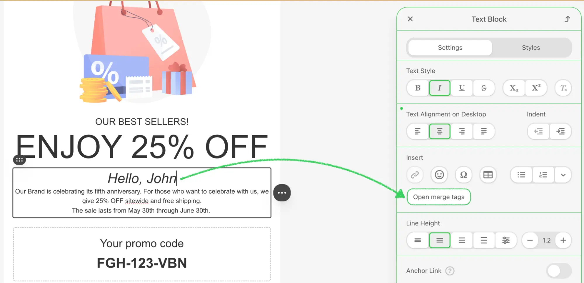
}Step 10: Create the Merge Tags UI Element
Create src/MergeTagsUiElement.js to define the custom UI element that will replace the default merge tags selector:
javascript
import {UIElement, UIElementType} from '@stripoinc/ui-editor-extensions';
import {MyExternalMergeTagsLibrary} from './MyExternalMergeTagsLibrary';

export const EXTERNAL_MERGE_TAGS_UI_ELEMENT_ID = 'external-merge-tags-ui-element';

export class MergeTagsUiElement extends UIElement {
    isModuleNode = false;

    /**
     * Returns the unique identifier for this UI element
     */
    getId() {
        return EXTERNAL_MERGE_TAGS_UI_ELEMENT_ID;
    }

    /**
     * Returns the HTML template for the merge tags button
     */
    getTemplate() {
        return `
            <div>
              <${UIElementType.BUTTON} id="mergeTagsButton" class="btn btn-primary">Open merge tags</${UIElementType.BUTTON}>
            </div>`;
    }

    /**
     * Called when the element is rendered in the editor
     * @param {HTMLElement} container - The container element
     */
    onRender(container) {
        this.listener = this._onClick.bind(this);

        this.mergeTagsButton = container.querySelector('#mergeTagsButton');
        this.mergeTagsButton.addEventListener('click', this.listener);
    }

    /**
     * Called when the element is destroyed
     */
    onDestroy() {
        this.mergeTagsButton.removeEventListener('click', this.listener);
    }

    /**
     * Handles button click events
     */
    _onClick(event) {
        this.openMergeTagLibrary();
    }

    /**
     * Opens the external merge tags library modal
     */
    openMergeTagLibrary() {
        if (!this.mergeTagsLibrary) {
            this.mergeTagsLibrary = new MyExternalMergeTagsLibrary();
        }
        this.mergeTagsLibrary.openMergeTagsLibrary(this.selectedMergeTag?.value, this.isModuleNode, (data) => {
            this.api.triggerValueChange(data);
        });
    }

    /**
     * Called when an attribute is updated
     * @param {string} name - Attribute name
     * @param {any} value - New attribute value
     */
    onAttributeUpdated(name, value) {
        if (name === 'blockNode') {
            this.isModuleNode = !!value.getClosestModuleId();
        }
        if (name === 'mergeTag') {
            this.selectedMergeTag = value;
            // If a merge tag is selected, open the library immediately
            this.selectedMergeTag && this.openMergeTagLibrary();
        }
    }
}
UI Element Lifecycle Methods
| Method | Purpose |
|---|---|
getId() | Returns unique identifier for the UI element |
getTemplate() | Returns HTML template for the button |
onRender(container) | Sets up event listeners when rendered |
onDestroy() | Cleans up event listeners when destroyed |
onAttributeUpdated(name, value) | Handles attribute changes from the editor |
Module Context Detection
The UI element tracks whether the merge tag is being used within a module context through the blockNode attribute:
isModuleNodeproperty: Boolean flag that indicates if the current node is within a moduleblockNodeattribute: When updated, the code checks if the node has a closest module ID usingvalue.getClosestModuleId()- Module Badge: The modal displays a "Module" badge when
isModuleNodeis true, helping users understand the context
API Integration
The this.api.triggerValueChange(data) method notifies the Stripo editor of the selected merge tag. The editor will then insert or update the merge tag in the template based on the current context. The isModuleNode flag is passed to the library to enable context-aware UI features like the module badge.
Step 11: Create the UI Element Tag Registry
Create src/ExtensionTagRegistry.js to register your custom UI element to replace the default merge tags selector:
javascript
import {UIElementTagRegistry, UIElementType} from '@stripoinc/ui-editor-extensions';
import {EXTERNAL_MERGE_TAGS_UI_ELEMENT_ID} from './MergeTagsUiElement';

export class ExtensionTagRegistry extends UIElementTagRegistry {
    /**
     * Registers custom UI elements to replace default editor elements
     * @param {Object} uiElementsTagsMap - Map of UI element types to custom element IDs
     */
    registerUiElements(uiElementsTagsMap) {
        uiElementsTagsMap[UIElementType.MERGETAGS] = EXTERNAL_MERGE_TAGS_UI_ELEMENT_ID;
    }
}
How Tag Registry Works
The UIElementTagRegistry allows you to map standard Stripo UI element types to your custom implementations:
- UIElementType.MERGETAGS: The standard merge tags selector type
- EXTERNAL_MERGE_TAGS_UI_ELEMENT_ID: Your custom element's unique ID
- When the editor needs a merge tags selector, it will use your custom implementation instead
Important
The tag registry is what enables your custom UI element to replace the default merge tags selector throughout the editor. Without this registration, your custom element would exist but not be automatically used by the editor.
Step 12: Register the Extension
Create src/extension.js to register your merge tags integration with the Stripo extension system:
javascript
import { ExtensionBuilder } from '@stripoinc/ui-editor-extensions';
import {MergeTagsUiElement} from './MergeTagsUiElement';
import {ExtensionTagRegistry} from './ExtensionTagRegistry';

const extension = new ExtensionBuilder()
    .addUiElement(MergeTagsUiElement)
    .withUiElementTagRegistry(ExtensionTagRegistry)
    .build();

export default extension;
Extension Registration Explained
The ExtensionBuilder class provides a fluent API for registering integrations:
.addUiElement(MergeTagsUiElement): Registers your custom UI element with the extension system.withUiElementTagRegistry(ExtensionTagRegistry): Registers your tag registry to replace default UI elements.build(): Constructs and returns the final extension object for the editor
Registration Order
The order of operations is important:
- First, register the UI element using
addUiElement() - Then, register the tag registry using
withUiElementTagRegistry() - The tag registry maps the
UIElementType.MERGETAGSto your custom element's ID - When the editor needs a merge tags selector, it will use your custom element
Multiple Integrations
Multiple integration methods can be chained to register different types of extensions within a single extension object:
javascript
new ExtensionBuilder()
    .addUiElement(MergeTagsUiElement)
    .withUiElementTagRegistry(ExtensionTagRegistry)
    .withExternalImageLibrary(MyExternalImageLibrary)
    .withExternalVideosLibrary(MyExternalVideosLibrary)
    .build();
Step 13: Configure the Editor Integration
Update your src/index.js to properly integrate the extension with the Stripo editor:
javascript
import extension from './extension.js';
import {PLUGIN_ID, SECRET_KEY, EDITOR_URL, EMAIL_ID, USER_ID} from './creds';

// Initialize the editor with your extension
function _runEditor(template, extension) {
    window.UIEditor.initEditor(
        document.querySelector('#stripoEditorContainer'),
        {
            html: template.html,
            css: template.css,
            metadata: {
                emailId: EMAIL_ID
            },
            locale: 'en',
            onTokenRefreshRequest: function (callback) {
                _request('POST', 'https://plugins.stripo.email/api/v1/auth',
                    JSON.stringify({
                        pluginId: PLUGIN_ID,
                        secretKey: SECRET_KEY,
                        userId: USER_ID,
                        role: 'user'
                    }),
                    function(data) {
                        callback(JSON.parse(data).token);
                    }
                );
            },
            // ... other configuration ...
            ignoreClickOutsideSelectors: ['#externalMergeTags'],
            extensions: [
                extension
            ]
        }
    );
}
Critical Configuration Options
| Option | Purpose |
|---|---|
ignoreClickOutsideSelectors | Prevents editor from closing your modal when clicking inside it |
extensions | Array of extension objects to register with the editor |
Important
The ignoreClickOutsideSelectors: ['#externalMergeTags'] configuration is critical. Without it, clicking inside your modal may trigger the editor's click-outside handlers and cause unexpected behavior. Make sure the selector matches your modal's ID.
Step 14: Run the Development Server
Your implementation is now ready for testing.
Start the Development Server
bash
npm run devThis command will:
- Start the Vite development server on
http://localhost:3000 - Automatically open your default browser
- Load the Stripo Editor with your merge tags extension integrated
Complete Example
For a full working example, check out the complete implementation in our GitHub repository.