Appearance
Block Component
Overview
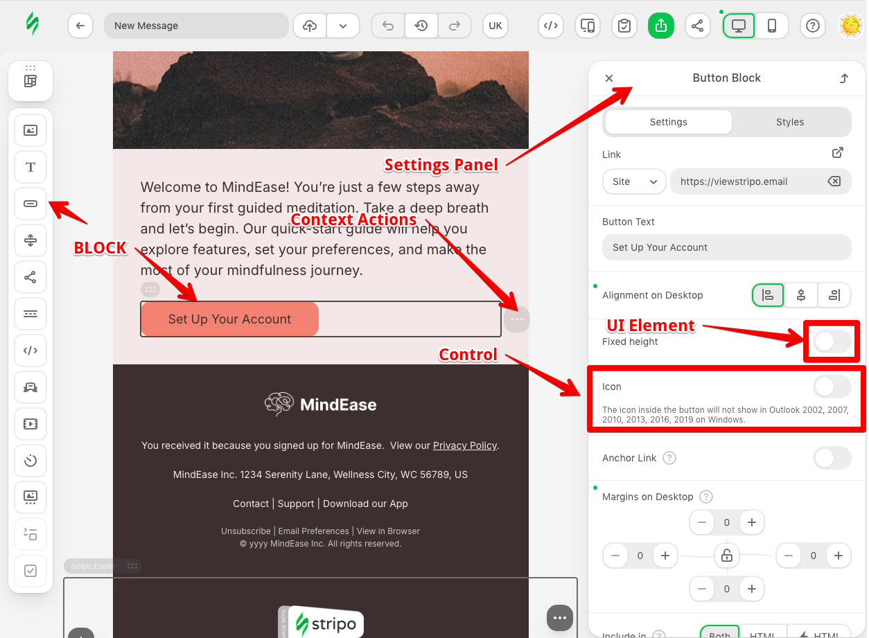
The Block component is the fundamental building unit of the Stripo Email Editor extension system. It represents a piece of content that users can drag and drop into their email templates. Blocks can range from simple text elements to complex, interactive structures that contain other blocks. The Block component provides a powerful abstraction layer that enables developers to create custom email content while maintaining compatibility with the editor's collaborative features and template management system.
Purpose and Core Concepts
What is a Block?
A Block in the Stripo Extensions SDK is a self-contained component that:
- Defines a reusable piece of email content
- Appears in the editor's blocks panel for drag-and-drop functionality
- Can contain HTML structure, styling, and behavior
- Integrates seamlessly with the editor's undo/redo, collaboration, and export features
- Maintains state and responds to user interactions through lifecycle hooks
Block Composition Types
Blocks are categorized into three fundamental types based on their composition:
Atomic Blocks (
BlockCompositionType.BLOCK)- Self-contained units that cannot contain other blocks
- Examples: buttons, images, text paragraphs, videos, social icons
- Can be inserted into containers
Container Blocks (
BlockCompositionType.CONTAINER)- Container blocks that can hold other blocks
- Examples: product cards
- Can be inserted into structures
Structure Blocks (
BlockCompositionType.STRUCTURE)- Hold containers with blocks inside them
- Examples: multi-column layouts, product lists
- Can be inserted into stripes
The Immutable Architecture
One of the key architectural decisions in the Stripo Extensions SDK is the use of immutable nodes. When working with blocks:
- You cannot directly modify HTML or CSS properties
- All template modifications must go through the
TemplateModifierAPI - This ensures proper synchronization in collaborative editing sessions
- Changes are tracked, versioned, and can be undone/redone
Key Features and Capabilities
1. Customizable Appearance
Blocks provide complete control over their visual representation:
- Custom icons for the blocks panel
- Localized names and descriptions
- Custom CSS classes for styling
- Support for responsive design patterns
2. Lifecycle Management
Blocks offer comprehensive lifecycle hooks that enable sophisticated behaviors:
- Document initialization - Set up initial state when a document loads
- Selection events - React when users select your block
- Creation events - Initialize new block instances
- Copy operations - Handle duplication logic
- Deletion events - Clean up resources or update state
- Document changes - Monitor and respond to template modifications
3. Custom Rendering
The Block component supports custom renderers that can:
- Display content differently in the editor vs. the exported email
- Show merge tags with preview values
- Add visual indicators for dynamic content
- Create interactive editing experiences
4. Context Actions
Blocks can define custom context menu actions:
- Override default actions (copy, move, delete)
- Add custom actions specific to your block
- Control action behavior
- Integrate with external services
5. Module Support
Blocks of types STRUCTURE or CONTAINER can be configured to work as reusable modules:
- Share modules across templates
- Control whether your block can be saved as a module
6. Advanced Interaction Controls
Fine-grained control over user interactions:
- Enable/disable block based on editor state
- Control inner block selection in structures and containers
- Configure quick-add icons for empty containers
Creating Custom Blocks
Basic Configuration
To create a custom block, there are two steps:
- Create a class that extends the
Blockclass - Register your block with the ExtensionBuilder
Minimal block configuration requires the following settings:
- Block identifier
- Block name
- Block description
- Block icon
- Block initial template
javascript
import {Block, ExtensionBuilder} from '@stripoinc/ui-editor-extensions';
import blockIcon from './icons/block.svg';

class SimpleBlock extends Block {
    getId() {
        return 'simple-block';
    }

    getIcon() {
        return blockIcon;
    }

    getName() {
        return 'Greetings'
    }

    getDescription() {
        return 'User greeting';
    }

    getTemplate() {
        return `
            <td>
                <b>Hello, user</b>
            </td>
        `
    }
}

export default new ExtensionBuilder()
    .addBlock(SimpleBlock)
    .build();
Advanced Configuration
There are several advanced configuration options that can be used to customize the block's behavior.
Block Composition Type
The composition type can be one of the following:
BlockCompositionType.BLOCK- simple blockBlockCompositionType.CONTAINER- container with blocks insideBlockCompositionType.STRUCTURE- structure with containers inside
javascript
import {Block, BlockCompositionType} from '@stripoinc/ui-editor-extensions';

class SimpleBlock extends Block {
    getBlockCompositionType() {
        return BlockCompositionType.STRUCTURE;
    }

    // Other block configuration...
}
Block Unique Class Name
By default, the block's class name is generated based on the block's identifier and has the value: esd-${this.getId()}. Usually, this is sufficient, but in some cases, it may be necessary to override the default behavior. This can be overridden by implementing the getUniqueBlockClassname method:
javascript
import {Block} from '@stripoinc/ui-editor-extensions';

class SimpleBlock extends Block {
    getUniqueBlockClassname() {
        return 'simple-block';
    }

    // Other block configuration...
}
Enable/Disable Block
By default, the block is enabled and visible in the blocks panel. This can be overridden by implementing the isEnabled method.
javascript
import {Block} from '@stripoinc/ui-editor-extensions';

class SimpleBlock extends Block {
    isEnabled() {
        return false;
    }

    // Other block configuration...
}
Save as a Module
Containers and structures can be saved to the modules library. By default, this is disabled but can be enabled by implementing the canBeSavedAsModule method.
javascript
import {Block} from '@stripoinc/ui-editor-extensions';

class SimpleBlock extends Block {
    canBeSavedAsModule() {
        return true;
    }

    // Other block configuration...
}
Quick-Add Block Icon
Empty containers contain quick-add icons that allow users to quickly add a new block to the container. Your custom block icon can be added to the quick-add icons array with the shouldDisplayQuickAddIcon method.
javascript
import {Block} from '@stripoinc/ui-editor-extensions';

class SimpleBlock extends Block {
    shouldDisplayQuickAddIcon() {
        return true;
    }

    // Other block configuration...
}
Interaction with Internal Blocks
When you create a block of type STRUCTURE or CONTAINER, you can control the behavior of the inner blocks. By default:
- Inner blocks like Text, Button, and Image are selectable
- Other blocks can be dragged and dropped into the container
This behavior can be overridden by implementing the allowInnerBlocksSelection and allowInnerBlocksDND methods:
javascript
import {Block} from '@stripoinc/ui-editor-extensions';

class SimpleBlock extends Block {
    allowInnerBlocksSelection() {
        return false;
    }

    allowInnerBlocksDND() {
        return false;
    }

    // Other block configuration...
}
Template Aliases
To ensure correct email rendering across various email clients, Stripo uses specially adapted template markup. To save extension developers from having to learn the standard block markup, special aliases have been introduced. When a block is created, these aliases are automatically converted into the correct markup. Currently, the following types of aliases are supported in the BlockType enum:
- BlockType.BLOCK_IMAGE - alias for image block
- BlockType.BLOCK_TEXT - alias for text block
- BlockType.BLOCK_BUTTON - alias for button block
- BlockType.CONTAINER - alias for container block
- BlockType.EMPTY_CONTAINER - alias for empty container block
- BlockType.STRUCTURE - alias for structure block
Lifecycle Hooks
Blocks can define lifecycle hooks that enable sophisticated behaviors:
Document Initialization
Called when the editor document is initialized. You can perform any template checks here and modify the template if necessary.
Here is an example of a hook to ensure only one instance of the block exists in the template:
javascript
import {Block, BlockType, ModificationDescription} from '@stripoinc/ui-editor-extensions';

export class SimpleBlock extends Block {
    onDocumentInit() {
        const blocks = this.api.getDocumentRoot()
            .querySelectorAll(`.${this.getUniqueBlockClassname()}`);
        this.api.setViewOnly(!!blocks.length);

        if (blocks.length > 1) {
            const modifier = this.api.getDocumentModifier();
            for (let i = 1; i < blocks.length; i++) {
                modifier.modifyHtml(blocks[i]).replaceWith(`<${BlockType.EMPTY_CONTAINER}/>`);
            }
            modifier.apply(new ModificationDescription('Removed extra blocks on init'));
        }
    }

    // Other block configuration...
}
Selection Events
Called when the user selects the block in the editor.
Here is an example of a hook to interact with the user when a block is selected:
javascript
import {Block, ModificationDescription} from '@stripoinc/ui-editor-extensions';

export class SimpleBlock extends Block {
    onSelect(node) {
        const message = window.prompt(`Hello, dear ${this.api.getEditorConfig().metadata?.username || 'user'}.
            \nProvide a prompt message:`, '');

        if (message) {
            this.api.getDocumentModifier()
                .modifyHtml(node.querySelector('p'))
                    .setInnerHtml(message)
                .apply(new ModificationDescription(`Set prompt message to ${message}`));
        }
    }

    // Other block configuration...
}
Creation Events
Called when the user creates a new block instance in all cases:
- When the user drags a block from the blocks panel
- When the user drags a block from the modules library
- When the user creates a block from the code editor
Here is an example of a hook to replace all block call-to-action links with a link to your website:
javascript
import {Block, ModificationDescription} from '@stripoinc/ui-editor-extensions';

export class SimpleBlock extends Block {
    onCreated(node) {
        this.api.getDocumentModifier()
            .modifyHtml(node.querySelector('a'))
                .setAttribute('href', 'https://stripo.email')
            .apply(new ModificationDescription('Set link href to https://stripo.email'));
    }

    // Other block configuration...
}
Copy Operations
Called when the user copies a block instance. This can be useful if your block needs to include unique data and, after copying, you need to reconfigure the copied block.
Here is an example of a hook to copy a block and reset the 'event-id' attribute on the copied block link:
javascript
import {Block, ModificationDescription} from '@stripoinc/ui-editor-extensions';

export class SimpleBlock extends Block {
    onCopy(targetNode, sourceNode) {
        if (!!targetNode.querySelector('a').getAttribute('event-id')) {
            this.api.getDocumentModifier()
                .modifyHtml(targetNode.querySelector('a'))
                    .removeAttribute('event-id')
                .apply(new ModificationDescription('Removed eventID attribute on copied block'));
        }
    }

    // Other block configuration...
}
Deletion Events
Called when the user deletes a block instance. Here is an example of a hook to remove extra CSS code from the template related to the deleted block:
javascript
import {Block, ModificationDescription} from '@stripoinc/ui-editor-extensions';

export class SimpleBlock extends Block {
    onDelete(node) {
        this.api.getDocumentModifier()
            .modifyCss(this.api.getDocumentRootCssNode().querySelector('.simple-block-instance-2'))
                .removeRule()
            .apply(new ModificationDescription('Removed simple-block CSS class'));
    }

    // Other block configuration...
}
Document Changes
Called when the user modifies the template.
Here is an example of a hook to add a summary block to the template:
javascript
import {Block, ModificationDescription} from '@stripoinc/ui-editor-extensions';

export class SimpleBlock extends Block {
    onDocumentChanged(node) {
        const templateContent = this.api.getDocumentRoot().querySelectorAll('.esd-block-text')
            .map(node => node.getInnerHTML())
            .join('\n\n\n');

        const summary = templateContent.substring(0, 100); // Put your AI summary logic here
        this.api.getDocumentModifier()
            .modifyHtml(node)
            .setInnerHtml("<p>Summary: " + summary + "</p>")
            .apply(new ModificationDescription('Updated template summary'));
    }

    // Other block configuration...
}
Custom Rendering
It is often necessary for the template markup to differ from what the user sees in the editor. For example:
- The block's markup may be completely empty (
<td></td>), but visually the block displays a message prompting the user to set up the initial configuration - The block's markup may include merge tags, but on the screen, real text and images should be shown
To enable this, a system called the Block Renderer was created. In practice, the BlockRenderer class contains only one method, getPreviewInnerHtml, which takes the actual block node and returns the visual representation of the block as an HTML string. Example:
javascript
import {Block, BlockRenderer} from '@stripoinc/ui-editor-extensions';

class SimpleBlockRenderer extends BlockRenderer {
    getPreviewInnerHtml(node) {
        return node.getInnerHTML().replace(`#{NAME}`, this.api.getEditorConfig().metadata?.username || 'user');
    }
}

export class SimpleBlock extends Block {
    getTemplate() {
        return `
            <td>
                Hello, #{NAME}
            </td>
        `
    }

    getCustomRenderer() {
        return SimpleBlockRenderer;
    }

    // Other block configuration...
}
Here's a more complex example where the visual representation of the block depends on the block's node configuration:
javascript
import {Block, BlockRenderer, Control} from '@stripoinc/ui-editor-extensions';

class BlockConfigurationControl extends Control {
    onRender() {
        this.api.onValueChanged('configurationText', (newValue, oldValue) => {
            this.api.getDocumentModifier()
                .modifyHtml(this.currentNode)
                    .setInnerHtml(`<p>${newValue}</p>`)
                    .setNodeConfig({initialized: true})
                .apply(new ModificationDescription(`Block initialized with ${newValue}`));
        });
    }

    // Other control configuration...
}

class SimpleBlockRenderer extends BlockRenderer {
    getPreviewInnerHtml(node) {
        if (node.getNodeConfig().initialized) {
            return node.getInnerHTML();
        } else {
            return `<div>Please, complete block configuration</div>`
        }
    }
}

export class SimpleBlock extends Block {
    getTemplate() {
        return `
            <td></td>
        `
    }

    getCustomRenderer() {
        return SimpleBlockRenderer;
    }

    // Other block configuration...
}IMPORTANT: When using custom renderers for blocks of type STRUCTURE or CONTAINER, inner blocks are not available for selection and drag & drop.
Context Actions
Every block has default context actions: copy, move, and delete. You can reorder existing actions or add new ones specific to your block. To do this, you need to:
- Create a class that extends the
ContextActionsuperclass - Register your action class with the ExtensionBuilder
- Add your action ID to the
getContextActionsIdsmethod of your block
Here is an example where a new context action is created. Also, the delete action is no longer available for this type of block:
javascript
import {Block, ContextAction, ContextActionType, ExtensionBuilder} from '@stripoinc/ui-editor-extensions';
import magicIcon from './icons/magic.svg';

class MagicContextAction extends ContextAction {
    getId() {
        return 'magic-context-action';
    };

    getIconClass() {
        return magicIcon;
    }

    getLabel() {
        return 'Magic';
    }

    onClick(node) {
        alert(`Magic action clicked. Block content: ${node.getInnerHTML()}`);
    }
}

class SimpleBlock extends Block {
    getContextActionsIds() {
        return [
            ContextActionType.COPY,
            ContextActionType.MOVE,
            'magic-context-action'
        ];
    }

    // Other block configuration...
}

export default new ExtensionBuilder()
    .addBlock(SimpleBlock)
    .addContextAction(MagicContextAction)
    .build();
Block API
The Block API allows you to access:
- Block behavior management
- The internationalization system
- The template modification system
- Editor configuration
- Editor state and subscription to its changes
- Custom font management
- Handling mouse clicks outside the block
- Managing Emoji and AI popovers
You can find more practical examples in the section Tutorials. Working with Components APIs.