Appearance
Control Component
Overview
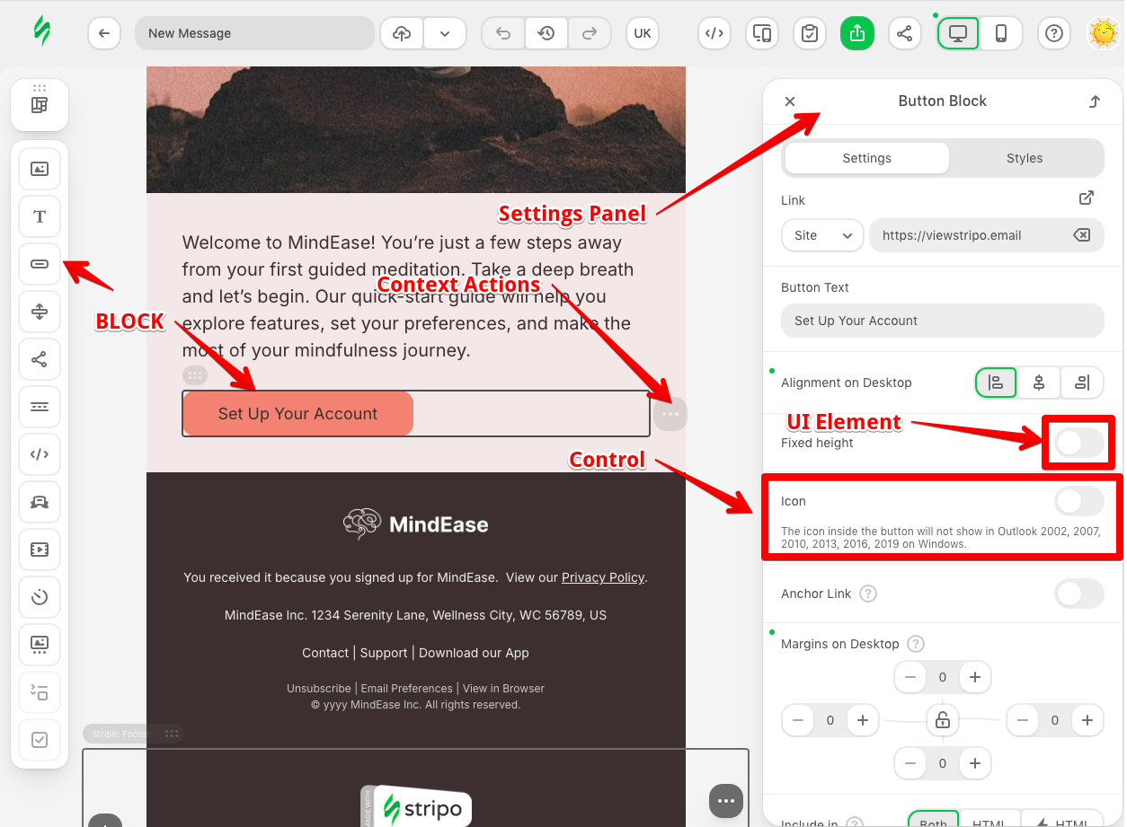
The Control component is the fundamental building block for creating custom settings interfaces in the Stripo Email Editor. Controls appear in the settings panel when users select blocks, allowing them to configure properties like colors, sizes, fonts, and custom behaviors. The Control API enables developers to create rich, interactive configuration interfaces that integrate seamlessly with the editor's template modification system, respond to state changes, and provide intuitive user experiences.
Purpose and Core Concepts
What is a Control?
A Control in the Stripo Extensions SDK is a configurable UI component that:
- Appears in the settings panel when users select blocks
- Contains one or more UI elements (inputs, dropdowns, color pickers, etc.)
- Communicates with the template modification system to apply changes
- Can be conditionally shown or hidden based on block state
- Responds to template updates and syncs its state accordingly
- Provides a bridge between the UI and the underlying template structure
Control Lifecycle
Controls follow a well-defined lifecycle that enables sophisticated behaviors:
- Initialization - The control is instantiated when added to a settings panel
- Rendering - The
onRender()hook is called once the control's template is inserted into the DOM - Updates - The
onTemplateNodeUpdated()hook is called whenever the selected template node changes - Visibility - The
isVisible()method is evaluated on each node change - Destruction - The
onDestroy()hook is called when the control is removed
Control vs Built-in Control
The SDK provides two approaches for creating controls:
- Custom Controls - Extend the Control class to create new settings interfaces from scratch
- Built-in Controls - Extend
BuiltInControlclasses to customize existing editor controls with minimal code
Key Features and Capabilities
1. Rich UI Composition
Controls can use any combination of UI elements:
- Color pickers, text inputs, dropdowns, checkboxes
- Custom UI elements created with the UIElement class
- Complex layouts with nested controls
- Expandable sections for organized interfaces
2. Template Modification
Controls have full access to the template modification system:
- Modify HTML structure and attributes
- Update CSS rules and styles
- Apply changes atomically with undo/redo support
- Chain multiple modifications together
3. Dynamic Visibility
Controls can show or hide based on block state:
- Check block attributes or classes
- Evaluate custom conditions
- Respond to configuration changes
- Context-sensitive interface adaptation
4. State Synchronization
Controls stay synchronized with template state:
- Automatically update when template changes
- Extract values from selected blocks
- Maintain UI consistency with block properties
Creating Custom Controls
Basic Configuration
To create a custom control:
- Create a class that extends the
Controlclass - Implement the required methods (
getId(),getTemplate()) - Register the control with the ExtensionBuilder
- Add the control to a settings panel via SettingsPanelRegistry
Minimal control configuration:
javascript
import {Control, UIElementType, UEAttr, ExtensionBuilder} from '@stripoinc/ui-editor-extensions';

class CustomColorControl extends Control {
    getId() {
        return 'custom-color-control';
    }

    getTemplate() {
        return `
            <div class="form-group">
                <${UIElementType.LABEL} ${UEAttr.LABEL.text}="Background Color"></${UIElementType.LABEL}>
                <${UIElementType.COLOR} ${UEAttr.DEFAULT.name}="bgColor"></${UIElementType.COLOR}>
            </div>
        `;
    }

    // Additional configuration
}

export default new ExtensionBuilder()
    .addControl(CustomColorControl)
    .build();
Communicating with UI Elements
Controls interact with UI elements through the Control API:
Reading Values
javascript
class CustomControl extends Control {
    getTemplate() {
        return `
            <div class="form-group">
                <${UIElementType.LABEL} ${UEAttr.LABEL.text}="Background Color"></${UIElementType.LABEL}>
                <${UIElementType.COLOR} ${UEAttr.DEFAULT.name}="bgColor"></${UIElementType.COLOR}>
            </div>
        `;
    }

    onRender() {
        // Get all values at once
        const values = this.api.getValues();
        console.log(values.bgColor);

        // Or listen to individual changes
        this.api.onValueChanged('bgColor', (newValue, oldValue) => {
            console.log(`Color changed from ${oldValue} to ${newValue}`);
        });
    }

    // Additional configuration
}
Setting Values
javascript
class CustomControl extends Control {
    getTemplate() {
        return `
            <div class="form-group">
                <${UIElementType.LABEL} ${UEAttr.LABEL.text}="Background Color"></${UIElementType.LABEL}>
                <${UIElementType.COLOR} ${UEAttr.DEFAULT.name}="bgColor"></${UIElementType.COLOR}>
            </div>
        `;
    }

    onTemplateNodeUpdated(node) {
        // Extract current color from node
        const currentColor = node.getStyle('background-color');

        // Update UI element
        this.api.updateValues({
            bgColor: currentColor
        });
    }

    // Additional configuration
}
Controlling UI Element Properties
javascript
class CustomControl extends Control {
    getTemplate() {
        return `
            <div class="form-group">
                <${UIElementType.LABEL} ${UEAttr.LABEL.text}="Background Color"></${UIElementType.LABEL}>
                <${UIElementType.COLOR} ${UEAttr.DEFAULT.name}="bgColor"></${UIElementType.COLOR}>
            </div>
        `;
    }

    onRender() {
        // Show/hide UI elements
        this.api.setVisibility('bgColor', false);

        // Set UI element attributes
        this.api.setUIEAttribute('bgColor', 'disabled', true);
    }

    // Additional configuration
}
Applying Template Modifications
Controls can modify templates using the TemplateModifier API:
javascript
import {Control, ModificationDescription} from '@stripoinc/ui-editor-extensions';

class BackgroundControl extends Control {
    getId() {
        return 'background-control';
    }

    getTemplate() {
        return `
            <${UIElementType.COLOR} ${UEAttr.DEFAULT.name}="bgColor"></${UIElementType.COLOR}>
        `;
    }

    onRender() {
        this.api.onValueChanged('bgColor', (newColor) => {
            // Create and apply modification
            this.api.getDocumentModifier()
                .modifyHtml(this.currentNode)
                    .setStyle('background-color', newColor)
                .apply(new ModificationDescription('Update background color'));
        });
    }

    onTemplateNodeUpdated(node) {
        this.currentNode = node;

        // Sync UI with current template state
        const currentColor = node.getStyle('background-color');
        this.api.updateValues({ bgColor: currentColor });
    }
}
Conditional Visibility
Controls can be shown or hidden based on block state:
javascript
class ConditionalControl extends Control {
    isVisible(node) {
        // Hide if block has data-locked attribute
        if (node.getAttribute('data-locked') === 'true') {
            return false;
        }

        return true;
    }

    // Additional configuration
}
Built-in Controls
The Stripo Extensions SDK provides a comprehensive set of built-in controls for common editing tasks. These controls handle complex editor functionality like color management, sizing, spacing, and more.
IMPORTANT: Built-in controls are designed exclusively for modifying Stripo's standard HTML markup. To ensure correct block HTML, always use Template Aliases. If your extension uses custom HTML markup, built-in controls are not supported and may not function as expected.
To use built-in controls:
- Override the appropriate built-in control class
- Set the id of the control
- (Optional) Override control labels
- (Optional) Override target nodes
- (Optional) Add additional modifications
- Register the control with the ExtensionBuilder
- Add the control to a settings panel via SettingsPanelRegistry
Built-in Control Types by Block Category
The SDK provides a comprehensive collection of built-in controls organized by block type. Each control is designed to modify specific aspects of its corresponding block type. When extending these controls, you can customize their behavior by overriding labels, target nodes, or adding additional modifications.
Button Block Controls
Button block controls handle all aspects of button customization, from styling to positioning.
ButtonAlignBuiltInControl
- Description: Controls button alignment within its container for both desktop and mobile views
- Override labels:
ControlLabelstitle- Main control title
ButtonBackgroundColorBuiltInControl
- Description: Manages button background color modifications
- Override labels:
ControlLabelstitle- Main control title
ButtonBlockBackgroundColorBuiltInControl
- Description: Controls the background color of the entire button block container
- Override labels:
ControlLabelstitle- Main control title
ButtonBorderBuiltInControl
- Description: Handles button border styling including color, width, and style
- Override labels:
ButtonBorderControlLabelstitle- Main control titletitleHint- Tooltip for the control titleborderColorTitle- Border color section titleborderStyleTitle- Border style section titleborderStyleHint- Tooltip for border style
ButtonBorderRadiusBuiltInControl
- Description: Controls button border radius (rounded corners)
- Override labels:
ButtonBorderRadiusControlLabelstitle- Main control titletitleHint- Tooltip for the control title
ButtonColorBuiltInControl
- Description: Controls button text color modifications
- Override labels:
ControlLabelstitle- Main control title
ButtonFitToContainerBuiltInControl
- Description: Adjusts button width to fit container width
- Override labels:
ControlLabelstitle- Main control title
ButtonFixedHeightBuiltInControl
- Description: Controls fixed height for button blocks with alignment options
- Override labels:
FixedHeightLabelstitle- Main control titlecounterTitle- Height counter section titlealignTitle- Alignment section title
ButtonFontFamilyBuiltInControl
- Description: Manages button text font family selection
- Override labels:
ControlLabelstitle- Main control title
ButtonHoverBorderColorBuiltInControl
- Description: Controls button border color on hover state
- Override labels:
ControlLabelstitle- Main control title
ButtonHoverColorBuiltInControl
- Description: Manages button background color on hover state
- Override labels:
ControlLabelstitle- Main control title
ButtonHoverTextColorBuiltInControl
- Description: Controls button text color on hover state
- Override labels:
ControlLabelstitle- Main control title
ButtonMarginsBuiltInControl
- Description: Manages external spacing (margins) around the button block
- Override labels:
ControlLabelstitle- Main control title
ButtonPaddingsBuiltInControl
- Description: Controls internal spacing (padding) within the button
- Override labels:
ControlLabelstitle- Main control title
ButtonTextBuiltInControl
- Description: Manages button text content modifications
- Override labels:
ControlLabelstitle- Main control title
ButtonTextSizeBuiltInControl
- Description: Controls button text font size
- Override labels:
ControlLabelstitle- Main control title
ButtonTextStyleAndFontColorBuiltInControl
- Description: Manages button text styling (bold, italic, underline) and font color together
- Override labels:
ButtonTextStyleAndFontColorControlLabelstitle- Main control titlecolorTitle- Font color section titlestyleTitle- Text style section title
ButtonVisibilityBuiltInControl
- Description: Controls button visibility and display conditions
- Override labels:
ControlLabelstitle- Main control title
Image Block Controls
Image block controls manage image properties, sizing, and spacing.
ImageAlignmentBuiltInControl
- Description: Controls image alignment within the surrounding layout
- Override labels:
ControlLabelstitle- Main control title
ImageMarginsBuiltInControl
- Description: Manages external spacing (margins) around image blocks
- Override labels:
ControlLabelstitle- Main control title
ImageSizeBuiltInControl
- Description: Controls image dimensions and sizing options
- Override labels:
ControlLabelstitle- Main control title
ImageVisibilityBuiltInControl
- Description: Controls image visibility and display conditions
- Override labels:
ControlLabelstitle- Main control title
Text Block Controls
Text block controls handle text formatting, styling, and layout.
TextFontFamilyBuiltInControl
- Description: Manages font family selection for text blocks
- Override labels:
ControlLabelstitle- Main control title
TextFixedHeightBuiltInControl
- Description: Controls fixed height for text blocks with alignment options
- Override labels:
FixedHeightLabelstitle- Main control titlecounterTitle- Height counter section titlealignTitle- Alignment section title
TextAlignBuiltInControl
- Description: Manages text alignment (left, center, right, justify)
- Override labels:
ControlLabelstitle- Main control title
TextBlockBackgroundBuiltInControl
- Description: Controls background color of the entire text block
- Override labels:
ControlLabelstitle- Main control title
TextColorBuiltInControl
- Description: Manages text color modifications
- Override labels:
ControlLabelstitle- Main control title
TextLineSpacingBuiltInControl
- Description: Controls line height and spacing between text lines
- Override labels:
ControlLabelstitle- Main control title
TextPaddingsBuiltInControl
- Description: Manages internal spacing (padding) within text blocks
- Override labels:
ControlLabelstitle- Main control title
TextSizeBuiltInControl
- Description: Controls text font size
- Override labels:
ControlLabelstitle- Main control title
TextStyleBuiltInControl
- Description: Manages text styling (bold, italic, underline, strikethrough)
- Override labels:
ControlLabelstitle- Main control title
TextVisibilityBuiltInControl
- Description: Controls text block visibility and display conditions
- Override labels:
ControlLabelstitle- Main control title
Container Block Controls
Container controls manage container styling, backgrounds, and borders.
ContainerBackgroundColorBuiltInControl
- Description: Controls container background color
- Override labels:
ControlLabelstitle- Main control title
ContainerBackgroundImageBuiltInControl
- Description: Manages container background image and its positioning
- Override labels:
BackgroundImageControlLabelstitle- Main control titletitleHint- Tooltip for the control titlerepeat- Background repeat option labelrepeatHint- Tooltip for repeat optionhorizontalPosition- Horizontal position labelverticalPosition- Vertical position labelbackgroundWidth- Background width labelbackgroundHeight- Background height label
ContainerBorderBuiltInControl
- Description: Controls container border styling including color, width, and style
- Override labels:
BorderLabelstitle- Main control titleborderColorTitle- Border color section titleborderStyleTitle- Border style section titleborderStyleHint- Tooltip for border style
ContainerVisibilityBuiltInControl
- Description: Controls container visibility and display conditions
- Override labels:
ControlLabelstitle- Main control title
Structure Block Controls
Structure controls manage layout structures, including responsive behavior and styling.
StructureAdaptBuiltInControl
- Description: Controls structure responsive behavior and mobile adaptation settings
- Override labels:
StructureAdaptControlLabelstitle- Main control titledescription- Descriptive text for adaptation options
StructureBackgroundColorBuiltInControl
- Description: Manages structure background color
- Override labels:
ControlLabelstitle- Main control title
StructureBackgroundImageBuiltInControl
- Description: Controls structure background image and its positioning
- Override labels:
BackgroundImageControlLabelstitle- Main control titletitleHint- Tooltip for the control titlerepeat- Background repeat option labelrepeatHint- Tooltip for repeat optionhorizontalPosition- Horizontal position labelverticalPosition- Vertical position labelbackgroundWidth- Background width labelbackgroundHeight- Background height label
StructureBorderBuiltInControl
- Description: Manages structure border styling including color, width, and style
- Override labels:
BorderLabelstitle- Main control titleborderColorTitle- Border color section titleborderStyleTitle- Border style section titleborderStyleHint- Tooltip for border style
StructureMarginsBuiltInControl
- Description: Controls external spacing (margins) around structure blocks
- Override labels:
ControlLabelstitle- Main control title
StructurePaddingsBuiltInControl
- Description: Manages internal spacing (padding) within structure blocks
- Override labels:
ControlLabelstitle- Main control title
StructureVisibilityBuiltInControl
- Description: Controls structure visibility and display conditions
- Override labels:
ControlLabelstitle- Main control title
Extending Built-in Controls
The BuiltInControl class allows you to customize existing editor controls with minimal code. This is useful when you want to:
- Change which elements a control targets
- Override control labels
- Add additional modifications
- Customize control behavior for custom blocks
Basic Built-in Control Extension
In the example below, we use the button background color control without modification. The control finds all Stripo button blocks and applies the background color to them.
javascript
import {ButtonBackgroundColorBuiltInControl} from '@stripoinc/ui-editor-extensions';

class CustomBackgroundColorControl extends ButtonBackgroundColorBuiltInControl {
    getId() {
        return 'custom-background-control';
    }
}
Overriding Target Nodes
By default, a built-in control attempts to find all nodes of the appropriate type inside the selected one to apply changes. You can override this behavior to target specific elements:
javascript
import {BlockSelector, ButtonBackgroundColorBuiltInControl} from '@stripoinc/ui-editor-extensions';

class CustomBackgroundColorControl extends ButtonBackgroundColorBuiltInControl {
    getId() {
        return 'custom-background-control';
    }

    getTargetNodes(root) {
        // Target only first button block inside the selected root node
        return [
            root.querySelector(BlockSelector.BUTTON)
        ];
    }
}
Customizing Labels
Override labels to match your custom block terminology:
javascript
import {ButtonBackgroundColorBuiltInControl} from '@stripoinc/ui-editor-extensions';

class CustomBackgroundColorControl extends ButtonBackgroundColorBuiltInControl {
    getId() {
        return 'custom-background-control';
    }

    getLabels() {
        return {
            title: this.api.translate('Custom Background Color')
        };
    }
}
Adding Custom Modifications
If you need to add custom modifications to the template, you can use the getAdditionalModifications() method. Describe all modifications with the modifier and return it without calling apply() to prevent multiple records in the undo stack and version history. If you want to override the message in the version history, you can use the getModificationDescription() method:
javascript
import {
    BlockSelector,
    ButtonBackgroundColorBuiltInControl,
    ModificationDescription
} from '@stripoinc/ui-editor-extensions';

class CustomBackgroundColorControl extends ButtonBackgroundColorBuiltInControl {
    getId() {
        return 'custom-background-control';
    }

    getAdditionalModifications(root) {
        const modifier = this.api.getDocumentModifier();

        // Add border to button in addition to the background color
        modifier
            .modifyHtml(root.querySelector(BlockSelector.BUTTON))
            .setStyle('border', '1px solid #ddd');

        return modifier;
    }

    getModificationDescription() {
        return new ModificationDescription('Update background with border');
    }
}
Conditional Visibility for Built-in Controls
Show or hide the control based on block state:
javascript
import {
    BlockSelector,
    ButtonBackgroundColorBuiltInControl,
} from '@stripoinc/ui-editor-extensions';

class CustomBackgroundColorControl extends ButtonBackgroundColorBuiltInControl {
    getId() {
        return 'custom-background-control';
    }

    isVisible(node) {
        return !!node.querySelector(BlockSelector.BUTTON).getAttribute('bgcolor');
    }
}
Control API
The Control API provides access to:
- Current node and document root access
- Template modification system
- UI element management (visibility, attributes, values)
- Value change listeners
- Editor configuration and state
- Internationalization utilities
You can find more practical examples in the Working with APIs tutorial.
Best Practices
1. Keep Controls Focused
Each control should handle a single responsibility. For complex configuration requirements, consider creating multiple related controls.
2. Synchronize State
Always implement onTemplateNodeUpdated() to keep UI elements synchronized with template state.
3. Use Descriptive IDs
Control IDs should clearly describe their purpose: product-price-color rather than control-1.
4. Validate User Input
Validate values before applying modifications to prevent invalid template states.
5. Provide User Feedback
Use modification descriptions that clearly explain changes to provide better version history messages.
6. Clean Up Resources
Always implement onDestroy() if you create timers, intervals, or external event listeners.
7. Leverage Built-in Controls
Before creating a custom control from scratch, check if extending a built-in control would be faster and more maintainable.