Appearance
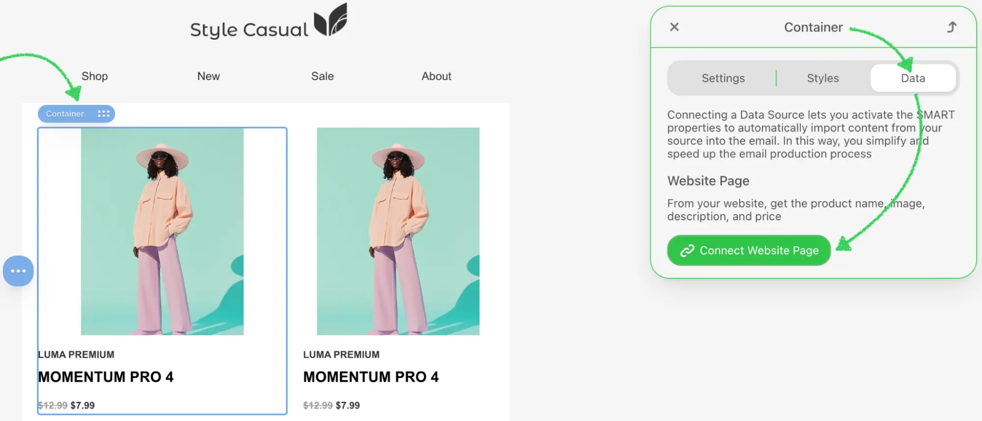
Integrate an External Smart Elements Library
Overview
The External Smart Elements Library integration enables users to browse and select dynamic, data-driven content elements from your product catalog or third-party sources directly within the Stripo Email Editor. Smart elements are pre-configured, reusable components that include dynamic content such as product recommendations, personalized offers, or any complex HTML structures that adapt based on data.
What You'll Build
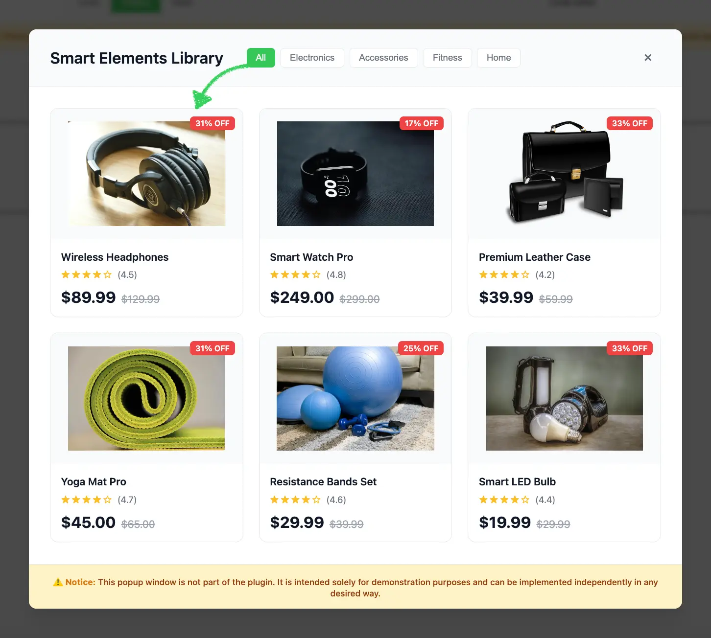
In this tutorial, you'll create a fully functional smart elements library modal that:
- Displays a responsive grid of product cards with images, prices, and ratings
- Supports category-based filtering (All, Electronics, Accessories, Fitness, Home)
- Handles element selection with proper callback integration
- Returns smart element data in the format expected by the Stripo editor
Use Cases
- Product Catalogs: Connect to your e-commerce platform to display products
- Dynamic Content: Provide personalized product recommendations
- Third-Party Integration: Connect to platforms like Shopify, WooCommerce, or custom APIs
- Data-Driven Templates: Create templates that adapt based on user data or behavior3
- Personalization: Insert context-aware content blocks with merge tags
Prerequisites
Before starting this tutorial, ensure you have:
- Node.js version 22.x or higher installed
- Basic understanding of JavaScript ES6+ syntax
- Familiarity with the Stripo Extensions SDK
Understanding the Interface
The ExternalSmartElementsLibrary class must implement a single method:
typescript
openSmartElementsLibrary(
  onDataSelectCallback: (smartElement: ExternalSmartElement) => void,
  onCancelCallback: () => void
): void
Parameters
| Parameter | Type | Description |
|---|---|---|
onDataSelectCallback | Function | Callback function invoked when a user selects an element |
onCancelCallback | Function | Callback function invoked when a user cancels the selection |
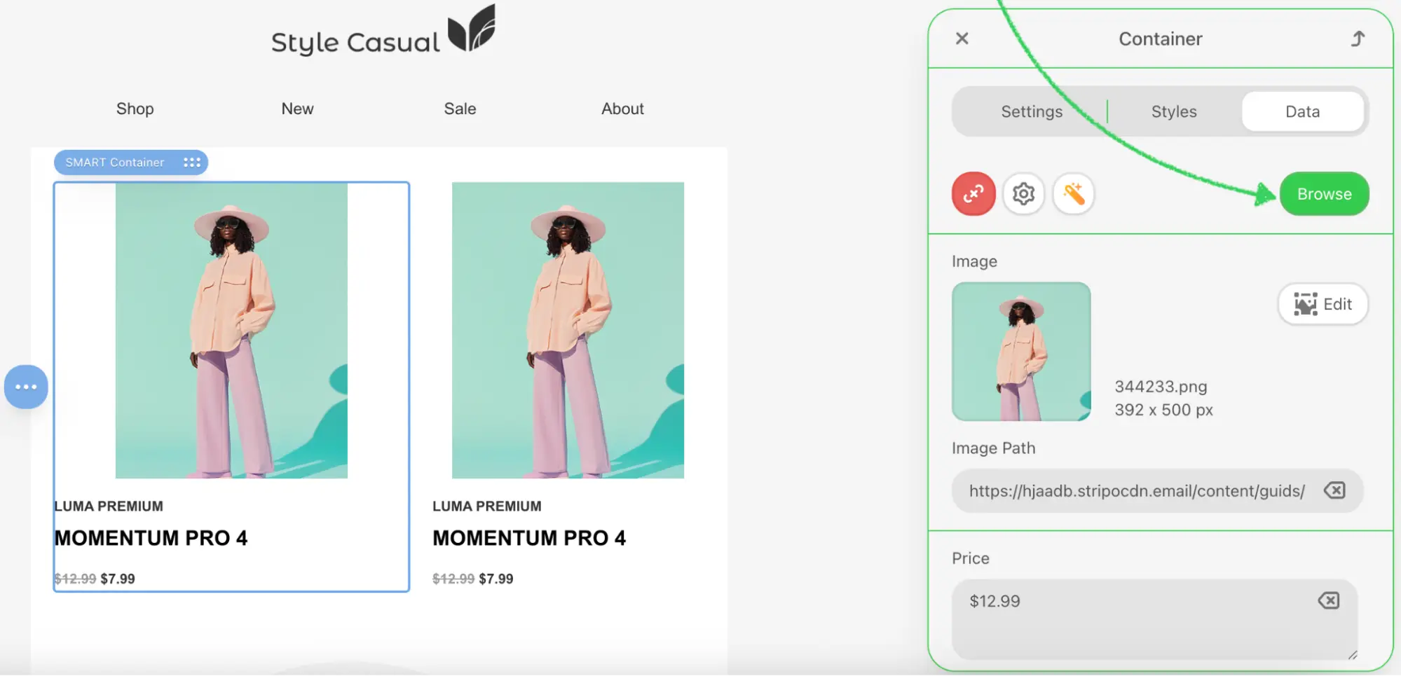
ExternalSmartElement Object
When a user selects an element, your library implementation must return an object with string key-value pairs:
typescript
type ExternalSmartElement = Record<string, string>Common Properties (customizable based on your needs):
typescript
{
  p_name: string;           // Product name
  p_price: string;          // Product price (e.g., "$89.99")
  p_image: string;          // Product image URL
  // ... any custom properties
}
Property Names
Property names starting with p_ are commonly used for product-related smart elements, but you can define any property names that suit your use case. All values must be strings.
Step 1: Project Setup
Create your project structure and install dependencies according to the Getting Started guide.
Your project directory structure should look like this:
bash
external-smart-elements/
├── index.html
├── src/
│   ├── creds.js
│   ├── index.js
│   └── extension.js
├── package.json
└── vite.config.js
Step 2: Create the Smart Elements Library Class
Create a new file src/MyExternalSmartElementsLibrary.js with the following basic class structure:
javascript
import {ExternalSmartElementsLibrary} from '@stripoinc/ui-editor-extensions';

/**
 * External Smart Elements Library Implementation
 * This class implements a modal product gallery with filtering capabilities
 * for the Stripo Email Editor extension system.
 */
export class MyExternalSmartElementsLibrary extends ExternalSmartElementsLibrary {
    // Instance properties
    externalLibrary;
    dataSelectCallback = () => {};
    cancelCallback = () => {};
    activeCategory = 'all';

    constructor() {
        super();
        this.createModal();
        this.attachEventListeners();
        this.initializeFilters();
    }

    /**
     * Required method called by the Stripo editor
     * Opens the smart elements library modal dialog
     * @param {Function} onDataSelectCallback - Callback invoked when an element is selected
     * @param {Function} onCancelCallback - Callback invoked when the modal is cancelled
     */
    openSmartElementsLibrary(onDataSelectCallback, onCancelCallback) {
        // Store callbacks
        this.dataSelectCallback = onDataSelectCallback;
        this.cancelCallback = onCancelCallback;

        // Show modal
        this.externalLibrary.style.display = 'flex';

        // Reset filters to show all products
        this.filterProducts('all');
        const allButton = this.externalLibrary.querySelector('[data-category="all"]');
        if (allButton) {
            this.updateActiveButton(allButton);
        }
    }
}
Key Components Explained
Instance Properties:
externalLibrary: Reference to the modal DOM elementdataSelectCallback: Stores the success callback from the Stripo editorcancelCallback: Stores the cancel callback from the Stripo editoractiveCategory: Tracks the currently active filter category
Constructor: Initializes the complete modal UI when the class is instantiated
openSmartElementsLibrary: Required method that:
- Stores the callbacks for later invocation
- Displays the modal dialog
- Resets filters to display all products
- Updates the active button state
Step 3: Define Smart Elements Data and Styles
Add static properties for product data and UI configuration. Continue editing src/MyExternalSmartElementsLibrary.js:
javascript
export class MyExternalSmartElementsLibrary extends ExternalSmartElementsLibrary {
    // ... existing properties ...

    // UI Style configurations
    static STYLES = {
        // Modal overlay styles
        overlay: {
            backgroundColor: 'rgba(0,0,0,.7)',
            position: 'fixed',
            top: '0',
            right: '0',
            bottom: '0',
            left: '0',
            zIndex: '1050',
            display: 'flex',
            alignItems: 'center',
            justifyContent: 'center',
            backdropFilter: 'blur(4px)',
            fontFamily: "-apple-system, BlinkMacSystemFont, 'Segoe UI', Roboto, 'Helvetica Neue', Arial, sans-serif"
        },

        // Modal container styles
        modal: {
            backgroundColor: '#ffffff',
            borderRadius: '12px',
            boxShadow: '0 20px 25px -5px rgba(0, 0, 0, 0.1), 0 10px 10px -5px rgba(0, 0, 0, 0.04)',
            maxWidth: '1000px',
            width: '90%',
            display: 'flex',
            flexDirection: 'column',
            position: 'relative'
        },

        // Header styles
        header: {
            padding: '24px 32px',
            borderBottom: '1px solid #e5e7eb',
            display: 'flex',
            alignItems: 'center',
            justifyContent: 'space-between',
            backgroundColor: '#f9fafb',
            borderRadius: '12px 12px 0 0'
        },

        // Content container styles
        content: {
            padding: '32px',
            height: '731px',
            overflowY: 'auto',
            overflowX: 'hidden',
            boxSizing: 'border-box'
        },

        // Grid styles
        grid: {
            display: 'grid',
            gridTemplateColumns: 'repeat(auto-fill, minmax(240px, 1fr))',
            gap: '24px'
        },

        // Button styles
        buttonActive: {
            padding: '6px 14px',
            borderRadius: '6px',
            border: 'none',
            backgroundColor: '#34c759',
            color: 'white',
            fontSize: '14px',
            fontWeight: '500',
            cursor: 'pointer',
            transition: 'background-color 0.2s'
        },

        buttonInactive: {
            padding: '6px 14px',
            borderRadius: '6px',
            border: '1px solid #e5e7eb',
            backgroundColor: 'white',
            color: '#6b7280',
            fontSize: '14px',
            fontWeight: '500',
            cursor: 'pointer',
            transition: 'all 0.2s'
        },

        // Footer styles
        footer: {
            padding: '16px 32px',
            borderTop: '1px solid #e5e7eb',
            backgroundColor: '#fef3c7',
            borderRadius: '0 0 12px 12px',
            textAlign: 'center'
        }
    };

    // Sample smart elements data
    static SMART_ELEMENTS = [
        {
            category: 'electronics',
            p_name: 'Wireless Headphones',
            p_price: '$89.99',
            p_original_price: '$129.99',
            p_image: 'https://rf.stripocdn.email/content/guids/CABINET_6832604a6dbd8f35c4c45dc999af6fe2144259d656ce5a5ea76e6969ed796bbd/images/gc0859fd762dc386caf67532ca5d9b968b19ba37572e19b72126eb421bee4adfc410dc64eea3dee23cf33c3da5ae06b88_640.jpeg',
            p_rating: '4.5',
            p_discount: '31% OFF'
        },
        {
            category: 'electronics',
            p_name: 'Smart Watch Pro',
            p_price: '$249.00',
            p_original_price: '$299.00',
            p_image: 'https://rf.stripocdn.email/content/guids/CABINET_6832604a6dbd8f35c4c45dc999af6fe2144259d656ce5a5ea76e6969ed796bbd/images/g5b54a78c579f1641216bab7b119c28b0b3dfa50ab44655c45039c8ac164e6d1835ad29ae242af635a8efe74a03f636a0_640.jpeg',
            p_rating: '4.8',
            p_discount: '17% OFF'
        },
        {
            category: 'accessories',
            p_name: 'Premium Leather Case',
            p_price: '$39.99',
            p_original_price: '$59.99',
            p_image: 'https://rf.stripocdn.email/content/guids/CABINET_6832604a6dbd8f35c4c45dc999af6fe2144259d656ce5a5ea76e6969ed796bbd/images/gc7a4da5fc1d4a3c14ca8964200ede6290826a825cea3dc704d47db7c9938b64c099879d2feeebfb24f3ae749d85736f1_640.png',
            p_rating: '4.2',
            p_discount: '33% OFF'
        },
        {
            category: 'fitness',
            p_name: 'Yoga Mat Pro',
            p_price: '$45.00',
            p_original_price: '$65.00',
            p_image: 'https://rf.stripocdn.email/content/guids/CABINET_6832604a6dbd8f35c4c45dc999af6fe2144259d656ce5a5ea76e6969ed796bbd/images/g3d9ab12046aedd0dd772da9bea9768d5fba2840db28046cf73de1f1bded09ad666ef5788d4812a07ad8cfa531487251f_640.jpeg',
            p_rating: '4.7',
            p_discount: '31% OFF'
        },
        {
            category: 'fitness',
            p_name: 'Resistance Bands Set',
            p_price: '$29.99',
            p_original_price: '$39.99',
            p_image: 'https://rf.stripocdn.email/content/guids/CABINET_6832604a6dbd8f35c4c45dc999af6fe2144259d656ce5a5ea76e6969ed796bbd/images/g939d0a14c9627c0476e3b6cdbee39819532d8823d6e23a3c2e6c651e4466402be0ea7a0384f1cd8e15d04fa52b27fa46_640.jpeg',
            p_rating: '4.6',
            p_discount: '25% OFF'
        },
        {
            category: 'home',
            p_name: 'Smart LED Bulb',
            p_price: '$19.99',
            p_original_price: '$29.99',
            p_image: 'https://rf.stripocdn.email/content/guids/CABINET_6832604a6dbd8f35c4c45dc999af6fe2144259d656ce5a5ea76e6969ed796bbd/images/g2b88c1f3019297a862fe221399e7cc8a69a6e0549a7d280cdbbef815ed22d0c5b9beed9e477ca16497218e9670c152e1_640.jpeg',
            p_rating: '4.4',
            p_discount: '33% OFF'
        }
    ];

    // ... rest of the class ...
}
Smart Element Object Properties
| Property | Type | Description |
|---|---|---|
category | string | Filter category (electronics, accessories, fitness, home) |
p_name | string | Product name |
p_price | string | Product price |
p_original_price | string | Original price before discount |
p_image | string | Product image URL |
p_rating | string | Product rating (0-5) |
p_discount | string | Discount label (optional) |
Production Implementation
In production environments, replace the static SMART_ELEMENTS array with API calls to dynamically fetch products from your backend service, e-commerce platform, or product recommendation engine.
Step 4: Build the Modal UI Structure
Implement the core modal creation methods. These methods generate the modal HTML structure and inject it into the page.
Create Modal Method
javascript
/**
 * Creates the modal HTML structure and appends it to the document body
 */
createModal() {
    const modalHtml = this.generateModalHTML();
    const container = document.createElement('div');
    container.innerHTML = modalHtml;
    document.body.appendChild(container);

    // Store reference to the modal element
    this.externalLibrary = document.getElementById('externalSmartElementsLibrary');
    // Initially hide the modal
    this.externalLibrary.style.display = 'none';
}

/**
 * Generates the complete modal HTML structure
 * @returns {string} Complete HTML string for the modal
 */
generateModalHTML() {
    return `
        <div id="externalSmartElementsLibrary" style="${this.styleObjToString(MyExternalSmartElementsLibrary.STYLES.overlay)}">
            <div style="${this.styleObjToString(MyExternalSmartElementsLibrary.STYLES.modal)}">
                ${this.generateHeaderHTML()}
                ${this.generateContentHTML()}
                ${this.generateFooterHTML()}
            </div>
        </div>
    `;
}
Style Conversion Helper
Add the following utility method that converts JavaScript style objects to inline CSS strings:
javascript
/**
 * Converts a style object to an inline style string
 * @param {Object} styleObj - Style object with camelCase properties
 * @returns {string} Inline CSS style string with kebab-case properties
 */
styleObjToString(styleObj) {
    return Object.entries(styleObj)
        .map(([key, value]) => {
            // Convert camelCase to kebab-case
            const kebabKey = key.replace(/([A-Z])/g, '-$1').toLowerCase();
            return `${kebabKey}: ${value}`;
        })
        .join('; ');
}
Important
The styleObjToString() method is essential for converting the STYLES object into inline CSS strings. This method is required for proper modal rendering.
Modal Structure Overview
The modal consists of three main sections:
- Header: Title, category filter buttons, and close button
- Content: Scrollable grid of product cards
- Footer: Informational disclaimer
Step 5: Generate Header with Filters
Create the header section with title, filter buttons, and close button.
Header HTML Generator
javascript
/**
 * Generates the modal header section HTML
 * @returns {string} HTML string for the header section
 */
generateHeaderHTML() {
    return `
        <div style="${this.styleObjToString(MyExternalSmartElementsLibrary.STYLES.header)}">
            <div style="display: flex; align-items: center; gap: 12px;">
                <h2 style="margin: 0; font-size: 24px; font-weight: 600; color: #111827; letter-spacing: -0.025em;">
                    Smart Elements Library
                </h2>
                <div class="filter-buttons" style="display: flex; gap: 8px; margin-left: 24px;">
                    ${this.generateFilterButtons()}
                </div>
            </div>
            ${this.generateCloseButton()}
        </div>
    `;
}
Filter Buttons Generator
javascript
/**
 * Generates category filter buttons HTML
 * @returns {string} HTML string for all filter buttons
 */
generateFilterButtons() {
    const categories = [
        { id: 'all', label: 'All', active: true },
        { id: 'electronics', label: 'Electronics', active: false },
        { id: 'accessories', label: 'Accessories', active: false },
        { id: 'fitness', label: 'Fitness', active: false },
        { id: 'home', label: 'Home', active: false }
    ];

    return categories.map(cat => `
        <button
            data-category="${cat.id}"
            style="${this.styleObjToString(cat.active ? MyExternalSmartElementsLibrary.STYLES.buttonActive : MyExternalSmartElementsLibrary.STYLES.buttonInactive)}">
            ${cat.label}
        </button>
    `).join('');
}
Category Customization
Categories can be added or modified by updating the categories array. Ensure your smart elements data contains matching category values for proper filtering.
Close Button Generator
javascript
/**
 * Generates close button HTML with hover effects
 * @returns {string} HTML string for the close button
 */
generateCloseButton() {
    return `
        <button class="close" type="button"
            style="cursor: pointer; background: transparent; border: none; font-size: 24px;
                   color: #6b7280; width: 40px; height: 40px; display: flex; align-items: center;
                   justify-content: center; border-radius: 8px; transition: all 0.2s;"
            onmouseover="this.style.backgroundColor='#f3f4f6'; this.style.color='#111827';"
            onmouseout="this.style.backgroundColor='transparent'; this.style.color='#6b7280';">
            <span style="line-height: 1;">×</span>
        </button>
    `;
}
Step 6: Generate Content with Product Grid
Create the content section that displays the product cards in a responsive grid.
Content Container Generator
javascript
/**
 * Generates the modal content section HTML with product grid
 * @returns {string} HTML string for the content section
 */
generateContentHTML() {
    return `
        <div style="${this.styleObjToString(MyExternalSmartElementsLibrary.STYLES.content)}">
            <div class="elements-grid" style="${this.styleObjToString(MyExternalSmartElementsLibrary.STYLES.grid)}">
                ${this.generateProductCards()}
            </div>
        </div>
    `;
}
Product Cards Generator
javascript
/**
 * Generates product card HTML
 * @returns {string} HTML string for all product cards
 */
generateProductCards() {
    return MyExternalSmartElementsLibrary.SMART_ELEMENTS.map(element => `
        <div class="product-card"
             data-category="${element.category}"
             data-name="${element.p_name}"
             data-price="${element.p_price}"
             data-image="${element.p_image}"
             data-original-price="${element.p_original_price}"
             data-rating="${element.p_rating}"
             data-discount="${element.p_discount || ''}"
             style="cursor: pointer; border-radius: 12px; overflow: hidden;
                    background-color: #ffffff; transition: all 0.3s;
                    border: 1px solid #e5e7eb; display: flex; flex-direction: column;"
             onmouseover="this.style.transform='translateY(-4px)';
                         this.style.boxShadow='0 20px 25px -5px rgba(0, 0, 0, 0.1), 0 10px 10px -5px rgba(0, 0, 0, 0.04)';"
             onmouseout="this.style.transform='translateY(0)';
                        this.style.boxShadow='none';">
            <div style="position: relative; width: 100%; height: 200px; background-color: #f9fafb;">
                <img style="width: 100%; height: 100%; object-fit: contain; padding: 20px;"
                     src="${element.p_image}"
                     alt="${element.p_name}">
                ${element.p_discount ? `
                    <span style="position: absolute; top: 12px; right: 12px;
                                 background-color: #ef4444; color: white;
                                 padding: 4px 8px; border-radius: 6px;
                                 font-size: 12px; font-weight: 600;">
                        ${element.p_discount}
                    </span>
                ` : ''}
            </div>
            <div style="padding: 16px; flex: 1; display: flex; flex-direction: column;">
                <h3 style="margin: 0 0 8px 0; font-size: 16px; font-weight: 600;
                           color: #111827; line-height: 1.4;">
                    ${element.p_name}
                </h3>
                <div style="display: flex; align-items: center; gap: 8px; margin-bottom: 12px;">
                    ${this.generateStarRating(parseFloat(element.p_rating))}
                    <span style="font-size: 14px; color: #6b7280;">(${element.p_rating})</span>
                </div>
                <div style="margin-top: auto;">
                    <div style="display: flex; align-items: baseline; gap: 8px;">
                        <span style="font-size: 24px; font-weight: 700; color: #111827;">
                            ${element.p_price}
                        </span>
                        <span style="font-size: 16px; color: #9ca3af; text-decoration: line-through;">
                            ${element.p_original_price}
                        </span>
                    </div>
                </div>
            </div>
        </div>
    `).join('');
}
Star Rating Generator
javascript
/**
 * Generates star rating HTML
 * @param {number} rating - Rating value (0-5)
 * @returns {string} HTML string for star rating
 */
generateStarRating(rating) {
    const fullStars = Math.floor(rating);
    const hasHalfStar = rating % 1 !== 0;
    const emptyStars = 5 - Math.ceil(rating);

    let stars = '';

    // Full stars
    for (let i = 0; i < fullStars; i++) {
        stars += '<span style="color: #fbbf24;">★</span>';
    }

    // Half star
    if (hasHalfStar) {
        stars += '<span style="color: #fbbf24;">☆</span>';
    }

    // Empty stars
    for (let i = 0; i < emptyStars; i++) {
        stars += '<span style="color: #e5e7eb;">★</span>';
    }

    return `<div style="display: flex; gap: 2px; font-size: 14px;">${stars}</div>`;
}
Key Features
- Responsive Grid: Utilizes CSS Grid with
auto-fillto create a responsive layout that adapts to different screen sizes - Product Cards: Each card displays product image, name, rating, price, and discount badge
- Hover Effects: Inline event handlers provide smooth transition animations during user interaction
- Data Attributes: Product metadata is stored in data attributes for efficient retrieval
- Discount Badges: Conditionally rendered discount labels positioned absolutely
- Star Ratings: Dynamic star rating visualization based on numeric rating value
Step 7: Generate Footer with Disclaimer
Add a footer section to display important notices or disclaimers.
javascript
/**
 * Generates the modal footer section HTML with disclaimer notice
 * @returns {string} HTML string for the footer section
 */
generateFooterHTML() {
    return `
        <div style="${this.styleObjToString(MyExternalSmartElementsLibrary.STYLES.footer)}">
            <p style="margin: 0; font-size: 13px; color: #92400e; font-weight: 500;">
                <span style="font-weight: 700; color: #d97706;">⚠️ Notice:</span> This popup window is not part of the plugin. It is intended solely for demonstration purposes and can be implemented independently in any desired way.
            </p>
        </div>
    `;
}
Step 8: Implement Event Handlers
Add event listeners to handle user interactions with the modal.
Attach Event Listeners
javascript
/**
 * Attaches event listeners to modal elements after creation
 */
attachEventListeners() {
    // Close button click handler
    this.externalLibrary.querySelector('.close')
        .addEventListener('click', this.cancelAndClose.bind(this));

    // Product card click handler (using event delegation)
    this.externalLibrary.addEventListener('click', this.onProductClick.bind(this));
}
Handle Product Selection
javascript
/**
* Handles click events on product cards
* @param {Event} e - Click event object
*/
onProductClick(e) {
// Check if clicked on product card or any of its children
const productCard = e.target.closest('.product-card');
if (!productCard) return;
// Create callback object with product data
// Note: All values must be strings as per ExternalSmartElement type
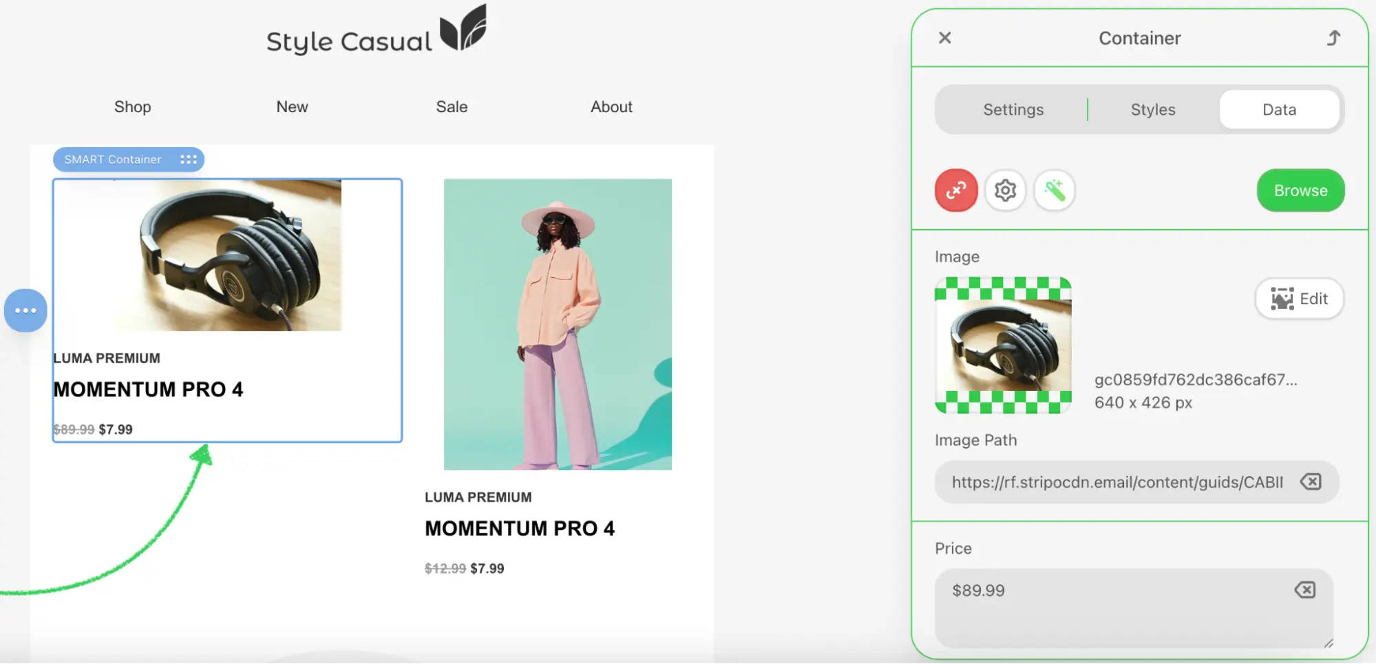
const smartElementData = {
category: productCard.getAttribute('data-category'),
p_name: productCard.getAttribute('data-name'),
p_price: productCard.getAttribute('data-price'),
p_image: productCard.getAttribute('data-image'),
p_original_price: productCard.getAttribute('data-original-price'),
p_rating: productCard.getAttribute('data-rating'),
p_discount: productCard.getAttribute('data-discount') || ''
};
// Close modal and execute callback
this.close();
this.dataSelectCallback(smartElementData);
}Data Format
The ExternalSmartElement type requires all values to be strings. When storing numeric data like ratings in data attributes, ensure they remain as strings. The consumer of the data can parse them as needed.
Handle Modal Closure
javascript
/**
 * Closes the modal and invokes the cancel callback
 */
cancelAndClose() {
    this.close();
    this.cancelCallback();
}

/**
 * Closes the modal dialog by hiding it from view
 */
close() {
    this.externalLibrary.style.display = 'none';
}
Event Delegation Benefits
Using event delegation by listening to the parent container provides several advantages:
- Improved Performance: A single event listener replaces multiple individual listeners for each card
- Simplified Maintenance: Eliminates the need to dynamically attach and detach listeners
- Future-Proof Implementation: Automatically handles dynamically added product elements
- Memory Efficiency: Reduces the memory footprint when managing numerous elements
Step 9: Implement Category Filtering
Add filtering functionality to help users find products by category.
Initialize Filter Buttons
javascript
/**
 * Initializes category filter button functionality
 */
initializeFilters() {
    const filterButtons = this.externalLibrary.querySelectorAll('.filter-buttons button');

    filterButtons.forEach(button => {
        button.addEventListener('click', (e) => {
            const category = e.target.getAttribute('data-category');
            this.filterProducts(category);
            this.updateActiveButton(e.target);
        });
    });
}
Filter Products by Category
javascript
/**
 * Filters displayed products based on the selected category
 * @param {string} category - Category identifier to filter by (or 'all' for all products)
 */
filterProducts(category) {
    this.activeCategory = category;
    const productCards = this.externalLibrary.querySelectorAll('.product-card');

    productCards.forEach(card => {
        const shouldShow = category === 'all' ||
                         card.getAttribute('data-category') === category;
        card.style.display = shouldShow ? 'flex' : 'none';
    });
}
Update Button Visual States
javascript
/**
 * Updates the visual state of category filter buttons
 * @param {HTMLElement} activeButton - The button element that was clicked and should be marked active
 */
updateActiveButton(activeButton) {
    const buttons = this.externalLibrary.querySelectorAll('.filter-buttons button');

    buttons.forEach(button => {
        const isActive = button === activeButton;
        const styles = isActive ?
            MyExternalSmartElementsLibrary.STYLES.buttonActive :
            MyExternalSmartElementsLibrary.STYLES.buttonInactive;

        // Apply styles
        Object.assign(button.style, styles);
    });
}
Step 10: Register the Extension
Create src/extension.js to register your smart elements library with the Stripo extension system:
javascript
import {ExtensionBuilder} from '@stripoinc/ui-editor-extensions';
import {MyExternalSmartElementsLibrary} from './MyExternalSmartElementsLibrary';

export default new ExtensionBuilder()
    .withExternalSmartElementsLibrary(MyExternalSmartElementsLibrary)
    .build();
Extension Registration Explained
The ExtensionBuilder class provides a fluent API for registering integrations:
withExternalSmartElementsLibrary(): Registers your custom smart elements library implementationbuild(): Constructs and returns the final extension object for the editor
Multiple Integrations
Multiple .with*() methods can be chained to register different integrations within a single extension:
javascript
new ExtensionBuilder()
    .withExternalSmartElementsLibrary(MyExternalSmartElementsLibrary)
    .withExternalImageLibrary(MyExternalImageLibrary)
    .withExternalVideosLibrary(MyExternalVideosLibrary)
    .build();
Step 11: Run the Development Server
Your implementation is now ready for testing.
Start the Development Server
bash
npm run devThis command will:
- Start the Vite development server on
http://localhost:3000 - Automatically open your default browser
- Load the Stripo Editor with your smart elements library extension integrated
Complete Example
For a full working example, check out the complete implementation in our GitHub repository.