Appearance
Integrate an External Image Library
Overview
The External Image Library integration allows users to browse and select images from your image hosting service or third-party platforms directly within the Stripo Email Editor. This integration provides a seamless experience for embedding images into email templates while maintaining full control over your image assets.
What You'll Build
In this tutorial, you'll create a fully functional image library modal that:
- Displays a responsive grid of image thumbnails with hover effects
- Supports category-based filtering (All, Nature, Abstract, Digital and Photography)
- Handles image selection with proper callback integration
- Returns image data in the format expected by the Stripo Editor
Use Cases
- Custom Image Platform: Connect to your proprietary image hosting service
- Curated Content: Provide pre-approved images for brand consistency
- Third-Party Integration: Connect to platforms such as Unsplash, Pexels, or Shutterstock
- Dynamic Content: Fetch images from your API or CMS in real time
- Brand Asset Management: Integrate with your Digital Asset Management (DAM) system
Prerequisites
Before starting this tutorial, ensure you have:
- Node.js version 22.x or higher installed
- A basic understanding of JavaScript ES6+ syntax
- Familiarity with the Stripo Extensions SDK
Understanding the Interface
The ExternalImageLibrary class must implement a single method:
typescript
openImageLibrary(
  currentImageUrl: string,
  onImageSelectCallback: (image: ExternalGalleryImage) => void,
  onCancelCallback: () => void
): void
Parameters
| Parameter | Type | Description |
|---|---|---|
currentImageUrl | string | Currently selected image URL (if any) |
onImageSelectCallback | Function | Callback function invoked when a user selects an image |
onCancelCallback | Function | Callback function invoked when a user cancels the selection |
ExternalGalleryImage Object
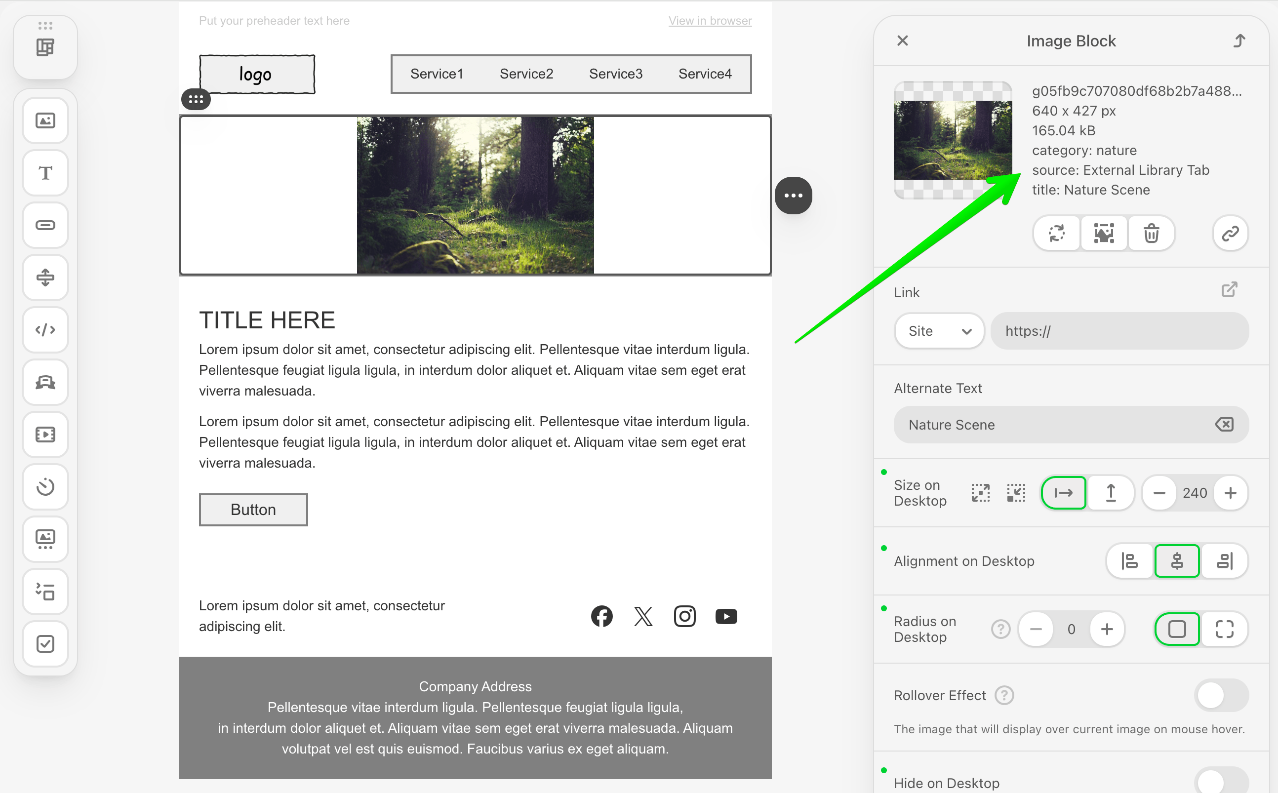
When a user selects an image, your library implementation must return an object with the following structure:
typescript
{
  originalName: string;    // Image file name
  width: number;           // Image width in pixels
  height: number;          // Image height in pixels
  sizeBytes: number;       // File size in bytes
  url: string;             // Image URL
  altText: string;         // Alt text for accessibility
  labels?: Record<string, string>;  // Optional metadata (v3.2.0+)
}
Starting from v3.2.0, you can include optional metadata using the labels property to store additional image information such as category, source or custom tags.
Step 1: Project Setup
Create your project structure and install dependencies according to the Getting Started guide.
Your project directory structure should look like this:
bash
external-image-library/
├── index.html
├── src/
│   ├── creds.js
│   ├── index.js
│   └── extension.js
├── package.json
└── vite.config.js
Step 2: Create the Image Library Class
Create a new file src/MyExternalImagesLibrary.js with the following basic class structure:
javascript
import {ExternalImageLibrary} from '@stripoinc/ui-editor-extensions';

/**
 * External Image Library Implementation
 * This class implements a modal image gallery with filtering capabilities
 * for the Stripo Email Editor extension system.
 */
export default class MyExternalImagesLibrary extends ExternalImageLibrary {
    // Instance properties
    externalLibrary;
    imageSelectCallback = () => {};
    cancelCallback = () => {};
    activeCategory = 'all';

    constructor() {
        super();
        this.createModal();
        this.attachEventListeners();
        this.initializeFilters();
    }

    /**
     * Required method called by the Stripo editor
     * Opens the image library modal dialog
     * @param {string} currentImageUrl - Currently selected image URL (if any)
     * @param {Function} onImageSelectCallback - Callback invoked when an image is selected
     * @param {Function} onCancelCallback - Callback invoked when the modal is cancelled
     */
    openImageLibrary(currentImageUrl, onImageSelectCallback, onCancelCallback) {
        // Store callbacks
        this.imageSelectCallback = onImageSelectCallback;
        this.cancelCallback = onCancelCallback;

        // Show modal
        this.externalLibrary.style.display = 'flex';

        // Reset filters to show all images
        this.filterImages('all');
        const allButton = this.externalLibrary.querySelector('[data-category="all"]');
        if (allButton) {
            this.updateActiveButton(allButton);
        }
    }
}
Key Components Explained
Instance Properties:
externalLibrary: Reference to the modal DOM elementimageSelectCallback: Stores the success callback from the Stripo editorcancelCallback: Stores the cancel callback from the Stripo editoractiveCategory: Tracks the currently active filter category
Constructor: Initializes the complete modal UI when the class is instantiated
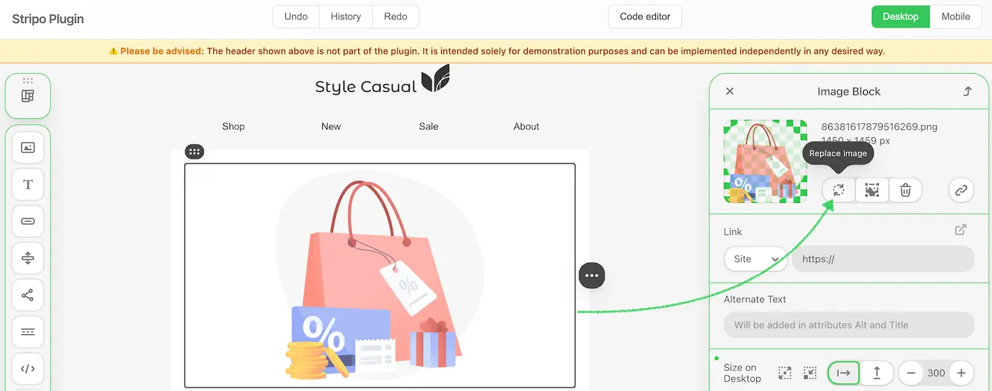
openImageLibrary: Required method that:
- Stores the callbacks for later invocation
- Displays the modal dialog
- Resets filters to display all images
- Updates the active button state
Step 3: Define Image Data and Styles
Add static properties for image data and UI configuration. Continue editing src/MyExternalImagesLibrary.js:
javascript
export default class MyExternalImagesLibrary extends ExternalImageLibrary {
    // ... existing properties ...

    // UI Style configurations
    static STYLES = {
        // Modal overlay styles
        overlay: {
            backgroundColor: 'rgba(0,0,0,.7)',
            position: 'fixed',
            top: '0',
            right: '0',
            bottom: '0',
            left: '0',
            zIndex: '1050',
            display: 'flex',
            alignItems: 'center',
            justifyContent: 'center',
            backdropFilter: 'blur(4px)',
            fontFamily: "-apple-system, BlinkMacSystemFont, 'Segoe UI', Roboto, 'Helvetica Neue', Arial, sans-serif"
        },

        // Modal container styles
        modal: {
            backgroundColor: '#ffffff',
            borderRadius: '12px',
            boxShadow: '0 20px 25px -5px rgba(0, 0, 0, 0.1), 0 10px 10px -5px rgba(0, 0, 0, 0.04)',
            maxWidth: '1000px',
            width: '90%',
            display: 'flex',
            flexDirection: 'column',
            position: 'relative'
        },

        // Header styles
        header: {
            padding: '24px 32px',
            borderBottom: '1px solid #e5e7eb',
            display: 'flex',
            alignItems: 'center',
            justifyContent: 'space-between',
            backgroundColor: '#f9fafb',
            borderRadius: '12px 12px 0 0'
        },

        // Content container styles
        content: {
            padding: '32px',
            height: '340px',
            overflowY: 'auto',
            overflowX: 'hidden',
            boxSizing: 'border-box'
        },

        // Grid styles
        grid: {
            display: 'grid',
            gridTemplateColumns: 'repeat(auto-fill, minmax(200px, 1fr))',
            gap: '20px',
            gridAutoRows: '125px'
        },

        // Button styles
        buttonActive: {
            padding: '6px 14px',
            borderRadius: '6px',
            border: 'none',
            backgroundColor: '#34c759',
            color: 'white',
            fontSize: '14px',
            fontWeight: '500',
            cursor: 'pointer',
            transition: 'background-color 0.2s'
        },

        buttonInactive: {
            padding: '6px 14px',
            borderRadius: '6px',
            border: '1px solid #e5e7eb',
            backgroundColor: 'white',
            color: '#6b7280',
            fontSize: '14px',
            fontWeight: '500',
            cursor: 'pointer',
            transition: 'all 0.2s'
        },

        // Footer styles
        footer: {
            padding: '16px 32px',
            borderTop: '1px solid #e5e7eb',
            backgroundColor: '#fef3c7',
            borderRadius: '0 0 12px 12px',
            textAlign: 'center'
        }
    };

    // Sample images data
    static IMAGES = [
        {
            category: 'nature',
            src: 'https://demo.stripocdn.email/content/guids/CABINET_ec6ac1de70c49219cc55754951562cc72c549fc9e7a7ec9636d3be7a33c392e2/images/g05fb9c707080df68b2b7a48884ecfb678ea72bfba6c4b30a3622d77b4e1fc4d686c2fa0ca69ecb08cb93ebe999a2cffd_640.jpeg',
            title: 'Nature Scene'
        },
        {
            category: 'abstract',
            src: 'https://demo.stripocdn.email/content/guids/CABINET_ec6ac1de70c49219cc55754951562cc72c549fc9e7a7ec9636d3be7a33c392e2/images/g039e37b4b08aab63892fa5bcb069ef5a4c3903ffdfe6a266b65d59c96669e69786dd8db7d6d686af5a93c55b5f59cc21_640.jpeg',
            title: 'Abstract Art'
        },
        {
            category: 'digital',
            src: 'https://demo.stripocdn.email/content/guids/CABINET_ec6ac1de70c49219cc55754951562cc72c549fc9e7a7ec9636d3be7a33c392e2/images/g865b29f858626ae67bf436c38ea27d23ce34ce2c083b7829929c1ce0f1c7a6f72f2f7654bfe16d837d53df0713b157da_640.jpeg',
            title: 'Digital Design'
        },
        {
            category: 'photography',
            src: 'https://demo.stripocdn.email/content/guids/CABINET_ec6ac1de70c49219cc55754951562cc72c549fc9e7a7ec9636d3be7a33c392e2/images/gf0fe89ba1310967859765c4634e5fdb5abc15576715a0e8793c2bccdd12fabb435f1f62ebf39c017d6c520c6a0cd0e83_640.jpeg',
            title: 'Mountain Vista'
        },
        {
            category: 'nature',
            src: 'https://rf.stripocdn.email/content/guids/CABINET_ec6ac1de70c49219cc55754951562cc72c549fc9e7a7ec9636d3be7a33c392e2/images/ge472fe8d47d49d6b4f022364cf352302eff394855af35507d5b92fe30d08e0c8a992246d3d813ff21769fd771fab7c90_640.jpeg',
            title: 'Ocean'
        },
        {
            category: 'nature',
            src: 'https://demo.stripocdn.email/content/guids/CABINET_ec6ac1de70c49219cc55754951562cc72c549fc9e7a7ec9636d3be7a33c392e2/images/g82fa2ffeb30d400bfa57c908a9716e883b41baf34f6ca09cb0650124ef4f0d10322137d9cfab9ae35aedb1a3d8adfb4e_640.jpeg',
            title: 'Waterfall'
        },
        {
            category: 'digital',
            src: 'https://rf.stripocdn.email/content/guids/CABINET_ec6ac1de70c49219cc55754951562cc72c549fc9e7a7ec9636d3be7a33c392e2/images/g37c2a939530fa27db0025bc0031514973909782c635b82080f91f5c7c15d473e0b3b7c6d41ef5a20d6370c6f58ae8ff0_640.jpeg',
            title: 'Lunar Rover'
        },
        {
            category: 'photography',
            src: 'https://demo.stripocdn.email/content/guids/CABINET_ec6ac1de70c49219cc55754951562cc72c549fc9e7a7ec9636d3be7a33c392e2/images/gfd3e800e20a1305512a60feb3cdf5fbc07ac64b8397398a9c12e3eb73ae28805d1ed5cbc941f302ab7186feedd38e4ff_640.jpeg',
            title: 'Ocean Sunset'
        }
    ];

    // ... rest of the class ...
}
Image Object Properties
| Property | Type | Description |
|---|---|---|
category | string | Filter category (nature, abstract, digital, photography) |
src | string | Image URL |
title | string | Image display name and alt text |
Production Implementation
In production environments, replace the static IMAGES array with API calls to dynamically fetch images from your backend service or third-party image providers.
Step 4: Build the Modal UI Structure
Implement the core modal creation methods. These methods generate the modal HTML structure and inject it into the page.
Create Modal Method
javascript
/**
 * Creates the modal HTML structure and appends it to the document body
 */
createModal() {
    const modalHtml = this.generateModalHTML();
    const container = document.createElement('div');
    container.innerHTML = modalHtml;
    document.body.appendChild(container);

    // Store reference to the modal element
    this.externalLibrary = document.getElementById('externalImagesLibrary');
    // Initially hide the modal
    this.externalLibrary.style.display = 'none';
}

/**
 * Generates the complete modal HTML structure
 * @returns {string} Complete HTML string for the modal
 */
generateModalHTML() {
    return `
        <div id="externalImagesLibrary" style="${this.styleObjToString(MyExternalImagesLibrary.STYLES.overlay)}">
            <div style="${this.styleObjToString(MyExternalImagesLibrary.STYLES.modal)}">
                ${this.generateHeaderHTML()}
                ${this.generateContentHTML()}
                ${this.generateFooterHTML()}
            </div>
        </div>
    `;
}
Style Conversion Helper
Add the following utility method that converts JavaScript style objects to inline CSS strings:
javascript
/**
 * Converts a style object to an inline style string
 * @param {Object} styleObj - Style object with camelCase properties
 * @returns {string} Inline CSS style string with kebab-case properties
 */
styleObjToString(styleObj) {
    return Object.entries(styleObj)
        .map(([key, value]) => {
            // Convert camelCase to kebab-case
            const kebabKey = key.replace(/([A-Z])/g, '-$1').toLowerCase();
            return `${kebabKey}: ${value}`;
        })
        .join('; ');
}
Important
The styleObjToString() method is essential for converting the STYLES object into inline CSS strings. This method is required for proper modal rendering.
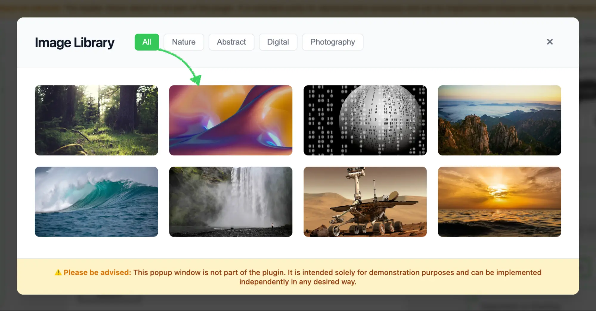
Modal Structure Overview
The modal consists of three main sections:
- Header: Title, category filter buttons, and close button
- Content: Scrollable grid of image thumbnails
- Footer: Informational disclaimer
Step 5: Generate Header with Filters
Create the header section with title, filter buttons, and close button.
Header HTML Generator
javascript
/**
 * Generates the modal header section HTML
 * @returns {string} HTML string for the header section
 */
generateHeaderHTML() {
    return `
        <div style="${this.styleObjToString(MyExternalImagesLibrary.STYLES.header)}">
            <div style="display: flex; align-items: center; gap: 12px;">
                <h2 style="margin: 0; font-size: 24px; font-weight: 600; color: #111827; letter-spacing: -0.025em;">
                    Image Library
                </h2>
                <div class="filter-buttons" style="display: flex; gap: 8px; margin-left: 24px;">
                    ${this.generateFilterButtons()}
                </div>
            </div>
            ${this.generateCloseButton()}
        </div>
    `;
}
Filter Buttons Generator
javascript
/**
 * Generates category filter buttons HTML
 * @returns {string} HTML string for all filter buttons
 */
generateFilterButtons() {
    const categories = [
        { id: 'all', label: 'All', active: true },
        { id: 'nature', label: 'Nature', active: false },
        { id: 'abstract', label: 'Abstract', active: false },
        { id: 'digital', label: 'Digital', active: false },
        { id: 'photography', label: 'Photography', active: false }
    ];

    return categories.map(cat => `
        <button
            data-category="${cat.id}"
            style="${this.styleObjToString(cat.active ? MyExternalImagesLibrary.STYLES.buttonActive : MyExternalImagesLibrary.STYLES.buttonInactive)}">
            ${cat.label}
        </button>
    `).join('');
}
Category Customization
Categories can be added or modified by updating the categories array. Ensure your image data contains matching category values for proper filtering.
Close Button Generator
javascript
/**
 * Generates close button HTML with hover effects
 * @returns {string} HTML string for the close button
 */
generateCloseButton() {
    return `
        <button class="close" type="button"
            style="cursor: pointer; background: transparent; border: none; font-size: 24px;
                   color: #6b7280; width: 40px; height: 40px; display: flex; align-items: center;
                   justify-content: center; border-radius: 8px; transition: all 0.2s;"
            onmouseover="this.style.backgroundColor='#f3f4f6'; this.style.color='#111827';"
            onmouseout="this.style.backgroundColor='transparent'; this.style.color='#6b7280';">
            <span style="line-height: 1;">×</span>
        </button>
    `;
}
Step 6: Generate Content with Image Grid
Create the content section that displays the image thumbnails in a responsive grid.
Content Container Generator
javascript
/**
 * Generates the modal content section HTML with image grid
 * @returns {string} HTML string for the content section
 */
generateContentHTML() {
    return `
        <div style="${this.styleObjToString(MyExternalImagesLibrary.STYLES.content)}">
            <div class="image-grid" style="${this.styleObjToString(MyExternalImagesLibrary.STYLES.grid)}">
                ${this.generateImageThumbnails()}
            </div>
        </div>
    `;
}
Image Thumbnails Generator
javascript
/**
 * Generates image thumbnail cards HTML
 * @returns {string} HTML string for all image thumbnail cards
 */
generateImageThumbnails() {
    return MyExternalImagesLibrary.IMAGES.map(image => `
        <div class="thumbnail"
             data-category="${image.category}"
             style="cursor: pointer; border-radius: 8px; overflow: hidden;
                    background-color: #f9fafb; transition: all 0.3s;
                    position: relative; height: 100%;"
             onmouseover="this.style.transform='translateY(-4px)';
                         this.style.boxShadow='0 20px 25px -5px rgba(0, 0, 0, 0.1), 0 10px 10px -5px rgba(0, 0, 0, 0.04)';"
             onmouseout="this.style.transform='translateY(0)';
                        this.style.boxShadow='none';">
            <img style="width: 100%; height: 100%; object-fit: cover; display: block;"
                 src="${image.src}"
                 alt="${image.title}">
            <div style="position: absolute; bottom: 0; left: 0; right: 0;
                       background: linear-gradient(to top, rgba(0,0,0,0.7), transparent);
                       padding: 12px; opacity: 0; transition: opacity 0.3s;"
                 onmouseover="this.style.opacity='1';"
                 onmouseout="this.style.opacity='0';">
                <p style="color: white; margin: 0; font-size: 14px; font-weight: 500;">
                    ${image.title}
                </p>
            </div>
        </div>
    `).join('');
}
Key Features
- Responsive Grid: Utilizes CSS Grid with
auto-fillto create a responsive layout that adapts to different screen sizes - Fixed Row Height: The
gridAutoRows: '125px'property ensures consistent thumbnail heights across the grid - Hover Effects: Inline event handlers provide smooth transition animations during user interaction
- Data Attributes: Image metadata (
data-category) is stored in data attributes for efficient filtering - Overlay Effect: The title appears on hover with a gradient background overlay for enhanced visual presentation
- Object Fit: The
object-fit: coverproperty ensures images fill their containers while maintaining their aspect ratio
Step 7: Generate Footer with Disclaimer
Add a footer section to display important notices or disclaimers.
javascript
/**
 * Generates the modal footer section HTML with disclaimer notice
 * @returns {string} HTML string for the footer section
 */
generateFooterHTML() {
    return `
        <div style="${this.styleObjToString(MyExternalImagesLibrary.STYLES.footer)}">
            <p style="margin: 0; font-size: 13px; color: #92400e; font-weight: 500;">
                <span style="font-weight: 700; color: #d97706;">⚠️ Please be advised:</span> This popup window is not part of the plugin. It is intended solely for demonstration purposes and can be implemented independently in any desired way.
            </p>
        </div>
    `;
}
Step 8: Implement Event Handlers
Add event listeners to handle user interactions with the modal.
Attach Event Listeners
javascript
/**
 * Attaches event listeners to modal elements after creation
 */
attachEventListeners() {
    // Close button click handler
    this.externalLibrary.querySelector('.close')
        .addEventListener('click', this.cancelAndClose.bind(this));

    // Image click handler (using event delegation)
    this.externalLibrary.addEventListener('click', this.onImageClick.bind(this));
}
Handle Image Selection
javascript
/**
 * Handles click events on image thumbnail cards
 * @param {Event} e - Click event object
 */
onImageClick(e) {
    // Check if clicked on thumbnail or any of its children
    const thumbnail = e.target.closest('.thumbnail');
    if (!thumbnail) return;

    // Get the image element within the thumbnail
    const img = thumbnail.querySelector('img');
    if (!img) return;

    // Create callback object with image data
    const imageData = {
        originalName: img.src.split('/').pop(),
        width: 600,
        height: 410,
        size: 169000,
        url: img.getAttribute('src'),
        altText: img.getAttribute('alt')
    };

    // Close modal and execute callback
    this.close();
    this.imageSelectCallback(imageData);
}
Dynamic Image Metadata
In production environments, you should fetch actual image dimensions and file sizes from your backend or use the Image API to retrieve real metadata. The example above uses placeholder values for demonstration purposes.
Handle Modal Closure
javascript
/**
 * Closes the modal and invokes the cancel callback
 */
cancelAndClose() {
    this.close();
    this.cancelCallback();
}

/**
 * Closes the modal dialog by hiding it from view
 */
close() {
    this.externalLibrary.style.display = 'none';
}
Event Delegation Benefits
Using event delegation by listening to the parent container provides several advantages:
- Improved Performance: A single event listener replaces multiple individual listeners for each thumbnail
- Simplified Maintenance: Eliminates the need to dynamically attach and detach listeners
- Future-Proof Implementation: Automatically handles dynamically added image elements
- Memory Efficiency: Reduces the memory footprint when managing numerous elements
Step 9: Implement Category Filtering
Add filtering functionality to help users find images by category.
Initialize Filter Buttons
javascript
/**
 * Initializes category filter button functionality
 */
initializeFilters() {
    const filterButtons = this.externalLibrary.querySelectorAll('.filter-buttons button');

    filterButtons.forEach(button => {
        button.addEventListener('click', (e) => {
            const category = e.target.getAttribute('data-category');
            this.filterImages(category);
            this.updateActiveButton(e.target);
        });
    });
}
Filter Images by Category
javascript
/**
 * Filters displayed images based on the selected category
 * @param {string} category - Category identifier to filter by (or 'all' for all images)
 */
filterImages(category) {
    this.activeCategory = category;
    const thumbnails = this.externalLibrary.querySelectorAll('.thumbnail');

    thumbnails.forEach(thumbnail => {
        const shouldShow = category === 'all' ||
                         thumbnail.getAttribute('data-category') === category;
        thumbnail.style.display = shouldShow ? 'block' : 'none';
    });
}
Update Button Visual States
javascript
/**
 * Updates the visual state of category filter buttons
 * @param {HTMLElement} activeButton - The button element that was clicked and should be marked active
 */
updateActiveButton(activeButton) {
    const buttons = this.externalLibrary.querySelectorAll('.filter-buttons button');

    buttons.forEach(button => {
        const isActive = button === activeButton;
        const styles = isActive ?
            MyExternalImagesLibrary.STYLES.buttonActive :
            MyExternalImagesLibrary.STYLES.buttonInactive;

        // Apply styles
        Object.assign(button.style, styles);
    });
}
Step 10: Register the Extension
Create src/extension.js to register your image library with the Stripo extension system:
javascript
import {ExtensionBuilder} from '@stripoinc/ui-editor-extensions';
import MyExternalImagesLibrary from './MyExternalImagesLibrary';

export default new ExtensionBuilder()
    .withExternalImageLibrary(MyExternalImagesLibrary)
    .build();
Extension Registration Explained
The ExtensionBuilder class provides a fluent API for registering integrations:
withExternalImageLibrary(): Registers your custom image library implementationbuild(): Constructs and returns the final extension object for the editor
Multiple Integrations
Multiple .with*() methods can be chained to register different integrations within a single extension:
javascript
new ExtensionBuilder()
    .withExternalImageLibrary(MyExternalImagesLibrary)
    .withExternalVideosLibrary(MyExternalVideosLibrary)
    .withExternalMergeTagsSelector(MyMergeTagsSelector)
    .build();
Step 11: Run the Development Server
Your implementation is now ready for testing.
Start the Development Server
bash
npm run devThis command will:
- Start the Vite development server on
http://localhost:3000 - Automatically open your default browser
- Load the Stripo Editor with your image library extension integrated
Complete Example
For a full working example, check out the complete implementation in our GitHub repository.