Appearance
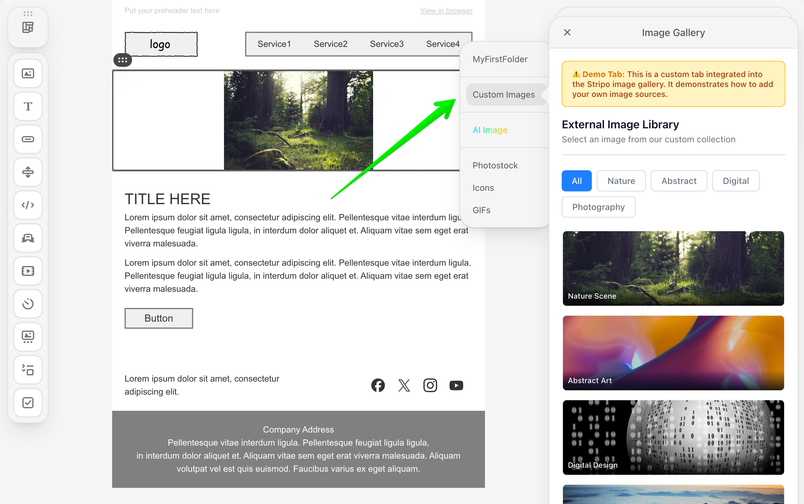
Integrate a Custom Tab in the Native Image Gallery
Overview
The External Image Library Tab integration allows you to add a custom tab directly within Stripo's native image gallery interface. Unlike creating a standalone modal dialog, this integration embeds your custom image collection as a seamless tab alongside Stripo's built-in image sources.
What You'll Build
In this tutorial, you'll create a fully functional custom image library tab that:
- Integrates directly into Stripo's native gallery as a custom tab
- Displays a responsive grid of image thumbnails with hover effects
- Supports category-based filtering (All, Nature, Abstract, Digital, and Photography)
- Handles image selection with proper callback integration
- Provides localization support for multiple languages
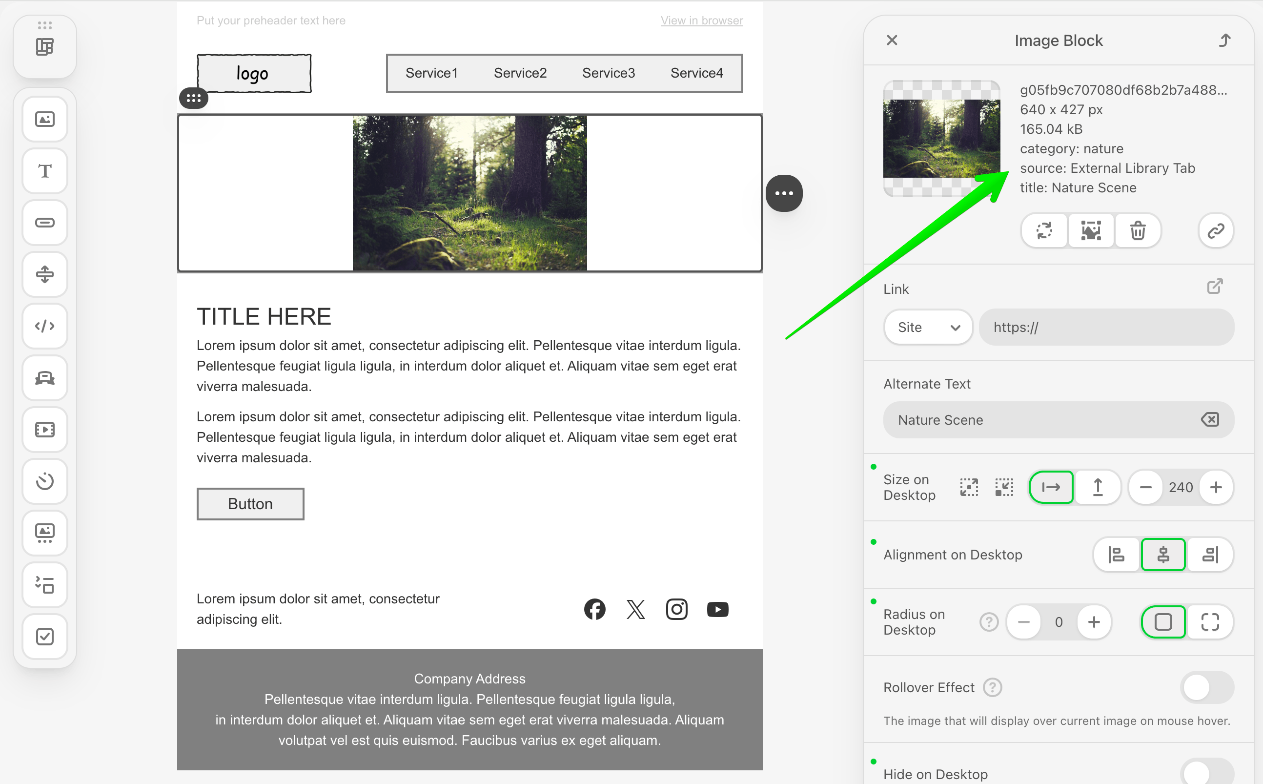
- Returns enhanced image metadata using the
labelsproperty
Available from v3.2.0
The ExternalImageLibraryTab interface and enhanced metadata support through the labels property are available starting from v3.2.0 of the Stripo Extensions SDK.
Use Cases
- Seamless User Experience: Integrate your image library without disrupting the native editor workflow
- Enhanced Metadata: Store additional image information such as categories or custom tags
Prerequisites
Before starting this tutorial, ensure you have:
- Node.js version 22.x or higher installed
- A basic understanding of JavaScript ES6+ syntax
- Familiarity with the Stripo Extensions SDK
- Completed the Getting Started guide
Understanding the Interface
The ExternalImageLibraryTab class must implement two key methods:
Required Methods
typescript
/**
 * Returns the localized name of the tab
 * This name will be displayed as the tab title in the gallery
 */
getName(): string

/**
 * Called when the tab is opened
 * Renders content into the provided container
 */
openImageLibraryTab(
  container: HTMLElement,
  onImageSelect: (image: ExternalGalleryImage) => void,
  selectedNode?: ImmutableHtmlNode
): void
Method Parameters
| Method | Parameter | Type | Description |
|---|---|---|---|
openImageLibraryTab | container | HTMLElement | DOM container where your tab content should be rendered |
openImageLibraryTab | onImageSelect | Function | Callback to invoke when a user selects an image |
openImageLibraryTab | selectedNode | ImmutableHtmlNode | (Optional) Selected node for which the gallery is being opened |
ExternalGalleryImage Object
When a user selects an image, your implementation must return an object with the following structure:
typescript
{
  originalName: string;              // Image file name
  width: number;                     // Image width in pixels
  height: number;                    // Image height in pixels
  sizeBytes: number;                 // File size in bytes
  url: string;                       // Image URL
  altText: string;                   // Alt text for accessibility
  labels?: Record<string, string>;   // Optional metadata
}
Enhanced Metadata
The optional labels property lets you attach extra metadata to an image—such as its category, source, or custom tags. These details will be shown beneath the default image properties like dimensions and file size in the gallery UI.
Step 1: Project Setup
Create your project structure and install dependencies according to the Getting Started guide.
Your project directory structure should look like this:
bash
external-image-library-tab/
├── index.html
├── src/
│   ├── creds.js
│   ├── index.js
│   ├── extension.js
├── package.json
└── vite.config.js
Install Dependencies
Ensure you have the required dependencies in your package.json:
json
{
  "name": "external-image-library-tab",
  "version": "1.0.0",
  "description": "External Image Library Tab Extension for Stripo Editor",
  "scripts": {
    "dev": "vite",
    "build": "vite build"
  },
  "dependencies": {
    "@stripoinc/ui-editor-extensions": "^3.2.0"
  },
  "devDependencies": {
    "vite": "^7.1.9"
  }
}
Run the installation:
bash
npm installStep 2: Create the Tab Implementation Class
Create a new file src/MyExternalImageLibraryTab.js that implements the ExternalImageLibraryTab interface:
javascript
import {ExternalImageLibraryTab} from '@stripoinc/ui-editor-extensions';
import {ImageLibraryTabUI} from './ImageLibraryTabUI.js';

/**
 * External Image Library Tab Implementation
 * This class implements the ExternalImageLibraryTab interface
 * and delegates all UI logic to ImageLibraryTabUI
 */
export default class MyExternalImageLibraryTab extends ExternalImageLibraryTab {
  constructor() {
    super();
    // Create UI handler instance
    this.ui = new ImageLibraryTabUI();
  }

  /**
   * Required method: Returns the localized name of the tab
   * This name will be displayed as the tab title in the gallery
   * @returns {string} Localized tab name
   */
  getName() {
    return this.api.translate('Custom Images');
  }

  /**
   * Required method: Called when the tab is opened
   * Delegates rendering to the UI class
   * @param {HTMLElement} container - DOM container where content should be rendered
   * @param {Function} onImageSelect - Callback to invoke when an image is selected
   * @param {ImmutableHtmlNode} selectedNode - (Optional) Selected node for which the gallery is being opened
   */
  openImageLibraryTab(container, onImageSelect, selectedNode) {
    this.ui.initialize(container, onImageSelect);
  }
}
Key Components Explained
- Constructor: Initializes the UI handler class that manages all presentation logic
- getName(): Returns the tab name. Uses
this.api.translate()to support localization - openImageLibraryTab(): Entry point called by Stripo when the tab is activated. Delegates rendering to the UI class
Separation of Concerns
This example follows a clean architecture pattern by separating the interface implementation (Tab class) from the UI logic (UI class). This makes the code more maintainable and testable.
Step 3: Create the UI Handler Class
Create a new file src/ImageLibraryTabUI.js that handles all UI rendering and interactions:
javascript
/**
 * UI Logic and Rendering for Image Library Tab
 * This class handles all the presentation logic, DOM manipulation,
 * and user interactions for the custom image library tab.
 */
export class ImageLibraryTabUI {
  constructor() {
    this.container = null;
    this.imageSelectCallback = () => {};
    this.activeCategory = 'all';
  }

  /**
   * Initializes the UI and renders content in the provided container
   * @param {HTMLElement} container - DOM container where content should be rendered
   * @param {Function} onImageSelect - Callback to invoke when an image is selected
   */
  initialize(container, onImageSelect) {
    this.container = container;
    this.imageSelectCallback = onImageSelect;

    this.renderUI();
    this.initializeFilters();
    this.filterImages('all');
  }

  /**
   * Renders the complete UI structure inside the container
   */
  renderUI() {
    const html = this.generateHTML();
    this.container.innerHTML = html;
    this.attachEventListeners();
  }
}
Instance Properties
| Property | Type | Description |
|---|---|---|
container | HTMLElement | Reference to the DOM container provided by Stripo |
imageSelectCallback | Function | Callback to invoke when an image is selected |
activeCategory | string | Currently active filter category |
Step 4: Define Image Data and Styles
Add static properties for image data and UI configuration to src/ImageLibraryTabUI.js:
javascript
export class ImageLibraryTabUI {
  // UI Style configurations
  static STYLES = {
    // Container styles
    container: {
      padding: '20px',
      boxSizing: 'border-box',
      backgroundColor: '#ffffff',
      fontFamily: '-apple-system, BlinkMacSystemFont, \'Segoe UI\', Roboto, \'Helvetica Neue\', Arial, sans-serif',
    },

    // Header styles
    header: {
      marginBottom: '24px',
      paddingBottom: '16px',
      borderBottom: '2px solid #e5e7eb',
    },

    // Filter buttons container
    filterContainer: {
      display: 'flex',
      gap: '8px',
      marginBottom: '20px',
      flexWrap: 'wrap',
    },

    // Grid styles
    grid: {
      display: 'grid',
      gridTemplateColumns: 'repeat(auto-fill, minmax(180px, 1fr))',
      gap: '16px',
      gridAutoRows: '120px',
    },

    // Button styles
    buttonActive: {
      padding: '8px 16px',
      borderRadius: '6px',
      border: 'none',
      backgroundColor: '#3b82f6',
      color: 'white',
      fontSize: '14px',
      fontWeight: '500',
      cursor: 'pointer',
      transition: 'background-color 0.2s',
    },

    buttonInactive: {
      padding: '8px 16px',
      borderRadius: '6px',
      border: '1px solid #d1d5db',
      backgroundColor: 'white',
      color: '#6b7280',
      fontSize: '14px',
      fontWeight: '500',
      cursor: 'pointer',
      transition: 'all 0.2s',
    },

    // Notice banner styles
    notice: {
      padding: '12px 16px',
      marginBottom: '20px',
      backgroundColor: '#fef3c7',
      borderRadius: '8px',
      border: '1px solid #fbbf24',
    },
  };

  // Sample images data
  static IMAGES = [
    {
      category: 'nature',
      src: 'https://demo.stripocdn.email/content/guids/CABINET_ec6ac1de70c49219cc55754951562cc72c549fc9e7a7ec9636d3be7a33c392e2/images/g05fb9c707080df68b2b7a48884ecfb678ea72bfba6c4b30a3622d77b4e1fc4d686c2fa0ca69ecb08cb93ebe999a2cffd_640.jpeg',
      title: 'Nature Scene',
    },
    {
      category: 'abstract',
      src: 'https://demo.stripocdn.email/content/guids/CABINET_ec6ac1de70c49219cc55754951562cc72c549fc9e7a7ec9636d3be7a33c392e2/images/g039e37b4b08aab63892fa5bcb069ef5a4c3903ffdfe6a266b65d59c96669e69786dd8db7d6d686af5a93c55b5f59cc21_640.jpeg',
      title: 'Abstract Art',
    },
    {
      category: 'digital',
      src: 'https://demo.stripocdn.email/content/guids/CABINET_ec6ac1de70c49219cc55754951562cc72c549fc9e7a7ec9636d3be7a33c392e2/images/g865b29f858626ae67bf436c38ea27d23ce34ce2c083b7829929c1ce0f1c7a6f72f2f7654bfe16d837d53df0713b157da_640.jpeg',
      title: 'Digital Design',
    },
    {
      category: 'photography',
      src: 'https://demo.stripocdn.email/content/guids/CABINET_ec6ac1de70c49219cc55754951562cc72c549fc9e7a7ec9636d3be7a33c392e2/images/gf0fe89ba1310967859765c4634e5fdb5abc15576715a0e8793c2bccdd12fabb435f1f62ebf39c017d6c520c6a0cd0e83_640.jpeg',
      title: 'Mountain Vista',
    },
    {
      category: 'nature',
      src: 'https://rf.stripocdn.email/content/guids/CABINET_ec6ac1de70c49219cc55754951562cc72c549fc9e7a7ec9636d3be7a33c392e2/images/ge472fe8d47d49d6b4f022364cf352302eff394855af35507d5b92fe30d08e0c8a992246d3d813ff21769fd771fab7c90_640.jpeg',
      title: 'Ocean',
    },
    {
      category: 'nature',
      src: 'https://demo.stripocdn.email/content/guids/CABINET_ec6ac1de70c49219cc55754951562cc72c549fc9e7a7ec9636d3be7a33c392e2/images/g82fa2ffeb30d400bfa57c908a9716e883b41baf34f6ca09cb0650124ef4f0d10322137d9cfab9ae35aedb1a3d8adfb4e_640.jpeg',
      title: 'Waterfall',
    },
    {
      category: 'digital',
      src: 'https://rf.stripocdn.email/content/guids/CABINET_ec6ac1de70c49219cc55754951562cc72c549fc9e7a7ec9636d3be7a33c392e2/images/g37c2a939530fa27db0025bc0031514973909782c635b82080f91f5c7c15d473e0b3b7c6d41ef5a20d6370c6f58ae8ff0_640.jpeg',
      title: 'Lunar Rover',
    },
    {
      category: 'photography',
      src: 'https://demo.stripocdn.email/content/guids/CABINET_ec6ac1de70c49219cc55754951562cc72c549fc9e7a7ec9636d3be7a33c392e2/images/gfd3e800e20a1305512a60feb3cdf5fbc07ac64b8397398a9c12e3eb73ae28805d1ed5cbc941f302ab7186feedd38e4ff_640.jpeg',
      title: 'Ocean Sunset',
    },
  ];

  // ... rest of the class ...
}
Image Object Properties
| Property | Type | Description |
|---|---|---|
category | string | Filter category (nature, abstract, digital, photography) |
src | string | Image URL |
title | string | Image display name and alt text |
Production Implementation
In production environments, replace the static IMAGES array with API calls to dynamically fetch images from your backend service or third-party image providers. Consider implementing pagination or lazy loading for better performance with large image collections.
Step 5: Generate the UI Structure
Add methods to generate the complete HTML structure for your tab. Continue editing src/ImageLibraryTabUI.js:
javascript
/**
 * Generates the complete HTML structure
 * @returns {string} Complete HTML string for the tab content
 */
generateHTML() {
  return `
    <div style="${this.styleObjToString(ImageLibraryTabUI.STYLES.container)}">
        ${this.generateNoticeHTML()}
        ${this.generateHeaderHTML()}
        ${this.generateFilterButtonsHTML()}
        ${this.generateImageGridHTML()}
    </div>
  `;
}

/**
 * Converts a style object to an inline style string
 * @param {Object} styleObj - Style object with camelCase properties
 * @returns {string} Inline CSS style string with kebab-case properties
 */
styleObjToString(styleObj) {
  return Object.entries(styleObj)
    .map(([key, value]) => {
      // Convert camelCase to kebab-case
      const kebabKey = key.replace(/([A-Z])/g, '-$1').toLowerCase();
      return `${kebabKey}: ${value}`;
    })
    .join('; ');
}
Notice Banner
Add an informational banner to explain the custom tab to users:
javascript
/**
 * Generates notice banner HTML
 * @returns {string} HTML string for the notice banner
 */
generateNoticeHTML() {
  return `
    <div style="${this.styleObjToString(ImageLibraryTabUI.STYLES.notice)}">
        <p style="margin: 0; font-size: 13px; color: #92400e; font-weight: 500;">
            <span style="font-weight: 700; color: #d97706;">⚠️ Demo Tab:</span>
            This is a custom tab integrated into the Stripo image gallery.
            It demonstrates how to add your own image sources.
        </p>
    </div>
  `;
}
Header Section
Create the header with title and description:
javascript
/**
 * Generates the header section HTML
 * @returns {string} HTML string for the header section
 */
generateHeaderHTML() {
  return `
    <div style="${this.styleObjToString(ImageLibraryTabUI.STYLES.header)}">
        <h3 style="margin: 0 0 8px 0; font-size: 18px; font-weight: 600; color: #111827;">
            External Image Library
        </h3>
        <p style="margin: 0; font-size: 14px; color: #6b7280;">
            Select an image from our custom collection
        </p>
    </div>
  `;
}
Step 6: Generate Filter Buttons
Create category filter buttons to help users navigate the image collection:
javascript
/**
 * Generates category filter buttons HTML
 * @returns {string} HTML string for filter buttons
 */
generateFilterButtonsHTML() {
  const categories = [
    {id: 'all', label: 'All', active: true},
    {id: 'nature', label: 'Nature', active: false},
    {id: 'abstract', label: 'Abstract', active: false},
    {id: 'digital', label: 'Digital', active: false},
    {id: 'photography', label: 'Photography', active: false},
  ];

  const buttons = categories.map(cat => `
    <button
        data-category="${cat.id}"
        style="${this.styleObjToString(
          cat.active ?
            ImageLibraryTabUI.STYLES.buttonActive :
            ImageLibraryTabUI.STYLES.buttonInactive
        )}">
        ${cat.label}
    </button>
  `).join('');

  return `
    <div class="filter-buttons" style="${this.styleObjToString(ImageLibraryTabUI.STYLES.filterContainer)}">
        ${buttons}
    </div>
  `;
}
Category Customization
Categories can be customized by modifying the categories array. Ensure your image data contains matching category values for proper filtering functionality.
Step 7: Generate Image Grid with Thumbnails
Create the image grid that displays all available images:
javascript
/**
 * Generates image grid HTML with thumbnails
 * @returns {string} HTML string for the image grid
 */
generateImageGridHTML() {
  const thumbnails = ImageLibraryTabUI.IMAGES.map(image => `
    <div class="thumbnail"
         data-category="${image.category}"
         style="cursor: pointer; border-radius: 8px; overflow: hidden;
                background-color: #f9fafb; transition: all 0.3s;
                position: relative; height: 100%; border: 2px solid transparent;"
         onmouseover="this.style.transform='translateY(-2px)';
                     this.style.borderColor='#3b82f6';
                     this.style.boxShadow='0 10px 15px -3px rgba(0, 0, 0, 0.1)';"
         onmouseout="this.style.transform='translateY(0)';
                    this.style.borderColor='transparent';
                    this.style.boxShadow='none';">
        <img style="width: 100%; height: 100%; object-fit: cover; display: block;"
             src="${image.src}"
             alt="${image.title}"
             data-title="${image.title}"
             data-category="${image.category}">
        <div style="position: absolute; bottom: 0; left: 0; right: 0;
                   background: linear-gradient(to top, rgba(0,0,0,0.8), transparent);
                   padding: 8px; color: white; font-size: 12px; font-weight: 500;">
            ${image.title}
        </div>
    </div>
  `).join('');

  return `
    <div class="image-grid" style="${this.styleObjToString(ImageLibraryTabUI.STYLES.grid)}">
        ${thumbnails}
    </div>
  `;
}
Step 8: Implement Event Handlers
Add event listeners to handle user interactions:
javascript
/**
 * Attaches event listeners to interactive elements
 */
attachEventListeners() {
  // Use capture phase to ensure we catch the event before child handlers
  this.container.addEventListener('click', this.onImageClick.bind(this));
}

/**
 * Handles click events on image thumbnail cards
 * @param {Event} e - Click event object
 */
onImageClick(e) {
  const thumbnail = e.target.closest('.thumbnail');
  if (!thumbnail) {
    return;
  }

  const img = thumbnail.querySelector('img');
  if (!img) {
    return;
  }

  const title = img.getAttribute('data-title') || img.getAttribute('alt') || '';
  const category = img.getAttribute('data-category') || '';

  // Create enhanced metadata using labels
  const labels = {
    category: category,
    source: 'External Library Tab',
    title: title,
  };

  // Create callback object with image data and metadata
  const imageData = {
    originalName: img.src.split('/').pop() || '',
    width: 600,
    height: 410,
    sizeBytes: 169000,
    url: img.getAttribute('src') || '',
    altText: title,
    labels: labels,  // Enhanced metadata (v3.2.0+)
  };

  // Invoke the callback to insert the image into the editor
  this.imageSelectCallback(imageData);
}
Enhanced Metadata with Labels
The labels property allows you to attach custom metadata to each image:
| Label Key | Example Value | Purpose |
|---|---|---|
category | "nature" | Organize images by type |
source | "External Library Tab" | Track image origin |
title | "Ocean Sunset" | Store descriptive information |
| Custom keys | Any value | Add your own metadata fields |
Step 9: Implement Category Filtering
Add filtering functionality to help users find images by category:
javascript
/**
 * Initializes category filter button functionality
 */
initializeFilters() {
  const filterButtons = this.container.querySelectorAll('.filter-buttons button');

  filterButtons.forEach(button => {
    button.addEventListener('click', (e) => {
      e.stopPropagation(); // Prevent event from bubbling to image click handler
      const category = e.target.getAttribute('data-category');
      if (category) {
        this.filterImages(category);
        this.updateActiveButton(e.target);
      }
    });
  });
}

/**
 * Filters displayed images based on the selected category
 * @param {string} category - Category identifier to filter by (or 'all' for all images)
 */
filterImages(category) {
  this.activeCategory = category;
  const thumbnails = this.container.querySelectorAll('.thumbnail');

  thumbnails.forEach(thumbnail => {
    const shouldShow = category === 'all' ||
                      thumbnail.getAttribute('data-category') === category;
    thumbnail.style.display = shouldShow ? 'block' : 'none';
  });
}

/**
 * Updates the visual state of category filter buttons
 * @param {HTMLElement} activeButton - The button element that should be marked active
 */
updateActiveButton(activeButton) {
  const buttons = this.container.querySelectorAll('.filter-buttons button');

  buttons.forEach(button => {
    const isActive = button === activeButton;
    const styles = isActive ?
      ImageLibraryTabUI.STYLES.buttonActive :
      ImageLibraryTabUI.STYLES.buttonInactive;

    // Apply styles
    Object.assign(button.style, styles);
  });
}
Step 10: Register the Extension with Localization
Create src/extension.js to register your image library tab with localization support:
javascript
import {ExtensionBuilder} from '@stripoinc/ui-editor-extensions';
import MyExternalImageLibraryTab from './MyExternalImageLibraryTab.js';

const extension = new ExtensionBuilder()
  .withExternalImageLibraryTab(MyExternalImageLibraryTab)
  .withLocalization({
    'en': {
      'Custom Images': 'Custom Images',
    },
    'uk': {
      'Custom Images': 'Власні зображення',
    },
  })
  .build();

export default extension;
Extension Registration Explained
The ExtensionBuilder provides a fluent API for registering your custom tab:
withExternalImageLibraryTab(): Registers your custom tab implementationwithLocalization(): Provides translations for different languagesbuild(): Constructs and returns the final extension object
Localization Structure
The localization object maps language codes to translation dictionaries:
javascript
{
  'en': {           // Language code (English)
    'Key': 'Value'  // Translation key-value pairs
  },
  'uk': {           // Language code (Ukrainian)
    'Key': 'Значення'
  }
}
Multiple Integrations
You can chain multiple .with*() methods to register different integrations:
javascript
new ExtensionBuilder()
  .withExternalImageLibraryTab(MyImageTab)
  .withExternalVideosLibrary(MyVideoLibrary)
  .withLocalization({ /* translations */ })
  .build();
Step 11: Run the Development Server
Your implementation is now ready for testing!
Start the Development Server
bash
npm run devThis command will:
- Start the Vite development server on
http://localhost:3000 - Automatically open your default browser
- Load the Stripo Editor with your custom image library tab
Complete Example
For a full working example, check out the complete implementation in our GitHub repository.