Appearance
Editor Theming & Panel Styling
The Stripo Extensions SDK provides comprehensive theming capabilities that allow you to customize the visual appearance of both the editor interface and the email template preview. This includes styling blocks panels, overriding default UI styles, and adding custom preview-only styles like selection borders and context icons.
Styles
Overview
There are two primary types of styles you can customize:
- UI Styles - Applied to the editor interface (blocks panel, controls, toolbars)
- Preview Styles - Applied only to the document preview area (selection borders, custom indicators)
UI Styles
UI styles modify the appearance of the editor interface itself, including the blocks panel, control panels, and other UI components.
Adding UI Styles
Use the addStyles() method to inject custom CSS into the editor interface:
javascript
import {ExtensionBuilder} from '@stripoinc/ui-editor-extensions';

const extension = new ExtensionBuilder()
    .addStyles(`
        /* Customize blocks panel background color */
        .block-panel-content {
            background-color: cadetblue;
        }
    `)
    .build();
Multiple Style Sheets
You can add multiple style sheets by calling addStyles() multiple times:
javascript
import {ExtensionBuilder} from '@stripoinc/ui-editor-extensions';
import panelStyles from './styles/panel.css?raw';
import controlStyles from './styles/controls.css?raw';

const extension = new ExtensionBuilder()
    .addStyles(panelStyles)
    .addStyles(controlStyles)
    .build();
Reacting to Email Template Theme Mode
Use ThemeMode with getEditorState() or onEditorStatePropUpdated() when your extension UI needs to adapt to the email template's active light or dark theme.
javascript
import {Control, EditorStatePropertyType, ThemeMode, UEAttr, UIElementType} from '@stripoinc/ui-editor-extensions';
class ThemeAwareControl extends Control {
getId() {
return 'theme-aware-control';
}
getTemplate() {
return `
<${UIElementType.MESSAGE} ${UEAttr.MESSAGE.name}="statusMessage"></${UIElementType.MESSAGE}>
`;
}
onRender() {
this.applyTheme(this.api.getEditorState().themeMode);
this.api.onEditorStatePropUpdated(
EditorStatePropertyType.themeMode,
(themeMode) => this.applyTheme(themeMode)
);
}
applyTheme(themeMode) {
this.api.setUIEAttribute(
'statusMessage',
UEAttr.MESSAGE.type,
themeMode === ThemeMode.DARK ? 'info' : 'warning'
);
}
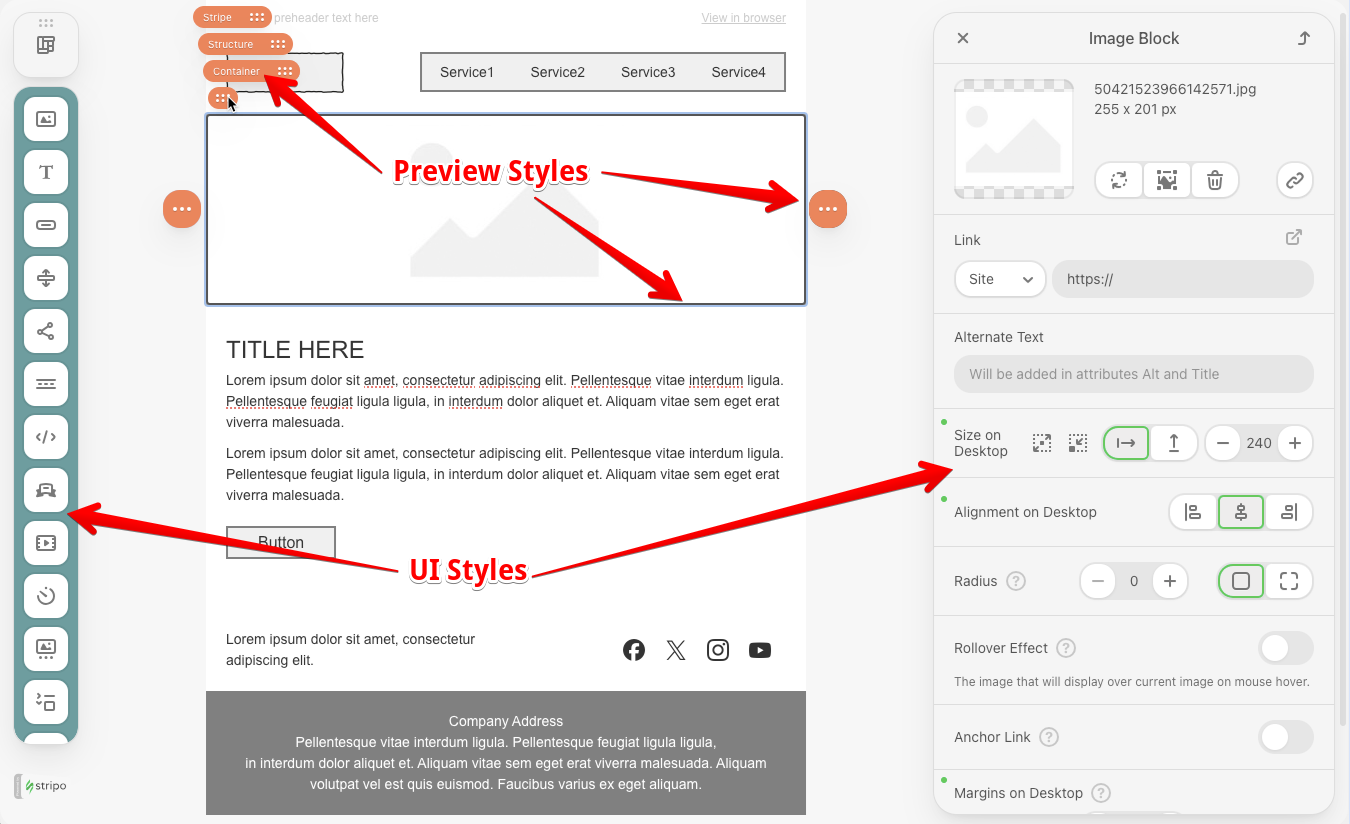
}Preview Styles
Preview styles are applied only to the document preview area. These styles don't affect the final HTML output - they only enhance the editing experience.
Adding Preview Styles
Use the withPreviewStyles() method to set styles that apply only in the editor preview:
javascript
import {ExtensionBuilder} from '@stripoinc/ui-editor-extensions';

const extension = new ExtensionBuilder()
    .withPreviewStyles(`
        .ue-preview-dragging, .ue-dots-icon {
           background-color: coral !important;
        }
    `)
    .build();
Blocks Panel Customization
For advanced blocks panel customization, use the BlocksPanel class. This class enables you to:
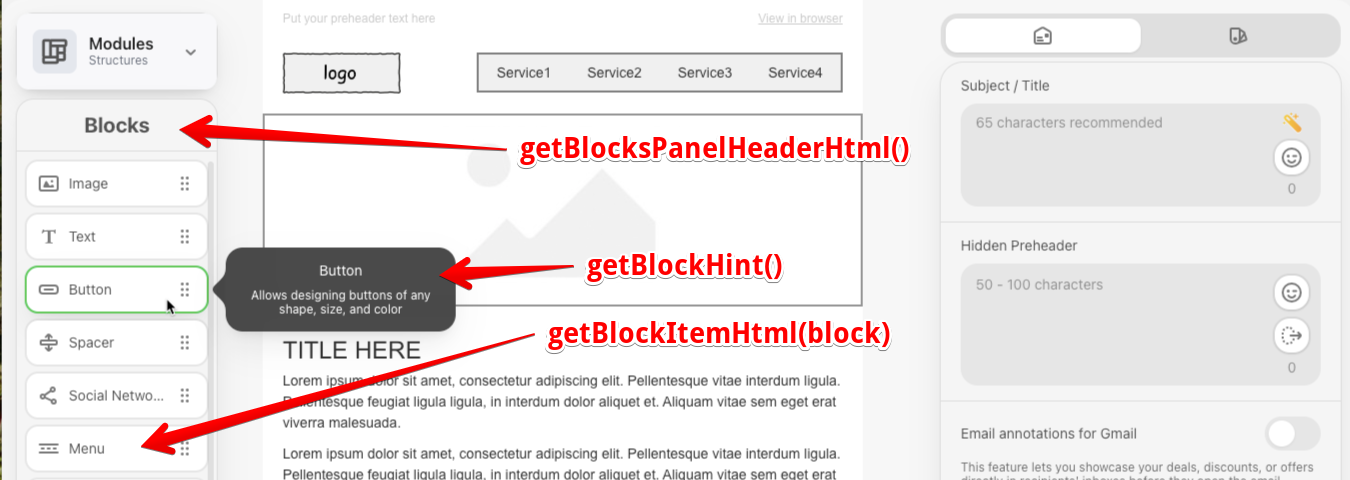
- Generate HTML representation for a block item in the blocks panel
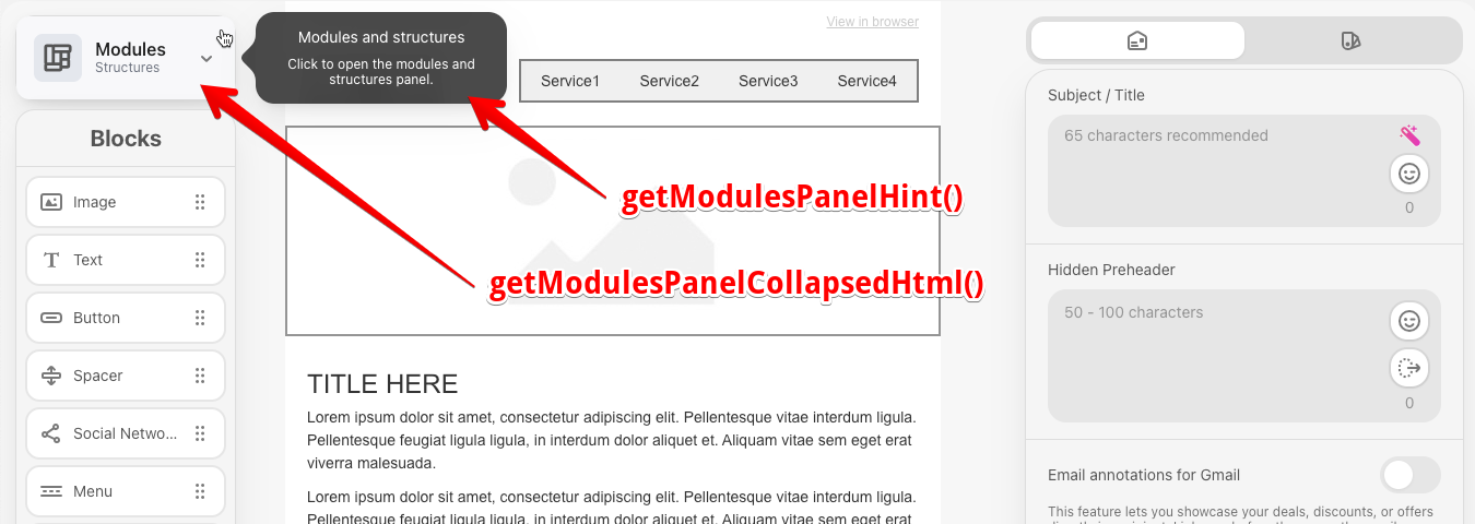
- Generate HTML representation for the blocks panel header
- Generate HTML representation for the modules panel in collapsed state
- Control hint visibility for individual blocks
- Control hint visibility for the collapsed modules panel
- Set a custom delay for showing hints in milliseconds
- Set the hint text for a block
- Set the hint text for the modules panel
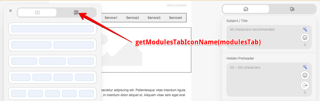
- Set icons for modules tabs
javascript
import {BlocksPanel, ExtensionBuilder} from '@stripoinc/ui-editor-extensions';

class CustomBlocksPanel extends BlocksPanel {
    getBlockItemHtml(block) {
        return `
            <div class="block-thumb" ${block.disabled ? 'disabled' : ''}>
                <ue-icon src="${block.iconSrc}" class="icon-button"></ue-icon>
                <span class="block-thumb-label word-break">${block.title}</span>
                <ue-icon src="reorder" class="rotate90 icon icon-button"></ue-icon>
            </div>
        `;
    }

    getBlocksPanelHeaderHtml() {
        return `
            <div class="blocks-panel-title">
                <h2>Blocks</h2>
            </div>
        `;
    }

    getHintDelay() {
        return 1000;
    }

    getModulesPanelHint() {
        return {
            title: this.api.translate('Modules and structures'),
            description: this.api.translate('Click to open the modules and structures panel.'),
        };
    }

    isBlockHintVisible(block) {
        return !block.disabled;
    }

    isModulesPanelCollapsedHintVisible() {
        return true;
    }
}

const extension = new ExtensionBuilder()
    .withBlocksPanel(CustomBlocksPanel)
    .addStyles(`
        .block-thumb {
            display: flex;
            align-items: center;
            gap: 10px;
            width: 100%;
            max-width: 100%;
            box-sizing: border-box;
        }
        .block-thumb-label {
            flex: 1;
            min-width: 0;
            white-space: nowrap;
            overflow: hidden;
            text-overflow: ellipsis;
        }

        .blocks-panel-title {
            border-bottom: var(--ue-border-width-1, 1px) solid var(--ue-panels-border-color, rgba(0, 0, 0, 0.07));
            display: flex;
            justify-content: center;
        }
    `)
    .build();